5 214 résultats
198217641Suisse 1982 in-folio Suisse, sans éditeur, (1982), in-folio, en feuilles, sous portefeuille gris éditeur illustré, 2 planches de texte, 36 planches et 4 planches non chiffrées.
1955241071955 Marseille, Imprimerie Romefort, c.1955, 99 x 61 cm., sérigraphie en couleurs signée en bas à droite.
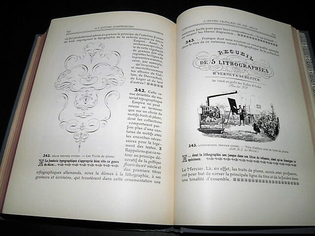
19211862Paris, Au Bureau de l'Edition, 1921, 1924. 3 volumes, complet. In-8 - 16 x 23 cm. Cartonnage éditeur signé Engel, à la bradel, en pleine percaline bleue, titre et illustrations à froid sur le dos et les plats, tranches rouges. Plus de 1 000 pages. Les deux premiers tomes de l'ouvrage comportent une préface de Georges Lecomte et un portrait en frontispice par Bernard Naudin. Ils comptent 517 reproductions en noir dans le texte et 65 planches hors texte dont certaines en couleurs, imprimées sur pâte d'Alfa des Papeteries Bergès. Le troisième volume, dédié à Eugène Grasset et à Georges Peignot, est également abondamment illustré dans le texte de vignettes, bandeaux, culs-de-lampe et ornements variés, ainsi que de planches hors-texte le plus souvent en couleurs.Tome I : Origine et formation de la Lettre d'Imprimerie : des lettres phéniciennes au romain de Didot ; La Lettre métallique dans le titre et la page de texte : de l'époque des manuscrits à la fin du XIXe siècle - Tome II : Classification de la lettre d'imprimerie au XIXe siècle (L'empattement dans la détermination des familles : le Didot, l'Antique, l'Egyptienne ...) ; Les Arts du Livre : la gravure et la fonte des caractères, les machines à imprimer typographiques, les machines à composer, le clichage et la galvanoplastie, l'encre et les rouleaux typographiques, la couleur dans l'impression, la gravure en relief, la gravure en creux, la lithographie et ses dérivés, le papier, la reliure. Tome III : Bagage indispensable ; Notions de typographie & vocabulaire technique ; Le caractère d'imprimerie ; Classification de la lettre d'imprimerie ; L'oeuvre moderne ; Méthodes, styles et manières ; Adaptation du matériel français de fonderie aux principaux genres de travaux ; La publicité ; Un essai de rénovation typographique d'une revue publicitaire ; Le croquis-calque. Intéressant ensemble, rarement complet des 3 volumes, le dernier étant conçu comme un supplément aux deux premiers.
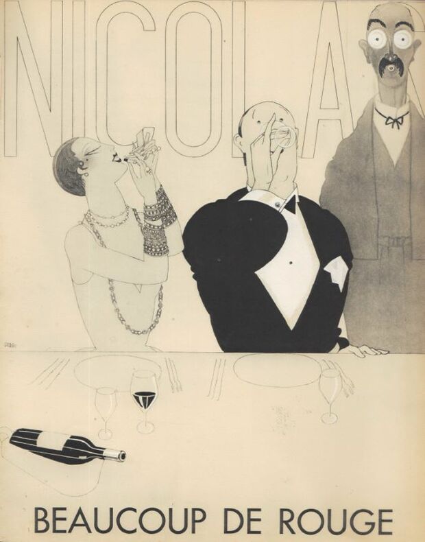
192316834Paris 1923 1 Affichette P.L.V. signée et datée dans la planche, pochoir en couleur cartonné, Paris, 1923, 29,6 x 39,7 cm.
193022400Paris DRAEGER 1930 3 Paris, Draeger, 1930, 1931, 1932, 3 plaquettes à la Gloire des Grands Vins de France. in-4, brochées, couvertures imprimées en couleurs.
193022759Paris DRAEGER 1930 3 Paris, Draeger, 1930, 1931, 1932, 3 plaquettes à la Gloire des Grands Vins de France. in-4, brochées, couvertures imprimées en couleurs.
19346Paris Mülbacher 19291929 1 in-12 Paris, Mülbacher, 1929, in-8, broché, titre imprimé sur la couverture à rabat.
82146aafAntwerpen, J. Gevers, 1935, in-4to, more than 1000 unnumb. p., richly ill. with logos, figures, signs,trade marks etc etc., orig. ill hardcover, stained spine. Binding used but firm.
42609aafDivers imprimeurs suisses, 1918-1952, env. 30/30 cm (13 placards) & env. 28/38 cm (4 placards). en feuilles
1762.1aaf1999. 34.2x62.2 cm. AFFICHE
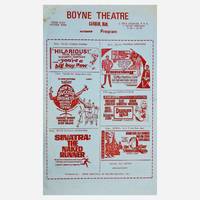
19593604Various Carman Winkler Morden St. Pierre Jolys: Privately Printed; Parkon Products Ltd.; Rehab Industries of Western Manitoba Inc.; Theatre Poster Service Ltd. Calendar Program; Cinema Services 1959-1991. Softcover. Our offering comprises of a rare selection of twelve double -sided illustrated period posters printed in a calendar-style format for various rural Manitoba drive-in theatres advertising their respective monthly film selections between the years of 1959 through to 1991 dates having been determined by the release date of the advertised films. Printed in various sizes and colours light blue white yellow pink with varied measurements: 8 at 8.5" x 11" // 2 at 10" x 8" // 2 at 14" x 8.5". Theatres represented amongst the selection include: 1. The Historic Boyne Theatre Carman Qty. 3 Winkler Theatre Winkler Qty. 1 Stardust Drive-In Theatre Morden Qty. 5 Cinema Jolys St. Pierre Jolys Qty. 2 Cinema Morden Morden Qty. 2. In addition to advertising their upcoming film screenings many include advertisements for offerings from their concession stands their location and contact particulars instructions for "tuning-in" hours of operation etc. Excepting for the rare occasional spot of foxing to a few of the posters nearly all remain without any substantial blemishes or the usual creases. A fascinating ephemeral artifact of vernacular culture. <br/><br/> Privately Printed; Parkon Products Ltd.; Rehab Industries of Western Manitoba, Inc.; Theatre Poster Service Ltd., Calendar Progr paperback
188139318n. p. 1881. 1st edition. Light wear to paper slight staining. Nevertheless a VG exmple. Broadside printed recto only. Large engraving by William R. Fish of Boston of the hotel and grounds. Caption reads: "Note: The Manager very reluctantly issues this Picture of Oakland Beach it is so unlike pictures generally in flattering a place for in this case instead of flattering justice is not rendered". 13-1/4" x 12-1/4" <br/><br/>"The Hotel is nearly new Elegantly furnished has unusually large airy rooms each room with Spacious Hanging Closet Lighted with Gas has Steam Heat so that in case of cold storms its patrons are made comfortable Modern Improvements a Lovely View of Ocean Fine Bathing Boating and Fishing a beautiful Lake of Fresh Water 125 Acres mostly Lawn with Concrete Walks Large Grove of Fine Old Oaks. Steamboat Connections to Various Points. Warwick & Oakland Beach R. R. terminates on the grounds connecting with Stonington Steamboats and Shore Line Trains from Grand Central Depot New York". -Elias Hotchkiss Manager For 10 Years Proprietor of St. James Hotel N. Y. City. No holdings listed of this advertisement on OCLC. Rare in the trade. unknown books
1978wq759Editions Pey Journal 1978 L’Inter-Forain est l’unique organe de la presse foraine en France. Crée par M. Auguste Teyssier en Avril 1909, il porte alors le nom de L’Intermédiaire Forain. Il est déjà imprimé sur du papier rose. En Septembre 1947, le journal, repris par M. Auguste Pey, devient L’Inter-Forain. Il parait tous les 15 jours et se consacre entièrement aux fêtes foraines, salons et cirques. L’Inter-Forain est aussi surnommé « Le Rose ». Ce lot propose 180 numéros de ce journal. De part leur nature ancienne et fragile, des taches de rousseur sont présentes sur les bords des numéros, avec des zones parfois abimées, déchirées, ou usées. Quelques numéros ont vu certains de leurs articles être découpés. Quelques volumes sont en double. Détail des volumes : 1978 : n°726 à 728 (manque n°729 à 731) ; n°732 à 749. 1980 : n°775 à 792, n°785 en double (manque n°793) ; n°794 en double (manque n°795) ; n°796 et n°797. 1982 : n°822 à 830, n°822 en double (manque n°831 à 834) ; n°835 Juillet, n°835 Août (manque n°836) ; n°837 à 843 (manque n°844) ; n°845. 1983 : n°846 à 848 (manque n°849) ; n°850 à 867, n°863 en double (manque n°868) ; n°869. 1984 : n°870 à 884 (manque n°885) ; n°886 à 893 (manque n°894). 1985 : n°895 à 916. 1997 : n°917. CHANGEMENT DE FORMAT ; jusqu'ici le journal était plié au milieu, il devient plié sur le coté. 1994 : Janvier 2ème quinzaine ; Février 1ère et 2ème quinzaine ; Juin 1ère quinzaine ; Juillet 1ère quinzaine ; Août 1ère quinzaine ; Décembre 1ère et 2ème quinzaine. 1999 : Février 2ème quinzaine ; Mars Février 1ère et 2ème quinzaine ; Avril 1ère et 2ème quinzaine ; Mai 1ère et 2ème quinzaine ; Juin 1ère et 2ème quinzaine ; Août 1ère et 2ème quinzaine ; Octobre 1ère quinzaine ; Décembre 1ère quinzaine. 2000 : Février 2ème quinzaine. 2001 : Janvier 1ère et 2ème quinzaine ; Février 1ère et 2ème quinzaine ; Mars 1ère et 2ème quinzaine ; Avril 1ère et 2ème quinzaine ; Mai 1ère et 2ème quinzaine ; Juin 1ère et 2ème quinzaine ; Juillet 1ère et 2ème quinzaine ; Août 2ème quinzaine 2002 : Mai 1ère et 2ème quinzaine ; Juin 1ère et 2ème quinzaine ; Août 2ème quinzaine ; Octobre 1ère et 2ème quinzaine ; Novembre 1ère et 2ème quinzaine ; Décembre 1ère et 2ème quinzaine. Livraison a domicile (La Poste) ou en Mondial Relay sur simple demande.
97871 Montrouge, Draeger, (1914), in-folio, cartonnage gaufré orné d'une plaque dorée Art Nouveau.
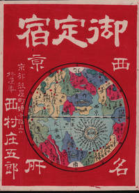
1878214047京都. Kyoto.: 西村庄五郎. Nishimura Shōgorou. 1878. Stunning colour map woodblock advertisement 25 x 19cm very good condition. This unusual and advertising woodblock map/print promotes Hiiragiya a renowned Japanese inn located in Kyoto. The print depicts the inn as the focal point of a Kyoto map humorously mimicking a world map. Established in 1861 by Nishimura Shogoro Hiiragiya continues to operate as a prestigious five-star inn in the heart of Kyoto. <br> <br>In the map distances to various landmarks and sites are indicated around the inn showcasing its central location within Kyoto. Additionally illustrations of major attractions such as the Royal Palace and the Kyoto Prefectural Office are depicted alongside the inn highlighting its proximity to key destinations. <br> <br>This eye-catching print serves as both an advertisement for Hiiragiya and a whimsical representation of Kyoto's attractions emphasizing the inn's prime location and prestigious reputation in the city. . 西村庄五郎. [Nishimura, Shōgorou]. unknown
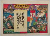
1904219714東京. Tokyo.: 尾﨑清次郎. Ozaki Seijirō. Circa1904. Colour woodblock folding sugoroku game sheet 38.3 x 52cm a little light soiling minor wear at margins but overall very good. This finely printed woodblock sugoroku game sheet was distributed as an advertisement by Ozaki Seijirō a rice and fertiliser merchant based in Toyama City a small rural centre on the Japan Sea coast. The game depicts major Japanese military commanders and the siege of Port Arthur highlighting both the difficulties of overcoming the Russians and the eventual retreat of their soldiers. Among the generals shown are Kodama Ōyama and Kuroki. Strikingly the goal of the game is marked not by triumphant soldiers but by two military nurses in uniform with rolls of bandages symbolising the soldiers’ return home in spite of wounds or illness. The sheet demonstrates how news of the war circulated widely reaching even provincial towns such as Toyama. . 尾﨑清次郎. [Ozaki Seijirō]. unknown
184618110101London: Edward Moxon 1846. Leather bound. Near fine. Three volumes complete twenty-fourmo size 1005 total pp. The ancient poetry of England continues to hold a fascination and influence over contemporary poets with the old ballads and songs still being read and studied. This three-volume set comprises a thorough selection of poems from the old English tradition with ballads featuring well-known characters such as Robin Hood King Arthur and Sir Gawain as well as poetry written by prominent Elizabethan writers such as Christopher Marlowe and Sir Walter Raleigh. The poetry is annotated with notes and a scholarly essay precedes the poems in Volume I making this set a historical and academic look at some of the most beautiful lyrics in the English language.<br/><br/>This set is bound in contemporary leather which has remained smooth and supple with elegant gilt designs in unusually nice condiiton.<br/><br/>___DESCRIPTION: Full brown leather gilt ruled borders around the edges of both boards five raised bands on the spine with gilt decorative and ruled borders brown and black leather spine labels with gilt lettering decorative gilt borders along the fore- bottom and top edges of the boards all edges marbled marbled endpapers in brown red and black; twenty-fourmo size 5.5" by 3.5" pagination: Volume I: i-v vi-ci cii-cv 1 2-283; Volume II: i-v vi-viii 1 2-303; Volume III: i-v vi-vii viii 1 2-298. Elegant inscription in a vintage hand in two different colours black and brown the brown ink "Florence P. P. Beasley / from/ her affectionate brother / E. C. Beasley / 28th May 1872" the black ink "Charles Edward illegible / Beasley in loving memory / of his dear mother CB" in all three volumes both inscriptions on the verso of the front free endpaper in each volume; additionally the inscriptions are dated 1907 in Volumes II and III. <br/><br/>___CONDITION: Volumes are near fine with clean boards strong square text blocks with solid hinges the interiors are clean and bright and the only prior owner markings we see are the inscriptions mentioned above; some very light rubbing to the corners on each volume all corners gently bumped and very minor foxing to a few pages in each volume but overall a lovely set.<br/><br/>___POSTAGE: Â International customers please note that additional postage may apply as the standard does not always cover costs; please inquire for details.<br/><br/>___Swan's Fine Books is pleased to be a member of the ABAA ILAB and IOBA and we stand behind every book we sell. Please contact us with any questions you may have we are here to help. Edward Moxon unknown books
199024464Vue sur la Ville. 1990 1 in-12 Paris, Chanel, Vue sur la Ville, 1990, in-12 oblong (15 x 30 cm), couverture pelliculée sur fond noir et titrée en lettres capitales blanches dans le plus pur style Chanel, 12 pages en noir et blanc.
4863Journal in folio de 8 pages,texte sur 3 colonnes, bi-hebdomadaire, paraît le dimanche et le jeudi.Rédacteur H de VILLEMESSANT.5ème année complète du n°301 du dimanche 3 janvier 1858 au n° 404 du jeudi 30 décembre 1858.En deux volumes demi-cuir vert époque,titre,année,tomaison,filets dorés.Un coin,une coiffe,restaurés.RARE
192523834PARIS Draeger 1925 1 Montrouge, Draeger, 1925, broché, couverture illustrée en noir par Bernard NAUDIN.
8523publicité pour SUZE apéritif à la gentiane "avec du cassis et du citron "affiche de format 312x461mm contrecollée sur carton fort,composition en couleurs de ILLORY.Coins légèrement tassés sinon bon exemplaire. Coloris frais
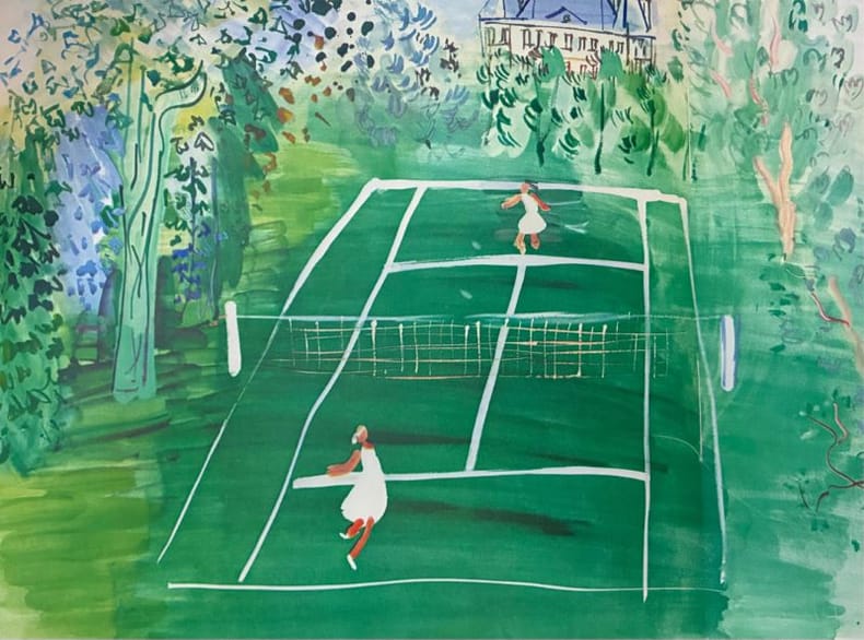
193625210PARIS DRAEGER 1936 1 IN-4 Broché Paris, Draeger, 1936, in-4, broché, couverture lithographiée par Raoul DUFY.
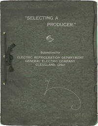
1930162432Various American Cities: Wilding Picture Productions 1930. First Edition. First Edition. A volume produced by Wilding Picture Productions also known as Wilding Studios advertising their audiovisual communications services for industrial use. Contemporary ownership annotation in manuscript ink on the second leaf. <br /> <br /> Wilding was founded in Detroit in 1914 moving into the Essanay Building in Chicago in 1937. The company would become one of the largest producers of industrial films over the ensuing decades and at one point operated out of Cleveland Hollywood Chicago Detroit and New York. Wilding is today best remembered for producing many of the US Armed Services' training and educational films during World War II.<br /> <br /> Of particular note in the volume on offer are over 15 pages of copied client testimonials and four pages of photographs of Wilding Studios during the making of various commercial films.<br /> <br /> Very Good plus in string-bound embossed leatherette wrappers. Wrappers moderately yapped. Contents Very Good with dampstaining affecting the first five leaves though leaves are not stuck together light toning throughout and several photographs and testimonials laid inhaving become detached from the leaves over time. Wilding Picture Productions unknown
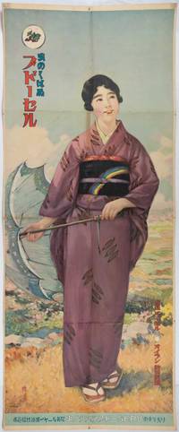
215601Japan. Large striking colour poster 120 x 49.6cm. This poster has been folded causing three horizontal creases and another vertical running the full length of the long sheet. Repairs to folds including some colouring along paper abrasion on folds on image itself. Still a lovely poster. This beautiful colour advertisement poster promotes the moth-proof serge kimono fabric from Budōseru Grape Brand Serge. Serge kimonos became highly fashionable in Japan around the turn of the 20th century. The merino wool was imported from Australia being regarded as the most suitable fibre for single-layer kimonos. However woollen fabrics were susceptible to insect damage. To combat this issue the Grape Brand Serge manufacturer developed a moth-proofing treatment utilising chemicals from the German company Bayer. According to the poster Bayer's compounds were used and their treated serge was marked on the selvedge as "moth-proof Budo serge". This processing took place at their factory in Aichi Prefecture. <br> <br>In the foreground a classical Japanese beauty graces a hillside elegantly attired in a purple kimono with a parasol in her hand. Her black obi bears an unusual rainbow design. The artist's signature appears in the lower left corner. . unknown
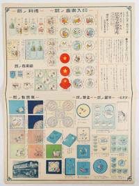
1930215725田中軍人デパート記念品専門部. Tanaka Gunjin Depāto Kinenhin Senmonbu. 1930s. Colourful small poster size advertisment featuring a large selection of gift ideas black and white photograph in the lower corner shows the business premises. 52.5 x 38cm. Few small closed tears at margins neatly mended on the reverse a bright interesting item. Scarce. This intriguing advertisement showcases a variety of gifts traditionally given by Japanese families to celebrate the safe return of loved ones from military service. Up until 1945 all Japanese males were required to serve three years in the military at the age of 20 before returning to civilian life. Issued by the Tanaka Military Servicemen Department Store in Kurume Kyushu—a town known for its Army base—the advertisement highlights items such as sake drinking sets tea cups and wrapping cloths all personalised with designs logos soldiers' names and unit numbers.<br><br>When a young man was conscripted he and his family often received farewell gifts including monetary gifts and goods. Upon his safe return families reciprocated with these commemorative items. Although military service in China became increasingly perilous during the 1930s the advertisement advises customers not to delay their orders as creating personalised items requires time. . 田中軍人デパート記念品専門部. [Tanaka Gunjin hardcover