833 résultats
Firenze, Galleria Michaud, 1977, in-8, br. edit., pp. 28. Con tavole.
L8583Moscou. Édition d'État de l'art décoratif, 1958. In-12 br. Musée d'État de la céramique. Texte en russe de B. Alexeev. Nombreuses photos des oeuvres en porcelaine du XVIII e. au XX e. siècle, de la période tsariste à la période soviétique. Photos en noir et blanc de N. Beliaev.
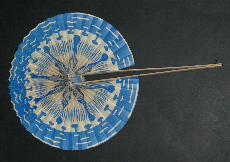
1935boz_003046Éventail en papier et bois, coloré. Dimensions : 20 cm de diamètre État : Papier légèrement décollé de la monture.
12539Paris, éditions Albert Lévy, "collection documentaire d'art moderne", 1924, in-folio (25,5 x 33,5 cm), 10 pp. (fx-titre, titre, introduction, table des planches, bl.) en feuilles et 50 planches sous chemise à lacets, titre en noir sur le dos de toile verte, plat supérieur imprimé ; quelques taches sur le plat supérieur de la chemise, des piqûres et une mouillure angulaire aux feuillets de texte.
0365193577.Gpaperback. Good. Access codes and supplements are not guaranteed with used items. May be an ex-library book. paperback
14913Brüssel, o.J. 42 Bll. mit Abbildungen, 12 handkolorierte Lithographien auf Rive. Kl.Qu.4°. Orig.-Karton (handschriftlicher Titel auf dem Rücken, leicht fleckig).
191065603Marburg, N. G. Elwert, [1910]. 22 kartonierte Bll. mit mont. Abb. unterschiedlichen Formats (Blattgr. ca. 24,2 x 15,6 cm). Lose in schlichter OKart.-Mappe.
194427884-ym5007Prag: Novina 1944. 76 Seiten und 3 Blatt. Illustrierte orig. englische Broschur (gering berieben und bestoßen, der Schutzumschlag mit kleinen Einrißen, sonst gutes und sauberes Exemplar). Gr.-8°. broschiert/ Taschenbuch
193527883-ym5008Prag: F. Topic 1935. 76 Seiten und 3 Blatt. Orig. Broschur (etwas berieben und bestoßen, der Rücken mit einer kleinen Fehlstelle am Fußkapital, der Umschlag leicht fleckig, sonst gutes und sauberes Exemplar). Gr.-8°. broschiert/ Taschenbuch
1912106888Xenien-Verlag: Leipzig 1912. Olivgrüne Originalpappbände,etwas lichtrandig, fleckig, berieben und bestoßen, äußere Rückengelenke leicht angeplatzt. 21,8x14,8 cm, 767 Seiten mit zahlreichen montierten einfarbigen Abbildungen. Papier leicht gebräunt/braunrandig. Guter Zustand.
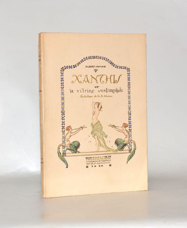
19200019491920 Paris, Ferroud, 1920. Grand in-8 (170 x 240 mm) broché, couverture rempliée illustrée couleurs et rehaussée d'or ; (1) f. blanc, frontispice, (3) ff., 44 pages, (2) ff. Quelques traces de frottements au dos, sans caractère de gravité.
1994165444Köln, Taschen, 1994. 244 S., mit zahlreichen s/w und farbigen Illustrationen. Original-Leinwand mit Schutzumschlag, 4°. Hardcover Gutes Exemplar.
2008EEZZ9699aKöln, Taschen 2008. 4°. 244 S. mit über 300 teils farbigen Abb., roter Original-Leinenband mit schwarzer Einbandpräg. u. OUmschlag Erste Ausgabe - zum Unterschied von späteren Auflagen aus der Coffeetablebuchfabrik - noch in Echtleinen gebunden. Als Einführung brauchbar. Doch leider mit vielen Ungenauigkeiten und Lücken. Bedauerlicherweise ohne Register.
2008EEZZ9699Köln, Taschen 2008. 4°. 240 S. mit über 300 teils farbigen Abb., OPappband mit OU. Als erste Einführung brauchbar. Leider viele Ungenauigkeiten und Lücken. Bedauerlicherweise ohne Register. Hier vorliegend die "Jubiläumsausgabe" in etwas verkleinertem Format, jedoch inhaltlich nicht verbessert oder gar vermehrt.
197452938Braunschweig : Klinkhardt und Biermann 1974. XVI, 508 S. : 318 S/W- u. Farbabbildungen, zahlreiche Signaturentafeln, 24 cm, mit Schutzumschlag, SU lichtbraun und unten mit Fehlstück. Lw., gebundene Ausgabe, Leinen, sonst Exemplar in gutem Erhaltungszustand
196351311ABZch., Conzett & Huber, 1963. 4°. 100 S. OKart.
9762Mardaga . Très bon état d’occasion.
In 4 (cm 33,5 x 34 circa), pp. doppie 24. Brossura editoriale illustrata. Ottavo numero della decima serie, dell'anno 1929, di questa rivista olandese Deco di arte e architettura. "In the Netherlands, the most extreme form of Art Deco typography was known as Wendingen style or rule tendency, a graphic style which was firmly rooted in the Architecture of the Amsterdam School. The person who took the ideas and the aestethics of this group to the printed page was Hendrik Th. Wijdeveld (1885-1988), the founding editor of the magazine Wendingen. Wijdeveld's view of typography and letterforms has often been identified with one expedient which was particularly scorned by traditionalists and modernists alike: his tendency to construct type and ornament with compositors' brass rule, the way an architect would use bricks to make a relief on a wall. This was, however, only one of many techniques Wijdeveld used" (Jan Middendorp, Dutch Type, 2004, p. 68 e ss). Questo numero e' dedicato a J. L. M. Lauweriks (autore anche dell'immagine di copertina), architetto, designer e illustratore.
In 4 (cm 33,5 x 34 circa), pp. doppie 26 con illustrazioni nel testo (pubblicita' alle pp. finali 17-26). Lieve mancanza all'angolo inferiore del piatto anteriore e del frontespizio. Brossura editoriale illustrata con litografia ad entrambi i piatti. Numero doppio 11/12 del novembre-dicembre 1920, di questa rivista olandese Deco di arte e architettura. "In the Netherlands, the most extreme form of Art Deco typography was known as Wendingen style or rule tendency, a graphic style which was firmly rooted in the Architecture of the Amsterdam School. The person who took the ideas and the aestethics of this group to the printed page was Hendrik Th. Wijdeveld (1885-1988), the founding editor of the magazine Wendingen. Wijdeveld's view of typography and letterforms has often been identified with one expedient which was particularly scorned by traditionalists and modernists alike: his tendency to construct type and ornament with compositors' brass rule, the way an architect would use bricks to make a relief on a wall. This was, however, only one of many techniques Wijdeveld used" (Jan Middendorp, Dutch Type, 2004, p. 68 e ss). Questo numero e' dedicato all'architetto Hendrik Petrus Berlage.
In 4 (cm 33,5 x 34 circa), pp. doppie 22 (da pagina 17 a pagina 22 annunci pubblicitari). Timbretto all'interno, qualche alone alle pagine. Brossura editoriale illustrata con vari strappetti e rotture ai margini di entrambi i piatti. Quarto numero, dell'aprile 1919, di questa rivista olandese Deco di arte e architettura. "In the Netherlands, the most extreme form of Art Deco typography was known as Wendingen style or rule tendency, a graphic style which was firmly rooted in the Architecture of the Amsterdam School. The person who took the ideas and the aestethics of this group to the printed page was Hendrik Th. Wijdeveld (1885-1988), the founding editor of the magazine Wendingen. Wijdeveld's view of typography and letterforms has often been identified with one expedient which was particularly scorned by traditionalists and modernists alike: his tendency to construct type and ornament with compositors' brass rule, the way an architect would use bricks to make a relief on a wall. This was, however, only one of many techniques Wijdeveld used" (Jan Middendorp, Dutch Type, 2004, p. 68 e ss). Questo numero e' dedicato alle architetture di: J. Luthmann, J. L. M. Lauweriks, Hendrik Th. Wijdeveld, De Groot, Bruno Taut.
3707Genève, Eggimann, 1897 ; 8°, broché, couverture illustrée, portrait en frontispice.
190210839Berlin, Fischer und Franke, 1902. Unpaginiert, ca. 400 S. Farbig geprägte OLeinwand
19892441Du Chêne 1989 in-4, 274 pp. Cartonnage éditeur, jaquette abîmée touchée par l’eau, nombreuses illustrations en couleurs
192065939Wien, Kunstanstalt Jaksch & Neuhold, o. J. (um 1920). Farb. lithogr. Plakat (ca. 94 x 63 cm).
197943189ABNew York, C. Ray Smith., 1979. 4°. 95 S. OKarton. First printing. Umschlag am Kapital etwas bestopen. Gutes Exemplar.