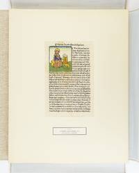
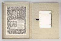
2 457 résultats
192952839London: Linotype & Machinery Ltd 1929. One of 100 copies. Portrait frontispiece. 1 vols. Folio. Vellum-backed patterned boards. A very fine copy with slip bearing compliments of the printer. One of 100 copies. Portrait frontispiece. 1 vols. Folio. <br/><br/> Linotype & Machinery Ltd hardcover
1020452757.Ghardcover. Good. Access codes and supplements are not guaranteed with used items. May be an ex-library book. hardcover
37459COLOR PRINTING CHRISTLICHES GEDENKBUCH. St. Louis: Eden Publishing House circa 1900. 8vo. Chromolithographic cloth binding all edges gilt. Unpaginated with 12 chromolithographic plates and a other pages with a pictorial border of flowers and nature scenes printed in brown ink. First edition. A stunningly fine copy with raised flowers on the spine and front board. Eac month begins with a piece of biblical verse with a chromolithographic border German text printed in several colors and gold. Rare. We could not find a c cited by OCLC. The publication was meant for daily reflection on the bible. unknown
1793ST20474Paris: Defer de Maisonneuve 1793. First Edition with these Illustrations. 350 x 262 mm. 13 3/4 x 10 1/4". 125 pp. <br/> VERY PRETTY 19TH CENTURY CRIMSON MOROCCO ELEGANTLY GILT covers framed with floral tools raised bands spine panels filled with rows of flower-and-lozenge roll gilt lettering gilt turn-ins top edges gilt. FOUR FINE STIPPLE-ENGRAVED PLATES by Colibert and Cazenave after Monsiau PRINTED IN COLORS. A Large Paper Copy. Cohen-de Ricci 400; Furstenberg 122; Lewine p. 188; Maggs 1930 Catalogue of French Illustrated Books 84; Ray p. 145. Occasional minor foxing the margins of one plate foxed a bit more otherwise a fine copy clean and fresh internally with immense margins the plates with pleasing colors and the unworn binding bright with gilt.<br/> <br/> This is an especially tall copy of Florian's pastoral romance in imitation of Cervantes one of the grander French books to be printed in colors when the vogue for such productions took hold during the last years of the 18th century. Ours is one of six such books all printed after 1786 that Ray singles out for praise as "handsome and imposing volumes." A noted painter of both classical and modern subjects Monsiau 1754-1837 was also an illustrator whose "abundant and interesting work in this line" is underrated even though it has the merits of being simple natural lively and piquant. Ray Monsiau's obscurity says Ray may be owing to the fact that he most often worked as a secondary collaborator on major illustrated works; the present book is one of the few he did on his own and it is among his best. Publisher Defer de Maisonneuve did not originate the technique of stipple engraving on copper plates but he did perfect the process which allowed for gradual tonal changes in hues and intensities of color rather than the "stained glass" effect of separately printed patches of color. Given the turmoil of the period when this book was published it is quite likely that it did not have an especially decorative original binding and may have remained in publisher's boards as was often the case. Happily a later owner supplied a period-appropriate binding here that matches the opulence of the contents. While our copy has the engraver's name just visible beneath the plates perhaps disqualifying them as the "avant la lettre" versions used in the Large Paper Copies per Cohen-de Ricci the size of the margins here and the quality of the paper certainly argue for that designation. Defer de Maisonneuve unknown
18759365Paris: Ve. A. Morel 1875. First edition. 20 chromolithographic plates 5 uncolored architectural views. 1 vols. Folio. Half red morocco. Some rubbing and chipping with head of spine missing corners repaired with red cloth not unattractive. 2 Photographs of Sainte Chapelle loosely inserted paste marks to front free endpaper. Text and plates bright. First edition. 20 chromolithographic plates 5 uncolored architectural views. 1 vols. Folio. Very fine plates by Lemercier of Paris. Ve. A. Morel unknown
35708COLOR PRINTING PICTURES AND SONGS FOR THE LITTLE ONES AT HOME. London: Thomas Nelson and Sons 1865. 8vo. Publisher's cloth. 16 leaves printed on one side only with 15 color plates. First edition. This is a very nice example of color printing by Thomas Nelson who used a transfer lithography method very similar to Baxter's color printing technique In it Nelson transferred the images from steel engravings as opposed to Baxte taking his images from wood blocks. Then Nelson used oil based colors to pri the image as did Baxter producing very bright and vivid colors. The color images in this book are quite small 1 1/2 x 1 3/4 inches and are pasted on pages all printed in brown ink with gold borders and vignettes that surround the color plates. Some sporadic foxing and slight cover discoloration but a good example of a seldom seen Victorian method of color printing. unknown
1822ST17561London: Published for the Proprietor by Longman Hurst Rees Orme and Brown 1822 1823. FIRST EDITION ONE OF 227 COPIES. 288 x 220 mm. 11 3/8 x 8 5/8". 3 p.l. vi 2 100 8 103-118 pp. 2 leaves. <br/> Pleasing 20th century rich green crushed morocco gilt-framed covers and smooth spine gilt lettering to spine edges untrimmed. In a burgundy calf-backed clamshell box meant for this book but for some reason substantially larger green morocco title label on spine. WITH 60 ENGRAVED ILLUSTRATIONS as called for in Abbey 48 PRINTED IN COLORS including decorative title page dedication with Earl Spencer's coat of arms six plates with a total of 18 color ink specimens two type specimen plates four engravings of printing presses Columbian Press in two states one before letters nine defaced plates printed recto-verso and six headpieces three color printed 28 engraved plates printed in colors: five in a single block six in two to four blocks 14 in five to nine blocks and three full-color in 13 14 and 29 blocks respectively as called for in the contents and in Abbey. Front pastedown with the bookplate of the Robin Collection. Abbey Life 233; Ray "England" 99. Occasional mild thumbing otherwise nothing but the most trivial imperfections--quite a fine copy internally clean and fresh with pleasing colors in a very appealing unworn binding.<br/> <br/> This virtuoso production was in Ray's opinion Savage's magnum opus a work that was "both a highly idiosyncratic volume and a notable landmark in the history of color printing from wood." Printer and engraver William Savage 1770-1843 was in Ruari McLean's words "the first true colour printer of the nineteenth century in England." One of his great innovations which made possible color printing as seen here was a new formulation of ink. DNB reports "Printing ink in England at that time was of a very poor quality and Savage by various experiments made a printing ink without any oil in its composition. This made it more serviceable for artistic work and easier to manufacture." Savage's inks transferred so cleanly from the engraved wooden block to the paper that the blocks did not have to be wiped between impressions--speeding up the process considerably especially when as here one image could require up to 29 colored blocks. The oil-free inks were also less inclined to smear or to bleed through the paper. While Savage's elaborate methods were not economically viable for mass printing of color-illustrated works his improvements to printing ink and his use of multiple blocks paved the way for the use of chromolithography. The engravings in this work are rare because the work was strictly limited and because Savage despite some protests fulfilled his promise to subscribers that all the blocks would be destroyed. While the plate count in the work can vary from copy to copy the present item collates as indicated by the table of contents and includes Clymer's Columbian Press plate in two states as called for by Abbey. This work appears on the market from time to time but seldom in the kind of agreeable condition seen here. Published for the Proprietor by Longman, Hurst, Rees, Orme, and Brown unknown
1790ST14261Paris: Drouhin 1790. FIRST EDITION. 265 x 205 mm. 10 3/8 x 8". Two volumes. <br/> VERY ATTRACTIVE CONTEMPORARY MARBLED CALF GILT IN A NEOCLASSICAL DESIGN covers with a cresting palmette frame featuring ornate urn ornaments at corners flat spine divided into compartments by Greek key roll floral spray centerpieces one green and one black label marbled endpapers. With 55 PLATES OF COSTUMES designed by Philippe Chéry and engraved by Pierre-Michel Alix 50 of these PRINTED IN COLOR five in black and white a couple of these with color highlights applied by hand and with a color portrait of the author from the 1802 edition tipped in at front. Colas 717; Hiler p. 542; Lipperheide 3203; Cohen-de Ricci 227; Brunet IV 1135. One corner worn to board joints and extremities lightly rubbed but the bindings lustrous and generally very attractive. First volume slightly browned throughout second volume occasionally so volume II with two-inch marginal stain to upper gutter affecting four quires and six plates but not touching text or images two plates with pen marks in margins touching lettering but not image other trivial defects but still an excellent copy internally the colors especially clear and pleasing.<br/> <br/> This is an elegant production with the Neoclassical binding being the perfect complement to the color engravings of ancient Greek and Roman costumes that illustrate the present history of theatrical attire. In the two volumes here theater critic and historian Jean Charles Le Vacher de Charnois 1749-92 covers Classical tragedies and comedies as well as later interpretations of these dramas by playwrights including Racine. Le Vacher de Charnois intended a series of books encompassing as the title indicates theatrical costumes from all nations and from the ancient to the modern; however the French Revolution interrupted his scheme and as a monarchist he was imprisoned in 1792 for his writings in support of the aristocracy. It was long thought that he had died in the massacres at the Abbaye prison in September of that year but later research indicates that he may have been executed during the Reign of Terror in 1794. The artists who illustrated this work were at the opposite end of the political spectrum. Painter Philippe Chéry 1759-1838 studied with Jacques-Louis David and adopted his master's passionate support for the Revolution as well as his Neoclassical style. Engraver Pierre-Michel Alix 1762-1817 was a specialist in color printing best known for his portraits of leaders of the French Revolution and later of Napoleon and First Empire dignitaries. While the handsome binding here is unsigned the palmette roll on the covers is very similar but not identical to one used by Bozerian see Culot "Jean-Claude Bozerian" roll #44 and plate #XXIV. Perhaps our binder had trained in that atelier as the design and workmanship are certainly of that level. Drouhin unknown
1846ST19286London: Printed by Catchpool & Trent for Simpkin Marshall & Co 1846. FIRST EDITION. 320 x 255 mm. 12 1/2 x 10". xiii 3 96 pp. <br/> Publisher's original blind-decorated dun-colored cloth gilt titling to upper cover smooth spine newer endpapers. WITH 11 COLOR ENGRAVINGS after Frost by W. P. Chubb & Son printed in oil colors by George Baxter all with original tissue guards. Front free endpaper with small ink signature of John Hill. See: Francis Reid "Isaac Frost's 'Two Systems of Astronomy' 1846: Plebeian Resistance and Scriptural Astronomy" in "The British Journal for the History of Science" Vol. 38 No. 2 Jun. 2005 pp. 161-177. Cloth rather spotted corners bumped but the binding solid with no wear to joints or hinges. A few spots of foxing to title page half of the tissue guards with overall very faint foxing/browning the illustrations with minor foxing at edges and in margins but the images themselves clean and bright and all in all a really excellent copy the text wide-margined and quite clean and fresh and the plates with rich coloring.<br/> <br/> Illustrated with beautiful color plates this anti-Newtonian work promotes a view of the universe based on the backward-looking beliefs professed by a Protestant sect known as the Muggletonians. Named after co-founder Lodowicke Muggleton the Muggletonians emerged in London in 1651 based on the claims of two tailors who professed to be the "Last Witnesses" described in the Book of Revelation. Rejecting the new directions in philosophical reason Muggletonians believed in a purely scriptural interpretation of the universe. According to E. P. Thompson's 1994 "Witness Against the Beast" the Muggletonians had curious notions quite contrary to other Protestant denominations: they believed that the soul is mortal that Jesus and God are one and the same that Heaven was left without divine supervision from Jesus' death until the day of judgment that Heaven resides six miles above the Earth that God stands between five and six feet tall and other unconventional things. Although the sect initially avoided both worship and evangelizing during the 19th century some followers became more outspoken about their beliefs and even published books appealing to the general public. Our author Isaac Frost 1793-1858 was a prominent Muggletonian and successful owner of a brass foundry who along with his brother Joseph invested large sums to promote their belief system--the present work being an especially notable example. Divided into two main sections the text first describes the Newtonian system of heliocentric astronomy and then turns to Frost's scriptural interpretation and geocentric views. As Reid tells us "According to Frost Scripture clearly states that the Sun the Moon and the Stars are embedded in a firmament made of congealed water and revolve around the Earth that Heaven has a physical reality above and beyond the stars and that the planets and the Moon do not reflect the Sun's rays but are themselves independent sources of light. Our book was apparently written as a reaction against the lecturers who expressed Newtonian astronomy--which was often for them and their audiences simply shorthand for heliocentrism." The 11 plates that illustrate these extraordinary ideas are the work of George Baxter a pioneering printer who revolutionized color printing techniques by combining metal engravings with woodblock printing using oil-based inks to produce high-quality affordable prints. The plates here are appropriately ethereal and otherworldly utilizing a beautiful palette with subtle gradations and esoteric figures to create memorable pseudo-scientific imagery. Although this work appears at auction with some regularity it is almost always incomplete no doubt because the attractiveness of its plates encourages harvesting. Useful price comparisons include a complete copy said to be in fine condition selling for £7500 in 2016 and six loose prints from the book fetching £6875 in 2015. [Printed by Catchpool & Trent for] Simpkin, Marshall, & Co unknown
19862111902160100429Not Available 1986. Soft Cover. Fine. Number of pages: 208 Not Available paperback
1864228980Mobile Alabama: S.H. Goetzel; Farrow & Bennett Printers 1864. First edition in English. 4 vols. 8vo. Printed wallpaper wrappers worn and fragile; back wrapper of Vol. II missing. In blue cloth drop-box. First edition in English. 4 vols. 8vo. Rare and telling example of printing in the confederacy toward the end of the war when paper was so scarce the publisher was forced to use wallpaper taken from Southern homes for the wrappers. Parrish 6437; Crandall M.L. Confederate imprints 3106 S.H. Goetzel; Farrow & Bennett, Printers unknown
190273377London: Edwin Arnold 1902. Limited to 165 numbered copies on vellum at the Essex House Press under C. R. Ashbee. Small octavo. 45 1 pp. Hand-colored frontispiece and two full-page hand-colored illustrations and eighty-five hand-colored ornamental letters by Edith Harwood. Tail-piece. Caslon type. Publisher's vellum with rose and gilt lettering to front cover. Bit of natural mottling to vellum. Custom folding cloth chemise and slipcase. A very good copy.Great Poems Series No. 6. "In 1886 C.R. Ashbee established the Guild of Handicraft at Essex House London. Around the same time Ashbee created the Essex House Press. The Essex House Press published its first book in 1898. The work of the press was very much a part of the Arts and Crafts Movement. Ashbee continually linked the aims of the press with those of John Ruskin and William Morris and described the object of the movement as “making useful things…making them well and…making them beautiful.†The critics however were not so sure about the work of Essex House Press calling it “articraftiness.†Later booklovers came to admire much of its work. Some of the presses and some of the workmen for Essex House Press came from the Kelmscott Press after its demise in 1897 following the death of William Morris. Ashbee designed his own typeface called “Endeavor†for the press. In 1902 the press moved to Glouscestershire. The Essex House Press closed in 1910 having produced more than seventy titles." Univ. of Utah Edwin Arnold hardcover
200476827Claremont CA: Scripps College Press 2004. First edition. One of 100 copies signed by the head of the Press Kitty Marryat and seven of the students involve in the making of this book. Oblong folio 16 1/2 x 6 1/4 inches. 40 pp. with text and poems printed in various inks and 24 woodblock illustrations and 12 original photographs of food tipped in. Publisher's cloth spine over purple and silk covered boards. A very nice copy.Scripps College Press wass founded in 1941 and the commissioned a new typeface from the venerable Frederick W. Goudy. Early instructors were Ward Ritchie Joseph Foster and Christy Bertelson. "In 1986 Kitty Maryatt became the director of the Press and instituted a new program of collaborative class books. Two letterpress books are produced each year by the Typography class. The class supported by the Press is entitled Typography and the Book Arts. Students from all five of the Claremont Colleges are allowed to attend under the premise that all students will learn the highest standards of typography and printing by publishing their own books. These neophyte students are asked to write on a given subject make imagery design the layout hand set the metal type print the book by letterpress and bind the edition of about 100 copies all in one semester" Scripps College. Scripps College Press hardcover
1796ST12327Paris: P. Didot l'aîné 1796. ONE OF 100 COPIES. 330 x 235 mm. 13 x 9 1/4". 2 p.l. 165 1 pp. <br/> Original gray boards flat spine dark gray paper title label two-thirds of the leaves UNOPENED. Engraved printer's device on title page and SEVEN FINE COLOR-PRINTED ENGRAVINGS AFTER PEYRON BY CHAPUY AND LAVALLÉE SOME FINISHED BY HAND. Cohen-de Ricci 730; Brunet III 1860. ◆A couple of very small brown spots and just a hint of soiling as well as minor abrasions to covers corners somewhat mashed as expected isolated trivial foxing to text but A VERY FINE COPY clean and bright internally with vividly colored plates and in a surprisingly sturdy and generally well-preserved original temporary publisher's binding.<br/> <br/> This is the fine Levy copy of a strictly limited Large Paper edition of a handsomely illustrated work offered here in what seem to be the publisher's temporary boards mostly unopened and virtually untouched internally. Attractively printed with enormous margins the text of the first and by far the most important work here is a prose poem on love supposedly translated from the Greek by one of the great political philosophers of the Enlightenment Charles de Secondat Baron de Montesquieu 1689-1755. In its own day the work was popular largely because of its racy content; today it is considered as a more serious accomplishment by modern scholars who are inclined to see it as a philosophical fable. The colophon informs us that this limited edition was printed with a new type cut and cast by Firmin Didot "with such perfection that up to this moment none other can equal it." The dramatic and animated plates are strikingly different from the Eisen engravings in other editions of this work and are more modern in sensibility than the usual 18th century French engravings. The colophon notes that the plates were broken after the 100 copies of this edition were printed. Our copy was in the outstanding library of American bibliophile Jacques Levy 1905-80 a man of wide-ranging interests who assembled an eclectic collection over 40 years always with a discriminating eye toward visually pleasing and historically important bindings and illustration. In his sale Sotheby's described our binding as being publisher's boards and although the volume seems almost too well preserved to be original we are persuaded by the collector's reputation that this is the correct characterization. P. Didot l'aîné unknown
1852ST20768London: Simpkin & Marshall 1852. FIRST EDITION. 153 x 102 mm. 6 x 4". 64 pp. <br/> Publisher's deluxe red pebble-grain morocco gilt covers with graceful Romantic-style frame central panel of upper cover with gilt lettering that of lower cover with gilt ornament spine blind-stamped to resemble raised bands panels with gilt ornament gilt turn-ins pale yellow endpapers all edges gilt. With title page vignette frontispiece portrait of Wellington and three full-page engravings of battles. Printed entirely in gilt on "enamel" gloss paper. Front free endpaper with faint pencilled signature. Binding very slightly soiled joints and extremities a little rubbed trivial soiling to front endpapers otherwise quite a fine copy the text entirely clean fresh and bright with sparkling gold.<br/> <br/> This now-scarce luxuriously produced little volume celebrates the life and military achievements of Arthur Wellesley Field Marshall and 1st Duke of Wellington perhaps the most widely admired Briton of the 19th century--and does so in glittering fashion. The key facts of Wellington's life and the decisive battles of his storied career are related here in sparkling gold text and images on alabaster white pages. Poet laureate Tennyson's funerary ode described Wellington 1769-1852 as "the last great Englishman" and his death evoked great mourning in response to his life of public service. DNB notes that his defeat of Napoleon at Waterloo crushing the emperor's ambition for European dominance put him in a class of his own: "No man certainly no Briton had ever been in such a situation before in Europe the object of universal hero-worship and gratitude." Wellington was particularly notable among senior military officers for his determination to lead his troops on the frontline in battle. The three battles depicted in the illustrations here attest to this: in "The Battle of Assaye" we see him on horseback two horses were shot from under him during the conflict wielding his sword as he bears down on enemy cannon. At the "Battle of Vittoria" he is shown leading the infantry to face the enemy with bayonet fixed. And in the decisive "Battle of Waterloo" scene he is once again with the cavalry wheeling to attack the advancing French. The frontispiece shows Wellington astride his famed horse Copenhagen who was his mount at Waterloo. Our volume concludes with a chronology of principal events in the duke's life. It is notable that such a handsome memorial work was produced so quickly after Wellington's sudden death on 14 September 1852: a contemporary ad in Bent's Literary Advertiser notes our title was published on 15 November three days before Wellington's state funeral on the 18th. Copies of this work are rare: we could trace no auction sales and OCLC records only seven copies just one in North America. Simpkin & Marshall unknown
1850102955<p>No place no date but Nancy Hinzelin c. 1850. One large folio sheet size 44 x 55 cm showing 90 large syllables with a vertical typographical border in the middle of the sheet.</p><p>Scarce and curious sheet that was printed to help children to learn the alphabet and read. Was it used to hang on the wall in schools</p>
1789372509Nuremberg: Grattenauer 1789. First edition. 16 178 5 iindex pp. 1 vols. 4to. Near contemporary glazed brown calf spine gilt paste paper endleaves edges red. Some rubbing very good overall an attractive copy. First edition. 16 178 5 iindex pp. 1 vols. 4to. Important chroncile of the early printers of Nuremberg. Bigmore & Wyman II 114 Grattenauer unknown
1661372198Cologne: Kinchium 1661. Mallinckrot: Engraved additional title dated 1639. 20 125 11pp. Kortholt: 8 56pp. Fritsch: 6 74 2pp. 4to. Early drab paper boards alla rustica binding on three cords manuscript title on spine text uncut. Foxing and heavily toned. Provenance: Princes of Liechtenstein armorial bookplate. Mallinckrot: Engraved additional title dated 1639. 20 125 11pp. Kortholt: 8 56pp. Fritsch: 6 74 2pp. 4to. Mallinckrot's monograph published on the occasion of the celebration of the second centenary of Gutenberg's invention is the first thorough investigation of the early testimonies to the discovery of printing with the author in favor of Mainz against Haarlem. The work contains the first use of the word "incunabula" in connection with printing. The additional title engraved by Loeffler includes portraits of Gutenberg Faust and Shakespeare and a scene in a printing shop. <br /> <br /> The second work here bound following Mallinckrot is Protestant theologian Kortholt's study on the origins of mathematics and astronomy asserting the Greeks were taught by Chaldeans and Egyptians. Bigmore & Wyman 2:16 Kinchium unknown
174036937La Haye: La Veuve Le Vier et Pierre Paupie 1740. First edition. Engraved allegorical frontispiece by Schley. 2 parts in one volumes. 1 vols. 4to. Contemporary French mottled calf gilt spine marbled endpapers. Upper joint starting at bottom and apart from some minor toning this is a lovely unsophisticated copy in contemporary dress. First edition. Engraved allegorical frontispiece by Schley. 2 parts in one volumes. 1 vols. 4to. Printed by Prosper Marchand a Huguenot publisher and journalist who fled France in 1709 the work appeared at the 300th anniversary of the invention of printing. Marchand writes that he produced the book "a la sollicitation de quelques amis qui ont cru que le troisième jubile ou la troisième année séculaire de l'imprimerie reveilleroit infailliblement la curiosité du publique touchant l'origine de ce bel art at the request of some friends who believed that the third jubilee or the tercentenary of printing would infallibly wake the public curiosity concerning the origin of this beautiful art." The allegorical frontspiece by J.V. Schley show Minerva and Mercury descending from Heaven granting the gift of printing to Germany who in turn gives it to England Holland France and Italy. Bigmore & Wyman II p. 22 La Veuve Le Vier et Pierre Paupie unknown
176936938Leipzig; Wien: Johan Paul Krauss 1769. First Edition. With 24 folding plates. xxv 436 12 index & errata; xl 524 18 index & errata. 1 vols. 8vo. Contemporary three quarter red morocco and marbled boards spine label. Exterior worn tear at foot of spine internally tight and clean. A very good copy. First Edition. With 24 folding plates. xxv 436 12 index & errata; xl 524 18 index & errata. 1 vols. 8vo. Includes notices of Berlin artists graphic arts engravers early woodcuts & woodcut books history of printing and account of a journey through Lower Saxony Westphalia & and Holland. Part Two with striking images from early printed books such as the "Eagle of John" from Ars Memorandi includes "a dissertation on the earliest forms of wood-cutting as applied to the illustration . Heinecken conjectures that Gutenberg took the idea of printing from the playing-card makers who are said to have been the first engravers of historical subjects intermingled with texts. . Heinecken is of opinion that their first productions were taken from wooden blocks." Bigmore & Wyman. Bigmore & Wyman p.320 Johan Paul Krauss unknown
1799214620Brussels: Emmanuel Plon 1799. First edition. 2 engraved plates 5 text engravings. 1 vols. 8vo. Half morocco and marbled boards. Slight foxing. First edition. 2 engraved plates 5 text engravings. 1 vols. 8vo. Bigmore & Wyman I 418 "One of the monument of typographical bibliography" Emmanuel Plon unknown
48210à la fin: Grenoble Veuvre André Giroud 1769. 7 pages. 23x18 Cm. Dérelié. Cette publication concernant lexercice du métier dimprimeur reprend un texte publié en 1728. Il contient 12 dispositions fixant l'impression et la vente de livres. Quelques traces de plis. Sinon; document très bien conservé. (à la fin:) Grenoble, Veuvre André Giroud, 1769. unknown
1929ST17493München: Weiss & Co. Antiquariat 1929. No. 21 OF 50 SETS issued with accompanying German text; there were also 50 with accompanying English text. 480 x 375 mm. 19 x 14 3/4". With an 87-pp. volume of commentary in German. <br/> Loose as issued in a linen-covered chemise titling in black on front cover. Commentary volume in original paper wrapper. WITH 55 LEAVES FROM INCUNABULA issued by German Swiss Dutch Czech and Italian presses ALL WITH ONE OR MORE WOODCUTS 32 OF THESE HAND-COLORED. ◆Front cover of commentary volume with thin six-inch brown stain along head edge but the volume otherwise clean and fresh the leaves with occasional browning or minor staining but excellent specimens overall the hand coloring often quite attractive.<br/> <br/> Arranged according to the city in which they were printed this is a wonderful collection of 55 incunabular leaves all illustrated with woodcuts. The group includes important early images large and small with 32 of them hand painted often with brilliant memorable color. Although every leaf here is of interest there are some leaves that deserve special mention: the 1471 Zainer printing of "Heiligenleben" the earliest leaf included; a number of leaves from herbals Bibles and lives of the saints; leaves representing two different editions of Brant's "Stultifera Navis" a Basel 1500 edition of Aesop and the celebrated 1499 Aldine "Hypnerotomachia Poliphili." A full-page woodcut from Koberger's "Schatzbehalter" "Treasure Book" 1491 shows Korah Dathan and Abiram being swallowed up by the Earth for their rebellion against God while Moses and Aaron pray as God sends fire to destroy the rebels. <br /> <br /> Among the hand-painted woodcuts are several that are outstanding both for the composition of large complex images and for exuberant coloring. These include Pharoah's daughter rescuing the baby Moses as well as the adult Moses with the burning bush both from the German Bible printed by Koberger in 1483; a view of the city of Perugia in Schedel's "Weltchronik" 1493; and another Schedel leaf depicting the martyrdoms of the Apostles Andrew and Thomas. The 55 specimens included here would serve very well either as a final capstone in an advanced collection or else an outstanding nucleus for a beginning collector of illustrated incunabular leaves. Several of the books represented are difficult to obtain and most of the ones that can be procured are very expensive. Weiss & Co. Antiquariat unknown
ST20503McMinnville Oregon: Phillip J. Pirages 2019. No. VII OF 47 COPIES numbered I-XLVII bound in flexible vellum from a total edition of 165 COPIES. Text: 244 x 154 mm. 9 1/8 x 6 1/8"; Case: 502 x 372 mm. 19 3/4 x 14 5/8". ii 75 pp. <br/> Bound in flexible vellum with ties inspired by Kelmscott Press bindings by Amy Borezo who also constructed the case holding the volume and leaves. The book printed letterpress on Zerkall Book Laid Vellum paper by Arthur Larson at Horton Tank Graphics. Book layout by Jill Mann. EACH COPY WITH FIVE LEAVES: ONE FROM THE KELMSCOTT CHAUCER WITH woodcut borders woodcut beginning word and A WOODCUT SCENE DESIGNED BY EDWARD BURNE-JONES AND ONE EACH FROM THE PRESSES OF FOUR GERMAN PRINTERS FROM THE 1470s--PETER SCHOEFFER JOHANN MENTELIN GÜNTHER ZAINER AND ANTON KOBERGER the Zainer leaf featuring at least one woodcut initial. The incunabular leaves consistently excellent with only minor defects and the Kelmscott leaves which were never part of a bound volume in entirely fine condition.<br/> <br/> This is a unique leaf book in the way that it combines three elements: a significant private press production involving people at the top of their craft a scholarly commentary that contributes to a further understanding of the history of printing and--most important--five leaves: one from the Kelmscott Press "Works" of Geoffrey Chaucer and four from books issued by German printers at work in the 1470s. The book has been printed and bound by hand by gifted professionals; the essay addresses a topic of significance to typophiles in a considerably more thoroughgoing way than has been done before; and the assemblage of leaves represents a powerful visual reinforcement of the text as well as an opportunity to share in the ownership of four important incunabula along with the extraordinary Kelmscott Chaucer. The story of the production is heavy on serendipity: in the winter of 2012 after purchasing a very incomplete copy of the Kelmscott Chaucer at auction we considered the possibility of producing a leaf book but because the Chaucer--universally considered to be one of the most beautiful books ever printed--had been written about by so many different people in so many different ways we didn't know what aspect was left for us to explore. The one topic we fastened on as thus far inadequately examined is the origin of the work's typeface. We soon learned that Morris who is known to have owned more than 500 incunables most admired--and was consequently most likely to have been influenced in his typographic design by--Peter Schoeffer of Mainz Johann Mentelin of Strassburg Günther Zainer of Augsburg and Anton Koberger of Nuremberg. Over the course of the years succeeding the purchase of the defective Chaucer we were fortunate beyond all expectation to acquire incomplete books from each of these four eminent printers. As a result the present leaf book will allow the reader not only to read in the accompanying essay about the influence on Morris of his typographic forebears but also to compare with his or her own eyes the resemblances between the Kelmscott leaf and the leaves from four centuries earlier. The essay comes in one of three bindings which reflect the degree of decorative elaboration on the accompanying Kelmscott leaf: linen-backed paper boards in imitation of the small format Kelmscott publications with a leaf containing text and small initials; floral patterned cloth after a Morris design with a leaf containing multiple six-line initials; or in the most deluxe version as here in flexible vellum with ties with a leaf featuring a full woodcut frame one or more prominent woodcut initials and a very large and striking Edward Burne-Jones woodcut scene. Phillip J. Pirages unknown
ST15039aAMcMinnville Oregon: Phillip J. Pirages 2019. ONE OF 32 COPIES in linen-backed blue paper boards from a total edition of 165 COPIES. Text: 244 x 154 mm. 9 1/8 x 6 1/8"; Case: 502 x 372 mm. 19 3/4 x 14 5/8". ii 75 pp. <br/> Bound in linen-backed blue paper boards inspired by Kelmscott Press bindings by Amy Borezo who also constructed the case holding the volume and leaves. The book printed letterpress on Zerkall Book Laid Vellum paper by Arthur Larson at Horton Tank Graphics. Book layout by Jill Mann. EACH COPY WITH FIVE LEAVES: ONE FROM THE KELMSCOTT CHAUCER with multiple 3-line initials AND ONE EACH FROM THE PRESSES OF FOUR GERMAN PRINTERS FROM THE 1470s--PETER SCHOEFFER JOHANN MENTELIN GÜNTHER ZAINER AND ANTON KOBERGER. The incunabular leaves consistently excellent with only minor defects and the Kelmscott leaves which were never part of a bound volume in entirely fine condition.<br/> <br/> This is a unique leaf book in the way that it combines three elements: a significant private press production involving people at the top of their craft a scholarly commentary that contributes to a further understanding of the history of printing and--most important--five leaves: one from the Kelmscott Press "Works" of Geoffrey Chaucer and four from books issued by German printers at work in the 1470s. The book has been printed and bound by hand by gifted professionals; the essay addresses a topic of significance to typophiles in a considerably more thoroughgoing way than has been done before; and the assemblage of leaves represents a powerful visual reinforcement of the text as well as an opportunity to share in the ownership of four important incunabula along with the extraordinary Kelmscott Chaucer. The story of the production is heavy on serendipity: in the winter of 2012 after purchasing a very incomplete copy of the Kelmscott Chaucer at auction we considered the possibility of producing a leaf book but because the Chaucer--universally considered to be one of the most beautiful books ever printed--had been written about by so many different people in so many different ways we didn't know what aspect was left for us to explore. The one topic we fastened on as thus far inadequately examined is the origin of the work's typeface. We soon learned that Morris who is known to have owned more than 500 incunables most admired--and was consequently most likely to have been influenced in his typographic design by--Peter Schoeffer of Mainz Johann Mentelin of Strassburg Günther Zainer of Augsburg and Anton Koberger of Nuremberg. Over the course of the years succeeding the purchase of the defective Chaucer we were fortunate beyond all expectation to acquire incomplete books from each of these four eminent printers. As a result the present leaf book will allow the reader not only to read in the accompanying essay about the influence on Morris of his typographic forebears but also to compare with his or her own eyes the resemblances between the Kelmscott leaf and the leaves from four centuries earlier. Phillip J. Pirages unknown