CHOKUBAN 勅版 (IMPERIAL PRINTING)Biblio.com
2 457 résultats
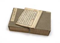
11212Collected & edited by Jiang Shaoyu 江少虞. Complete in 78 parts plus table of contents bound in 15 vols. full collation supplied in the Hyde catalogue. Large 8vo 286 x 215 mm. early paper wrappers new stitching. Japan: chokuban privately published by the Emperor Go-Mizunoo’s order 1621.<br /> <BR> <BR> First edition and a fine complete set of one of the very few surviving “imperial editions†printed with movable type kokatsujiban å¤æ´»å—版. There is considerable modern debate with no definitive conclusion whether this book was printed with metal or wooden type see below. It is of very great rarity and we find no printed copy in WorldCat.<br /> <BR> <BR> This enormous publication is by far the largest of the eight surviving chokuban imperial printings and the only surviving Gen’na chokuban 元和勅版 — imperial printing during the reign 1611-29 of Emperor Go-Mizunoo 後水尾天皇 1596-1680. The production of this large work was a very complex and difficult project employing the recently imported technology of movable type from Korea.<br /> <BR> <BR> The Song dynasty editor Jiang Shaoyu active 12th century compiled the substantial encyclopedia Huang Song shi shi lei yuan 皇宋事實類苑 of the writings of Chinese courtly scholars completed in 1145. Encouraging the preservation of Chinese traditions long valued by aristocrats Emperor Go-Mizunoo continued the project initiated by his father Emperor Go-YÅzei of printing imperially commissioned volumes of Chinese literary classics with the present work a collection of Confucian texts that were considered both an ethical and a literary legacy of the court. Some of the many topics include music medicine painting calligraphy supernatural events safeguarding the border and controlling the unruly.<br /> <BR> <BR> “The earliest surviving books printed in Korea with movable type date from the late fourteenth century…During the invasion of the Korean peninsula undertaken by Toyotomi Hideyoshi in the closing years of the sixteenth century…large numbers of printed books were looted and printing type was removed from the Printing Office and taken to Japan…It appears that Korean type was immediately put to use to print the text of the…Kobun kokyo Classic of Filial Piety in 1593 although no copies of this appear to have survived. In 1597 in the postface to another work printed in Japan with movable type a monk who was present at Hideyoshi’s headquarters acknowledged that typography in Japan had come from Korea. It was not clear whether any Korean printing artisans came to Japan as well as a result of the invasion but in any event the impact on Japan of Korean typography both technologically and intellectually was far greater than that of the Jesuit Mission Press principally because the imported Korean typography was much closer to the centres of power in Japan than the increasingly precarious Jesuit missions.â€â€“Kornicki The Book in Japan p. 129.<br /> <BR> <BR> Emperor Go-YÅzei who nominally ruled Japan from 1586 to 1611 “displayed great enthusiasm for the new process and not content with the original type brought back from Korea ordered a new set of wooden type to be made. This was engraved between 1597 and 1602 and the books printed from this new type are generically known as choku-han or ‘imperial printings.’ Indeed ‘imperial’ is a fitting description of these works for they are among the finest unillustrated books ever produced in Japan. Not only was the typeface larger but the best-quality paper and the finest ink were used to achieve effect. Very few choku-han works were actually printed between 1597 and 1603 actually 1621 and if we exclude the 1593 edition of Kobun kokyÅ almost all the titles were copies of Chinese philosophical classics…<br /> <BR> <BR> “One other choku-han is known to have been printed by order of Emperor Go-Mino-o Emperor Go-YÅzei’s son and successor in 1621 and that is the Horuien the present work although one or two other titles were printed and have been lost. All these works are considerable examples of the printer’s art and show how quickly the Japanese were able to make full and aesthetic use of movable type.â€â€“Chibbett The History of Japanese Printing and Book Illustration p. 69.<br /> <BR> <BR> At the time of the writing of the Hyde sale catalogue it was believed that the present work was printed with copper type; the latest research has suggested that wooden type was used. No final conclusion has been reached. See Kornicki Printing Technologies and Book Production in Seventeenth-Century Japan Cambridge: 2025 p. 26 for a discussion.<br /> <BR> <BR> Very fine and fresh set. Minor worming carefully repaired. Final volume with some dampstaining. Preserved in two chitsu.<br /> <BR> <BR> From the RokuÅ-in 鹿王院 temple in Kyoto and the library of Donald and Mary Hyde their sale Christie’s NY 7 October 1988 lot 87. With the provenance seal å¼˜æ–‡è˜ â€œKÅbunshņthe trade name of Sorimachi Shigeo å町茂雄 1901-91 the “H.P. Kraus of Japan.â€. unknown
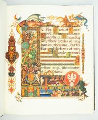
1939ST20331London: Beaconsfield Press 1939. No. 72 OF 125 COPIES SIGNED BY THE ARTIST AND THE EDITOR for sale in the British Empire. 292 x 248 mm. 11 1/2 x 9 3/4". xxvi pp. 46 leaves all leaves French fold. Edited by Cecil Roth. <br/> Elegant original blue crushed morocco by Sangorski & Sutcliffe signed on front turn-in covers with gilt French fillet border and large intricate central figure designed by Szyk of a patriarch holding a goblet and book raised bands spine gilt in double ruled compartments with ornate crown centerpiece gilt titling turn-ins with double gilt-ruled and scalloped border surrounding an illustrated silk doublure featuring a Szyk portrait of Moses with the Ten Commandments done in shades of gray within a frame of elaborate design. In an excellent velvet-lined box of blue half morocco over lighter blue cloth upper cover with central lion's head in gilt on blue morocco spine like that of the book. WITH 14 FULL-PAGE AND 32 SMALLER COLOR REPRODUCTIONS OF DESIGNS BY SZYK. English translation printed in black commentary printed in red. Front flyleaf inscribed in ink: "To Mr. and Mrs. Solomon Brachman / very cordially / Arthur Szyk / New York. April 1945." Very faint naturally occurring variations in the grain of the vellum otherwise a pristine copy.<br/> <br/> With an important Holocaust-related authorial inscription this is a very fine copy of what the London Times described as "a book worthy to be placed among the most beautiful of books that the hand of man has produced." Arthur Szyk 1894-1951 a Polish Jew is considered by scholars to be the greatest 20th century illuminator. Using the style of the Medieval illuminated manuscript artists he has here created a Haggadah for Passover that is at once a beautiful book of devotion a political protest against the rise of Nazism and a plea for England's help for the Jews of Europe. By 1939 Szyk's anti-Nazi cartoons had caused Hitler to put a price on his head forcing him to flee to England. His original illustrations for his "Haggadah" featuring the villains of the Exodus with the heads of Hitler Goebbels and other leading Nazis had to be toned down before publication. All 46 pages of the Hebrew text are illustrated with scenes from the Passover story as well as vignettes of Jewish life in modern Europe—sometimes Szyk mixes the two to great effect. Perhaps the most moving illustration in the book is the elaborately illustrated dedication to King George VI of England appealing for his mercy to European Jews. The great symbols of the British Empire—the lion and unicorn St. George defeating the dragon—surround Szyk's plea to the king: "At the feet of your most gracious majesty I humbly lay these works of my hands shewing forth the affliction of my people Israel." In the lower right corner of the painting we see Jewish refugees beside one of the ships which were usually turned away from British shores while Szyk depicts himself leaning against the painting his brush and easel in hand. The text here is enriched by the historical introduction and the commentary contributed by Cecil Roth 1899-1970 the preeminent British expert on Jewish history. This crowning achievement of Szyk's life was four years in the making and has proved to be an enduring treasure. Szyk presented this copy to Texas oilfield supply magnate Solomon "Sol" Brachman 1896-1974 and his wife Etta. The son of a Latvian Jew Brachman was the founding president of the Jewish Federation of Fort Worth in 1936 and helped arrange an emergency $100000 bank loan for Israel on the eve of statehood in 1948. His wife who served as president of the National Council of Jewish Women was known as "the mother of Hadassah." Szyk's 1945 inscription was no doubt especially meaningful to this devout family whose Latvian relatives were among the 90 percent of that country's Jews who perished in the Holocaust. Beaconsfield Press unknown
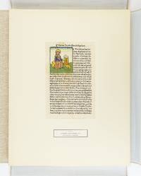
1929ST17493München: Weiss & Co. Antiquariat 1929. No. 21 OF 50 SETS issued with accompanying German text; there were also 50 with accompanying English text. 480 x 375 mm. 19 x 14 3/4". With an 87-pp. volume of commentary in German. <br/> Loose as issued in a linen-covered chemise titling in black on front cover. Commentary volume in original paper wrapper. WITH 55 LEAVES FROM INCUNABULA issued by German Swiss Dutch Czech and Italian presses ALL WITH ONE OR MORE WOODCUTS 32 OF THESE HAND-COLORED. ◆Front cover of commentary volume with thin six-inch brown stain along head edge but the volume otherwise clean and fresh the leaves with occasional browning or minor staining but excellent specimens overall the hand coloring often quite attractive.<br/> <br/> Arranged according to the city in which they were printed this is a wonderful collection of 55 incunabular leaves all illustrated with woodcuts. The group includes important early images large and small with 32 of them hand painted often with brilliant memorable color. Although every leaf here is of interest there are some leaves that deserve special mention: the 1471 Zainer printing of "Heiligenleben" the earliest leaf included; a number of leaves from herbals Bibles and lives of the saints; leaves representing two different editions of Brant's "Stultifera Navis" a Basel 1500 edition of Aesop and the celebrated 1499 Aldine "Hypnerotomachia Poliphili." A full-page woodcut from Koberger's "Schatzbehalter" "Treasure Book" 1491 shows Korah Dathan and Abiram being swallowed up by the Earth for their rebellion against God while Moses and Aaron pray as God sends fire to destroy the rebels. <br /> <br /> Among the hand-painted woodcuts are several that are outstanding both for the composition of large complex images and for exuberant coloring. These include Pharoah's daughter rescuing the baby Moses as well as the adult Moses with the burning bush both from the German Bible printed by Koberger in 1483; a view of the city of Perugia in Schedel's "Weltchronik" 1493; and another Schedel leaf depicting the martyrdoms of the Apostles Andrew and Thomas. The 55 specimens included here would serve very well either as a final capstone in an advanced collection or else an outstanding nucleus for a beginning collector of illustrated incunabular leaves. Several of the books represented are difficult to obtain and most of the ones that can be procured are very expensive. Weiss & Co. Antiquariat unknown
19512091202133203574Published by Sonkeikaku Series Published by Maeda Ikutoku Zaien 1951. Soft Cover. Fine. Number of books: 3 volumes Published by Sonkeikaku Series Published by Maeda Ikutoku Zaien paperback
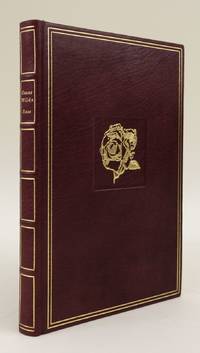
1982ST16482Bayreuth: Printed by Chr. Scheufele Offizin Stuttgart for Bear Press 1982. No. 1 OF 10 COPIES ON VELLUM plus a "special" edition of 25 copies and 185 copies on Kochi Japanese paper. 223 x 148 mm. 8 7/8 x 5 3/4". 50 pp. 2 leaves.Translated and with an afterword by Wolfram Benda. <br/> Publisher's fine burgundy morocco by Erwin Lehr upper cover with gilt rose in recessed square flat spine with gilt titling turn-ins with gilt fillet frame pale yellow silk pastedowns. In the original burgundy suede slipcase. With three large initials in burnished gold and four signed and numbered original etchings by Peter Klitsch. Printed in red and black. Signed in the colophon by the artist the binder and the publisher/translator. In mint condition.<br/> <br/> This is the splendid deluxe version of a finely crafted private press edition of Wilde's fairy tales "The Nightingale and the Rose" "The Happy Prince" and "The Selfish Giant." It is the third work issued by the Bear Press founded in 1979 by literary scholar Wolfram Benda and still in operation. According to the firm's website "at a time when the craftsmanship and ethos of the artisan in bookmaking have been damaged by ever-increasing industrialization and neglect . . . The Bear Press . . . tries to achieve the highest possible degree of technical and artistic perfection in its printed works." The font used to print the text and the artist chosen to illustrate each work are carefully selected to express "the individual author's personality and intention." Even the discriminating aesthete Wilde 1854-1900 would be pleased with the choices here especially for the luxurious vellum printing: the type is set in refined Walbaum Antiqua and shown off with special effect by the creamy leaves; the etchings by Austrian artist Peter Klitsch b. 1934 are meticulous detailed and reminiscent of the work of Wilde's friend Aubrey Beardsley; and the binding is the epitome of tasteful restraint flawlessly executed with premium materials. <br /> <br /> The three tales here first appeared in 1888 and are bittersweet in their themes of love and self-sacrifice. His stories for children were one of Wilde's early successes and DNB notes "Their permanent place in child affections refutes the vulgarism that Wilde's literary reputation arose from his legal notoriety. In all cases the fairy tales are on the child's side celebrating the courage and generosity of the poor and vulnerable while their satire mocks the kind of pomposity and hypocrisy children can recognize." We have been able to trace just two other copies of the vellum printing at auction in ABPC and RBH. [Printed by Chr. Scheufele Offizin, Stuttgart, for] Bear Press unknown
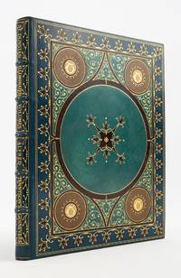
1902ST20771New Rochelle: Printed by the University Press for George D. Sproul 1902. No. 23 OF 30 COPIES 18 for America 12 for Europe; this copy illuminated for Herman A. Metz of the "St. Dunstan Edition" all of them PRINTED ON VELLUM. 270 x 210 mm. 10 5/8 x 8 3/8". 50 leaves last blank. <br/> SUMPTUOUS COBALT BLUE MOROCCO GILT AND INLAID TO AN ARABESQUE DESIGN BY TRAUTZ-BAUZONNET stamp-signed on front doublure covers framed in gilt and inlaid brown morocco blossoms central panel of azure blue morocco outlined in brown morocco large central medallion enclosed in brown morocco and inlaid with an eight-pointed inlaid and gilt fleuron each corner with tan and ivory morocco medallion with gilt "T" at center outlined in brown morocco the spaces between the medallions with curling gilt flourishes raised bands spine compartments with gilt lettering framed by sprays of gilt berries SKY BLUE MOROCCO DOUBLURES inlaid with darker blue squares containing an ivory morocco polygon these forming a frame around a central taupe morocco panel with inlaid blue morocco flowers at corners vellum free endleaves painted with a simple blue frame small flowers at each corner all edges gilt. BEAUTIFULLY ILLUMINATED BY ROSS TURNER the title page and final page with heraldic emblems and WITH 51 LOVELY INITIALS in a range of hues 22 with delicate extensions. Printed entirely in majuscules on rectos only. A couple of small faint water spots to upper board with slight dulling where someone tried to fix these naturally occurring variations in the grain and color of the vellum otherwise A FINE COPY--the vellum creamy and smooth the colors and gilt bright and the binding lustrous.<br/> <br/> A bookmaking tour-de-force this item is part of the remarkable St. Dunstan series of famous works of literature produced at the turn of the century in very strictly limited and particularly luxurious editions by publisher George Sproul. Named for the English bishop Dunstan 909-88 who was known for his skills as an illuminator the St. Dunstan volumes were printed on vellum illuminated by different artists and then put into bindings of striking design executed by Trautz-Bauzonnet one of the premier French binders of the period. While the physical properties of this volume announce themselves more emphatically than the text the narrative here is from Tennyson's "Idylls of the King" a work Day tells us in which the legend of King Arthur is used "to establish the Victorian virtues of marital faithfulness fair play gentlemanly conduct and useful action for self and society." "Guinevere" sets forth the consequences of marital infidelity presenting a penitent queen now withdrawn to a convent groveling for Arthur to pardon her affair with Lancelot. Although the injured king grants her forgiveness he does so with little grace appearing to modern readers as "insufferably self-righteous." Day Reminiscent of the designs used in 15th century illuminated books the painted initials in our volume are well executed and attractive combining fluid shapes and consonant combinations of colors and the binding is a singularly elaborate achievement. German-born binder Georges Trautz 1807-79 apprenticed in Heidelberg Stuttgart and Witemberg before arriving in Paris in 1803. There he trained in “dorure†with the skilled gilder Debès learning to create intricate gilt designs on bindings. In 1833 he was hired as a doreur by Bauzonnet the successor to the celebrated Purgold and soon achieved acclaim for his beautifully gilded bindings. According to Michon he was "the uncontested master of the luxury binding" in 19th century France celebrated for his "sumptuous moroccos" and "dazzling gilt." His bindings were so sought after that the term "Trautzolâtrie" was coined to describe the craze for his work. In 1869 he became the first bookbinder to be named a chevalier of the Legion of Honor. The culmination and termination of the St. Dunstan books was a planned edition of 15 sets of the complete works of Dickens projected to contain 130 large folio volumes—surely the most ambitious undertaking in the history of modern American fine printing. Five volumes only comprising most of "Pickwick" were produced before the grandeur of the project overwhelmed its sponsors. Potter says that in addition to the Dickens edition the St. Dunstan series comprised a dozen volumes of the works of various authors one of them the present Tennyson issued to subscribers at the spectacular amount of $12000 per set. One of the subscribers was our original owner New York chemical manufacturer and U.S. Congressman Herman A. Metz 1867-1934. Not surprisingly this strictly limited "Guinevere" is quite rare: We could trace just two copies at auction since 1975 one of them ours sold in 1998.  . [Printed by the University Press for] George D. Sproul unknown
1822ST17561London: Published for the Proprietor by Longman Hurst Rees Orme and Brown 1822 1823. FIRST EDITION ONE OF 227 COPIES. 288 x 220 mm. 11 3/8 x 8 5/8". 3 p.l. vi 2 100 8 103-118 pp. 2 leaves. <br/> Pleasing 20th century rich green crushed morocco gilt-framed covers and smooth spine gilt lettering to spine edges untrimmed. In a burgundy calf-backed clamshell box meant for this book but for some reason substantially larger green morocco title label on spine. WITH 60 ENGRAVED ILLUSTRATIONS as called for in Abbey 48 PRINTED IN COLORS including decorative title page dedication with Earl Spencer's coat of arms six plates with a total of 18 color ink specimens two type specimen plates four engravings of printing presses Columbian Press in two states one before letters nine defaced plates printed recto-verso and six headpieces three color printed 28 engraved plates printed in colors: five in a single block six in two to four blocks 14 in five to nine blocks and three full-color in 13 14 and 29 blocks respectively as called for in the contents and in Abbey. Front pastedown with the bookplate of the Robin Collection. Abbey Life 233; Ray "England" 99. Occasional mild thumbing otherwise nothing but the most trivial imperfections--quite a fine copy internally clean and fresh with pleasing colors in a very appealing unworn binding.<br/> <br/> This virtuoso production was in Ray's opinion Savage's magnum opus a work that was "both a highly idiosyncratic volume and a notable landmark in the history of color printing from wood." Printer and engraver William Savage 1770-1843 was in Ruari McLean's words "the first true colour printer of the nineteenth century in England." One of his great innovations which made possible color printing as seen here was a new formulation of ink. DNB reports "Printing ink in England at that time was of a very poor quality and Savage by various experiments made a printing ink without any oil in its composition. This made it more serviceable for artistic work and easier to manufacture." Savage's inks transferred so cleanly from the engraved wooden block to the paper that the blocks did not have to be wiped between impressions--speeding up the process considerably especially when as here one image could require up to 29 colored blocks. The oil-free inks were also less inclined to smear or to bleed through the paper. While Savage's elaborate methods were not economically viable for mass printing of color-illustrated works his improvements to printing ink and his use of multiple blocks paved the way for the use of chromolithography. The engravings in this work are rare because the work was strictly limited and because Savage despite some protests fulfilled his promise to subscribers that all the blocks would be destroyed. While the plate count in the work can vary from copy to copy the present item collates as indicated by the table of contents and includes Clymer's Columbian Press plate in two states as called for by Abbey. This work appears on the market from time to time but seldom in the kind of agreeable condition seen here. Published for the Proprietor by Longman, Hurst, Rees, Orme, and Brown unknown
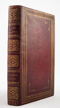
1805ST21016London: Printed by T. Bensley 1805. APPARENTLY THE ONLY COPY PRINTED ON VELLUM. 260 x 152 mm. 10 x 1/4 x 6". 2 p.l. 146 pp. 1 leaf notes. Translated by Maria Henrietta Montolieu. <br/> Very pleasing contemporary straight-grain scarlet morocco gilt by Charles Hering binder's ticket on verso of front flyleaf covers bordered with a wide frame of multiple patterned rolls with rosette cornerpieces enclosing a delicate frame of a dotted roll cornered small floral tools raised bands spine gilt in compartments wide turn-ins sumptuously gilt cream silk endleaves with gilt borders and fleuron cornerpieces all edges gilt. WITH EIGHT ENGRAVINGS BY FRANCESCO BARTOLOZZI IN TWO STATES one on gold silk and the second on paper. EXTRA-ILLUSTRATED with two engravings depicting Princess Izabela Czartoryska and her daughter Zofia. A Large Paper Copy. Henrey 624. See also Clemens Alexander Wimmer "The Princess and the Poles" Historic Gardens Review no. 10 2002: 14-17. Spine slightly darkened joints and edges with minor barely noticeable wear vellum a bit and naturally rumpled and consequently the book yawning a bit a handful of light spots but still an extremely appealing copy with fine impressions of the plates vast margins and a special story to tell.<br/> <br/> Printed on vellum richly bound and illustrated with attractive plates on silk this is an extraordinarily luxurious copy of Delille's famous poem on gardens that almost certainly belonged to a noblewoman whose gardens are mentioned in the text. First published in 1780 our poem condemns formal gardens and broad promenades in favor of a gardening art which hides its artistry by reproducing the asymmetrical groupings of nature and careless bounty of the countryside. This view accords with the translation of Virgil's "Georgics" done by Delille 1738-1813 in 1769 a version that brought him great acclaim for its supple and sonorous versification. In fact it so pleased the Count of Artois the future Charles X that he named Delille abbot of Saint-Séverin; however revolution disrupted things and the poet for a time led a wandering life in Switzerland Germany and England where this updated and expanded version of "Gardens" was published in 1801. The present special edition includes the plates which had appeared as head- and tailpieces in the first edition but now used as stand-alone plates in two states. These were executed by Bartolozzi after originals by Portuguese neoclassical painter Francisco Vieira. In addition to the called-for suite of illustrations our copy includes two inserted plates portraits of Princess Izabela Czartoryska 1745-1835 and her daughter Zofia. Czartoryska was a major figure in the Polish Enlightenment as a writer and patron of the arts as well as an advocate for improving the lives of the poor. She is best remembered for the sprawling gardens at her palace in Pu awy which included a formal garden a "wild promenade" or landscape park and multiple structures including the neoclassical Temple of the Sibyl which became one of Poland's first museums. She made the acquaintance of the author while travelling through Paris in 1791 and the two struck up a friendship. She financially backed the second edition of the work in exchange for a mention of her gardens which duly appears in heightened verse on pp. 11-13: "Favoured Pulhavi! You from Heaven obtain / Each separate charm Earth's choicest scenes contain; / Bright glow thy features fresh from Nature's hand / Excite our wonder and our praise command." The presence of this poetic tribute--and especially the inserted plates showing the princess and her daughter-- clearly suggest that the our apparently unique luxury edition must have been a presentation copy to Czartoryska herself. The present copy is as striking outside as it is inside. Charles Hering was the most distinguished and influential English binder of the first decade of the 19th century and although his career was brief from about 1795-1812 Ramsden focuses on his work as representing the transition in binding styles from those of the German émigrés of the late 18th century to the new generation of binders headed by Charles Lewis. Dibdin states that until "the star of Charles Lewis rose above the bibliopegistic horizon no one could presume to 'measure business' with Hering. There was a strength squareness and a good style of work about his volumes which rendered him deservedly a great favourite." We have been unable to trace any other copies of the present edition on vellum. Printed by T. Bensley unknown
168424285Edo Tokyo: Hyoshiya Ichirobe Hayashi-shi Yoshinaga First month 1684 But Third month 1680. A large woodcut map of Edo Tokyo with fine handcolouring on joined and folded paper. The map is breathtaking in its detail and features many paintings of important landmarks temples bridges and people who are often pictured working or fishing from boats on the waterways running through Tokyo. A stunning and very rare woodblock map beautifully and unusually handcoloured. Roads blocks buildings open areas canals and waterways are all vividly laid out on this huge and most impressive map. 123.5 by 149.5 cm. folded within paper covers folds to 28 by 18 cm now preserved in a fine clamshell box. A remarkably well preserved and very rare item with some light rubbing due to age and as to be expected. A bit of old worming or light soiling and occasional small repairs but in all quite astonishing in its quality and beautifully preserved with bright and vivid colour and detail. AN EXTRAORDINARY ITEM REMARKABLE FOR BOTH ITS CARTOGRAPHIC DETAIL AND ITS ARTISTIC BEAUTY. The wood block printing shows land tenures of Daimyo and Hatamoto. It also shows temples and shrines includes a distance chart and descriptive listing of Daimyo showing crests and halberds. There is also a inset of the eastern portion of Edo. Hyoshiya Ichirobe (Hayashi-shi Yoshinaga) unknown
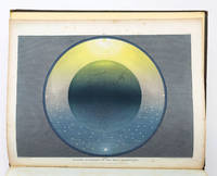
1846ST19286London: Printed by Catchpool & Trent for Simpkin Marshall & Co 1846. FIRST EDITION. 320 x 255 mm. 12 1/2 x 10". xiii 3 96 pp. <br/> Publisher's original blind-decorated dun-colored cloth gilt titling to upper cover smooth spine newer endpapers. WITH 11 COLOR ENGRAVINGS after Frost by W. P. Chubb & Son printed in oil colors by George Baxter all with original tissue guards. Front free endpaper with small ink signature of John Hill. See: Francis Reid "Isaac Frost's 'Two Systems of Astronomy' 1846: Plebeian Resistance and Scriptural Astronomy" in "The British Journal for the History of Science" Vol. 38 No. 2 Jun. 2005 pp. 161-177. Cloth rather spotted corners bumped but the binding solid with no wear to joints or hinges. A few spots of foxing to title page half of the tissue guards with overall very faint foxing/browning the illustrations with minor foxing at edges and in margins but the images themselves clean and bright and all in all a really excellent copy the text wide-margined and quite clean and fresh and the plates with rich coloring.<br/> <br/> Illustrated with beautiful color plates this anti-Newtonian work promotes a view of the universe based on the backward-looking beliefs professed by a Protestant sect known as the Muggletonians. Named after co-founder Lodowicke Muggleton the Muggletonians emerged in London in 1651 based on the claims of two tailors who professed to be the "Last Witnesses" described in the Book of Revelation. Rejecting the new directions in philosophical reason Muggletonians believed in a purely scriptural interpretation of the universe. According to E. P. Thompson's 1994 "Witness Against the Beast" the Muggletonians had curious notions quite contrary to other Protestant denominations: they believed that the soul is mortal that Jesus and God are one and the same that Heaven was left without divine supervision from Jesus' death until the day of judgment that Heaven resides six miles above the Earth that God stands between five and six feet tall and other unconventional things. Although the sect initially avoided both worship and evangelizing during the 19th century some followers became more outspoken about their beliefs and even published books appealing to the general public. Our author Isaac Frost 1793-1858 was a prominent Muggletonian and successful owner of a brass foundry who along with his brother Joseph invested large sums to promote their belief system--the present work being an especially notable example. Divided into two main sections the text first describes the Newtonian system of heliocentric astronomy and then turns to Frost's scriptural interpretation and geocentric views. As Reid tells us "According to Frost Scripture clearly states that the Sun the Moon and the Stars are embedded in a firmament made of congealed water and revolve around the Earth that Heaven has a physical reality above and beyond the stars and that the planets and the Moon do not reflect the Sun's rays but are themselves independent sources of light. Our book was apparently written as a reaction against the lecturers who expressed Newtonian astronomy--which was often for them and their audiences simply shorthand for heliocentrism." The 11 plates that illustrate these extraordinary ideas are the work of George Baxter a pioneering printer who revolutionized color printing techniques by combining metal engravings with woodblock printing using oil-based inks to produce high-quality affordable prints. The plates here are appropriately ethereal and otherworldly utilizing a beautiful palette with subtle gradations and esoteric figures to create memorable pseudo-scientific imagery. Although this work appears at auction with some regularity it is almost always incomplete no doubt because the attractiveness of its plates encourages harvesting. Useful price comparisons include a complete copy said to be in fine condition selling for £7500 in 2016 and six loose prints from the book fetching £6875 in 2015. [Printed by Catchpool & Trent for] Simpkin, Marshall, & Co unknown
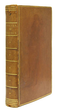
1569673671569. London 1569. First edition. Folio. London 1569. First edition. Folio. PMM 89: "The Crown and Flower of English Medieval Jurisprudence" Bracton Henry de d. 1268. De Legibus & Consuetudinibus Angliae Libri Quinq; In Varios Tractatus Distincti ad Diversorum et Vetustissimorum Codicum Collationem Ingenti Cura Nunc Primum Typis Vulgati; Quorum Quid Cuiq; Insit Proxima Pagina Demonstrabit. London: Apud Richardum Tottellum An. do. 1569. With imprimatur "Cum priuilegio" at foot of title. xvi 172 175-444 ff. Complete. Folio 11-1/4" x 7-3/4"; 28.6 x 19.7 cm. Nineteenth-century diced calf gilt rules to boards gilt fillets ornaments and title to spine gilt rules to board edges gilt inside rules marbled endpapers ribbon marker. Light rubbing to boards faint dampstain to front board moderate rubbing to extremities front joint starting at head rear joint cracked corners bumped and somewhat worn armorial bookplate "Ex Libris Munden" to front pastedown. Attractive large woodcut decorated initials. Light toning to text somewhat heavier in places light foxing and finger smudges to some leaves some fading to text of ff. 1 and 2. A handsome copy of a landmark work with an interesting provenance perserved in a navy blue clamshell box. $13000. First edition. Written between 1250 and 1256 De Legibus et Consuetudinibus Angliae The Laws and Customs of England is the first treatise on English law. A systematic work it emphasizes the separation of procedural and substantive matters and also cites cases as sources of at least intellectual if not formal authority. Both the principles formulated in this work and its use of precedents determined the development of English law and established the method adopted by Littleton and Coke. In Maitland's words it is "the crown and flower of English medieval jurisprudence" and "by far the greatest of our medieval law books." This copy belonged to Arthur Henry Holland-Hibbert 3rd Viscount Knutsford 1855-1935 of Munden House Hertfordshire. He served as both a justice of the peace and High Sheriff of Hertfordshire. His bookplate was engraved by Sir Henry Badeley who designed bookplates for a number of important clients including the House of Lords Library. Maitland Collected Papers II:43. Dauchy et al. Eds. The Formation and Transmission of Western Legal Culture: 150 Book. unknown
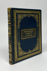
189511071n. p. but Washington: U. S. Treasury Department Bureau of Engraving and Printing 1895. Hardcover. Near fine. Square octavo 21 numbered leaves of portrait plates plus four unnumbered. Bound in full crushed navy morocco with elaborate gilt tooling to boards spine compartments and edges with gilt dentelles all edges gilt and marbled endpapers. In near fine condition overall very well-preserved with a few tiny nicks to the corners and some scattered internal foxing mostly at the gutters and borders; and not on the proof images. The first two engravings depict the U. S. Capitol Building and the White House. The last two portraits of sitting President Grover Cleveland and his wife Frances are each SIGNED by their subjects in different ink below the images. The main contents consist of extremely well-executed and quite familiar portraits of the presidents; the very portraits that were used by the Bureau of Engraving and Printing on official U. S. banknotes. These Treasury Department specimen books were produced in very small numbers and presented to important diplomats cabinet secretaries members of Congress and the like. The proof engravings contained within were designed for use on official US banknotes though some of the images were likely never used on actual money. At the turn of the 21st century numismatic experts had counted 47 known examples. Several more have come to auction primarily numismatic since then but they remain extremely rare in the trade. No two specimen books are exactly alike. We could trade one example closely matching the contents of ours however that copy was in a different binding and did not include the signed portraits of President and Mrs. Cleveland. <br /> <br /> The name "Romaine" is stamped on the gilt-stamped morocco label on the front board and is almost certainly the surname of the intended recipient of this volume though without any further context nor any bookplates or written provenance we are unable to identify this person. <br /> <br /> When these books do occasionally come to auction there is much buzz. It is difficult to imagine a more interesting and treasured sort of volume for anyone who has an interest in numismatics and rare books. A rare chance to own a special volume of American printing history. (U. S. Treasury Department Bureau of Engraving and Printing) hardcover
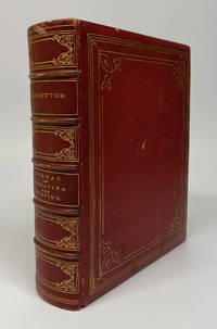
187511070Washington DC: U. S. Treasury Department Bureau of Engraving and Printing 1875. Hardcover. Near fine. Small quarto unpaginated. Bound in full red crushed morocco with gilt borders edges spine title and compartments. All edges gilt. 144 engravings plus frontispiece and engraved title page. A near fine example with some small nicks to the boards and some mild scattered foxing internally. An extraordinary volume one of a small and undetermined number of these U. S. Treasury specimen books. These were printed and bound by the Treasury Department's Bureau of Engraving and Printing and presented to a select few diplomats cabinet secretaries and members of Congress. The proof engravings contained within were designed for use on official US banknotes though some of the images were likely never used on actual money. At the turn of the 21st century numismatic experts had counted 47 known examples. Several more have come to auction primarily numismatic since then but they remain extremely rare in the trade. No two specimen books are exactly alike; they usually contain a number of portraits of Presidents and other notable politicians but some as in our copy contain a number of vignettes of major events and places in US history along with more abstract concepts such as "Loyalty" and "Liberty and Union." Some significant examples herein include "Reconstruction" "Valley Forge" "The Patent Office" and far too many more to list. A number of the engravings have no caption and some of these are the most alluring. For example one of the largest images depicts a Native American man sitting on a cut-down tree head in hands as though he is weeping. Before him is a modern city with dozens of billowing smokestacks. Clearly this image is meant to portray the imminent conclusion to the United States Government's closing of the frontier and final usurpations of land from Indigenous people. It almost goes without saying that each and every one of the vignettes and portraits is of the most excellent quality both in design and execution as both the artists and the printing tools were of the highest order of the day. Though undated the title page names George B. McCartree as Chief of the BEP on the title page a position he held from 1869-1876 which would approximate the date.<br /> <br /> When these books do occasionally come to auction there is much buzz. It is difficult to imagine a more interesting and treasured sort of volume for anyone who has an interest in numismatics and rare books. A rare chance to own a special volume of American printing history. U. S. Treasury Department Bureau of Engraving and Printing hardcover
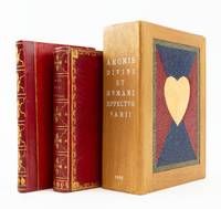
1626ST19298Antwerp: M. Snyders 1626. FIRST EDITION. 135 x 82 mm. 5 1/4 x 3 1/4". 39 of 40 leaves lacking C4. Two volumes one as issued the other a companion volume containing related plates without any title page. <br/> Very pretty late 18th or early 19th century red morocco covers bordered by delicate cresting roll with leaf cornerpieces smooth spine gilt in compartments with leafy centerpieces gilt lettering turn-in with gilt floral roll pale blue watered silk endleaves all edges gilt. Supplemental volume in late 19th century red half morocco over red paper boards similarly tooled spine. Housed together in a custom-made modern wooden box with sliding panel closure a heart mosaic in multi-colored hard-grain leather on its sides. Amoris Divini WITH engraved title page and 38 of 39; lacking plate XXXIV ENGRAVED PLATES 35 OF THEM ON VELLUM ALL DELICATELY COLORED AND HEIGHTENED IN GOLD plates 19 29 30 31 and 36 bound after text pages for plates 31 36 29 30 and 34 respectively; second volume with 45 plates on paper though without any text including many of these same emblems apparently from a later edition of this work ALL DAINTILY HIGHLIGHTED WITH GILT. Front pastedown of first volume with monogram book label in colors and gilt verso of front free endpaper with oval armorial bookplate "Ex Museo Van Der Helle" see below. De Vries "De Nederlandsche Emblemata" 121; Landwehr "Low Countries" 33; Praz p. 254; Brunet I 240 this copy; Delbergue-Cormont "Bibliothèque de M. Van der Helle" Paris 10 Février 1868 lot 69 this copy. Amoris spine very slightly dulled occasional hints of marginal thumbing but A LOVELY COPY clean and fresh internally with rich colors and glistening gold in a well-preserved binding; supplemental plates with faint marginal browning but excellent internally the engravings gently shimmering with gold and the binding with few signs of wear.<br/> <br/> The main volume here comprises a collection of emblems illustrating concepts of human and divine love; it is made all the more special by being printed on vellum beautifully hand colored and then delicately highlighted with gold. The emblems depict Divine Love as a beardless young man with nimbus who always represents love in its purest form. Human love or worldly love is variously embodied in a winged Cupid sometimes blindfolded who represents erotic love and who is accompanied by symbols of treasure or power that represent worldly desires. Landwehr Praz and De Vries make no mention of a vellum edition but Brunet describes one copy on vellum painted in colors and gold which he says sold at the Duriez auction. That book appeared as lot 3216 in "Catalogue des livres imprimés et manuscrits composant la bibliothèque de feu M. L.-M.-J. Duriez de Lille membre de la Société des Bibliophiles français" Paris J.-S. Merlin 1827 where its binding description matches our copy. Having uncovered no other hand-colored copies on vellum in auction records or in OCLC we think it quite likely that the present volume is in fact the Duriez copy. Louis Duriez 1753-1825 was a Lille lawyer of sufficient skill and cleverness to move without incident from serving as lieutenant provost for his district under King Louis XVI to becoming receiver of the district of Lille after the revolution 1791 and purchasing the estate of an aristocrat which had been seized by the state. He rose to successively more important and remunerative governmental positions and was named Knight of the Royal Order of the Legion of Honor in 1814. In 1820 he was one of the founding members of the Société des Bibliophiles français an elite group limited to 24 scholarly collectors. After his death his collection of more than 5000 carefully chosen works was dispersed at 59 auctions held between 22 January and 1 April 1828 at Maison Silvestre in Paris. A perusal of the lots on offer finds a strong emphasis on fine bindings works on vellum and illustrated books many noting hand coloring. The emblems in the second thinner book here on paper without coloring--but with gold highlighting allow the reader to experience the pleasure to be found in comparing the degrees of decoration and opulence of the two volumes. These illustrations likely come from one of the later printings of this title each of which added new emblems to the original 39 called for in Landwehr and Praz. It is not clear when or by whom this second volume was wedded to the first. After its presumed residence in the Duriez collection our copy of the 1626 edition and perhaps its sidecar volume moved to another distinguished library--that formed by the scholarly and erudite French collector M. Van Der Helle of Lille who amassed a collection particularly rich in illustrated books and works on vellum. In the catalogue for the sale of his library in 1868 Paris auction house Delbergue-Cormont described him as a bibliophile "of the school of Renouard . . . who only liked irreproachable copies." We bought this item without being warned that it is slightly defective but given its distinguished provenance and the many other features it has going for it we did not ask the seller to take it back. M. Snyders unknown
1862ST20857London: Edmund Evans for Sampson Low Son and Co 1862. ONE OF PERHAPS 10 COPIES PRINTED ON VELLUM. 260 x 195 mm. 10 1/4 x 7 3/4". vii 1 235 1 pp. <br/> Publisher's stiff vellum smooth spine with gilt lettering edges untrimmed. In a modern felt-lined blue buckram drop-back box. Decorative initials in red or blue title page and text leaves with full criblé border of vined foliation occasionally inhabited eight or 10 leaves with more extensive illustrations at head or foot all engraved by W. J. Linton after illustrations by John Franklin. Front pastedown with ex-libris of Marion Hope Rattey. A Large Paper Copy. McLean "Victorian Book Design" p. 184. Short thin cracks to head and tail of front joint spine vaguely soiled upper cover with two very small brown spots and one trivial red mark occasional mild rumpling or naturally occurring variations in the grain or thickness of the vellum as usual a couple of minor smudges but still a very agreeable copy the binding solid and without the splaying common in vellum books the interior clean fresh and bright and the margins extraordinarily wide.<br/> <br/> This is an infrequently encountered copy of a beautiful Victorian book on vellum issued by one of the era's top printers. The volume was printed by Edmund Evans 1826-1905 who is now best remembered for his illustrations and advances in color wood engravings. Relatively little is known about this book's production: Ruari McLean tells us that it was "entirely printed" by Evans but it is unknown whether he was responsible for the design as well McLean remarks that "if Evans was responsible for its design it shows his superiority in book-making". We also are unsure how many copies were printed on vellum although the general consensus is 10. Regardless as McLean tells us "it is one of the prettiest books of the 'sixties" with sharp deep impressions of the type on the rich creamy vellum jewel-like colored initials and elegant wood-engraved illustrations. These illustrations are the work of John Franklin ca.1800-68 a painter and draftsman who was highly respected in his own time. The precisely realized borders feature idealized human forms posed within a robust botanical largely acanthus context the figures posing with balletic grace their expressive faces often turned gently away from the reader. The size of the leaf here is significant: the untrimmed edges retain their tiny printing pinholes which would normally have been trimmed away with regrettable loss. And not surprisingly our vellum printing is almost never seen: we could trace just two copies at auction since 1924. Former owner Marion Hope Rattey 1922-97 was likely the daughter of bibliographer Clifford C. Rattey 1886-1970 whose impressive library featured incunabula and block prints. [Edmund Evans for] Sampson Low, Son, and Co unknown
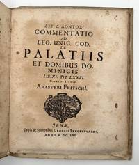
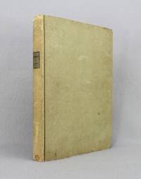
1661372198Cologne: Kinchium 1661. Mallinckrot: Engraved additional title dated 1639. 20 125 11pp. Kortholt: 8 56pp. Fritsch: 6 74 2pp. 4to. Early drab paper boards alla rustica binding on three cords manuscript title on spine text uncut. Foxing and heavily toned. Provenance: Princes of Liechtenstein armorial bookplate. Mallinckrot: Engraved additional title dated 1639. 20 125 11pp. Kortholt: 8 56pp. Fritsch: 6 74 2pp. 4to. Mallinckrot's monograph published on the occasion of the celebration of the second centenary of Gutenberg's invention is the first thorough investigation of the early testimonies to the discovery of printing with the author in favor of Mainz against Haarlem. The work contains the first use of the word "incunabula" in connection with printing. The additional title engraved by Loeffler includes portraits of Gutenberg Faust and Shakespeare and a scene in a printing shop. <br /> <br /> The second work here bound following Mallinckrot is Protestant theologian Kortholt's study on the origins of mathematics and astronomy asserting the Greeks were taught by Chaldeans and Egyptians. Bigmore & Wyman 2:16 Kinchium unknown
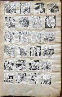
192061659New York: American Publishing & Engraving Co. J.J. Schultz & Co. 184 William St. Bookbinder ca. 1920-1939. Thick folio. 13 x 19 x 3.5 in. 135 leaves numbered reverse in pencil on versos of last half. on linen with 4274 camera-ready clipart samples all w/ inventory numbers rubber stamped below the image sized approx. 2 x 2 in. throughout arranged in montages of 24 28 32 & 40 per page each carefully mounted some crossed out w/ annotation “Killed†and others worn through at the lower right corner of some leaves while just a few have been removed and in once case clipped from the upper fore-edge of the leaf. Contemporary light gray/beige buckram soiled dampstained wear at fore-edges partially shaken rebacked still a VG- exemplar. An extraordinary printing & engraving firm’s factory sample catalogue for over 4000 of their camera-ready clipart advertisements for subscribing businesses following World War II through the Great Depression and the New Deal programs of President Roosevelt. This superlative archive of images traces Art Deco styles spanning nearly two decades advertising campaigns printing styles fonts and with almost not repeated images offered by American Publishing & Engraving Co. AP&E Co. to their extensive client list. In addition these engravings capture the revolutionary changes in American industry and commerce with nearly 50% devoted to the automobile industry including automobile manufacturers and dealerships accessory suppliers automobile repair public safety from bad driving the fast-growing electric motors and battery industries and more. Ford the Dodge Brothers Buick Studebaker Cadillac Plymouth Auburn Chrysler Essex Auburn-Cord DeSoto Hudson Terraplane and many others all are featured here advertising their service departments features speed and more. A significant portion also reveal the very real needs to wash the cars clean engines repaint the lacquer update the automobile tops replace batteries repair radiators and the always pressing need to maintain safety equipment and tires. Interspersed as well are automobile movers commercial body builders for trucks and commercial delivery vehicles with a significant percentage showing cylinder grinding engine rebuilding boiler repair and other very necessary secondary market needs as metal alloys and tolerances were far less durable with breakdowns an ever pressing problem for the motorist. Public safety notices reflecting the impact of the Progressive Era illustrate the dangers of the automobile with many indicating streetcars potentially hitting stalled cars which had not been repaired properly gridlock automobile accidents from ignoring traffic signals and police traffic officers as well as speeders hitting pedestrians or ignoring motorcycle police traps. Early in the sample illustrations are many reflecting the interest in building large Tudor Revival or Arts & Crafts homes installing electric lighting new furniture stylish clothes & shoes beautiful Oriental carpets and jewelry and watches for young flapper-era women. There are also promotional ads for Art & Stained Leaded Glass windows for homes interior decorators a panoply of beauty products many reflecting the Flapper Era hair and dress styles as well as evolution of the Art Deco lettering. As the AP&E Co. continued to add their sample engravings through the Great Depression not only is there a greater emphasis on repairing automobiles shoes recovering furniture and even repairing mattresses reflecting the belt tightening of the 1930’s but there are also increasing influences of more streamlined automobiles introduction of appliances such as refrigerators appearance of beer ads following the repeal of Prohibition and the fast growing radio industry. American Publishing & Engraving Co. based out of New York was one of a myriad of job printer engraving firms who emerged at the end of the 19th Century and initially specialized in publishing local histories and genealogies for historical societies by subscription typically with illustrations. Although this cataloguer could find no specific trade reference either in contemporary magazines or newspapers they appear to have operated out of the same locations as the Atlantic Publishing & Engraving Co. with some overlap and by the beginning of the 20th Century had largely dispensed with publishing local histories engraved portraits or vanity press projects. Contemporary court cases and other references indicate that they operated a subscription service for businesses advertising art to be run in magazines newspapers pulps or added to trade literature for matchbook covers business flyers etc. and by 1916-1925 were managed by Thomas W. Smith. No similar factory sample collection or published collection located in Worldcat. American Publishing & Engraving Co., J.J. Schultz & Co., 184 William St., Bookbinder, hardcover
202011157Tacoma WA 2020. Limited Edition. Hardcover. Fine in Fine Archival Box. Limited Edition. Hardcover. Quiet sophisticated and remarkably powerful Gabby's newest work is an exquisite blend of book art and binding. Gabby has from early in her career gone beyond her roots in design binding creating the text art and printing for several books now. Just as her design bindings push limits and explore possibilities so does her art and print work. It is a remarkable evolution.<br /> "Ralph Emerson wrote this poem "Blight" in July of 1843. He spoke out on climate change and the ways we could shift course by not blindly following others. In describing his travels to Europe while writing on life and nature Emerson said "same faces under new caps and jackets another turn of the old kaleidoscope."<br /> I took some liberties with Emerson's poem surrounding his words with photographs captured at Owen Beach in Washington state on a rainy winter day in 2019. This public beach in the middle of an urban old-growth forest will close for a year beginning in fall of 2020 to mitigate the effects of climate change and rising sea levels. Emerson's words of anger and disappointment at environmental destruction only resonate more with our current climate of melting glaciers and raging fires. As we continue to twist the kaleidoscope I remain optimistic we will find a way to rearrange these fragments and improve the view for future generations." artist statement<br /> <br /> This copy a 'making copy' adds tests of inks gouache type and design on a lot of the pages on the main book. The clamshell box includes a drawer of three separate folios of ink photo transfer and gouache. Inset into the drawer are two test covers as well more like miniature bindings of the big book. One is just the case and one has a separate small binding to test the structure. Housed in a custom box. Tight bright and unmarred. Brown textured paper boards by Hook Pottery Paper in a modified case binding letterpress printed with handset type on inkjet photo transfers silkscreen printed panels and acrylic painted Kozuke paper printing completed at Springtide Press with assistance from Jessica Spring; housed in an archival dropspine box. 4to. np. Illus. color plates. Numbered limited edition of 28 this being AP1. Signed by the artist. hardcover
1796ST12327Paris: P. Didot l'aîné 1796. ONE OF 100 COPIES. 330 x 235 mm. 13 x 9 1/4". 2 p.l. 165 1 pp. <br/> Original gray boards flat spine dark gray paper title label two-thirds of the leaves UNOPENED. Engraved printer's device on title page and SEVEN FINE COLOR-PRINTED ENGRAVINGS AFTER PEYRON BY CHAPUY AND LAVALLÉE SOME FINISHED BY HAND. Cohen-de Ricci 730; Brunet III 1860. ◆A couple of very small brown spots and just a hint of soiling as well as minor abrasions to covers corners somewhat mashed as expected isolated trivial foxing to text but A VERY FINE COPY clean and bright internally with vividly colored plates and in a surprisingly sturdy and generally well-preserved original temporary publisher's binding.<br/> <br/> This is the fine Levy copy of a strictly limited Large Paper edition of a handsomely illustrated work offered here in what seem to be the publisher's temporary boards mostly unopened and virtually untouched internally. Attractively printed with enormous margins the text of the first and by far the most important work here is a prose poem on love supposedly translated from the Greek by one of the great political philosophers of the Enlightenment Charles de Secondat Baron de Montesquieu 1689-1755. In its own day the work was popular largely because of its racy content; today it is considered as a more serious accomplishment by modern scholars who are inclined to see it as a philosophical fable. The colophon informs us that this limited edition was printed with a new type cut and cast by Firmin Didot "with such perfection that up to this moment none other can equal it." The dramatic and animated plates are strikingly different from the Eisen engravings in other editions of this work and are more modern in sensibility than the usual 18th century French engravings. The colophon notes that the plates were broken after the 100 copies of this edition were printed. Our copy was in the outstanding library of American bibliophile Jacques Levy 1905-80 a man of wide-ranging interests who assembled an eclectic collection over 40 years always with a discriminating eye toward visually pleasing and historically important bindings and illustration. In his sale Sotheby's described our binding as being publisher's boards and although the volume seems almost too well preserved to be original we are persuaded by the collector's reputation that this is the correct characterization. P. Didot l'aîné unknown
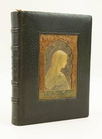
1909ST16339Paris: Bouasse-Lebel et Marrin ca. 1909. 188 x 140 mm. 7 3/8 x 5 1/2". 72 pp.; 1 leaf miniature; XXXII pp. <br/> Tasteful contemporary olive green crushed morocco each cover WITH A CENTRAL RECESSED PANEL OF MODELLED AND PAINTED LEATHER that on the upper cover with a portrait of the Virgin Mary within an arched frame of acanthus leaves that on the lower cover with the coat of arms of the Deburghgraeve family. With text and decorations lithographed featuring decorative borders and initials throughout those on 55 pages COLORED AND ILLUMINATED BY HAND many of these in a Medieval or Renaissance style others with Japanese or Greek motifs with a small hand-painted miniature of the Crucifixion against a golden sky and WITH A FULL-PAGE HAND-PAINTED MINIATURE showing the Flight into Egypt within a decorative border featuring vignettes of a peasant gathering wood and a knight in armor praying. With a hand-painted ribbon bookmark "Souvenir de ma 1ère Communion" dated 6 June 1909; carbon copy of a poem "A la Memoire de ma tres chere et regrettee cousine Mathilde Deburghgraeve-Canal" by Lucy Salze-Bouchet dated February 1945 this with short curving tear into one margin. Just the most trivial signs of wear but A VERY FINE COPY the vellum leaves quite clean and very bright with shining decorations and the binding lustrous and virtually unworn.<br/> <br/> Luxuriously lithographed on vellum handsomely bound and illuminated and painted by hand in vibrant colors this charming prayer book was obviously treasured by its owners--the first of whom may have been a young lady who received it on the occasion of her First Communion. The text and decorations here have been reproduced lithographically from a manuscript of the period being printed apparently by Bouasse-Lebel et Massin--a company specializing in devotional prints and books. The firm's name appears in very small letters at various places in the volume. Each leaf contains a different border design inspired by Medieval and Renaissance manuscripts as well as artwork from around the world in a pleasing pastiche of Western Egyptian Japanese Indian and Grecian motifs. Many of the borders have been hand-colored and present an array of distinct palettes usually richly hued which adds greatly to the book's appeal and the viewer's sense of discovery from page to page. The bespoke binding featuring the Madonna in profile beautifully modelled in leather adds another element of luxury to the book. The coat of arms suggests that it was made for a member of the Deburghgraeve family and the laid-in poem suggests that it remained with them through the death of the family's matriarch Mathilde Deburghgraeve-Canal in 1944. We know that Mathilde had three daughters all born around the turn of the century; based on the presence of a bookmark commemorating a First Communion in 1909 it is likely that the original recipient was among these three young ladies. Bouasse-Lebel was established in 1845 by Eulalie Bouasse-Lebel 1809-98 as a means of supporting herself and her children following the dissolution of her marriage. Though founded under difficult circumstances Bouasse-Lebel became a very successful enterprise and even earned a papal commendation in 1871 for consistently excellent work. The company was highly regarded for the quality and delicacy of their productions of which the present work is a choice example. Although individual religious cards printed by Bouasse-Lebel show up fairly frequently far scarcer are complete books in the estimable condition seen here--particularly those with the kind of deluxe upgrades that make this particular item so desirable. Bouasse-Lebel et Marrin unknown
40919Madrid: Imprenta Real 1799. 4to 254 x 172 mm in 2 parts 2 74 1 75--147 leaves printed on one side only on alternate rectos and versos within woodcut borders wide-margin copy printed on thick paper title with vignette of the arms of the King of Spain single sheet of printed prices tipped-in a nice clean copy marbled endpapers contemporary tree calf light stain to lower board spine leather lettering piece slightly rubbed a very nice copy. The most important Spanish type specimen. The Imprenta Real Madrid was set up in 1780 when the State took over the equipment of the printer Francisco Manuel de Mena whose heirs were unable to discharge their debts towards the State. This was the first type specimen book from the Imprenta Real and it contains many roman and italic types including some cut by Geronimo Gil for the Royal Library. "The book is in two parts. The first comprises an ambitious collection of excellent roman and italic types followed by Greek types fine in the largest and smallest sizes a few pages of Arabic and a little Hebrew. Apart from Gil's fonts and others of that style there are a number of lighter fonts both in roman and italic that while distinctly 'old style' show the taste for lighter letter-forms which was then making headway in Spain. A second collection of type of decidedly more modern cut begins on page 75. The tendency toward less "nourished" lighter letters is clearly seen in these over-finished monotonous character types by no means so interesting as those of Part I. Following these is a large display of capital letters in roman and italic shaded initials Greek capital letters and a repertoire of 'flowers' A few are original but a great many of these 'flowers' were derived from Holland France and England and others from various perfectly recognizable sources; but they are rendered in such a way as to be transmuted into very Spanish Design."Updike. Provenance: Bookplate of Jules Laloux secretary for the Compagnie Typographique Paris. Updike II pp. 85-86. Madrid: [Imprenta Real,] 1799 hardcover
1882ST12705Paris: A. Quantin 1882. UNIQUE COPY ON VELLUM printed for M. A. Werlé. 206 x 140 mm. 8 1/8 x 5 1/2". xxxii 247 pp. 1 leaf colophon.With a bio-bibliographical notice by Fernand Drujon. <br/> Pleasing burgundy Jansenist crushed morocco by Canape et Corriez stamp-signed in gilt on front turn-in dated 1930 on rear turn-in raised bands turn-ins richly gilt marbled endpapers all edges gilt on the rough. Decorative head- and tail-pieces throughout and eight engraved plates comprised of a frontispiece portrait in four states one on vellum three on paper and an allegorical vignette also in four states. Verso of front free endpaper with ex-libris of Jean Furstenberg. ◆Two small dark spots to upper cover a couple of leaves with naturally occurring minor discoloration to vellum but A FINE COPY--especially clean fresh and bright internally and in a lustrous unworn binding.<br/> <br/> Given its illustrious provenance and its singular status as the only copy printed on vellum this is a quintessentially bibliophilic copy of the poems of French cleric and diplomat Cardinal François-Joachim de Pierre de Bernis 1715-94. Admired as a witty epigrammist at the court of Louis XV where Madame de Pompadour presided Bernis composed poems on such conventional themes as love and the natural world but also verses contemplating manners and mores fashion independence and love of country. Since none of his poems was published before his death he was not widely known as a poet during his lifetime but in another sphere he performed important service to his country as France's ambassador to Rome. He provided shelter and succour there for refugees from the French Revolution earning the papal epithet "Protector of the Church of France." The present work was printed for Count Alfred Werlé whose father had inherited the Veuve Clicquot Champagne house from the Widow Clicquot. Alfred took over the operation in 1884 and greatly expanded the Veuve Clicquot-Ponsardin vineyards. The volume subsequently passed into the library of the great collector Jean or Hans Furstenberg 1890-1982 who put together one of the finest collections of 18th century books ever assembled. In 1974 the Furstenberg collection was sold en bloc to Dr. Otto Schäfer whose marvelous library had already become distinguished for its fine and historic bindings. A. Quantin unknown
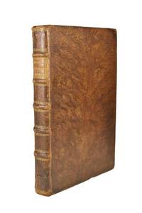
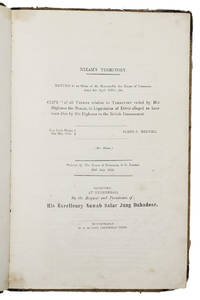
1854ABC_47435Secunderabad near Hyderabad: Robert Hudson Columbian Press 1854. Contemporary half calf orange and blue marbled sides over paper boards gold-tooled double fillets on the spine red sprinkled edges. 33 x 22 cm. The extremely rare Hyderabad edition of the official British papers relating to the so-called Hyderabad debt crisis during which Lord Dalhousie the Governor-General of India and General James Stuart Fraser the British Resident in Hyderabad orchestrated a "shakedown" of the Nizam of Hyderabad whom they claimed owed the British an astounding 7.4 million rupees. This resulted in the Nizam of Hyderabad having to cede the wealthy cotton-growing province of Berar to the British to clear his debts. The first edition of this account appeared at London in 1854 as part of the serial publication of parliamentary papers and the present Hyderabad edition probably later in the same year the first separate publication. It was printed and published by the Columbian Press in Secunderabad "by the request and permission of His Excellency Nawab Salar Jung Bahadoor" the Prime Minister of the Hyderabad State who believed that the papers portrayed Dalhousie and Fraser in a bad light. Nawab Sir Mir Turab Ali Khan Salar Jung I 1829-1883 also known as Salar Jung I was an Indian nobleman who served as Prime Minister of Hyderabad State between 1853 and 1883 and was also the regent for the sixth Nizam Asaf Jah VI from 1869 to 1883.The present work is the ultimate insiders account from the British perspective of the crisis surrounding the Nizam's staggering debt to the British government featuring transcriptions or summaries of all the official correspondence and documents of Lord Dalhousie General Fraser and other colonial senior officials. The present work is extremely rare in this Indian Secunderabad/Hyderabad edition we have not been able to trace any other copy on the market or institutionally. Supposedly the Salar Jung Museum in Hyderabad holds a copy of the same edition but we were not able to verify it.With an owner's inscription "Margaret D. Stubbs" and an orange printer's label "Secunderabad Columbian Press R. Hudson" both on the front pastedown. The binding is somewhat worn without affecting its structural integrity the outer margin of 6 leaves between pp. 52-69 and pp. 83-84 are folded in. With a minor tear in the foot margin of the title-page near the gutter and occasionally very slight staining. Otherwise in good condition.l Cf. WorldCat 941776603 electronic version of the first ed.; for the background: H.G. Briggs The Nizam his history and relations with the British Government London 1861; Kumari Sarjini Regani The cession of Berar in: Indian History Congress 20 1957 pp. 525-259. Robert Hudson, Columbian Press, hardcover
1790ST14261Paris: Drouhin 1790. FIRST EDITION. 265 x 205 mm. 10 3/8 x 8". Two volumes. <br/> VERY ATTRACTIVE CONTEMPORARY MARBLED CALF GILT IN A NEOCLASSICAL DESIGN covers with a cresting palmette frame featuring ornate urn ornaments at corners flat spine divided into compartments by Greek key roll floral spray centerpieces one green and one black label marbled endpapers. With 55 PLATES OF COSTUMES designed by Philippe Chéry and engraved by Pierre-Michel Alix 50 of these PRINTED IN COLOR five in black and white a couple of these with color highlights applied by hand and with a color portrait of the author from the 1802 edition tipped in at front. Colas 717; Hiler p. 542; Lipperheide 3203; Cohen-de Ricci 227; Brunet IV 1135. One corner worn to board joints and extremities lightly rubbed but the bindings lustrous and generally very attractive. First volume slightly browned throughout second volume occasionally so volume II with two-inch marginal stain to upper gutter affecting four quires and six plates but not touching text or images two plates with pen marks in margins touching lettering but not image other trivial defects but still an excellent copy internally the colors especially clear and pleasing.<br/> <br/> This is an elegant production with the Neoclassical binding being the perfect complement to the color engravings of ancient Greek and Roman costumes that illustrate the present history of theatrical attire. In the two volumes here theater critic and historian Jean Charles Le Vacher de Charnois 1749-92 covers Classical tragedies and comedies as well as later interpretations of these dramas by playwrights including Racine. Le Vacher de Charnois intended a series of books encompassing as the title indicates theatrical costumes from all nations and from the ancient to the modern; however the French Revolution interrupted his scheme and as a monarchist he was imprisoned in 1792 for his writings in support of the aristocracy. It was long thought that he had died in the massacres at the Abbaye prison in September of that year but later research indicates that he may have been executed during the Reign of Terror in 1794. The artists who illustrated this work were at the opposite end of the political spectrum. Painter Philippe Chéry 1759-1838 studied with Jacques-Louis David and adopted his master's passionate support for the Revolution as well as his Neoclassical style. Engraver Pierre-Michel Alix 1762-1817 was a specialist in color printing best known for his portraits of leaders of the French Revolution and later of Napoleon and First Empire dignitaries. While the handsome binding here is unsigned the palmette roll on the covers is very similar but not identical to one used by Bozerian see Culot "Jean-Claude Bozerian" roll #44 and plate #XXIV. Perhaps our binder had trained in that atelier as the design and workmanship are certainly of that level. Drouhin unknown
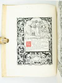
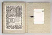
ST20503McMinnville Oregon: Phillip J. Pirages 2019. No. VII OF 47 COPIES numbered I-XLVII bound in flexible vellum from a total edition of 165 COPIES. Text: 244 x 154 mm. 9 1/8 x 6 1/8"; Case: 502 x 372 mm. 19 3/4 x 14 5/8". ii 75 pp. <br/> Bound in flexible vellum with ties inspired by Kelmscott Press bindings by Amy Borezo who also constructed the case holding the volume and leaves. The book printed letterpress on Zerkall Book Laid Vellum paper by Arthur Larson at Horton Tank Graphics. Book layout by Jill Mann. EACH COPY WITH FIVE LEAVES: ONE FROM THE KELMSCOTT CHAUCER WITH woodcut borders woodcut beginning word and A WOODCUT SCENE DESIGNED BY EDWARD BURNE-JONES AND ONE EACH FROM THE PRESSES OF FOUR GERMAN PRINTERS FROM THE 1470s--PETER SCHOEFFER JOHANN MENTELIN GÜNTHER ZAINER AND ANTON KOBERGER the Zainer leaf featuring at least one woodcut initial. The incunabular leaves consistently excellent with only minor defects and the Kelmscott leaves which were never part of a bound volume in entirely fine condition.<br/> <br/> This is a unique leaf book in the way that it combines three elements: a significant private press production involving people at the top of their craft a scholarly commentary that contributes to a further understanding of the history of printing and--most important--five leaves: one from the Kelmscott Press "Works" of Geoffrey Chaucer and four from books issued by German printers at work in the 1470s. The book has been printed and bound by hand by gifted professionals; the essay addresses a topic of significance to typophiles in a considerably more thoroughgoing way than has been done before; and the assemblage of leaves represents a powerful visual reinforcement of the text as well as an opportunity to share in the ownership of four important incunabula along with the extraordinary Kelmscott Chaucer. The story of the production is heavy on serendipity: in the winter of 2012 after purchasing a very incomplete copy of the Kelmscott Chaucer at auction we considered the possibility of producing a leaf book but because the Chaucer--universally considered to be one of the most beautiful books ever printed--had been written about by so many different people in so many different ways we didn't know what aspect was left for us to explore. The one topic we fastened on as thus far inadequately examined is the origin of the work's typeface. We soon learned that Morris who is known to have owned more than 500 incunables most admired--and was consequently most likely to have been influenced in his typographic design by--Peter Schoeffer of Mainz Johann Mentelin of Strassburg Günther Zainer of Augsburg and Anton Koberger of Nuremberg. Over the course of the years succeeding the purchase of the defective Chaucer we were fortunate beyond all expectation to acquire incomplete books from each of these four eminent printers. As a result the present leaf book will allow the reader not only to read in the accompanying essay about the influence on Morris of his typographic forebears but also to compare with his or her own eyes the resemblances between the Kelmscott leaf and the leaves from four centuries earlier. The essay comes in one of three bindings which reflect the degree of decorative elaboration on the accompanying Kelmscott leaf: linen-backed paper boards in imitation of the small format Kelmscott publications with a leaf containing text and small initials; floral patterned cloth after a Morris design with a leaf containing multiple six-line initials; or in the most deluxe version as here in flexible vellum with ties with a leaf featuring a full woodcut frame one or more prominent woodcut initials and a very large and striking Edward Burne-Jones woodcut scene. Phillip J. Pirages unknown