612 résultats
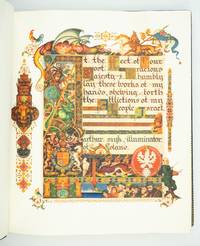
1939ST20331London: Beaconsfield Press 1939. No. 72 OF 125 COPIES SIGNED BY THE ARTIST AND THE EDITOR for sale in the British Empire. 292 x 248 mm. 11 1/2 x 9 3/4". xxvi pp. 46 leaves all leaves French fold. Edited by Cecil Roth. <br/> Elegant original blue crushed morocco by Sangorski & Sutcliffe signed on front turn-in covers with gilt French fillet border and large intricate central figure designed by Szyk of a patriarch holding a goblet and book raised bands spine gilt in double ruled compartments with ornate crown centerpiece gilt titling turn-ins with double gilt-ruled and scalloped border surrounding an illustrated silk doublure featuring a Szyk portrait of Moses with the Ten Commandments done in shades of gray within a frame of elaborate design. In an excellent velvet-lined box of blue half morocco over lighter blue cloth upper cover with central lion's head in gilt on blue morocco spine like that of the book. WITH 14 FULL-PAGE AND 32 SMALLER COLOR REPRODUCTIONS OF DESIGNS BY SZYK. English translation printed in black commentary printed in red. Front flyleaf inscribed in ink: "To Mr. and Mrs. Solomon Brachman / very cordially / Arthur Szyk / New York. April 1945." Very faint naturally occurring variations in the grain of the vellum otherwise a pristine copy.<br/> <br/> With an important Holocaust-related authorial inscription this is a very fine copy of what the London Times described as "a book worthy to be placed among the most beautiful of books that the hand of man has produced." Arthur Szyk 1894-1951 a Polish Jew is considered by scholars to be the greatest 20th century illuminator. Using the style of the Medieval illuminated manuscript artists he has here created a Haggadah for Passover that is at once a beautiful book of devotion a political protest against the rise of Nazism and a plea for England's help for the Jews of Europe. By 1939 Szyk's anti-Nazi cartoons had caused Hitler to put a price on his head forcing him to flee to England. His original illustrations for his "Haggadah" featuring the villains of the Exodus with the heads of Hitler Goebbels and other leading Nazis had to be toned down before publication. All 46 pages of the Hebrew text are illustrated with scenes from the Passover story as well as vignettes of Jewish life in modern Europe—sometimes Szyk mixes the two to great effect. Perhaps the most moving illustration in the book is the elaborately illustrated dedication to King George VI of England appealing for his mercy to European Jews. The great symbols of the British Empire—the lion and unicorn St. George defeating the dragon—surround Szyk's plea to the king: "At the feet of your most gracious majesty I humbly lay these works of my hands shewing forth the affliction of my people Israel." In the lower right corner of the painting we see Jewish refugees beside one of the ships which were usually turned away from British shores while Szyk depicts himself leaning against the painting his brush and easel in hand. The text here is enriched by the historical introduction and the commentary contributed by Cecil Roth 1899-1970 the preeminent British expert on Jewish history. This crowning achievement of Szyk's life was four years in the making and has proved to be an enduring treasure. Szyk presented this copy to Texas oilfield supply magnate Solomon "Sol" Brachman 1896-1974 and his wife Etta. The son of a Latvian Jew Brachman was the founding president of the Jewish Federation of Fort Worth in 1936 and helped arrange an emergency $100000 bank loan for Israel on the eve of statehood in 1948. His wife who served as president of the National Council of Jewish Women was known as "the mother of Hadassah." Szyk's 1945 inscription was no doubt especially meaningful to this devout family whose Latvian relatives were among the 90 percent of that country's Jews who perished in the Holocaust. Beaconsfield Press unknown
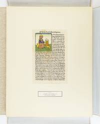
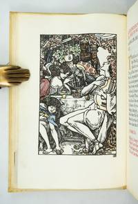
1929ST17493München: Weiss & Co. Antiquariat 1929. No. 21 OF 50 SETS issued with accompanying German text; there were also 50 with accompanying English text. 480 x 375 mm. 19 x 14 3/4". With an 87-pp. volume of commentary in German. <br/> Loose as issued in a linen-covered chemise titling in black on front cover. Commentary volume in original paper wrapper. WITH 55 LEAVES FROM INCUNABULA issued by German Swiss Dutch Czech and Italian presses ALL WITH ONE OR MORE WOODCUTS 32 OF THESE HAND-COLORED. ◆Front cover of commentary volume with thin six-inch brown stain along head edge but the volume otherwise clean and fresh the leaves with occasional browning or minor staining but excellent specimens overall the hand coloring often quite attractive.<br/> <br/> Arranged according to the city in which they were printed this is a wonderful collection of 55 incunabular leaves all illustrated with woodcuts. The group includes important early images large and small with 32 of them hand painted often with brilliant memorable color. Although every leaf here is of interest there are some leaves that deserve special mention: the 1471 Zainer printing of "Heiligenleben" the earliest leaf included; a number of leaves from herbals Bibles and lives of the saints; leaves representing two different editions of Brant's "Stultifera Navis" a Basel 1500 edition of Aesop and the celebrated 1499 Aldine "Hypnerotomachia Poliphili." A full-page woodcut from Koberger's "Schatzbehalter" "Treasure Book" 1491 shows Korah Dathan and Abiram being swallowed up by the Earth for their rebellion against God while Moses and Aaron pray as God sends fire to destroy the rebels. <br /> <br /> Among the hand-painted woodcuts are several that are outstanding both for the composition of large complex images and for exuberant coloring. These include Pharoah's daughter rescuing the baby Moses as well as the adult Moses with the burning bush both from the German Bible printed by Koberger in 1483; a view of the city of Perugia in Schedel's "Weltchronik" 1493; and another Schedel leaf depicting the martyrdoms of the Apostles Andrew and Thomas. The 55 specimens included here would serve very well either as a final capstone in an advanced collection or else an outstanding nucleus for a beginning collector of illustrated incunabular leaves. Several of the books represented are difficult to obtain and most of the ones that can be procured are very expensive. Weiss & Co. Antiquariat unknown
19512091202133203574Published by Sonkeikaku Series Published by Maeda Ikutoku Zaien 1951. Soft Cover. Fine. Number of books: 3 volumes Published by Sonkeikaku Series Published by Maeda Ikutoku Zaien paperback
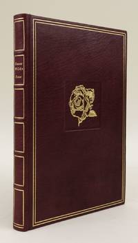
1982ST16482Bayreuth: Printed by Chr. Scheufele Offizin Stuttgart for Bear Press 1982. No. 1 OF 10 COPIES ON VELLUM plus a "special" edition of 25 copies and 185 copies on Kochi Japanese paper. 223 x 148 mm. 8 7/8 x 5 3/4". 50 pp. 2 leaves.Translated and with an afterword by Wolfram Benda. <br/> Publisher's fine burgundy morocco by Erwin Lehr upper cover with gilt rose in recessed square flat spine with gilt titling turn-ins with gilt fillet frame pale yellow silk pastedowns. In the original burgundy suede slipcase. With three large initials in burnished gold and four signed and numbered original etchings by Peter Klitsch. Printed in red and black. Signed in the colophon by the artist the binder and the publisher/translator. In mint condition.<br/> <br/> This is the splendid deluxe version of a finely crafted private press edition of Wilde's fairy tales "The Nightingale and the Rose" "The Happy Prince" and "The Selfish Giant." It is the third work issued by the Bear Press founded in 1979 by literary scholar Wolfram Benda and still in operation. According to the firm's website "at a time when the craftsmanship and ethos of the artisan in bookmaking have been damaged by ever-increasing industrialization and neglect . . . The Bear Press . . . tries to achieve the highest possible degree of technical and artistic perfection in its printed works." The font used to print the text and the artist chosen to illustrate each work are carefully selected to express "the individual author's personality and intention." Even the discriminating aesthete Wilde 1854-1900 would be pleased with the choices here especially for the luxurious vellum printing: the type is set in refined Walbaum Antiqua and shown off with special effect by the creamy leaves; the etchings by Austrian artist Peter Klitsch b. 1934 are meticulous detailed and reminiscent of the work of Wilde's friend Aubrey Beardsley; and the binding is the epitome of tasteful restraint flawlessly executed with premium materials. <br /> <br /> The three tales here first appeared in 1888 and are bittersweet in their themes of love and self-sacrifice. His stories for children were one of Wilde's early successes and DNB notes "Their permanent place in child affections refutes the vulgarism that Wilde's literary reputation arose from his legal notoriety. In all cases the fairy tales are on the child's side celebrating the courage and generosity of the poor and vulnerable while their satire mocks the kind of pomposity and hypocrisy children can recognize." We have been able to trace just two other copies of the vellum printing at auction in ABPC and RBH. [Printed by Chr. Scheufele Offizin, Stuttgart, for] Bear Press unknown
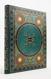
1902ST20771New Rochelle: Printed by the University Press for George D. Sproul 1902. No. 23 OF 30 COPIES 18 for America 12 for Europe; this copy illuminated for Herman A. Metz of the "St. Dunstan Edition" all of them PRINTED ON VELLUM. 270 x 210 mm. 10 5/8 x 8 3/8". 50 leaves last blank. <br/> SUMPTUOUS COBALT BLUE MOROCCO GILT AND INLAID TO AN ARABESQUE DESIGN BY TRAUTZ-BAUZONNET stamp-signed on front doublure covers framed in gilt and inlaid brown morocco blossoms central panel of azure blue morocco outlined in brown morocco large central medallion enclosed in brown morocco and inlaid with an eight-pointed inlaid and gilt fleuron each corner with tan and ivory morocco medallion with gilt "T" at center outlined in brown morocco the spaces between the medallions with curling gilt flourishes raised bands spine compartments with gilt lettering framed by sprays of gilt berries SKY BLUE MOROCCO DOUBLURES inlaid with darker blue squares containing an ivory morocco polygon these forming a frame around a central taupe morocco panel with inlaid blue morocco flowers at corners vellum free endleaves painted with a simple blue frame small flowers at each corner all edges gilt. BEAUTIFULLY ILLUMINATED BY ROSS TURNER the title page and final page with heraldic emblems and WITH 51 LOVELY INITIALS in a range of hues 22 with delicate extensions. Printed entirely in majuscules on rectos only. A couple of small faint water spots to upper board with slight dulling where someone tried to fix these naturally occurring variations in the grain and color of the vellum otherwise A FINE COPY--the vellum creamy and smooth the colors and gilt bright and the binding lustrous.<br/> <br/> A bookmaking tour-de-force this item is part of the remarkable St. Dunstan series of famous works of literature produced at the turn of the century in very strictly limited and particularly luxurious editions by publisher George Sproul. Named for the English bishop Dunstan 909-88 who was known for his skills as an illuminator the St. Dunstan volumes were printed on vellum illuminated by different artists and then put into bindings of striking design executed by Trautz-Bauzonnet one of the premier French binders of the period. While the physical properties of this volume announce themselves more emphatically than the text the narrative here is from Tennyson's "Idylls of the King" a work Day tells us in which the legend of King Arthur is used "to establish the Victorian virtues of marital faithfulness fair play gentlemanly conduct and useful action for self and society." "Guinevere" sets forth the consequences of marital infidelity presenting a penitent queen now withdrawn to a convent groveling for Arthur to pardon her affair with Lancelot. Although the injured king grants her forgiveness he does so with little grace appearing to modern readers as "insufferably self-righteous." Day Reminiscent of the designs used in 15th century illuminated books the painted initials in our volume are well executed and attractive combining fluid shapes and consonant combinations of colors and the binding is a singularly elaborate achievement. German-born binder Georges Trautz 1807-79 apprenticed in Heidelberg Stuttgart and Witemberg before arriving in Paris in 1803. There he trained in “dorure†with the skilled gilder Debès learning to create intricate gilt designs on bindings. In 1833 he was hired as a doreur by Bauzonnet the successor to the celebrated Purgold and soon achieved acclaim for his beautifully gilded bindings. According to Michon he was "the uncontested master of the luxury binding" in 19th century France celebrated for his "sumptuous moroccos" and "dazzling gilt." His bindings were so sought after that the term "Trautzolâtrie" was coined to describe the craze for his work. In 1869 he became the first bookbinder to be named a chevalier of the Legion of Honor. The culmination and termination of the St. Dunstan books was a planned edition of 15 sets of the complete works of Dickens projected to contain 130 large folio volumes—surely the most ambitious undertaking in the history of modern American fine printing. Five volumes only comprising most of "Pickwick" were produced before the grandeur of the project overwhelmed its sponsors. Potter says that in addition to the Dickens edition the St. Dunstan series comprised a dozen volumes of the works of various authors one of them the present Tennyson issued to subscribers at the spectacular amount of $12000 per set. One of the subscribers was our original owner New York chemical manufacturer and U.S. Congressman Herman A. Metz 1867-1934. Not surprisingly this strictly limited "Guinevere" is quite rare: We could trace just two copies at auction since 1975 one of them ours sold in 1998.  . [Printed by the University Press for] George D. Sproul unknown
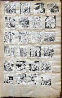
192061659New York: American Publishing & Engraving Co. J.J. Schultz & Co. 184 William St. Bookbinder ca. 1920-1939. Thick folio. 13 x 19 x 3.5 in. 135 leaves numbered reverse in pencil on versos of last half. on linen with 4274 camera-ready clipart samples all w/ inventory numbers rubber stamped below the image sized approx. 2 x 2 in. throughout arranged in montages of 24 28 32 & 40 per page each carefully mounted some crossed out w/ annotation “Killed†and others worn through at the lower right corner of some leaves while just a few have been removed and in once case clipped from the upper fore-edge of the leaf. Contemporary light gray/beige buckram soiled dampstained wear at fore-edges partially shaken rebacked still a VG- exemplar. An extraordinary printing & engraving firm’s factory sample catalogue for over 4000 of their camera-ready clipart advertisements for subscribing businesses following World War II through the Great Depression and the New Deal programs of President Roosevelt. This superlative archive of images traces Art Deco styles spanning nearly two decades advertising campaigns printing styles fonts and with almost not repeated images offered by American Publishing & Engraving Co. AP&E Co. to their extensive client list. In addition these engravings capture the revolutionary changes in American industry and commerce with nearly 50% devoted to the automobile industry including automobile manufacturers and dealerships accessory suppliers automobile repair public safety from bad driving the fast-growing electric motors and battery industries and more. Ford the Dodge Brothers Buick Studebaker Cadillac Plymouth Auburn Chrysler Essex Auburn-Cord DeSoto Hudson Terraplane and many others all are featured here advertising their service departments features speed and more. A significant portion also reveal the very real needs to wash the cars clean engines repaint the lacquer update the automobile tops replace batteries repair radiators and the always pressing need to maintain safety equipment and tires. Interspersed as well are automobile movers commercial body builders for trucks and commercial delivery vehicles with a significant percentage showing cylinder grinding engine rebuilding boiler repair and other very necessary secondary market needs as metal alloys and tolerances were far less durable with breakdowns an ever pressing problem for the motorist. Public safety notices reflecting the impact of the Progressive Era illustrate the dangers of the automobile with many indicating streetcars potentially hitting stalled cars which had not been repaired properly gridlock automobile accidents from ignoring traffic signals and police traffic officers as well as speeders hitting pedestrians or ignoring motorcycle police traps. Early in the sample illustrations are many reflecting the interest in building large Tudor Revival or Arts & Crafts homes installing electric lighting new furniture stylish clothes & shoes beautiful Oriental carpets and jewelry and watches for young flapper-era women. There are also promotional ads for Art & Stained Leaded Glass windows for homes interior decorators a panoply of beauty products many reflecting the Flapper Era hair and dress styles as well as evolution of the Art Deco lettering. As the AP&E Co. continued to add their sample engravings through the Great Depression not only is there a greater emphasis on repairing automobiles shoes recovering furniture and even repairing mattresses reflecting the belt tightening of the 1930’s but there are also increasing influences of more streamlined automobiles introduction of appliances such as refrigerators appearance of beer ads following the repeal of Prohibition and the fast growing radio industry. American Publishing & Engraving Co. based out of New York was one of a myriad of job printer engraving firms who emerged at the end of the 19th Century and initially specialized in publishing local histories and genealogies for historical societies by subscription typically with illustrations. Although this cataloguer could find no specific trade reference either in contemporary magazines or newspapers they appear to have operated out of the same locations as the Atlantic Publishing & Engraving Co. with some overlap and by the beginning of the 20th Century had largely dispensed with publishing local histories engraved portraits or vanity press projects. Contemporary court cases and other references indicate that they operated a subscription service for businesses advertising art to be run in magazines newspapers pulps or added to trade literature for matchbook covers business flyers etc. and by 1916-1925 were managed by Thomas W. Smith. No similar factory sample collection or published collection located in Worldcat. American Publishing & Engraving Co., J.J. Schultz & Co., 184 William St., Bookbinder, hardcover
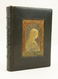
1909ST16339Paris: Bouasse-Lebel et Marrin ca. 1909. 188 x 140 mm. 7 3/8 x 5 1/2". 72 pp.; 1 leaf miniature; XXXII pp. <br/> Tasteful contemporary olive green crushed morocco each cover WITH A CENTRAL RECESSED PANEL OF MODELLED AND PAINTED LEATHER that on the upper cover with a portrait of the Virgin Mary within an arched frame of acanthus leaves that on the lower cover with the coat of arms of the Deburghgraeve family. With text and decorations lithographed featuring decorative borders and initials throughout those on 55 pages COLORED AND ILLUMINATED BY HAND many of these in a Medieval or Renaissance style others with Japanese or Greek motifs with a small hand-painted miniature of the Crucifixion against a golden sky and WITH A FULL-PAGE HAND-PAINTED MINIATURE showing the Flight into Egypt within a decorative border featuring vignettes of a peasant gathering wood and a knight in armor praying. With a hand-painted ribbon bookmark "Souvenir de ma 1ère Communion" dated 6 June 1909; carbon copy of a poem "A la Memoire de ma tres chere et regrettee cousine Mathilde Deburghgraeve-Canal" by Lucy Salze-Bouchet dated February 1945 this with short curving tear into one margin. Just the most trivial signs of wear but A VERY FINE COPY the vellum leaves quite clean and very bright with shining decorations and the binding lustrous and virtually unworn.<br/> <br/> Luxuriously lithographed on vellum handsomely bound and illuminated and painted by hand in vibrant colors this charming prayer book was obviously treasured by its owners--the first of whom may have been a young lady who received it on the occasion of her First Communion. The text and decorations here have been reproduced lithographically from a manuscript of the period being printed apparently by Bouasse-Lebel et Massin--a company specializing in devotional prints and books. The firm's name appears in very small letters at various places in the volume. Each leaf contains a different border design inspired by Medieval and Renaissance manuscripts as well as artwork from around the world in a pleasing pastiche of Western Egyptian Japanese Indian and Grecian motifs. Many of the borders have been hand-colored and present an array of distinct palettes usually richly hued which adds greatly to the book's appeal and the viewer's sense of discovery from page to page. The bespoke binding featuring the Madonna in profile beautifully modelled in leather adds another element of luxury to the book. The coat of arms suggests that it was made for a member of the Deburghgraeve family and the laid-in poem suggests that it remained with them through the death of the family's matriarch Mathilde Deburghgraeve-Canal in 1944. We know that Mathilde had three daughters all born around the turn of the century; based on the presence of a bookmark commemorating a First Communion in 1909 it is likely that the original recipient was among these three young ladies. Bouasse-Lebel was established in 1845 by Eulalie Bouasse-Lebel 1809-98 as a means of supporting herself and her children following the dissolution of her marriage. Though founded under difficult circumstances Bouasse-Lebel became a very successful enterprise and even earned a papal commendation in 1871 for consistently excellent work. The company was highly regarded for the quality and delicacy of their productions of which the present work is a choice example. Although individual religious cards printed by Bouasse-Lebel show up fairly frequently far scarcer are complete books in the estimable condition seen here--particularly those with the kind of deluxe upgrades that make this particular item so desirable. Bouasse-Lebel et Marrin unknown
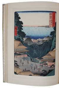
194160043Tokyo Nihon Bijutsu Hanga Kenkyu Kai 1941 March 10th. Folio 355 x 260 mm. In the original silkcovered sewn boards binding with blue title-label pasted on to front board. 50 woodblock reproduction of Ukiyo-e art all with printed tissueguards describing in both English and Japanese the artist and artwork. A very fine copy. <br/><br/><em>A fine work showing the rich tradition Ukiyo-e art which flourished from the 17th through 19th centuries. Its artists produced woodblock prints and paintings of such subjects as female beauties kabuki actors and sumo wrestlers scenes from history and folk tales travel scenes and landscapes flora and fauna and erotica. The term 'ukiyo-e' translates as "pictures of the floating world". Ukiyo-e was central to forming the West's perception of Japanese art in the late 19th century particularly the landscapes of Hokusai and Hiroshige. From the 1870s onwards Japonisme became a prominent trend and had a strong influence on the early Impressionists such as Edgar Degas Édouard Manet and Claude Monet as well as having an impact on Post-Impressionists such as Vincent van Gogh and Art Nouveau artists such as Henri de Toulouse-Lautrec. </em> hardcover
1904ST20796London: Essex House Press 1904. No. 1 OF 140 COPIES all on vellum. 195 x 131 mm. 7 3/4 x 5 1/8". 1 p.l. frontispiece 3-11 2 pp. <br/> Original stiff vellum over thin boards front cover with embossed rose design. In custom-made linen clamshell box with red morocco label on spine. Hand-colored woodcut frontispiece and final tailpiece both by Reginald Savage hand-painted initials in burnished gold red blue or green. Printed in black and red. Front pastedown with red morocco bookplate of William Andrews Clark Jr.; front endleaves with evidence of bookplate and inscription removal. Tomkinson p. 76; Ransom p. 268; Franklin p. 200. A VERY FINE COPY clean bright and free of the splaying that very frequently afflicts the boards of this work.<br/> <br/> This is a most appealing example of the luxurious hand-crafted volumes produced under the auspices of the Essex House Press with our copy coming from the library of a noted Dryden collector. The book is the 11th from the Essex House series of 14 "Great Poems in the English Language" a group of lovely little works all printed on vellum and with delightful colored illustrations and historiated initials. Generally considered to be the best example in English of the choric hymn the present work is set at a feast given by Alexander the Great who finds himself entranced by the poet and lyrist Timotheus. The great leader is lost in reveries of exploits and victory he sighs and cries over battles lost and warriors slain and he finds inspiration for new conquests. Our printer C. R. Ashbee founded the Essex House Press in 1898 by purchasing the presses and other production equipment though not the type formerly owned by the Kelmscott Press which had shut down at the death of William Morris. Ashbee printed books for 12 years with vellum ink and paper identical to that used by Kelmscott in an effort to carry on the tradition Morris had established. But the Essex House Press because it was conceived of and continued as part of a larger enterprise involving various artisans at work in a group of workshops at Ashbee's Guild of Handicrafts located at Essex House in London's Mile End Road always had its own special identity a fact which Cave reflects when he calls it the "Arts and Crafts press 'par excellence.'" The illustrator here Reginald Savage fl. 1886-1904 is deemed by Houfe "a talented and imaginative designer and woodcut artist" and Houfe notes that he was also commended by his fellow illustrator Walter Crane 1845-1915 for his "weird designs." Former owner William Andrews Clark Jr. 1877-1934 put together one of the most distinguished collections of English and French literature of his day. He had strong holdings in many areas but especially in Shakespeare and the other Elizabethans in Dryden in Oscar Wilde and in the French drama. After a fire in his home in 1923 Clark constructed a separate fireproof building to house his collection; in 1926 this library building with its distinguished collection was deeded to the University of California and now serves as a prominent center for literary research. Essex House Press unknown
1937PRINTING011799Esselte Aktiebolag Stockholm. 1937. First edition. Quarto. 90 card leaves ringbound in orange cloth covers. Sample catalogue of all the printing techniques on offer from Esselte these being boktryck letterpress offset stentryck lithography ljustryck collotype djuptryck copper-plate and staltryck steel-plate. Actual examples of the various print jobs of the year are given many of them tipped in. These include book illustrations and covers catalogue covers product packaging adverts brochures these are shown in their entirety posters etc. Everything has a distinctly Art Deco air about it. All very impressive.Cloth scuffed at bottom of front joint. Very good indeed. Very scarce. Esselte Aktiebolag, [Stockholm]. hardcover
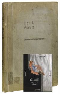
195841578Brooklyn NY: Consolidated Lithographing Corp 1958. Near fine. An enormous scrapbook of chronologically-arranged printing samples from the Consolidated Lithographing Corporation of Brooklyn preserving the company's packaging work for the undergarment industry. Labels include bands tags wraps and labels from predominantly women's products: stockings hosiery lingerie bras panties and the like. Men's and children's products also represented however socks undershirts etc. The printing processes evident in the samples evolve from chromolithography to color lithography to photo mechanical in the later examples - all vivid and exhibiting elegant postwar design. Hundreds of brands and products in total: Regent Hosiery Artemis Underthings Treo Undergaments Spick and Span Hosiery Lowenstein Fabrics Sport-Wear The Lone Ranger and Superman Branded Socks among many others. Consolidated Lithographing Corporation was founded by Jacob A. Voice around 1925 and operated as one of the finest and most prolific American commercial printers of the era specializing in cigar labels dust jackets for Doubleday liquor labels garment packaging and more. This rich archive likely containing the only extant examples of numerous works offers numerous worthy avenues for future study: from commercial printing methods to mid-century design and marketing. Hardcover. Elephant folio. Grey cloth screw-bound boards. Measuring approximately 24" x 16.5" containing 350 color lithographed and chromolithographed paper packaging elements in a wide variety of sizes adhesive mounted recto and verso to 38 paper leaves. Additional 65 leaves blank. Top board stamped "Consolidated Lithographing Corporation." Pencil notations recording catalog numbers and dates throughout. Mild handling wear to exterior. Penned notation to cover notes "Set 5 Book 5." Likely one volume from larger company archive. Contents clean well preserved and apparently complete. Near fine overall. Consolidated Lithographing Corp paperback
190738817Leipzig J.A. Barth 1907. Contep. hcloth. Both hinges with a tear at upper part. "Annalen der Physik Vierte Folge. Band 23. Herausgegeben von W.Wien und M. Planck" VIII1000 pp. and 4 plates. Einstein's papers pp. 197-98 a. 206-209 a. 371-384. Internally fine and clean. The whole volume offered. <br/><br/><em>All 3 papers in first edition. - The first paper "New possibility of testing the relativity principle" deals with the shift of canal rays in the Dobbler effect as a possible confirmation of the Principle of Relativity - the confirmation became actual only in 1938 when new improved instrumentation made it possible. - The second paper "remarks concerning Paul Ehrenfest's note: 'Translation of the deformable electron and the momentum law' Einstein gives his answer by relating it to his Theory of Relativity. - The third paper "The inertia of energy as demanded by the principle of relativity" which is a importen paper as it i is the first to state E=mc2 in its general form. general form. This new relation which was adumbrated already in his paper of 1906 Das prinzip von der Erhaltung der Schwerpunktsbewegung brings about the complete unification of mass and energy into a single concept. In natural units which make c=1 we have E=m i.e. mass and energy are one and the same quantity. Every form of energy also has a mass value just as every mass represents a definite amount of energy. - Weil Nos 1718 a. 19 </em> hardcover
190153506Washington D. C.: Government Printing Office. As New. 1901. Hardcover. FREE UPGRADE to Courier/Priority Shipping Upon Request IN STOCK AND IMMEDIATELY AVAILABLE FOR SHIPMENT - Text pristine & unmarked - 135 pages. -- with a bonus offer-- . Government Printing Office hardcover
190273377London: Edwin Arnold 1902. Limited to 165 numbered copies on vellum at the Essex House Press under C. R. Ashbee. Small octavo. 45 1 pp. Hand-colored frontispiece and two full-page hand-colored illustrations and eighty-five hand-colored ornamental letters by Edith Harwood. Tail-piece. Caslon type. Publisher's vellum with rose and gilt lettering to front cover. Bit of natural mottling to vellum. Custom folding cloth chemise and slipcase. A very good copy.Great Poems Series No. 6. "In 1886 C.R. Ashbee established the Guild of Handicraft at Essex House London. Around the same time Ashbee created the Essex House Press. The Essex House Press published its first book in 1898. The work of the press was very much a part of the Arts and Crafts Movement. Ashbee continually linked the aims of the press with those of John Ruskin and William Morris and described the object of the movement as “making useful things…making them well and…making them beautiful.†The critics however were not so sure about the work of Essex House Press calling it “articraftiness.†Later booklovers came to admire much of its work. Some of the presses and some of the workmen for Essex House Press came from the Kelmscott Press after its demise in 1897 following the death of William Morris. Ashbee designed his own typeface called “Endeavor†for the press. In 1902 the press moved to Glouscestershire. The Essex House Press closed in 1910 having produced more than seventy titles." Univ. of Utah Edwin Arnold hardcover
19432111902160200673Hayashi jin'uemon 1943. Soft Cover. Fine. Number of books: 3 books Hayashi jin'uemon paperback
19022111902160201152Hanshichi Yoshikawa 1902. Soft Cover. Fine. Number of books: 7 books Hanshichi Yoshikawa paperback
191564006Bradford West Yorkshire UK: W.N. Sharpe Ltd. 1915. Thick oblong Folio. 13 x 10.5 x 2.5 in. 72 pp unpaginated. on thick tanned-gray card stock w/ 93 greeting cards envelopes calendar greeting cards folding cards embossed examples most of them colour printed some w/ die-cut decorations and features many w/ hand-coloured Bromide photo illustrations hand-coloured photogravure many raised gilt ornamental decorations monograms and all could be ordered w/ gilt embossed Regimental badges or ornaments. Publisher’s fish-scale scalloped ivory-silver cloth embossed gilt lettering & ornament on front cover some toning scuffing minor bumping to spine edgewear light uniform interior toning slightly shaken 1 small closed tear rear joint at head of spine still a VG- copy w/ Regimental Badges order sheet tipped-in on pricing and ordering instructions on endpapers including specific pricing for Welsh customers. First edition of this scarce World War I-era greeting card and advertising promotions salesman’s sample catalogue filled with beautifully executed printer’s samples to help raise morale during the brutal second year of the Great War. 1915 opened with the disheartening Neuve Chapelle offensive by General Haig and subsequent political fallout battles of Aubers Ridge Festubert Loos as well as Zeppelin bombings and U-Boat blockade transformed the War and Great Britain into an all out effort and grinding stalemate of trench warfare. With millions of men separated from their families and homes W.N. Sharpe and other publisher’s quickly expanded and adapted ensuring that postcards and greeting cards were supplied so that people far from loved ones could exchange morale-boosting messages. These greeting cards were available to be embossed with regimental badges flags of the allies patriotic messages and would prove to be wildly popular during the opening years of the War. When initially prepared for printing in late 1914 there were only 25 Regimental badges but this quickly grew to 62 and here Sharpe has included the updated list. The greeting cards and Christmas cards feature Bromide photos of English Bulldogs with British Empire flags; soft-focus images of idyllic rural scenes mothers & children; Naval scenes; flower arrangements and even King George V. By the early 20th-Century W.N. Sharpe was one of the largest greeting card and postcard colour printing companies in the World on par with Raphael Tuck and were well known for their famed “Patent FAB Patchwork Card†which featured a decorative square of silk that could be cut out and worked into a pin cushion or tea cozy. Following World War I they would continue to expand into producing stationery wedding cards and stationery birthday cards along with calendars postcards and many other paper ephemera. In 1937 they would built the historic 76000 square foot Hallmark House in Bradford and later in 1984 was acquired by Hallmark Cards of the United States. No copies in Worldcat; See: Graham Hall Classic Cards’ Bradford: The History of W.N. Sharpe Ltd. The Bradford Antiquary Series 3 Vol. 11 2007. W.N. Sharpe Ltd., hardcover
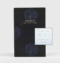
1919176501Shanghai: Privately printed by Kelly & Walsh Ltd for G.S.J. 1919. A Shanghai expat's otherwise unrecorded tribute to his goddaughter inscribed by the author on the first blank "To Irene from Stewart with all good wishes. 22nd October 1919 Shanghai". G. Stewart Jones "G.S.J." in the imprint ran the Shanghai office of the chemicals giant Brunner Mond & Co. Jones composed his poems in Shanghai Tianjin on the Yangtze River and in England. His collection is a rare surviving example of the bespoke luxury printing and bookbinding service provided by Kelly & Walsh Asia's largest publisher-printer. Octavo pp. 16. Contents printed in blue. Original decorative black and blue brocade front cover lettered in gilt edges untrimmed binder's ticket on rear pastedown. Boards lightly rubbed and bowed foxing to endpapers and edges: a very good copy. hardcover
192059816Los Angeles CA: MacDonald Collection ca. 1920-1955. Archive of 89 coated labels sized from 2.25 x 3.5 in. up to 6.25 x 8.5 in. with many in the middle ranges including distinctive 5.25 in. rounds most colour lithographs some with metallic inks nearly all retaining the original adhesive from never having been applied to luggage in assorted shapes many round others rectangular square diamond shaped etc. most on thin coated paper stock all NF condition from the library of Archibald Angus MacDonald 1892-1977 stepson of famed southern California oil man William F. Byrne as well as oil company and drilling equipment company owner and manager of MacDonald & Burns Oil Producers. A delightful and remarkably colourful small archive of fine lithographed and colour printed luggage labels preserved from over three decades of ocean liner travel by the well-to-do California oil family. Their frequent voyages carried them to Hawaii Asia South Asia Africa Europe and the Americas preserving luggage labels souvenir brochures and more along the way. At the time they were an essential advertising campaign largely driven by the popular Grand Hotels and were often illustrated by such renowned commercial and graphic artists as Dan Sweeney and Mario Borgoni. Included amongst these are iconic labels for the historic Park Hotel depicting jockeys racing on the Shanghai Club race track in front of the iconic Art Deco building completed in 1934; The Cathay & The Metropole in Shanghai operated by Cathay Hotels Ltd.; the historic Peninsula Hotel in Kowloon Hong Kong opened in 1928 and founded by the brothers Ellis & Elly Kadoorie still considered one of the finest hotels east of the Suez; or beautiful scenic labels created for the Eastern & Oriental Hotel the “E&O†still considered one of the finest hotels in Southeast Asia and the Oriental Hotel in Kobe Japan. Also present are labels for the Raffles Hotel in Singapore originally opened in 1887 Mrs. Ch’ien’s Guest House located originally not far from the Legation Quarter in Peking Maidens Hotel Delhi the splendid Clark’s Hotel Benares Varanasi still considered the finest heritage hotel in the city and the Imperial Hotel of New Delhi opened in 1936 designed by F.B. Blomfield. The MacDonald’s visited the Philippines several times often staying the Manila Hotel Hawaii where the Royal Hawaiian and the Kiluaea Volcano House were their places of choice and frequently stated at The Biltmore in Los Angeles after returning from trips the Plaza in Buenos Aires the Waldorf in New York and many of the major European Hotels. Also present are labels for the Galle Face Hotel in Colombo Sri Lanka founded in 1865 featuring the historic south wing designed by Edward Skinner and one of the oldest hotels East of Suez. South Africa was a stopover during their 1952 Great Africa-India Cruise on the RMS Caronia and labels include Polley’s Hotel Pretoria the Imperial Hotel in Pietermaritzburg and the North Western Hotel Livingstone N. Rhodesia. MacDonald Collection, unknown
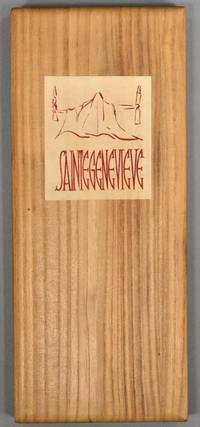
1923884591923. WOODBLOCK PRINTING CLAUDEL Paul. SAINTEGENEVIEVE Poeme Par Paul Claudel. Tokio Chinchiocha A.D. 1923. #610 of 1000cc. Tall folding album 32.5 x 13.5 cm bound in paulownia wood kiri. An illustration by Tomita Keisen and a page reproducing Claudel's script were cut into woodblocks by the master Igami Bonkotsu as well as the title design by Noemi Pernessin and a series of text illustrations by Audrey Parr. The rest of the text which is entirely in French is typeset. A lovely French-Japanese collaboration created at the moment that Tokyo was crushed by earthquake and fire. In the original publisher's clasped chitsu case. Near fine. unknown
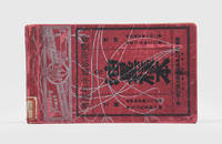
1930178912Shanghai: Wah-Foong Printing Company and Type Foundry c.1930. A rare example of a Republican-era printer's sampler offering clients a wide range of German lithographic inks to print half-tones and text. Founded in 1915 Wah-Foong operated out of the British Concession and had a production plant and a Nanjing branch. In 1927 it moved the plant to 100 Lincoln Road Shanghai the address given on the front cover of this example. After the 1949 revolution the plant was absorbed into the state-run printing system as Shanghai Number One Matrix Plant. Landscape quarto. With dozens of leaves printed with specimen colours; blanks with cover sheets at end for mounting additional samples. Text in Chinese. Original red card wrappers front cover printed in black and white. Old shelf label on spine pencil annotations in text. Rubbed spine consolidated with adhesive one cover sheet torn away sample creased: very good. unknown
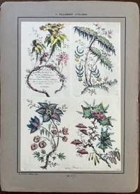
192460304Paris: Ernst Henri 1924. Folio. 2 unnumbered leaves of text. With 40 mounted hand-coloured plates beautifully reproducing the original designs Rococco chinoiserie designs 3 plates w/ old reinforced mounts at upper corners a few w/ old offsetting from the original glue. Preserved in the original quarter-chinoiserie cloth over boards printed illustrated label on front cover front tie loosened from the fore-edge edgewear rubbing still a nice complete set of these plates. First edition thus of this exceptional portfolio reproducing the exquisite and fanciful botanical settings landscapes and allegorical Chinese figures from this extraordinary artist. His chinoiserie engravings exaggerated the wispy and delicate qualities of the style portraying the world as a fairyland fileed with colour and fantasy. His 18th-Century Rococo designs were wildly popular by decorative arts manufacturers and applied to silk textiles porcelain pottery wallpapers and even silver. Pillement 1719-1808 had developed by 1764 a new method of printing on silk with fast colours and that also encouraged the durability and legacy of his designs. The majority of these were engraved by the noted woman artist & engraver Anne Allen a British artist who not only was the second wife to Pillement but created etchings based on his paintings by using the “a la poupee†or multi-colour Intaglio copperplate engraving style of printmaking which breathed life into the intricate scenes. This portfolio reproduces many of her portfolios as well as those executed by Gauthier Dagoty Canot Avril and Robert Cooper. Ernst Henri, hardcover
19452251The Hague: 's-Gravenhage F. Batten; Printed by N.G. van der A Drukkerij Albédon 1945. First edition thus. First edition thus together with: second edition. 8 pp. String-tied textured wrappers. Minor wear to spine else fine.<br /> <br /> One copy each of the first edition March 1945 and the second edition April 1945 each one of one hundred numbered copies "somewhere in occupied Holland in honour of our British allies on the Ides of March 1945." Number 1 of the series Vliegend Verzet. Reprints Brooke's "Safety" and "The Soldier" along with Churchill's memoir of Brooke from the Times of April 26th 1915. ['s-Gravenhage, F. Batten; Printed by N.G. van der A (Drukkerij Albédon)] unknown
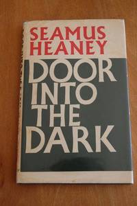
1969ABE-5207626813Faber & Faber London 1969 FIRST WORLD PRINTING OF THE NOBEL LAUREATE's SCARCE SECOND COLLECTION. Near Fine no internal markings black cloth boards unfaded pages and endpapers clean. In a protected dustwrapper not price-clipped and with slight wear to the wraparounds and one corner loss - very slight - on the lower back. Superb copy of this extraordinary poet's second book. Language: eng Language: eng 0.0 Language: eng 0.0 Language: eng 0.0 Language: eng. 1st Edition. Hardcover. Near Fine/Very Good. Faber & Faber London hardcover
19752092902140600037All Japan Printing and Bookbinding Machinery Manufacturers Association 1975. Soft Cover. Fine. Number of pages: 301p Size: A4 All Japan Printing and Bookbinding Machinery Manufacturers Association paperback