971 résultats
1933kk2996Editions Berger-Levrault Album cartonné 1933 PREMIERE EDITION. Alphabet. Berger-Levrault, sans date [première édition, 1933]. Cette édition de 1933 est rare, alors que la réédition de 1949 est assez fréquente. In-4 (24,5 x 32,3 cm), album cartonné, dos toilé brique, plats illustrés en couleurs : un éléphant humanisé portant le titre en guirlande de lettres au premier plat, un hamster lisant l'ABC au centre du quatrième plat, 27 feuillets imprimés au recto uniquement, d'abord le titre puis une page pour chacune des 26 lettres de l'alphabet, mettant en scène des animaux humanisés avec une phrase de légende en écriture cursive verte où la lettre illustrée figure en rouge. Magnifique abécédaire de peintre réalisé par Jean de La Fontinelle (1900-1974), mondialement reconnu pour ses peintures de paysages et sculptures de céramiques art déco ; quelques petits frottements, bel exemplaire. Livraison a domicile (La Poste) ou en Mondial Relay sur simple demande.
Incisione all'acquaforte, foglio 26,5x19,5 cm. ca. Tratta da '' Alfabeto in sogno''. Esemplare per disegnare di Giuseppe Maria Mitelli pittore Bolognese. L'incisore e pittore bolognese Giuseppe Maria Mitelli pubblicò nel 1683 l'"Alfabeto in sogno", un manuale di disegno in cui le lettere della lingua italiana prendono la forma di corpi umani, congiunti fra loro o con altri esseri viventi e oggetti. Mitelli, nell'introduzione dell'opera, racconta di essere stato visitato in sogno da Morfeo. Il mitologico ministro delle apparizioni oniriche circondò l'artista con forme e visioni pertinenti alla nobilissima arte del Disegno "nostro unico diletto, e mio singolar esercizio: egli mi rappresentò le lettere dell'Alfabeto formate da incomposti fantasmi e da confuse immagini, e mi comandò che dovessi disegnare in proporzionate figure quegli embrioni, che, appena nati, svaniscono.Onde, io di subito svegliato, qui li ho disposti con simmetria, e alla vostra diligente applicazione dedicati".. .
Incisione all'acquaforte, f. 26,5x19,5 cm. ca. Un uomo con un cigno sulle spalle forma la lettera ''C''. Tratta da '' Alfabeto in sogno''. Esemplare per disegnare di Giuseppe Maria Mitelli pittore Bolognese. ''Dal C spronati a la Costanza io sento,E prò s'a lo studio utile è tanto,Una lettera sol vale per Cento''. L'incisore e pittore bolognese Giuseppe Maria Mitelli pubblicò nel 1683 l'"Alfabeto in sogno", un manuale di disegno in cui le lettere della lingua italiana prendono la forma di corpi umani, congiunti fra loro o con altri esseri viventi e oggetti. Mitelli, nell'introduzione dell'opera, racconta di essere stato visitato in sogno da Morfeo. Il mitologico ministro delle apparizioni oniriche circondò l'artista con forme e visioni pertinenti alla nobilissima arte del Disegno "nostro unico diletto, e mio singolar esercizio: egli mi rappresentò le lettere dell'Alfabeto formate da incomposti fantasmi e da confuse immagini, e mi comandò che dovessi disegnare in proporzionate figure quegli embrioni, che, appena nati, svaniscono.Onde, io di subito svegliato, qui li ho disposti con simmetria, e alla vostra diligente applicazione dedicati".. .
196014763Rueil-Malmaison, Marcel Spaeth, s.d. (circa années 1960) ; in-4, broché agrafé sur le côté, polycopié de 53, (3) ff. de planches, couverture beige illustrée, titre indigo reproduction d'écriture, (1) f. de papier bleu en frontispice, nombreuses figures, texte recto.
187017528<p>New York: McLoughlin Bros. n.d. ca. 1870s First edition Date inferred from wrapper ads. Publisher's color-printed paper wrappers sewn at spine. 6 x 10 in. Six pages printed in black with reading and vocabulary lessons. Otherwise illustrated in color. Some dustsoiling and chipping to wrappers and some foxing throughout. A good copy of a fragile item. Contains eleven lessons that teach children the alphabet and simple vocabulary words. The Civil War appears thematically in the present work which includes depictions of children dressed as soldiers and an illustration of a soldier paired with the following verse: "U stands for our Union O long may it stand / V is for Volunteer with his gun in his hand."</p> McLoughlin Bros.,
186869589Salt Lake City UT: Deseret University 1868. First edition. Hardcover. Very good. 72pp. Duodecimo 19 cm 1/4 brown cloth with tan illustrated boards. Illustrated. Boards a bit discolored more so the rear board. Underlying boards peeking through at the bottom fore-edge corners of the boards. Very thin cracks to the paper along the hinges. Internally exceptionally clean and bright. The Deseret Alphabet was introduced in 1854 and was created by Parley P. Pratt Heber C. Kimball and George D. Watt. Made up of thirty-eight characters to correlate with basic sounds in the English language the Deseret Alphabet was intended to be used to help simplify the principles of the English language. The creation of the language is one the more unusual ideas of Brigham Young and never was embraced in the way he thought it would be. The Deseret Alphabet was quickly abandoned shortly after Young's death. Flake 2818. [Deseret University] hardcover
186871631Salt Lake City: Regents of the Deseret University 1868. Hardcover. Very good. Hardcover. 72pp. Brown cloth backed printed boards. Dampsatin to bottom of textblock at the spine old tape repair to the rear endpaper else an about very good example. Alfred L. Bush finds these readers to be "a curious and interesting aspect of Brigham Young's empire-building-which went so far as to include an attempt at an alphabetic reformation" qtd. in Streeter. Flake 2818; Streeter IV: 2309. Regents of the Deseret University hardcover
186871633NY: Russell Bros. for The Regents of The Deseret University 1868. Hardcover. Very good. Hardcover. 38pp. Brick cloth backed printed boards. Slightly darkened and rubbed old tape repair to tears on rear endpaper else a very good example. Alfred L. Bush finds these readers to be "a curious and interesting aspect of Brigham Young's empire-building-which went so far as to include an attempt at an alphabetic reformation" qtd. in Streeter. Flake 606; Streeter IV: 2309. Russell Bros. for The Regents of The Deseret University hardcover
1731216640À Leipzig et à Francfort 1731. Hardcover Leder Zustand: Exemplar einer Privatbibliothek mit Kennungen. Rücken Ecken Kanten berieben/bestoßen. À Leipzig et à Francfort, hardcover
1918wq789Berger-Levrault Album cartonné 1918 Magnifique alphabet graphiquement très fort. Alphabet de Jean-Jean (L'). Berger-Levrault. Paris. 1918. A Paris, à Nancy sous le bombardement. Imprimerie Berger-Levrault. (24,5 x 32,5 cm). (52), (1) pp. : album de l'éditeur, dos de toile beige, plats de papier beige lithographiés en noir et rouge (titre), une fillette lisant un livre assise dans l'herbe, papillons et fleurs dans les angles inférieurs, encadrement de petits rectangles noirs et blancs, gardes illustrées. Alphabet publié durant la Grande Guerre. Une double page par lettre illustrée certainement d'après des gravures sur bois. Une très grande initiale rouge encadrée d'un filet noir au centre de la page et le dessin en noir s'y mêlant. De jeunes enfants dans leurs jeux d'extérieur sont prétextes à figurer plusieurs occurrences, chaque illustration est placée dans un encadrement noir et blanc. Sur la page de gauche, sont listés en majuscules les noms des occurrences séparés en syllabes par un gros point rouge, leurs initiales sont également rouges. En tête, des syllabes, en pied une phrase à épeler. La page de texte est encadrée d'une frise rouge et les angles supérieurs ornés de motifs floraux. Chaque dessin porte le monogramme GF, le F étant inclus à l'intérieur du G. Bon état général (petites salissures sur le premier plat, intérieur frais avec quelques rares traces de piqûres). Livraison a domicile (La Poste) ou en Mondial Relay sur simple demande.
First and only edition of these philosophical musings, with illustrations by the author. 223 pp. ON THE HALF-TITLE IS AN INSCRIPTION TO LAURENCE CALMELS, AN ORIGINAL ALPHABET COMPOSITION, executed in pencil, SIGNED BY VILLEGLE. Small 4to. Original wraps. FINE AND BRIGHT.
wq801Armand Colin Album "Méthode de lecture abondamment illustrée par l'artiste Ferdinand Raffin (actif 1890-1948). J'ai 4 ans et je commence à lire dans l'A, B, C Jean Bedel. Librairie Armand Colin. Paris. (1901). Imp. P. Mouillot. [Couvertures] imp. Draeger frères. (27 x 20,4 cm). 32 pp. : album de l'éditeur, dos de percaline bleue, plats vernissés illustrés en couleurs et à l'or, une maman montrant des lettres à deux enfants dans un décor floral sur le premier, encadrement végétal et sigle de l'éditeur sur le second. L'auteur Jean Bedel était le directeur de l'Année enfantine et rédigea de nombreux manuels conformes au programme officiel. Ferdinand Raffin illustra des ouvrages scolaires et est principalement connu pour sa collaboration active aux revues du Chat noir, du Petit Français illustré et à la Semaine de Suzette de 1909 à 1948. Mise en pages très moderne, bandeaux, vignettes, doubles pages accompagnent l'étude d'une lettre par page agrémentée de lignes en petits caractères destinées à servir de guide à la maîtresse. (Figure dans l'ouvrage ""le siècle d'or du livre d'enfants et de jeunesse 1840 - 1940) Garde du début détachée. Intérieur très frais, très bon état général. Livraison a domicile (La Poste) ou en Mondial Relay sur simple demande."
1962wq798Engel, C. Latour Album cartonné avec jaquette 1962 Abécédaire de luxe à tirage limité édité à l’occasion du soixante-dixième anniversaire des vêtements Weill. De A jusqu’à Weill. Publicis en a assuré la conception et la réalisation technique d’après une idée et des maquettes de Jean-Pierre Bensimon. [Paris. 1962]. Imprimée sur les presses de C. Latour et reliée par Engel. (25 x 25,5 cm). 30 pp. et demi-pages : cartonnage de toile moirée beige rosé, titre estampé en turquoise et blanc sur le premier plat. Pages de différentes couleurs et tailles, A comme aiguille avec une vraie aiguille piquée dans la page, photos en couleurs appliquées sur papier couché, photomontages, clichés noir et blanc, graphisme novateur, mise en pages “pop”. Ouvrage réservé aux amis et amies. TRES BON ETAT. Livraison a domicile (La Poste) ou en Mondial Relay sur simple demande.
wq825Vigot Frères Instruisons nos Enfants par l'Image Album "TRÉS BELLE IMPRESSION AUX COULEURS TRÈS FRAICHES. BOUISSET (Théo). Alphabet du moussaillon. Collection ""Instruisons nos enfants par l'image"". Illustré par Théo. Bouisset. Edité par Vigot Frères. France. 1944. Imp. Crété. Corbeil. (24 x 27,4 cm). (24) pp. : cartonnage de l'éditeur, dos de papier chagriné bordeaux, plats illustrés en couleurs, un jeune marin tenant son voilier (fait d'un sabot) par une cordelette sur le premier plat, deux autres assis et lisant à la lueur d'une lanterne sur le second. Abécédaire consacré aux termes de marine illustré de grandes compositions par le peintre albigeois Théo Bouisset. Une initiale noire par page et sa minuscule illustrées par toute la hiérarchie des gars de la marine et les différents types de navires. L'artiste a placé ses marins sur un socle cylindrique, tels des jouets de bois soclés et y a inscrit leurs grades, correspondant, de même que le bateau, à l'initiale de la page. T, U, V, W et X, Y sont 2 par pages. État général correct (traces d'usures et coins frottés, plats très légèrement salis). Livraison a domicile (La Poste) ou en Mondial Relay sur simple demande."
wq783Librairie Garnier Album souple RARE ABÉCÉDAIRE ILLUSTRÉ PAR JACQUES LE CHEVALLIER ABC. Librairie Garnier. 6, rue des Saints-Pères. Paris. (Vers 1928). Imprimerie Paul Dupont. Paris. (30,8 x 23,2 cm). (22) pp., contre-gardes comprises : couvertures de papier fort illustrées en couleurs, enfants et jouets face à un tableau noir sur la première, Y, Z illustrées sur la seconde. Abécédaire illustré par le décorateur, graveur, et maître verrier, Jacques Le Chevallier (1896-1987). Formé aux Arts décoratifs, il est l'un des membres fondateurs de l'U.A.M. (Union des artistes modernes) en 1925. Graphisme en couleurs recherché, une à deux lettres par planche suivant une mise en pages identique : une frise en tête sous forme d?une petite composition autour du nom d'une occurrences, dans une cadre en dessous : un motif central entre l'initiale majuscule et minuscule placées en diagonale et d'autres petits dessins d'occurrences diverses. Bon état général (très frais à l'intérieur, mais quelques traces sur le premier et deuxième plat ainsi que sur la quatrième de couverture. Petites traces d'usures aux coins et sur les tranches). Livraison a domicile (La Poste) ou en Mondial Relay sur simple demande.
1928010211Paris: Albin Michel 1928 Pictorial card covers with old tape repair to spine else clean and tidy. A color alphabet of animals alternating between a pictorial abc and a comic opposite incorporating some or all of the animals represented. Amusing and uncommon. Marius Roussillon is best known for creating the Michelin Man. . Pictorial Card Covers. Near Very Good/No Jacket. Illus. by O'Galop Pseud. Marius Rossillon. Small 4to. Albin Michel paperback
1894bf5573Emile Guérin, éditeur. 2, rue des Poitevins, Paris Album cartonnage souple 1894 RARE. Par une illustratrice anglaise, très connue dans le domaine de l'édition pour enfant. Emile Guérin, éditeur. 2, rue des Poitevins, Paris [vers 1894]. Impr. Dean & Fils Ld. Londres. (35x17 cm), (14) pp., contre gardes comprises, couvertures vernissées illustrées en couleurs en continu, un jeune garçon en costume sur une falaise dessine un aigle portant l'ouvrage entre ses griffes et son bec. Edition française d'un ablua anglais, ABC of the World. L'éditeur Dean exporta pour plusieurs pays européens des livres imprimés par ses soins dans le texte étranger. Alternance de pages en deux tons de vert et de pages lithographiées aux coloris éclatants. Deux lettres par page, une pour le M et le N sur la double page centrale en couleurs. Une lettre et un dessin par pays avec mentions du continent et de la capitale. Les compositions sont signées F. Holms. Miss Florence Holms participa activement à l'illustration anglaise de la fin du XIXe siècle ; petits défauts d'usage, bel exemplaire. Livraison a domicile (La Poste) ou en Mondial Relay sur simple demande.
1970COLLECT620160718Hollande, Hilversum, steendrukkerij de Jong & Co., 1970, 25 x 25, feuille-cadrat composée d'un ensemble de 30 planches photographiques figurant un alphabet des corps, ainsi que quelques signes de ponctuation. Le tout sous chemise illustrée. Photographie de Geert Kooimann. Reportage d'Ed van der Elsken.
1666PHO-2151Paris, Jean du Puis, 1666, 1 volume (2) in-4 (24x18cm), 23ff.-648pp., veau époque, dos à nerfs, manque important au dos, frottements, coiffes arasées, fentes, mouillure, manque les cartes.
In-8°; front. inciso su rame, pp. (4) con l’avertissement, e 34 tavole numerate incise su rame da Sanier figlio (di cui una ripiegata contenente una serie di simboli) con tutti gli esempi di lettere singole e monogrmmi a due o tre lettere, utilizzati nelle botteghe di vari artigiani, dai gioiellieri ai calligrafi; in fine anche il testamento di Luigi XVI inciso entro un tondo in caratteri minuscoli. legatura in piena pergamena con tassello e titolo in oro al dorso.Cifrario specimen alfabeti monogrammi model book calligraphic monograms writing ecriture alphabet calligraphy incisioni engravings
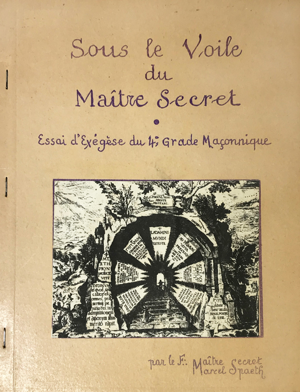
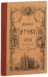
Very Good Turkish, Ottoman (1500-1928) Original color map of Eastern Anatolia, Dogu Beyazit, Bayazid, Bargiri, Nakhchevan, Karakilise, Van, etc. 50x60 cm. In Ottoman script (Enverî). 1 p. Scale: 1:200.000. Slightly toned, several small holes on paper. Otherwise a very good copy. Enverî script is the war minister Enver Pasha's alphabet and writing amendment, which he tried to implement within the Ministry of War between 12 March 1914 and 10 August 1914. Starting from the Tanzimat (Westernization) period in the Ottoman Empire, the discussions on simplification in language, writing, alphabet and reading-writing had increased and at the end of the 19th century, military necessities also became one of the concerns. The problems such as the low rate of literacy among the recruited soldiers, the need to teach the soldiers how to read and write in a short time, and their misconceptions about the spelling of proper nouns led Enver Pasha to add the writing problem to his reform agenda, once he took office. Enver Pasha's reform is based on the principle of writing the Ottoman letters, which take different forms in the beginning, in the middle and at the end according to their unification with the other letters, separately in their original state without merging them. While this new alphabet was being created, the existing 32 letters in the Ottoman were preserved. The 8 vowels in the Turkish language, which could not be written with the old letters, was shown by placing small marks on the existing vowels and by doing so a new alphabet consisting of a total of 40 letters was created. With this alphabet, officially called 'Ordu Elifbasi', rules were adopted such as writing of the letters without merging them, writing the words as they are pronounced. At first glance, Enver Pasha's writing reform, which appeared as a definite solution to the theory of the solution of the ongoing debates on the alphabet and the spelling, formed a wide experiment field in the military. It was not possible to use Ordu Elifbasi, which essentially is a transliteration alphabet that allows transferring the sounds of these three different languages (Turkish, Arabic, Persian) to a single alphabet, in the daily life. Thanks to this new alphabet and spelling, learning to read and write were accelerated to some extent. However, it was seen that the literacy rate of the well-educated, literate people fell to the spelling and did not even progress. This alphabet and spelling reform, which Enver Pasha thought of spreading to the whole country, caused much more problems as it was experienced in the army. Although it was postponed until the end of the mobilization period following the declaration of the mobilization, Ordu Elifbasi, which remained in force for 152 days, eventually failed to be realized. (Source: Karakus: Enver Pasha's Alphabet And Spelling Attempt: Ordu Elifbasi (Army Alphabet)).In this extremely rare document, there are some articles and thoughts on a case. This is one the serie of the Bonn projection maps which are the first map series in modern techniques in Turkey and the Ottoman Empire. In order to produce these maps covering Turkish territory, Reconnaissance Branch was incorporated into The Mapping Commission. The maps were produced in the datum based on the latitude and longitude of Ayasofya Mosque in equal area Bonn Projection. The field works for the 123 sheets covering the country were conducted by 76 staff. The production was completed in 18 years starting from east west. Field works continued without stopping except in years 1914 and 1920. This map series called also reconnaissance maps contributed a lot to producing 1:25.000 scale maps. Extremely rare. KW: "Harfleri Islah Cemiyeti" Hurûf-i munfasila Reform Turkish Letter revolution First World War WW 1 Map Geography Military maps.
1918271847B.G. Teubneri Leipzig 1918. Softcover Großformat Folgende Bände sind hier angeboten: Onomasticon Vol III Fasc: III. 1918 1923 Index Librorum Scriptorum Inscriptionum ex Quibus Exempla Adferuntur Supplementum 1958 Vol X1 Fasc IIIIII 1986IVVIII. Vol X2 Fasc IIIIIIIVV 1987. Zustand: keine Beschädigungen keine Eintragungen. Rücken Ecken Kanten gut. B.G. Teubneri, Leipzig, paperback
42242ABLondon, The Childrens Friend, o.J. Folio. Ca. 30 nn. Bll. mit zahlr. Abbildungen. Halbleinwand. Farb. Deckelillustration. Half cloth. Coloured images on boards. Stark ber. u. best., 1 Ecke geknickt, 1 Ecke m. Fehlst. Etw. gebr. u. fl., Buchblock u. Bindung lose. Rubbed and bumped, 1 corner missing. Slightly browned and stained, bookblock loose.
D16823Amsterdam: Willem Coertse. First Edition. Hardcover. Very Good. c. 1790 8vo original printed boards untrimmed rebacked rubbing; early ownership inscription on front pastedown. pp. 78. 12 engraved plates each with two illustrations comprising an alphabet series of captioned designs. Printed on nice paper contents are quite fresh. <br/><br/> Willem Coertse hardcover
1711PHO-1260Amsterdam , chez Paul Marret, 1711 , 2 Vol. in-2 (15,5x 10 cm), 320 pp. et 358 pp.,illustré de 2 frontispices et 4 planches dépliantes dont 3 cartes , titre rouge et noir , relié plein cuir époque ,Tome 1 dos absent , frottements , tome 2 , frottements et petit manque au plat. Piqures au titre , tome 1.