15 453 résultats
- Boussod, Valadon & Cie, Paris s.d (1889), in-plano (41x59cm), en feuilles sous portefeuille de l'éditeur. - 15 lithographies d'après Degas [15 lithographs after Degas] Boussod, Valadon & Cie | Paris [1889] | folio (41 x 59 cm) | loose leaves under the publisher's portfolio First and only edition published of this remarkable set of 15 original lithographs from the post-impressionist painter George William Thornley, only 100 copies printed. Publisher's portfolio bound in boards very skilfully restored. 14 of the 15 lithographs are printed in colour (black, blue, green, mauve and different browns) on broadside China paper laid on pale blue thick paper, one is directly printed on thick paper. All except the last, bear the stamp of Thornley's signature with the words "Chez Mrs Boussod & Valadon - 19 Bd Montmartre" and "Imp. Becquet frères à Paris". "In 1888, George William Thornley was commissioned to produce a series of lithographs based on the works of Degas. These lithographs go well beyond the reproduction quality of the renowned publisher. They also demonstrate the high level of collaboration between Degas and Thornley. Thornley first selected the works to publish, made the necessary changes in the preparatory drawings and even interrupted the printing at times so that improvements could be made. "The importance of Thornley's engravings in Degas' work is particularly highlighted by the book dedicated to Degas by JS Boggs and published by the Metropolitan Museum of New York; a publication in which we find several of the engravings presented in the collection." (Chantal and Guy Heytens) We have only identified two copies in libraries: one in the Bibliothèque nationale de France and the other in the Institut national d'histoire de l'art. [FRENCH VERSION FOLLOWS] Édition originale et seule parue de cette remarquable suite de 15 lithographies originales du peintre post-impressionniste Georges William Thornley, imprimée à seulement 100 exemplaires. Portfolio cartonné de l'éditeur très habilement restauré. Quatorze des quinze lithographies sont imprimées en couleurs (noir, bleu, vert, mauve et différents bruns) sur papier de Chine volant appliqué sur papier fort bleu pâle, une seule est directement imprimée sur le papier fort. Toutes à l'exception de la dernière, portent le cachet de la signature de Thornley avec les mentions «?Chez Mrs Boussod & Valadon - 19 Bd Montmartre?» et «?Imp. Becquet frères à Paris?». «?En 1888, Georges William Thornley se vit passer commande d'une série de lithographies d'après les uvres de Degas. Ces lithographies vont bien au-delà de la qualité de reproduction de l'illustre éditeur. Elles démontrent aussi le haut degré de collaboration entre Degas et Thornley. Ce dernier sélectionna tout d'abord les uvres à éditer, effectua les changements nécessaires dans les dessins préparatoires et interrompit même parfois l'impression afin que des améliorations puissent être encore apportées. L'importance des gravures de Thornley dans l'uvre de Degas est tout particulièrement mise en lumière par l'ouvrage consacré à Degas par J.-S. Boggs et édité par le Metropolitan Museum de New York ; publication dans laquelle nous retrouvons plusieurs des gravures présentées dans la collection.?» (Chantal et Guy Heytens) Nous n'avons recensé que deux exemplaires en bibliothèque?: un à la BNF et un à l'INHA.
8413African Sculpture. KIFWEBE MASK - SONGE CONGO. Wood carved and polychromed. About 23 inches 580mm. tall 12 inches 305mm. at widest point 11 inches 280mm deep. Hollowed protruded eyes and mouth straight nose extending from crest at top incised all over with parallel striations painted in red white and black and with pieced holes for attachment around the perimeter. A fine example of this monumental style mask with strong patination and in excellent condition. Antique. Compare Sothebys Sale NO8095 December 2005 lot 84 our picture 6. unknown
Tre voll., cc. (1), (9), (1) tav. ripiegata, 60 tavv. (v.1); cc. (17), (1) tav., 60 tavv.; cc. (11), (1) tav., 60 tavv. Molte tavole presentano degli appunti a matita con riferimenti numerici; molto probabilmente riferibili allo stesso Cavaceppi. Potrebbe trattarsi di riferimenti ad un suo inventario personale o forse anche di prezzi. Prima e unica edizione di questa rara opera, una sorta di “catalogo ragionato ante litteram” voluto e prodotto dal più importante restauratore di sculture del Settecento, il romano Bartolomeo Cavaceppi (1716-1799), personaggio originale nella sua triplice veste di imprenditore/restauratore/studioso, e centrale non solo nella nascente cultura del restauro, ma proprio tout court nello scenario della storia dell’arte e nel dibattito artistico del suo tempo. I tre volumi, prodotti separatamente fra il ’68 e il ’72, hanno un’importanza che concorre solo con la loro estrinseca bellezza, un totale di oltre 180 incisioni a piena pagina che fin dall’inizio e probabilmente pure nell’intenzione editoriale, furono destinate a essere vendute anche separatamente, e dunque rarissime da trovare rilegate integralmente come nel presente insieme. I tre volumi, nella parte iconografica e testuale, hanno enorme importanza nella storia del restauro, ma più in generale nella storia dell’arte e della scultura, sia per il loro opulento apparato iconografico, sia per la parte di testo, testo che precede ciascuna delle tre raccolte e consiste di una serie di monografie destinate a discutere (e risolvere) questioni sul restauro e sul commercio dell’antichità molto dibattute all’epoca di questi scritti e già affrontate, ma solo in parte, circa il restauro di dipinti. Chiaramente le questioni teoriche sul restauro di sculture estende l’orizzonte temporale del dibattito, che riguardava fino allora solo dipinti e affreschi, e quindi opere d’arte non altrettanto antiche. Non meno originale è l’intento commerciale che spinse l’autore alla creazione di questo libro: già noto e apprezzato (e ricco) al tempo della pubblicazione del primo volume, Cavaceppi cataloga i suoi restauri anche con lo scopo di reclamizzare la qualità del suo lavoro e vendere le opere stesse (quelle pubblicate nel primo volume erano già state tutte vendute o quasi, mentre nel secondo quelle acquistabili sono almeno 41 e nel terzo 23). La parte testuale conferma quest’intenzione: la “Raccolta è destinata a un pubblico selezionato di sovrani, nobili, collezionisti specialmente inglesi e tedeschi rispetto ai quali l’autore cerca da un lato di accreditare la propria elevatissima professionalità, dall’altro di porsi su un piano collaborativo, fornendo ad esempio indicazioni utili a smascherare i falsi” (si veda Meyer, S.A. - Piva, C., “L’arte di ben restaurare. La ‘Raccolta d’antiche statue di Bartolomeo Cavaceppi”, 2011). La scelta e lo svolgimento degli argomenti che costruiscono la parte di testo sostiene, insomma, l’originalità dell’operazione editoriale: di seguito a un’introduzione, contenuta in ciascun volume con testo diverso, e diretta “Agli amatori dell’antica scultura”, l’autore entra subito, nel primo volume, in argomento con un saggio, “Dell’arte di ben restaurare le antiche statue”, che è insieme premessa teorica al lavoro di restauratore e autopromozione del suo lavoro e della sua bottega; nel secondo volume (stampato nel ’69) troviamo un altro scritto “Degli inganni che si usano nel commercio delle antiche sculture” volto chiaramente a rassicurare possibili mecenati, collezionisti e clienti, nonché quello che poi sarebbe stato lo scritto più noto del C., ovvero la “Descrizione del viaggio in Germania” compiuto nel ’68 insieme all’amico Winckelmann: viaggio che sarebbe stato, fra l’altro, l’ultimo episodio della vita del W., assassinato a Trieste proprio sulla via del ritorno verso Roma; l’omicidio di Winckelmann ebbe un’eco enorme all’epoca, e la tempestiva pubblicazione del resoconoto di questo tour, compiuto dai due nelle corti tedesche prima appunto della morte dell’archeologo tedesco, era destinata a suscitare un’enorme curiosità (al punto che di tutto il libro questo testo è l’unico che sarebbe stato, negli anni, ristampato autonomamente). Interessantissimo è il saggio introduttivo al terzo volume nel quale C. entra nel merito di un dibattito ancora “in fasce” come quello sul restauro conservativo o interpretativo, e si spinge a formulare dettagliate indicazioni su come e quanto un pezzo d’arte antica debba essere valutato (“Una bella Testa Imperiale, che non abbia altro ristauro che la punta del naso […] suol valutarsi ordinariamente Zecchini cinquanta. Se poi la medesima fosse affatto intatta, potrebbe stimarsi il doppio. Una Testa Greca vale sempre di più”, ecc. ecc.). A sostegno dell’originalità dell’operazione editoriale, è stato anche notato come “Cavaceppi rinuncia a porre la sua opera […] sotto la protezione di qualche mecenate e la dedica Agli Amatori dell’antica scultura. Una scelta coraggiosa. Come quella di rivolgersi a un editore che era stato incarcerato per aver pubblicato libri di orientamento anticuriale. Rivendica con fierezza la sua professione di restauratore. Pur se, riferisce Giovanni Gherardo De Rossi, ‘gli movevano guerra gli artisti di quel tempo, e lo chiamavano scarpellinello della scultura, ma egli ne rideva, e contentavasi di essere piuttosto abile ciabattino che imperito calzolajo’” (Meyer-Piva, cit.). Di ciascuno di questi volumi sono state stampate due diverse tirature: la parte iconografica è identica, mentre la parte testuale è stata ricomposta; è ragionevole pensare, in base a riscontri testuali, che la presente copia sia quella stampata per prima, visti gli interventi di pulizia tipografica chiaramente determinati dall’autore e riportati nell’altra serie d’impressioni, che sembrerebbe essere più comune di questa. La Raccolta fu pubblicata in tre volumi fra 1768 e 1772. Per la precisione il primo volume è del 1768, il secondo del 1769 e il terzo del 1772. La prima cosa da dire è che l’apparato iconografico vi gioca sicuramente un ruolo fondamentale: ogni volume contiene infatti sessanta tavole che presentano altrettante statue antiche restaurate da Cavaceppi, con l’indicazione degli eventuali acquirenti (le opere pubblicate nel primo volume erano già state tutte vendute; nel secondo sono acquistabili quarantuno lavori e nel terzo ventitre). Ogni “album” è accompagnato da una serie di scritti; a volte si tratta di veri e propri brevi trattati; in altre circostanze di avvertenze al pubblico; in altre ancore di scritti chiaramente volti a soddisfare la curiosità del lettore. Ciò che importa segnalare è che gli scopi della pubblicazione sono chiaramente autopromozionali. Cavaceppi è uno scultore (anzi, un restauratore – vedremo meglio poi - ) di fama internazionale, e la sua Raccolta è destinata a un pubblico selezionato di sovrani, nobili, collezionisti specialmente inglesi e tedeschi rispetto ai quali l’autore cerca da un lato di accreditare la propria elevatissima professionalità, dall’altro di porsi su un piano collaborativo, fornendo ad esempio indicazioni utili a smascherare i falsi. Decisamente sperimentale dal punto di vista editoriale, la Raccolta […] unisce un catalogo promozionale delle sculture restaurate dall’autore (per la verità, almeno per il primo volume tutte le opere illustrate erano già state vendute al momento della stampa) con una serie di considerazioni teoriche non solo sul restauro, ma più in generale sulla storia dell’arte e del gusto. «Gli movevano guerra gli artisti di quel tempo, e lo chiamavano scarpinello della scultura, ma egli ne rideva, e contentavasi di essere piuttosto abile ciabattino che imperito calzolajo» Come ha già da tempo rilevato Orietta Rossi Pinelli, Cavaceppi si presentò quale «primo restauratore-scultore capace di imporsi nel panorama artistico come figura di specialista oramai equiparata sul piano della dignità professionale a quella degli artisti-creatori» Cavaceppi rinuncia a porre la sua opera […] sotto la protezione di qualche mecenate e la dedica Agli Amatori dell’antica scultura. Una scelta coraggiosa. Come quella di rivolgersi a un editore che era stato incarcerato per aver pubblicato libri di orientamento anticuriale. Rivendica con fierezza la sua professione di restauratore. Pur se, riferisce Giovanni Gherardo De Rossi, «gli movevano guerra gli artisti di quel tempo, e lo chiamavano scarpellinello della scultura, ma egli ne rideva, e contentavasi di essere piuttosto abile ciabattino che imperito calzolajo» https://warburg.sas.ac.uk/pdf/ckn1102v1.pdf https://catalogue.libraries.london.ac.uk/record=b2238065 Three vols., Cc. (1), (9), (1) pl. folded, 60 plates (v.1); cc. (17), (1) pl., 60 pl .; cc. (11), (1) pl., 60 pl. Many tables have pencil notes with numerical references; most likely referable to Cavaceppi himself. It could be references to his personal inventory or maybe even prices. Scattered light foxing. First and only edition of this rare work, a sort of "catalogue raisonné ante litteram” wanted and produced by the most important sculptor restorer of the eighteenth century, the Roman Bartolomeo Cavaceppi (1716-1799), an original character in his triple role as entrepreneur / restorer / scholar, and central not only in the nascent culture of restoration, but tout court in the scenario of the history of art and in the artistic debate of his time. The three volumes, produced separately between '68 and '72, have an importance that concurs only with their extrinsic beauty, a total of over 180 full-page engravings that from the beginning and probably also in the editorial intention were destined to be sold also separately, and therefore very rare to find fully bound as in the present set. The three volumes, in the iconographic and textual part, have enormous importance in the history of restoration, but more generally in the history of art and sculpture, both for their opulent iconographic apparatus, and for the text part, text that precedes each one of the three collections and consists of a series of monographs intended to discuss (and resolve) issues on the restoration and trade of antiquity much debated at the time of these writings and already addressed, but only in part, about the restoration of paintings. Clearly the theoretical questions on the restoration of sculptures extends the temporal horizon of the debate, which until then only concerned paintings and frescoes, and therefore works of art that were not as ancient. No less original is the commercial intent that prompted the author to create this book: already known and appreciated (and rich) at the time of the publication of the first volume, Cavaceppi catalogs his restorations also with the aim of advertising the quality of his work and sell the works themselves (those published in the first volume had already been sold or almost all, while in the second there are at least 41 purchasable works and in the third 23). The textual part confirms this intention: the "Collection is intended for a selected audience of sovereigns, nobles, especially British and German collectors with respect to whom the author tries on the one hand to accredit his very high professionalism, on the other to put himself on a collaborative plan, providing for example useful information to unmask the false "(see Meyer, SA - Piva, C.," The art of well-restored. The 'Collection of ancient statues by Bartolomeo Cavaceppi ", 2011). The choice and development of the arguments that make up the part of the text supports, in short, the originality of the editorial operation: following an introduction, contained in each volume with a different text, and directed "To the amateurs of ancient sculpture" , the author immediately enters, in the first volume, on the subject with an essay, “On the art of well restoring the ancient statues”, which is both a theoretical premise to the work of restorer and self-promotion of his work and his workshop; in the second volume (printed in '69) we find another writing "Of the deceptions that are used in the trade of ancient sculptures" clearly aimed at reassuring possible patrons, collectors and customers, as well as what would later be the most famous writing of Cavaceppi, or the "Description of the trip to Germany" made in '68 together with his friend Winckelmann: a trip that would have been, among other things, the last episode in Winckelmann’s life, as he was murdered in Trieste on the way back to Rome; Winckelmann's murder had a huge echo at the time, and the timely publication of the account of this tour, carried out by the two in the German courts before the death of the German archaeologist, was destined to arouse enormous curiosity (to the point that of the whole book this text is the only one that would have been reprinted independently over the years). The introductory essay to the third volume in which Cavaceppi enters into the merits of a debate still "in its infancy" such as the one on conservative or interpretative restoration is very interesting, and goes on to formulate detailed indications on how and how much an ancient art piece should be evaluated ("A beautiful Imperial Head, which has no other restoration than the tip of the nose [...] usually in Zecchini is evaluated as fifty. If the same were completely intact, it could be estimated twice as much. A Greek Head is always worth more", etc. . etc.). In support of the originality of the publishing operation, it was also noted how "Cavaceppi renounces placing his work [...] under the protection of some patron and dedicates it to the Amateurs of ancient sculpture. A courageous choice. Like turning to a publisher who had been jailed for publishing anti-curial books. He proudly claims his profession as a restorer. Although, reports Giovanni Gherardo De Rossi, 'the artists of that time waged war on him, and called him a stonecutter, but he laughed at it, and was content to be rather a skilled cobbler than an imperishable shoemaker' "(Meyer-Piva, cit. ). Two different editions of each of these volumes have been printed: the iconographic part is identical, while the textual part has been recomposed; it is reasonable to think, based on textual evidence, that this copy is the one printed first, given the typographic cleaning interventions clearly determined by the author and reported in the other set of impressions, which would seem to be more common than this one. As Orietta Rossi Pinelli had already pointed out for some time, Cavaceppi presented himself as "the first restorer-sculptor capable of establishing himself in the artistic panorama as a figure of specialist now equated in terms of professional dignity to that of artists-creators". https://warburg.sas.ac.uk/pdf/ckn1102v1.pdf https://catalogue.libraries.london.ac.uk/record=b2238065
- Paris 1930-1952, formats divers ; cahier 18,1x22,3cm , 11 photographies et un cahier de 45 ff.. - Exceptional set of archives from the Rudier foundry: a manuscript register of castings (45 leaves and 8 loose leaves) and a set of 11 original silver print photographs. Housed in a box covered with a decorative paper. Register bound in a cloth, first cover detached; consolidated with a re-used cover from an insurance company sheet. Numerous tears on the covers, tears on a few pages not affecting the text, a few pages loose. Extremely rare documents, to our knowledge unique set of archives to have survived the destruction of the molds and records of the Rudier foundry in 1952. The only other archives known to date only concern castings commissioned by the Rodin Museum. Precious visual and manuscript archives of a place where both Rodin's and Giacometti's Walking Man were first cast into bronze. This exceptional notebook records the genesis of Cubist works of art, as well as timeless creations of Rodin and wonderful pieces of Art Deco sculpture. Probably kept by a worker of the Rudier foundry between 1930 and 1952, this register of mostly bronze casts records an important part of 20th-century art history - the only surviving chronicles of the foundry where some of the most famous sculptures in modern art were made and are now exhibited in major museums and private collections. The notebook records the casts of Giacometti masterpieces: L'Homme au doigt (1947), Grande Figure (1949), La Place (1950), Buste d'Homme (1950), La Roue de la fortune (1950) tracing back to his very first sculpture ever cast by Rudier (Femme couchée qui rêve, 1931). And casts of major Rodin sculptures, whom Rudier was the official founder: The Thinker, Monument to Balzac are recorded numerous times on the register and appear on two unpublished photographs taken at the foundry. Includes a lot of entries for castings of Rodin's Kiss, sculptures from The Gates of Hell, The Burghers of Calais and The Age of Bronze. Also contains numerous entries for artworks by Bourdelle, Maillol, Zadkine, Renoir, Pompon, Jean Joachim, Paul Manship, Edgar Brandt, as well as Chana Orloff, Germaine Richier, Marie-Louise Simard, Céline Emilian, Claire Colinet ou Malvina Hoffmann, and many more. 11 unpublished photographs (described at the end), only one was featured in L'Art et les artistes, 1936. These rare photographs show works by Rodin, his pupil Jules Desbois, and masterpieces of Art Deco sculpture by Antoine Bourdelle (Vierge à l'Offrande) and Joseph Bernard (Femme à l'enfant). In other photographs, foundry workers proudly pose next to major Parisian monuments, including a Wederkinch monument near the Eiffel Tower, a deer from the Versailles gardens restored at the foundry, the statue of Albert I (place de la Concorde), or a monumental angel from the Sacré-Coeur Church in Gentilly. This collection offers a unique view inside a major place of artistic creation. The foundry thrived under the direction of Eugène Rudier, who became Rodin's appointed founder and was an undisputed master of the delicate art of sand casting (Laurence Betrand-Dorléac, The Art of Defeat (1940-1944)). He maintained a long and fruitful collaboration with world-renowned artists. Rudier gave Antoine Bourdelle shelter in his property, where he died in 1929. In 1947, Giacometti commissioned him to cast his very first Walking Man and visited him to admire his many Rodin sculptures: "One autumn day in 1950, Giacometti found himself in the park of the foundryman Eugène Rudier at Le Vésinet, and could not resist gazing at Eustache de Saint Pierre, one of the valiant Burghers of Calais [...] This irruption of the "Grison" sculptor into one of Rodin's most emblematic works demonstrates once again his admiration for this great genius." The notebook (48 leaves) was certainly written by one of the foundry workers who worked for several decades in the Rudier atelier, providing precious information on the castings
- Pitois-Levrault et Cie, Paris 1839, volume de texte : 13x21cm / atlas : 24x28,5cm, 2 volumes reliés. - De la loi du contraste simultané des couleurs, et de l'assortiment des objets colorés, considéré d'après cette loi Pitois-Levrault et Cie | Paris 1839 | text: 13 x 21 cm / plate volume: 24 x 28.5 cm | contemporary calf The first edition, complete with the two folding tables in the text volume. The second volume has 40 plates, making up a hundred or so illustrations, partly coloured and all signed by Chevreul. These show examples of colour contrasts through lithographed colour spots on light or dark backgrounds. At the end of this volume, there is also a text by Condorcet printed on 9 different-coloured leaves. Contemporary half light-brown calf, spine with fillets in gilt and blind, gilt dentelle at head and foot, marbled paper pastedowns and endpapers. Plate volume in half-cloth Bradel binding. An internationally renowned chemist, member of the Royal Society and director of the Natural History Museum, Michel-Eugène Chevreul was inspired by his lectures at the Gobelins tapestry workshops to write this foundational work on colour theory. This work, of key scientific importance, also had a significant impact on the applied arts (textiles, glass, and so on) and painting. Chevreul's chromatic circles inspired the Impressionists (especially Seurat) and later also the Neo-Impressionists like Sonia and Robert Delaunay. Paul Signac acknowledged his debt in his famous essay D'Eugène Delacroix au Néo-impressionnisme (1899): "During a visit we made to Chevreul at the Gobelins in 1884, which was our initiation into the science of colours, the learned sage told us that around 1850, Delacroix, whom he didn't know, wrote to him expressing the desire to debate with him the scientific theory of colours and ask him about several things that were still troubling him. Unfortunately, Delacroix's permanent sore throat prevented him from going out on the appointed day, and they never met. Perhaps, otherwise, the sage would have enlightened Delacroix even further." Rare complete copy of this work, which played a fundamental role in the evolution of modern painting. [FRENCH VERSION FOLLOWS] Édition originale. Exemplaire bien complet des deux tableaux dépliants du volume de texte et des 40 planches de l'atlas présentant une centaine de figures partiellement coloriées et toutes signées par Chevreul. Elles montrent des exemples de contrastes de couleurs à partir de points colorés lithographiés sur fonds clairs ou sombres. À la fin de ce même volume se trouve un texte de Condorcet imprimé sur 9 feuillets de couleurs différentes. Reliure de l'époque en demi veau lavallière, dos lisse orné de filets dorés et à froid, dentelle dorée en tête et en queue, gardes et contreplats de papier caillouté, reliure de l'époque. Atlas en demi percaline à la bradel. Chimiste de réputation internationale, membre de la Royal Society et directeur du Museum d'histoire naturelle, Michel-Eugène Chevreul s'inspira de ses conférences sur les tapisseries à la manufacture des Gobelins pour réaliser cet ouvrage fondateur de la théorie des couleurs. Ce travail, d'une importance scientifique capitale, eut également une influence considérable sur les arts appliqués (tissus, vitraux...) et la peinture. Les cercles chromatiques de Chevreul inspirèrent les impressionnistes (notamment Seurat) et plus tard les néo-impressionnistes comme Sonia et Robert Delaunay. Paul Signac reconnut sa dette dans son fameux essai, D'Eugène Delacroix au Néo-impressionnisme (1899)?: «?Lors d'une visite que nous fîmes à Chevreul, aux Gobelins, en 1884, et qui fut notre initiation à la science de la couleur, l'illustre savant nous raconta que, vers 1850, Delacroix, qu'il ne connaissait pas, lui avait, par lettre, manifesté le désir de causer avec lui de la théorie scientifique des couleurs et de l'interroger sur quelques points qui le tourmentaient encore. Malheureusement le perpétuel mal de gorge dont s
- Chez J.-E. Bulloz, à Paris 1903, 37x48cm, en feuilles sous chemise. - Les Portraits dessinés de J.-A.-D. Ingres [Ingres's portraits] Chez J.-E. Bulloz | à Paris 1903 | 37 x 48 cm | loose leaves with custom slipcase The very rare first edition, consisting of only 100 numbered copies, the text on Arches paper with 100 charcoal portraits laid down on thick grey-blue paper, margins slightly soiled, gilt listel frame to each portrait, Bulloz stamp to lower right. This copy has a half red morocco chemise with flaps, spine soiled, double gilt fillet to covers, title giltstamped on upper cover, cloth and paper flaps heavily damaged (lower flap lacking), headpieces rubbed with lacks to head and foot of joints, corners rubbed, ties lacking. Portraits of political and intellectual figures from the 19th century. The majority of the illustrations are signed and dated in the plate. These reproductions were mostly done after works in private collections. A noted specialist on Ingres, Henry Lapauze (1867-1925) notes in his introduction, «Thus these fantastic portraits, most of which are jealously guarded as family heirlooms or are the pride of private collections, become a national treasure that all may look upon.» Lapauze's main goal was to allow a broader public to become better acquainted with Ingres' work at a time when culture was elevated into the ranks of the French national heritage by the Third Republic. It was thus that Jean-Auguste-Dominique Ingres' (1780-1867) work once more awoke the interest of art historians and the general public at the turn of the 20th century. These one hundred portraits make up a visual gallery of Ingres' circle. Lapauze thinks it is of little importance whether or not readers are familiar with the people portrayed, since the painter's genius is enough to get across the «master's glorious talent» and to ensure «the delight of people of good taste». Ingres is thus elevated into a genius of 19th century French painting. A very rare copy of the first edition of one hundred portrait drawings by Ingres. [FRENCH VERSION FOLLOWS] Les Portraits dessinés de J.-A.-D. Ingres [Ingres's portraits] Très rare édition originale tirée à seulement 100 exemplaires numérotés, texte sur Arches accompagné de 100 portraits réalisés au charbon et encollés sur papier fort gris-bleu, aux marges légèrement passées, listel doré en encadrement de chaque portrait, cachet de Bulloz en bas à droite. Notre exemplaire est présenté sous chemise à rabats en demi maroquin à coins bordeaux, dos lisse muet passé, double filet doré sur les plats, titre estampé à l'or sur le premier plat, rabats de percaline et papier fortement endommagés (rabat inférieur manquant), coiffes frottées avec manques en tête et en pied des mors, coins émoussés, rubans de fermeture manquants. Portraits des personnalités politiques et intellectuelles du XIXème siècle. La majorité des planches sont datées et signées dans la planche. Ces reproductions ont pour la plupart été exécutées d'après des uvres détenues par des collectionneurs privés. Spécialiste reconnu d'Ingres, Henry Lapauze (1867-1925) note dans l'introduction « Ainsi ces portraits merveilleux, dont la plupart sont jalousement gardés comme des monuments de famille, ou font l'orgueil de collections privées, deviennent un trésor national, que tous pourront contempler ». L'objectif principal de Lapauze est de permettre aux uvres d'Ingres d'être mieux connues du grand public à une époque où la culture est érigée au rang de patrimoine national par la Troisième République. C'est ainsi que l'uvre de Jean-Auguste-Dominique Ingres (1780-1867) éveille à nouveau l'intérêt des historiens d'art et du public au début du XXème siècle : ces cent portraits offrent une galerie visuelle de l'entourage de Dominique Ingres ; que les personnalités portraiturées soient connues ou non des lecteurs, Lapauze considère que cela importe peu dans la mesure où le génie du peintre suffit à « la gloire du maître » et à la « délec
- Bruxelles 9 janvier 1965, 13,5x20,5cm, deux pages sur un feuillet. - Handwritten letter, signed with his initials Brussels 9 January 1965, 13,5 x 20,5 cm, two pages on one leaf Significant letter written by René Magritte to André Bosmans, dated 9 January 1965 and signed with his initials. 35 lines in black ink on one leaf with the heading "René Magritte 97, rue des Mimosas, Bruxelles 3 Téléphone 15.07.30". Several words crossed out and passages underlined. Published in the Lettres à André Bosmans 1958-1967, Seghers I. Brachot, 1990, pp. 407-408 A letter that is both comical and of great philosophical depth, in which the Surrealist painter René Magritte tackles the question of the imagination and inspiration. In it there is a very pertinent analysis of the issues of aesthetics and of modern thinking, while the painter is seeking inspiration to produce the cover of the next XXe siècle, an avant-garde artistic and literary journal (issue XXV, June 1965). Magritte addresses this letter to his great friend André Bosmans, a school teacher, poet and editor-in-chief of Rhétorique, a literary journal to which Magritte actively contributed. The painter, then in full mastery of his art, enjoyed international recognition since the beginning of the 1960s. His work has already been the object of numerous retrospectives in France and in Belgium, and will be celebrated on the other side of the Atlantic several months later at the Museum of Modern Art in New York. His letter is divided between humour and psychological reflection. Magritte's usual taste for irony is present: "Here is the extract from the newspaper La Meuse. The serious advice to pregnant women becomes comical when it accompanies this reproduction of a gouache made about thirty years ago. This is probably 'humour' for serious people?" A daily paper in Liège had indeed taken a Surrealist gouache painting by Magritte, entitled Maternité, where the mother was represented with a baby's face and the baby with the face of a woman, for one of its articles. After this aside, Magritte provides Bosmans with a draft painting earmarked for a journal (reproduced below): "I don't know yet what I will paint for the cover of the next XXe siècle". The art journal Le XXe siècle was founded in 1938 by an Italian journalist reporting in Paris, Gualtieri di San Lazzaro, and appeared in the form of an annual notebook on modern art trends, embellished with lithographs and original works. Magritte featured alongside Giorgio de Chirico, his idol, and also Kandinsky, Jean Arp and Joan Miro, as well as numerous other pioneering artists or heirs to Surrealism. Each issue was dedicated to a different current subject, with contributions from critics, artists and writers. Magritte dissects the title of the next issue for Bosmans ("Aux sources de l'imaginaire" "To the sources of the imaginary"), which according to him, symbolises an entire era that has become the subconscious slave since the Surrealist revolution:"'The imaginary' perhaps now replaces 'the ideal' of a previous era. Instead of an ideal museum, it is now an imaginary museum. I believe the proper expression would be: inventory or catalogue of the perfect museum." Taking André Malraux's well-known paradigm, the "musée imaginaire" "imaginary museum," Magritte emphases the transition from romanticism to Surrealism: this replacement of the pursuit of an ideal through the opening up on to dreams and the accidental. He also criticizes the XXe siècle's pompous expression: "It is the mediocre imaginary that is responsible (the source, speaking figuratively like the XXe siècle) for that which only has an imaginary value." Because for Magritte, there is a fundamental distinction between the imaginary and imagination, between dreams and creation. For this artist, who is profoundly sensitive to the paradoxes of reality and the role of mystery in life and in art, the imagination is nothing without being creative. His paintings based on "hallucinated
- Jacques Povolozky & Cie & Der Sturm, Paris & Berlin s.d. (circa 1915), 25x34,5cm, en feuilles reliées par deux noeuds tressés. - Sturm livre d'images N° V : Les Peintres expressionnistes Jacques Povolozky & Cie & Der Sturm | Paris & Berlin [ca 1915] | 25 x 34.5 cm | loose leaves bound with two strings Very rare first issue of this periodical, the mouthpiece of German Expressionism founded by Herwarth Walden in 1910. Text by Rudolf Blümmer. One tear at the bottom of the spine, another at the head, pale angular damp stain on the marginally discoloured covers, the text sheet tends to come apart. A fragile set held together by two strings. Illustrated catalogue of 15 colour reproductions of artworks, laid on thick black paper by Marc Chagall (3 works), Wassily Kandinsky (2), Alexander Archipen ko (1), Rudolf Bauer (1), Albert Gleizes (1), Reinhard Goering (1), Jacoba von Heemskerck (1), Paul Klee (1), Fernand Léger (1), Franz Marc (1), Johannes Molzahn (1) and Nell Walden (1). [FRENCH VERSION FOLLOWS] Très rare édition originale du numéro de cette revue porte-parole de l'expressionnisme allemand fondée par Herwarth Walden en 1910. Texte de Rudolf Blümmer. Une déchirure en pied du dos, une autre en tête, piqûre et pâle mouillure angulaire sur les plats marginalement décolorés, le feuillet de texte tend à se désolidariser, ensemble fragile maintenu par deux ficelles. Catalogue illustré de 15 reproductions en couleurs d'oeuvres, montées sur papier fort noir, de Marc Chagall (3 oeuvres), Wassily Kandinsky (2 ), Alexander Archipenko (1), Rudolf Bauer (1), Albert Gleizes (1), Reinhard Goering (1), Jacoba von Heemskerck (1), Paul Klee (1), Fernand Léger (1), Franz Marc (1), Johannes Molzahn (1) et Nell Walden (1).
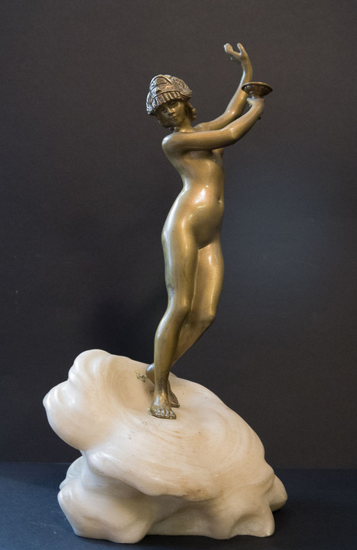
12261DBo.J. Georges Charles Coudray, geboren am 31. Januar 1862 in Paris, gestorben 1932. Französischer Bildhauer. Seine Bronzen sind häufig Darstellungen von jungen eleganten Frauen oder aus mythologischen Motiven, hauptsächlich im Art nouveau. [7 Warenabbildungen]
13273DBo.J. [3 Warenabbildungen]
- AMIEL Léon, Paris, New-York 1966, 36x49.5cm, une feuille. - CHAGALL Marc. For the cloude of the Lorde was upon the Tabernacle by day, and fire was in it by night, in the sight of all the house of Israel thorowout all their journeys - The Story of Exodus Amiel Léon, Paris, New-York 1966, 36 x 49.5 cm, one single leaf Original color lithograph, one of 15 proofs on Japon impérial paper reserved for the artist and his collaborators, the only printing with 20 more on Japon and 250 on Arches paper. Unsigned proof, as all proofs in this series, other than the frontispiece. A superb proof on Japon paper specially made for The Story of Exodus, published in 1966, for which Chagall made 24 hors-text lithographs printed by Mourlot. An exceedingly rare original proof on Japon paper, the most attractive and best for color lithographs. Fernand Mourlot was undoubtedly the finest lithographic printer of the 20th century and was thus the friend and printer to the leading artists of his day. "Picasso, Matisse, Chagall, Miró, Braque, Dubuffet, Léger, Giacometti...added to their own expression and contemporary art a new field of research. With Mourlot, and thanks to him, lithography acquired both a personality and a future" (Pierre Cabanne, in Cinquante années de lithographie). Having already printed two volumes of the Bible illustrated by Chagall, Mourlot contributed to the artist's lithographic training in the 1950s. It was during this period that Chagall began to visit Mourlot's workshop regularly in order to learn lithographic techniques and that he developed bonds of friendship with the staff of the workshop, most notably Charles Sorlier. It was thus at the peak of his powers that Chagall made this story of Exodus, which coincided with the termination of his immense lithographic and pictoral work on the Bible, undertaken in 1930 at the urging of Ambroise Vollard. This decorative cycle, entitled Le Message Biblique [The Biblical Message] was in fact the basis for the creation of the Chagall Museum, originally called the Musée national du message biblique Marc-Chagall. [FRENCH VERSION FOLLOWS] Lithographie originale en couleur, une des 15 épreuves imprimées sur papier japon impérial et réservées à l'artiste et à ses collaborateurs, seul tirage avec 20 autres japon et 250 Arches. Epreuve non signée, comme toutes les épreuves de cette série, hormis le frontispice. Superbe épreuve sur Japon réalisée spécialement pour The Story of Exodus paru en 1966, dont Chagall réalisa les 24 lithographies hors-texte imprimés par Mourlot. Fernand Mourlot, incontestablement le meilleur artisan lithographe du XXeme siècle, fut naturellement l'imprimeur et l'ami des plus grands artistes de son temps. "Picasso, Matisse, Chagall, Miró, Braque, Dubuffet, Léger, Giacometti...ont enrichi leurs expressions propres et l'art contemporain d'un domaine de recherches nouveau. Avec Mourlot, et grâce à lui, la lithographie a acquis à la fois une personnalité et un avenir." (Pierre Cabanne, in Cinquante années de lithographie). Déjà imprimeur des deux volumes de la Bible illustrée par Chagall, Mourlot contribua à la formation de l'artiste à l'art de la lithographie dans les années 1950. C'est à cette époque que Chagall commence en effet à fréquenter l'atelier de Mourlot afin d'apprendre les procédés lithographiques et qu'il se lie d'amitié avec les artisans de l'imprimerie, notamment Charles Sorlier. Ainsi est-ce au sommet de son art que Chagall réalise cette histoire de l'Exode qui coincide avec l'achèvement de son immense travail lithographique et pictural sur la Bible entamé en 1930 à l'initiative d'Ambroise Vollard. Ce Cycle décoratif intitulé Le Message Biblique sera d'ailleurs à l'origine de la création du Musée Marc Chagall, originellement Musée national du message biblique Marc-Chagall. Rarissime épreuve originale imprimée sur Japon, le plus beau papier et le meilleur pour les gravures en couleur.
- [s.d.] circa 1948, 14,6x19cm, 2 pages sur un feuillet. - Letter about jazz and painting: «J'ai souvent pensé en les écoutant à des équivalences colorées possibles" "When listening to them I have often thought of the possible colour equivalents" [n.d.] circa 1948, 14.6 x 19 cm, 2 pages on one leaf Magnificent and unpublished handwritten letter signed by Fernand Léger about American jazz and colours, addressed to Gaston Criel, author of a pioneering essay on "Swing." The painter looks back on his exile in the United States from 1940 to 1945, talks about Louis Armstrong and of his captivating discovery of experimental jazz in New York, in the company of the Afro-American painters of the Harlem Renaissance. 29 lines in black ink, written on one leaf. The hand-written letter is presented under a half forest green morocco chemise, green paper boards with a stylised motif, endpapers lined with green lamb, slip case lined with the same morocco, the piece is signed by Goy & Vilaine. Léger replies to Georges Criel and congratulates him on his American jazz essay: "Votre « swing » m'intéresse. Vous avez trouvé un style sonore qui colle au sujet". "Your 'swing' interests me. You have found a sound style that suits the subject." Indeed, in his essay entitled Swing, Criel had adopted the very "bebop" rhythmic style that Léger had had the opportunity to listen to in New York. This first French language study of jazz was unanimously recognised, by the likes of Sartre and Stravinsky, Gide, Senghor and Poulenc. The undated letter was written in 1948, the year Criel's essay was published. After a long exile in the United States between 1940 and 1945, Léger went back to France and joined the communist party . Living in Paris, at the same time he reopened his painting academy in a new location on Boulevard de Clichy, which will bring him an influx of American students, former demobilised GIs such as Sam Francis and Kenneth Noland. As early as 1924, Léger was acquainted with jazz and America at the same time in his experimental film Ballet mécanique, shot by the Americans Dudley Murphy and Man Ray, on music by Duke Ellington and George Antheil. Three stays in New York between 1931 and 1939, many projects and meetings - particularly with the writer Dos Passos - had familiarised Léger with this city that was emblematic of modernity. However, it was his exile during the war that really introduced him to America and to jazz music: "J'ai pu pendant 5 ans d'Amérique réagir pour ou contre cette expression nègre" " "I was able, during 5 years of America, to react in favour or against this negro expression." In 1941, he discovered the country whilst travelling on a bus towards the West, he gave lectures in California and had his Ballet Mécanique screened at the famous experimental university Black Mountain in North Carolina. It is also in the United States that, in 1942, he invented a new use of colour, inspired by the way advertising lights sweep the facades of Time Square: colour is now separated from the drawing, and gives rise to the painting Starfish (Solomon R. Guggenheim Museum), his series of "Cyclistes" "Cyclists" (Biot, Musée national Fernand Léger) and the "Plongeurs" "Divers," of which he produces a enormous copy in 1943 for the architect's house, Rockefeller, Wallace K. Harrison, in Long Island. Jazz, synonymous with modernity and freedom, was also an opportunity to explore colour. Léger gives his sound experiences a striking synthetic description: "J'ai souvent pensé en les écoutant à des équivalences colorées possibles. Les sardanes espagnols par exemple c'est de la couleur pure. Jaune bleu rouge. Le Jazz comporterait souvent des nuances" "When listening to them I have often thought of the possible colour equivalents. The Spanish Sardanas, for example, are pure in colour. Yellow blue red. Jazz often contains different shades." He helped in New York's clubs as bebop emerged, a new form of fast-paced jazz with breath-taking skill, whose
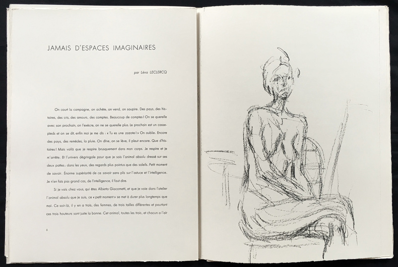
1961720-AAlberto GIACOMETTI DERRIERE LE MIROIR N° 127 (tirage de luxe signé). Paris, maeght Editeur, 1961. In-4° (385 x 288), en feuilles, sous couverture imprimée en lithographie sur les 2 plats, chemise cartonnée recouverte de vergé gris, étui de même nature, étiquette de titre collée sur le front. - 14 LITHOGRAPHIES ORIGINALES EN NOIR dont 3 en double page. - Textes de Olivier Larronde, Léna Leclercq et Isaku Yanaihara. Édition originale. Édition de tête limitée à 150, celui-ci n°116, signé au crayon par l'artiste sur l'achevé d'imprimer. L' ouvrage en parfait état, insolation d'usage à l'étui. Très rare. (Lust 148 à 161). -- ENGLISH DESCRIPTION: Alberto GIACOMETTI. Derriere le Miroir n° 127 (signed deluxe edition). Paris, maeght Publisher, 1961. In-4° (385 x 288), in sheets, under cover printed in lithography on both covers, cardboard folder covered with gray laid paper, slipcase of the same type, title label stuck on the front. - 14 ORIGINAL LITHOGRAPHS IN BLACK including 3 in double page. - Texts by Olivier Larronde, Léna Leclercq and Isaku Yanaihara. Original edition. Deluxe edition limited to 150, this one n°116, signed in pencil by the artist on the justification page. The book in perfect condition, the case is insolated. Very rare. (Lust 148 to 161).
1925STLA0015Frankfurter Vlgs.-Anst. 1923-1925. 4°, 166(1) S., 72 Taf. u. 43 Textabb.; 126 S., 60 Taf. u. 37 Textabb.; 144(1) S., 78 Taf. u. 32 Textabb.; 169(1) S., 85 Taf. u. 50 Textabb.; OHLnbde. m. schönem Marmorbezugspapier, nur unwesentl. Gebrauchsspuren an den Einbänden. Arntzen/R. K94. - Die sogen. Bozetti (Vorentwürfe für Bildhauer-Arbeiten) sind hauptsächlich für die Kenntnis der Barockkunst von Bedeutung, da die Ausführung nach einem Bozzetto oftmals einem künstlerisch unbedeutenderen Gehilfen übertragen wurde. In vorliegendem Standardwerk werden neben den Arbeiten italienischer Künstler auch diejenigen holländischer, französischer u. deutscher Bildhauer der Barockzeit behandelt.
- Galerie d'art Deplanche , Paris 1910, 24x15,5cm, une feuille rempliée. - APOLLINAIRE Guillaume & RABIER Benjamin Exposition Benjamin Rabier Galerie d'art Deplanche , Paris 1910, 24 x 15.5 cm, one folded sheet. Rare first edition of the catalogue of the first exhibition of Benjamin Rabier's watercolors, showing 41 works at the Galerie d'art Deplanche from 8 June to 4 July 1910. A very good copy despite slight staining to edge of upper cover. An important and amusing preface by Guillaume Apollinaire who awards Rabier the prize for the "most spiritual of our animal painters." The catalogue is illustrated with a reproduction of one original watercolor by Benjamin Rabier on the cover. [FRENCH VERSION FOLLOWS] Rare édition originale du catalogue de la première exposition des aquarelles de Benjamin Rabier présentant ses quarante-et-une uvres à la Galerie d'art Deplanche du 8 juin au 4 juillet 1910. Bel exemplaire en dépit de petites taches en marge du premier plat. Importante et amusante préface de Guillaume Apollinaire qui décerne à Benjamin Rabier le premier prix «?du plus spirituel de nos animaliers?». Le catalogue d'exposition est illustré de la reproduction d'une aquarelle originale de Benjamin Rabier en couverture.
- Editions Bonaparte, Paris 1929, 15,5x23,5cm, agrafé. - Très rare édition originale du catalogue de la première exposition du groupe "Le Grand Jeu" s'étant déroulée du 8 au 22 juin 1929. Textes de Roger Gilbert-Lecomte et René Daumal Très bel et rare exemplaire illustré de 2 reproductions d'oeuvres de Joseph Sima. [ENGLISH DESCRIPTION ON DEMAND]
1900167901900 1 Bronze doré, sur socle en marbre sculpté en vagues, signé, (1900), 33.5 x 11 x 6.5 cm.
- AMIEL Léon, Paris, New-York 1966, 36x49.5cm, une feuille. - Original color lithograph, one of 15 proofs on Japon impérial paper reserved for the artist and his collaborators, the only printing with 20 more on Japon and 250 on Arches paper. Unsigned proof, as all proofs in this series, other than the frontispiece. A superb proof on Japon paper specially made for The Story of Exodus, published in 1966, for which Chagall made 24 hors-text lithographs printed by Mourlot. An exceedingly rare original proof on Japon paper, the most attractive and best for color lithographs. Fernand Mourlot was undoubtedly the finest lithographic printer of the 20th century and was thus the friend and printer to the leading artists of his day. "Picasso, Matisse, Chagall, Miró, Braque, Dubuffet, Léger, Giacometti...added to their own expression and contemporary art a new field of research. With Mourlot, and thanks to him, lithography acquired both a personality and a future" (Pierre Cabanne, in Cinquante années de lithographie). Having already printed two volumes of the Bible illustrated by Chagall, Mourlot contributed to the artist's lithographic training in the 1950s. It was during this period that Chagall began to visit Mourlot's workshop regularly in order to learn lithographic techniques and that he developed bonds of friendship with the staff of the workshop, most notably Charles Sorlier. It was thus at the peak of his powers that Chagall made this story of Exodus, which coincided with the termination of his immense lithographic and pictoral work on the Bible, undertaken in 1930 at the urging of Ambroise Vollard. This decorative cycle, entitled Le Message Biblique [The Biblical Message] was in fact the basis for the creation of the Chagall Museum, originally called the Musée national du message biblique Marc-Chagall. [FRENCH VERSION FOLLOWS] Lithographie originale en couleur, une des 15 épreuves imprimées sur papier japon impérial et réservées à l'artiste et à ses collaborateurs, seul tirage avec 20 autres japon et 250 Arches. Epreuve non signée, comme toutes les épreuves de cette série, hormis le frontispice. Superbe épreuve sur Japon réalisée spécialement pour The Story of Exodus paru en 1966, dont Chagall réalisa les 24 lithographies hors-texte imprimés par Mourlot. Fernand Mourlot, incontestablement le meilleur artisan lithographe du XXeme siècle, fut naturellement l'imprimeur et l'ami des plus grands artistes de son temps. "Picasso, Matisse, Chagall, Miró, Braque, Dubuffet, Léger, Giacometti...ont enrichi leurs expressions propres et l'art contemporain d'un domaine de recherches nouveau. Avec Mourlot, et grâce à lui, la lithographie a acquis à la fois une personnalité et un avenir." (Pierre Cabanne, in Cinquante années de lithographie). Déjà imprimeur des deux volumes de la Bible illustrée par Chagall, Mourlot contribua à la formation de l'artiste à l'art de la lithographie dans les années 1950. C'est à cette époque que Chagall commence en effet à fréquenter l'atelier de Mourlot afin d'apprendre les procédés lithographiques et qu'il se lie d'amitié avec les artisans de l'imprimerie, notamment Charles Sorlier. Ainsi est-ce au sommet de son art que Chagall réalise cette histoire de l'Exode qui coincide avec l'achèvement de son immense travail lithographique et pictural sur la Bible entamé en 1930 à l'initiative d'Ambroise Vollard. Ce Cycle décoratif intitulé Le Message Biblique sera d'ailleurs à l'origine de la création du Musée Marc Chagall, originellement Musée national du message biblique Marc-Chagall. Rarissime épreuve originale imprimée sur Japon, le plus beau papier et le meilleur pour les gravures en couleur.
- AMIEL Léon, Paris, New-York 1966, 36x49.5cm, une feuille. - Lithographie originale en couleur, une des 15 épreuves imprimées sur papier japon impérial et réservées à l'artiste et à ses collaborateurs, seul tirage avec 20 autres japon et 250 Arches. Epreuve non signée, comme toutes les épreuves de cette série, hormis le frontispice. Superbe épreuve sur Japon réalisée spécialement pour The Story of Exodus paru en 1966, dont Chagall réalisa les 24 lithographies hors-texte imprimés par Mourlot. Fernand Mourlot, incontestablement le meilleur artisan lithographe du XXeme siècle, fut naturellement l'imprimeur et l'ami des plus grands artistes de son temps. "Picasso, Matisse, Chagall, Miró, Braque, Dubuffet, Léger, Giacometti...ont enrichi leurs expressions propres et l'art contemporain d'un domaine de recherches nouveau. Avec Mourlot, et grâce à lui, la lithographie a acquis à la fois une personnalité et un avenir." (Pierre Cabanne, in Cinquante années de lithographie). Déjà imprimeur des deux volumes de la Bible illustrée par Chagall, Mourlot contribua à la formation de l'artiste à l'art de la lithographie dans les années 1950. C'est à cette époque que Chagall commence en effet à fréquenter l'atelier de Mourlot afin d'apprendre les procédés lithographiques et qu'il se lie d'amitié avec les artisans de l'imprimerie, notamment Charles Sorlier. Ainsi est-ce au sommet de son art que Chagall réalise cette histoire de l'Exode qui coincide avec l'achèvement de son immense travail lithographique et pictural sur la Bible entamé en 1930 à l'initiative d'Ambroise Vollard. Ce Cycle décoratif intitulé Le Message Biblique sera d'ailleurs à l'origine de la création du Musée Marc Chagall, originellement Musée national du message biblique Marc-Chagall. Rarissime épreuve originale imprimée sur Japon, le plus beau papier et le meilleur pour les gravures en couleur. [ENGLISH DESCRIPTION ON DEMAND]
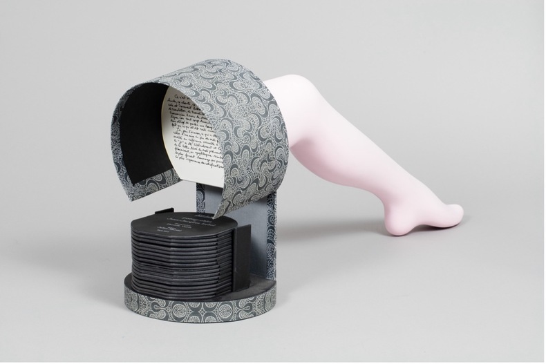
awd-1161Paris, Atelier Julien Martial, 2011. Poème-objet constitué d’un leporello octogonal inséré à la base d’une sculpture de jambe féminine posée sur un socle de carton (diam. 25 cm, H. 80 cm).
In-4° grande; pp. (4), incluso frontespizio in rame figurato, inciso su rame da Lasinio, da disegno di Carradori, pp. XXXVII, (1 ), pp. (17) (di "spiegazione delle tavole" e di indice, intercalate alle tavole), tavole 13 fuori testo, che contengono 17 illustrazoni. Rarissima edizione originale di quest’opera di Francesco carradori – professore di scultura nella Regia Scuola di Firenze – ricca di tavole incise su rame in cui si raffigura la figura umana con le sue proporzioni, e si illustrano, ad uso dei giovani artisti, i metodi pratici e tecnici con cui tradurre il disegno in scultura, con cui sbozzare il blocco di marmo, preparare una fusione in bronzo, e in cui si mostra alfine la bottega di uno scultore con tutti gli strumenti occorrenti. Brunet I, 1598; Graesse II, 54. Legatura in cartonato colorato. Piccolo timbro a inchiostro al margine del frontespizio. arte scultura etruria firenze artisti anatomia disegno art sculpture anatomy drawing artist
- AMIEL Léon, Paris, New-York 1966, 36x49.5cm, une feuille. - Original color lithograph, one of 15 proofs on Japon impérial paper reserved for the artist and his collaborators, the only printing with 20 more on Japon and 250 on Arches paper. Unsigned proof, as all proofs in this series, other than the frontispiece. A superb proof on Japon paper specially made for The Story of Exodus, published in 1966, for which Chagall made 24 hors-text lithographs printed by Mourlot. An exceedingly rare original proof on Japon paper, the most attractive and best for color lithographs. Fernand Mourlot was undoubtedly the finest lithographic printer of the 20th century and was thus the friend and printer to the leading artists of his day. "Picasso, Matisse, Chagall, Miró, Braque, Dubuffet, Léger, Giacometti...added to their own expression and contemporary art a new field of research. With Mourlot, and thanks to him, lithography acquired both a personality and a future" (Pierre Cabanne, in Cinquante années de lithographie). Having already printed two volumes of the Bible illustrated by Chagall, Mourlot contributed to the artist's lithographic training in the 1950s. It was during this period that Chagall began to visit Mourlot's workshop regularly in order to learn lithographic techniques and that he developed bonds of friendship with the staff of the workshop, most notably Charles Sorlier. It was thus at the peak of his powers that Chagall made this story of Exodus, which coincided with the termination of his immense lithographic and pictoral work on the Bible, undertaken in 1930 at the urging of Ambroise Vollard. This decorative cycle, entitled Le Message Biblique [The Biblical Message] was in fact the basis for the creation of the Chagall Museum, originally called the Musée national du message biblique Marc-Chagall. [FRENCH VERSION FOLLOWS] Lithographie originale en couleur, une des 15 épreuves imprimées sur papier japon impérial et réservées à l'artiste et à ses collaborateurs, seul tirage avec 20 autres japon et 250 Arches. Epreuve non signée, comme toutes les épreuves de cette série, hormis le frontispice. Superbe épreuve sur Japon réalisée spécialement pour The Story of Exodus paru en 1966, dont Chagall réalisa les 24 lithographies hors-texte imprimés par Mourlot. Fernand Mourlot, incontestablement le meilleur artisan lithographe du XXeme siècle, fut naturellement l'imprimeur et l'ami des plus grands artistes de son temps. "Picasso, Matisse, Chagall, Miró, Braque, Dubuffet, Léger, Giacometti...ont enrichi leurs expressions propres et l'art contemporain d'un domaine de recherches nouveau. Avec Mourlot, et grâce à lui, la lithographie a acquis à la fois une personnalité et un avenir." (Pierre Cabanne, in Cinquante années de lithographie). Déjà imprimeur des deux volumes de la Bible illustrée par Chagall, Mourlot contribua à la formation de l'artiste à l'art de la lithographie dans les années 1950. C'est à cette époque que Chagall commence en effet à fréquenter l'atelier de Mourlot afin d'apprendre les procédés lithographiques et qu'il se lie d'amitié avec les artisans de l'imprimerie, notamment Charles Sorlier. Ainsi est-ce au sommet de son art que Chagall réalise cette histoire de l'Exode qui coincide avec l'achèvement de son immense travail lithographique et pictural sur la Bible entamé en 1930 à l'initiative d'Ambroise Vollard. Ce Cycle décoratif intitulé Le Message Biblique sera d'ailleurs à l'origine de la création du Musée Marc Chagall, originellement Musée national du message biblique Marc-Chagall. Rarissime épreuve originale imprimée sur Japon, le plus beau papier et le meilleur pour les gravures en couleur.
- Atelier Fanal, Bâle 1985, 32x32cm, en feuilles sous chemise à lacet. - First edition printed in 65 numbered copies, this copy one of 30 signed and numbered by Aurélie Nemours. This copy is complete with 21 plates. A nice and rare copy. [FRENCH VERSION FOLLOWS] Edition originale imprimée à 65 exemplaires numérotés, le nôtre un des 30 signés et numérotés par Aurélie Nemours. Notre exemplaire est bien complet de ses 21 planches qui sont des "extraits essentiels su Sériel blanc de Nemours". L'étui est en demi toile sable, plats de cartonnage à coins de toile sable comportant des piqûres, l'étui est complet de ses lacets. Agréable et rare exemplaire.
142174aaf2004. 40,5 x 29 cm. Gipsrelief auf Holzplatte. Exlibris von Peter E. Obergfell.