7 619 résultats
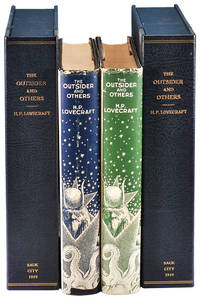
19395219Sauk City WI: Arkham House 1939. First Editions. The first major collection of Lovecraft's weird fiction and the first production by the legendary Arkham House - a landmark in 20th century genre publishing. The 32 stories written for various pulp magazines were gathered and preserved by Lovecraft's friends August Derleth and Donald Wandrei who founded Arkham House in 1939 to preserve and publish the best of Lovecraft's fiction. The stories "range from early exercises in Dunsanian pastiche to the mature and highly distinctive tales of the Cthulhu Mythos which construct a horrific cosmological and historical context for human history. Luckless protagonists who stumble upon various dire intrusions of Cthulhu and his kin or who unwisely pursue dangerous inquiries in the appropriate revelatory tomes are inevitably brought to repulsively stick ends. Lovecraft became the consummate master of the confirmatory ending in which what has been suspected all along finally becomes manifest" Barron Horror Literature: A Reader's Guide 3-132. It took Derleth and Wandrei nearly five years to sell through the modest print run and The Outsider has not been reprinted since. <br /> <br /> Enclosed with the present copies are a five letters written between May 10 1937 - November 26 1939 between the Arkham House principals detailing both the publication history of The Outsider as well revelatory background information concerning the dustjacket design by Virgil Finlay 1914-1971. In his time Finlay was among the most in-demand illustrators of fantasy science fiction and horror literature in the United States and his panoramic composition for The Outsider's dustjacket remains among the best executed and most desirable examples in the genre. According to a letter to Derleth from Adolph J. Hyson of the George Banta Publishing Company proofs for the dustjacket were struck in three colors - black bronze blue and a dark olive green. Both the black and green versions of the dustjacket were vetoed by all involved - the black on account of having "a strangely flat and monotonous effect without depth or life. Second and more important certain of the figures such as the monkey-like and ass-like creatures to the right of the topmost star containing the woman's figure behind the lettering "By" faded away to almost absolute imperceptibility in black but stood out with fairly well defined clarity in the blue" DW to VF Nov.14 1939. The green jacket was dismissed right out and described by Wandrei as being "a peculiarly detestable and odious color." It is not clear how many examples of either the black or green trial state dustjackets survived after being scrapped though all of the predictably few extant examples originated with the personal collection of Donald Wandrei sold close to four decades ago. Joshi 15. First Printings one of 1268 copies. Two octavo volumes 24cm; black cloth with titles stamped in gilt on spines; dustjackets; xiv5535pp. The present offering consists of two unique copies:<br /> <br /> - Copy 1: Trivial wrinkling to cloth at crown else Fine. Dustjacket is unclipped priced $5.00 gently spine-sunned and lightly edgeworn with shallow loss to base of spine and some light dust-soil and waviness to rear panel; Very Good. Inscribed vertically along the left margin of the rear flap by dustjacket designer Virgil Finlay: "This jacket is a photographic composite of early Weird Tales drawings probably only one or two were for HPL stories - I wish I might have found time for more of his work which I did admire / Virgil Finlay." Housed in a custom half-morocco clamshell case. <br /> <br /> - Copy 2: Trivial wear to lower board edges faint dust-soil to upper edge of textblock with mild offsetting and some faint scattered foxing to endpapers; Near Fine. Inscribed by Arkham House co-founder Donald Wandrei on front endpaper: "For Priscilla - and the goon - Donald Wandrei / Christmas 1939." In the apparently unique trial dustjacket printed in green instead of blue with the flaps and rear panel without text; light wear and a few tiny tears to extremities hint of sunning to spine with a faint vertical fold along rear joint and some mild dust-soil to rear panel; holograph printer's measurements in ink across base of spine panel; Very Good. For the sake of completion offered together with a Fine copy of the replica dustjacket produced in the 1970's by specialty publisher and collector Gerry de le Ree from Finlay's original plates. Folded and laid into this copy are examples of the publisher's original prospectus measuring 7.25" x 7.75" as well as an earlier mimeographed announcement letter measuring 8.5" x 11". Housed in a custom half-morocco clamshell case. Arkham House unknown
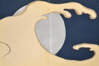
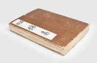
1909908701909. DESIGN Kamisaka SEKKA artist. MOMOYOGUSA. Kyoto: Unsodo Meiji 42-43 1909-10. 3 volumes. 30.1 X 22.5 cm. Most consider it the finest Japanese design book of all time this exquisite suite of 60 double-page color-printed woodblocks is printed and overprinted using opaque and metallic inks to produce a sumptuous surface. This is an early impression with woodgrain showing in a few prints. The condition is internally superb with almost none of the gutter fading and metallic ink transfer common to this work. One of the finest printings we have seen. Volume one has been meticulously restored. Some paper fill-in and other work has been so successfully accomplished as to be unnoticeable. Some paper overlay is chipped away on the front covers of volumes one and three though they retain the original printed titles and the paper overlay on the back of one volume is restores/replaced. A complete copy of this cornerstone of any Japanese design collection. unknown
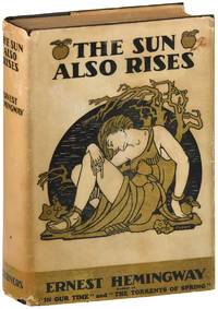
19267284New York: Charles Scribner's Sons 1926. Hemingway's first novel synonymous with the Lost Generation in which "the post-war disillusion and the post-war liberation are united in the physical enjoyment of living and the pains of love" Connolly p.53. The novel portrays a group of English and American expatriates frequenting the cafés of Paris who travel along the Camino de Santiago to the Fiesta de San Fermín in Pamplona where they watch the running of the bulls. Basis for Henry King's 1957 film adaptation starring Tyrone Power and Ava Gardner. Uncommon in dustjacket. Grissom A.6.1b. Hanneman 6A; Connolly 100. Second printing one of 1970 copies with the typographical error on p.181 line 26 "stoppped" for "stopped" in the corrected state. Octavo 19.75cm; black cloth with printed gold paper title labels mounted to spine and front cover; dustjacket; viii23-2591pp. Early ownership markings to front endpaper mild softening to spine ends gentle sunning to spine with some trivial dust-soil to upper edge of textblock and some darkening and pinpoint wear to title labels; contents clean; Very Good. In the correct second state dustjacket unclipped priced $2.00 with the typographical error in "In Our Times" in the corrected state along the lower front panel; spine and panels gently sunned and lighty dust-soiled some moderate external wear with a few small nicks and closed tears particularly at base of spine and a few faint scattered stains; still a presentable example unrestored Very Good or better. Housed in a custom clamshell case. Charles Scribner's Sons unknown
1903911311903. DESIGN UNSODO 芸艸堂 Publisher. BIJUTSUKAI 美術海. Kyoto Unsodo 24.0 x 16.3 cm 61 numbers of the 70 numbers printed in the BIJUTSUKAI design series Numbers 1 thru 61 Originally issued in 70 volumes in the early 1900s. Number one was published on January 1st Meiji 36 1903 Number 61 in 1905. Over 1200 color woodblock printed designs. A remarkable achievement by most of the important designers of the day. Bijutsukai printing is always good the early printings here are extraordinary In very good condition though number one is a bit tired. Enclosed in an old clasped chitsu case. There is quite a bit of confusion about this series BIJUTSUKAI and the SHIN-BIJUTSUKAI series which followed it. They are two different sets of design. The BIJUTSUKAI was printed under the general rubric of Shinbijutsukai but they are two different works pubished with two different series titles and numbering. Early printings of the BIJUTSUKAI have become unusual such a long run of the individual issues unheard of. unknown
1932058083London Uk: Emery Walker Wilfrid Merton And Bruce Rogers 1932. First Edition Thus . Hardcover. Near Fine. One Of The Most Famously Well Produced Books Of The 20Th Century. Unpaginated One Of 530 Copies Only. Bound In Full Black Niger Morocco With Top Edges Gilts And Gilt Spine Lettering Deckled Edges. Printed On Special Paper Made By J. Barcham Greem & Son In 16-Point Monotype Centaur. There Are 26 Decorations Of Homeric Figures From Greek Vase-Paintings That Are Printed In Black On Roundels Of Gold Leaf That At The Head Of Each Book And On The Title Page. Several Of The Original Loose Tissue Guards Are Present. Lacking The Slipcase. Slight Usage To Covers. Endpapers Darkened In Half-Inch Strips Along Edges From Turns As Usual. <br/> <br/> Emery Walker, Wilfrid Merton And Bruce Rogers hardcover
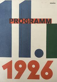
19263163Dresden 1926. Mint condition. Fold out. Stefan Sebok was a Hungarian-born architect who worked with Walter Gropius in Dessau and Berlin in the late 1920s and then with fellow Hungarian emigré László Moholy-Nagy on his famous Light Prop and later moved to the Soviet Union to work with the constructivist architects Moisei Ginzbrug El Lissitzky and the Vesnin brothers. In between he carried out numerous projects of his own and found himself central to a key generation of emerging modern architects in Dresden Berlin and Moscow. Life and work<br /> He was accepted in Dresden in 1921 at the Hochbau Architecture faculty at the Sächsiche Technische Hochschule opting for the science oriented course but chose art for his optional subject. The university records show him as a highly achieving student and he was given the opportunity to do a research project on Viennese Baroque which he presented in 1925 as an illustrated public lecture at the Dresden Kupferstichkabinett.<br /> <br /> In 1926 he submitted his Diploma work a project for the design of the Tanztheater Dresden probably inspired by the presence of the famous dancer Gret Palucca in Dresden at the time. The work had many innovative features aiming to minimise the interface between stage and spectators.<br /> He received his diploma Dip. Ing. Arch. in March 1927. Although he already had a firm position offered by Erich Mendelsohn at the time he decided to join Walter Gropius in Dessau. The main attraction for Sebök was the recently commissioned revolutionary theatre by Erwin Piscator. Although the theatre did not materialise at the time the concept of the possible use of films the stage and roof design was reworked by Sebök in several drawings over the years and it found its continuation also in a plan worked out by Gropius and Sebök in 1930 for a theatre for Kharkov for mass performances for which many of Sebök’s annotated preliminary sketches have survived.<br /> In 1928 Sebök briefly returned to Dresden probably to re-work his Tanztheater for the Internationales Problem Theater. From 1928 till 1931 Sebök rejoined Gropius in Berlin participating in numerous projects. Sebök also collaborated closely with László Moholy-Nagy on the Kinetisch-konstruktives System Kinetic Constructive System and the Light space modulator. The collages for these are marked durchconstruirt constructed by Sebök and the technical drawings for the latter bear his signature. During 1929 he was also involved with Moholy-Nagy in various stage designs for Erwin Piscator. unknown
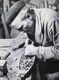
196548080Arnsberg and Dortmund Germany: Arbeitsgemeinschaft Gestaltendes Handwerk 1965. First edition. Hardcover. Near fine condition. Duodecimo 6 1/8 x 8 1/2". Unpaginated app. 100 leaves each three volumes. Original screw-bolted brown cloth with gray lettering on spines. Text printed to handmade paper in variant colors: black brown gray blue cream yellow green burnt Sienna and umbra photographs printed to glossy white paper. With lists of full and associate members of the workshop at front printed in white on black paper.<br /> <br /> Complete catalog of "Werkstattporträt Workshop Portrait" in three volumes a joint venture of the Project Group Creative Crafts for the Districts of Arnsberg and Dortmund Germany from 1961 to 1965. Participants of this project included craftsmen and women from the fields of pottery weaving embroidery bookbinding lathe work carpentry photography painting and sculpting. An extraordinary project presenting a state-of-the-art view of craftsmanship and art in Eastern Westfalia in the 1960s illustrated with 309 b/w photographs.<br /> <br /> Albert Renger-Patzsch participated in this project not only as a photographer see portrait 10 but provided one-hundred and forty-five of the three hundred and eleven photographs of works of other participants including portrait photographs for the catalogs "Werkstattportrait." Renger-Patzsch had worked as press photographer for the Chicago Tribune before publishing his title 'Crassula" with the Auriga-Verlag in the series 'Die Welt der Planze' in 1924. He had his first museum exhibition in 1927. His second book "Die Welt ist schön" became his best-known publication. During the 1930s he remained in Germany and made photographs for the German industy and in advertising. His archive was destroyed during W.W.II. In 1944 he moved to Wamel North Rhine-Westfalia and lived there for the rest of his life.<br /> <br /> The catalog is structured in twenty-nine chapters 0-271 introducing artists and craftsmen and women including one introductory chapter with eight photographs and a final chapter with six photographs. The object of the project was to further the exchange of knowledge and experience collaboration in research shared leisure time and visits of the workshops and studios of participants. Regional and national exhibitions and publications were arranged to help find buyers for the created work. The introductory chapter includes lists of full members and associate members.<br /> <br /> Each of the twenty-seven workshop portraits includes an introductory leaf for the respective participant describing the workshop or studio and the career including particulars about the techniques and material used by the artist with captions on the objects captured in eight b/w offset reproductions of photographs by Albert Renger-Patzsch and others on verso. Each set of photographs includes a portrait of the respective artist. Following each set of photographs a page with contact information of the artist and photo-credits for the work displayed.<br /> <br /> The final chapter is entitled "Workshop Portrait." It includes a brief description of the workshop taking place from April 1961 to December 1965 six b/w photographs of workshop exhibits and a list of all participants with contact information. The last page of this chapter an address by Walter Römhildt states the conclusion of this project and announces the continuation of publications of the series "werkstattforum" at his new office the "Beratungsstelle für Handwerksform bei der Handwerkskammer Hannover." Participants of the project "werkstattportait" will automatically receive those publications. <br /> <br /> Content with participating artists:<br /> <br /> portrait 0: Introduction of the project with photos by Renger-Patzsch 9 <br /> portrait 1: Hildegard Bäumer weaver Siegen photos by Renger-Patzsch 6 and Foto-Besser Siegen 3<br /> portrait 2: Ignatius Geitel Glass painter Bochum with Klischees by Titze & Lorenz Gelsenkirchen 9<br /> portrait 3: Karl Josef Hoffmann sculptor Attendorn with photos by Renger-Patzsch 9<br /> portrait 4: Anneliese Kretschmer photographer Dortmund photos by Anneliese Kretschmer 9<br /> portrait 5: Udo Dickerhoff carpenter Bochum photos by Renger-Patzsch 8 Sabine Renger 1 and Christian Bathe Münster 1; with two transparencies.<br /> portrait 6: Ingeborg and Bruno Asshoff potters Bochum photos by Renger-Patzsch 10 Dagmar Korn Düsseldorf 2 and Helmut Hering Dortmund 2<br /> portrait 7: Martha Wurm embroider Wattenscheid photos by Photo-Soeding J. Müller Soest 11<br /> portrait 8: Otto Pickhan turner Mollseifen photos by Renger-Patzsch 9<br /> portrait 9: Irmgard Timmermann weaver Soest photos by Photo-Soeding J. Müller Soest 9 H. Musmann Lage 1 and Renger-Patzsch 1<br /> portrait 10: Albert Renger-Patzsch photographer Wamel photos by Sabine Renger Wamel 1 Renger-Patzsch 11 Klischees by Titze & Lorenz Gelsenkirchen; <br /> portrait 11: Andrea Böhm picture weaver Lüdenscheid w/o photo-credits 10<br /> portrait 12: Päule Jelich goldsmith Iserlohn photos by Schmidt Lueg Iserlohn 11 and Foto Melchers Herne 1 <br /> portrait 13: Wolfgang Kruse turner Hamm photos by Schmidt Lueg Iserlohn 10<br /> portrait 14: Wolfgang Kreutter sculptor Dödesberg photos by Bert Brösel Siegen 1 Heidersberger Wolfsburg 2 Schmidt Lueg Iserlohn 9 <br /> portrait 15: Marianne Proll bookbinder Hagen photos by A. Bach Hagen 6 Renger-Patzsch 8 <br /> portrait 16: Heinz Abendroth metal smith Dortmund photos by Rolf Schmieding Dortmund 9 Dinstühler Dortmund 1; <br /> portrait 17: Liesel Bellmann sculptor Dortmund photos by Gerd Schlitzer Dortmund 4 W. von Frankenberg Dortmund 1 Rolf Schmieding Dortmund 3 and Heller Telgte 1 w/o credit 3<br /> portrait 18: Karl Jlling metal smith Mallar photos by Renger-Patzsch 10 <br /> portrait 19:Dieter Pieper goldsmithLüdenscheid photos by Werkstätten Carl Golderer Pforzheim 24 <br /> portrait 20: Marieluise Quade painter and graphic designer Lüdenscheid photos by Carl Huth Lüdenscheid 2 w/o credits 7<br /> portrait 21: Waldemar Wien sculptor Kierape 1 photos by Renger-Patzsch 13<br /> portrait 22: Christel Humpert potter Bochum photos by Renger-Patzsch10<br /> portrait 23: W. K. A. Weisheit carpenter Plettenberg-Oesterau photos by Renger-Patzsch 9<br /> portrait 24: Günter Hülshoff potter Rosemarie Hülshoff batik both Wangern photos by Renger-Patzsch 14<br /> portrait 25: Josef Severin metal smith Anröchte/Krs. Lippstadt photos by Renger-Patzsch 6 and Sabine Renger 4 <br /> portrait 26: Gisela Lohse weaver Hagen photos by Renger-Patzsch 11 <br /> portrait 27: Johannes Scharfenstein carpenter Meschede photos by Renger-Patzsch 10 and Foto-Zwietasch Kornwestheim 1<br /> "werkstattportrait" with Klischees by Tietze & Lorenz Gelsenkirchen 6<br /> <br /> Text in German. Minor wear overall with some red underlining of text in Römhildt address on last page. Translation of werkstattportrait 10: <br /> <br /> "Albert Renger-Patzsch born on June 22m 1897 graduated at the Humanistic Gymnasium studied chemistry until the preliminary examination after that he became the head of the photography department of the Folkwang Publisher in Hagen and Darmstadt. Since 1925 independent photographer in Bad Harzburg; first exhibition at Kestner-Gesellschaft in Hannover in 1925; first publication: "Die Halligen" in 1927 worked from 1929–1944 in Essen after that in Wamel near Soest. Following his title "Die Welt ist schön" he published monographs of cities and architecture books on marked-off landscapes and other topics. Renger=Patzsch works are in the collections of the MOMA New York the Eastman House in Rochester the Gernsheim Collection in London the Copper-Engraving Collection of the National Library in Paris and the Photo-Museum in Dresden. He was awarded the David Octavius Hill Medal of the G.D.L. in 1957 the Culture-Award of the German Society for Photography Cologne in 1960 and the Golden Society Medal of the Vienna Photographic Society in 1961. Renger-Patzsch is seen as the father of "Neue Sachlichkeit" in photography. In his book "Die Welt ist schön" he introduces a program with the goal to deter photography from engaging in a race with painting and reflect on its own medium. His notion that photography based on its mechanical structure is better suited to do justice to an object portrait it as an artistic individual pertains to large fields of photography today. Arbeitsgemeinschaft Gestaltendes Handwerk hardcover
1920140553Munich: Dreilander Verlag 1920. Collection of 38 issues of the landmark Weimar-era periodical highlighting fantasy horror and early science fiction stories. Text in German. <br /> <br /> One of the world's first fantasy periodicals alongside the Swedish "Hugin" "Der Orchideengarten" featured a mix of new German stories alongside translations of foreign literature largely French including works by Victor Hugo Guy de Maupassant Voltaire Charles Dickens Edgar Allan Poe Joseph Capek H.G. Wells and many others. The magazine also made forays into the proto-science fiction genre as seen in Vol. 2 No. 4 entitled "Phantastik der Technik." <br /> <br /> A true product of the Weimar era's cultural blossoming the magazine also features stunning illustrations both with its two- and three-color cover art and its woodcut reproductions throughout: sinister yet elegant visions of anthropomorphic flowers religious idols Grim Reapers and gory deaths. "Der Orchideengarten" featured the work of Gustave Dore Otto Linnekogel Karl Ritter Alfred Kubim Carl Rabus Otto Nuckel and many more. <br /> <br /> This archive contains the following largely sequential issues: Vol.1 Nos.1-18 16 and 17 published as a combined issue; Vol.2 Nos.1-6 8 10-16 18-24. <br /> <br /> 9 x 12 inches saddle stapled. Very Good to Near Fine condition. In a custom quarter leather clamshell box. Dreilander Verlag unknown
1909912721909. DESIGN Kamisaka SEKKA artist. MOMOYOGUSA. Kyoto: Unsodo Meiji 42 1909. Volume one of three. 30.1 X 22.5 cm. Most consider it the finest Japanese design book of all time this exquisite suite of double-page color-printed woodblocks is printed and overprinted using opaque and metallic inks to produce a sumptuous surface. This is an early impression. The condition is internally quite good with almost none of the gutter fading and metallic ink transfer common to this work. One of the better printings we have seen. Complete as issued with all 20 prints from volume one included. Has the original printed title label The mica patterning from the front cover is gone. unknown
195562463New York NY Kansas City MO & Carmel Santa Barbara & San Francisco CA: Marian Ross Mizelle Madrigal 1955-1974. Four Vols. and original Store Sign for Carmel CA boutique. Folio. 2 - 12 x 15.25 in. & 2 - 13 x 19 in. 48; 48; 48; 48 pp unpaginated. all w/ mylar sleeves archival black paper insert backings with 151 original designs in gouache watercolour chalk and pen & ink 38 in pen & ink or pencil sized from 7 x 11 in. up to 10 x 15 in. and nearly all signed by Marian Ross three feature original fabric sample swatches affixed to them including one w/ pencil MS “Winner†and mimeographed description affixed to verso several of them are translucent pochoir stapled to backing paper many are on thick stiff studio board while others on assorted textured paper stock. In addition there are three newspaper and magazine clippings 1966 & 2013 a photostat copy of early Ross Mizelle “Mod†fashion designs and original black & white silver gelatin photo of young Marian Ross modeling a wedding dress. All are preserved in flexible vinyl portfolios printed labels on spines some minor scuffing & shelfwear to portfolios occasional very minor closed tears or edgewear to the designs a few w/ minor holes from removed staples still an exemplary archive of designs together with the original Madrigal signboard sized 16 x 27 in. from their Carmel CA store. This sensational archive of original fashion designs for Kansas City MO based department store suppliers by Marian Ross Mizelle before her move to California in the 1970’s to establish the Madrigal boutique with her husband Elliot A. Mizelle 1916-2007. These vividly reveal the Mid-20th-Century fashion trends following World War II. Many of the designs in this collection reflect the transition from the late 1950’s elegance and emphasis on Dior’s “New Look†highlighting femininity and opulent use of fabrics towards the more youthful designs emerging out of Swinging London which were a slimming down beginning to raise hemlines with short skirts bolero tops and increasing influence of Pierre Cardin Andre Courreges and Givenchy. The Mid-20th-Century saw a tremendous upsurge in marketing slimmer lines tighter fitting bodices and fashions emerging from such cultural events as Audry Hepburn in her iconic 1961 “Breakfast at Tiffany’s†film which heavily influenced a generation of young women.Young Marian Ross b. 1936 after completing her Fashion Academy certificate in 1955 free-lanced and worked in the New York fashion industry before landing with the influential and hot-selling Gay Gibson label with Gernes Garment Co. in 1961. The Gernes Garment Co. had been originally founded in 1928 by Sara Desaix Gernes 1896-1978 and her husband Alexander Gernes 1882-1947 to market her groundbreaking fashion designs targeting everyday fashion for young women juniors and teens. Her designs proved very popular as she initiated and fashioned sizing and dresses and clothing for teenagers through young college-age women and her designs proved very successful and were marketed through Chicago’s Marshall Field’s department store. By 1961 the Gernes Garment Co. moved their design and pattern making department to New York to capture young fashion designers such as Marian Ross as well as be closer to the influential couturier houses in New York & Paris. The Gay Gibson label was marketed in Mademoiselle Seventeen Glamour and Vogue magazines with Twiggy often modeling Gay Gibson dresses in the 1960’s. Marian’s designs were inventive playful and emphasizing movement as well as comfort. Many of the fashion patterns depict her models in flats ballet flats or even shoeless while dressed in elegant evening or formal dress. Also depicted are designs such as billowing harem pants modified and sleek upscale poodle skirts and Tartan patterned capes pockets dresses and accessories. Others encompass swimwear ski wear as well as the emphasized and often enforced domesticity of the late 1950’s to 1960’s with stylish plaid house-dresses in the kitchen and bar as well as frequent use of lace. The Gay Gibson label maintained a showroom at 1407 Broadway on the 39th Floor in New York ad held over 24 showings from 1961-1969 including Junior Dresses Summer Collections Spring Junior Collections as well as Holiday and Resort collections. By the early 1970’s the label was having financial difficulties and the popularity began to drop with the company run by Desaix Gernes her mother and husband Paul before folding a few years after Sara Desaix Gernes’ death. Marian and Elliot Mizelle established Madrigal Inc. name chosen because of the seductive chic of Manhattan’s Le Madrigal restaurant and grew into a legendary luxury boutique at one point operating store fronts in Santa Barbara downtown San Francisco and Carmel CA. In her 2015 interview for “Women in Business†with the Carmel Pine Cone Marian stated she “wanted to be an actress but it didn’t work out that way. I used to sketch a lot so I studied design instead. Everything I touched while was designing worked. I got a lot of jobs and was featured on a lot of Seventeen magazine covers.†This cataloguer could find not similar extant archive of original designs for the 1960’s period of the Gay Gibson label or for Marian Ross Mizelle; See: Interview with Desaix Gernes Garment Industry Oral History Collection The Kansas City Public Library Jan. 14 2005 SC229 Series 2 2024; Gay Gibson Vintage Fashion Guild 2025; Donnelly Garment Company vs. International Ladies Garment Workers Union et al Photographs Clothing Demonstration The Pendergast Years Kansas City in the Jazz Age & Great Depression 2025. Marian Ross Mizelle, Madrigal, hardcover
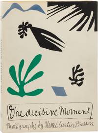
1952165340New York: Simon and Schuster 1952. First Edition. First Edition. Board and jacket design by Henri Matisse. Original "captions" booklet laid in as issued. <br /> <br /> One of the most influential collections of twentieth century street photography a testament to Henri Cartier-Bresson's unique and discerning eye and his ability to capture the emotive nature of his subjects. <br /> <br /> Near Fine in a spectacular Near Fine dust jacket. In a custom green clamshell box with a black leather label on the spine also Fine. The best copy of this title we have ever seen.<br /> <br /> Oversize volume shipping billed at cost. Simon and Schuster unknown
19281723681928. SOVIET PROPAGANDA DESIGN. Za oboronu SSSR For Defence of the USSR. 48 pp. illustrated with 32 full page plates printed in red and black. Small folio 275 x 200 mm. bound in publisher's wrappers illustrated by Czech artist P. Skala. Moscow: Izdatel'stvo AKHRR: Shkola FZU pri 1-i Obraztsovoi tipografii 1928. A remarkable collection of Soviet imagery intended as instruction for decorating workers' clubs reading huts and use during rallies. The illustrations include fully decorated interiors concepts for 'hands-on' attractions such as a 'rayok' or Russian peep show shooting galleries and quiz shows. Most of the imagery is in the constructivist style but also includes numerous caricatures of western fat cats fascists and even a Ku Klux Klan member which would have been inspiration for costume design. Rare OCLC finds just one copy at the Bibliotheque Nationale de France. The leaves with illustrations have an even toning from the printing process else a fine copy with the errata slip and unusually printed on fine thick paper. unknown
19304317Chicago: Beardslee Chandelier Manufacturing Company 1930. No Binding. Very Good. Chicago 1930s A remarkable archive of 52 original designs for light fixtures executed in watercolor ink and graphite on heavy card stock. Most sheets measure approximately 20 × 13 inches with one large folding drawing included. Each design bears the distinctive Beardslee blindstamp. Some sheets show minor surface smudging and light edge wear consistent with age and use. The Beardslee Chandelier Manufacturing Company based in Chicago Illinois was a leading producer of high-quality gas and electric light fixtures in the early 20th century. The company originated as the W.S. Edwards Manufacturing Co. but in 1901 under the leadership of George Murray Beardslee b. 1868 it was renamed and expanded its operations. Beardslee who had joined the firm in 1890 served as both treasurer and vice president. Rogers Park/West Ridge Historical Society HistoryWiki One of Beardslee's key designers was Anton Dvorak b. 1888 a graduate of both the Chicago Institute of Art and the Lewis Institute of Chicago. Dvorak began his career at the Chicago Gas and Electric Fixture Co. 1904-1914 before joining Beardslee where he eventually became vice president. Between 1921 and 1930 he filed six patents with the U.S. Patent Office contributing significant innovations in lighting design. Encyclopedia of Bohemian and Czech-American Biography Vol. 1 Miloslav Rechigl Jr. Beardslee specialized in stylish yet affordable lighting fixtures for banks churches retail stores and offices. By the mid-1920s the firm had earned a national reputation described as "one of the largest and best known lighting equipment companies in the Midwest." Wisconsin Rapids Daily Tribune September 30 1925 This collection reflects the elegance and precision of Art Deco design. Each drawing is meticulously labeled with a model number and scale and many include notes specifying their intended installation locations-such as "2nd hall" "men's room" "civic room" "safe deposit" "main stairs" "main lounge" and "parlour." The set may have been commissioned for a major architectural project possibly the Biltmore Hotel in Oklahoma City. Beardslee Chandelier Manufacturing Company unknown
193855160МоÑква Moscow: Музеиа-Ð’Ñ‹Ñтавки Охраны МатеринÑтва и МладенчеÑтва Museums and Exhibitions of Motherhood and Childhood Protection 1938. First edition. Hardcover. g to vg-. Folio. Unpaginated 113 double-sided leaves. Original blue cloth with gilt lettering and yellow circular embossed bas-relief on the front cover designed by Anna Yuzhakova. Spine with blind-stamped illustration and lettering. Binding protected in modern mylar. Housed in its original blue cloth slipcase with a circular windowed cutout for the bas-relief. Photo-illustrated endpapers. The title page is a double-page spread with modernist typography and title text appearing in 10 additional languages including Ukrainian Belorussian Bulgarian Armenian Georgian Turkmen Azerbaijani Uzbek and others.<br /> <br /> Following the title page are four pages of introductory text and then a fold-out with woodcut illustrations in black by Nikolai Piskarev 1892-1959 showing images of the Russian revolution revealing photographic portraits of Lenin and Stalin when opened. The work is profusely illustrated throughout with countless photographic images beautifully printed in b/w and sepia-toned gravure. The book's overall design and layout was the work of Yakov Babushkin b.1907 which displays a wide variety of artistic and conceptual flourishes. Throughout the book are many smaller half-width multipage inserts artistic insets and fold-outs as well as extensive photomontages and large double-page spreads. Final leaf contains extensive contributor's credits.<br /> <br /> The publication features the work of a long list of contributors including noted photographers such as Olga Ignatovich 1905-1984 and Elizaveta Ignatovich 1903-1983 - both sister of pioneering Soviet photographer and photojournalist Boris Ignatovich cinematographer and filmmaker Alexander Frolov 1904-1962 and Solomon Tules among many others.<br /> <br /> This lavishly produced piece of Soviet photo-propaganda praising the state's maternity and child-care institutions and services. Published on the 20th anniversary of the establishment of the department for the Protection of Motherhood and Infancy Okhrana Materinstva i Mladenchestva or OMM the book showcases the state's initiatives to support mothers and and their young children in the and promote the importance of Motherhood as a vital role within Soviet society. Documented are women's centers hospitals early childhood education and summer camps among countless other state-controlled entities from across many different republics of the Soviet Union Russia Ukraine Belarus Georgia Azerbaijan Armenia Kazakhstan Kyrgyzstan Uzbekistan and Tajikistan. The work one of 5 notable Soviet photo-books issued between 1933 and 1938 focussing on women and women's issues in the USSR.<br /> <br /> Binding with light bumping and rubbing to extremities including some light abrading to the very bottom of the front cover. Interior with starting at the interior front cover. Sporadic light staining to the endpapers and interior covers. Persistent light stain along the bottom of the book block visibly affecting the bottom of most pages throughout. Images are otherwise still mostly clean and vibrant. Binding fairly tight overall. Binding and interior in good to very good- condition overall. Scarce. Bibliographic reference: Heiting and Karasik The Soviet Photobook 1920-1941 p. 380.<br /> <br /> A scarce work with only 6 known copies woldwide on OCLC. Музеиа-Ð’Ñ‹Ñтавки Охраны МатеринÑтва и МладенчеÑтва (Museums and Exhibitions of Mother hardcover
1920186580Tokyo: Rinshikin Shukai 1920-34. The birth of the matchbox-collecting movement A vibrant collection containing pre-war matchbox labels produced by the Rinshikin Shukai Japan's first society for matchbox collectors. The boldly coloured designs show kabuki actors geisha Buddhist deities baseball players famous ukiyo-e prints vistas of capital cities and even wartime propaganda. Matchbox labels became popular in the late-19th and early-20th centuries in Japan as an opportunity for striking and individualistic graphic design. This album opens with 100 labels on untrimmed sheets each one submitted by an individual member of the Rinshikin Shukai. The labels are then divided into sets usually of 12 as per traditional Japanese artistic conventions. Many are after famous prints by the likes of Kitagawa Utamaro and Sharaku but the majority are fresh designs. One charming set is titled "Sports in the Afterlife" showing silver skeletons playing a variety of sports. The wartime labels are particularly striking showing cartoon soldiers firing missiles piloting aircraft and wading through rivers. One set commemorates the "Three Brave Bombers" a group of soldiers who were lionized for breaking through the Chinese lines during the Shanghai Incident and setting off suicide bombs to allow the Japanese army to advance. The Rinshin Shukai was formed in 1903 by Fukuyama Hekisui 1876-1934 as a society for those interested in collecting designing and distributing matchbox labels. It quickly grew in popularity as branches were established all over Japan and in 1907 it held a sponsored display at the Tokyo Industrial Exhibition where thousands of labels designed by Hekisui were given out. Over the following 30 years Hekisui's personal collection grew to exceed 200000 examples designed by prominent members such as Furuya Rankei Hasegawa Giichiro Ogawa Saku and Oda Shuichi. Upon his death in 1934 the society produced a commemorative label which is pasted at the front of this album. Quarto concertina-style. With 1323 colour woodblock matchbox labels 60 x 42 mm to 117 x 78 mm 100 on tipped-in and untrimmed sheets 2 loosely inserted 10 letterpress labels mounted on recto and verso of 26 leaves 2 sides blank; many printed on mica-speckled paper text in Japanese. Original brown thick card boards original manuscript paper label on front board. Labels bright a couple with loss a few seemingly missing boards rubbed 2 joints repaired with Japanese tissue: a well-preserved collection. hardcover
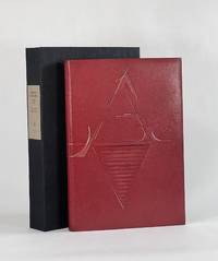
19279186New York: Printed by William Edwin Rudge for the Grolier Club 1927. Full Leather. Very Good binding. Quarto. 6 xxiii 1 208 2 pp. illus. Limited edition one of 390 copies. This copy bound by Don Glaister in full crimson goatskin with typographic design referencing Rogers's type design throughout the volume—a stylized A on the front cover and Z on the rear tooled in blind and gold transitioning to painted lines. Glaister employs slightly raised and recessed areas beneath the leather with occasional light sanding all to offer subtle dimensionality a suggestive nod to the raise aspects of type. Crimson cork endpapers gold and crimson silk headbands accent the original gold top-edge. Signed in blind on the rear pastedown with date and gold dot "Donald Glaister 2025." Fine in clamshell.<br /> <br /> This edition designed by Bruce Rogers is the first English translation of Tory's landmark work begun in 1523 and published 1529. Tory's influence on 16th century typography was immeasurable—moving French printing away from gothic types towards the roman faces a movement that would define modern typography. D. B. Updike calls Tory's Champ Fleury "one of the important books in the history of letter design" I p. 188. A beautiful edition that took decades for Rogers to bring from a proposal to the Grolier Club to a printed edition. And of all he designed it was among Rogers's favorite #24 in BR Thirty. Tory's groundbreaking and forward-looking work had long been a classic text by the time Rogers designed this edition 400 years later. Now 100 years further on Glaister adds his voice to this typographic tradition and in his distinct style takes these now-classic letterforms and nudges them into modernity. Haas 413. Grolier 361. Updike Daniel Berkeley. Printing Types. 3rd ed. 1966. Printed by William Edwin Rudge for the Grolier Club unknown
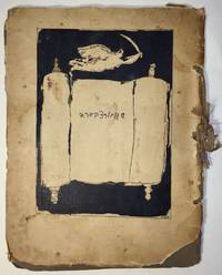
19271751Paris: I. Grodzensky 1927. First edition. Text in French and Yiddish. In publisher’s wrappers bound by string. Cover design by Marc Chagall. Cover and plates are worn at extremities. Cover and some plates damaged at corners and at the string. Two photographic reproductions are loose. Overall in good condition. First edition. Text in French and Yiddish. In publisher’s wrappers bound by string. Cover design by Marc Chagall. 4 text plates and 19 album card plates with mounted photographic reproductions. <p><br /> Scarce book with Chagall’s cover design.<br /> <p><p><br /> With Marc Chagall’s image on the front cover. Before a black background the image features an opened Torah scroll with the inscription of Schwartzbard's name in Hebrew letters an angel with sword flies over the Torah an allusion to Michael the Archangel the advocate of the Jews.<br /> <p><p><br /> A scarce album with pictures of places and portraits of people connected with the Schwartzbard-trial together with short expressions of opinion from prominent intellects as well as brief biographical notes on Schwartzbard and Petliura.<br /> <p><p><br /> Sholom Schwartzbard 1886–1938 was a Russian-born French Yiddish poet and anarchist the assassin of Symon Petliura 1879–1926 head of the Ukrainian government-in-exile in Paris in 1926. Schwartzbard held Petliura responsible for the death of fifteen of his relatives murdered in pogroms during Petliura rule of the Ukrainian National Republic. The number of Jews murdered during the massive 1918–1921 pogroms in Ukraine is estimated to be between 35000 and 50000 and a large percent of the violent attacks were carried out by soldiers under Petliura’s command. The Schwartzbard trial began in mid-October 1927 lasted for eight days in the end it turned on accusations of Petliura's responsibility for the pogroms and eventually Schwarztbard was acquitted. <br /> <p><p><br /> Scarce we could trace only 3 copies in institutional holdings Harvard University Widener Library Cambridge MA USA; NLI Jerusalem; Musée d’art et d’histoire du Judaïsme Paris.<br /> <p>. [I. Grodzensky] unknown
1965122002N.p.: N.p. 1965. A dazzling collection of ten original pressbooks designed by Saul Bass documenting the majority of the famed title and ad designer's work with director Otto Preminger in the 1950s 60s and 70s. <br /> <br /> Several of the pressbooks defy the conventions of pressbook design with custom shapes to represent items in keeping with the films for which they were made: "Advise and Consent" resembles a briefcase "In Harm's Way" is designed as a dossier with a string tie "The Cardinal" as a parcel and "Bunny Lake is Missing" as a newspaper. Other key titles in the collection include "Anatomy of a Murder" "Bonjour Tristesse" "Exodus" and "The Man with the Golden Arm."<br /> <br /> For most of the pressbooks in this collection we have never seen another example. A fascinating example of the advertising work done by the premiere title and ad designer of the twentieth century. <br /> <br /> Various sizes ranging from Very Good to Near Fine condition. <br /> <br /> Complete details available on request. N.p. unknown
1916143509N.p.: N.p. 1916. Vintage Swiss one sheet lithograph poster made to promote the 1916 opening of Speck's Orient-Cinema in Zurich during the heart of the silent film era. Designed and illustrated by costume and commercial designer Ernst Deutsch-Dryden. <br /> <br /> The poster's illustration portrays well-dressed clientele watching a Western movie likely meant to represent a US import. During this period there was a push in Zurich as in all large European and American cities to build lavish new cinemas to accommodate the constantly growing public demand for films and elegant movie houses in which to view them. <br /> <br /> 27 x 39 inches. Linen backed with no extra linen borders with slight restoration at the folds and edges. Archivally framed with UV plexi. N.p. unknown
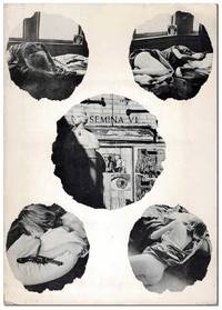
19607086Larkspur CA: Wallace Berman 1960. First Edition. Complete copy of the sixth issue of Berman's iconic assemblage zine dedicated entirely to David Meltzer's 13-part poem "The Clown." Berman illustrated the title leaf and designed the photographic collage on the cover of the portfolio featuring four images of his Larkspur landlady and Sausalito gallery owner Phyllis surrounding an image of the Semina Gallery. Semina Culture p.62. One of 335 copies. Slim octavo 21cm; photo-illustrated card portfolio with 14 handpress-printed loose sheets held in a pocket mounted to inner cover. Subtle toning to the edges of the 14 inserts else Near Fine. Portfolio is lightly edgeworn and dust-soiled with some faint scattered foxing and a few tiny tears; Very Good. Housed in a custom half-morocco clamshell case. Wallace Berman unknown
19011717801901. NAKAMURA Gyokushu. Miyama no shiori. 2 volumes. 250 x 160 mm. Kyoto: Honda Unkido 1901. An exquisite collection of designs probably created as patterns for kimonos. In fine condition and extremely rare. Some of the plates have a distinctly modernist feel. There is some soiling but the stunning plates are immaculate. OCLC lists The National Diet Library and the Wolfsonian. unknown
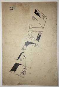
19221736Moscow: Der Shtrom The Moscow School for Yiddish Printers 1922. First edition. In publisher’s illustrated wrappers. Paper yellowed due to aging. Tiny inkblots on cover. Note in pencil on title page. Numeric notes between pp. 9–25. Three pinholes throughout at the gutter. Cover artistically restored. Overall in very good condition. Cover design by Marc Chagall. Cover design by Marc Chagall. First edition. In publisher’s illustrated wrappers. 80 p. <p><br /> The second number of the first Soviet Yiddish literary-cultural periodical featuring a cover designed by Marc Chagall.<br /> <p><p><br /> Shtorm was founded and edited by a literary and artistic group formed in Kiev of Yekhezkl Dobrushin Nokhem Oyslender and Arn Kushnirov and Dovid Hofshteyn. Six numbers were published in five issues between 1922 and 1924. <br /> <p><p><br /> Each cover featured the same illustration on the front by Marc Chagall. “Chagall used only the letters in the word Shtrom as illustrations which included a disembodied person on the »R« and a factory with a worker entering the building as part of the »Sh«†Shneer pp. 145–6.<br /> <p><p><br /> Bibl.: Shneer D.: Yiddish and the Creation of Soviet Jewish Culture: 1918–1930. Cambridge University Press 2004.<br /> <p>. Der Shtrom, The Moscow School for Yiddish Printers unknown