7 619 résultats
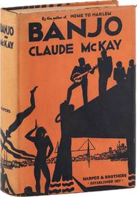
192988435New York: Harper & Brothers Publishers 1929. First Edition. First Printing. Octavo 19.5cm; navy blue and red paper-covered boards and black cloth backstrip with titles stamped in gilt on spine; decorative endpapers; orange topstain; dustjacket; viii23-3262pp. Spine ends gently nudged topstain slightly dulled else a fresh very Near Fine copy. In the original dustjacket designed by Aaron Douglas; unclipped priced $2.50 gently spine-sunned and lightly edgeworn with a few tiny tears a tiny split at rear flap fold and some mild dust-soil; still a bright Near Fine copy. <br /> <br /> McKay's second novel an accurate social perspective of Black life in southern France drawn directly from McKay's experience living in Marseilles. "Lincoln Agrippa known to his drifter cohorts on the 1920s Marseilles waterfront as "Banjo" passes his days panhandeling and dreaming of starting his own little band. At night Banjo Malty Ginger Dengel Bugsy Taloufa Goosey and even Jake of Home to Harlem prowl the rough waterfront bistros drinking looking for women playing music fighting loving and talking - about their homes in Senegal the West Indies or the American South; about Garvey's Back-to-Africa Movement; about being Black. When Ray a writer joins the group it triggers his rediscovery of his African roots and his feeling that at last he belongs to a race "weighted tested and poised in the universal scheme" from the HarperCollins reissue. PERRY 377; GLOSTER p.165-166. 88435. Harper & Brothers Publishers unknown
1908884571908. DESIGN Sugiura HISUI designer. MITSUKOSHI; MITSUKOSHI TIMES; OSAKA MITSUKOSHI Tokyo & Osaka 1908-1923. Western-style magazines 24.9 x 18.4 cm decorated wrappers. Lovely covers most by Sugiura Hisui 1876-1965 or designed under his supervision. Hisui is the most important figure in the development of Japanese commercial art in the 20th century the progenitor of "Taisho Chic" and a force to be reckoned with as a practical designer at Mitsukoshi and an educator at the Japan School of Art the Imperial School of Fine Art and the Tama Imperial School of Art which he co-founded. He even spent two years in Europe in the early 20s researching design. He created many portfolios of design examples for professionals wrote treatises on the principles of design and was a tireless creator of posters and magazine covers. He began work at Mitsukoshi in 1908 as a design consultant in charge of cover art for the house organ MITSUKOSHI TIMES. When MITSUKOSHI magazine began in 1912 he had already been promoted to head of design for the company a year earlier and stayed in that position for decades. His artwork graced the covers of many magazines over the years but it was his work for MITSUKOSHI and MITSUKOSHI TIMES and OSAKA MITSUKOSHI that began his design career. We are offering here a group of issues of those magazines most with his brilliant cover art. The magazines as a form of trade catalog and guide to fashion for the well-heeled clientele of Mitsukoshi department store were intrinsically ephemeral. They are hefty magazines a vade mecum for the bon ton with pictures of summer frocks kimono fabrics morning coats shoes - with instructions on how they should be cleaned stored worn. With pictures and prices and order sheets. Useful and used then thrown away they are seldom found today. A gathering of this size is quite unusual especially as it begins with issues of MITSUKOSHI TIMES from 1908 - the year that Hisui took over design reponsibilities for the house organ. The issues: MITSUKOSHI TIMES 11 issues from 1908-13 Oct & Nov Meiji 41 1908; V.8 #s 4 & 6; V.10 #s 9 & 11; V.11 #s 4 7 11 & 14 V.12 #3. MITSUKOSHI 31 issues from 1912-1923 V.2 #4; V.4 #s 5 6 7 & 8; V.5 #s 4 5 7 & 8; V.6 #s 2 & 11; V.7 #s 6 7 & 8; V.8 #s 2 3 4 5 & 7; V.9 #s 4 5 6 7 9 & 12; V.10 #s 4 6 & 12; V.11 #11`; V.12 #3; V.13 #6. OSAKA MITSUKOSHI 2 issues V.4 #8 1915 a. unknown
1913D7495Paris 1913-1918. Hardcover. Very Good. Morocco backed original cloth; oblong 380 x 305 mm; contains over 100 drawings of dresses hats jackets and more done primarily in pen and ink and colored in pencil or gouache; and highlighted by 5 mounted photographs of a woman modeling different gowns. From the Parisian fashion house Detrois et Cie. Women's garments shown from the front and back and professionally presented -- drawings are polished and nicely detailed and colored. Scuffing along spine and edges of boards; binding a bit shaken. <br/><br/> hardcover
1933274DB(Wien, 1933-1938). 8°. (32) Seiten ohne Umschlag., 1
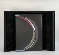
196110424San Francisco: Grabhorn Press 1961. Folio. 4 46 2 blank pp. illus. Limited edition one of 180 copies. This copy bound by Katy Starr-Baum in full black calf with inlays of sanded aluminum and pained paper as well as onlays of buffalo watersnake and stone veneer all arranged in a coronal design from front board to rear; graphite top edge with sprinkled palladium; handsewn silk endbands; hand-painted endpapers echo the cover design. Housed in clamshell box. <br /> <br /> A beautiful and fitting binding on one of the Grabhorn Shakespeare series with colored woodblock illustrations by Mary Grabhorn. A bold design using material that speaks to the time—stone and metal. The hand-painted endpapers evoke the night sky and have an iridescence that is dynamic when one opens the cover the light catching the paint shifts as the board moves. While boldly monochromatic what color there is in the binding the leather onlays and the painted paper picks up the pastels of Grabhorn's illustrations. The coronal design speaks to the backdrop of this play Henry IV holding onto power amidst treachery and Prince Hal's coming into the crown. But as Starr-Baum notes the design has a more potent deeper meaning: "the circular shape … represents familial cycles: the traits and behaviors that are passed down from one generation to the next and the transformation of Prince Hal into King Henry." A powerful binding by one of the most recent recipients of the Fine Binding Diploma of the elite American Academy of Bookbinding. Grabhorn Press unknown
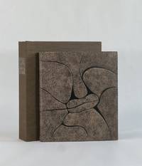
19489757Paris: Chez Georges Visat 1948. Full Leather. Near Fine binding. Octavo. 52 6 pp. frontis illus. Limited edition number 195 of 225 copies. This copy bound by Monique Lallier in full calf with extensive leather onlay shapes referencing the style of Alanore's illustrations. Textblock is sewn on meeting guards with the original wrappers incorporated in the binding. Silk embroidered endbands and leather doublures and flyleaves. Stamp-signed and dated 2014 by Lallier in gold on the rear pastedown. Light offsetting from the etchings and occasional light foxing but generally an internally clean copy nearly fine in a fine binding housed in clamshell that is slightly bumped at the extremities. <br /> <br /> An engaging and quirky narrative text in French wonderfully illustrated with 20 drypoint etchings by Alanore some full page but most incorporated around the printing. This binding from Lallier's personal collection is featured in her 2018 retrospective exhibition put on by Guildford College with catalogue published by Oak Knoll Press. In it she remarks how Alanore's etchings all have prominent lips which informed her design of the cover in a leather that looks like horse p. 100. A striking book inside and out bound by one of the most important design binders of the last 50 years. Chez Georges Visat unknown
192420052Wien, Würthle, 1924. 80 S., 16 nn. Bll. (Anzeigen) mit zahlr. Textabb. 8°. OKart. (kl. Restaurierungen, etw. gebräunt und bestoßen). [6 Warenabbildungen]
19234485EBPlauen i.V., Christian Stoll, 1923. Groß-2°. 45,5 cm. Titelblatt, 20 lose Blatt. Original-Halbleinenmappe mit Titelschildchen und Schließbändern. [6 Warenabbildungen] Emile Alain Seguy, 1877-1951, war ein bedeutender französischer Künstler des Art Deco.
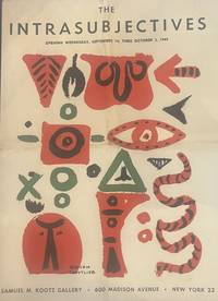
19493479New York 1949. First edition. Folding prospectus forming a large poster when unfolded central folds. Very good condition. First edition. Folding prospectus forming a large poster when unfolded central folds. <p><br /> Scarce poster-prospectus for the 1949 Kootz Gallery exhibition of the "Intrasubjectives" marking an early formation of Abstract Expressionism.<br /> <p><p><br /> Exhibition prospectus for the Kootz Gallery presentation of the "Intrasubjectives" documenting an early moment in the emergence of what would later be termed Abstract Expressionism. The publication announces and frames the work of artists including Willem de Kooning Arshile Gorky Robert Motherwell Jackson Pollock Ad Reinhardt and Mark Rothko at a stage before the movement had acquired its later critical designation.<br /> <p><p><br /> Texts by Harold Rosenberg accompany the presentation situating the group within a developing discourse of postwar abstraction. The design-by William Baziotes Hans Hofmann and Adolph Gottlieb-reflects the close alignment between artistic production and exhibition graphics characteristic of the New York avant-garde of the late 1940s.<br /> <p>. unknown
1933900971933. DESIGN FUJII Tatsukichi 藤井é”å‰ designer. SÔSAKU SENSHOKU ZUANSHÛ 創作染色図案集. A Collection of Designs for Dyework Tokyo & Osaka: Bungado Showa 8 1933. Large portfolio 41 x 31 cm. decorative cloth covered clasped chitsu case with a printed decorative label all enclosed in the publisher's folding cardboard outer box. A 4 page fascicle of preliminaries and a table of contents. With the chitsu design the cover design 3 preliminary page designs and 61 designs on the 50 content fascicles. The designs are primarily in color woodcut printed on both paper and occasionally cloth. A beautiful production here in almost perfect condition. Fujii Tatsukichi 1881-1964 was one of the most important reformers of the traditional arts in Japan. His creativity touched nearly every area: lacquer pottery papermaking dyeing - his influence was enormous. This scarce and lovely portfolio of his original designs helps to illustrate why he was so important. This deluxe production cost 25 yen in 1933 - a princely sum during the depths of the Depression in Japan. Complete. unknown
19341653411934. JAPANESE DESIGN. Juraku Cho. 3 volumes illustrated with a total of 90 colour and monochrome woodblock plates. Oblong folio 270 x 390 mm. bound in publisher's silk over boards in a new chitsu case. Kyoto: Unsodo 1934. A spectacular series of designs with superb colour woodblock plates with each volume devoted to a different motif. Volume 1 is Ryu no maki the dragon. Volume 2 is Hoo no maki the phoenix and Volume 3 is Shishi no maki the lion. Both the full colour plates and the monochrome plates facing them are masterpieces of the woodblock maker's art. Unsodo is the name of a large Japanese publishing company with branches in both Tokyo and Kyoto. Founded in 1891 this company is still in existence today. From the 1890s through the 1930s the Unsodo publishing house was involved in printing high quality pattern books for various crafts including textiles and lacquer.Some wear to the boards but otherwise a fine set. Rare with no listing on OCLC. hardcover
197154569Tokyo: Shueisha 集英社 1971. New edition. Hardcover. vg to near fine. Large oblong folio. 15x21". Unpaginated. All content housed inside the publisher's original cardboard shipping box with printed label pasted on the front. Binding protected in original a white cloth portfolio with red lettering on the front cover and lavishly decorated interior flaps. Black suede-covered boards with mutli-colored illustration mounted on the front cover. Decorative endpapers. Engraved stainless-steel plate showing Mishima's face mounted on black paper preceding the title page.<br /> <br /> The deluxe and lavishly printed new bilingual edition of the acclaimed and eroticly-charged work also know as "Killed by Roses" by Japanese photographer Eikoh Hosoe b.1933. It gained notoriety and elicited controversy when it was originally released in 1963 and won the Japan Photo Critics Association's writer award. The main photographic subject of the book the acclaimed and controversial writer Yukio Mishima 1925-1970 wrote the preface to the original edition and also writes the preface for this new edition both are included here. Mishima's acclaimed works include the famous and controversial novels "Confessions of a Mask" 1949 and "The Temple of the Golden Pavilion" 1956. Hosoe's striking high-contrast b/w photographs are all printed in high-quality photogravure retaining all the power and atmosphere of his original images. In comparison with the first version of the work this edition features the content having been noticeably re-edited with one image added a few others removed. The images have been thematically re-organized into five new chapters with the names "Sea & Eyes" "Eyes & Sins" "Sins & Dreams" "Dreams & Death" and "Death" respectively. Influential artist and graphic designer Tadanori Yokoo b. 1936 oversaw all of the design and layout aspects of the book and also created its additional illustrated elements most of which comprise the first chapter of this new edition.<br /> <br /> While Hosoe was still completing work to prepare this new edition of "Ordeal by Roses" the notorious "Mishima Incident" occurred November 25th 1970 which culminated in the ritual suicide of Yukio Mishima by seppuku. The incident shocked the nation and in its wake the photographer was quite unsure of how to proceed regarding the publication of the book. Not wanting to seem like an opportunist taking advantage of the controversy and the publicity surround Mishima's death he contemplated shelving the project but was later persuaded by Mishima's widow Yoko who said that her husband would have wanted it to be released. It was finally release only a few months later on January 30th 1971.<br /> <br /> Text in Japanese and English throughout.<br /> <br /> Portfolio with light foxing and sunning to the white cloth of the front cover very minor foxing and smudges to the flaps. Interior of portfolio with minor smudging to the cloth joints but the illustrations on the flaps are still clean. Suede binding clean. Minor foxing to the verso of the front endpaper. Interior with all pages and images clean and vibrant save for a few sporadic instances of the most minor stains or smudges on the blank versos a few pages. Portfolio in very good binding and interior in very good to near fine condition overall. Alternate title: 細江英公写真作å“. Shueisha (集英社) hardcover
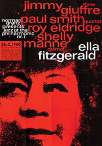
196073749Hamburg: 1960. Superb large-scale poster for the JATP tour of Germany in 1960 featuring Ella Fitzgerald the Jimmy Giuffre Three Paul Smith Quartet Roy Eldridge and the Shelly Manne Quintet. An example of the work of Kieser's early collaborative atelier with typographer Hans Michel 1952-62 which produced some truly remarkable work graphically highly original and imbued with a great sensitivity to the aesthetic of the artists being promoted. Here red black and white typography in lower case sans serif is overlaid on a portrait of Ella in black on red to stunning effect. Produced solely for the German tour this is an uncommon poster particularly so in the A0 format in such sharp condition. Offset lithographic on paper. Vintage outsize A0 format sheet size: 112 x 82.6 cm. Light creases from old folds some very slight cracking of the colour surface and one or two mild scuff minute closed tear to the right-hand edge but overall very good. Presented float mounted in a black museum box-style frame. unknown
1938894341938. DESIGN HAPPODO publisher/printer. KOKUGA OGI. Kyoto Happodo N.D. other sources indicate a date of 1938 Very large oblong brocade porfolio 36.5 x 59.0 cm. Contains an undated Happodo colophon and 50 design prints 49 in color and one as a textual calligraphic introduction to the work A source indicates the designs were done by Yamaoka Chinpei. The prints are extraordinarily lavish with sprinkled metal flakes overprinting metallic inks etc. A wonderfultribute to the Neo-Rimpa and Deco sensibilities of the age. The case has been restored the prints are quite clean. unknown
192755266Offenbach am Main: Verlag des Herausgebers Doktor Guggenheim 1927. First edition. Hardcovers. 1/300. Quarto. 97 1pp. Rebound in 3/4 beige pebbled leather over tan buckram retaining original printed stiff brown paper front cover. Gilt-stamped tooling ruling and raised bands on the spine. Publisher's device in red on the title page. <br /> <br /> The scarce first edition of the acclaimed illustrated Haggadah produced by Dr. Siegfried Guggenheim 1873-1961 in Offenbach Germany. Printed in a limited edition of 300 copies this gorgeous Passover Haggadah contains hand-colored woodcut illustrations by artist Fritz Kredel 1900-1973 including two illustrated maps of the Holy Land. German text throughout is printed in "Bible Gothic" type font specifically created for this publication by acclaimed German type designer and calligrapher Rudolf Koch 1876-1934 who was an early teacher of Kredel's at the Offenbach School of Art and Design. Includes text printed in black as well as orange color with many sections of musical notation and lyrics to Passover prayers and songs with printed in German translation as well as transliterations from the Hebrew. <br /> <br /> Guggenheim was initially inspired to produce the work as a result of his need to spark his passion for Jewish traditions in his own children and by extension the need to create a new and visually engaging work to inspire the younger generation of German Jews. It was compiled from a huge number of stories anecdotes and songs collected by Guggenheim over a 14-year period. These were eventually paired down into the final work which was so-named in order to tie it to the rich history of past printed Haggadah in the city dating back to at least the early 18th century.<br /> <br /> Text throughout in German and Hebrew.<br /> <br /> Binding with minor smudging to the beige leather. Gilt of the Star of David motifs on the spine has been mostly rubbed away. Interior with sporadic minor to light foxing to pages throughout though mostly in the margins. Most images throughout are clean and vibrant. Binding in very good interior in very good- condition overall. vg- to vg.<br /> <br /> WITH<br /> <br /> Offenbacher Haggadah. New edition BLACK & WHITE EDITION Published by Dr. Guggenheim Flushing N.Y. in commission at Otto Harrasowitz Wiesbaden. 1/500. Quarto. 133 1pp. Blue half cloth over gray paper boards. Black lettering on tan paper label pasted on the spine. This second edition of the acclaimed Offenbacher Haggadah originally published in 1927 saw the book printed in the America in a slightly shorter and thinner format. From an edition of 500 copies with b/w illustrations. In the years preceding the Second World War the two most central figures in the production of the original edition publisher editor and compiler Dr. Siegfried Guggenheim 1873-1961 and illustrator Fritz Kredel 1900-1973 had both emigrated to the United States fleeing the Nazis.<br /> <br /> This edition replaces Kredel's original woodcut illustrations for the 1927 edition with many more numerous newly created images by the artist especially for this edition which are here lithographically printed in black. Additionally the original gothic type font created by Rudolf Koch for the first edition has been replaced here by a more standard font and more passages in Hebrew have been added. All of the text content of the original edition has been faithful preserved here including all of the sections of musical notation and lyrics to Passover prayers and songs with printed in German translation as well as transliterations from the Hebrew. A newly written foreword for this edition by publisher Siegfried Guggenheim is included along with his foreword from the first edition. Text throughout in German and Hebrew. Binding with minor to light rubbing/bumping to corners and some very minor smudges and scratches to the front boards. Very light stains to blue cloth along spine. Binding in very good- condition interior in near fine condition overall.<br /> <br /> AND WITH<br /> <br /> Offenbacher Haggadah. New edition COLOR EDITION Published by Dr. Guggenheim Flushing N.Y. in commission at Otto Harrassowitz Wiesbaden. 1/600. Quarto. 133 1pp. Brown half cloth over beige paper boards. Black lettering on tan paper label pasted on spine. The second edition of the acclaimed Offenbacher Haggadah originally published in 1927 in a slightly shorter and thinner format. 1 of an edition of 600 copies with colored illustrations by the Schauer & Silwar coloring company in Darmstadt. Near fine condition overall. Verlag des Herausgebers Doktor Guggenheim hardcover
196354664Bratislava: Mladé letá 1963. First edition. Hardcover. Very good to near fine condition. 1/5000. Large quarto. Unpaginated. 72pp. Original off-white cloth with abstract illustration of a human heart on front cover red lettering on spine in original photo-illustrated dustjacket black lettering on spine red on cover protected by modern mylar. Photo-illustrated endpapers. "The book is one of the most unusually edited and designed and also rarest postwar photo books by Karol Kállay." Czech and Slovak Photoo-Publications p. 316<br /> <br /> This rare and poignant photo-essay by Slovak photographer Karol Kállay present seventy-two sheet-fed gravures. Divided into two parts: A selection of photographs showing Bratislava children playing together or walking through a neighborhood under construction in part one and part two documents the everyday life of surgeons and nurses dedicated to save lives at the Bratislava Children's University Hospital where children are seen undergoing open-heart surgery while anxious parents wait and hope for a positive outcome. <br /> <br /> Text in Czech. Dustjacket lightly rubbed along edges slightly more pronounced at top of front foredge and minor chips at tail of spine. Binding age-toned along top and bottom edges. Interior in near fine condition. Karol Kallay 1926-2012 was a citizen of the world a photographer with blue blood running in his veins who in the educational spirit of the First Republic remained a sworn Czechoslovak even after the breakup of Czechoslovakia in 1993. He was born a Hungarian aristocrat on the 26th of April 1926 in Cadca in Czechoslovakia’s First Republic where right from the republic’s beginnings the use of aristocratic titles - distinguishing those with “blue blood†from the mere mortals - was officially banned. Despite this his distinction conspicuously radiated out of him all his life. He always wanted to be a photographer. Perhaps it was because at the age of sixteen he won a gold medal in a Slovak photo contest. But it was also thanks to the excellent education he got from his older friends in the Trencin amateur photographic club Halasa Hajduch Farkas which was one of the many Slovak photographic societies started after the war by Jiri Jenicek an officer of the Czechoslovak army and a brilliant and enthusiastic amateur photographer. Kallay’s wise father didn’t want to impede his son’s “comedian career†as he regarded the photographic profession but he had one condition - his son had to study something proper first. And so Karol after the end of the Second World War studied commercial engineering and law in Bratislava. He worked for a construction company in Zilina and Sucany and in his free time he devoted himself to photo reportage as an associate of a photo weekly Domov and Svet. That brought him to Prague where he meet two eminent photographers: Karel Hajek the shining star of reportage photography and Jan Lukas whose recently published book Zeme a lide not only impressed him but practically predetermined his future photojournalistic direction in the spirit of humanistic photography. “Through Jan Lucas I discovered magazines - "Life" "Paris Match" "Illustrated London News" including fashion magazines such as "Vogue" and "Harper’s Bazaar"; articles and the opinions of the aesthetician Alexander Libermann and the artistic direction of Alexey Brodovitch - it was all important learning for me because we didn’t have that in Slovakia†he remembers. And so Kallay’s specific bipolarity as an excellent fashion and advertising photographer was basically the source of his income with excellent reporting constantly mapping out the people’s lifestyles that he found on his frequent travels all over the world. Thanks to the Bratislava weekly magazine "Moda" to which he was a regular contributor he could leave his regular job in 1956 and become a freelance photographer. That opened the way for him to contribute to the most important foreign fashion magazines - mainly "Jardin des Modes" in Paris and "Saison" and "Sybille" in Berlin. And because of this at home he became forever known as a successful photographer of fashion who brought the freshness and the dynamism of live photography into his work. In other words: he stopped photographing models as stiff coat hangers. In addition he traveled published books and did reportages for prestigious magazines such as "Geo" "Stern" "Spiegel" "Focus" "Merian" "Sports International" "Paris Match" and "Illustré" of which at that time the world behind the iron curtain knew practically nothing about. And thanks to this talent Karol Kallay became a photo reporter like none other in Czechoslovakia. Mladé letá hardcover
1965013433Philadelphia: Institute of Contemporary Art University of Pennsylvania 1965. 1st Edition. Hardcover. Near Fine. Catalog of Warhol's first museum show with the compliments card of Sam Green who curated it. 8vo illustrated stiff covers black cloth backstrip perfect bound 27 full page illustrations. Housed in a phase box with an enameled medallion - with the Warhol image of Campbell soup cans similar to the cover of the catalog - in a round silver mount on the front slot designed and crafted by Wesley Tanner. Institute of Contemporary Art, University of Pennsylvania hardcover
1910891951910. DESIGN Ogino Issui designer. ZUAN HYAKUDAI. 3 Vols. Kyoto Unsodo Meiji 43 1910 An orihon in 3 volumes 27 X 19 cm with woodblock printed covers all in a later fitted clasped cloth chitsu case. Unsodo outdid itself in this early design effort. Dozens of double page horizontal designs which become large prints the paper size being 37.5 x 27 cm as well as circular and fan-shaped and single page designs too. Most in the neo-Rimpa style which Unsodo artists pioneered at the beginning of the last century - bold and lovely. A bit of browning and fading the covers show some wear but overall very good condition a very nice impression of this important set. Complete. One of the very best of the Unsodo design books which is very good indeed. unknown