4 641 résultats
1519FURNITUR011798Eget F�rlag G�teborg. 1915-1916. First edition. Small quarto. Four volumes: 196 23 adverts; 198 23 adverts; 192 27 adverts; 192 31 adverts. Almost all the pages are devoted to photographs of the hugely prolific Otto Schultz's distinctive furniture designs which seem to take elements from the Arts and Crafts movement and blend them with the latest Art Deco ideas. Each volume has a short introduction by Schultz. Text in Swedish. Original hessian bindings stamped with titles in art deco type. Laid into the third and fourth volumes are eight-page pamphlets giving the dimensions of the various items. Otto Schultz went on to found the Boet interior design store in Gothenburg and ran the influential magazine of the same name.Ownership signatures on front endpapers of first volume. Titles on covers slightly flaking. A very good set indeed. Very scarce. Eget F�rlag, G�teborg. unknown
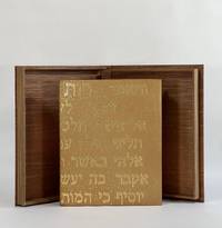
10426Provo UT: Tryst Press 2011. Full Leather. Fine binding. Quarto. 32 pp. illus. Limited edition one of 160 copies this copy out of series. Bound by Katy Starr-Baum in tan goatskin; textblock is sewn on meeting guards with hand-embroidered silk endbands; binding with Hebrew lettering made up of hand-tooled gold dots which extend to the top edges of boards and headcaps; edge-to-edge hand-painted doublures and free endpapers. Housed in clamshell box. A fine copy. <br /> <br /> A lovely book by Robert Buchert at his Tryst Press printed on purpose-made paper by the printer with a barley ear watermark and in Buchert's Psalter type. The colophon reports that this is the first book employing Buchert's typeface. Many in-text woodcuts some full page embellish the book. Here beautifully bound in a meaningful way by Starr-Baum who having over the course of a few years learned of her Jewish roots and converted to Judaism like Ruth that first convert before her. The Hebrew rendered in gold on the binding reads in the King James version: "And Ruth said Intreat me not to leave thee or to return from following after thee; for whither thou goest I will go; and where thou lodgest I will lodge: they people shall be my people and they God my God; Where thou diest will I die and there will I be buried; the Lord do so to me and more also if ought be death part thee and me." Starr-Baum has been binding books for more than 20 years and is among the most recent recipients of the Fine Binding Diploma of the elite American Academy of Bookbinding. Tryst Press unknown
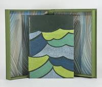
9379Old Stile Press 2009. Full Leather. Near Fine binding. Folio. 56 pp. illus. Limited edition number 193 of 195 copies signed by Onken at the colophon. A skilled and imaginative design binder and a graduate of the American Academy of Bookbinding fine binding program Brenda Gallagher has engaged with this modern telling of a story that comes from a long tradition of Celtic and Norse selkie stories. Full bound in green goat with onlays in fish leather that capture the movement of the waves in green blue and gray. Gallagher's binding wonderfully complements the tale both thematically and artistically as her bold stylized cover shares a harmony with Onken's woodcuts. But even subtler details bring this text and binding together like her skillfully woven silk endbands and the painted top-edge a lovely sea-green with the suggestion of vegetation as though looking down on the top-edge of the book is to look down into the sea. Housed in clamshell box. <br /> <br /> A finely printed and illustrated selkie story written by Brown in 1984 and first published here by the Old Stile Press. The cuts by Onken are beautifully done and are indispensable in conveying this story of a selkie who has been separated from her seal skin by a fisherman trapping her in her human form. Perhaps the most striking of Onken's cuts is only found on the publisher-issued binding as a pictorial pastedown on the front board. Gallagher whose engagement with this text is not limited to the binding relays the tale of disappointment when purchasing this book unbound and necessarily without this woodcut—perhaps the woodcut that resonated with her the most. Since the printer had no extra copies of the illustration Gallagher was driven to locate and contact Onken who had neither print nor the block from which the illustration was printed. Instead he offered to lend her a good drawing of the image. From this image Gallagher cut her own linoleum block and printed the illustration remarkably true to the original. That print serves as the front fly leaf in her binding—a one of one lino print. An exceptional designed binding by an American binder coming into her own. Old Stile Press unknown
000700<p><b>For consideration: These wall coverings could be framed for display.</b></p><p>Newark DE/ Scottsdale AZ: Schumacher Co./ Frank Lloyd Wright Foundation. Frank Lloyd Wright: Wallcoverings title from cover Wright. Trade catalogue.- Newark DE/ Scottsdale AZ. Schumacher Co./ Frank Lloyd Wright Foundation. There are seventy pages that are numbered corresponding to listed samples. There are 17 unpaged samples which are borders that go along with the wallpaper samples. Then there are six interior scenes showing of the wallpaper and other Wright inspired designs. Then there are another eleven pages of textile designs for sheers panels prints wovens and rugs. Extremely rare to find a wright Catalog with actual samples. We did not find a date but it appears based on research that this is from the 1980's. Wright catalogs are EXTREMELY RARE. Condition:The book is in Very Good condition. It measures 9 inches by 12 inches. The covers have minor edge wear. The contents are tightly bound and secured with two metal bolts as issued. The contents are almost Like New. There is a very strong paint and wallpaper odor associated with this book when it is opened. There is no mold. The buyer would do well to let the book sit open. Please write with questions. First Edition. Hard Cover. Near Fine. Folio - over 12" - 15" tall.</p> Schumacher Co./ Frank Lloyd Wright Foundation. hardcover
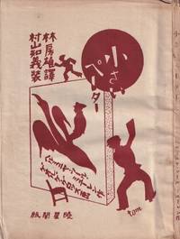
55248Tokyo: Gyoseikaku 1927. Small octavo 16.5 × 12.5 cm. Original pictorial wrappers illustrated by Tomoyoshi Murayama; 4; 89 5 pp. with 6 plates of illustrations by George Grosz. An uncut copy with wide margins; wrappers and margins somewhat dust-stained and toned; good or better. Rare first Japanese edition of the children's book with illustrations by George Grosz and cover design by Mavo founder Tomoyoshi Murayama. It was first published in 1921 under the title "Was Peterchens Freunde erzählen" What Little Peter's Friends Talk About in 1921 as the first volume in the book series "Märchen der Armen" Fairy Tales of the Poor published by Malik-Verlag which had been founded by John Heartfield and Wieland Herzfelde for the Berlin Dada movement. The little volume was to become one of the most successful proletarian children's books worldwide. In it the "Red Countess" as the communist noblewoman was also known describes how the objects in Peter's room begin to speak while he lies sick and bored in bed. The coals in the stove tell of the miners' hard work the water bottle of the glassblowers and the matchbox of the trees and forest workers.<br /> <br /> The Japanese translation by Hayashi Fusao featuring illustrations by Grosz played a key role in making Grosz known in China. Surprisingly it was the Japanese edition published between the two wars with Japan and approximately two years after the suspension of the Chinese Civil War between Nationalists and Communists in favor of a united front against Japan that served as the basis for Lu Xun's first Chinese translation in 1929 titled "Xiao Bide." Remarkably Grosz had been known in the Japanese Empire for many years before his illustrations in this book also gained circulation in China which unlike Japan had extensive Communist Party structures. Cf. Paul Bevan. A Modern Miscellany: Shanghai Cartoon Artists Shao Xunmei's Circle and the Travels of Jack Chen 1926-1938 Berlin 2018 pp. 135ff.<br /> <br /> It was mainly thanks to Tomoyoshi Murayama that the Berlin Dadaist Grosz became known in Japan; Murayama studied in Berlin from 1921 to 1923 and joined the circle associated with the "Der Sturm" gallery run by the communist Herwarth Walden. There he met among others Grosz and Schwitters. He also took part in the Düsseldorf Congress of "Progressive Artists" where Dadaists and Constructivists joined forces. Upon returning to Tokyo he founded "Mavo" as so to speak the Japanese branch of Dada. Like the Berlin group "Mavo's" art actions were not least political protests directed against the military government in Tokyo. Cf. Hanne Bergius Das Lachen Dadas: Die Berliner Dadaisten und ihre Aktionen Berlin 1989 p. 300. It was also Murayama who introduced Mavo member Yanase Masamu to the work of Grosz. The illustrator and cartoonist was also a member of the "Japanese Proletarian Artists' Association" for which he designed several journals posters and books. Furthermore he had been employed as a cartoonist and comic artist at the daily newspaper "Yomiuri Shimbun" since 1920. In 1929 Yanase published a comprehensive monograph on Grosz's work titled "Musan kaikyu no gaka Georuge Gurossu" George Grosz: Painter of the Proletariat. See Bevan ibid.<br /> <br /> As of March 2026 KVK OCLC lists no copy worldwide. unknown
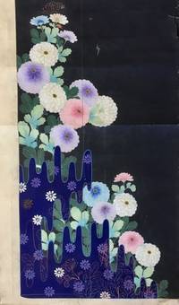
181956897Kyoto Japan: Marubeni Shoten Design Dept. Keimeikai Textile & Dyeing Studio Tanioka Shoten Design Dept. ca. 1918-1945. Folio. 61 original hand-painted inked and pencil designs with a few on a lightly toned but quality semi-translucent paper the majority on thick paper stock and still others with two pieces carefully pasted together with contiguous designs sized from 9 x 15 in. up to 19.25 x 38.5 in. with 13 of the pieces larger the larger size a number of them sized 18 x 32 in. and many in the 14.25 x 15.5 in. size colour painted; the majority feature the design studio chop or crest at lower corners throughout many w/ annotations in margins several w/ change orders neatly annotated or even the title of the design and still many others w/ Roman numeric inventory codes in margins as well two still retaining original small silk samples many with creasing or minor tears & edgewear or creasing to fore-edges a few w/ small & large closed tears while others show some creasing and thumbing from continued use still an exceptional group of manuscripts. This superb archive of 61 original hand-painted kimono designs furnishes an exceptional visual array of Taisho- and early Showa-era Japanese motifs and styles. A number of the designs evoke traditional Japanese Ukiyo-e woodblock prints with deep vivid colours and well rendered illustrations. Many of these designs incorporate floral patterns including Kiku Chrysanthemum Botan Mon Peony Pattern Manju Kiku Marigolds Japanese Irises Morning Glory Cockscomb Ivy Dahlias and many other botanical motifs. In addition there are many illustrating ornately embroidered designs austere bamboo mushrooms and intriguing landscapes some with a small portion fully painted in with brilliant colouring while the outline of the kimono fills out the drawing. Two of the designs still features their original small attached silk kimono sample more reminiscent of Western Design houses which often attached their chosen fabric samples to their clothing designs. A few of the designs are executed on translucent thin paper for the kimono draper to transfer the design to white silk or other fabrics via some type of carbon paper process. Another of the designs has been executed on a stunning silver metallic paper with palm or bamboo leaf fronds executed in vivid blues & browns. Some feature a nearly surrealist quality while several others include illustrations of doves or chickens. Two of the designs incorporate Art Deco representations of Chinese Junks and Japanese sailing vessels typical of the 1930’s prior to World War II. In the Taisho Era a new era opened for textile designers working with Kyoto drapers and department stores with many having trained at new art colleges and then working in the design studios of Marubeni Keimeikai Textile & Dyeing Studio and others. The Tachiki Artist design studio designs on thin translucent paper include one with designer stamp of character embedded within a skull. Some appear to have two different date stamps for the Marubeni Shoten Design and some are unsigned or stamped. The Taisho- and Showa-era kimonos featured brighter colours more groundbreaking designs as Japan’s designers embraced traditional dress and transformed it into a new garment equally appealing to the “Moga†or brazen “Modern Girl.†The designer notes include instructions to “leave a little more space between the fans;†“Drop the little fan crest;†“too much white bush clover†on the pine cones and even that Matsuo Taishichi had ordered a design for “clothes for paying a visit for a young person.†The Marubeni Shoten originated with Chubei Itho who began in 1858 as a salesman for linen cloth and by 1872 had opened his drapery store Benchu in Senba Osaka. By 1918 Chubei Itoh had expanded the business into Osaka and deciced to merge with Itochu Shoten Ltd. becoming Marubeni Shoten with their own drapers shops and many contracts with department stores. Later by the mid-1950s Marubeni merged with the company that operated the Takashimaya Dept. Store Chain all the while preserving their design studio and artists. See: Yuko Fukatsu-Fukuoka The Evolution of Yuzen-dyeing Techniques and Designs After the Meiji Restoration 2004; Arisa Shinko Tomikawa Hand Painted Kyo Yuzen Atelier “Arisa†A Brief Introduction 2020; Annie Van Asche Japanese Kimono Fashion of the Early Twentieth Century Textile Society of America Symposium Proceedings 2000; Our History Our Roots Marubeni Corporation 2020. Marubeni Shoten Design Dept., Keimeikai Textile & Dyeing Studio, Tanioka Shoten Design Dept., hardcover
197154569Tokyo: Shueisha 集英社 1971. New edition. Hardcover. vg to near fine. Large oblong folio. 15x21". Unpaginated. All content housed inside the publisher's original cardboard shipping box with printed label pasted on the front. Binding protected in original a white cloth portfolio with red lettering on the front cover and lavishly decorated interior flaps. Black suede-covered boards with mutli-colored illustration mounted on the front cover. Decorative endpapers. Engraved stainless-steel plate showing Mishima's face mounted on black paper preceding the title page.<br /> <br /> The deluxe and lavishly printed new bilingual edition of the acclaimed and eroticly-charged work also know as "Killed by Roses" by Japanese photographer Eikoh Hosoe b.1933. It gained notoriety and elicited controversy when it was originally released in 1963 and won the Japan Photo Critics Association's writer award. The main photographic subject of the book the acclaimed and controversial writer Yukio Mishima 1925-1970 wrote the preface to the original edition and also writes the preface for this new edition both are included here. Mishima's acclaimed works include the famous and controversial novels "Confessions of a Mask" 1949 and "The Temple of the Golden Pavilion" 1956. Hosoe's striking high-contrast b/w photographs are all printed in high-quality photogravure retaining all the power and atmosphere of his original images. In comparison with the first version of the work this edition features the content having been noticeably re-edited with one image added a few others removed. The images have been thematically re-organized into five new chapters with the names "Sea & Eyes" "Eyes & Sins" "Sins & Dreams" "Dreams & Death" and "Death" respectively. Influential artist and graphic designer Tadanori Yokoo b. 1936 oversaw all of the design and layout aspects of the book and also created its additional illustrated elements most of which comprise the first chapter of this new edition.<br /> <br /> While Hosoe was still completing work to prepare this new edition of "Ordeal by Roses" the notorious "Mishima Incident" occurred November 25th 1970 which culminated in the ritual suicide of Yukio Mishima by seppuku. The incident shocked the nation and in its wake the photographer was quite unsure of how to proceed regarding the publication of the book. Not wanting to seem like an opportunist taking advantage of the controversy and the publicity surround Mishima's death he contemplated shelving the project but was later persuaded by Mishima's widow Yoko who said that her husband would have wanted it to be released. It was finally release only a few months later on January 30th 1971.<br /> <br /> Text in Japanese and English throughout.<br /> <br /> Portfolio with light foxing and sunning to the white cloth of the front cover very minor foxing and smudges to the flaps. Interior of portfolio with minor smudging to the cloth joints but the illustrations on the flaps are still clean. Suede binding clean. Minor foxing to the verso of the front endpaper. Interior with all pages and images clean and vibrant save for a few sporadic instances of the most minor stains or smudges on the blank versos a few pages. Portfolio in very good binding and interior in very good to near fine condition overall. Alternate title: 細江英公写真作å“. Shueisha (集英社) hardcover
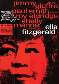
196073749Hamburg: 1960. Superb large-scale poster for the JATP tour of Germany in 1960 featuring Ella Fitzgerald the Jimmy Giuffre Three Paul Smith Quartet Roy Eldridge and the Shelly Manne Quintet. An example of the work of Kieser's early collaborative atelier with typographer Hans Michel 1952-62 which produced some truly remarkable work graphically highly original and imbued with a great sensitivity to the aesthetic of the artists being promoted. Here red black and white typography in lower case sans serif is overlaid on a portrait of Ella in black on red to stunning effect. Produced solely for the German tour this is an uncommon poster particularly so in the A0 format in such sharp condition. Offset lithographic on paper. Vintage outsize A0 format sheet size: 112 x 82.6 cm. Light creases from old folds some very slight cracking of the colour surface and one or two mild scuff minute closed tear to the right-hand edge but overall very good. Presented float mounted in a black museum box-style frame. unknown
1938894341938. DESIGN HAPPODO publisher/printer. KOKUGA OGI. Kyoto Happodo N.D. other sources indicate a date of 1938 Very large oblong brocade porfolio 36.5 x 59.0 cm. Contains an undated Happodo colophon and 50 design prints 49 in color and one as a textual calligraphic introduction to the work A source indicates the designs were done by Yamaoka Chinpei. The prints are extraordinarily lavish with sprinkled metal flakes overprinting metallic inks etc. A wonderfultribute to the Neo-Rimpa and Deco sensibilities of the age. The case has been restored the prints are quite clean. unknown
192755266Offenbach am Main: Verlag des Herausgebers Doktor Guggenheim 1927. First edition. Hardcovers. 1/300. Quarto. 97 1pp. Rebound in 3/4 beige pebbled leather over tan buckram retaining original printed stiff brown paper front cover. Gilt-stamped tooling ruling and raised bands on the spine. Publisher's device in red on the title page. <br /> <br /> The scarce first edition of the acclaimed illustrated Haggadah produced by Dr. Siegfried Guggenheim 1873-1961 in Offenbach Germany. Printed in a limited edition of 300 copies this gorgeous Passover Haggadah contains hand-colored woodcut illustrations by artist Fritz Kredel 1900-1973 including two illustrated maps of the Holy Land. German text throughout is printed in "Bible Gothic" type font specifically created for this publication by acclaimed German type designer and calligrapher Rudolf Koch 1876-1934 who was an early teacher of Kredel's at the Offenbach School of Art and Design. Includes text printed in black as well as orange color with many sections of musical notation and lyrics to Passover prayers and songs with printed in German translation as well as transliterations from the Hebrew. <br /> <br /> Guggenheim was initially inspired to produce the work as a result of his need to spark his passion for Jewish traditions in his own children and by extension the need to create a new and visually engaging work to inspire the younger generation of German Jews. It was compiled from a huge number of stories anecdotes and songs collected by Guggenheim over a 14-year period. These were eventually paired down into the final work which was so-named in order to tie it to the rich history of past printed Haggadah in the city dating back to at least the early 18th century.<br /> <br /> Text throughout in German and Hebrew.<br /> <br /> Binding with minor smudging to the beige leather. Gilt of the Star of David motifs on the spine has been mostly rubbed away. Interior with sporadic minor to light foxing to pages throughout though mostly in the margins. Most images throughout are clean and vibrant. Binding in very good interior in very good- condition overall. vg- to vg.<br /> <br /> WITH<br /> <br /> Offenbacher Haggadah. New edition BLACK & WHITE EDITION Published by Dr. Guggenheim Flushing N.Y. in commission at Otto Harrasowitz Wiesbaden. 1/500. Quarto. 133 1pp. Blue half cloth over gray paper boards. Black lettering on tan paper label pasted on the spine. This second edition of the acclaimed Offenbacher Haggadah originally published in 1927 saw the book printed in the America in a slightly shorter and thinner format. From an edition of 500 copies with b/w illustrations. In the years preceding the Second World War the two most central figures in the production of the original edition publisher editor and compiler Dr. Siegfried Guggenheim 1873-1961 and illustrator Fritz Kredel 1900-1973 had both emigrated to the United States fleeing the Nazis.<br /> <br /> This edition replaces Kredel's original woodcut illustrations for the 1927 edition with many more numerous newly created images by the artist especially for this edition which are here lithographically printed in black. Additionally the original gothic type font created by Rudolf Koch for the first edition has been replaced here by a more standard font and more passages in Hebrew have been added. All of the text content of the original edition has been faithful preserved here including all of the sections of musical notation and lyrics to Passover prayers and songs with printed in German translation as well as transliterations from the Hebrew. A newly written foreword for this edition by publisher Siegfried Guggenheim is included along with his foreword from the first edition. Text throughout in German and Hebrew. Binding with minor to light rubbing/bumping to corners and some very minor smudges and scratches to the front boards. Very light stains to blue cloth along spine. Binding in very good- condition interior in near fine condition overall.<br /> <br /> AND WITH<br /> <br /> Offenbacher Haggadah. New edition COLOR EDITION Published by Dr. Guggenheim Flushing N.Y. in commission at Otto Harrassowitz Wiesbaden. 1/600. Quarto. 133 1pp. Brown half cloth over beige paper boards. Black lettering on tan paper label pasted on spine. The second edition of the acclaimed Offenbacher Haggadah originally published in 1927 in a slightly shorter and thinner format. 1 of an edition of 600 copies with colored illustrations by the Schauer & Silwar coloring company in Darmstadt. Near fine condition overall. Verlag des Herausgebers Doktor Guggenheim hardcover
196354664Bratislava: Mladé letá 1963. First edition. Hardcover. Very good to near fine condition. 1/5000. Large quarto. Unpaginated. 72pp. Original off-white cloth with abstract illustration of a human heart on front cover red lettering on spine in original photo-illustrated dustjacket black lettering on spine red on cover protected by modern mylar. Photo-illustrated endpapers. "The book is one of the most unusually edited and designed and also rarest postwar photo books by Karol Kállay." Czech and Slovak Photoo-Publications p. 316<br /> <br /> This rare and poignant photo-essay by Slovak photographer Karol Kállay present seventy-two sheet-fed gravures. Divided into two parts: A selection of photographs showing Bratislava children playing together or walking through a neighborhood under construction in part one and part two documents the everyday life of surgeons and nurses dedicated to save lives at the Bratislava Children's University Hospital where children are seen undergoing open-heart surgery while anxious parents wait and hope for a positive outcome. <br /> <br /> Text in Czech. Dustjacket lightly rubbed along edges slightly more pronounced at top of front foredge and minor chips at tail of spine. Binding age-toned along top and bottom edges. Interior in near fine condition. Karol Kallay 1926-2012 was a citizen of the world a photographer with blue blood running in his veins who in the educational spirit of the First Republic remained a sworn Czechoslovak even after the breakup of Czechoslovakia in 1993. He was born a Hungarian aristocrat on the 26th of April 1926 in Cadca in Czechoslovakia’s First Republic where right from the republic’s beginnings the use of aristocratic titles - distinguishing those with “blue blood†from the mere mortals - was officially banned. Despite this his distinction conspicuously radiated out of him all his life. He always wanted to be a photographer. Perhaps it was because at the age of sixteen he won a gold medal in a Slovak photo contest. But it was also thanks to the excellent education he got from his older friends in the Trencin amateur photographic club Halasa Hajduch Farkas which was one of the many Slovak photographic societies started after the war by Jiri Jenicek an officer of the Czechoslovak army and a brilliant and enthusiastic amateur photographer. Kallay’s wise father didn’t want to impede his son’s “comedian career†as he regarded the photographic profession but he had one condition - his son had to study something proper first. And so Karol after the end of the Second World War studied commercial engineering and law in Bratislava. He worked for a construction company in Zilina and Sucany and in his free time he devoted himself to photo reportage as an associate of a photo weekly Domov and Svet. That brought him to Prague where he meet two eminent photographers: Karel Hajek the shining star of reportage photography and Jan Lukas whose recently published book Zeme a lide not only impressed him but practically predetermined his future photojournalistic direction in the spirit of humanistic photography. “Through Jan Lucas I discovered magazines - "Life" "Paris Match" "Illustrated London News" including fashion magazines such as "Vogue" and "Harper’s Bazaar"; articles and the opinions of the aesthetician Alexander Libermann and the artistic direction of Alexey Brodovitch - it was all important learning for me because we didn’t have that in Slovakia†he remembers. And so Kallay’s specific bipolarity as an excellent fashion and advertising photographer was basically the source of his income with excellent reporting constantly mapping out the people’s lifestyles that he found on his frequent travels all over the world. Thanks to the Bratislava weekly magazine "Moda" to which he was a regular contributor he could leave his regular job in 1956 and become a freelance photographer. That opened the way for him to contribute to the most important foreign fashion magazines - mainly "Jardin des Modes" in Paris and "Saison" and "Sybille" in Berlin. And because of this at home he became forever known as a successful photographer of fashion who brought the freshness and the dynamism of live photography into his work. In other words: he stopped photographing models as stiff coat hangers. In addition he traveled published books and did reportages for prestigious magazines such as "Geo" "Stern" "Spiegel" "Focus" "Merian" "Sports International" "Paris Match" and "Illustré" of which at that time the world behind the iron curtain knew practically nothing about. And thanks to this talent Karol Kallay became a photo reporter like none other in Czechoslovakia. Mladé letá hardcover
1890249781New York 1890. Approximately 34 items on various stock including George D. Thompson letterhead. Various sizes generally 7 x 3 1-2 in to 11 x 8 1/2 in. Some toning some designs show signs of previous mounting on verso generally very good. Approximately 34 items on various stock including George D. Thompson letterhead. Various sizes generally 7 x 3 1-2 in to 11 x 8 1/2 in. Watercolor designs in Classical Romantic and Chinoise styles for leather screens manufactured by George D. Thompson & Co. The company letterhead advertises "Hand tooled and painted chair leathers and wall panels . Period designs still life flower bird & fruit panels hand painted bellows trays humidors book covers." Some designs give dimensions and prices on verso. unknown
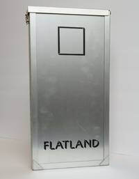
1405941San Francisco California: Arion Press 1980. Limited Edition #100/275. Hardcover. Tall quarto unpaginated. In Very Good minus condition. Double-sided accordion fold binding encased in aluminum boards and encased in a latching aluminum frame. Frame has mild general scuffing hinge lacking its pin. Aluminum boards have moderate general scuffing especially along the edges. Textblock head and tail edges dyed black and moderately scuffed fore and rear edges have mild age-toning and soiling. Signed flat by Ray Bradbury at the conclusion of introduction. Signed flat by Andrew Hoyem beneath the colophon. GH Consignment. Shelved Case 9 3/4. Andrew Hoyem's Arion Press edition of FLATLAND by Edwin Abbott Abbott originally published under the tongue-in-cheek pseudonym "A Square" in 1884 by London's Seeley & Co. FLATLAND satirizes socioeconomic class structures following the various strata of geometric shapes who must traverse a two-dimensional world. Barely successful upon release FLATLAND slowly earned its cult status in the science fiction canon following Albert Einstein's publication of his general theory of relativity. Einstein not unlike Abbott posited the concept of a fourth-dimension and elaborated upon the importance of time affecting Earthly phenomena. Afterwards Abbott's work was perceived as almost prophetic albeit fictional. Throughout the 1960s several writers produced work inspired by FLATLAND including Norton Juster. Released two decades later the Arion Press edition is the truest attempt to contain Abbott's text in a form reflective of its content. Laid out in its entirety the double-sided accordion fold spans 30 feet and contains unique die-cuts that illustrate the world of FLATLAND. 1405941. Shelved Dupont Bookstore. Arion Press hardcover
1965013433Philadelphia: Institute of Contemporary Art University of Pennsylvania 1965. 1st Edition. Hardcover. Near Fine. Catalog of Warhol's first museum show with the compliments card of Sam Green who curated it. 8vo illustrated stiff covers black cloth backstrip perfect bound 27 full page illustrations. Housed in a phase box with an enameled medallion - with the Warhol image of Campbell soup cans similar to the cover of the catalog - in a round silver mount on the front slot designed and crafted by Wesley Tanner. Institute of Contemporary Art, University of Pennsylvania hardcover
1910891951910. DESIGN Ogino Issui designer. ZUAN HYAKUDAI. 3 Vols. Kyoto Unsodo Meiji 43 1910 An orihon in 3 volumes 27 X 19 cm with woodblock printed covers all in a later fitted clasped cloth chitsu case. Unsodo outdid itself in this early design effort. Dozens of double page horizontal designs which become large prints the paper size being 37.5 x 27 cm as well as circular and fan-shaped and single page designs too. Most in the neo-Rimpa style which Unsodo artists pioneered at the beginning of the last century - bold and lovely. A bit of browning and fading the covers show some wear but overall very good condition a very nice impression of this important set. Complete. One of the very best of the Unsodo design books which is very good indeed. unknown
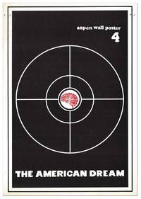
7992Aspen: The Aspen Wallposter / Meat Possum Press Ltd 1970. First Edition. First Printing presumed one of 500 copies. Large bifolium measuring 57.25cm x 40.25cm closed and 57.25cm x 80.25cm with text and illustrations offset printed in black and red on thick white stock; 4pp; illus. Mild handling and a small ink arrow at upper left corner of front cover with two thin black ink marks on p.2; Near Fine.<br /> <br /> Fourth installment of seven in the Aspen Wall Poster series this one a double issue. Articles include "Aspen Summer of Hate 1970 Will the Sheriff be Killed" "Weird Picnic in Boulder" "Wisdom from a Leading Citizen" "Open Letter to Ned Vare" "Homage to Raoul Duke" "Fat City Fun Girl #1 vs "My Lai 4" "Memo to the Homefolks on Independence Day" "Food Stamps and the Red Menace." Masthead titled "Better Living Through Jimson Weed" and lists Thompson as editor along with Tom Benton. It also shows Oscar Acosta as the L.A. bureau representative and Ralph Steadman as the London bureau representative. Page 3 reprints the "Jilly" nude from the Evergreen Review. Shoaf notes a reliable source reporting a second printing of 500 copies identical to the first which we are compelled to mention here for the sake of accuracy. Shoaf A5. The Aspen Wallposter / Meat Possum Press, Ltd unknown
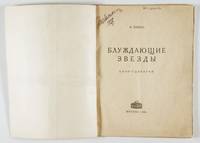
192654867Moscow МоÑква: Kinopechat Кинопечать 1926. First edition. Softcover. Good to very good condition. Octavo. 80pp. Dark blue and white wrappers with constructivist typography on the front cover housed in modern blue heavy paper portfolio with printed typographic design of original cover pasted to cover flap. Publisher's device on title page. This scarce published screenplay for the film adaptation of Sholem Aleichem's novel "Wandering Stars" by the acclaimed Russian-Jewish novelist playwright and journalist Isaac Babel 1894-1940. The film was premiered in Kiev on January 4th 1927 and was directed by Grigori Gritscher-Tscherikower 1883-1945. It was produced by VUFKU studios the national film studios of the Ukrainian SSR.<br /> <br /> This book contains the entirety of the film's screenplay accompanied by three striking b/w illustrations by Soviet artist and designer Alexander Bykhovskii 1888-1978 who likely also created the striking cover. The final three pages contain publisher's ads listing other work on the topic of cinema.<br /> <br /> The story tells of the love between Leibel the son of a wealthy shtetl family and Reizel a poor cantor's daughter in Bessarabia. The two run off to join a traveling Yiddish theater group. They are later separated with each becoming successful in their own right only to eventually reunite in America. The work was first serialized and originally appeared in the Warsaw newspapers between 1909 and 1911. It has come to be seen as the third in an unofficial trilogy of novels by the writer centering on musicians or performers preceded by Stempenyu 1888 and The Nightingale 1889.<br /> <br /> In 1925 the Moscow State Jewish Theater suggested that the Goskino the Soviet State Film Studio produce a film adaptation of Sholem Aleichem’s novel. The order was commissioned to Isaac Babel for translation and adaptation from the book's original Yiddish language to Russian for the screenplay. During this period Babel had been working on other translations of Yiddish literature into Russian including the collected works of Sholem Aleichem and work by David Bergelson. According to Babel's foreword printed here he faced a number of difficulties adapting the novel including the modification of petty bourgeoisie motifs as well as the changes of film directors and their differing requirements. Because of certain elements in the script of which the main committee of the Goskino did not approve the film's production had to ultimately be switched to VUFKU studios in Odessa. In a letter during the period of production Babel apparently wrote: “I will have to be present on the set. if I am not there the director will ruin everything" and later upon hearing of further changes made by Gritscher-Tscherikower wrote that "it is more profitable for me not to participate in this shameful productionâ€. Regardless of Babel's opinion of the final product the film was well received by Soviet audiences at the time.<br /> <br /> Text in Russian. Portfolio with minor wear. Wraps partially restored with minor wear. Previous owner's names and date at top of title page one near gutter. Light water staining along right half of bottom edge of first 30 pages reappearing from pages 40 to end though along lower part of foredge more pronounced on pages 75/76 and light fraying along foredge from pages 67 to 76. Block lightly age-toned. Kinopechat (Кинопечать) unknown
50199Tokyo: Shueisha 集英社 1971. New edition. Hardcover. vg- to near fine. Large oblong folio. 15x21". Unpaginated. All content housed inside the publisher's original cardboard shipping box with printed label pasted on the front. Binding protected in original a white cloth portfolio with red lettering on the front cover and lavishly decorated interior flaps. Black suede-covered boards with mutli-colored illustration mounted on the front cover. Decorative endpapers. Engraved stainless-steel plate showing Mishima's face mounted on black paper preceding the title page.<br /> <br /> The deluxe and lavishly printed new bilingual edition of the acclaimed and eroticly-charged work also know as "Killed by Roses" by Japanese photographer Eikoh Hosoe b.1933. It gained notoriety and elicited controversy when it was originally released in 1963 and won the Japan Photo Critics Association's writer award. The main photographic subject of the book the acclaimed and controversial writer Yukio Mishima 1925-1970 wrote the preface to the original edition and also writes the preface for this new edition both are included here. Mishima's acclaimed works include the famous and controversial novels "Confessions of a Mask" 1949 and "The Temple of the Golden Pavilion" 1956. Hosoe's striking high-contrast b/w photographs are all printed in high-quality photogravure retaining all the power and atmosphere of his original images. In comparison with the first version of the work this edition features the content having been noticeably re-edited with one image added a few others removed. The images have been thematically re-organized into five new chapters with the names "Sea & Eyes" "Eyes & Sins" "Sins & Dreams" "Dreams & Death" and "Death" respectively. Influential artist and graphic designer Tadanori Yokoo b. 1936 oversaw all of the design and layout aspects of the book and also created its additional illustrated elements most of which comprise the first chapter of this new edition.<br /> <br /> While Hosoe was still completing work to prepare this new edition of "Ordeal by Roses" the notorious "Mishima Incident" occurred November 25th 1970 which culminated in the ritual suicide of Yukio Mishima by seppuku. The incident shocked the nation and in its wake the photographer was quite unsure of how to proceed regarding the publication of the book. Not wanting to seem like an opportunist taking advantage of the controversy and the publicity surround Mishima's death he contemplated shelving the project but was later persuaded by Mishima's widow Yoko who said that her husband would have wanted it to be released. It was finally release only a few months later on January 30th 1971.<br /> <br /> Text in Japanese and English throughout.<br /> <br /> Portfolio with foxing to the white cloth including the front cover and the interior but the illustrations on the flaps are still clean. Suede binding clean and protected in modern mylar. Light foxing to the edges of the book block. Interior with all pages and images clean and vibrant save for a few sporadic instances of the most minor stains or smudges on the blank versos a few pages. The verso of the final photographic plate and the page opposite have a bit more foxing. Portfolio in very good- binding and interior in very good to near fine condition overall. Alternate title: 細江英公写真作å“. Shueisha (集英社) hardcover
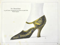
88077Leonhard Zeh und Georg Driesch München 1924/25 Winter . Landscape folio 30 x 21 cm.pp 54 25 chromolithographed plates image size 21.5 x 18 cm. all with descriptive text and captions 11 small crayon shoe designs 18.5 x 14 cm on tissue paper and one black and white photograph inserted loose bound in original grey wrappers title lettered in gilt tied with green silk thread slightly stained on lower wrapper; overall a very attractive collection.<br /> This unusual album of shoe designs contains designs for both men and women. <br /> Leonhard Zeh und Georg Driesch, München 1924/25 Winter unknown
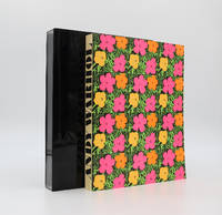
29745Stockholm: Moderna Museet. 1969. Deluxe edition. Deluxe edition. The catalogue for Andy Warhol's first major European retrospective. Illustrated card covers with a design after Warhol's 'Flowers' silk-screen. All edges gilt. Housed in the original perspex slipcase as issued. 614 black-and-white reproductions divided into three sections: black-and-white reproductions of Warhol's work followed by two sections of photographs of Warhol and his associates by Billy Name and Stephen Shore. A fine copy the binding square and tight without fading loss or tears. The contents are clean throughout and without previous owner's inscriptions or stamps. The notoriously fragile perspex slipcase remains solid and in original condition with only a few light scratches. An exceptional example of this landmark Warhol publication offered here in its most desirable form. The deluxe issue of Warhol's legendary Stockholm Exhibition Catalogue. Some copies were also signed by Warhol this example is not. It is unknown exactly how many were issued in this gilt edged deluxe edition most estimate around 50 copies and others possibly as many as 100. All deluxe issues were made from the second edition. Whatever the number intact examples of this issue in attractive original condition are rare in commerce. Parr & Badger: The Photobook II p.144-145. Further details and images for any of the items listed are available on request. Lucius Books welcomes direct contact with our customers. Stockholm: Moderna Museet. 1969 unknown
PJH32371Scheidegger & Spiess 2010. Mint set in publishers boards in plain slipcase still shrink wrapped. Textiles are one of Switzerland's oldest industries. Cotton and silk has been spun and woven in homework in the rural parts of the country for decades before the textile sector was one of the first to become quickly and fully industrialised. One of the major players in Switzerland's silk trade has been Abraham AG Abraham Ltd. The company's history dates back to 1878 when Jakob Abraham became a partner in a Zurich-based business. Under the direction of Gustav Zumsteg who had joined as a partner in 1943 the business became a firm part of post-war Paris Haute Couture as supplier of silk fabrics to the leading fashion houses. The 1960s-80s were the heyday of Abraham AG with the close and personal collaboration between Zumsteg and Yves Saint Laurent from 1961 onwards. This equally successful and glamorous period was followed by a slow but steady decline eventually leading to the company's bankruptcy and liquidation in 2002. 'Soie Pirate: The History and Fabric Designs of Abraham Ltd.'. is a comprehensive history of this fascinating enterprise. Volume one tells the company's story and investigates its importance in the international business of high fashion and in the context of time. Volume two presents a wealth of designs patterns and samples of the beautiful fabrics designed by Abraham AG but also of the elegant dresses and spectacular gowns the great couturiers like Cristobal Balenciaga Coco Chanel Christian Dior Hubert de Givenchy Yves Saint Laurent or Emanuel Ungaro have created using Abraham's products. Together both volumes bring to life a chapter in the history of high fashion worldwide. ISBN 9783858817259 Scheidegger & Spiess 2010 hardcover
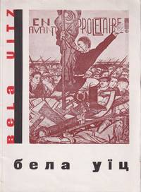
54109Kharkiv: Mystetstvo 1933. Large octavo 25.7 × 18.8 cm. Original pictorial wrappers by Vasily Sedliar decorative dust jacket; 20 1 pp. of text 41 leaves of plates to rectos 2 pp. of text including list of reproductions. Small loss to corner of first leaf; pre-war stamps to title verso and p. 21 of the Ukrainian Public Library without inventory numbers marking the book part of the later dispersed duplicate exchange fund. Else about very good. A striking important Ukrainian avant-garde book designed by Vasily Sedliar 1899-1937 a leading Ukrainian painter illustrator and art pedagogue of the interwar period who was killed during the Stalin Terror of 1937. The book is likely the first monograph on Béla Uitz 1887-1972 a Hungarian-Soviet avant-garde artist who later turned to monumental painting creating large-scale murals for the Kharkiv Krasnovodsk Theatre a project he worked on with Sedliar. Uitz was initially influenced by Cubism Expressionism and later Constructivism with the 42 reproductions of his work in this volume tracing his artistic trajectory. Active in Comintern in Hungary France Austria and Germany in 1926 Uitz moved to the Soviet Union joining the October group and teaching at VKhUTEMAS in 1927-1930. In 1931 Uitz was elected secretary of the International Union of Revolutionary Artists at a conference held in Kharkiv and commissioned to decorate the Kharkiv theatre with this volume likely published for the occasion.<br /> <br /> The Ukrainian art critic and monumental painter Ievhen Kholostenko 1904-1945 wrote the introductory text to the volume. Both Sedliar and Kholostenko were students of Mykhailo Boichuk 1882-1937 at the Kyiv Academy of Art. A celebrated modernist painter Boichuk came into disfavor in the 1930s. His arrest and execution he was accused of being "an agent of the Vatican" affected an entire generation of students known as the "Boichukists" who practiced the innovative kind of monumental painting Boichuk taught. One of the closest associates of Boichuk Sedliar was part of the so-called "executed renaissance" rozstriliane vidrodzhennia a generation of innovative artists and writers who perished during the Great Purge. Any printed matter bearing their names was systematically removed from libraries and bookstores in the late 1930s.<br /> <br /> As of June 2024 KVK OCLC show a sole copy worldwide at Staats- & Universitätsbibliothek Hamburg. unknown
19722091202133212420Not Available 1972. Soft Cover. Fine. Volume: 1 Not Available paperback
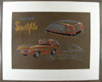
187861970. Watercolor and pastel on illustration board. Signed "William A. Moore" Intriguing concpetual drawing for an unusual pickup truck<br/> <br/> Three views of a rather dazzling vision of a pickup truck and though the "Dodge Sportflite" was never produced the idea of making more luxurious and innovative pickup trucks has definitely caught fire since the time of this handsome drawing. This design brings the driver over the engine as in many heavier trucks giving the driver greater command of the road especially for town and city driving. The styling of the cab and cargo bed is anything but mundane with lines vents a black ribbon around the cab and two large additional brake lights that add a notes of elegance and creativity to the overall effect. "In 1956 William Moore won the General Motors Fisher Body Craftsmen' Guild National Exhibition for his car design. In 1968 he accepted a position as Head of Design for Lear in Reno Nevada. William Moore's art has been placed in.the Smithsonian and the Favell Museum of Art and Artifacts." The Museum of Automotive Art and Design website.<br/> <br/> The Museum of Automotive Art and Design website artist biographies # 129. unknown
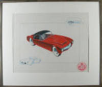
195318800Boston 1953. Tempera on paper. Initialled "R.S.W." Mounted circular label lower right. Handsome 1950s sports car design.<br/> <br/> All of our present information about this drawing comes from a label on the back of the piece which indicates that it comes from the archives of the A.J. White Motor Vehicle Research Company - designers of exotic cars in the Boston MA area. We have not discovered any further information about the A. J. White Research Company thus far nor about the artist R.S.W. of this particular drawing. There does not appear to be any connection to the great White truck manufacturer. The drawing itself is especially nice its cool red sportscar positioned diagonally between two details in blue in a way that makes it appear anxious to move. unknown