29 735 résultats
In 16° br. fig con dorso rinforzato pp.88
Minor bump to head of spine and along back edge else Fine. DJ has minor rubbing. ; 0.65 x 9.76 x 6.28 Inches; 192 pages; Cities in the ancient world relied on private generosity to provide many basic amenities, as well as expecting leading citizens to pay for 'bread and circuses' - free food and public entertainment. This collection of essays by leading scholars from the UK and USA explores the important phenomenon of benefaction and public patronage in Roman Italy. Ranging from the late republican period to the later Roman Empire, the contributions cover a wide range of topics, including the impact of benefactions and benefactors on the urban development of Roman Italy, on cultural and economic activity, and on the changing role of games and festivals in Roman society. They also explore the relationship between communities and their benefactors, whether these were local notables, senators, or the emperor himself, and examine how the nature of benefaction changed under the Empire.
0.65 x 9.76 x 6.28 Inches; 192 pages; Cities in the ancient world relied on private generosity to provide many basic amenities, as well as expecting leading citizens to pay for 'bread and circuses' - free food and public entertainment. This collection of essays by leading scholars from the UK and USA explores the important phenomenon of benefaction and public patronage in Roman Italy. Ranging from the late republican period to the later Roman Empire, the contributions cover a wide range of topics, including the impact of benefactions and benefactors on the urban development of Roman Italy, on cultural and economic activity, and on the changing role of games and festivals in Roman society. They also explore the relationship between communities and their benefactors, whether these were local notables, senators, or the emperor himself, and examine how the nature of benefaction changed under the Empire.
BIBRR111229962Hardcover. USED. THIS RARE/ANTIQUE BOOK PUBLISHED IN THE YEAR 1972 BY Roma chaudhuri HAVING 73 PGS AND SIZE 5.258.50 WRITTEN IN Sanskrit. THE BOOK IS IN READABLE CONDITION Originally in Hardcover with some issues like HB damage & Without jacket and some Pin Holes. THE IMAGE OF THIS BOOK IS GIVEN FOR YOUR REFERENCE. WE CAN REBIND THE SAME IN LEATHER BINDING FOR EXTRA $ 25. hardcover
20112099946Rom: École Francaise de Rome 2011. 394, (2) Seiten. Mit einigen, teils farbigen Abbildungen auf Kunstdrucktafeln. Gr. 8° (24 x 17 cm). Illustrierte Orig.-Broschur. [Softcover / Paperback].
Pieghe editoriali
Pieghe editoriali
Foglio 159; IV. - Quadrante in scala 1:50.000 della "Grande Carta topografica del Regno d?Italia e regioni adiacenti" dell?Istituto Geografico Militare di Firenze. Circa cm. 41x42, pi— i margini. Montata su tela a riquadri all'epoca. Senza parte dei margini bianchi che riportano le didascalie, ma carta completa e ben conservata. VG- -. ** Comprende, a nord: da Regione Le Fosse e M.te Cerrachiette a Fiume Sacco e stazione di Morolo. A sud: da Regione Bastione e M.te Acquapuzza a Maenza e pozzo della Traversa. Comprende: Montelanico, Morolo, Norma, Sermoneta, Bassiano, Roccagorga...
Tavola tratta dal celebre Antiquae urbis splendor di Giacomo Lauro, opera di grande importanza storica e archeologica che l’autore iniziò nel 1612. Il titolo intero è: Antiquae urbis splendor, hoc est praecipua eiusdum templa, amphitheatra, theatra, circi, naumachie, arcus triumphales, mausolea aliaque sumptuosiora aedificia, pompae item triumphalis et colossaearum imaginum descriptio; opera & industria Iacobi Lauri Romani in aes incisa atque in lucem edita. Addita est breuis quaedam et succincta imaginum explicatio in qua regum consulum imperatoruq; res gestae et rei romanae origo progressus incrementum, ac finis cu almae urbis antiquor. ac modernor. vestigior. additione utcunq; hoc insequenti anno 1630 reperiutur, et ex veteru ac recentior. historiar. monumentis clare ostenditur. Il libro ha una lunga e varia storia di pubblicazione, a partire dal 1612, anche se il lavoro di Lauro sul libro precede la sua pubblicazione di almeno diciotto anni. Il libro fu stampato per la prima volta da Giacomo Mascardi, e originariamente conteneva solo due parti, anche se nel 1615 si era allargato a una terza parte. La prima parte conteneva 37 incisioni, con una dedica al re Sigismondo III di Polonia, datata 1614, e un ritratto datato 1609 (preso in prestito da un altro libro di incisioni). La seconda parte conteneva un ritratto di Carlo Emanuele I, duca di Savoia, datato 1613, e 41 incisioni. Vale la pena notare che questi primi due libri erano entrambi dedicati alla nobiltà polacca, probabilmente a causa del fatto che Lauro aveva goduto di patrocinio dall'incisione di battaglie polacche all'inizio della sua carriera. La terza parte, aggiunta più tardi, era dedicata a Ranuccio Farnese, uno dei maggiori mecenati di Lauro più tardi nella sua vita, e conteneva 40 incisioni. Il numero di tavole incluse in ciascuna delle precedenti edizioni dell'opera di Lauro (stampate alla Camera Apostolica nel 1614 in quattro parti, e stampate di nuovo lì nel 1621 in tre parti) fu finalmente stabilito nel 1628 con l'aggiunta del quarto e ultimo libro per un totale di 166 incisioni, che è il numero generalmente accettato per quante incisioni totali Lauro produsse per quest'opera. L'edizione pubblicata da Vitale Mascardi e curata da Giovanni Alto uscì nel 1637. Alto ha aggiunto un indice finale e numerato ciascuna delle incisioni, 2-167, per quest'ultima edizione. Incisione in rame, stampata su carta vergata coeva, con margini, in ottimo stato di conservazione. Plate taken from the important Antiquae urbis splendor by Giacomo Lauro. The full title is: Antiquae urbis splendor, hoc est praecipua eiusdum templa, amphitheatra, theatra, circi, naumachie, arcus triumphales, mausolea aliaque sumptuosiora aedificia, pompae item triumphalis et colossaearum imaginum descriptio; opera & industria Iacobi Lauri Romani in aes incisa atque in lucem edita. Addita est breuis quaedam et succincta imaginum explicatio in qua regum consulum imperatoruq; res gestae et rei romanae origo progressus incrementum, ac finis cu almae urbis antiquor. ac modernor. vestigior. additione utcunq; hoc insequenti anno 1630 reperiutur, et ex veteru ac recentior. historiar. monumentis clare ostenditur. The book has a long and varied history of publishing, beginning in 1612, though Lauro’s work on the book predates its publishing by at least eighteen years. The book was first printed by Giacomo Mascardi, and it originally only contained two parts, though by 1615 it had expanded to a third part. The first part contained 37 engravings, with a dedication to King Sigismund III of Poland, dated 1614, and a portrait dated 1609 (borrowed from another book of engravings). The second part contained a portrait of Charles Emmanuel I, Duke of Savoy, dated 1613, and 41 engravings. It is worth noting that these first two books were both dedicated to Polish nobility, probably due to the fact that Lauro had enjoyed patronage from engraving Polish battles early in his career. The third part, added later, was dedicated to Ranuccio Farnese, one of Lauro’s greater patrons later in his life, and contained 40 engravings. The number of plates included in each of the earlier editions of Lauro’s work (printed at the Camera Apostolica in 1614 in four parts, and printed there again in 1621 in three parts) was finally settled in 1628 with the addition of the fourth and final book for a total of 166 engravings, which is the generally accepted number for how many engravings total Lauro produced for this work. The edition published by Vitale Mascardi and curated by Giovanni Alto was released in 1637. Alto added a final index and numbered each of the engravings, 2-167, for this latest release. Copperplate, printed on contemporary laid paper, with margins, good condition.
Roma, Stab. Staderini, 1933, in-16, cart. edit., pp. 48. Con una tavola piegata, illustrante le filiali del Banco di Roma (di cui questa guida è omaggio) in Italia, e un'appendice fotografica, celebrativa di Roma fascista.
Brossura editoriale in cartoncino flessibile, illustrata e con lievissimi segni di usura dovuti soprattutto a scaffalatura, all'interno pagine in buonissimo stato di conservazione, appena ingialliti i bordi. Numero pagine 191 USATO
5 gr. voll. in folio, cc 307; 81; 54; 624; 291, leg. m. tela con tit. oro al d. Parti del I, III e IV vol. sono impaginate nei voll. successivi. I dispacci contenuti nell’opera sono compresi negli anni 1604 e 1605. Copia manoscritta ricavata dall’originale custodito nell’Archivio dei Frari in Venezia, ad uso del Conte Filippo Nani Mocenigo nel 1892.
in-8°; pp, 42. Prima edizione in italiano. Legatura in piena pelle con cornice dorata ai piatti. Manferrari 1, p. 68.
1742615107Amsterdam, Changuion, 1742. 4to. 6 Bl., 494 S.; 1 Bl., 400 S.; 53 Bl., 523 S., 78 Bl. Index. Mit 2 wiederholten gestochenen Titelvignetten. Pergament d. Zeit mit reicher (vor allem am Vorderdeckel abgeriebener) Rücken- und Deckelvergoldung (angestaubt, Schließbänder fehlen). [3 Warenabbildungen]
Acquaforte, 1645/50 circa, firmata in lastra in basso a destra..Inusuale veduta panoramica della città, con vista su vari monumenti, descritti in basso in un legenda di 9 punti, riportata in basso in italiano e francese e che comprende: 1. Vestigij del Tempio della Pace . 2. Chiesa di S.ta Francesca Romana . 3. Vigna Fanesia . 4. Vestigij del Palazzo Maggiore. 5. Vestigij della Casa di Cicerone. 6. St. Maria liberatrice . 7. St. Pietro Montorio. 8. Frontespitio dell'Acqua Paula. 9. Colonne restate del Tempio di Giove Statore. La Basilica, in primo piano, è disegnata con grande dettaglio, come pure il panorama della città, dove sono riconoscibili numerose opere architettoniche. Come per il panorama generale di Roma, anche questa veduta generale venne probabilmente incisa "da un disegno eseguito ad vivum da L. de Lincher, un disegnatore francese poco noto che fu attivo in quegli anni a Roma e fornì i sui disegni a diversi incisori fra i quali anche il conterraneo Francois Collignon" (cfr. Barbara Jatta in "Roma Veduta" p. 164),Il Silvestre, incisore e disegnatore, nasce a Nancy nel 1621. Tra il 1638 e il 1641 viaggiò in Italia; si hanno notizie della sua presenza nella Penisola ancora nel 1643 e nel 1653. Il suo stile fu, all’inizio, piuttosto sciolto, ma dal 1643 in poi divenne più raffinato e delicato, acquisendo accuratezza e precisione senza essere asciutto, risultando a volte simile a quello di Jacques Callot o di Stefano della Bella, con i quali ebbe rapporti di amicizia. Accanto alle testimonianze per la Roma antica mostrò ben presto un grandissimo interesse per la città "moderna", divenendo uno dei precursori del vedutismo - non solo nel campo incisorio - anticipando artisti come Lievin Cruyl e Gaspar van Wittel. Bellissima prova, con ampli margini, pieghe verticali dovute alla conservazione - più volte ripiegata e conservata il album - in ottimo stato di conservazione. Rara. Etching, circa 1645/50, signed on the lower right-hand plate. Unusual panoramic view of the city, with a view of various monuments, described in a 9-point legend at the bottom in Italian and French, including: 1. Vestigij del Tempio della Pace . 2. Chiesa di S.ta Francesca Romana . 3. Vigna Fanesia . 4. Vestigij del Palazzo Maggiore. 5. Vestigij della Casa di Cicerone. 6. St. Maria liberatrice . 7. St. Pietro Montorio. 8. Frontespitio dell'Acqua Paula. 9. Colonne restate del Tempio di Giove Statore. The Basilica, in the foreground, is drawn in great detail, as is the panorama of the city, where numerous architectural works are recognisable. As with the general view of Rome, this panorama was probably engraved "from a drawing made ad vivum by L. de Lincher, a little-known French draughtsman who was active in Rome in those years and supplied his drawings to various engravers, including his fellow countryman Francois Collignon" (cf. Barbara Jatta in "Roma Veduta" p. 164). Silvestre, engraver and draughtsman, was born in Nancy in 1621. Between 1638 and 1641 he travelled in Italy; there are records of his presence in the Peninsula again in 1643 and 1653. His style was rather loose at first, but from 1643 onwards it became more refined and delicate, acquiring accuracy and precision without being dry, sometimes resembling that of Jacques Callot or Stefano della Bella, with whom he was friends. Alongside the evidence for ancient Rome, he soon showed great interest in the "modern" city, becoming one of the forerunners of vedutism - not only in the field of engraving - anticipating artists such as Lievin Cruyl and Gaspar van Wittel. Beautiful proof, with wide margins, vertical folds due to storage - folded several times and stored in the album - in excellent condition. Rare.
Acquaforte, 1745 circa, firmata in lastra. Magnifica prova, con pieni margini, in perfetto stato di conservazione.Opera tratta dalle “Varie Vedute di Roma Antica, e Moderna. Disegnate e Intagliate da Celebri Autori” stampata in Roma “a spese di Fausto Amidei”, 1748.La raccolta, in 4° oblungo, viene pubblicata da Fausto Amidei in varie edizioni dal 1745 al 1750, e da Giovanni Bouchard nel 1752. Conteneva frontespizio inciso e 93/96 tavole, delle quali 47 firmate Piranesi in lastra ed altre da Giraud, Carloni, Nicole, Mogalli, Bellicard, Le Geay, ed Anesi.Opere giovanili del Piranesi, appena giunto a Roma dove fu allievo della bottega di Giuseppe Vasi. Vasi lavora alle sue vedute, che presentate come raccolta, prenderanno dal 1747 il nome delle 'Magnificenze di Roma'; agli inizi dell’opera Piranesi lo affianca, ma, almeno dal 1744, produce sue proprie vedutine, che nel 1745 formano il nucleo più importante delle 'Varie Vedute di Roma antica e moderna disegnate e intagliate da celebri autori' per il libraio ed editore Amidei.Tratta dal " Il Mercurio errante, delle grandezze di Roma, tanto antiche che moderne" di Pietro Rossini. Roma 1760. Etching, around 1745, signed in plate. A very good impression with full margins, in perfect condition.Taken from the “Varie Vedute di Roma Antica, e Moderna. Disegnate e Intagliate da Celebri Autori” printe in Rome by Fausto Amidei, 1748.The collection, in 4th oblong, is published by Fausto Amidei in various editions from 1745 to 1750, and by Giovanni Bouchard in 1752. It contained an engraved frontispiece and 93/96 plates, of which 47 signed by Piranesi and others by Giraud, Carloni, Nicole, Mogalli, Bellicard, Le Geay, and Anesi.Early works by Piranesi, who had just arrived in Rome where he was a student of the workshop of Giuseppe Vasi. Vasi’s works will take the name of the 'Magnificenze di Roma'; from 1747; at the beginning of the work Piranesi joined him, but, at least since 1744, he produced his own views, which in 1745 formed the most important nucleus of the 'Varie Vedute di Roma antica e moderna disegnate e intagliate da celebri autori' for the bookseller and editor Amidei.Taken from " Il Mercurio errante, delle grandezze di Roma, tanto antiche che moderne" di Pietro Rossini. Roma 1760. Wilton-Ely 98; Focillon 95
Coppia di incisioni all'acquaforte di cm.35x24 e 24x34, più i margini stampate su carta forte. (1)-Carte Topographique des Antiquités d'Albano. Veduta con piante di edifici e sul lato destro, frammenti di modanature e cornici. (2)-Restes des anciens Thermes d'Albano. Pianta dei resti delle terme con alla base incise alcune statue e iscrizioni di resti archeologici. (degni di piegature ma senza danni.
Pianta archeologica a proiezione verticale con elevazione dei soli monumenti antichi. Disegnata ed incisa da Etienne Duperac per l’editore Antonio Lafreri. Si tratta di un’elegante rappresentazione della pianta archeologica, che mostra in alzato prospettico i monumenti principali. La morfologia segue quella della pianta del Bufalini (1551), ma per l’orografia, molto ben delineata, anche quella del Paciotto (1557) edita sempre da Lafreri. La pianta è inserita in alcuni esemplari dello Speculum Romanae Magnificentiae dell’editore francese. La lastra è descritta nel catalogo del Lafreri (n. 113), come “Roma con tutti gli edificii che hoggi si vegono in piede et che se ne può veder vestigie”. Quindi è inclusa nell’inventario di Stefano Duchetti del 1581 (n. 31) come “Roma con li monti dif.o Imperaiale” ed infine compare nel catalogo di Pietro de Nobili (inv. 1585, n. 32, come “La Roma antiqua de Stefano imperiale”, che la ristampa invariata aggiungendo il proprio excudit. Figura anche nell’atto della divisione della tipografia de Nobili del 30 maggio 1589, dove la lastra, denominata “Roma in pianta imperiale”, passa al figlio Pietro Paolo. Il primo stato della lastra era stato congetturato da Destombes sulla base dell’evidente integrazione nella data MDLXXIII, dove l’ultimo numerale è addossato alla parola seguente, suggerendo che sia stato aggiunto successivamente. Durante lo studio per questa pubblicazione abbiamo riscontrato l’esistenza di una prova della pianta con la data 1572 nella collezione della Bibliothèque Nationale de France. Oltre alla differenza nella data, la prima stesura dell’opera si distingue per la dedica allo STVDIOSO LECTORI preceduta dal termine TIPOGRAPHUS – ovvero Antonio Lafreri – che, nella ristampa del 1573, verrà sostituito dalla firma STEPHANUS DU PERAC ARCHITET. Nel lato sinistro, al centro, si legge: STEPHANUS DU PERAC ARCHITET STVDIOSO LECTORI. En tibi lector nuc prodit specimen, seu perfecta urbis antquae imago ex piscis illis monumentis scriptorum veterum, et cunctis quae ad hunc usq[ue] diem superesse videntur reliquijs, et parietibus quam acuratissime delineata: quecumque oculis nostri subiecta esse possunt exigua tabella comprehendens; opus ut immensum sanè, sic nec minus antiquitatis omnigenae studiosis apprime necessarium, his recentibus formis aencis, typis exaratum impensa Antonij lafrerij Anno MDLXXIII Hoc fruere libens et Vale. Nell’angolo inferiore destro, in un cartiglio, è incisa una legenda numerica di 89 rimandi a luoghi notabili, distribuita su tre colonne. Segue l’iscrizione: DE VESTIGITS URBIS ANTIQUAE EPIGRAMA: Quam brevis haec presens oculis sit carta requiris Urbem dum modico continet in spatio Desine mirari: vestigia maxima claudit Quae modo ROMA potens subijcit his oculis. Antiquae monstrans Urbis signacula promptè Dum numeris certis cuncta notata signat Discuta mira solers: novanu sint prima vetustis: Anue vetusta novis nunc manifesta patent. Nella tavola sono fornite ulteriori indicazioni toponomastiche. Orientazione nei quattro lati al centro con il nome dei punti cardinali: SEPTENTRIO, MERIDIES, ORIENS, OCIDENS, il nord è a sinistra.Acquaforte e bulino in ottime condizioni di conservazione. Esemplare nel secondo stato di tre, con la dedica che inizia con "STEPHANUS DU PERAC ARCHITET STVDIOSO LECTORI" (cfr. Bifolco-Ronca p. 2354).Altra Bibliografia:Alberti (2009): p. 153, n. 33; Frutaz (1962): n. XXI e tav. 36; Hülsen (1915): X, pp. 58-59, nn. 51-52; Hülsen (1921): p. 142, n. 1a-b; Hülsen (1933): p. 107, X; Lincoln (2000): p. 185; Marigliani (2016): n. XI.6; Pagani (2008): pp. 15, 374; Pagani (2011): p. 133; Rubach (2016): n. 259; Scaccia Scarafoni (1939: n. 17. Alberti (2009): p. 153, n. 33; Frutaz (1962): n. XXI e tav. 36; Hülsen (1915): X, pp. 58-59, nn. 51-52; Hülsen (1921): p. 142, n. 1a-b; Hülsen (1933): p. 107, X; Lincoln (2000): p. 185; Marigliani (2016): n. XI.6; Pagani (2008): pp. 15, 374; Pagani ... Pianta archeologica a proiezione verticale con elevazione dei soli monumenti antichi. Disegnata ed incisa da Etienne Duperac per l’editore Antonio Lafreri. Si tratta di un’elegante rappresentazione della pianta archeologica, che mostra in alzato prospettico i monumenti principali. La morfologia segue quella della pianta del Bufalini (1551), ma per l’orografia, molto ben delineata, anche quella del Paciotto (1557) edita sempre da Lafreri. La pianta è inserita in alcuni esemplari dello Speculum Romanae Magnificentiae dell’editore francese. La lastra è descritta nel catalogo del Lafreri (n. 113), come “Roma con tutti gli edificii che hoggi si vegono in piede et che se ne può veder vestigie”. Quindi è inclusa nell’inventario di Stefano Duchetti del 1581 (n. 31) come “Roma con li monti dif.o Imperaiale” ed infine compare nel catalogo di Pietro de Nobili (inv. 1585, n. 32, come “La Roma antiqua de Stefano imperiale”, che la ristampa invariata aggiungendo il proprio excudit. Figura anche nell’atto della divisione della tipografia de Nobili del 30 maggio 1589, dove la lastra, denominata “Roma in pianta imperiale”, passa al figlio Pietro Paolo. Il primo stato della lastra era stato congetturato da Destombes sulla base dell’evidente integrazione nella data MDLXXIII, dove l’ultimo numerale è addossato alla parola seguente, suggerendo che sia stato aggiunto successivamente. Durante lo studio per questa pubblicazione abbiamo riscontrato l’esistenza di una prova della pianta con la data 1572 nella collezione della Bibliothèque Nationale de France. Oltre alla differenza nella data, la prima stesura dell’opera si distingue per la dedica allo STVDIOSO LECTORI preceduta dal termine TIPOGRAPHUS – ovvero Antonio Lafreri – che, nella ristampa del 1573, verrà sostituito dalla firma STEPHANUS DU PERAC ARCHITET. Nel lato sinistro, al centro, si legge: STEPHANUS DU PERAC ARCHITET STVDIOSO LECTORI. En tibi lector nuc prodit specimen, seu perfecta urbis antquae imago ex piscis illis monumentis scriptorum veterum, et cunctis quae ad hunc usq[ue] diem superesse videntur reliquijs, et parietibus quam acuratissime delineata: quecumque oculis nostri subiecta esse possunt exigua tabella comprehendens; opus ut immensum sanè, sic nec minus antiquitatis omnigenae studiosis apprime necessarium, his recentibus formis aencis, typis exaratum impensa Antonij lafrerij Anno MDLXXIII Hoc fruere libens et Vale. Nell’angolo inferiore destro, in un cartiglio, è incisa una legenda numerica di 89 rimandi a luoghi notabili, distribuita su tre colonne. Segue l’iscrizione: DE VESTIGITS URBIS ANTIQUAE EPIGRAMA: Quam brevis haec presens oculis sit carta requiris Urbem dum modico continet in spatio Desine mirari: vestigia maxima claudit Quae modo ROMA potens subijcit his oculis. Antiquae monstrans Urbis signacula promptè Dum numeris certis cuncta notata signat Discuta mira solers: novanu sint prima vetustis: Anue vetusta novis nunc manifesta patent. Nella tavola sono fornite ulteriori indicazioni toponomastiche. Orientazione nei quattro lati al centro con il nome dei punti cardinali: SEPTENTRIO, MERIDIES, ORIENS, OCIDENS, il nord è a sinistra.Acquaforte e bulino in ottime condizioni di conservazione. Esemplare nel secondo stato di tre, con la dedica che inizia con "STEPHANUS DU PERAC ARCHITET STVDIOSO LECTORI" (cfr. Bifolco-Ronca p. 2354).LiteratureAlberti (2009): p. 153, n. 33; Frutaz (1962): n. XXI e tav. 36; Hülsen (1915): X, pp. 58-59, nn. 51-52; Hülsen (1921): p. 142, n. 1a-b; Hülsen (1933): p. 107, X; Lincoln (2000): p. 185; Marigliani (2016): n. XI.6; Pagani (2008): pp. 15, 374; Pagani (2011): p. 133; Rubach (2016): n. 259; Scaccia Scarafoni (1939: n. 17. Alberti (2009): p. 153, n. 33; Frutaz (1962): n. XXI e tav. 36; Hülsen (1915): X, pp. 58-59, nn. 51-52; Hülsen (1921): p. 142, n. 1a-b; Hülsen (1933): p. 107, X; Lincoln (2000): p. 185; Marigliani (2016): n. XI.6; Pagani (2008): pp. 15, 374; Pagani (2011): p... Bifolco Ronca (2018): tav. 1212, II/III
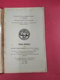
Tavola tratta dalla Cosmographiae Universalis, edizione in tedesco, Basilea, seconda metà del XVI secolo.La Cosmographiae Universalis di Sebastian Münster (1488-1552), stampata per la prima volta Basilea nel 1544 dall’editore Heinrich Petri, venne più volte aggiornata e aumentata di nuove carte geografiche e rappresentazioni urbane nelle sue numerose edizioni che arrivano all’inizio del secolo successivo. Münster aveva lavorato a raccogliere informazioni al fine di ottenere un'opera che non deludesse le aspettative e, dopo un'ulteriore pubblicazione in tedesco abbellita da 910 stampe su legno, giunse nel 1550 all'edizione definitiva in latino, illustrata da 970 silografie. Vi furono poi numerose edizioni in diverse lingue, fra cui latino, francese, italiano, inglese e ceco. Dopo la sua morte di Münster (1552), Heinrich Petri prima, e il figlio Sebastian poi, continuarono la pubblicazione dell’opera. La Cosmographia universalis fu uno dei libri più popolari e di successo del XVI secolo, e vide ben 24 edizioni in 100 anni: l'ultima edizione tedesca venne pubblicata nel 1628, molto tempo dopo la morte dell'autore. La Cosmographia conteneva non solo le ultime mappe e vedute di tutte le città più famose, ma anche una serie di notizie enciclopediche di dettagli relative al mondo conosciuto, e sconosciuto. Il particolare successo anche commerciale di quest'opera fu dovuto in parte alle belle incisioni (tra i cui autori si possono citate Hans Holbein il Giovane, Urs Graf, Hans Rudolph Manuel Deutsch, David Kandel). Silografia, bella coloritura a mano, in buone condizioni. Plate taken from the Cosmographiae Universalis, German edition, Basel, second half of the 16th Century. The Cosmographiae Universalis of Sebastian Münster (1488-1552), printed for the first time in Basel in 1544 by the publisher Heinrich Petri, was updated several times and increased with new maps and urban representations in its many editions until the beginning of the next century. Münster had worked to collect information in order to obtain a work that did not disappoint expectations and, after a further publication in German embellished with 910 woodblock prints, arrived in 1550 to the final edition in Latin, illustrated by 970 woodcuts. There were then numerous editions in different languages, including Latin, French, Italian, English and Czech. After his death in Münster (1552), Heinrich Petri first, and then his son Sebastian, continued the publication of the work. The Cosmographia universalis was one of the most popular and successful books of the 16th century, and saw as many as 24 editions in 100 years: the last German edition was published in 1628, long after the author's death. The Cosmographia contained not only the latest maps and views of all the most famous cities, but also a series of encyclopedic details related to the known, and unknown, world. The particular commercial success of this work was due in part to the beautiful engravings (among whose authors can be mentioned Hans Holbein the Younger, Urs Graf, Hans Rudolph Manuel Deutsch, David Kandel). Woodcut, beautiful hand-coloring, in good condition.
(Roma), proprietà di Alessandro d'Atri, via Capo le case, 52, 1872, in-4, formato album, cartone marmorizzato. Con 56 tavole incise in rame da A. Moschetti e E. Salandri, delle quali 41 riguardano Roma, 8 Tivoli, 1 Albano, 1 Cora, 1 Grottaferrata.
Acquaforte e bulino, 1561, firmata in lastra in basso al centro. La veduta appartiene alla serie "Praecipua aliquot romanae antiquitatis ruinarum monumenta par baptistam Pittonem vicentinum mense september MDLXI", ispirata alle opere di Hieronimus Cock del "Praecipua aliquot romanae antiquitatis ruinarum monumenta".Le lastre del Pittoni furono successivamente ristampate, nel 1582, nell’opera di Vincenzo Scamozzi "Discorsi sopra l'Antichità di Roma". Queste prove, più stanche, recano al verso il testo descrittivo. Una terza stesura della lastra, dalla quale proviene questo esemplare, è di nuovo stampata priva del testo descrittivo, nella metà del XVII secolo.Buona prova, impressa su carta vergata, con ampli margini, in eccellente stato di conservazione. Tutte le rovine sono sinonimo di persistenza e decadenza. Eppure la specificità delle rovine romane, per l'editore di Anversa Hieronymus Cock (c. 1510-1570), risiede meno in una sublimità carica che in un persistente potere di modellare, di fornire modelli nel suo qui-e-ora olandese. La sorprendente serie di incisioni di Cock, i Praecipua Aliquot Romanae Monimenta fu pubblicata nel 1551. Uno dei primi prodotti della rivoluzionaria ditta Aux Quatre Vents di Cock, la Praecipua si è a lungo dimostrata problematica per gli storici dell'arte, poiché non sembra tanto documentare l'antica Roma quanto presentare la città come un paesaggio, una distesa di strutture disastrate. Scrivendo nel 1907, l'archeologo Hülsen si lamentava che le vedute di Cock "non ci insegnano quasi nulla" dell'antichità, e "descrivono solo quanto grave sia diventato lo sttao id conservazione dei monumenti". Eppure il fascino cinquecentesco delle stampe di Cock risiedeva proprio in questa rappresentazione della decadenza. Per il suo pubblico Cock frammentava le vedute del Colosseo, confondeva le distanze tra edifici come il Settizonio e le Terme di Diocleziano e corredava le rovine con piccoli animali e figure umane. In definitiva, le incisioni non erano importanti come documenti antiquari, ma come stampe di modelli, che vennero riutilizzati ed estrapolati da intarsisti tedeschi, fabbri olandesi e pittori italiani. Era il mezzo di stampa che permetteva a tali copie di ricostruire una Roma che non c'era più, non tanto mostrandola quanto rimettendola in scena attraverso una sorta di virtualità antiquaria. (cfr. Christopher P. Heuer, Hieronymus Cock's Aesthetic of Collapse, pp. 387, 389-408, Oxford 2009). Etching and engraving, 1561. Example of the third issue, printed without text on verso in the middle of the 17th Century. First published in the rare Praecipua aliquot romanae antiquitatis ruinarum monumenta par baptistam Pittonem vicentinum mense september MDLXI, inspired by the same work by Hieronimus Cock, printed in Antwerp in 1551 (frontispiece and 24 plates). “All ruins bespeak both persistence and decay. Yet the specificity of Roman ruins, for the Antwerp publisher Hieronymus Cock (c. 1510—1570), lay less in a charged sublimnity than in a lingering power to model, to furnish templates in his Netherlandish here-and-now. Cock's astonishing series of etchings, the Praecipua Aliquot Romanae Monimenta was published in 1551. One of the earliest products of Cock's revolutionary Aux Quatre Vents firm, the Praecipua has long proven problematic to art historians, since it seems less to document ancient Rome than to present the city as landscape, a sprawl of disabled structures. Writing in 1907, for example, the archaeologist Hülsen complained that Cock's views 'teach us nearly nothing' of antiquity, and 'depict only how grave the monuments' "en-rubblement" (Verschüttung) has become'. Yet the sixteenth-century appeal of Cock's prints lay precisely with this enactment of decay. For his audiences Cock fragmented views of the Colosseum, blurred distances between buildings like the Septizodium and the Baths of Diocletian and dotted the ruins with tiny animals and human figures. Ultimately, the etchings mattered not as antiquarian documents but as pattern prints, templates re-used and excerpted by German intarsists, Dutch metalsmiths, and Italian painters. It was the print medium that enabled such copia to reconstruct a Rome that was no longer there, less by showing it than re-staging via a kind of antiquarian virtuality, its aesthetic of bricolage” (cf. Christopher P. Heuer, Hieronymus Cock's Aesthetic of Collapse, pp. 387, 389-408, Oxford 2009). The plates by Pittoni were later reprinted in 1582 and included in the Vincenzo Scamozzi Discorsi sopra l'Antichità di Roma, where the views are weaker and with a descriptive text, on verso.
nella metà del XVII secolo. Opera appartenente alla rarissima serie Praecipua aliquot romanae antiquitatis ruinarum monumenta par baptistam Pittonem vicentinum mense september MDLXI. Si tratta di una serie di incisioni basate sull’omonima opera di Hieronimus Cock, stampata ad Anversa nel 1551 (frontespizio e 24 tavole). Tutte le rovine sono sinonimo di persistenza e decadenza. Eppure la specificità delle rovine romane, per l'editore di Anversa Hieronymus Cock (c. 1510-1570), risiede meno in una sublimità carica che in un persistente potere di modellare, di fornire modelli nel suo qui-e-ora olandese. La sorprendente serie di incisioni di Cock, i Praecipua Aliquot Romanae Monimenta fu pubblicata nel 1551. Uno dei primi prodotti della rivoluzionaria ditta Aux Quatre Vents di Cock, la Praecipua si è a lungo dimostrata problematica per gli storici dell'arte, poiché non sembra tanto documentare l'antica Roma quanto presentare la città come un paesaggio, una distesa di strutture disastrate. Scrivendo nel 1907, l'archeologo Hülsen si lamentava che le vedute di Cock "non ci insegnano quasi nulla" dell'antichità, e "descrivono solo quanto grave sia diventato lo sttao id conservazione dei monumenti". Eppure il fascino cinquecentesco delle stampe di Cock risiedeva proprio in questa rappresentazione della decadenza. Per il suo pubblico Cock frammentava le vedute del Colosseo, confondeva le distanze tra edifici come il Settizonio e le Terme di Diocleziano e corredava le rovine con piccoli animali e figure umane. In definitiva, le incisioni non erano importanti come documenti antiquari, ma come stampe di modelli, che vennero riutilizzati ed estrapolati da intarsisti tedeschi, fabbri olandesi e pittori italiani. Era il mezzo di stampa che permetteva a tali copie di ricostruire una Roma che non c'era più, non tanto mostrandola quanto rimettendola in scena attraverso una sorta di virtualità antiquaria. (cfr. Christopher P. Heuer, Hieronymus Cock's Aesthetic of Collapse, pp. 387, 389-408, Oxford 2009). Le lastre del Pittoni furono successivamente ristampate, nel 1582, nell’opera di Vincenzo Scamozzi Discorsi sopra l'Antichità di Roma. Queste prove recano al verso il testo descrittivo. Buona prova, impressa su carta vergata coeva, con margini, minimi restauri alla piega centrale, per il resto in buono stato di conservazione. Etching and engraving, 1561. Example of the third issue, printed without text on verso in the middle of the 17th Century. First published in the rare Praecipua aliquot romanae antiquitatis ruinarum monumenta par baptistam Pittonem vicentinum mense september MDLXI, inspired by the same work by Hieronimus Cock, printed in Antwerp in 1551 (frontispiece and 24 plates). “All ruins bespeak both persistence and decay. Yet the specificity of Roman ruins, for the Antwerp publisher Hieronymus Cock (c. 1510—1570), lay less in a charged sublimnity than in a lingering power to model, to furnish templates in his Netherlandish here-and-now. Cock's astonishing series of etchings, the Praecipua Aliquot Romanae Monimenta was published in 1551. One of the earliest products of Cock's revolutionary Aux Quatre Vents firm, the Praecipua has long proven problematic to art historians, since it seems less to document ancient Rome than to present the city as landscape, a sprawl of disabled structures. Writing in 1907, for example, the archaeologist Hülsen complained that Cock's views 'teach us nearly nothing' of antiquity, and 'depict only how grave the monuments' "en-rubblement" (Verschüttung) has become'. Yet the sixteenth-century appeal of Cock's prints lay precisely with this enactment of decay. For his audiences Cock fragmented views of the Colosseum, blurred distances between buildings like the Septizodium and the Baths of Diocletian and dotted the ruins with tiny animals and human figures. Ultimately, the etchings mattered not as antiquarian documents but as pattern prints, templates re-used and excerpted by German intarsists, Dutch metalsmiths, and Italian painters. It was the print medium that enabled such copia to reconstruct a Rome that was no longer there, less by showing it than re-staging via a kind of antiquarian virtuality, its aesthetic of bricolage” (cf. Christopher P. Heuer, Hieronymus Cock's Aesthetic of Collapse, pp. 387, 389-408, Oxford 2009). The plates by Pittoni were later reprinted in 1582 and included in the Vincenzo Scamozzi Discorsi sopra l'Antichità di Roma, where the views are weaker and with a descriptive text, on verso.
63703Hermeneus 49,1,2,4 & 5 (1977).