341 résultats
18930006882London & Boston: Elkin Mathews / Copeland & Day 1893. First edition. Hardcover. Good. 8vo decorated boards October 1893 Elkin Mathews catalogue at rear tips of spine chipped rebacked with original spine laid down top board bumped front endpaper reattached with archival tape. Ex libris Francis Wilson famed actor and bibliophile. Scarce <br/><br/>One of only 500 copies of the first printing of Thompson's first book. Kraus 5 . " Robert Frost took a book off the shelf in the front sitting room and said 'You should have this.' It was the copy of Francis Thompson's POEMS to which Robert made frequent reference over the years in his readings and lectures - Jack Hagstrom in the Dartmouth College Library Bulletin April l1996." Thompson was a lauded poet clearly with the distinction too of being a nominee as Jack The Ripper ! Co-published by Copeland & Day in its first year of operation. Frontispiece and cover design by Laurence Housman. Elkin Mathews / Copeland & Day hardcover
21332Very Good. Nice clean copy with a tight binding! Mild cover shelf wear. unknown
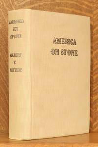
193150817New York: Doubleday Doran and Co. 1931. limited edition. Hardcover. Very good /fair. 9 x 12 in. 415 pp. Edition of 750 copies this is numbered 703 on the limitation pg. Gray cloth boards. Numerous color and B&W plates. Comes with a letter about the book by Harry Peters dated 1936. In it he recounts an amusing story about the first print in the book. Condition is VERY GOOD ; covers very clean no wear at all to edges. The covers have a touch of bowing due I believe more to the size and weight of the book than from wear. Binding tight and text/plates spotless. The original gray DJ is FAIR ; torn with numerous tape repairs. The original slipcase is very good - some wear and scuffing to surface wear at edges but no loss or splits. The copy number is inked on the lower end. A very nice copy with a signed letter. Art. RGR. Doubleday, Doran and Co. hardcover
1923109496Bologna 1923. In 8° piena pelle coeva muta con due nervi al dorso e motivo geometrico da cartone fustellato ricoperto al piatto anteriore. Frontespizio entro ricca cornice azzurra pp. 150 non numerate con il catalogo della campionatura del completo corredo tipografico della Merlani. Tutte le pagine entro cornice a filettino semplice azzurro. Ottimo e raro esemplare con tagli a raspa in false barbe Bologna unknown
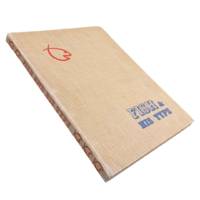
19476456Los Angeles: Wendell W. Fish 1947. Revised Edition. 4to 12.5x9.5" 83pp. Specimens printed in black on a variety of stock with decorative page borders of different colors. Original tan cloth covers with 3-brad binding spine lettering and fish logo in red with blue lettering on front cover. Some toning to pages single marginal tear to page 64. Boards bumped and worn. Very good. <br /> <br /> Attractive specimen book from Wendell Wilbur Fish a native of Bakersfield who in 1920 opened his first office in L.A. becoming one of the earliest "advertising typographers" in the area. In The Pacific Printer and Publisher October 1922 we find a review of some of Fish's work:<br /> <br /> <br /> "Fish. has made a special study of good typography. He is recognized as an authority on the subject of typographical treatment of financial advertising for newspaper purposes. But he has also put into type some of the largest campaigns for firms of national repute a versatility of treatment and design enabling him to get the highest utility as well as appropriateness into the printed message."<br /> <br /> We find little mention of Fish outside of these trade journals from the 20s and 30s. He must have been somewhat prominent for quite some time with this revised edition of his collection of type appearing some 25 years after he began in the trade. OCLC cites 5 holdings for 3 likely only 2 versions of this specimen book with just 1 on the revised edition at the Wolfsonian Library FIU. . Wendell W. Fish unknown
1965mon0000181694William Clowes & Sons 1965-01-01. Paperback. Good. in x in x in. Ex-Library usual stamps and markings. Hardback/Hardcover. Well read copy with some spine wear but still very useable. EXACT EDITION AND DATE OF PUBLICATION IS UNKNOWN. William Clowes & Sons paperback
DADAX0385093268Doubleday 0000-00-00. paperback. New. 0.00x0.00x0.00. Buy with confidence. Excellent Customer Service & Return policy. Doubleday paperback
191058183New York: The Century Co. 1910. 8vo. xi 3 477 1 pp. With 100’s of text illustrations type specimens diagrams woodcut engravings 1 in colour historiated vignettes decorated initials. Brown publisher’s cloth gilt lettering on spine gilt & red morocco spine label t.e.g. minor bumping to corners edgewear some rubbing still a VG copy. Second edition of this classic and surprisingly scarce printer’s manual originally issued in 1904 and the third title in De Vinne’s unexcelled series on typography. This work devoted to mechanical methods of book composition encompasses chapters on equipment composition of books composing & printing mathematics and music books foreign languages such as Greek Hebrew & German stone work and more. De Vinne 1828-1914 was often designated the “Dean of American Printers†founded the Grolier Club collaborated with Robert Hoe to advance fine printing and presses and embraced the concept of the book as objet d’art. The Century Co., hardcover
1822BB0354London: Printed for Samuel Richards and Co. 3 Grocers'-Hall Court Poultry; and T. Mason & Sons 2 Great Russel Street Bloomsbury 1822. Paper-Covered Boards. Very Good . The "best scandalous chronicle of the day" complete in three volumes. Tooley 12mo: viii319; 321; 326pp with 12 hand-colored plates engraved by Maddocks E. F. Burney and W. Read. Uniformly rebound to style by Fitterer with period marbled paper-covered boards and modern paper labels top edges gilt end papers renewed with laid paper. Bindings pristine; some gatherings foxed in volume I otherwise a very good or better set with only sporadic foxing and offsetting from the plates which are generally fresh and bright. Tooley 283 for 1821 octavo edition. Originally published pseudonymously in 1760 in two volumes. This Johnston's chief work spelled variously Johnston Johnson and Johnstone "appeared in four volumes between 1760 and 1765. The first and second volumes were written during a visit to the earl of Mount-Edgcumbe in Devon and had already gone through three editions before Johnstone was prevailed on to write the concluding two and the whole work was frequently reprinted during the eighteenth century and translated into French. An excoriating satire that won Johnstone respect as a wit but few friends the novel is set roughly during the period of the Seven Years' War 1757–63 and pretends to reveal political secrets and to expose the private profligacy of many of the well-known—and highly colourful—public characters of the time." ODNB N. B. With few exceptions always identified we only stock books in exceptional condition. All orders are packaged with care and posted promptly. Satisfaction guaranteed. Fine Editions Ltd is a member of the Independent Online Booksellers Association and we subscribe to its codes of ethics. Printed for Samuel Richards and Co. 3, Grocers'-Hall Court, Poultry; and T. Mason & Sons, 2, Great Russel Street, Bloomsbury unknown
19594604New York / Basel SW: Hastings House / Teufen Ar. A. Niggli 1959 . First edition. Hardcover. Very Good/issued without. Square octavo 248 pages clothbacked boards rear joint repaired in publisher's worn slipcase. Scarce. <br/><br/>"This international pictorial survey takes modern graphic art from its origins through the present-day achievements and concludes with a look into the future. Although 'graphic art' is limited here to art in the service of advertising there is no limit to the artistic value of the means employed - this is a selection of the best work in the field past and present. Contemporary graphic art - work done since the end of the World War II - is presented in the second and more comprehensive part of the book. It includes a wide range of media and techniques among which are: Newspaper advertisements leaflets catalogues posters displays lettering packages business stationery trade markes and devices." Trilingual text in Englilsh German and French. 432 illustrations of which 12 are in full colour. Printed in Switzerland. "Gerstner is one of the most important innovators in typography commercial art and corporate design - Swiss National Library." Includes treatments of trade marks book jackets posters magazines etc. Hastings House / Teufen, Ar., A. Niggli hardcover
19780007014Boston & Lexington KY: D. R. Godine 1978. First Limited edition. Hardcover. Fine/issued without. Quartos 57 213 pages quarter brown morocco brown cloth covered boards in matching cloth slipcase. <br/><br/>These are copies XXXII of 50 deluxe copies of printings of 500 and 550 copies. The second title carries the imprint of The Anvil Press 1981. Both volumes were designed by Martino Mardersteig and printed at his Stamperia Valdonega Verona Italy. These two companion volumes were later joined by VICTOR HAMMER: AN ARTIST'S TESTAMENT. Sir John Rothenstein was the Director of London's Tate Gallery. His volume includes 19 color plates. Hammer''s volume includes bibliographies of Victor Hammer and his four presses. D. R. Godine hardcover
192855499München: Albert Langen 1928. First edition. Softcover. Good- to good condition. Quarto. 251pp. Original tan wraps with brown lettering on cover and spine. Dedicated to E. H. F. Porsche. Cover by E. A. Enders. Font and typography similar to the Bauhaus book-series.<br /> <br /> 'Style seen strictly aesthetically demands foremost a consistent uniform character of an object or matter. We know that because we easily detect violations against this rule finding the objects violating it tasteless in bad style;' this is how Kollmann opens his introduction. Therefore Kollmann concludes: "Style is a basic aesthetic demand that is to say that of unity not to be confused with the delight humans take in the decorative. <br /> <br /> An extensive treatise of industrial architecture and design including factories bridges cranes masts ships airplanes and Zeppelins cars trains machines and their pats. The book is profusely illustrated with 151 b/w reproductions of photographs and some technical drawings. Contains notes on text and pictures and bibliography at rear. Text in German. Light wear along edges of covers. Minor foxing of endpapers and foredge of block. Previous owner's stamp on half-title. Albert Langen unknown
193239018Paris: Editions du Belier 1932. A PERFECT COPY ON IMPERIAL JAPANESE PAPER of this beautifully-illustrated edition of Dante´s Paradiso with art déco typography by François-Louis Schmied. 141 pp. From a total edition of 500 copies this is ONE OF ONLY 54 COPIES ON IMPERIAL JAPANESE PAPER WITH AN EXTRA SUITE OF COSTETTI'S WOOD-ENGRAVINGS PRINTED WITHOUT THE TEXT ON FINE CHINESE PAPER. Laid in is a cordial handwritten letter dated 1932 from Maurice Tahon co-founder with Schmied of Editions du Belier to the original purchaser of this volume. 4to. Sewn in original printed wraps. Suite of wood-engravings loose as issued. FINE AND BRIGHT WITH NO DEFECTS in the original board chemise and slipcase. <br/><br/> Editions du Belier paperback
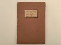
19379872AB1937. Portfolio with 6 prints by The Typophiles. New York 1937. 23 : 155 cm. With 6 booklets. Original cardboard portfolio. Portfolio of the Typophiles for the dinner party given for the british book-designer and author Beatrice Ward how wrote under the pseudonym of Paul Beaujon. There were published only very few portfolios of this type of this then young society of book-designers authors and book-lovers under the leadership of Pau. A. Bennett. They were all designed and produced by and for the members of the club. Contains: Paul A. Bennett Greetings - Paul Beujon Betrice Warde - The battle of the Century Beaujon verses Typophiles - Beatrice L. Warde Printing should be invisible - Stags and a few Dears A Souvenir - Alicis Paul Beaujon A portriat of him. - Very rare. unknown
190965456Boston and New York: Printed at The Riverside Press for Houghton Mifflin Company 1909. Limited Edition. Hardcover. Very Good. SIGNED. 332pp. Quarto 28.5 cm Black cloth spine with green paper over boards with ornamental gilt stamping. Deckled fore and bottom edges. Printed on English handmade paper. With areas of fading to the head and foot of the backstrip. The most prominent area of fading is to the foot of the backstrip measuring approximately 2 inches tall by 1 and 3/4 inches wide. Internally bright and fresh. Publisher's prospectus laid in. Prolific engraver Geofroy Geoffroy Tory 1480-1533 was primarily responsible for the French Renaissance style of book decoration and played a leading role in popularizing the Roman letter over the prevailing Gothic letter in France.<br /> <br /> Number 270 in an edition of 370 copies designed by Bruce Rogers. This copy is signed by Bruce Rogers on the limitation page. American typographer and book designer Bruce Rogers 1870-1957 was highly influential in fine book design in the United States during the early 20th century. Rogers began his career as an illustrator for an Indianapolis newspaper. He moved to Boston in 1895. There he met a number of men who were revolutionizing the book publishing industry including George Mifflin of Houghton Mifflin who put him to work at the Riverside Press. The press opened a limited editions department in 1900 and Rogers was put in charge and given the responsibility of designing and printing fine books. During the next 12 years he produced over 100 Riverside Press editions which are still held in high esteem today. Information from Britannica.com. Printed at The Riverside Press for Houghton Mifflin Company hardcover
1822BB1085London: Published By R. Ackermann At The Repository Of Arts 101 Strand London; And To Be Had Of All The Booksellers In The United Kingdom 1822. Full Leather. Very Good . First Edition of the "last of the genuine or 'authorized' Syntax books" Abbey first issued in eight monthly parts. Royal 8vo 236 x 1452mm: iv267pagination irregular but text complete1pp with 24 hand-colored aquatints by Thomas Rowlandson. Contemporary straight-grain morocco gilt boards framed in gilt and in blind with leaf-and-flower rolls rebacked with part of original spine and red morocco lettering piece laid down marbled end papers. A Very Good or better copy generally clean and bright with first and final leaves including title page foxed usual offsetting from plates very occasional finger-soiling. Abbey Life 268. Tooley 413. Grolier Rowlandson 48. Martin Hardie 174-75. As early as 1809 the publisher Ackermann had hired Combe to write the letterpress to accompany many of Rowlandson's most successful illustrations including those for the final volume of the "Microcosm of London" and perhaps especially for the illustrations that resulted in the series of comic poetry for which Combe is still most famous and which earned him his nickname Doctor Syntax: The Tour of Doctor Syntax in Search of the Picturesque and its two sequels 1812 1820 1821 The English Dance of Death 1815 1816 The Dance of Life 1817 and finally The History of Johnny Quae Genus the Little Foundling of the Late Doctor Syntax 1822. "Combining light-hearted satire of William Gilpin's theory of the picturesque in art with a central character modelled on Cervantes' Don Quixote and Henry Fielding's Parson Adams Combe created a lovable eccentric whose misadventures on the road structure the Tour. For over a century the many editions and numerous imitations of the Tour attested to the popularity of Combe's humorous hero." ODNB N. B. With few exceptions always identified we only stock books in exceptional condition. All orders are packaged with care and posted promptly. Satisfaction guaranteed. Fine Editions Ltd is a member of the Independent Online Booksellers Association and we subscribe to its codes of ethics. Published By R. Ackermann, At The Repository Of Arts, 101, Strand, London; And To Be Had Of All The Booksellers In The United Ki unknown
1918ABE-1693603570673Dill & Collins 1918 Original pictorial paper boards newly rebacked with matching paper. Illustrations throughout featuring the work of 30 graphic designers ranging from decorative initials and ornaments to reproductions of posters and magazine covers many of them full-page one double-page mostly in color. Printed on specimens of 30 different types of paper made by Dill & Collins seven of the leaves with multiple paper. Owner's signature of Jeanette E. Samuelson of the N.Y Herald Tribune dated 1933 on front fly leaf with her gift inscription. Rear paste-down with the bookplate/shelf label of Will Ransom. Corners and portions of edges of the paper boards somewhat worn two-inch tape repair to rear in one leaf crossing a very small portion of a border without loss first few leaves a bit spotted around margins many leaves slightly darkened a few additional trivial spots otherwise an excellent copy generally quite clean. Rare. 1st Edition. Hardcover. Very Good. Dill & Collins hardcover
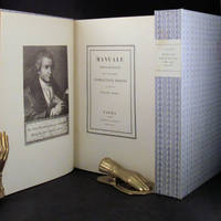
181830675Parma London: Presso La Vedova The Holland Press 1818 1960. 2 volumes. LIMITED EDITION one of only 500 copies printed of the very impressive facsimile of Bodoni's original edition of 1818. With a fine frontispiece portrait three folding plates of musical notation and seemingly countless typographical specimen. Tall 4to in the printer's original blue patterned paper-covered boards with printed paper labels on the spines. lxxii 267; iv 279 pp. A fine and handsome set beautifully preserved and essentially pristine. LIMITED FACSIMILE EDITION OF A MASTERPIECE OF THE TYPOGRAPHICAL ARTS BODONI'S MANUALE TIPOGRAFICO. Printer for the Duke of Parma Bodoni's manual was the culmination of more than four decades of work and is one of the age of printing's greatest typographical achievements. It is comprised of 291 roman and italic typefaces along with samples of Russian Greek and many other types. Presso La Vedova [The Holland Press] hardcover
20080006706London: The Folio Society 2008. Facsimile edition. Hardcover. Fine/issued without. Folio brownish-red cloth extra gilt cover in fine publisher's slipcase <br/><br/>A handsome facsimile of the famed masterwork of The Kelmscott Press created by William Morris with illustrations by Edward Burne-Jones. Appended to this is an Afterword essay on the Kelmscott Chaucer by William S. Peterson the bibliographer of The Kelmscott Press. He states that of numerous facsimiles the 1975 edition by The Basilisk Press is "heads and shoulders above the rest . it is an astonishing recreation." This Folio Society edition used the personal copy of the proprietor of The Basilisk Press to create this reproduction. Even the thick paper - to imitate the original - was specially commissioned from the James Cropper Paper Mill. The Folio Society hardcover
1989DEMO013090INo place: Joseph J. D'Ambrosio 1989. First Limited edition. Hardcover. As New/as new. photographs. Octavo 129pp. leather copper and marbled paper; Italian linen & paper dj <br/><br/>D'Ambrosio's second bibliography of his work bringing it up-to-date. This one gives a much fuller account of the genesis and processes of each of his works with laser-printed color photographs of the books some of which are limited to only one copy! Indispensable to the appreciation of the artistry and the artist. Laid in is the original announcement for this work. Joseph J. D'Ambrosio hardcover
201122032603Claremont California: Scripps College Press 2011. Limited Edition. Stitched Binding. Fine. One of 103 copies folio size 28 pp. signed by the students and Kitty Marryatt. The publications by the students of the Book Arts and Typography Class at Scripps College are some of the most imaginative we have ever seen and this publication is no exception. <br /> <br /> The work was inspired by the the 13th-century poet Jalaud'din Rumil now known by most simply as "Rumi". Although a Muslim by faith his poetry "seeks to deal with the more universal aspects of the human condition. He discusses the aspects of existance encountered by all individuals and continues to make profound beautiful statements regarding even the most ortinary tasks and occurences." n.b from the book's bio of Rumi. <br /> <br /> The students in the Class chose a medieval text and provided their own commentaries as exegesis. This book unfolded as a poem by Rumi as interpreted by Coleman Barks with the students' commentaries. The visual images "were inspired by the geometric structures of medieval book imagery. The colors of the linoleum blocks reflect the preponderance of lapis lazuli blue crimson red and royal purple in medieval miniatures" n.b. from the Colophon. <br /> <br /> A true delight for both the eye and the soul. Scarce in the online markeplace as of this writing there are no other copies online; our search of OCLC locates thirty institutional holdings. <br /> <br /> ___DESCRIPTION: Boards bound in Ginga Iridescent Orange bookcloth introducing gold which was prevalent in medival manuscrips binding Tyvek-reinforced tapes with gold thread which are attached to the covers each page with a geometric design in various colours signed by each of the students in the class and Professor Maryatt on the page facing the Colophon; types Scripps Old Style Centaur Arrighi and Weiss Initials on Rives BFK paper binding folio size 14 1/4" by 11 1/8" unpaginated with fourteen leaves; limited edition of 103 copies this no. 73. <br /> <br /> ___CONDITION: Fine overall the cloth over the boards clean the tape binding strong straight corners with a modicum of rubbing a square text block the interior is clean and bright and entirely free of prior owner markings; a lovely production. <br /> <br /> ___POSTAGE: International customers please note the following: i additional postage may apply as the standard does not always cover costs please inquire for details; and ii any taxes duty or tariffs charged by your country will of necessity be your responsibility. <br /> <br /> ___Swan's Fine Books is pleased to be a member of the ABAA ILAB and IOBA and we stand behind every book we sell. Please contact us with any questions you may have we are here to help. Scripps College Press unknown
1868BB0846Eton / London: Ingalton and Drake / Simpkin Marshall 1868. Decorative Cloth. Fine. First Edition of apparently the first field guide to birds to use photographs as illustrations. 8vo: xiv2232pp with four hand-colored and varnished albumen photographs of stuffed birds mounted on heavy card stock. "It was impossible at the time to photograph live birds due to the absence of the telephoto lens and extremely sensitive plates that would permit short exposures." Goldschmidt & Naef Publisher's forest-green pebble-grained cloth spine and upper cover with bird vignettes in gilt spine lettered and ruled in gilt chocolate coated end papers. A Fine tight square copy clean crisp text the photographs vibrant with deep rich colors. Provenance: Book plate of Henry Neville Gladstone third son of Prime Minister William Ewart Gladstone. Binder's ticket of James Burn & Co. Kirby St. to rear paste-down. Gernsheim 436. Truthful Lens 96. Margolis & Moss 24. The author was only age 16 when he published this "contribution to the natural history of two counties" in which Kennedy identified no less than 225 species of birds. N. B. With few exceptions always identified we only stock books in exceptional condition carefully preserved in archival removable mylar sleeves. All orders are packaged with care and posted promptly. Satisfaction guaranteed. Fine Editions Ltd is a member of the Independent Online Booksellers Association and we subscribe to its codes of ethics. Ingalton and Drake / Simpkin, Marshall unknown
1992DEMO012900ISherman Oaks CA: D'Ambrosio 1992. First Limited edition. hardcover. Fine. Josephp D'AMBROSIO's serigraphs. Octavo 24pp. crenellated spine paper label aqua spine floral boards. <br/><br/>A Livre d'Artiste by D'Ambrosio. Introd. by Patrick Magarick. Limited to 85 copies on handmade papers by Madeleine Pestiaux. Villiers de L'Isle Adam a French contemporary to de Maupassant and Huysmans is best known for his CONTES CRUELS. D'Ambrosio designed hand-set printed and bound this work. "D'Ambrosio is a book artist of individual books. As his aim is not to break tradition in and of itself heis not avant-garde. His goal is to make beautiful books and there is never any doubt that the object he creates is just that. His work is so outstanding that I have never seen anything like it in a lifetime of book collecting -Magarick." In this work he has set most of the text pages into three-dimensional framed borders in a self-boxed format. D'Ambrosio hardcover
1764KC8048Venice: Remondini 1764. Hardcover. Very Good. Folio 315 x 240mm. 38pp. I-XXXVIII. Finely printed with decorative chapter headings and tail-pieces. Engraved printers device of Remondini depicting bishop with putti carrying crozier and miter. Engraved vignette of muses on dedication page. Decorative paper covered boards; some minor soiling or staining joint repaired on title verso lacking first and last blanks otherwise complete and in good form with good wide margins. <br/><br/>Collection of poetic essays in song of Sister Maria Theresa Crocefissa 1645-1699 an Augustinian nun from Venice known for her long orations printed by the Remondini press. In the 16th century Venice was the marketplace of the world. Its location on the lagoon and its unique connections with the sea distinguished it as a cosmopolitan center among the great cities of the Renaissance. In this larger context commerce and trade played a central role in the development and achievements of music printing. The subject of this work is poems written as canzones and sonettoes or songs and little songs of Sister Maria Crocefissa. From an early age Maria Crocefissa was devoted to long poetic orations. Soon she was also engaged in self-punitive actions including wearing a hairshirt. At the age of 23 she experienced her first religious ecstasies. During these periods of trance some lasting well over a week she regressed into a childlike state that left her completely paralyzed. The presence of Maria Crocefissa in her Augustinian convent of San Girolamo brought about a series of supernatural episodes and mysterious sightings which interested the public. While she was still alive her papers were widely published. This particular title of her poems addressed to Girolama Gaudio is of utmost rarity not located in a contemporary library collection or market worldwide. From the Remondini press who by the second half of the 18th century were employing more than a thousand people in the Bassano del Grappa with hundreds of others busy in their local paper mills and selling their products in scores of countries making them perhaps the biggest publishers in Europe. Between 1751 and 1790 Remondini were granted more licenses for books than all the other Venice booksellers put together. Printed matter was a luxury and the Remondini press was known to employ refined typographical features to suit the tastes of buyers. In this work attention is paid to the decorative elements initials and layout of each page. Remondini hardcover
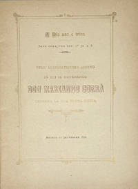
1890102911<p>Agordo Tipografia Cavassago 1890. 4to. 17 i pp. Title & text within a double rule decorative frame printed in gold with bronze ink titling main text in black. Original yellow card cover printed with blue ink slight sunning to upper cover decorative rectagnular upper cover panel of scrollwork repeated circular ornament with small devotional vignettes & putti on the angles and crosspieces. A very good copy.</p><p>A finely printed devotional booklet celebrating the first mass of Don Marianno Corrà. <strong>Antiquarian printings from Agordo seem particularly rare and the press of the Tipografia Cavassagio seems entirely unrepresented outside of Italy in institutional holdings. </strong></p>