341 résultats
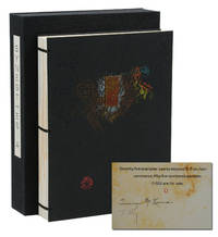
140941961New York: Granary Books 1992. Signed Limited First Edition. Fine. First edition. An artist's book containing drawn and painted images by Timothy C. Ely set against text written by Terence McKenna with typography by Philip Gallo. From a limited edition of only 75 copies signed by McKenna and Ely. Of those 75 there were 55 numbered copies and 20 hors commerce copies lettered G-Z and this is copy letter O. Pages printed letterpress on Rives BFK in pairs on single leaves wrapped around and pasted onto thick card stock and adorned with original watercolor paintings by Ely; sewn binding with brass rods securing textblock to black embossed paper-covered boards with decorative brass piece affixed to upper board housed in original black cloth chemise case with printed paper title label to spine. Fine. In 1991 McKenna visited an exhibition at Granary Books featuring Ely's work and this collaboration would result. A fantastic push and pull of Gallo's refined typography set against Ely's abstract watercolor offering a visual landscape for the eye to wander perfectly paired with McKenna's text on broad themes such as art language history and nature. Granary Books unknown
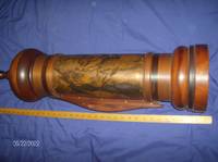
1992DEMO006065IStatesboro GA: The Boxwood Press 1992. First Limited edition. Hardcover. Fine. In a mahogany and copper scroll case with vertical slot and hidden crank handle; with a protective velvet cloth <br/><br/>Only 16cc.Remarkable bilingual presentation / re-interpretation of this Biblical work placing it in the the Reagan / Bush era. Illustrated with 16 color etchings by Bernard Solomon the translator and etcher. He realized there were remarkable parallels between the Biblical story of Esther and that of Anita Hill Clarence Thomas and the U.S. Senate Judiciary Committee. This interpretation unfolds sequentially as each leaf is unrolled from the 33 in. high scroll holder. The body of the scroll holder is one of the original copper plates used for the etchings which is why it is limited to an edition of only 16. The top and bottom of the handcrafted minaret-style case is finely shaped and polished mahogany by Anthony V. Mann. Designed with a hidden crank to rewind the scroll into the case. Altogether remarkable! The Boxwood Press hardcover
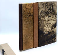
015681Kalamazoo Michigan: Rarach Press 1989. Hardcover. Fine. No. 30 of 38 copies signed by the artist/publisher Ladislav Hanka. In a multi-textured binding by Jan Sobota stamp-signed on rear doublure covers of sueded calfskin printed with original etchings flat spine of brown catfish leather turn-ins and headbands covered in eel skin beige pigskin doublures covered with original etchings leather hinges. In an encapsulated pigskin slipcase covered with etchings beige linen pull-off spine with brown morocco label. With 16 etchings of flora and fauna by Ladislav Hanka. 333 x 248 mm. 13 1/8 x 9 3/4''. A fine copy. This is a handsomely-produced book arts collaboration celebrating the natural beauty of Kalamazoo County Michigan featuring a memorable binding by Czech master binder Jan Sobota. After studying with Karel Silinger in Pilsen and at the School for Applied Arts in Prague and then working in Switzerland Sobota came to the United States where hespend 15 years mostly working at Southern Methodist University. He returned to Loket Czech Republic in 1997 where he founded the Sobota family bookbinding studio and helped to organize the Society of Czech Bookbinders becoming its first president. He has won numerous awareds for his innovative and often whimsical work which has been exhibited worldwide. The present volume is equal parts inventiveness and elegance. Book artist and publisher Ladislav Hanka b. 1952 earned degrees in biology and zoology before receiving his MFA in printmaking and his background in the natural sciences obviously infuses his art which focuses on the flora and fauna of forest and lakes. This volume's collection of prose and poetry inspired by the natural landscape is enhanced by Hanka's dramatic etchings of twisted bare-limbed trees fossils and insects. The letterpress work was done by Amy Bollinger on heavy handmade paper. Rarach Press hardcover
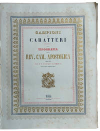
1853LL 603<p>TYPOGRAPHIC SPECIMENS OF THE VATICAN PRINTING HOUSE. Folio 342x255 mm; original cloth with title impressed in gold on upper cover; half-title leaf title-page leaf printed in blue red and gold within a triple border as well printed in blue red and gold a leaf with the advice to reader pp. VIII 62 plates and 4 plates containing many samples of fonts text printed in Italian Latin Greek Copic French also with sample of numbers music typographical borders tailpieces etc. last 4 plates: " Campioni dei tratti di penna" so calligraphic samples. Francesco Salviucci belonging to a well-known family of Roman typographers director of the Typography of the "Reverenda Camera Apostolica" describes a vast sample of the printing characters present in the typography preceded by a brief excursus on typographic art in general. In addition to the characters there are various friezes and engravings including the image of a steamship probably the first of the Papal State. Maggs cat. n. 509; Books on Printing Part II Books From Famous Presses 15th To 20th Century.</p> Tipografia della Rev. Camera Apostolica hardcover
200894189Birkhäuser Architecture. New. 2008. Hardcover. 3764385812 . FREE UPGRADE to Courier/Priority Shipping Upon Request - IN STOCK AND IMMEDIATELY AVAILABLE FOR SHIPMENT - Flawless copy brand new pristine never opened -- Text in English. 460 pages; 430 color 620 b/w illustrations. Description: "Adrian Frutiger first came to the design world's attention in the late 1950s with his design of Univers and the numbering concept behind it. A considerable proportion of his output has also been informed by developments in typesetting technology. In the 1970s he set a standard for signage typefaces with his Alphabet Roissy for the Paris-Roissy airport. Slightly reworked this went on to enjoy great success as a body typeface under the name Frutiger. His machine-readable OCR-B which is used on paying-in slips passports credit cards and as ISBN numbers on books has become an official ISO standard. His sans serif typefaces Avenir and Vectora which appeared at the end of the 1980s stand out because of their exceptional readability and have cemented Frutigers reputation as 'Mr Sans Serif'. The Complete Works is based on interviews and conversations with the designer and on comprehensive research by the editors. Its depth and range make it an indispensable reference work. Completed in the year of Adrian Frutiger's 80th birthday it represents as is his wish his legacy to further generations of type designers and typographers." Birkhäuser Architecture hardcover
17910005591Worcester & Boston: Isaiah Thomas 1791. First edition. Hardcover. Good. With two of the 50 copperplate engravings from the folio edition plates 29 & 48. Royal quarto 1310 pages contemporary blindstamped full sheep repaired joints and head and foot spine panels replaced and with new endpapers; The frontispiece has been tipped-in on the new endpaper; rear cover very scuffed foxing and spots throughout edgeworn <br /> <br /> a few minor marginal tears and chips some leaves imperfectly sewn in. The Family Record leaves have extensive handwritten notes of the families of Gen. Joseph Badger Jr. Signed by him of Gilmanton Belmont NH father of Gov. Wm. Badger 1834-36. & Charles Jacobs of Gilmanton. <br/><br/>Isaiah Thomas whom Benjamin Franklin called 'the Baskerville of America' was one of the notable publishers during the early days of the Republic.He made every effort to ensure accuracy of the text by comparing some thirty different editions and having the text carefully examined by several clergymen and others who compared it with eight Bibles - Herbert 1353." The First Illustrated Bible printed in America is the 1791 folio Bible by Isaiah Thomas "The most sumptuous American Bible of the eighteenth century" : thus this quarto-sized version of that work is the Second Illustrated Bible printed in America and the first Royal Quarto Bible in English published in American both editions were announced as "completed" on the same date altho vol. 2 of the folio was still in progress. Rumball-Petre 172; Sabin 5173 variant; O'Callaghan pp. 40-42; Hills 30. Evans 23185 states that some copies were issued with no Concordance and 48 additional plates. This state however has only two copperplates as frontispieces of the 50 copperplate engravings from the folio edition plates 29 & 48 . Included are 200 pages of Tables Apocrypha and Family Records Index etc. The subscription price was $7 but half the price could be paid in wheat rye Indian corn butter or pork! It is believed that 1500 copies of each format were printed. "The two Thomas Bibles of 1791 were without doubt far in advance of any other publications of the same kind that had appeared in America in point of typography excellence of paper binding and general execution - Wright EARLY BIBLES OF AMERICA." Isaiah Thomas hardcover
2008C94189Birkhäuser Architecture. As New. 2008. Hardcover. 3764385812 . FREE UPGRADE to Courier/Priority Shipping Upon Request - IN STOCK AND IMMEDIATELY AVAILABLE FOR SHIPMENT - Flawless copy brand new pristine never opened -- Text in English. 460 pages; 430 color 620 b/w illustrations. Description: "Adrian Frutiger first came to the design world's attention in the late 1950s with his design of Univers and the numbering concept behind it. A considerable proportion of his output has also been informed by developments in typesetting technology. In the 1970s he set a standard for signage typefaces with his Alphabet Roissy for the Paris-Roissy airport. Slightly reworked this went on to enjoy great success as a body typeface under the name Frutiger. His machine-readable OCR-B which is used on paying-in slips passports credit cards and as ISBN numbers on books has become an official ISO standard. His sans serif typefaces Avenir and Vectora which appeared at the end of the 1980s stand out because of their exceptional readability and have cemented Frutigers reputation as 'Mr Sans Serif'. The Complete Works is based on interviews and conversations with the designer and on comprehensive research by the editors. Its depth and range make it an indispensable reference work. Completed in the year of Adrian Frutiger's 80th birthday it represents as is his wish his legacy to further generations of type designers and typographers." -- with a bonus offer-- - May be EITHER: out of print OOP and extremely rare in this pristine condition; signed by author or contributor; or a first or special edition; inquire for details . Birkhäuser Architecture hardcover
55699Prague: B. Å meral Odeon and Knihtiskárna "Orbis" 1936. Octavo 23.7 × 16 cm. Original red paper wrappers over blind card boards with gray printed label to upper left corner; 71 4 pp. Five full-page illustrations by Toyen Å tyrský Hoffmeister Bidlo and Pelc. In the original red paper-covered slipcase. Signed throughout by all authors and artists. Red wrapper somewhat creased over front board; trace of plastic protective wrapper inside front and rear boards; Very good. First and only edition of this striking "anti-fascist" anthology of poems essays music and art "published for the benefit of the anti-fascist struggle" in Spain by BohumÃr Å meral and sold in commission by Odeon. Å meral 1880-1941 was a leading Czech communist politician a co-founder of the Czechoslovak Communist Party and later advisor to Stalin. The book contains poems by Konstantin Biebl FrantiÅ¡ek Halas JindÅ™ich HoÅ™ejÅ¡Ã Helena MalÃÅ™ová Stanislav K. Neumann Jiřà Noha and Laco Novomeský; prose by Karel Konrád Jiřà KratochvÃl Marie Majerová Ivan Olbracht Marie Pujmanová and Vladislav VanÄura; and songs by E. F. Burian lyrics by VÃtÄ›zslav Nezval and Jiřà Ježek lyrics by Voskovec and Werich. Illustrated with five photomechanical full-page prints reproducing drawings by FrantiÅ¡ek Bidlo Adolf Hoffmeister A. V. Pelc JindÅ™ich Å tyrský and Toyen each signed by the respective artist. With the exception of Karel Teige who provided the typographic and overall design all contributors have signed their texts and illustrations. Numbered copy of 550 copies on wood-free paper. An additional fifteen copies XV were printed on Pannekoek with all illustrations hand-colored. <br /> <br /> Vloemans 337. unknown
192850278München: Albert Langen 1928. First edition. Hardcover. Good to very good condition. Quarto. 251pp. Original tan cloth with brown lettering on cover and spine in original dustjacket protected by modern mylar. Dedicated to E. H. F. Porsche. Cover and typography by Adolf Meyer Franz Kollmann. Font and typography similar to the Bauhaus book-series.<br /> <br /> 'Style seen strictly aesthetically demands foremost a consistent uniform character of an object or matter. We know that because we easily detect violations against this rule finding the objects violating it tasteless in bad style;' this is how Kollmann opens his introduction. Therefore Kollmann concludes: "Style is a basic aesthetic demand that is to say that of unity not to be confused with the delight humans take in the decorative. <br /> <br /> An extensive treatise of industrial architecture and design including factories bridges cranes masts ships airplanes and Zeppelins cars trains machines and their pats. The book is profusely illustrated with 151 b/w reproductions of photographs and some technical drawings. Contains notes on text and pictures and bibliography at rear. Text in German. Dustjacket two inch closed tear at top of front cover three quarter inch at bottom else very light wear along edges. Illustrated Ex-Libris on inside front cover. Minor foxing on endpapers. Albert Langen hardcover
1670<p><strong>Lovely "oriental" type samples from one of the oldest and most prestigious European scientific institutions.</strong></p><p><strong>Very rare: WorldCat traces only one copy</strong> in Uni. California Santa Barbara. No copy traced in the Italian Union catalogue OPAC SBN.</p><p>In 1611 Galileo Galilei became a member of the Italian "Academy of the Lynx-Eyed" founded just a few years before in 1603 with a focus on natural sciences and mathematics.<br />In the late 19th c. the Accademia dei Lincei became "Reale" growing into a famous centre of studies which would soon host the greatest scholars such as Pasteur Einstein Mommsen and others. As its programme was expanded with many humanitarian disciplines including Oriental studies the Reale Accademia published this elegant booklet with relatively new samples of Sanskrit Armenian Syriac Samaritan Arabic Turkish and Persian Aramaic Hieroglyphic Coptic Chinese Greek and Russian types in two sizes.<br />As the introduction states the Academy's press was in reality the Tipografia Salviucci founded in 1747 and renamed in 1885.</p><p>Description<br />Small 4to 25.5 x 17.5 cm. First blank leaf title printed in red and black and within ornamental framed and 29 pp. printed on recto only text within decorative frames.<br />Binding<br />Original light grey wrappers printed in reddish brown bound in contemporary marbled boards flat spine with red label with gilt lettering.<br />Condition<br />Covers lightly rubbed at extremities spine a bit faded and worn with old paper repair to upper half wrappers a bit spotted; except some minimal light browning at the very edge of pages a fresh copy internally.</p> R. Accademia dei Lincei, Roma, 1889. hardcover
18260005340Chiswick: Charles Whittingham 1826. First edition. Hardcover. Near Fine. 60 wood engravings by John Thompson from drawings by Stothard Corbould Harvey and others. 16mos full dark cherry calf raised bands extra glt spines inner dentelles a.e.g. bound by Zaehnsdorf Bindery for Lauriat's of Boston some rubbed spots at tips of some spines. <br/><br/>Singer was a member of the Society of Antiquaries and a former bookseller when he and Charles Whittingham printed this handsome popular illustrated edition of the Bard of Avon. "Singer was responsible for a careful collation of the text and many useful notes. . He unostentatiously did much to advance the study of Elizabethan literature - DNB." John Thompson trained by Robert Branston and Thomas Bewick was considered unexcelled as a wood engraver in the two decades surrounding this set. 60 wood engravings by John Thompson from drawings by Stothard Corbould Harvey and others. This was the first edition to possess Singer's Notes - Jaggard SHAKESPEARE BIBLIOGRAPHY p. 517 . Charles Whittingham hardcover
19840009327Statesboro GA : The Boxwood Press 1984 . First Limited edition. Hardcover. Fine/issued without dj. wood engravings. Folio unpaginated marbled endpapers; issued without the slipcase mentioned in the colophon. <br/><br/>Copy 10 of only 50 plus 5 proofs signed by Solomon. Handset in 30 pt. Broadway. Twelve full-page blocks by Solomon. These poems were inspired by the legend of St. Julian "The Hospitaller". Ratner's poems were worked out in concert with these woodblock illustrations each influencing the other. "The results are a work of visual literature which exists apart from the poems and which we hope will make its own statement - Introduction by Ratner." Julian's life-journey invlves an encountter with a stag. The stag is invoked in relief on the top cover and in intaglio on the rear and covered fully in split-grain leather. The Boxwood Press hardcover
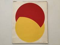
197619356AB1976. Dorog Szövorg 1976. 355 : 295 cm. 6 screen prints Loose as issued in original cardboard portfolio One of 250 numbered copie. With texts by Peter Mátyás and Lajos Kassak. - Binding a bit dusty spine and front board bit rubbed. unknown
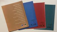
19584465New York: Lester Rossin Associates 1958. Very good. 4to 295 x 230 mm. Original 4-flap portfolio of brown pictorial paper containing three folders of bifolium sample illustrations designs and photographs loose as issued collated complete. Portfolio margins and folds with a little wear and creasing contents in excellent state. "MAD MEN" ERA GRAPHIC DESIGN BEING A PROMOTIONAL PORTFOLIO FOR A NOTED NYC ADVERTISING AND MARKETING AGENCY. THE PORTFOLIO IS ITSELF INGENIOUSLY DESIGNED AND THE CONTENTS PRESENT A "STABLE" OF INTERNATIONALLY RECOGNIZED ILLUSTRATORS DESIGNERS AND PHOTOGRAPHERS INCLUDING RAY PROHASKA AND D. STONE MARTIN. <br /> <br /> Lester Rossin is recognized as being one of the original "Mad Men" an elevated advertising art and marketing firm that thrived in the 1950s and 1960s. Offered here is an original portfolio of design work that was no doubt distributed to potential clients. The portfolio was designed by Clifford Condak and contains three color-coded folders with samples from the firm's three divisions. The folders are: Illustrators blue folder with a circle: 13 samples; Photographers green / square: 4 samples; and Designers red / triangle: 6 samples. Each folder bears the names of the individuals whose work was contained therein. <br /> <br /> On the front of the portfolio is an extraordinary "raison d'etre" by the firm which bears reprinting:<br /> <br /> "Design is the basis of a creative illustration.<br /> Whatever the medium<br /> message or technique only a<br /> heightened sense<br /> of design will raise the work from craftsmanship to<br /> the level of art. This is our belief.<br /> It is the basis of our<br /> achievement the discipline of<br /> our daily work<br /> and the guarantee of our future."<br /> <br /> On the back of the portfolio is a long list of the company's "Distinctions" including "Bests" at the 1957 International Poster Annual and the American Institute of Graphic Arts. Here the potential client is informed that "In the past 12 months we have designed and produced art for 2198 advertisers 1561 mailing pieces and 932 point-of-sale units." <br /> <br /> On the upper cover is the statement that this "First in a series"; no other subsequent portfolio has been located by us and not even this one is listed in WorldCat. Lester Rossin Associates unknown
1787DEMO006589IAugsburg : Christ. Friderici Burglen 1787. First edition. Hardcover. Very Good. 8 engravings two woodcuts. 4to 251 pages later speckled boards rebacked new spine some waterstains <br/><br/>Moguntina is the city of Mainz birthplace of moveable type and home to Johann GUTENBERG. This is Bishop Wurdtwein's study of the first hundred years of printing concentrating on the contribution of Gutenberg as continued by Fust & Schoefer and their followers. 8 engravings two woodcuts Christ. Friderici Burglen hardcover
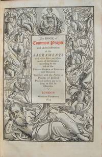
185313061'A TRIUMPH OF PRINTING<br />AS WELL AS OF ILLUSTRATION AND TYPOGRAPHY'<br />IN AN APPROPRIATE SCOTTISH BINDING<br />first edition thus 12mo. in sixes collates a-d6 B-Z6 AA-KK6 a-z6 AA6 that is 720 pages printed in Caslon type title page printed in red and black within a deep and striking woodcut border representing the Tree of Jesse full-page woodcut of Queen Elizabeth on verso of title page text inside varied and complex decorative and pictorial woodcut borders throughout by Mary Byfield decorative initial letters contemporary dark purple morocco over bevelled boards signed on verso of front free endpaper "Orrock Binder Edinb." sides blocked with 8 nesting borders of blind fillets and rolls some crossing at the corners to make small corner compartments with a leaf tool in blind in each spine with raised bands and blind tooling direct lettered gilt all edges gilt purple ribbon marker some very minor and scattered light foxing some light rubbing else a nice copy. Handsome copy of a most attractive book.<br /><br />GRIFFITHS <i>Bibliography . Book of Common Prayer</i> 1853 22<br />"The cuts harmonize perfectly with the type and this small tome is a triumph of printing as well as of illustration and typography" R. McLean <i>Victorian Book Desig</i>n 1972 p.12.For this book Mary Byfield 1795-1871 who spent most of her life working for the Chiswick Press cut over 100 wood blocks. These blocks many of great beauty were in the main based on early designs by Holbein Dürer Tory &c. copied from Queen Elizabeth's Book of Christian Prayers London 1581 and 1590 but they also included some based on contemporary designs by Charlotte Whittingham although to distinguish the old from the new is virtually impossible.<br />This edition was afterwards reissued by other publishers. William Pickering [printed by C. Whittingham at the Chiswick Press] hardcover
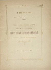
1890102911<p>Agordo Tipografia Cavassago 1890. 4to. 17 i pp. Title & text within a double rule decorative frame printed in gold with bronze ink titling main text in black. Original yellow card cover printed with blue ink slight sunning to upper cover decorative rectagnular upper cover panel of scrollwork repeated circular ornament with small devotional vignettes & putti on the angles and crosspieces. A very good copy.</p><p>A finely printed devotional booklet celebrating the first mass of Don Marianno Corrà. <strong>Antiquarian printings from Agordo seem particularly rare and the press of the Tipografia Cavassagio seems entirely unrepresented outside of Italy in institutional holdings. </strong></p>
1764KC8048Venice: Remondini 1764. Hardcover. Very Good. Folio 315 x 240mm. 38pp. I-XXXVIII. Finely printed with decorative chapter headings and tail-pieces. Engraved printers device of Remondini depicting bishop with putti carrying crozier and miter. Engraved vignette of muses on dedication page. Decorative paper covered boards; some minor soiling or staining joint repaired on title verso lacking first and last blanks otherwise complete and in good form with good wide margins. <br/><br/>Collection of poetic essays in song of Sister Maria Theresa Crocefissa 1645-1699 an Augustinian nun from Venice known for her long orations printed by the Remondini press. In the 16th century Venice was the marketplace of the world. Its location on the lagoon and its unique connections with the sea distinguished it as a cosmopolitan center among the great cities of the Renaissance. In this larger context commerce and trade played a central role in the development and achievements of music printing. The subject of this work is poems written as canzones and sonettoes or songs and little songs of Sister Maria Crocefissa. From an early age Maria Crocefissa was devoted to long poetic orations. Soon she was also engaged in self-punitive actions including wearing a hairshirt. At the age of 23 she experienced her first religious ecstasies. During these periods of trance some lasting well over a week she regressed into a childlike state that left her completely paralyzed. The presence of Maria Crocefissa in her Augustinian convent of San Girolamo brought about a series of supernatural episodes and mysterious sightings which interested the public. While she was still alive her papers were widely published. This particular title of her poems addressed to Girolama Gaudio is of utmost rarity not located in a contemporary library collection or market worldwide. From the Remondini press who by the second half of the 18th century were employing more than a thousand people in the Bassano del Grappa with hundreds of others busy in their local paper mills and selling their products in scores of countries making them perhaps the biggest publishers in Europe. Between 1751 and 1790 Remondini were granted more licenses for books than all the other Venice booksellers put together. Printed matter was a luxury and the Remondini press was known to employ refined typographical features to suit the tastes of buyers. In this work attention is paid to the decorative elements initials and layout of each page. Remondini hardcover
1992DEMO012900ISherman Oaks CA: D'Ambrosio 1992. First Limited edition. hardcover. Fine. Josephp D'AMBROSIO's serigraphs. Octavo 24pp. crenellated spine paper label aqua spine floral boards. <br/><br/>A Livre d'Artiste by D'Ambrosio. Introd. by Patrick Magarick. Limited to 85 copies on handmade papers by Madeleine Pestiaux. Villiers de L'Isle Adam a French contemporary to de Maupassant and Huysmans is best known for his CONTES CRUELS. D'Ambrosio designed hand-set printed and bound this work. "D'Ambrosio is a book artist of individual books. As his aim is not to break tradition in and of itself heis not avant-garde. His goal is to make beautiful books and there is never any doubt that the object he creates is just that. His work is so outstanding that I have never seen anything like it in a lifetime of book collecting -Magarick." In this work he has set most of the text pages into three-dimensional framed borders in a self-boxed format. D'Ambrosio hardcover
1868BB0846Eton / London: Ingalton and Drake / Simpkin Marshall 1868. Decorative Cloth. Fine. First Edition of apparently the first field guide to birds to use photographs as illustrations. 8vo: xiv2232pp with four hand-colored and varnished albumen photographs of stuffed birds mounted on heavy card stock. "It was impossible at the time to photograph live birds due to the absence of the telephoto lens and extremely sensitive plates that would permit short exposures." Goldschmidt & Naef Publisher's forest-green pebble-grained cloth spine and upper cover with bird vignettes in gilt spine lettered and ruled in gilt chocolate coated end papers. A Fine tight square copy clean crisp text the photographs vibrant with deep rich colors. Provenance: Book plate of Henry Neville Gladstone third son of Prime Minister William Ewart Gladstone. Binder's ticket of James Burn & Co. Kirby St. to rear paste-down. Gernsheim 436. Truthful Lens 96. Margolis & Moss 24. The author was only age 16 when he published this "contribution to the natural history of two counties" in which Kennedy identified no less than 225 species of birds. N. B. With few exceptions always identified we only stock books in exceptional condition carefully preserved in archival removable mylar sleeves. All orders are packaged with care and posted promptly. Satisfaction guaranteed. Fine Editions Ltd is a member of the Independent Online Booksellers Association and we subscribe to its codes of ethics. Ingalton and Drake / Simpkin, Marshall unknown
20080006706London: The Folio Society 2008. Facsimile edition. Hardcover. Fine/issued without. Folio brownish-red cloth extra gilt cover in fine publisher's slipcase <br/><br/>A handsome facsimile of the famed masterwork of The Kelmscott Press created by William Morris with illustrations by Edward Burne-Jones. Appended to this is an Afterword essay on the Kelmscott Chaucer by William S. Peterson the bibliographer of The Kelmscott Press. He states that of numerous facsimiles the 1975 edition by The Basilisk Press is "heads and shoulders above the rest . it is an astonishing recreation." This Folio Society edition used the personal copy of the proprietor of The Basilisk Press to create this reproduction. Even the thick paper - to imitate the original - was specially commissioned from the James Cropper Paper Mill. The Folio Society hardcover
1989DEMO013090INo place: Joseph J. D'Ambrosio 1989. First Limited edition. Hardcover. As New/as new. photographs. Octavo 129pp. leather copper and marbled paper; Italian linen & paper dj <br/><br/>D'Ambrosio's second bibliography of his work bringing it up-to-date. This one gives a much fuller account of the genesis and processes of each of his works with laser-printed color photographs of the books some of which are limited to only one copy! Indispensable to the appreciation of the artistry and the artist. Laid in is the original announcement for this work. Joseph J. D'Ambrosio hardcover
201122032603Claremont California: Scripps College Press 2011. Limited Edition. Stitched Binding. Fine. One of 103 copies folio size 28 pp. signed by the students and Kitty Marryatt. The publications by the students of the Book Arts and Typography Class at Scripps College are some of the most imaginative we have ever seen and this publication is no exception. <br /> <br /> The work was inspired by the the 13th-century poet Jalaud'din Rumil now known by most simply as "Rumi". Although a Muslim by faith his poetry "seeks to deal with the more universal aspects of the human condition. He discusses the aspects of existance encountered by all individuals and continues to make profound beautiful statements regarding even the most ortinary tasks and occurences." n.b from the book's bio of Rumi. <br /> <br /> The students in the Class chose a medieval text and provided their own commentaries as exegesis. This book unfolded as a poem by Rumi as interpreted by Coleman Barks with the students' commentaries. The visual images "were inspired by the geometric structures of medieval book imagery. The colors of the linoleum blocks reflect the preponderance of lapis lazuli blue crimson red and royal purple in medieval miniatures" n.b. from the Colophon. <br /> <br /> A true delight for both the eye and the soul. Scarce in the online markeplace as of this writing there are no other copies online; our search of OCLC locates thirty institutional holdings. <br /> <br /> ___DESCRIPTION: Boards bound in Ginga Iridescent Orange bookcloth introducing gold which was prevalent in medival manuscrips binding Tyvek-reinforced tapes with gold thread which are attached to the covers each page with a geometric design in various colours signed by each of the students in the class and Professor Maryatt on the page facing the Colophon; types Scripps Old Style Centaur Arrighi and Weiss Initials on Rives BFK paper binding folio size 14 1/4" by 11 1/8" unpaginated with fourteen leaves; limited edition of 103 copies this no. 73. <br /> <br /> ___CONDITION: Fine overall the cloth over the boards clean the tape binding strong straight corners with a modicum of rubbing a square text block the interior is clean and bright and entirely free of prior owner markings; a lovely production. <br /> <br /> ___POSTAGE: International customers please note the following: i additional postage may apply as the standard does not always cover costs please inquire for details; and ii any taxes duty or tariffs charged by your country will of necessity be your responsibility. <br /> <br /> ___Swan's Fine Books is pleased to be a member of the ABAA ILAB and IOBA and we stand behind every book we sell. Please contact us with any questions you may have we are here to help. Scripps College Press unknown
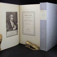
181830675Parma London: Presso La Vedova The Holland Press 1818 1960. 2 volumes. LIMITED EDITION one of only 500 copies printed of the very impressive facsimile of Bodoni's original edition of 1818. With a fine frontispiece portrait three folding plates of musical notation and seemingly countless typographical specimen. Tall 4to in the printer's original blue patterned paper-covered boards with printed paper labels on the spines. lxxii 267; iv 279 pp. A fine and handsome set beautifully preserved and essentially pristine. LIMITED FACSIMILE EDITION OF A MASTERPIECE OF THE TYPOGRAPHICAL ARTS BODONI'S MANUALE TIPOGRAFICO. Printer for the Duke of Parma Bodoni's manual was the culmination of more than four decades of work and is one of the age of printing's greatest typographical achievements. It is comprised of 291 roman and italic typefaces along with samples of Russian Greek and many other types. Presso La Vedova [The Holland Press] hardcover
1918ABE-1693603570673Dill & Collins 1918 Original pictorial paper boards newly rebacked with matching paper. Illustrations throughout featuring the work of 30 graphic designers ranging from decorative initials and ornaments to reproductions of posters and magazine covers many of them full-page one double-page mostly in color. Printed on specimens of 30 different types of paper made by Dill & Collins seven of the leaves with multiple paper. Owner's signature of Jeanette E. Samuelson of the N.Y Herald Tribune dated 1933 on front fly leaf with her gift inscription. Rear paste-down with the bookplate/shelf label of Will Ransom. Corners and portions of edges of the paper boards somewhat worn two-inch tape repair to rear in one leaf crossing a very small portion of a border without loss first few leaves a bit spotted around margins many leaves slightly darkened a few additional trivial spots otherwise an excellent copy generally quite clean. Rare. 1st Edition. Hardcover. Very Good. Dill & Collins hardcover