3 418 résultats
1990689Iowa City: Windhover Press 1990. First edition. One of 26 specially bound lettered copies signed by Strand & Welliver with two separate prints laid in at the back; the only signed issue of this publication. As new. Folio original wrappers with Japanese style clasps. As new. Windhover Press unknown books
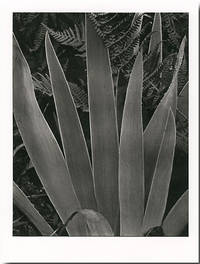
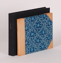
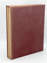
19838564New York. The Aperture Foundation. 1983. Plates laid loose into sand linen cloth Portfolio which is further encased in a like linen Solander box. Gilt titled morocco Title Label inset to front cover of box. Tall Folio. 17" x 21 This Edition Limited to 300 numbered copies of which this is #120. Portfolio is accompanied by a Text Folio by noted photography critic Ben Lifson and Michael E. Hoffman former Executive Director of Aperture and bears the stamp of the Paul Strand Archive and Limitation Colophon. Illustrated by 10 hand-pulled dust-grain photogravures by Paul Strand made from the original glass plates in 1973. Printed by master photogravure printer Jon Goodmanthese works were the subject of a major exhibition at the Metropolitan Museum of Art New York in February 1998. The collection is comprised by : Still Life Pear and Bowls Twin Lakes Connecticut 1916 Paper Size 20" X 16" Image Size 10" X 11 1/4" Hudson River Pier New York 1914 Paper Size 20" X 16" Image Size 9 1/4" X 12 1/4" City Hall Park New York 1915 Paper Size 20" X 16" Image Size 13 1/8" X 6 1/4" Fifth Avenue New York 1915 Paper Size 20" X 16" Image Size 12 1/4" X 8" Yawning Woman New York 1916 Paper Size 20" X 16" Image Size 12 1/2" X 9 1/2" Man Five Points Square New York 1916 Paper Size 20" X 16" Image Size 9 1/2" X 10 1/4" From the Viaduct 125th Street New York 1915 Paper Size 20" X 16" Image Size 10" X 12 7/8" Railroad Sidings New York 1914 Paper Size 20" X 16" Image Size 12 1/2" X 9 1/2" From the El New York 1917 Paper Size 20" X 16" Image Size 12 3/4" X 9 1/8" Abstraction Porch Shadows Twin Lakes Connecticut 1916 Paper Size 20" X 16" Image Size 13" X 9 1/8" In the earlier years of his formidable career Paul Strand 18901976 was befriended and mentored by Alfred Stieglitz. A fierce proponent of modern art in America Stieglitzs infamous 291 Gallery on Fifth Avenue was the first to champion the avant-garde of European and American art and photography. His stewardship of Strand had a profound effect cultivating in Strand one of the greatest modernist photographers of the era. Aperture has drawn some of his most notable images for this portfolio from the Paul Strand Archive; they include City Hall Park New York 1915; From the El New York 1917; and Yawning Woman New York 1916. Describing Strands oeuvre Stieglitz said: In the history of photography there are but few photographers who from the point of view of expression have really done much work of any importance. And by importance we mean work that has some relatively lasting quality that element which gives all art its real significance. . . . The work is brutally direct. Devoid of any flim-flams; devoid of trickery and any ism devoid of any attempt to mystify an ignorant public. A Very Fine Pristine As New copy. The Aperture Foundation. hardcover books
1977WRCLIT59117New York: Aperture Inc. 1977. Quarto. Printed cloth with ribbon marker. Illustrated with over one hundred photographs by Paul Strand. Very fine in cloth slipcase and publisher's shipping box. First enlarged edition limited issue. Preface by Paul Metcalf afterword by Beaumont Newhall. One of 450 numbered copies assembled from hand-selected sheets and specially bound. Accompanied by hand-pulled grain photogravure made from Strand's original negative in an edition of 450 prints. The plate was made by Jon Goodman and Richard Benson and the edition was printed at Atelier de Taille Douce St. Prex. Signed by Hazel Strand for the Paul Strand Foundation on the limitation sheet. Aperture, Inc. hardcover books
201510194Norway 2015. Limited Edition. Hardcover. Fine. Tight bright and unmarred. Black stiff board black cloth spine Japanese string binding relief prints hand printed using hand cut stencils on 11-12 gram Japanese paper. Oblong fo. np each iteration has 4 to 7 sheets. Illus. color plates. Numbered limited edition this being 1 of 3 copies. <br/><br/>Some of the books in the series were made into a film and the film becoming an artwork unto itself. The film was awarded the Critic’s Prize on the juried regional exhibition in Trondheim 2017. <br />“The paper is translucent soft airy and completely silent. Quick movements of the papers is physically impossible. Each sheet has one visual element a shape which is mirrored as you turn the page. The fragile paper is printed with motives developed from Arabic ornamentation. This expression was originally created out of mathematics and geometry to avoid imagery that might lead to idolatry. I wanted to combine the book as a system with this geometry to see what that could bring. I find it fascinating how the images switch between flat and spatial" and that despite the strict patterns associations may vary and go towards modernism the oriental and paradoxically also towards figuration. The transparency causes overlaps between the pages that create new shapes and new colors. <br />The sheets melt together in a way which makes it almost impossible for the reader to predict the next sheet’s exact pattern and color or to remember precisely the last motif. It plays with the illusions of form color space and order. The image is transformed with each turn of a page and becomes ephemeral. A book starts to exist the moment its pages are turned. Since the book is a media of intimacy presence and touch haptic communication inevitably establishes meaning in itself a communication which invariably will be in some kind of relation to the mental content. It is an arena where perception and thinking operate together it might also bring awareness of your own perception. <br />Books have been holy objects for many different reasons. The fragility of the paper and the actions necessary may add a ritualistic element to the act of reading. I see the reader’ act as a performance a slow motion ballet. In a materialistic culture of mass consumption and noisy offensive expressions I find it appropriate to react by focussing on tranquility care and consideration. Like mandalas which often are written in sand to be washed away I have tried to create a space for a contemplative experience displaying the ever changing character and relativeness of existence where different elements always are colored and influenced by their surroundings.” Artist statement <br />Randi Annie Strand visual artist born in Norway 1962. Lives in Oslo. MA from Bergen Academy of Art and Design 92. Language signs and sensory experiences are central elements in her works. Her ideas have been realised through different media and techniques. hardcover books
201610196Norway 2016. Limited Edition. Hardcover. Fine. Tight bright and unmarred. Black stiff board black cloth spine Japanese string binding relief prints hand printed using hand cut stencils on 11-12 gram Japanese paper. Oblong fo. np each iteration has 4 to 7 sheets. Illus. color plates. Numbered limited edition this being 3 of 5 copies. <br/><br/>Some of the books in the series were made into a film and the film becoming an artwork unto itself. The film was awarded the Critic’s Prize on the juried regional exhibition in Trondheim 2017. <br />“The paper is translucent soft airy and completely silent. Quick movements of the papers is physically impossible. Each sheet has one visual element a shape which is mirrored as you turn the page. The fragile paper is printed with motives developed from Arabic ornamentation. This expression was originally created out of mathematics and geometry to avoid imagery that might lead to idolatry. I wanted to combine the book as a system with this geometry to see what that could bring. I find it fascinating how the images switch between flat and spatial" and that despite the strict patterns associations may vary and go towards modernism the oriental and paradoxically also towards figuration. The transparency causes overlaps between the pages that create new shapes and new colors. <br />The sheets melt together in a way which makes it almost impossible for the reader to predict the next sheet’s exact pattern and color or to remember precisely the last motif. It plays with the illusions of form color space and order. The image is transformed with each turn of a page and becomes ephemeral. A book starts to exist the moment its pages are turned. Since the book is a media of intimacy presence and touch haptic communication inevitably establishes meaning in itself a communication which invariably will be in some kind of relation to the mental content. It is an arena where perception and thinking operate together it might also bring awareness of your own perception. <br />Books have been holy objects for many different reasons. The fragility of the paper and the actions necessary may add a ritualistic element to the act of reading. I see the reader’ act as a performance a slow motion ballet. In a materialistic culture of mass consumption and noisy offensive expressions I find it appropriate to react by focussing on tranquility care and consideration. Like mandalas which often are written in sand to be washed away I have tried to create a space for a contemplative experience displaying the ever changing character and relativeness of existence where different elements always are colored and influenced by their surroundings.” Artist statement <br />Randi Annie Strand visual artist born in Norway 1962. Lives in Oslo. MA from Bergen Academy of Art and Design 92. Language signs and sensory experiences are central elements in her works. Her ideas have been realised through different media and techniques. hardcover books
63673Salt Lake City UT: Red Butte Press 1993. Limited Edition. Bonnie Sucec. SIGNED. 26pp. Folio 40 cm Gray cloth in matching clamshell. Near fine in a very good clamshell with light soiled marks and a thin moisture stain to the rear. Another charming production by Red Butte Press. Every page is for a different letter of the alphabet and is accompanied by an original illustration from Bonnie Sucec. Bonnie Sucec's work is included in the collections of the Salt Lake Art Center the Utah Arts Council and the Utah Museum of Fine Arts. Signed by the author and the illustrator on the limitation page. A limited edition with a very low limitation. Number 10 in an edition of 75 copies with an additional 20 copies hors commerce.<br /> <br /> "Mark Strand was recognized as one of the premier American poets of his generation as well as an accomplished editor translator and prose writer. The hallmarks of his style are precise language surreal imagery and the recurring theme of absence and negation; later collections investigate ideas of the self with pointed often urbane wit. Named the US poet laureate in 1990 Strand's career spanned five decades and he won numerous accolades from critics and a loyal following among readers. In 1999 he was awarded the prestigious Pulitzer Prize for Poetry for his collection Blizzard of One." - Poetry Foundation. Red Butte Press unknown
1993RSTRPOE00FPRed Butte Press 1993. Fine. Strand Mark. A Poet's Alphabet of Influences. Sucec Bonnie. Salt Lake City UT: Red Butte Press 1993. copy #25 of 75. Illustrated. Tall narrow quarto. Brown cloth with painterly decorations in black. Signed by author. Book condition: Fine in very good taupe linen clamshell box with faint moisture stain at opening. Signed by Mark Strand and Bonnie Sucec on limitation page. Each poem headed with decorative hand-colored initials. Red Butte Press hardcover
142476New York NY: Thornwillow Press Ltd 2004. quarter crushed tan morocco over paste-paper covered boards leather tips title in gilt on spine marbled endsheets cloth clamshell box with title in gilt on spine. Thornwillow Press. oblong 8vo. quarter crushed tan morocco over paste-paper covered boards leather tips title in gilt on spine marbled endsheets cloth clamshell box with title in gilt on spine. 34 pages. Monotypes by Wendy Mark. Limited to 1000 copies of which this is one of 50 copies bound thus. Signed by Mark Strand and Wendy Mark on the title page as well as with the signature of the printer Luke Ives Pontifell on the colophon. Fine in fine clamshell box.<BR> <br /> <BR> <br /> This facsimile edition of Candy: a Poem by Mark Strand 2004 is letterpress printed from the hand-written manuscript. Printed by Luke Ives Pontifell at his Thornwillow Press on handmade paper and bound at the press.<BR> <br /> <BR> <br /> From the artist: "This whimsical and beautiful poem by former U.S. Poet Laureate Mark Strand celebrates the many virtues joys and challenges of candy. The monotypes by Wendy Mark were made especially for this edition and were reproduced from her originals using offset lithography. Thornwillow Press, Ltd unknown
1964180723001Iowa City: The Stone Wall Press 1964. First Edition. Hardcover. Very Good. First edition. Copy 184 of only 225 copies. 53 1 pp. Red cloth lettered in gilt on spine. Very Good with slightly soiled cloth rubbed gilt and slight cigar odor. In original acetate wraps slightly irregularly trimmed along top edge and thoroughly wrinkled but still quite rare thus. The poet's first book. The Stone Wall Press hardcover
1990689Iowa City: Windhover Press 1990. First edition. One of 26 specially bound lettered copies signed by Strand & Welliver with two separate prints laid in at the back; the only signed issue of this publication. As new. Folio original wrappers with Japanese style clasps. As new. Windhover Press unknown
409124New York: Aperture 1972. Some fading to the case and spines else fine. Two volumes 4to. Purple buckram; slipcase. Deluxe limited issue number 17 of 100 copies "specially bound in buckram and stamped in genuine gold signed by Strand. Aperture unknown
8564New York. The Aperture Foundation. 1983. Plates laid loose into sand linen cloth Portfolio which is further encased in a like linen Solander box. Gilt titled morocco Title Label inset to front cover of box. Tall Folio. 17" x 21 This Edition Limited to 300 numbered copies of which this is #120. Portfolio is accompanied by a Text Folio by noted photography critic Ben Lifson and Michael E. Hoffman former Executive Director of Aperture and bears the stamp of the Paul Strand Archive and Limitation Colophon. Illustrated by 10 hand-pulled dust-grain photogravures by Paul Strand made from the original glass plates in 1973. Printed by master photogravure printer Jon Goodmanthese works were the subject of a major exhibition at the Metropolitan Museum of Art New York in February 1998. The collection is comprised by : Still Life Pear and Bowls Twin Lakes Connecticut 1916 Paper Size 20" X 16" Image Size 10" X 11 1/4" Hudson River Pier New York 1914 Paper Size 20" X 16" Image Size 9 1/4" X 12 1/4" City Hall Park New York 1915 Paper Size 20" X 16" Image Size 13 1/8" X 6 1/4" Fifth Avenue New York 1915 Paper Size 20" X 16" Image Size 12 1/4" X 8" Yawning Woman New York 1916 Paper Size 20" X 16" Image Size 12 1/2" X 9 1/2" Man Five Points Square New York 1916 Paper Size 20" X 16" Image Size 9 1/2" X 10 1/4" From the Viaduct 125th Street New York 1915 Paper Size 20" X 16" Image Size 10" X 12 7/8" Railroad Sidings New York 1914 Paper Size 20" X 16" Image Size 12 1/2" X 9 1/2" From the El New York 1917 Paper Size 20" X 16" Image Size 12 3/4" X 9 1/8" Abstraction Porch Shadows Twin Lakes Connecticut 1916 Paper Size 20" X 16" Image Size 13" X 9 1/8" In the earlier years of his formidable career Paul Strand 18901976 was befriended and mentored by Alfred Stieglitz. A fierce proponent of modern art in America Stieglitzs infamous 291 Gallery on Fifth Avenue was the first to champion the avant-garde of European and American art and photography. His stewardship of Strand had a profound effect cultivating in Strand one of the greatest modernist photographers of the era. Aperture has drawn some of his most notable images for this portfolio from the Paul Strand Archive; they include City Hall Park New York 1915; From the El New York 1917; and Yawning Woman New York 1916. Describing Strands oeuvre Stieglitz said: In the history of photography there are but few photographers who from the point of view of expression have really done much work of any importance. And by importance we mean work that has some relatively lasting quality that element which gives all art its real significance. . . . The work is brutally direct. Devoid of any flim-flams; devoid of trickery and any ism devoid of any attempt to mystify an ignorant public. A Very Fine Pristine As New copy. The Aperture Foundation. hardcover
1950201919New York: Oxford University Press 1950. First edition and first printing. Hardcover. 248 pages. Features forewords by Newhall and Strand along with text selected and edited by Nancy Newhall. A beautiful selection of Strand's black and white photographs. A near fine copy in cloth boards with a crease to the top corner of the first seven pages and in very good plus dust jacket with some minor wear. Signed and inscribed by Nancy Newhall on the front free endpaper in the year of publication and additionally signed by Paul Strand as well. Very uncommon as such. Oxford University Press unknown
10194Norway 2015. Limited Edition. Hardcover. Fine. Limited Edition. Hardcover. Some of the books in the series were made into a film and the film becoming an artwork unto itself. The film was awarded the Critic's Prize on the juried regional exhibition in Trondheim 2017. <br /> "The paper is translucent soft airy and completely silent. Quick movements of the papers is physically impossible. Each sheet has one visual element a shape which is mirrored as you turn the page. The fragile paper is printed with motives developed from Arabic ornamentation. This expression was originally created out of mathematics and geometry to avoid imagery that might lead to idolatry. I wanted to combine the book as a system with this geometry to see what that could bring. I find it fascinating how the images switch between flat and spatial" and that despite the strict patterns associations may vary and go towards modernism the oriental and paradoxically also towards figuration. The transparency causes overlaps between the pages that create new shapes and new colors. <br /> The sheets melt together in a way which makes it almost impossible for the reader to predict the next sheet's exact pattern and color or to remember precisely the last motif. It plays with the illusions of form color space and order. The image is transformed with each turn of a page and becomes ephemeral. A book starts to exist the moment its pages are turned. Since the book is a media of intimacy presence and touch haptic communication inevitably establishes meaning in itself a communication which invariably will be in some kind of relation to the mental content. It is an arena where perception and thinking operate together it might also bring awareness of your own perception. Books have been holy objects for many different reasons. The fragility of the paper and the actions necessary may add a ritualistic element to the act of reading. I see the reader' act as a performance a slow motion ballet. In a materialistic culture of mass consumption and noisy offensive expressions I find it appropriate to react by focussing on tranquility care and consideration. Like mandalas which often are written in sand to be washed away I have tried to create a space for a contemplative experience displaying the ever changing character and relativeness of existence where different elements always are colored and influenced by their surroundings." Artist statement <br /> Randi Annie Strand visual artist born in Norway 1962. Lives in Oslo. MA from Bergen Academy of Art and Design 92. Language signs and sensory experiences are central elements in her works. Her ideas have been realised through different media and techniques. Tight bright and unmarred. Black stiff board black cloth spine Japanese string binding relief prints hand printed using hand cut stencils on 11-12 gram Japanese paper. Oblong fo. np each iteration has 4 to 7 sheets. Illus. color plates. Numbered limited edition this being 1 of 3 copies. hardcover
201510195Norway 2015. Limited Edition. Hardcover. Fine. Limited Edition. Hardcover. Some of the books in the series were made into a film and the film becoming an artwork unto itself. The film was awarded the Critic's Prize on the juried regional exhibition in Trondheim 2017. <br /> "The paper is translucent soft airy and completely silent. Quick movements of the papers is physically impossible. Each sheet has one visual element a shape which is mirrored as you turn the page. The fragile paper is printed with motives developed from Arabic ornamentation. This expression was originally created out of mathematics and geometry to avoid imagery that might lead to idolatry. I wanted to combine the book as a system with this geometry to see what that could bring. I find it fascinating how the images switch between flat and spatial" and that despite the strict patterns associations may vary and go towards modernism the oriental and paradoxically also towards figuration. The transparency causes overlaps between the pages that create new shapes and new colors. <br /> The sheets melt together in a way which makes it almost impossible for the reader to predict the next sheet's exact pattern and color or to remember precisely the last motif. It plays with the illusions of form color space and order. The image is transformed with each turn of a page and becomes ephemeral. A book starts to exist the moment its pages are turned. Since the book is a media of intimacy presence and touch haptic communication inevitably establishes meaning in itself a communication which invariably will be in some kind of relation to the mental content. It is an arena where perception and thinking operate together it might also bring awareness of your own perception. <br /> Books have been holy objects for many different reasons. The fragility of the paper and the actions necessary may add a ritualistic element to the act of reading. I see the reader' act as a performance a slow motion ballet. In a materialistic culture of mass consumption and noisy offensive expressions I find it appropriate to react by focussing on tranquility care and consideration. Like mandalas which often are written in sand to be washed away I have tried to create a space for a contemplative experience displaying the ever changing character and relativeness of existence where different elements always are colored and influenced by their surroundings." Artist statement <br /> Randi Annie Strand visual artist born in Norway 1962. Lives in Oslo. MA from Bergen Academy of Art and Design 92. Language signs and sensory experiences are central elements in her works. Her ideas have been realised through different media and techniques. Tight bright and unmarred. Black stiff board black cloth spine Japanese string binding relief prints hand printed using hand cut stencils on 11-12 gram Japanese paper. Oblong fo. np each iteration has 4 to 7 sheets. Illus. color plates. Numbered limited edition this being 2 of 5 copies. hardcover
201610198Norway 2016. Limited Edition. Hardcover. Fine. Limited Edition. Hardcover. Some of the books in the series were made into a film and the film becoming an artwork unto itself. The film was awarded the Critic's Prize on the juried regional exhibition in Trondheim 2017. <br /> "The paper is translucent soft airy and completely silent. Quick movements of the papers is physically impossible. Each sheet has one visual element a shape which is mirrored as you turn the page. The fragile paper is printed with motives developed from Arabic ornamentation. This expression was originally created out of mathematics and geometry to avoid imagery that might lead to idolatry. I wanted to combine the book as a system with this geometry to see what that could bring. I find it fascinating how the images switch between flat and spatial" and that despite the strict patterns associations may vary and go towards modernism the oriental and paradoxically also towards figuration. The transparency causes overlaps between the pages that create new shapes and new colors. <br /> The sheets melt together in a way which makes it almost impossible for the reader to predict the next sheet's exact pattern and color or to remember precisely the last motif. It plays with the illusions of form color space and order. The image is transformed with each turn of a page and becomes ephemeral. A book starts to exist the moment its pages are turned. Since the book is a media of intimacy presence and touch haptic communication inevitably establishes meaning in itself a communication which invariably will be in some kind of relation to the mental content. It is an arena where perception and thinking operate together it might also bring awareness of your own perception. <br /> Books have been holy objects for many different reasons. The fragility of the paper and the actions necessary may add a ritualistic element to the act of reading. I see the reader' act as a performance a slow motion ballet. In a materialistic culture of mass consumption and noisy offensive expressions I find it appropriate to react by focussing on tranquility care and consideration. Like mandalas which often are written in sand to be washed away I have tried to create a space for a contemplative experience displaying the ever changing character and relativeness of existence where different elements always are colored and influenced by their surroundings." Artist statement <br /> Randi Annie Strand visual artist born in Norway 1962. Lives in Oslo. MA from Bergen Academy of Art and Design 92. Language signs and sensory experiences are central elements in her works. Her ideas have been realised through different media and techniques. Tight bright and unmarred. Black stiff board black cloth spine Japanese string binding relief prints hand printed using hand cut stencils on 11-12 gram Japanese paper. Oblong fo. np each iteration has 4 to 7 sheets. Illus. color plates. Numbered limited edition this being 4 of 5 copies. hardcover
201610503Norway 2016. Limited Edition. Hardcover. Fine. Limited Edition. Hardcover. Some of the books in the series were made into a film and the film becoming an artwork unto itself. The film was awarded the Critic's Prize on the juried regional exhibition in Trondheim 2017. <br /> "The paper is translucent soft airy and completely silent. Quick movements of the papers is physically impossible. Each sheet has one visual element a shape which is mirrored as you turn the page. The fragile paper is printed with motives developed from Arabic ornamentation. This expression was originally created out of mathematics and geometry to avoid imagery that might lead to idolatry. I wanted to combine the book as a system with this geometry to see what that could bring. I find it fascinating how the images switch between flat and spatial" and that despite the strict patterns associations may vary and go towards modernism the oriental and paradoxically also towards figuration. The transparency causes overlaps between the pages that create new shapes and new colors. <br /> The sheets melt together in a way which makes it almost impossible for the reader to predict the next sheet's exact pattern and color or to remember precisely the last motif. It plays with the illusions of form color space and order. The image is transformed with each turn of a page and becomes ephemeral. A book starts to exist the moment its pages are turned. Since the book is a media of intimacy presence and touch haptic communication inevitably establishes meaning in itself a communication which invariably will be in some kind of relation to the mental content. It is an arena where perception and thinking operate together it might also bring awareness of your own perception. <br /> Books have been holy objects for many different reasons. The fragility of the paper and the actions necessary may add a ritualistic element to the act of reading. I see the reader' act as a performance a slow motion ballet. In a materialistic culture of mass consumption and noisy offensive expressions I find it appropriate to react by focussing on tranquility care and consideration. Like mandalas which often are written in sand to be washed away I have tried to create a space for a contemplative experience displaying the ever changing character and relativeness of existence where different elements always are colored and influenced by their surroundings." Artist statement <br /> Randi Annie Strand visual artist born in Norway 1962. Lives in Oslo. MA from Bergen Academy of Art and Design 92. Language signs and sensory experiences are central elements in her works. Her ideas have been realised through different media and techniques. Tight bright and unmarred. Black stiff board black cloth spine Japanese string binding relief prints hand printed using hand cut stencils on 11-12 gram Japanese paper. Oblong fo. np each iteration has 4 to 7 sheets. Illus. color plates. Numbered limited edition this being 4 of 5 copies. hardcover
11005Norway 2019. Limited Edition. Hardcover. Fine. Limited Edition. Hardcover. Some of the books in the series were made into a film and the film becoming an artwork unto itself. The film of an alternative version was awarded the Critic's Prize on the juried regional exhibition in Trondheim 2017. <br /> "The paper is translucent soft airy and completely silent. Quick movements of the papers is physically impossible. Each sheet has one visual element a shape which is mirrored as you turn the page. The fragile paper is printed with motives developed from Arabic ornamentation. This expression was originally created out of mathematics and geometry to avoid imagery that might lead to idolatry. I wanted to combine the book as a system with this geometry to see what that could bring. I find it fascinating how the images switch between flat and spatial" and that despite the strict patterns associations may vary and go towards modernism the oriental and paradoxically also towards figuration. The transparency causes overlaps between the pages that create new shapes and new colors. <br /> The sheets melt together in a way which makes it almost impossible for the reader to predict the next sheet's exact pattern and color or to remember precisely the last motif. It plays with the illusions of form color space and order. The image is transformed with each turn of a page and becomes ephemeral. A book starts to exist the moment its pages are turned. Since the book is a media of intimacy presence and touch haptic communication inevitably establishes meaning in itself a communication which invariably will be in some kind of relation to the mental content. It is an arena where perception and thinking operate together it might also bring awareness of your own perception. <br /> Books have been holy objects for many different reasons. The fragility of the paper and the actions necessary may add a ritualistic element to the act of reading. I see the reader' act as a performance a slow motion ballet. In a materialistic culture of mass consumption and noisy offensive expressions I find it appropriate to react by focussing on tranquility care and consideration. Like mandalas which often are written in sand to be washed away I have tried to create a space for a contemplative experience displaying the ever changing character and relativeness of existence where different elements always are colored and influenced by their surroundings." Artist statement <br /> Randi Annie Strand visual artist born in Norway 1962. Lives in Oslo. MA from Bergen Academy of Art and Design 92. Language signs and sensory experiences are central elements in her works. Her ideas have been realised through different media and techniques. Tight bright and unmarred. Black stiff board black cloth spine Japanese string binding relief prints hand printed using hand cut stencils on 11-12 gram Japanese paper. Oblong fo. np each iteration has 4 to 7 sheets. Illus. color plates. Numbered limited edition this being 2 of 3 copies. Please Note: we have a number of variations of this work and there is a discount when buying 3 or more. hardcover
11101Norway 2019. Limited Edition. Hardcover. Fine. Limited Edition. Hardcover. Some of the books in the series were made into a film and the film becoming an artwork unto itself. The film of an alternative version was awarded the Critic's Prize on the juried regional exhibition in Trondheim 2017. <br /> "The paper is translucent soft airy and completely silent. Quick movements of the papers is physically impossible. Each sheet has one visual element a shape which is mirrored as you turn the page. The fragile paper is printed with motives developed from Arabic ornamentation. This expression was originally created out of mathematics and geometry to avoid imagery that might lead to idolatry. I wanted to combine the book as a system with this geometry to see what that could bring. I find it fascinating how the images switch between flat and spatial" and that despite the strict patterns associations may vary and go towards modernism the oriental and paradoxically also towards figuration. The transparency causes overlaps between the pages that create new shapes and new colors. <br /> The sheets melt together in a way which makes it almost impossible for the reader to predict the next sheet's exact pattern and color or to remember precisely the last motif. It plays with the illusions of form color space and order. The image is transformed with each turn of a page and becomes ephemeral. A book starts to exist the moment its pages are turned. Since the book is a media of intimacy presence and touch haptic communication inevitably establishes meaning in itself a communication which invariably will be in some kind of relation to the mental content. It is an arena where perception and thinking operate together it might also bring awareness of your own perception. <br /> Books have been holy objects for many different reasons. The fragility of the paper and the actions necessary may add a ritualistic element to the act of reading. I see the reader' act as a performance a slow motion ballet. In a materialistic culture of mass consumption and noisy offensive expressions I find it appropriate to react by focussing on tranquility care and consideration. Like mandalas which often are written in sand to be washed away I have tried to create a space for a contemplative experience displaying the ever changing character and relativeness of existence where different elements always are colored and influenced by their surroundings." Artist statement <br /> Randi Annie Strand visual artist born in Norway 1962. Lives in Oslo. MA from Bergen Academy of Art and Design 92. Language signs and sensory experiences are central elements in her works. Her ideas have been realised through different media and techniques. Tight bright and unmarred. Black stiff board black cloth spine Japanese string binding relief prints hand printed using hand cut stencils on 11-12 gram Japanese paper. Oblong fo. np each iteration has 4 to 7 sheets. Illus. color plates. Numbered limited edition this being 1 of 3 copies. Please Note: we have a number of variations of this work and there is a discount when buying 3 or more. hardcover
201911102Norway 2019. Limited Edition. Hardcover. Fine. Limited Edition. Hardcover. Some of the books in the series were made into a film and the film becoming an artwork unto itself. The film of an alternative version was awarded the Critic's Prize on the juried regional exhibition in Trondheim 2017. <br /> "The paper is translucent soft airy and completely silent. Quick movements of the papers is physically impossible. Each sheet has one visual element a shape which is mirrored as you turn the page. The fragile paper is printed with motives developed from Arabic ornamentation. This expression was originally created out of mathematics and geometry to avoid imagery that might lead to idolatry. I wanted to combine the book as a system with this geometry to see what that could bring. I find it fascinating how the images switch between flat and spatial" and that despite the strict patterns associations may vary and go towards modernism the oriental and paradoxically also towards figuration. The transparency causes overlaps between the pages that create new shapes and new colors. <br /> The sheets melt together in a way which makes it almost impossible for the reader to predict the next sheet's exact pattern and color or to remember precisely the last motif. It plays with the illusions of form color space and order. The image is transformed with each turn of a page and becomes ephemeral. A book starts to exist the moment its pages are turned. Since the book is a media of intimacy presence and touch haptic communication inevitably establishes meaning in itself a communication which invariably will be in some kind of relation to the mental content. It is an arena where perception and thinking operate together it might also bring awareness of your own perception. <br /> Books have been holy objects for many different reasons. The fragility of the paper and the actions necessary may add a ritualistic element to the act of reading. I see the reader' act as a performance a slow motion ballet. In a materialistic culture of mass consumption and noisy offensive expressions I find it appropriate to react by focussing on tranquility care and consideration. Like mandalas which often are written in sand to be washed away I have tried to create a space for a contemplative experience displaying the ever changing character and relativeness of existence where different elements always are colored and influenced by their surroundings." Artist statement <br /> Randi Annie Strand visual artist born in Norway 1962. Lives in Oslo. MA from Bergen Academy of Art and Design 92. Language signs and sensory experiences are central elements in her works. Her ideas have been realised through different media and techniques. Tight bright and unmarred. Black stiff board black cloth spine Japanese string binding relief prints hand printed using hand cut stencils on 11-12 gram Japanese paper. Oblong fo. np each iteration has 4 to 7 sheets. Illus. color plates. Numbered limited edition this being 3 of 3 copies. Please Note: we have a number of variations of this work and there is a discount when buying 3 or more. hardcover
201911103Norway 2019. Limited Edition. Hardcover. Fine. Limited Edition. Hardcover. Some of the books in the series were made into a film and the film becoming an artwork unto itself. The film of an alternative version was awarded the Critic's Prize on the juried regional exhibition in Trondheim 2017. <br /> "The paper is translucent soft airy and completely silent. Quick movements of the papers is physically impossible. Each sheet has one visual element a shape which is mirrored as you turn the page. The fragile paper is printed with motives developed from Arabic ornamentation. This expression was originally created out of mathematics and geometry to avoid imagery that might lead to idolatry. I wanted to combine the book as a system with this geometry to see what that could bring. I find it fascinating how the images switch between flat and spatial" and that despite the strict patterns associations may vary and go towards modernism the oriental and paradoxically also towards figuration. The transparency causes overlaps between the pages that create new shapes and new colors. <br /> The sheets melt together in a way which makes it almost impossible for the reader to predict the next sheet's exact pattern and color or to remember precisely the last motif. It plays with the illusions of form color space and order. The image is transformed with each turn of a page and becomes ephemeral. A book starts to exist the moment its pages are turned. Since the book is a media of intimacy presence and touch haptic communication inevitably establishes meaning in itself a communication which invariably will be in some kind of relation to the mental content. It is an arena where perception and thinking operate together it might also bring awareness of your own perception. <br /> Books have been holy objects for many different reasons. The fragility of the paper and the actions necessary may add a ritualistic element to the act of reading. I see the reader' act as a performance a slow motion ballet. In a materialistic culture of mass consumption and noisy offensive expressions I find it appropriate to react by focussing on tranquility care and consideration. Like mandalas which often are written in sand to be washed away I have tried to create a space for a contemplative experience displaying the ever changing character and relativeness of existence where different elements always are colored and influenced by their surroundings." Artist statement <br /> Randi Annie Strand visual artist born in Norway 1962. Lives in Oslo. MA from Bergen Academy of Art and Design 92. Language signs and sensory experiences are central elements in her works. Her ideas have been realised through different media and techniques. Tight bright and unmarred. Black stiff board black cloth spine Japanese string binding relief prints hand printed using hand cut stencils on 11-12 gram Japanese paper. Oblong fo. np each iteration has 4 to 7 sheets. Illus. color plates. Numbered limited edition this being 1 of 1 copies. Please Note: we have a number of variations of this work and there is a discount when buying 3 or more. hardcover
1964142743Iowa City IA: Stone Wall Press 1964. cloth acetate dust jacket. Stone Wall Press. 8vo. cloth acetate dust jacket. unpaginated. One of 225 copies of which this is the first issue with the Roman Numerials printed in red on the table of contents page Berger Printing & the Mind of Merker 16. Laugher p.551. The spine is ever-so-slightly faded else a tight bright and unmarred copy. The very rare acetate wrapper is present. <BR> <br /> <BR> <br /> Printed by Kim Merker at the Stone Wall Press with Romanee type on Curtis Rag paper using Romanée type. The first book by this Pulitzer Prize winning author.<BR> <br /> <BR> <br /> Mark Strand b.April 11 1934 in Summerside Prince Edward Island - d. November 29 2014New York was a American man of letters. Strand who would go on to win many awards in his career including the Pulitzer Prize thought highly enough of this his first collection to include ten of these poems in his 1980 Selected Poems. Stone Wall Press unknown
61547Iowa City: Windhover Press 1990. First edition limited to 251 copies this being one of 26 lettered copies signed by the poet and the illustrator this being copy 'Y'; folio pp. 60 printed on Umbria paper on rectos only in black and blue title page in black gray and blue; 2 woodcuts in the text repeated on 2 separate prints in pocket at the back as issued; light wrinkle to the tops of the first half dozen leaves else fine copy in original plain gray wrappers made by Tim Barrett Japanese-style thong-and-loop clasps. The printer Kim Merker's copy. Bifoliate prospectus laid in. Berger Printing and the Mind of Merker 97: "those twenty-six copies . sold out instantly. Windhover Press unknown
1969232051969. Steve Rose's photographic coverage of demonstrations strike activity broadcast spaces and police control in New York City and Washington D.C. circa 1969-1971 with dissent moving through street assembly underground and movement media institutional protest and municipal enforcement. Rose active in New York documentary photography during the early 1970s photographed activists such as Abbie Hoffman crowds radio workers and police at campuses transit sites and city streets where public speech met managed space. These photographs of early 1970s New York and D.C. activism span police violence organizers gathering outside major institutions broadcasters at consoles and microphones and school protest and street demonstration aligned with the same documentary practice that recorded Young Lords and Gay Liberation actions in the city.<br /> <br /> Photo archive of 19 Large silver gelatin photographs each 8 x 10 inches New York City and Washington D.C. circa 1969-1971. The most confrontational scenes place police with raised batons inside a damaged transit interior with shattered or cracked glass and turnstiles marked "NOT FOR EXIT" locating the violence inside a controlled urban access point rather than an open street. Riot helmets gas masks clubs broken barriers and confined stair and platform space place crowd control transit management and physical force together during moments of unrest. In this group the violent scenes are central evidence of municipal authority enforcing movement and restricting public assembly in New York at the turn of the 1970s. Contents include schoolchildren descending an interior stair with placards reading "A LITTLE RADIATION IS NO GOOD FOR CHILDREN AND OTHER PEOPLE" and "NO NO NO"; a street protester holding a hand-lettered sign reading "Strike! Support the Manifesto"; a crowd assembled outside the Interchurch Center one sign reading "Fight White Racism Join Us"; a woman labeled "Beulah" likely a college student impersonating activist Beulah Sanders addressing a large outdoor gathering; and a dense overhead crowd view made from an elevated vantage point. Another group centers on urban control points and police presence including subway turnstiles marked "NOT FOR EXIT" officers in helmets and gas masks advancing with batons a handwritten wall slogan reading "NO MORE FARE" above a tiled stair and a verso note identifying one image as "grand central subway control booth." Additional prints include a radio or news studio with a control console a broadcaster wearing headphones at a microphone a silhouetted operator in a booth and a saxophonist performing before an audience. Several versos bear Steve Rose photographer stamps signatures a Nancy Palmer Photo Agency stamp crediting Rose the note "view from president's terrace" and dated notations including "Steve Rose / Newsreel 6-9-69." One image is duplicated.<br /> <br /> The archive contains antiwar activism childcare and school protest strike support racial justice organizing broadcast work and police intervention inside the same metropolitan circuit. Press-marked versos agency stamps location notes and dated inscriptions record the working infrastructure through which Rose's images moved as news and movement documentation. Light handling wear minor curling scattered verso toning and staining editorial stamps and manuscript notations throughout; one duplicate image present. Police violence crowd control and organized dissent intersect inside transit interiors institutional exteriors broadcast studios and city streets in New York City and Washington D.C. unknown
1990499366Iowa City: The Windhover Press 1990. Softcover. Fine. First edition. Illustrated with two original woodcuts by Neil Welliver with another two laid in. 24pp. printed rectos only. Folio. Stitched flexible wrappers with Japanese-style clasps. Fine. Printed on Umbria paper by Kim Merker and Don Howell. Bound by Larry Yerkes. One of 26 lettered copies the only portion of the series 251 total Signed by Strand and Welliver printed on Umbria and with two additional woodcuts the same as illustrate the book laid in. The Windhover Press unknown