AUBANEL, L (TIPOGRAFIA)Biblio.com
341 résultats
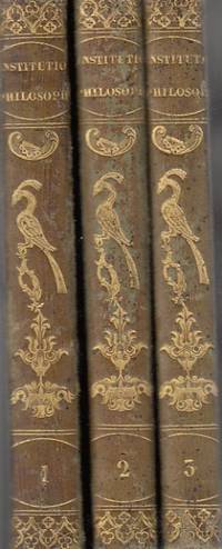
182585906Aubanel 1825. hardcover. Bueno. Avenione 1825. L. Aubanel. Piel verde con figuras doradas en lomo. Tres tomos Completa. Lógica Metafisica general y especial Ética general y especial. Nombre anterior propietario. Algunas anotaciones a lápiz. 212271256 pp. 18x13. Cubiertas algo rozadas. En Latín. Aubanel hardcover
2024__475625781XPie International 2024. Hardcover. New. annual edition. 292 pages. 12.00x8.60x1.20 inches. Pie International hardcover
2024x-475625781XPie International 2024. Hardcover. New. annual edition. 292 pages. 12.00x8.60x1.20 inches. Pie International hardcover
46118894like new. unknown
46118894-nnew. unknown
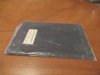
1929039396Los Angeles: Jake Zeitlin 1929. 1st Edition 1st Printing. Soft cover. Fine/Near Fine. One Of 500 Copies Printed By The Mayers Company Published By Jake Zeitlin. Black Card Wrappers With Black Dj With Printed White Cover Label. This Example With The Bookplate Of Merle Armitage Signed By Him. In A Specially Made Folding Case Red Cloth Red Morocco Spine With Armitage's Name Title And Date In Gilt. Book Very Clean Spine Split At Ends. <br/> <br/> Jake Zeitlin paperback
1929028522Los Angeles: Jake Zeitlin 1929. 1st Edition 1st Printing. Soft cover. Fine/Near Fine. One Of 500 Copies Printed By The Mayers Company. Black Card Wrappers With Black Dj With Printed White Cover Label. This Example Inscribed By Armitage For His Friend And Illustrator Of Many Of Armitage's Books Pasquale Giovanni Napolitano About Whom Armitage Later Wrote A 1935 Book "Badly Written Its Meaning Still Holds. Inscribed To Napolitano / Merle Armitage". Book Is Fine Dj Clean But With A Few Minor Edge Tears And Nicks. A Controversial Address Rare When Signed Or Inscribed. <br/> <br/> Jake Zeitlin paperback
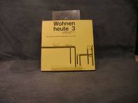
050001960 Zürich Schweizerischen Werkbund Verlag Arthur Niggli. 21 x 21 cm - 167 pgs - original soft cover - very well illustrated in b/w - important catalogue on Swiss design - very good copy see Bolliger Katalog 7 nr 254 <br /> 1960 Zürich Schweizerischen Werkbund, Verlag Arthur Niggli paperback
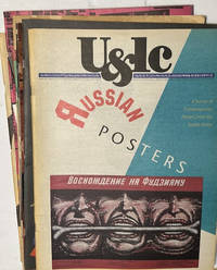
1982s241228e<p><strong>87 issues of U&lc Upper and lower Case Magazine</strong> <strong>1982 through 2000</strong>. New York: International Typeface Corporation. 11"x17" staple-bound newsprint averaging 36-100 pages per issue.</p><p>Published quarterly between 1973 and 2000 <strong>U&lc</strong> magazine was a defining voice in graphic design. Initially created to showcase the ITC typeface library the magazine became a showpiece for creative typography unique graphic design and a wide variety of technical historical and cultural surveys and insights. Contributors included prominent writers artists and designers such as Herb Lubalin; Steven Heller and Seymour Chwast. Approximately 120 issues were published before it ceased publication in 1999. Though these 87 issues are not a complete run many of the annual volumes have all four issues present. Five of the later issues were printed in reduced size at 8-1/2x11"</p><p><strong>CONDITION: Mostly Very Good; none less than Good. </strong>A few issues have edgewear and minor tears or creases; some with yellowing pages at margins. Some have original mailing labels present. Exemplar photos are at:</p> International Typeface Corporation paperback
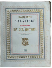
1853LL 603<p>TYPOGRAPHIC SPECIMENS OF THE VATICAN PRINTING HOUSE. Folio 342x255 mm; original cloth with title impressed in gold on upper cover; half-title leaf title-page leaf printed in blue red and gold within a triple border as well printed in blue red and gold a leaf with the advice to reader pp. VIII 62 plates and 4 plates containing many samples of fonts text printed in Italian Latin Greek Copic French also with sample of numbers music typographical borders tailpieces etc. last 4 plates: " Campioni dei tratti di penna" so calligraphic samples. Francesco Salviucci belonging to a well-known family of Roman typographers director of the Typography of the "Reverenda Camera Apostolica" describes a vast sample of the printing characters present in the typography preceded by a brief excursus on typographic art in general. In addition to the characters there are various friezes and engravings including the image of a steamship probably the first of the Papal State. Maggs cat. n. 509; Books on Printing Part II Books From Famous Presses 15th To 20th Century.</p> Tipografia della Rev. Camera Apostolica hardcover
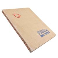
19476456Los Angeles: Wendell W. Fish 1947. Revised Edition. 4to 12.5x9.5" 83pp. Specimens printed in black on a variety of stock with decorative page borders of different colors. Original tan cloth covers with 3-brad binding spine lettering and fish logo in red with blue lettering on front cover. Some toning to pages single marginal tear to page 64. Boards bumped and worn. Very good. <br /> <br /> Attractive specimen book from Wendell Wilbur Fish a native of Bakersfield who in 1920 opened his first office in L.A. becoming one of the earliest "advertising typographers" in the area. In The Pacific Printer and Publisher October 1922 we find a review of some of Fish's work:<br /> <br /> <br /> "Fish. has made a special study of good typography. He is recognized as an authority on the subject of typographical treatment of financial advertising for newspaper purposes. But he has also put into type some of the largest campaigns for firms of national repute a versatility of treatment and design enabling him to get the highest utility as well as appropriateness into the printed message."<br /> <br /> We find little mention of Fish outside of these trade journals from the 20s and 30s. He must have been somewhat prominent for quite some time with this revised edition of his collection of type appearing some 25 years after he began in the trade. OCLC cites 5 holdings for 3 likely only 2 versions of this specimen book with just 1 on the revised edition at the Wolfsonian Library FIU. . Wendell W. Fish unknown
190965456Boston and New York: Printed at The Riverside Press for Houghton Mifflin Company 1909. Limited Edition. Hardcover. Very Good. SIGNED. 332pp. Quarto 28.5 cm Black cloth spine with green paper over boards with ornamental gilt stamping. Deckled fore and bottom edges. Printed on English handmade paper. With areas of fading to the head and foot of the backstrip. The most prominent area of fading is to the foot of the backstrip measuring approximately 2 inches tall by 1 and 3/4 inches wide. Internally bright and fresh. Publisher's prospectus laid in. Prolific engraver Geofroy Geoffroy Tory 1480-1533 was primarily responsible for the French Renaissance style of book decoration and played a leading role in popularizing the Roman letter over the prevailing Gothic letter in France.<br /> <br /> Number 270 in an edition of 370 copies designed by Bruce Rogers. This copy is signed by Bruce Rogers on the limitation page. American typographer and book designer Bruce Rogers 1870-1957 was highly influential in fine book design in the United States during the early 20th century. Rogers began his career as an illustrator for an Indianapolis newspaper. He moved to Boston in 1895. There he met a number of men who were revolutionizing the book publishing industry including George Mifflin of Houghton Mifflin who put him to work at the Riverside Press. The press opened a limited editions department in 1900 and Rogers was put in charge and given the responsibility of designing and printing fine books. During the next 12 years he produced over 100 Riverside Press editions which are still held in high esteem today. Information from Britannica.com. Printed at The Riverside Press for Houghton Mifflin Company hardcover
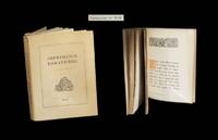
1929287631929. Dijon Imprimerie DarantiÂre 1934. Un vol. au format in-8 222 x 167 mm de 192 pp. brochÂŽ sous couverture ˆ rabats rempliÂŽs. Edition originale. Tirage unique ˆ 800 exemplaires numÂŽrotÂŽs. Le rÂŽcit proposÂŽ conna”t ici au fil de chacune des pages une reproduction dans des caractÂres typographiques diffÂŽrents. Rares rousseurs dans le corps d'ouvrage. Du reste belle condition. b42961 unknown
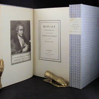
181830675Parma London: Presso La Vedova The Holland Press 1818 1960. 2 volumes. LIMITED EDITION one of only 500 copies printed of the very impressive facsimile of Bodoni's original edition of 1818. With a fine frontispiece portrait three folding plates of musical notation and seemingly countless typographical specimen. Tall 4to in the printer's original blue patterned paper-covered boards with printed paper labels on the spines. lxxii 267; iv 279 pp. A fine and handsome set beautifully preserved and essentially pristine. LIMITED FACSIMILE EDITION OF A MASTERPIECE OF THE TYPOGRAPHICAL ARTS BODONI'S MANUALE TIPOGRAFICO. Printer for the Duke of Parma Bodoni's manual was the culmination of more than four decades of work and is one of the age of printing's greatest typographical achievements. It is comprised of 291 roman and italic typefaces along with samples of Russian Greek and many other types. Presso La Vedova [The Holland Press] hardcover
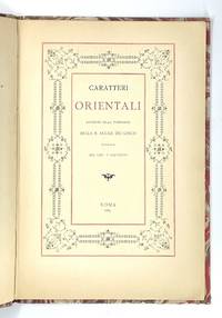
1670<p><strong>Lovely "oriental" type samples from one of the oldest and most prestigious European scientific institutions.</strong></p><p><strong>Very rare: WorldCat traces only one copy</strong> in Uni. California Santa Barbara. No copy traced in the Italian Union catalogue OPAC SBN.</p><p>In 1611 Galileo Galilei became a member of the Italian "Academy of the Lynx-Eyed" founded just a few years before in 1603 with a focus on natural sciences and mathematics.<br />In the late 19th c. the Accademia dei Lincei became "Reale" growing into a famous centre of studies which would soon host the greatest scholars such as Pasteur Einstein Mommsen and others. As its programme was expanded with many humanitarian disciplines including Oriental studies the Reale Accademia published this elegant booklet with relatively new samples of Sanskrit Armenian Syriac Samaritan Arabic Turkish and Persian Aramaic Hieroglyphic Coptic Chinese Greek and Russian types in two sizes.<br />As the introduction states the Academy's press was in reality the Tipografia Salviucci founded in 1747 and renamed in 1885.</p><p>Description<br />Small 4to 25.5 x 17.5 cm. First blank leaf title printed in red and black and within ornamental framed and 29 pp. printed on recto only text within decorative frames.<br />Binding<br />Original light grey wrappers printed in reddish brown bound in contemporary marbled boards flat spine with red label with gilt lettering.<br />Condition<br />Covers lightly rubbed at extremities spine a bit faded and worn with old paper repair to upper half wrappers a bit spotted; except some minimal light browning at the very edge of pages a fresh copy internally.</p> R. Accademia dei Lincei, Roma, 1889. hardcover
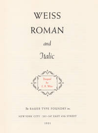
19318949New York: Bauer Type Foundry 1931. 3 volumes of specimens of Weiss types bound together. Illustrated with numerous specimens of Weiss types available through the Bauer Type Foundry. 4to. each part sewn in original printed paper wrappers string bound into blue cloth-backed grey paper covered boards printed title label to upper cover. A very good set of specimens of the German Weiss types. Bauer Type Foundry hardcover
14667Printed at the De Vinne Press No. 12 Lafayette Place New York. 1897. 4 47pp. 8vo. In printed wraps. Internally in fair condition on aged paper with slight staining to the corners; in worn and chipped wraps. A handsome production as one might expect from one of the nine founders of the Grolier Club with a two-page introduction followed by a full-page reproduction of the Ascensius printer's device and 47 examples of pages set in various point sizes of Cushing Ancient Roman Jenson Satanick Louis XV and Century Roman. No copy on COPAC six American and one French on WorldCat. Printed at the De Vinne Press, No. 12 Lafayette Place, New York. 1897. paperback
1965001932S. l. New Britain Conn.: The Sign of the Jaded Jester 1965. Softcover. Miniature first edition limited to 250 copies this copy #150; 2 in x 4.5 ft; vegetable parchment scroll rolled on a wooden spool with plastic stick-pins on either end; sparkly red wrap and a decorative silk ribbon attached to the beginning of the scroll; housed in a transparent pill bottle with a ruled paper label; thin vertical crack to bottle not affecting its integrity; light age-toning to label; ribbon slightly frayed at the free end; parchment fine; overall in very good to near fine condition. With a rather unique three-color printing Edison Julian I. Miniature Book News # 3: 1966 March. St. Louis Missouri. UNT Digital Library. http://digital.library.unt.edu. Web. January 12 2016 the miniature is a beautiful typographical and artistic example containing amusing and insightful book-related apothegms and epigrams including a personal favorite to wit: "On the subject of repetition.as to whether a speaker should have said 'that' or 'which' he replied: "I consider that that 'that' that that man used is correct." The compiler Walter Blumenthal 1883 - 1969 was a renowned Jewish-American scholar writer and editor. Robert Massmann was a former Director of Library Services at Central Connecticut State University who published numerous miniature books usually in very small editions for more than 4 decades. The Sign of the Jaded Jester paperback
1822BB1085London: Published By R. Ackermann At The Repository Of Arts 101 Strand London; And To Be Had Of All The Booksellers In The United Kingdom 1822. Full Leather. Very Good . First Edition of the "last of the genuine or 'authorized' Syntax books" Abbey first issued in eight monthly parts. Royal 8vo 236 x 1452mm: iv267pagination irregular but text complete1pp with 24 hand-colored aquatints by Thomas Rowlandson. Contemporary straight-grain morocco gilt boards framed in gilt and in blind with leaf-and-flower rolls rebacked with part of original spine and red morocco lettering piece laid down marbled end papers. A Very Good or better copy generally clean and bright with first and final leaves including title page foxed usual offsetting from plates very occasional finger-soiling. Abbey Life 268. Tooley 413. Grolier Rowlandson 48. Martin Hardie 174-75. As early as 1809 the publisher Ackermann had hired Combe to write the letterpress to accompany many of Rowlandson's most successful illustrations including those for the final volume of the "Microcosm of London" and perhaps especially for the illustrations that resulted in the series of comic poetry for which Combe is still most famous and which earned him his nickname Doctor Syntax: The Tour of Doctor Syntax in Search of the Picturesque and its two sequels 1812 1820 1821 The English Dance of Death 1815 1816 The Dance of Life 1817 and finally The History of Johnny Quae Genus the Little Foundling of the Late Doctor Syntax 1822. "Combining light-hearted satire of William Gilpin's theory of the picturesque in art with a central character modelled on Cervantes' Don Quixote and Henry Fielding's Parson Adams Combe created a lovable eccentric whose misadventures on the road structure the Tour. For over a century the many editions and numerous imitations of the Tour attested to the popularity of Combe's humorous hero." ODNB N. B. With few exceptions always identified we only stock books in exceptional condition. All orders are packaged with care and posted promptly. Satisfaction guaranteed. Fine Editions Ltd is a member of the Independent Online Booksellers Association and we subscribe to its codes of ethics. Published By R. Ackermann, At The Repository Of Arts, 101, Strand, London; And To Be Had Of All The Booksellers In The United Ki unknown
195756526Washington D.C.: United States Government Printing Office 1957. 4to. xxii 201 1 pp. Printing layout diagrams throughout. Black pebbled cloth gilt lettering & lozenge illust. of printing press on front cover red comb binding as issued minor dustsoiling edgewear still VG copy. Second edition revised & expanded of this work designed to meet production problems of the US Government Printing Office composed of a signature size chart and series of face-up impositions. It does note that not every possible folding imposition is contained but those dummies can be inserted or laid-in to this work as necessary. United States Government Printing Office, hardcover
194948711Chicago: Society of Typographic Arts 1949. Folio. xx 181 3 pp. Title in red & black numerous facsimile leaves of type fonts illustrations tipped-in facsimiles photo illustrations some leaves printed in red & black others blue & black some rubricated & decorated initials. Brick-red cloth gilt design on front cover gilt lettering on spine still a NF bright copy. First edition of this splendidly printed homage to the famed American type designer lettering artist and graphic designer. Cooper 1879-1940 headed the firm of Bertsch & Cooper who developed the ad campaigns for such companies as Packard Motor Car Company and Anheuser-Busch Breweries at the beginning of the 20th century. This work includes unfinished autobiographical notes by Cooper Notes on Oz by W.A. Dwiggins famed type designer as well as numerous examples of his Cooper Series Typefaces. Society of Typographic Arts, hardcover
191058183New York: The Century Co. 1910. 8vo. xi 3 477 1 pp. With 100’s of text illustrations type specimens diagrams woodcut engravings 1 in colour historiated vignettes decorated initials. Brown publisher’s cloth gilt lettering on spine gilt & red morocco spine label t.e.g. minor bumping to corners edgewear some rubbing still a VG copy. Second edition of this classic and surprisingly scarce printer’s manual originally issued in 1904 and the third title in De Vinne’s unexcelled series on typography. This work devoted to mechanical methods of book composition encompasses chapters on equipment composition of books composing & printing mathematics and music books foreign languages such as Greek Hebrew & German stone work and more. De Vinne 1828-1914 was often designated the “Dean of American Printers†founded the Grolier Club collaborated with Robert Hoe to advance fine printing and presses and embraced the concept of the book as objet d’art. The Century Co., hardcover
194063235Boston: Technical Composition Company 1940. Quarto. Tan linen hardcover; 386pp. Small tear to upper margin of first two preliminary leaves else Fine and unmarked. A specimen book containing "Linotype and Monotype faces suitable for book work and available to customers of the Technical Composition Company. There is illustrated also a selection of foundry type for title pages and special work" from Foreword. Technical Composition Company unknown
193656351Kansas City MO: Western Typesetting Co. 1936. Two vols. 1st. - 4to. 220 pp. Title and section titles printed in colour on thick cover stock typefaces throughout. Black pictorial cloth Western motif cowboy riding typeface on front cover silver Art Deco lettering slight shelfwear; 2nd - 8vo. 81 1 pp. Typeface alphabets throughout self-printed black & silver softcovers minor shelfwear inserted into front pocket of Specimen book NF set. First editions of both these excellent volumes on American type faces produced by the noted company during the 1930s. Western offered Linotype Monotype Ludlow and Hand-set types reproduction proofs long wearing unconditionally guaranteed types and other advantages towards their clients. The type specimens included hear encompass Scripts Gothics Spartans Bodoni Moderns extensive special figures and more. The Type Identifier lists over 400 different faces from ATF Baltimore Bauer Continental Intertype Monotype Ludlow and other sources. Western Typesetting Co., paperback
1822BB0354London: Printed for Samuel Richards and Co. 3 Grocers'-Hall Court Poultry; and T. Mason & Sons 2 Great Russel Street Bloomsbury 1822. Paper-Covered Boards. Very Good . The "best scandalous chronicle of the day" complete in three volumes. Tooley 12mo: viii319; 321; 326pp with 12 hand-colored plates engraved by Maddocks E. F. Burney and W. Read. Uniformly rebound to style by Fitterer with period marbled paper-covered boards and modern paper labels top edges gilt end papers renewed with laid paper. Bindings pristine; some gatherings foxed in volume I otherwise a very good or better set with only sporadic foxing and offsetting from the plates which are generally fresh and bright. Tooley 283 for 1821 octavo edition. Originally published pseudonymously in 1760 in two volumes. This Johnston's chief work spelled variously Johnston Johnson and Johnstone "appeared in four volumes between 1760 and 1765. The first and second volumes were written during a visit to the earl of Mount-Edgcumbe in Devon and had already gone through three editions before Johnstone was prevailed on to write the concluding two and the whole work was frequently reprinted during the eighteenth century and translated into French. An excoriating satire that won Johnstone respect as a wit but few friends the novel is set roughly during the period of the Seven Years' War 1757–63 and pretends to reveal political secrets and to expose the private profligacy of many of the well-known—and highly colourful—public characters of the time." ODNB N. B. With few exceptions always identified we only stock books in exceptional condition. All orders are packaged with care and posted promptly. Satisfaction guaranteed. Fine Editions Ltd is a member of the Independent Online Booksellers Association and we subscribe to its codes of ethics. Printed for Samuel Richards and Co. 3, Grocers'-Hall Court, Poultry; and T. Mason & Sons, 2, Great Russel Street, Bloomsbury unknown