9 826 résultats
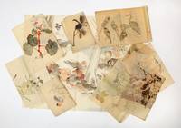
6845The sheets range from 640 x 1430 mm. to smaller. Kyoto: 19th century. The Yagis father and son were notable artists of 19th-century Japan. The father Kiho 1806-76 was born in today's Shiga Prefecture and lived mainly in Kyoto. He studied painting under Keibun Matsumura of the Shijo school and Giho Yamagata of the Kano school. Kiho excelled at figure painting and bird-and-flower painting and was the subject along with his teachers of a recent exhibition 2009 at the Nagahama Castle Historical Museum in Shiga a catalogue was issued at the time. His work is found at the Kyoto Palace and the Higashi Honganji Temple also in Kyoto. His son Unkei d. 1892 also had a successful career as an artist concentrating in the same genres. This collection of drawings which are mostly of natural history subjects landscapes and dragons reflects the very considerable skills of the Yagis and must be seen to be appreciated. There are fourteen sheets of underdrawings of birds for the screen at the Higashi Honganji Temple. In excellent condition. unknown books
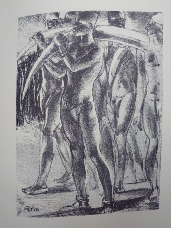
8177Liège, Union liégeoise du livre et de lestampe, 1934.33 x 25 cm, En feuilles, couv. imprimée et rempliée, chemise et emboîtage déditeur. Un des 75 exemplaires sur vélin à la forme Van Gelder destinés aux membres de lunion liégeoise (n°39 imprimé pour Henry Leclercq). Illustré de 41 lithographies de Mambour (complet). Étui avec de légères traces de frottement, exemplaire non coupé et intérieur très frais. Formé à lAcadémie des Beaux-Arts de Liège, Auguste Mambour, second prix de Rome en 1922. Il séjourne au Congo Belge de 1923 à 1926. Ce séjour sera déterminant pour lensemble de son oeuvre. En effet, tenté par lexpérience cubiste il en trouve un écho dans les « Sculptures vivantes » quil contemple en Afrique.
8177Liège, Union liégeoise du livre et de lestampe, 1934.33 x 25 cm, En feuilles, couv. imprimée et rempliée, chemise et emboîtage déditeur. Un des 75 exemplaires sur vélin à la forme Van Gelder destinés aux membres de lunion liégeoise (n°39 imprimé pour Henry Leclercq). Illustré de 41 lithographies de Mambour (complet). Étui avec de légères traces de frottement, exemplaire non coupé et intérieur très frais. Formé à lAcadémie des Beaux-Arts de Liège, Auguste Mambour, second prix de Rome en 1922. Il séjourne au Congo Belge de 1923 à 1926. Ce séjour sera déterminant pour lensemble de son oeuvre. En effet, tenté par lexpérience cubiste il en trouve un écho dans les « Sculptures vivantes » quil contemple en Afrique.
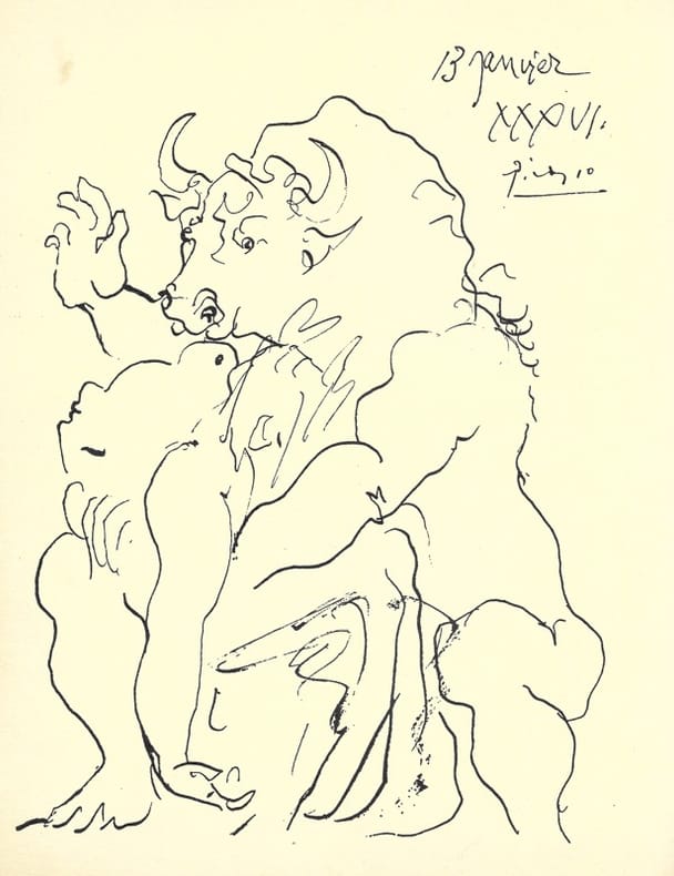
193629759Frontispice de Picasso, envoi signé et épreuve par Man Ray Paris, GLM, coll. « Repères », n° 14, (mai) 1936. 1 vol. (190 x 250 mm) de [20] p. En feuilles, sous couverture rouge titrée. Édition originale. Frontispice de Picasso. Tirage unique à 70 exemplaires sur Normandy vellum teinté, justifié et signé par l’éditeur. Envoi signé : « à Suzanne Hugon, avec la vive sympathie et les compliments amicaux de René Char ».
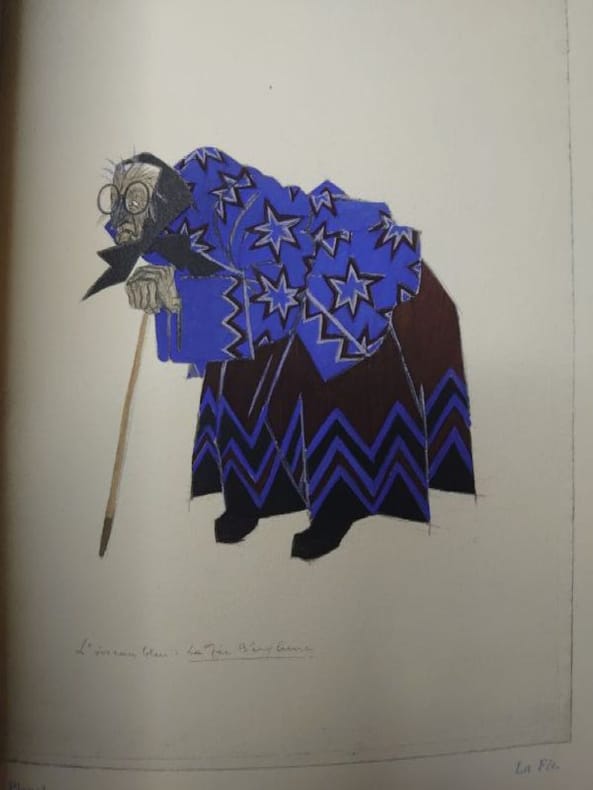
8194Paris, «Le Livre», 1925 (achevé d'imprimer daté 1924) et 1927. Deux volumes in-8 (16,4 x 24 cm). Deux volumes brochés, couvertures rempliées. Titre passé au dos du volume Décors et costumes avec une toute petite déchirure sur le bord de la couverture, sinon beaux exemplaires. Premier volume : [10], 212, [1], [1 bl.] pp. Édition ornée de 14 aquarelles reproduites au pochoir par G. Saudé: la vignette de couverture, 1 frontispice et 14 vignettes dans le texte. Tirage limité à 465 exemplaires numérotés plus 25 hors commerce. Un des 400 sur Arches. Le frontispice est contresigné par Lepape au crayon. Deuxième volume : [4], x, [1], [1 bl.], [1], [1 bl.] pp. Album de 61 planches dont 7 décors à double page mises en couleur au pochoir par J. Saudé. Tirage limité à 225 exemplaires numérotés plus 5 hors commerce. Un des 200 sur Arches.
8194Paris, «Le Livre», 1925 (achevé d'imprimer daté 1924) et 1927. Deux volumes in-8 (16,4 x 24 cm). Deux volumes brochés, couvertures rempliées. Titre passé au dos du volume Décors et costumes avec une toute petite déchirure sur le bord de la couverture, sinon beaux exemplaires. Premier volume : [10], 212, [1], [1 bl.] pp. Édition ornée de 14 aquarelles reproduites au pochoir par G. Saudé: la vignette de couverture, 1 frontispice et 14 vignettes dans le texte. Tirage limité à 465 exemplaires numérotés plus 25 hors commerce. Un des 400 sur Arches. Le frontispice est contresigné par Lepape au crayon. Deuxième volume : [4], x, [1], [1 bl.], [1], [1 bl.] pp. Album de 61 planches dont 7 décors à double page mises en couleur au pochoir par J. Saudé. Tirage limité à 225 exemplaires numérotés plus 5 hors commerce. Un des 200 sur Arches.
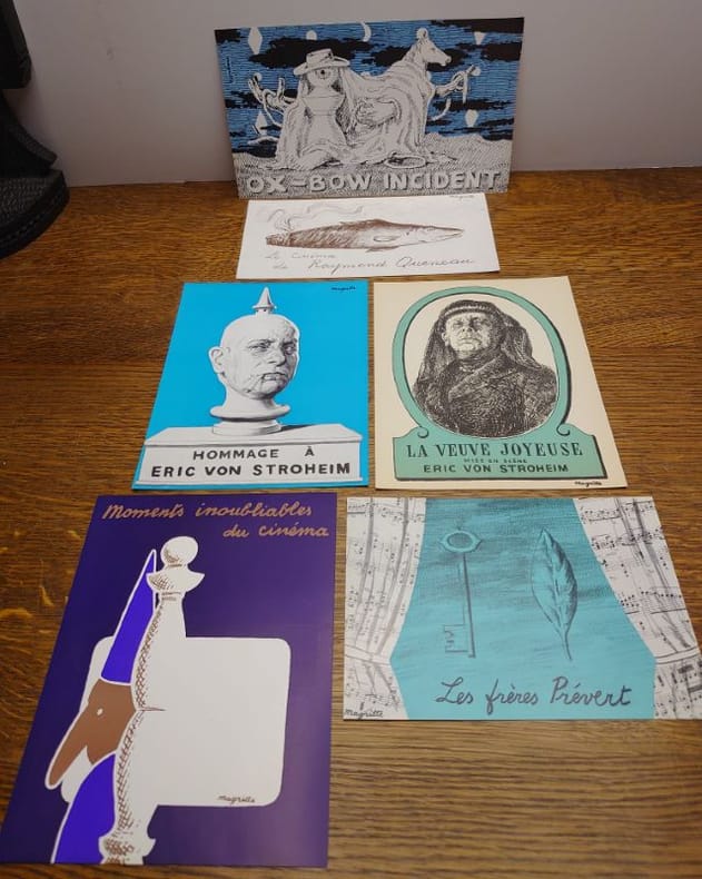
8639- La veuve joyeuse. Mise en scène Eric von Stroheim. Écran du Séminaire des Arts. Séance du 29 novembre 1955. Bruxelles, Palais des Beaux-Arts, 1955. Prospectus 18,5 x 14 cm, avec la reproduction en vert et noir d'un dessin de Magritte, signé en bas à droite. - Hommage à Eric von Stroheim. Écran du Séminaire des Arts. Séance des 8 et 22 octobre 1957. Bruxelles, Palais des Beaux-Arts, 1957. Prospectus 18,5 x 13,6 cm, avec un dessin reproduit en similigravure, signé Magritte en haut à droite. - Moments inoubliables di cinéma. Écran du Séminaire des Arts. Séance du 2 décembre 1958. Bruxelles, Palais des Beaux-Arts, 1958. Prospectus 18,5 x 14 cm, avec un dessin reproduit en similigravure, signé Magritte en bas à droite. - Oxbow Incident. Écran du Séminaire des Arts. Séance du 13 janvier 1959. Bruxelles, Palais des Beaux-Arts, 1959. Prospectus 13 x 22 cm, avec un dessin reproduit, signé Magritte en haut à gauche. - Les frères Prévert. Écran du Séminaire des Arts. Séance du 17 octobre 1961. Bruxelles, Palais des Beaux-Arts, 1961. Prospectus 12 x 17 cm, avec un dessin reproduit, signé Magritte en bas à gauche. - Le cinéma de Raymond Queneau. Écran du Séminaire des Arts. Séance du 17 mars 1964. Bruxelles, Palais des Beaux-Arts, 1964. Prospectus 10,3 x 19,6 cm, avec la reproduction d'un dessin Le Cinéma de Raymond Queneau, signé Magritte en haut à droite. Réf : Schwilden, Magritte et l'image, pages 57, 58, 59, 60. 138 [Fig. 37, 38, 39, 40, 41, 42]. Ancienne collection R.C.
8639- La veuve joyeuse. Mise en scène Eric von Stroheim. Écran du Séminaire des Arts. Séance du 29 novembre 1955. Bruxelles, Palais des Beaux-Arts, 1955. Prospectus 18,5 x 14 cm, avec la reproduction en vert et noir d'un dessin de Magritte, signé en bas à droite. - Hommage à Eric von Stroheim. Écran du Séminaire des Arts. Séance des 8 et 22 octobre 1957. Bruxelles, Palais des Beaux-Arts, 1957. Prospectus 18,5 x 13,6 cm, avec un dessin reproduit en similigravure, signé Magritte en haut à droite. - Moments inoubliables di cinéma. Écran du Séminaire des Arts. Séance du 2 décembre 1958. Bruxelles, Palais des Beaux-Arts, 1958. Prospectus 18,5 x 14 cm, avec un dessin reproduit en similigravure, signé Magritte en bas à droite. - Oxbow Incident. Écran du Séminaire des Arts. Séance du 13 janvier 1959. Bruxelles, Palais des Beaux-Arts, 1959. Prospectus 13 x 22 cm, avec un dessin reproduit, signé Magritte en haut à gauche. - Les frères Prévert. Écran du Séminaire des Arts. Séance du 17 octobre 1961. Bruxelles, Palais des Beaux-Arts, 1961. Prospectus 12 x 17 cm, avec un dessin reproduit, signé Magritte en bas à gauche. - Le cinéma de Raymond Queneau. Écran du Séminaire des Arts. Séance du 17 mars 1964. Bruxelles, Palais des Beaux-Arts, 1964. Prospectus 10,3 x 19,6 cm, avec la reproduction d'un dessin Le Cinéma de Raymond Queneau, signé Magritte en haut à droite. Réf : Schwilden, Magritte et l'image, pages 57, 58, 59, 60. 138 [Fig. 37, 38, 39, 40, 41, 42]. Ancienne collection R.C.
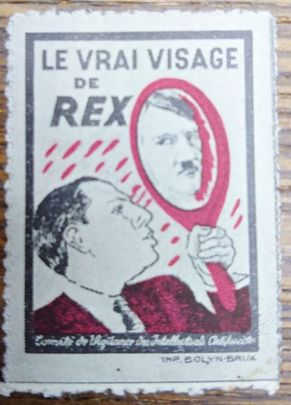
8642Photogravure, 5,3 x 3,3 cm, sur papier gommé. Bel état. Rarissime. Timbre inspiré d'une affiche réalisée par Magritte pour le Comité de vigilance des intellectuels antifascistes, probablement pour la campagne électorale de 1937. Léon Degrelle, chef du parti rexiste, se regarde dans un miroir où apparaît le visage de Hitler. Tiré en rouge et noir. Réf. pour l'affiche : Schwilden, Magritte et l'image, page 31, 74 [Fig. 94]. Ancienne collection R.C.
8642Photogravure, 5,3 x 3,3 cm, sur papier gommé. Bel état. Rarissime. Timbre inspiré d'une affiche réalisée par Magritte pour le Comité de vigilance des intellectuels antifascistes, probablement pour la campagne électorale de 1937. Léon Degrelle, chef du parti rexiste, se regarde dans un miroir où apparaît le visage de Hitler. Tiré en rouge et noir. Réf. pour l'affiche : Schwilden, Magritte et l'image, page 31, 74 [Fig. 94]. Ancienne collection R.C.
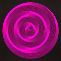
55370Munich-Ottobrunn: Messerschmitt-Bölkow-Blohm GmbH 1972. Square quarto 34 × 34 cm. Original printed laminated boards; 160 pp. with over 130 full-page reproductions of computer graphics as well as some examples of applied technical graphics of aircraft development and road planning. With 10 separate color screen prints by Frank Böttger Sylvia Roubaud Gerold Weiss Aron Warszawski and Rolf Wölk. Film lamination on the binding joints with age-typical minor damage and wear; half title and last page colophon fox-stained; else good or better; the color serigraphs very good. First and only edition of an elaborately designed early publication on computer-generated art; here a copy from the part of the print run produced for IBM. The volume was not published in Max Bense's academic environment but is the result of industrial experimental research. On the occasion of the 1972 Olympic Games in Munich the exhibition MBB Computer Graphics was shown on the premises of Messerschmitt-Bölkow-Blohm GmbH. The exhibits were created by a team of mathematicians engineers and mechanical engineers from MBB's aircraft department together with the painter and graphic artist Sylvia Roubaud mainly in their spare time. Messerschmitt-Bölkow-Blohm was one of the leading German aerospace and defense companies at the time and was later acquired by Daimler-Benz. One of the company's best-known projects was the development of the world's first passenger-carrying magnetic levitation train which was presented to the public on a test track in Munich-Ottobrunn in 1971. <br /> <br /> The development of programs to generate graphics presented itself here as basic research as the step towards computer-aided technical drawing had already been taken. The speed and technical precision that engineers were able to take advantage of is particularly emphasized. According to the volume working with the computer increasingly became "an almost perfect question-and-answer game when solving problems." At the level of art and poetry it was now possible to experiment with the generative possibilities of computing machines. The volume contains not only computer graphics but also "machine-generated texts." The publication reveals for example that it was already possible in 1972 "to produce exact translations from one language into another with the help of computers when the source texts are specialist texts. So far the computer can only provide rough translations of literature; grammatically almost correct but still semantically naive in the choice of words." By using a random generator the machine was able to "play freely with the words" "whose meaning the computer cannot yet understand."<br /> <br /> Herbert W. Franke - one of the most important protagonists in the early days of the artistic use of computer technology - wrote an enthusiastic review after the publication of the book in the strictly peer-reviewed journal "Leonardo" which deals primarily with the use of contemporary science and technology in art and music. This review also outlines the structure and intention of the book so we quote extensively from it: "There has been no book on computer art published hitherto that illustrates the mathematical-aesthetic principles of computer-generated graphics as well as this one. The task was defined by the team members themselves namely to investigate the possibilities of visual expression of 21 mathematical principles including superposition of curves moire random paths grids composed of elements and pseudoperspective effects. Of special interest are 'Stochastic Lines with Constraints' and 'Cube Representations' by W61k 'Rotations in Constant Steps' and 'Rotation Surfaces' by Böttger 'Bundles of Circles' by Warszawski and 'Random Super- position and Explosion of Lines' and 'Connection of Points by a Sequence of Circular Arcs' by Roubaud and Weiss. Several examples are shown of each ordering principle and a short description of each geometrical structure is given. The result is an impressive demonstration of mathematical principles that is not only interesting in itself for pedagogical reasons but that also provides food for thought on the relationship between mathematics and aesthetics. Furthermore this book leaves no room for doubt but that computer graphics put effects of Op art in the shade. The collaboration of mathematicians computer operators and artists has led to a remarkable document showing the artistic possibilities of advanced technology." Leonardo Vol. 6 No. 4 Autumn 1973 pp. 374-375. unknown
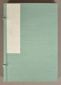
1915908941915. Gendai Haiga ShÅ« ç¾ä»£ä¿³ç”»é›† A Collection of Modern Haiga<br /> Nakamura Fusetsu ä¸æ‘ä¸æŠ˜ et al artists<br /> Tokyo<br /> HaigadÅ ä¿³ç”»å ‚ publisher<br /> Taisho 4-6 1915-17<br /> <br /> 4 volumes approx 25 x 16.5cm string-bound Japanese-style fukuro-toji thread-sewn Yamato binding. One volume is dated Taisho 4 1915 Spring one is 5 1916 Summer and two Fall and Winter are 6 1917. Three of the volumes are in the original decorated wrappers and one Spring is in plain wrappers. Compiled by Shimada Yukichi å³¶ç”°å‹‡å‰ and published by HaigadÅ ä¿³ç”»å ‚ Tokyo. Printed by Abe NabegorŠ阿部é‹äº”郎 vol. 1 Matsui NaojirÅ æ¾äº•ç›´æ¬¡éƒŽ vols. 2-3 and Kishi Kageyoshi å²¸æ™¯å‰ vol. 4.<br /> <br /> 4 volumes of original color woodblock prints exploring the 4 seasons some featuring poems within the woodcut. Each volume has a Table of Contents in the front listing poems that reflect one of the seasons concluding words and a colophon. Spring has 28 full-page color woodcuts Summer has 31 and Autumn and Winter have 30 each for a total of 119.<br /> <br /> The Gendai Hanga ShÅ« ç¾ä»£ä¿³ç”»é›† is a work of considerable skill and scarcity. The list of artists involved is a long one including Nakamura Fusetsu ä¸æ‘ä¸æŠ˜ Sazanami Iwaya å·–è°·å°æ³¢ Tomita Keisen Ishii Hakutei Hirafuku Hyakusui Ota Saburo Kosugi Misei Shimomura Izan and many other important figures in Western-style painting here working in their literati "haiga" mode. Mitchell had but one volume of the four the British Library only procured its own complete set within the last ten or fifteen years. Hillier seems to have missed the existence of the book completely. See Mitchell p. 266 Winter volume.<br /> <br /> Wear and dirt staining to covers. Toning on a few prints otherwise prints are in good condition. Very good printing. unknown
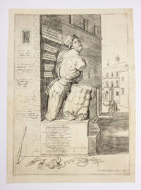
15504234<p>Rome: Antonio Lafreri 1550. </p><p>Price: $3750.00 </p><p>Single sheet engraving. 400 x 288 mm. plate; 431 x 318 mm. sheet </p><p>First state. With Lafreri's excudit: "Ant. LafrerI FormIs Romae MDL" at lower right. Watermark "Crossbow with arrow in a circle" similar to Briquet 759. A very good impression with light surface wear and light marginal soiling. Three early stamps on the verso two of them from the Kupferstichkabinet Berlin Lugt 1606 the second of which identifies the print as a duplicate Lugt 2482. The third stamp Lugt 1672 is that of the collector Wilhelm von Lepel.</p><p>An iconic image of the statue known as Pasquino by far the most famous of Rome's statue parlanti talking statues. The statue was discovered in 1501 in the Parione district of Rome. Cardinal Oliviero Carafa "the embodiment of humanist ideals centering on the revival of antiquity"Reynolds erected the statue next to his palace near Piazza Navona on the site of today's Palazzo Braschi where it stands to this day. As early as 1501 satirical poems in Latin and Italian variously celebrating or criticizing the pope clergy and nobility or lampooning private individuals were affixed to the statue. By 1508 the statue had become the focus of a yearly celebration held on St. Mark's Day during which the statue was dressed as a Roman deity or other mythological figure and anonymous writers attached to it poems written in the "voice" of the statue. In 1511 Pasquino was dressed as Grief mourning the death of Cardinal Carafa. In 1549 the year before this print was published Pasquino famously opined on the death of Pope Paul III: 'Here was buried a certain Paul/ a fraud a fox thief murderer;/ Here famous in the mouth of Pasquino/ There suffering in the mouth of the devil."<br /><br />The artist responsible for this print has included a number of pasquinades in Latin and Italian shown on bits of paper attached to the walls of Carafa's palace. The ground in front of the statue is strewn with props a reference to the costumes worn by Pasquino during the St. Mark's Day celebration. In the distance are two pairs of men the first standing in the piazza and the second strolling towards the statue. Carafa's arms are visible in the shadow on the statue's base.<br /><br />Lafreri's print is a close copy of one published in 1542 by Antonio Salamanca Lafreri's rival and eventual business partner. The identity of the artist is unknown. Among those to whom the plate has been attributed are Enea Vico and Nicolas Beatrizet.<br /><br />The sculpture comprises two figures believed to be either Menelaus cradling the dead Patroclus or Ajax holding the dead Achilles.<br /><br />The primary inscription is a sonetto caudato.<br /><br />Io non son come paio un Babbuino <br />stroppiato senza piedi et senza mani <br />Nemen con glialtri membri sconci et strani <br />La simmia son di Niccolo Zoppino. <br />Ma son quel famosissimo Pasquino <br />Che tremar faccio i Signor piu soprani<br />et stupir forastieri et Paesani<br />quando compango in volgare o in Latino.<br />La mia persona è fatta in tal maniera <br />Per i colpi e hor questo hor quel in accocca <br />Per ch'io dico i lor falli a buona cera. <br />Ma infin ch'io ha l'usata lingua in bocca <br />Non ne fo stima anchor che 'l resto pera <br />et sempre cantaro Zara a chi tocca <br />Che se la gente sciocca <br />Non si vuol rimaner de i falli suoi <br />Chi terrà me' che no 'l ridica poi.<br /><br />I am not as I seem a Babbuino<br />crippled without hands or feet <br />Nor with obscene and strange exotic parts <br />am I the Ape of Nicolò Zoppino<br />But I am that most famous Pasquino <br />who makes the most prominent men shiver. <br />and astonishes the out-of-towners and my fellow citizens<br />when I compose in vernacular or in Latin.<br />My persona was shaped in this way: <br />by the blows I take from here and from there <br />because I reveal their sins<br />But as long as I have the use of the tongue in my mouth<br />I do not care even if the rest of my body perishes <br />and I will continue to sing whatever happens <br />and the people who are offended must deal with it. <br />Because if stupid people do not want to keep their sins to themselves<br />Who is going to stop me from telling them<br /><br />The one that was sure to attract the most attention reads:<br /><br />Pasquin tu fuste et sarai semper un pazo<br />Ti sai in ogni forma trasformate<br />Se ti voi alle donne grato fare<br />Per che non ti trasformi int' Vn Ca<br /><br />Pasquino you always were and always will be an idiot.<br />You know how to transform yourself into any form<br />If you want to please women<br />Why don't you turn yourself into a dck<br /><br />Pasquino: Witness to a Rivalry Prelude to a Partnership:<br /><br />The engraving of Rome's talking statue published in 1550 bears witness to the rivalry between the two leading Roman print publishers of the mid-16th c. Antonio Salamanca 1479-1562 and Antonio Lafreri 1512-1577 and to the vast publishing phenomenon that came to be known as the "Speculum Romanae Magnificentiae" The Mirror of Roman Magnificence". <br /><br />In the years following the sack of 1527 the Spanish emigree Antonio Salamanca began producing engravings of Roman subjects with regularity prior to the sack such prints were few and appeared sporadically. In the 1540s another emigree printer the Frenchman Antonio Lafreri Antoine Lafréry began a rival enterprise copying many of Salamanca's engravings. The Pasquino an image that Lafreri lifted from Salamanca dates to this period.<br /><br />In 1553 the two competing Roman publishers entered into a contractual alliance for twelve years "with the explicit purpose of printing and selling copperplate prints of ancient and modern subjects… When the contractual agreement between Salamanca and Lafreri was established in 1553 the underlying principle of the "Speculum" was in place: it was to be a corpus of documentary prints of ancient and modern Roman subjects mainly in folio."Parshall<br /><br />Lafreri's and Salamanca's engravings illustrating the ancient and modern marvels of Rome tombs temples palaces baths statuary obelisks columns inscriptions frescoes etc. were purchased by tourists as souvenirs studied by antiquarians used as models by artists and architects and circulated as virtual visits for armchair travelers beyond Rome. By the late 1570s collectors could also purchase an engraved title page while selecting prints for their own Speculum collections. As a result Lafreri's customers or those of his heirs Salamanca had died in 1562 and Parshall suggests that the title was only in use after Lafreri's death in 1577 collected images to suit their own needs or taste. After the death of Lafreri two-thirds of the existing copper plates went to his heirs and another third was sold to other publishers. These new owners continued to print the existing images while still producing new prints.<br /><br />"Print collecting in the Renaissance is not very well understood mainly because prints were numerous comparatively inexpensive and therefore rarely inventoried. They are less likely than other sorts of objects to come down to us with a clear indication of their original setting. Nevertheless the evidence of a few large collections from the sixteenth century does suggest some consistent patterns most notably that prints accumulated in substantial numbers tended to be compiled in albums where they were organized by subject- matter and scale…. There is still much to learn about how such collecting practices evolved and the development of a market to serve them."Parshall "Antonio Lafreri's Speculum Romanae Magnificentiae" Print Quarterly March 2006 Vol. 23 No. 1 pp. 3-28.</p><p>References: Lafreri-Index Z.249. Marigliani "Lo Splendore di Roma nell'Arte incisoria del Cinquecento" Edizioni Tipografia Marina 2016 V.56; Rubach "Ant. Lafreri Formis Romae: Der Verleger Antonio Lafreri und seine Druckgraphickproduktion" 2016 no. 337; Hülsen Speculum 1921 Nr. 71a; Alberti L'Indice di Antonio Lafreri no. 84.</p> Antonio Lafreri, books
70258Zürich 1805-40. . 4to. 36 issues With manuscript title page 36 aquatint plates including one folding and 33 hand-coloured some heightened with gum arabic each acompanied by an engraved portrait of the artist and text with biographical information and mostly with separate title page which states year of publication; occasional light spotting. Contemporary half calf over marbled boards flat spine gilt; lightly rubbed.<br /> Fine copy of the complete first series of this periodical finely illustrated with lovely atmospheric hand-coloured plates showing Swiss landscapes genre scenes and portraits.<br /><br />Neujahrsblätter are annual publications and pamphlets published by smaller societies or groups for a special occasions or specific reasons. Here the Artists Society sought to educate the local young men by introducing a range of regional Swiss artists such as Fuessli and Salomon Gessner.<br /> Zürich, 1805-40. hardcover
51-3840A Paris: De l'Imprimerie de P.G. Le Mercier Imprimeur-Libraire ordinaire de la Ville rue Saint Jacques au Livre d'Or. M.DCC.XL. Avec Privilege Du Roy. Large folio. 58.4 x 46.4cm. Contemporary half morocco and brown linen boards restored with new matching endpapers. 2 pages with manuscript flourishes with the name Lapie. Title page repaired in lower margin. Some pages with age stains in lower margins.ii 22 p. 13 pl. 8 dble.: 2 illus.; . Folio.General NoteSeven plates are unnumbered - pl. 2 3 5-7 10 11. The eight double pl. are nos. 1 2 8-13. Plate 4 has been bound in as a frontispiece. The two illus. are a t.p. vignette and headpiece at the head of the text.ContentsFrontis. t.p. - Text - Plates.Responsibility NoteAll plates are signed as drawn and engraved by J.F. Blondel. Most carry also the name of a designer - Salley pl. 1 2 6-9 12 13 Gabriel pl. 3 4 Servandony pl.5 or Rousset pl. 10 11. The title-page vignette is signed as drawn by Edm. Bouchardon and engraved by Soubeyran; the headpiece is signed as drawn and engraved by Jac. Rigaud.Summary NoteThe plates are a record of the celebrations mounted in Paris on the occasion of the marriage of Louise Elisabeth daughter of King Louis XV of France and Filippo Duke of Parma and son of King Philip V of Spain. The marriage itself took place in Spain at Alcala de Henares on 25 October 1739. The plates show: 1. Plan of the Seine; 2. Plan and elevation of a Temple of Hymen on Pont-Neuf; 3 & 4. Plan profile and elevation of the throne; 5. Plan and elevation of the Salon de Musique; 6 & 7. Boats decorated with lanterns; 8. Plan and elevation of the Louvre terrace showing tents; 9. Fireworks on the Seine; 10-13. Plans and sections of the Hôtel-de-Ville showing the courtyard illuminated for the ball.Important Parisian festival book†Bull. Morgand et Fatout 11011.The engraved plates by J.-Fr. Blondel represent: the flat map of the part of the Seine where the celebrations were given; le temple de l’Hymen the temple of the Hymen setting of the fire work placed on the platform of the Pont-Neuf; élévation géométrale du trône flat elevation of the throne built so Their Majesties would see the celebration executed after Gabriel’s drawings; le plan et l’élévation géométrale du salon de musique the map and flat elevation of the music room built in the middle of the river between the Pont-Neuf and the Pont-Royal ;les bateaux illuminés the illuminated boats. Plate 8 gives the élévation géométrale de la terrasse du bord de l’eau flat elevation of the terraces along the water where the tents were located for the retinue of their Majesties. Plate 9 gives us a vue générale de cette fête sur la Seine general view of the celebration on the Seine with all its settings illuminations and fireworks. Beside these thirteen plates the edition is illustrated with a fleuron drawn by Bouchardon and engraved by Soubeyran and with a large vignette used as letterhead drawn and engraved by J. Rigaud representing a joust on the Seine.These luxury works were covered more or less sumptuously. The sovereign and the princes of his family used to receive copies covered with dentelle morocco ministers morocco less richly decorated and the mere bishops volumes modestly bound with calf – all of them bearing though in the center of the covers the arms of the city that had financed the enterprise.OCLC Number: 560727468 A Paris,: De l'Imprimerie de P.G. Le Mercier, Imprimeur-Libraire ordinaire de la Ville, rue Saint Jacques, au Livre d'Or., M.DCC hardcover
59090New York: Harper 1898 as individually described below each signed and labeled in pencil below the image. Chicago 1890s. Original pencil drawings. 1 "The American Black Scoter / Ademia americana" an original pencil drawing 11 3/4 x 15 1/2 inches of two American Scoters a male and a female swimming on the water's surface but with one webbed foot clearly visible below with hills in the background; signed in pencil by the artist below the image "Drawn from Nature by D.G. Elliot F.R.S.E. &c." and labeled as the title. 2 "Canvas-Back Duck" an original pencil drawing 11 1/2 x 15 1/4 inches of two American Scoters a male and a female the male standing on a marsh the female swimming on the water's surface with a small flock of canvasbacks flying the background; signed in pencil by the artist below the image "Drawn from Nature by D.G. Elliot F.R.S.E. &c." and labeled as the title. 3 "Hooded Merganser / Lophodytes cucullatus" an original pencil drawing 11 1/2 x 15 1/2 inches of two Hooded Mergansers a male and a female swimming on the water's surface but with one webbed foot of each clearly visible below with wooded islands in the background; signed in pencil by the artist below the image "Drawn from Nature by D.G. Elliot." and labeled as the title. A similar lot of Elliot's drawings for "Wild Fowl" sold at auction in 1988 for $2000 ABPC 1976-2011. Very good. Matted some darkening or soiling around the edges. #6098. Elliot a native of New York City travelled through Europe the Near East and South America as a young man studying the birds of those areas "a subject in which he had always been interested. An artist of no mean attainments his ambitions led him to the publication of large folios like those of John Gould monographing various families of birds with lifesize illustrations from his own brush . these included birds of paradise pheasants and thrushes horn bills and other species. His own collection of birds consisting of some one thousand specimens and covering most of the described species in North America was the best private collection extant and was secured by the American Museum of Natural History in 1869" DAB. He was one of the founders of the American Ornithologists' Union and its second president 1890; he accepted a position at the Field Museum in Chicago in the early 1890s directing that institution for ten years ending his career working on the natural history of mammals. <br/><br/> unknown books
Six large signed and justified original lithographs (three printed in color) by Joan Hern·ndez Pijuan: posters he designed during his career, all signed and avant la lettre. 76 x 56 cm. Editions all limited to 99 impressions printed on fine, thick wove paper (before the much larger unsigned poster editions). Maluquer 115, 146, 148, 219, and 276 (the sixth poster, from 1993, is extremely rare and is not in Maluquer). FINE AND BRIGHT, like new. Price is for all six. The set is extremely rare; I have found no evidence of them ever being offered for sale as a group. Some are available separately; please inquire.
Three very large signed and justified original aquatints (one printed in color) by Joan Hern·ndez Pijuan. 100 x 76 cm (sheet). Edition limited to 50 impressions printed on fine, thick wove paper. FINE AND BRIGHT, like new. Maluquer 470-472. Price is for the set. Individual prints may be available separately. Please inquire.
7121 En feuillets, sous chemise et étui en toile fuchsia de l'éditeur. 39,5 x 30 cm, 112-[8] p. Paris, Denoël, 1967. Edition originale
7121 En feuillets, sous chemise et étui en toile fuchsia de l'éditeur. 39,5 x 30 cm, 112-[8] p. Paris, Denoël, 1967. Edition originale
572317 aquarelles et encres originales signées et datées 1951. Format : 27 x 20 cm fixées sur des feuilles de vélin, sous chemise cartonnée. Projet d'illustration : 17 aquarelles très abouties, avec dans le bas, l'extrait du texte qu'elles illustrent. Cette suite ne paraît pas avoir été employée pour un livre, ni éditée. Sur une chemise papier, étiquette du Salon Quadriennal de Belgique, Liège 1953. Collection E. Van Zuylen.
572317 aquarelles et encres originales signées et datées 1951. Format : 27 x 20 cm fixées sur des feuilles de vélin, sous chemise cartonnée. Projet d'illustration : 17 aquarelles très abouties, avec dans le bas, l'extrait du texte qu'elles illustrent. Cette suite ne paraît pas avoir été employée pour un livre, ni éditée. Sur une chemise papier, étiquette du Salon Quadriennal de Belgique, Liège 1953. Collection E. Van Zuylen.
55500Cologne: Wolfgang Hake Verlag 1968. Square quarto 25 × 25 cm. Original typographically designed wrappers stab-sewn leporello binding; 48 pp and and 24 original graphic works by 21 artists mainly colour serigraphs aquatint etchings and linocuts but also one collage all numbered and signed by the respective artist. Binding slightly finger-stained and with barely noticeable signs of wear; else very good. One of 90 copies of the deluxe portion of the print run with original prints total print run: 200 copies of which 100 without prints; ten further copies featured two additional signed prints. The graphic works collected here can largely be classified as belonging to the Berlin school of "critical realism" which distanced itself from American pop art and the Düsseldorf school of "capitalist realism" Sigmar Polke Gerhard Richter on the one hand but adopted their methods on the other. Above all however this movement positioned itself in opposition to the expressive painting of artists such as Markus Lüpertz. A few years after this publication appeared the painters Bettina von Arnim and Ulrich Baehr were among the founding members of the West Berlin "Gruppe Aspekt".<br /> <br /> The graphic works are by Otmar Alt Bettina von Arnim Ulrich Baehr Werner Berges Gernot Bubenik Klaus Heider Bernhard Höke Wolf Kahlen Siegfried Kischko Bernd Koberling Karl Heinz Krüll Christiane Maether Jobst Meyer Werner Pelzer Wolfgang Rohloff Manfred Schmale Peter P. S. Sohn Hans-J. Spesshardt Gerd Struckmeier Werner Wenz and Lambert Maria Wintersberger.<br /> <br /> Spindler 158 29.<br /> <br /> As of January 2026 OCLC locates four copies in North America. unknown
50455Leningrad: Leningradskoe Oblastnoe Izdatel'stvo 1931. Quarto 30 × 21 cm. Original embossed cloth; 92 11 and 104 pp. With four unnumbered plates in color two of which folded. One full-page photomontage incorporating a photograph of Stalin printed in red and black. Cover design and photomontage by Valentina M. Khodosevich and Andrei R. Diderikhs. Typographic design by Veniamin P. Belkin. As usual with this publication with condition flaws: front hinge split; general wear and staining; traces of moisture to upper right corner of text; old bookseller description affixed to first leaf; still good or better. This rare album illustrates and promotes the achievements of the first Five-Year Plan 1928-1932 and stylistically captures a transitional moment in Soviet art and culture. Dynamic photographic compositions are accompanied by explanatory texts which cite recent statistics to demonstrate the resounding success of the first plan. Constructivist design and photomontage are used throughout the album even as constructivism was getting progressively attacked in the Soviet press with the anti-formalist campaign and accusations of bourgeois tendencies of constructivism well underway by the mid-1930s. The diagonal and frieze compositions of photographs texts and graphic material as well as bold geometric borders printed in two tones black and red are reminiscent of avant-garde publications such as LEF. Documentary photography factography of the 1920s as well as complex photomontages are positioned side by side with staged and pavilion shots more typical of the 1930s in this album. The work is divided into seven thematic sections: Tractor Construction of the USSR; Fuel and the Five Year Plan; Ways of Collectivization; Public Catering in the Service of National Construction; Our Achievements on the Cultural Front and Public Health in the New Phase. As is typical of albums of the period photographs of Lenin and Stalin introduce the publication.<br /> <br /> The album was designed by the husband and wife artistic team of Andrei Diderikhs 1884-1942 and Valentina Khodasevich 1894-1970 and is stylistically similar to their previous collaboration the five-year plan photographic publication "Udarniki" Shock Workers. Diderikhs and Khodasevich both studied with modernist masters in Germany and France prior to the Revolution. Upon her return to Russia Khodasevich worked in the studio of the famous Constructivist Vladimir Tatlin and took part in the exhibits of the Mir Iskusstva World of Art and Bubnovyi Valet Jack of Diamonds art groups. Both Diderikhs and Khodasevich were active in creating the designs for the public festivities in Petrograd in 1918 for the anniversary of the Revolution subsequently working in theater and book design. The painter and graphic artist Veniamin Belkin 1884-1951 did the typographic design of the album. Other artists included in the publication are Georgii Vereiskii Evgenii Belukha and Adrian Kaplun.<br /> <br /> Rare; as of February 2024 KVK and OCLC show copies at Chicago complete Hoover and the National Gallery both only the first two issues. unknown
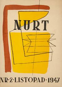
52750Warsaw: Robotnicza Spółdzielnia Wydawnicza "Prasa" 1947. Original pictorial wrappers by Marian Bogusz; 80 and 96 pp. Illustrations throughout from drawings and with reproductions of artworks many full-page including works by Toyen Aristide Maillol Picasso Strzemiński Stażewski and others. Light overall wear and unobtrusive professional repair to wrappers of the first issue; toning due to stock; issue no. 1 with damp stain to first few pages and stamp of a Polish publisher to front wrapper; else about very good; the second issue very good or better. Two issues all published of one of the most significant literary and cultural magazines of post-WWII period edited by the writer journalist and key personality of post-war Polish literature Tadeusz Borowski 1922-1951. The first volume included translations of Sartre Steinbeck translation of "The Raid" and Aragon with illustrations by the young Polish artists and members of the new Polish avant-garde Jan Lenica 1928-2001 and Marian Bogusz 1920-1960 who also designed the covers of the publication. The second volume includes an extended article on cubism as well as reproductions of works of Polish avant-garde masters such as Władisław Strzemiński Henryk Stażewski and Tadeusz Kantor. The first issue also contains a short gloss about Ernest Hemingway.<br /> <br /> Born in Zhytomyr and raised in Warsaw Borowski started out as a poet publishing several poetic cycles clandestinely during WWII. Involved with the leftist underground in Warsaw he was eventually arrested in 1943 and would go on to survive the Auschwitz and Dachau concentration camps. The experience led him to turn away from poetry and to publish prose works such as "We Were in Auschwitz" 1946 and "This Way to The Gas Chamber Ladies and Gentlemen" 1948 which would become classics of Polish literature. In the interim he would try his hand as an editor of this monthly literary magazine which quickly ran into trouble with the censors. Two months into the publication Borowski received a letter from a friend a literary critic announcing the journal's demise: "Comrade Z. Pióro was here and said that Nurt had been finally throttled. Before it burst forth. Exactly as I predicted. He told me the reason was the contents of the issue: Sartre Koestler Steinbeck. Evidently not so much young literature on the attack as old Trotskyites" See T. Drewnowski ed. Postal Indiscretions: The Correspondence of Tadeusz Borowski p. 181. The wrapper designer Marian Bogusz would go on to work with the painter and photographer Zbigniew Dłubak to found Grupa 55 which would position itself against the aesthetics of Socialist Realism paving the way for the Polish Neo-Avant Garde.<br /> <br /> As of May 2025 no copies located outside of Poland via KVK OCLC. unknown