29 262 résultats
193288038Moscow: State Publishing House of Graphic Arts 1932. First Edition. Folio 41.5cm; original pictorial wrappers stapled; 40pp; ilus.; text is entirely in English. Light wear to extremities touch of oxidation to staples with some very mild creases to spine-fold; contents clean complete; Near Fine. <br /> <br /> A significant issue of this landmark Soviet art magazine issued from 1930 to 1941 to celebrate the achievements of the first two Five Year Plans and through various foreign-language editions to propagandize the stark contrast between the vibrant Soviet economy during this period and the stagnation of Western economies under capitalism. "All the visual strategies of the propaganda photobooks designed by Lissitsky Rodchenko and others.were developed in USSR in Construction one of the most beautifully produced magazines of the twentieth century" Parr-Badger The Photobook I:148.<br /> <br /> The present issue is entirely devoted to Magnetogorsk an industrial city in Chelyabinsk Oblast on the eastern side of the Ural Mountains. The interior is laid out by M. Alpert and A. Smolyan with N. Troshin's cover being one of the most striking in the magazine's history. 88038. State Publishing House of Graphic Arts unknown
1901840301901. SEKKA Kamisaka. DESIGN BOOK Kamisaka SEKKA Yoshitaka. SHIKISHI. Kyoto: Tanaka jihei Meiji 34 1901. 2 folios each 31.2 x 21.5 cm. Volume one has 2 color prints and 30 bw sumi prints volume two has 30 bw sumi prints. An interesting design book of subtlety. The covers are quite worn and stained and there is some internal wear and spotting as well. But overall a good early printing. Cord-bound fukuro-toji Japanese style with the title printed on the covers. Complete. unknown books
89262FAN DESIGN ALBUM TANAKA Tôshû. UCHIWA-CHÔ. Another example of the fan sample genre. Here there are 55 color woodblock printed square designs each 23 x 23.5 cm in ribbon-bound printed cardboard covers with a printed paper title label. The designs are by the designer Tanaka Tôshû and the album seems to have been commissioned by him as well. Bold designs undated but from the 50s or 60s of the last century. In good condition overall. unknown books
195347241Concepción: by the Company 1953-4. First Edition. Quarto 27cm. Twelve monthly issues comprising the entire first year of publication. Bound into cloth-backed boards front and rear wrappers retained; each issue 16pp. Moderate external wear; punch-holes in bound margin of each issue else Very Good. A graphically impressive company journal issued by the major Chilean mining and manufacturing firm Compañia de Acero del Pacifico CAP. Founded in 1947 CAP is still one of the largest industrial concerns in all of Latin America. Huachipato a publication aimed toward the company's employees chronicles activities both within the company and in the surrounding apparently vast company town. In addition to industrial and technological achievements the publication documents the social life of the company's workers with much coverage of sporting and cultural events the town's soccer team also called Huachipato was elevated to Chile's primera división as early as 1965. The journal is noteworthy for its graphical sophistication with photo-montaged covers sprightly layouts and a mid-century aesthetic reflecting Latin America's internationalist ambitions during this period. Rare; OCLC 2020 locates just scattered holdings all for three or fewer issues; Texas and Cornell only in North America. by the Company unknown books
1932WRCLIT76600Moscow: State Publishing House of Graphic Arts 1932. Folio 41.5 x 30cm. Pictorial wrappers. A good copy only: the extreme lower forecorners are a bit creased and occasionally ragged; the front wrapper has the lower extreme fore- corner chipped away and there is a short tear near the toe of the spine resulting in the loss of the extreme lower spine corner of the lower wrapper and last leaf; there is a small chip in the lower wrapper at the spine crown; there is an 11 cm internally mended tear in the rear wrapper up from the lower edge and another internally mended 7 cm tear in the fore-edge each with small chips associated; and one panel of the enormous center four panel gatefold is neatly separated along the fold; still a reasonably good copy of an issue seldom found in ideal condition. Founded by Maxim Gorky and published in the Soviet Union from 1930 to 1941 and 1949 under the general editorship of G. Piatakov. An important issue of this innovative periodical devoted to the Dnieprostroy hydroelectric project with the 'plan' of the issue by El Lissitsky and M. Alpert. The text is by Boris Agapov translated for this English version by D. S. Mirsky. Of special note are four preliminary pages in tribute to H. G. Wells. The photographic component drew on a number of official sources with additional special photography by Alpert and A. Shaykhet. "All the visual strategies of the propaganda photobooks designed by Lissitsky Rodchenko and others were developed in USSR in Construction one of the most beautifully produced magazines of the twentieth century" - Parr-Badger. Versions were also published in Russian German and French. PARR-BADGER I:148. State Publishing House of Graphic Arts unknown books
1932894161932. PREWAR DESIGN Atorie-sha. ZUAN SHINGIHÔ KÔZA NOUVEAU COURS: METHODES DU DESSIN DECORATIF 8 vols. Tôkyô Atorie-sha Shôwa 7 1932. 8 volumes 8vo. complete bound western-style in wrappers. An interesting synopsis in Japanese of world-wide trends in commercial art in the early 1930s. Very good or better condition many bw illustrations. In the original publisher's slipcases. The Atorie-sha was one of the most important publishers of art criticism etc. before the war in Japan. unknown books
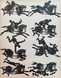
19431004435Copenhagen: Fischers Forlag 1943. First edition of this guide to printmaking for children by Danish designer Axel Salto 1889-1961 best known for his pioneering work in ceramics. Salto shows how ink stamps can be combined to create dynamic compositions: a trick rider and his horse doing stunts a ceramics display crashing to the floor a leopard pursuing a flock of deer circus performers before a crowd. Printed on recycled wartime paper Tryk Selv Dine Billeder emphasizes the value of simple materials and creative play. Text in Danish. A near-fine copy of a stunning book. Folio measuring 14 x 11 inches: 20. Original buff pictorial boards lithographed in orange and black pictorial endpapers. Text and illustrations lithographed on buff and green paper. Lightest shelfwear sunning to edges of green pages. Fischers Forlag unknown
19481004053New York: Whitney Publications 1948. First edition of this wonderfully illustrated collection of articles first published in INTERIORS magazine in the original dust jacket designed by Alvin Lustig inscribed by author Francis Schroeder: "The first copy of my first book for my first wife - Bunny." Journalist and art critic Schroeder was the editor of INTERIORS from 1941 until his death in 1952 documenting the midcentury modern revolution in industrial and interior design. The first half of this volume "Anatomy for Interior Designers" offers ideal sizes and proportions for the furnishing of private and public spaces: "styles in furniture have nothing to do with these measurements. They will apply just as well to a Louis XV bergère as to a chromium and rawhide chair; to a quick lunch counter as to an office desk; to a Victorian love seat as to a park bench." The second half "How to Talk to a Client" provides practical advice on the pursuit cultivation and management of design clients: "It is possible to have a client give final approval to finished drawing without the use of alcohol but it is apparently seldom done." The recipient of this copy the wife of Schroeder's youth was Charlotte Dwight Church: by 1948 the year of the book's publication both Schroeder and Church had remarried. A terrific presentation copy in near-fine condition much nicer than usually found. Single volume measuring 10 x 8.75 inches: 9 10-69 1. Original orange boards lettered in black original unclipped color pictorial dust jacket. Black-and-white illustrations throughout text. Presentation inscription from Schroeder to front pastedown with his pictorial bookplate designed by Leo Kober laid in. Light shelfwear to jacket offsetting to front endpapers. Whitney Publications unknown
196926325Watford England: Watford School of Art / Edition Hansjorg Mayer 1969. Light foxing to the text block and some scratching and wear to the mounted tin covers else very good in cloth wrappers. Limited edition. Quarto. Number 100 of an edition of 100 copies. Includes copies of works by Richard Buckley Ian Burton Elliott Frank Challenger Veronica Loveless Hansjörg Mayer Graham Pow Kathryn Wallbridge Cilla Weeks and John Wells printed with a Rotaprint R 70. Covers are original works of art on tin attributed to Watford School of Art on the colophon page. Watford, England: Watford School of Art / Edition Hansjorg Mayer unknown books
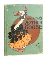
190111370New York: McClure Phillips & Company Publishers 1901. Very Good. New York: McClure Phillips & Company Publishers 1901. First Edition Second State with four pages of pictures before "Humpty Dumpty." Quarto. 96 pp. Bright and highly amusing color illustrations by Denslow throughout with verses hand-lettered by the esteemed type designer Frederic W. Goudy. Paper-covered boards with color illustration to front and back stamped in black. Illustrated endpapers. No dust jacket. <br /> <br /> Boards edgeworn with exposure and some fraying at spine ends. Spine lettering and colophon notably sharp and binding is sound. Touch of off-setting to pages but overall pages unmarked. <br /> <br /> Greene & Hearn 24. McClure, Phillips & Company Publishers unknown
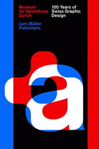
201409586Lars Muller 2014. Hardcover. Very Good. 12x8x1. Lars Muller hardcover
1960KOS049700004Kusatsu Art Center 1960 Soft Cover Fine
1961KOS047100030Nishijin, executive committee, Tokyo film lovers Association 1961 Soft Cover Fine
1958155556Vienna: Verein für Soziale Wohnkultur 1958. Two vintage furniture and home decor booklets produced by Austrian furniture maker Soziale Wohnkultur for subsidized housing in Vienna circa 1958. One booklet illustrated throughout with black-and-white and color photographs the other illustrated with black-and-white photographs only. Text in German. <br /> <br /> In 1952 in the midst of rebuilding the city after WWII the government of Vienna formed a furniture initiative called Soziale Wohnkultur or "Social Living Culture" a project spearheaded by architect Franz Schuster. The project introduced a line of furniture for low-income municipal housing residents that was designed to be attractive and high quality but also inexpensive and practical for small apartments. A number of prominent Austrian designers were commissioned to work on the project and the resulting designs ranged from kitchen bedroom and living furniture to wall shelving and lamps all emblazoned with the "SW" logo. The furniture and fittings produced by the SW are considered to have had a significant influence on mid-century Austrian design and extant furniture from the period is still highly in demand today. <br /> <br /> Booklets 5.75 x 7 inches. One booklet with perfect binding the other saddle stapled. Both booklets with brief curling else about Near Fine. Verein für Soziale Wohnkultur unknown
1929144757New York: Henry Miller's Theatre 1929. Original flyer for the 1929 play "Journey's End" which premiered at Henry Miller's Theatre on Broadway on March 22 1929 and closed on May 17 1930 for a total of 485 performances. <br/><br/>The first US production of the play after its smash hit at at the Apollo Theatre in London which starred a young Laurence Olivier and was directed by then-unknown director James Whale. It is widely considered to be one of the greatest plays ever written about World War I following the plight of a British Army infantry company in 1918. <br/><br/>Whale accompanied the play to America for the production advertised here which by late 1929 was being performed by 14 companies in English and 17 in other languages and he would go on to direct the 1930 film adaptation starring Colin Clive David Manners and Ian Maclaren. His film would be the first of numerous adaptations including: "The Other Side" 1931 "Aces High" 1976 and "Journey's End" 2017. <br/><br/>Whale would go on to even greater Hollywood fame later directing "Frankenstein" "The Invisible Man" "The Bride of Frankenstein" and more and was one of the first openly gay directors.<br/><br/>Two-color single leaf folded once 10 x 8 inches. Bright and Near Fine with a few closed tears and edge creases. Henry Miller's Theatre unknown books
1952129068Basel: Verlag Karl Werner, 1952. 168 S. ; 22,5 x 21,5 cm ; Leinen.
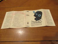
1928059012London Uk: Gollancz 1928. 1st Edition 1st Printing. No Binding. No Book Included/Good. Dust Jackt Only For First Edition Gollancz 1928. Would Be Near Fine No Wear Or Tear But A Little Pinkish Dampstaining To Flaps And Rear Panel. Se Wikipedia: Edward Mcknight Kauffer 1890 -1954 Was An American Artist And Graphic Designer Who Lived For Much Of His Life In The United Kingdom. He Worked Mainly In Poster Art But Was Also Active As A Painter Book Illustrator And Theatre Designer. Edward Leland Kauffer Was Born On 14 December 1890 In Great Falls Montana. By 1910 He Had Moved To San Francisco Working As A Bookseller And Studying Art At The California School Of Design From 1910 To 1912. At Around This Time Professor Joseph Mcknight Of The University Of Utah Became Aware Of Kauffer's Work Sponsored Him And Paid To Send Him To Paris For Further Study. In Gratitude Kauffer Took His Sponsor's Name As A Middle Name. Kauffer Stopped In Chicago For Six Months In 1912/1913 And Studied At The Art Institute Of Chicago. While There He Witnessed The Armory Show One Of The First Major Exhibitions To Introduce The Styles Of Modernism To American Viewers. This Likely Had A Major Impact On Kauffer Who Would Work In Many Of The Same Styles Throughout His Career. He Arrived In Paris In 1913 And Studied At The Académie Moderne Until 1914. In Paris In 1923 He Met The Textile Designer Marion Dorn 1896-1964 And Subsequently Lived With Her In London From Late 1923 To July 1940. They Married In 1950 And Moved To New York Until His Death In 1954. Kauffer Moved To London Upon The Start Of The First World War And Remained There For Most Of His Career. He Was Briefly Associated With Robert Bevan's Cumberland Market Group And Had A One-Man Show At The Omega Workshops. In Brighton On The South Coast He Designed A "Novel" Mural For The Lobby Of Embassy Court A Modernist Block Of Flats Designed By Wells Coates In 1935. The Mural Consisted Of "Monochrome Photographs . Printed Directly On To A Light-Sensitive Cellulose Coating". Kauffer May Be Best Known For The 140 Posters That He Produced For London Underground And Later London Transport. The Posters Span Many Styles: Many Show Abstract Influences Including Futurism Cubism And Vorticism; Others Evoke Impressionist Influences Such As Japanese Woodcuts. He Created Posters For Shell Oil The Great Western Railway And Other Commercial Clients And Also Illustrated Books And Book Covers. Later He Also Became Interested In Textiles Interior Design And Theatrical Design. He Returned To New York City In 1940 At The Beginning Of The Second World War And Tried To Find Work In Advertising. He Struggled In The More Competitive Atmosphere Until He Was Approached To Do A Series Of Posters For American Airlines In 1947. American Airlines Remained His Primary Client Until His Death In 1954. <br/> <br/> Gollancz unknown
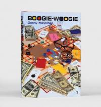
2000157523London: Duckworth Literary Entertainments 2000. First edition signed limited issue number 74 of 500 copies signed by the author on the title page and by Hirst on the rear panel of the dust jacket. Boogie-Woogie was based on Moynihan's experiences of working in the contemporary art world where he met Hirst who said of the book: "Art is about life; the art world is about money. Boogie-Woogie is where the two collide" quoted in Federico. It was made into a film of the same name in 2009 with screenplay by Moynihan. It was directed by Duncan Ward and starred among others Gillian Anderson Alan Cumming Heather Graham and Christopher Lee. Octavo. Original red cloth spine lettered in gilt yellow endpapers red silk bookmarker. With dust jacket by Damien Hirst. A fine copy in like jacket. Cherie Federico "When Art Takes on a Life of Its Own" Aesthetica available online. hardcover
<h3>Autore/Curatore: Emma Calderini</h3> <h3>Editore: Sperling e Kupfer</h3> <h3>Anno: 1934 N. 722/1050</h3> <h3>Formato: 23x30 cm - Copertina Rigida</h3> <h3>Pagine: 166 pagine +200 tavole</h3> <h3>Lingua: Italiano</h3> <h3>Condizioni: Buone, come da foto, con segni del tempo e di utilizzo. Abrasioni e piccole rotture alla copertina. Ossidazioni sparse. Qualche strappetto marginale e macchiolina di inchiostro.</h3>
1894886851894. DESIGN HARUNA Shigeharu editor. Kogei Oyo ZUAN ZASSHI 7 issues. No.'s 20-26 Tokyo Meiji 26-27 1893-4. 24.5 x 16.6 cm. Stab-bound wrapper's in woodblock printed paper covers. Haruna Shigeharu 1847-1913 was a pottery painter born into the upper classes in Ishikawa prefecture here using his artistic and design skills to organize and edit this "PRACTICAL ARTS DESIGN MAGAZINE" full of black and white design ideas and articles on such topics as the Columbian Exposition etc. Very unusual periodical here in very good condition inside and out. A short but continuous run. unknown
2012207331Los Angeles CA: AMMO Books 2012. First edition and first printing. Large oblong hardcover. 408 pages. Massive monograph on the furniture and design of Charles and Ray Eames. Edited by Gloria Fowler and Steve Crist. Features essays and quotes by Charles & Ray Eames Lucia Eames Carla Hartman Byron Atwood Lucia Dewey Atwood Eames Demetrios and Llisa Demetrios. Includes illustrations of furniture graphics textiles toys & games and numerous other works A fine copy and in a very near fine slipcase with some color shift from light exposure. No dust jacket as issued. Still in the publisher's shrinkwrap. One of most comprehensive books on the Eames who helped define the Mid-Century Modern style. This is a heavy and oversized book and will require extra shipping. AMMO Books unknown
1894886851894. DESIGN HARUNA Shigeharu editor. Kôgei Ôyô ZUAN ZASSHI 7 issues. No.'s 20-26 Tôkyô Meiji 26-27 1893-4. 24.5 x 16.6 cm. Stab-bound wrapper's in woodblock printed paper covers. Haruna Shigeharu 1847-1913 was a pottery painter born into the upper classes in Ishikawa prefecture here using his artistic and design skills to organize and edit this "PRACTICAL ARTS DESIGN MAGAZINE" full of black and white design ideas and articles on such topics as the Columbian Exposition etc. Very unusual periodical here in very good condition inside and out. A short but continuous run. unknown books
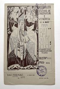
19242438Paris 1924. During the 1920s a number of Russian artists living and working in Paris formed the L'Union des Artistes Russes. To help raise funds they held several spectacular charity balls organized primarily by Natalie Goncharova 1881-1962 and her husband Mikhail Larionov. These included the Grand Bal des Artists in 1923; the Bal Banal in 1924; the Bal Olympique also in 1924; and the Grand Ourse Bal in 1925." Princeton University Graphic Arts Collection blog 2012 The guest list included Braque Brancusi Cocteau Diaghilev Juan Gris Mayakovsky Picasso Picabia and many others. The ticket is perforated at the bottom edge and untorn numbered 524 with the Union's stamp. Alexey Brodovitch designed an award-winning poster for the event; Picasso's design came in second. Short closed tear to right edge. unknown
201032012David Bull 2010 First Printing full # line in dust jacket with signed Christmas Card from the Phil Hill Family for the season 2006 to their close friend & Santa Monica neighbor film director Joe Pytka with other Hill family memorabilia laid in Fine in Fine no markings trifling edge wear to dj top panel else bright tight exemplary copy with signed card from the great Formula One race car driver - unique association copy dj in mylar protector; folio; 191pp illus. Extra shipping charge REQUIRED for shipment of this heavy oversize book additional charge WILL BE SUBSTANTIAL for expedited or overseas shipment. Signed by Author. First Edition. Hard Cover. As New/As New. David Bull hardcover
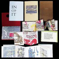
21913Fine. A cohesive archive of experimental letterpress books 9 from Indiana University 2001-2010 issued as keepsakes for the Fine Arts Library Benefit Dinner.<br /> <br /> Produced for Indiana University's Fine Arts Library this cohesive archive of experimental letterpress books-created by students of the Graphic Design Press for annual Benefit Dinners between 2001 and 2010-explores structure typography and the act of reading itself. These small-format works document a decade of design pedagogy tracing the evolution from early exploratory forms to increasingly refined editioned pieces aligned with a growing institutional patron base.<br /> <br /> Issued as keepsakes for the Indiana University Fine Arts Library Benefit Annual Banquets.<br /> <br /> Bibliographic Line - Bloomington Indiana: Graphic Design Press Indiana University 2001-2010. A group of multiple letterpress-printed works produced by members of the S451 Letterpress course for annual Fine Arts Library benefit events.<br /> <br /> Overview - This archive represents a rare surviving group of student-produced yet institutionally anchored letterpress works each conceived as both a functional printed object and a conceptual exercise. Formats include accordion-fold structures sculptural paper constructions and dual-surface designs integrating text and image.<br /> <br /> The works explore themes ranging from typography and modernist theory to riddles ornament and environmental awareness. Several pieces explicitly reference design history including engagement with Adolf Loos' 'Ornament and Crime' while others operate as visual or tactile problem-solving exercises intended to challenge conventional reading.<br /> <br /> By the mid-2000s the series demonstrates increasing refinement with clearly stated edition sizes structured colophons and alignment with donor or patron distribution indicating a transition from classroom experiment to semi-formal fine press production.<br /> <br /> Physical Description: A group of small-format artist books and letterpress objects generally measuring approximately 3 to 5 inches in their closed state. Printed primarily in monochrome or limited color palettes often on colored stock.<br /> <br /> Structures include:<br /> Accordion-fold sequences<br /> Multi-panel narrative strips<br /> Sculptural folded forms<br /> Dual-sided text/image constructions<br /> <br /> Typography is handset or digitally composed for letterpress output with consistent emphasis on spacing pacing and interaction between form and content.<br /> <br /> CONDITION: Fine - The pieces are in excellent condition. Paper is clean with strong color retention. Fold structures remain crisp and fully functional. Minimal evidence of handling consistent with careful storage. No notable tears losses or restorations observed. Individual Components -<br /> 2001 - Keepsake Piece named student designers<br /> Early example with credited participants; establishes program origin and collaborative structure.<br /> c. early 2000s - Riddle Structure Piece<br /> Complex sculptural accordion work integrating puzzle logic and sequential reading; among the most visually and conceptually advanced in the group.<br /> 2005 - 'Ornament and Crime' Interpretation<br /> Text-driven typographic exploration referencing Adolf Loos; strong conceptual grounding in modernist design theory.<br /> 2007 - Amphibian / Environmental Decline Piece No. 44 of 134<br /> Accordion strip with dual-surface design; addresses ecological themes and demonstrates formalized edition structure with patron allocation.<br /> 2008-2010 - Later Benefit Series Pieces multiple<br /> Increasingly refined works showing consistency in production expanded edition sizes and continued experimentation in folded form and typographic layout.<br /> <br /> Significance - This archive provides a compact but meaningful record of early 21st-century letterpress pedagogy within an academic setting. It reflects the continued relevance of handset and relief printing in design education not merely as a technical exercise but as a conceptual discipline.<br /> <br /> The progression visible across the group illustrates:<br /> The integration of historical design theory into contemporary practice<br /> The use of book structure as a communicative device<br /> The relationship between academic production and institutional fundraising<br /> <br /> Such material occupies a growing area of interest for collectors and institutions focused on book arts design history and the preservation of teaching presses. Produced and distributed through the Fine Arts Library Benefit events at Indiana University Bloomington.<br /> <br /> Additional Information - The Graphic Design Press at Indiana University has long served as a teaching laboratory for letterpress printing emphasizing both craft and conceptual design. Works produced in this environment often blur the line between student exercise and collectible artist book particularly when tied to formal events such as library benefit programs.<br /> <br /> Subjects: Book arts typography letterpress printing graphic design education Indiana University conceptual book design modernist design theory environmental themes in print Artist books fine press printing letterpress ephemera design pedagogy. unknown