4 641 résultats
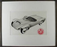
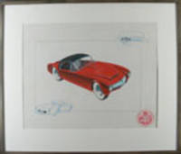
195318800Boston 1953. Tempera on paper. Initialled "R.S.W." Mounted circular label lower right. Handsome 1950s sports car design.<br/> <br/> All of our present information about this drawing comes from a label on the back of the piece which indicates that it comes from the archives of the A.J. White Motor Vehicle Research Company - designers of exotic cars in the Boston MA area. We have not discovered any further information about the A. J. White Research Company thus far nor about the artist R.S.W. of this particular drawing. There does not appear to be any connection to the great White truck manufacturer. The drawing itself is especially nice its cool red sportscar positioned diagonally between two details in blue in a way that makes it appear anxious to move. unknown
195318794Boston 1953. Mixed media on paper. Mounted circular label lower right of the Motor Vehicle Research Company. Drawn for A. J White's Motor Vehicle Research Company which is said to have been a Boston based car designer of exotic cars in the 1950's this handsome prototype embodies several features that were realized later especially in recent racing cars. The gleaming prototype is extremely well drawn and seems to be happily flying through the air. unknown
72742Berlin BBZ Berliner Börsen-Zeitung Dr. 1930. . Umfaßt drei Teile: Geschichte der Zeitung Themenspektrum der Berichte von Außenpolitik über Wirtschaft bis Industrie und Kultur schließlich bebilderte Selbstdarstellungen deutscher Unternehmen. - Auf dem Vorsatz montiert ist ein SIGNIERTER Brief des "Oberen Vertreters" der "Deutsch-Ostafrikanische Gesellschaft" Ernst August Warnholtz an die Witwe eines Mitgliedes der an der Festschrift beteiligt war. - Einband angestaubt und bereiben/begriffen Gelenke gelockert innen sauber [Berlin, BBZ, Berliner Börsen-Zeitung Dr. 1930]. unknown
1969197985New York: Catharine Lorillard Wolfe Art Club 1969. Paperback. Good Wraps are lightly toned/scuffed/smudged/foxed; textblock edges are lightly toned/foxed; interiors are clean; bindings are solid. White stapled wraps with b&w photo and black lettering; richly illustrated; various paginations. Issues include: "Seventieth Anniversary Members Exhibition Dec 3rd through 19th 1967"; "Seventy-first Annual Members Exhibition November 30 through Dec 17th 1968"; "Seventy-third Annual Exhibition December 3rd through December 20th 1970" and "Seventy-third Open Exhibition December 4th through December 21st 1969." [Catharine Lorillard Wolfe Art Club] paperback
36848Easthampton MA: Cheloniidae Press 1990. Hardcover. Fine. Hardcover. Number 21 of 100 xxi/c copies in the deluxe edition signed and numbered by illustrator and book designer Alan James Robinson. There were also 26 copies bound in quarter leather. This magnificent book was undertaken by the press as a celebration of its tenth anniversary. It is one of the great achievements of Robinson's Cheloniidae Press one of the most respected American private presses. Founded in 1979 the press went through several incarnations during its existence. The constant throughout was the artistry of Alan James Robinson who became famed for his superlative wood engravings and etchings of animals birds the sea and more. The original text for this edition was written by Arthur F. Kinney who was then the Thomas W. Copland Professor of Literary History at the University of Massachusetts and an extensive publisher and lecturer on Shakespeare. <br /> <br /> From the prospectus: this book "focuses on popular bird and animal lore and the way Shakespeare turns it into lines of haunting and indelible beauty by describing the familiar and unfamiliar ideas about many creatures and by showing how Shakespeare used these ideas to shape character and plot in his plays.Shakespeare's imaginative use of observed detail and magical fantasies is matched by the intricate and mysterious wood engravings of Robinson."<br /> <br /> Beautifully bound by noted binders Claudia Cohen and Sarah Creighton in full rust morocco with the title stamped in gilt on the front panel within a blind rule at the outer edge of the covers raised bands and leather hinges. Illustrated with 54 wood engravings depicting the birds and beasts found in Shakespeare's plays and poems plus two portraits of the Bard: one etching and one wood engraving. The book is accompanied by an additional suite of 56 signed and numbered prints from the illustrations. There is also an original watercolor of a Barnacle goose that is not known or called for in the prospectus. They are housed in a linen covered portfolio. The prospectus is also included. There are beautiful hand marbled endpapers by Faith Robinson. The book was printed on special Cheloniidae Rag paper carrying the press watermark that is the exact size of the First Folio of 1623. The type is Centaur and Arrighi set by M&H Type in San Francisco with additional hand composition by Arthur Larson. The book was letter press printed by master printer Harold Patrick McGrath. Housed in a custom clamshell box in near fine condition covered with beige linen with a brown leather spine label. The book is In fine condition. Book is 10.5 x 16 inches. Box is 11 x 17 inches. iv 87 single fold pages. PRI/102423. Cheloniidae Press hardcover
197856289Los Angeles CA & Detroit MI: Chrysler Corp. ca. 1978-1980. 4to. 103 colour and black & white photographs sized 8 x 10 in. w/ nearly all featuring inventory numbers on versos many w/ concept artist’s identifying marks at lower fore-edge of images all w/ 3-hole punch at upper fore-edge. Black vinyl 3-ring binder manuscript label on spine w/ 1 sheet of manuscript tucked-into front cover entitled “Image Studies†rounded corners slight shelfwear light toning to leaf of manuscript NF exemplar. A fascinating Chrysler Corp. Design Group photo archive documenting the development of the full scale mock-ups and designs for the 1978 & 1979 Chrysler 300 Chrysler Cordoba as well as the rebadged Dodge Charger early concepts for the Dodge Minivan 5 years before introduction and the under appreciated Dodge Omni rally car. Many of the Chrysler concept car designs included here are signed by such artists as Svensen Kreiling and the famed Stewart Reed. The album opens with concept car designs for the 1979 Chrysler Cordoba 300 offering views of a concept car mock-up not only featuring a split between two different designs but also different wheels as well as views of the designs littering the walls and ceilings of the Chrysler Corp. Design Group studios. It also shows the nascent red & blue pinstriping on silver when the eventual production model featured that on a white background. Also shown are the development photos for the rebadged Dodge Challengers and Dodge Chargers basically reusing the Mitsubishi Galant Lambda as a base. Many of these Chrysler/Dodge/Plymouth Mopar concept cars are shown with a variety of artists’ renderings for Targa tops sleek modern lines and colours which unfortunately for Chrysler never made it into general production because if they had Chrysler may not have needed the 1979 bailout by the US Government. Of particular interest are the artists renderings of a 1978 Dodge Omni as a rally car and two very early concept designs for the Dodge/Chrysler minivan project led by Stewart Reed. The unsung Dodge Omni and Plymouth Horizon developed by Chrysler’s European Division were Chrysler’s first front-wheel compact car beating the K-Car to market by over three years and with its’ handling and popularity even received the attention of Carroll Shelby who worked to convert them into true performance race cars. The Minivan would remake the American auto market from the time of its eventual production introduction in 1984 revive the fortunes of Chrysler and spawn many competitors such as the Chevrolet Astro Ford Aerostar Toyota Previa and many others. Reed worked in Chrysler’s design group from 1971 to 1980 as part of the initial Minivan design team then Toyota’s Calty Design Research Inc. in Newport Beach CA and after 1994 operated his own design studio in Plymouth MI creating such concept vehicles as the 1998 Gear Box SUV and the 2001 Cunningham C7 Car. See: David Zatz The Chrysler Cordoba And 300: “Personal Luxury†Allpar Feb. 9 2017; Pete Dunton 1978-1990 Dodge Omni -- the Little Car that Rescued Chrysler Old Car Memories Nov. 24 2018; William Stopford The Most Obscure Special Editions and Forgotten Limited-Run Models: Mopar Edition Part III -- A Trip to Aspen Curbside Classic Nov. 13 2015. Chrysler Corp., unknown
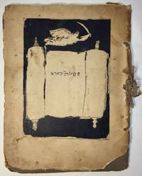
19271751Paris: I. Grodzensky 1927. First edition. Text in French and Yiddish. In publisher’s wrappers bound by string. Cover design by Marc Chagall. Cover and plates are worn at extremities. Cover and some plates damaged at corners and at the string. Two photographic reproductions are loose. Overall in good condition. First edition. Text in French and Yiddish. In publisher’s wrappers bound by string. Cover design by Marc Chagall. 4 text plates and 19 album card plates with mounted photographic reproductions. <p><br /> Scarce book with Chagall’s cover design.<br /> <p><p><br /> With Marc Chagall’s image on the front cover. Before a black background the image features an opened Torah scroll with the inscription of Schwartzbard's name in Hebrew letters an angel with sword flies over the Torah an allusion to Michael the Archangel the advocate of the Jews.<br /> <p><p><br /> A scarce album with pictures of places and portraits of people connected with the Schwartzbard-trial together with short expressions of opinion from prominent intellects as well as brief biographical notes on Schwartzbard and Petliura.<br /> <p><p><br /> Sholom Schwartzbard 1886–1938 was a Russian-born French Yiddish poet and anarchist the assassin of Symon Petliura 1879–1926 head of the Ukrainian government-in-exile in Paris in 1926. Schwartzbard held Petliura responsible for the death of fifteen of his relatives murdered in pogroms during Petliura rule of the Ukrainian National Republic. The number of Jews murdered during the massive 1918–1921 pogroms in Ukraine is estimated to be between 35000 and 50000 and a large percent of the violent attacks were carried out by soldiers under Petliura’s command. The Schwartzbard trial began in mid-October 1927 lasted for eight days in the end it turned on accusations of Petliura's responsibility for the pogroms and eventually Schwarztbard was acquitted. <br /> <p><p><br /> Scarce we could trace only 3 copies in institutional holdings Harvard University Widener Library Cambridge MA USA; NLI Jerusalem; Musée d’art et d’histoire du Judaïsme Paris.<br /> <p>. [I. Grodzensky] unknown
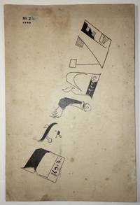
19221736Moscow: Der Shtrom The Moscow School for Yiddish Printers 1922. First edition. In publisher’s illustrated wrappers. Paper yellowed due to aging. Tiny inkblots on cover. Note in pencil on title page. Numeric notes between pp. 9–25. Three pinholes throughout at the gutter. Cover artistically restored. Overall in very good condition. Cover design by Marc Chagall. Cover design by Marc Chagall. First edition. In publisher’s illustrated wrappers. 80 p. <p><br /> The second number of the first Soviet Yiddish literary-cultural periodical featuring a cover designed by Marc Chagall.<br /> <p><p><br /> Shtorm was founded and edited by a literary and artistic group formed in Kiev of Yekhezkl Dobrushin Nokhem Oyslender and Arn Kushnirov and Dovid Hofshteyn. Six numbers were published in five issues between 1922 and 1924. <br /> <p><p><br /> Each cover featured the same illustration on the front by Marc Chagall. “Chagall used only the letters in the word Shtrom as illustrations which included a disembodied person on the »R« and a factory with a worker entering the building as part of the »Sh«†Shneer pp. 145–6.<br /> <p><p><br /> Bibl.: Shneer D.: Yiddish and the Creation of Soviet Jewish Culture: 1918–1930. Cambridge University Press 2004.<br /> <p>. Der Shtrom, The Moscow School for Yiddish Printers unknown
55686Leipzig Magazin für Litteratur 1800. . L'Eloge des perruques von Jean-Nicolas-Marie De Guerle Jean-Marie Nicolas Deguerle pseud. Docteur Akerlio 1766-1824 übertragen von Karl Ludwig Methusalem Müller 1771-1837. - Colas 819. - U.a. über Neuerungen auf dem Perückensektor berühmte französische Friseure und Perückenknüpfer die "Ökonomische Perücke" aus Drahtfäden. - Mit dem Exlibris des Arztes u. volkskundl. Sammlers Dr. Rud. Rudolf H. Ferber Hamburg 2. Hälfte des 19. Jhdts. Zugleich gewissermaßen eine amüsante und doch fundierte "Geistes- Kultur- u. Sittengeschichte des Perücketragens". - Unbeschnitten Heftung locker Titelblatteinriß verso hinterlegt Papier unterschiedlich gebräunt; es fehlen die S. 99-110 ab Anmerkung # 32 und Index. Leipzig, Magazin für Litteratur, [ 1800]. unknown
19782268Zeeland Michigan: Herman Miller Inc. 1978. Very Good. 11-1/4 x 8-3/4 inches. Unpaginated but 28pp printed recto only. Side-stapled with ruled white wrappers and leaves. B&w illustrations. Light soiling/rubbing to wrappers; slight bump to upper corner. A collection of 44 notes on the theory of connection in design presented as if typed on ruled paper and with printed ink marginalia in green beside some notes. Caplan was a design consultant author and teacher who in addition to his work for Herman Miller was a longtime director of the International Design Conference in Aspen. The theme of the conference in 1978 was "Making Connections" and included what would be Charles Eames' last public presentation. Herman Miller, Inc. unknown
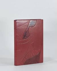
9380New York: Crown Publishers 1976. Full Leather. Fine binding. Octavo. 160 pp. illus. First edition first printing thus. Full bound in burgundy morocco with blind-tooling sanding and dyed and acrylic-toned goat onlays. Top edge gilt with sgraffito designed. Hand-woven silk endbands. Housed in clamshell box. <br /> <br /> In this binding Brenda Gallagher has drawn from Boyce's erotic illustrations to render a beautifully blind-tooled drawing spanning both covers. Stamped onlays and sanded details bring the binding into perfect union with the text. Gallagher has subtly titled the cover by embedding both the author's name and title within the blind tooling. A remarkably designed and excellently executed binding capturing the spirit of Nin's prose and quite directly the character of Boyce's drawings. Gallagher is a design bookbinder and a graduate of the American Academy of Bookbinding. Crown Publishers unknown
9402New York: Caliban Press 2020. Full Leather. Fine binding. Tall octavo. 3 blanks 44 2 prospectus 3 blanks ll. Limited edition number 5 of 100 copies signed by McMurray. Originally issued by McMurray in a spiral binding with heavy printed wrappers; the printer notes that this was "printed on various scrap papers found at Caliban Press over time. Canada China England France Germany India Japan Mexico Nepal and Spain are all represented—including Papeterie St-Armand." It includes fold-outs a volvelle and slide-outs. This copy is finely bound by Donald Glaister in full goat skin with onlays of laminated mylar and sanded and painted aluminum on the front and back boards. There are also recessed areas on both boards with acrylic painted lines at some perimeter edges. Polished top-edge with silk endbands; painted cork endpapers. The leaves original covers and prospectus have been mounted on guards with a portion of the perforations from the spiral binding still visible with intention a way in which Glaister is engaging with McMurray's style and playfulness that present throughout this specimen book. Even the clamshell box holding the book has a compartment containing the original red spiral a toy begging to be played with. <br /> <br /> McMurray describes this type specimen of numerals as a way to document a collection of more than 4 dozen cases and around 75 fonts. It became evident that a complete catalogue was far too expansive for a single volume so this the first volume was just numerals. Far from a straightforward specimen book McMurray's playfulness and humor engage the viewer throughout. And engaged Glaister in his design. He writes in his artist’s statement: "Mark McMurray has compiled a wonderfully designed collection of families of numbers from his collection. The is almost without words only numbers . . . The design for the binding is as simple and as complicated as the binary system. A '1' and a '0' on each cover is all there is. However these numbers are presented differently subtly richly and with great care as to their design and positions. These forms and qualities are a mirror of the text within." A wonderful book beautifully bound by one of the premier designer bookbinders in the country. Caliban Press unknown
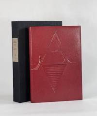
19279186New York: Printed by William Edwin Rudge for the Grolier Club 1927. Full Leather. Very Good binding. Quarto. 6 xxiii 1 208 2 pp. illus. Limited edition one of 390 copies. This copy bound by Don Glaister in full crimson goatskin with typographic design referencing Rogers's type design throughout the volume—a stylized A on the front cover and Z on the rear tooled in blind and gold transitioning to painted lines. Glaister employs slightly raised and recessed areas beneath the leather with occasional light sanding all to offer subtle dimensionality a suggestive nod to the raise aspects of type. Crimson cork endpapers gold and crimson silk headbands accent the original gold top-edge. Signed in blind on the rear pastedown with date and gold dot "Donald Glaister 2025." Fine in clamshell.<br /> <br /> This edition designed by Bruce Rogers is the first English translation of Tory's landmark work begun in 1523 and published 1529. Tory's influence on 16th century typography was immeasurable—moving French printing away from gothic types towards the roman faces a movement that would define modern typography. D. B. Updike calls Tory's Champ Fleury "one of the important books in the history of letter design" I p. 188. A beautiful edition that took decades for Rogers to bring from a proposal to the Grolier Club to a printed edition. And of all he designed it was among Rogers's favorite #24 in BR Thirty. Tory's groundbreaking and forward-looking work had long been a classic text by the time Rogers designed this edition 400 years later. Now 100 years further on Glaister adds his voice to this typographic tradition and in his distinct style takes these now-classic letterforms and nudges them into modernity. Haas 413. Grolier 361. Updike Daniel Berkeley. Printing Types. 3rd ed. 1966. Printed by William Edwin Rudge for the Grolier Club unknown
9594New Haven: Editions Wequetequock Cove 2006. Full Leather. Fine binding. Small folio 8.5" x 7". 32 pp. illus. Limited edition number 23 of 50 copies. Signed by Baltazar and Watsky. This copy sewn on meeting guards with silk endbands. Bound in dyed calf and finished with recessed stone veneer over sheep skiver dyed calf inlays and onlays as well as onlays in lizard. Subtly titled in blind across one of the onlays at the spine. Paper doublures with dyed calf hinges. <br /> <br /> Botehlo writes of this book being "filled with etchings of heavy lined and voluptuous shapes with textures and shade all done in black. The poetry evoked for me the verdancy of rogue plants that spring up between the cracks of concrete. It spoke of the appeal of being a snake allusions to original sin. I wanted the green onlays that have been dyed and embossed to be pillowed the stone inviting touch. I intended to create something that invites a sensory exploration." And here she has succeeded with astonishing grace creating a design that draws and keeps the attention. Wonderfully conceived and executed with exceptional skill. Botelho is among a select group of extraordinary design binders who are graduates from the American Academy of Bookbinding Fine Binding program. Editions Wequetequock Cove unknown
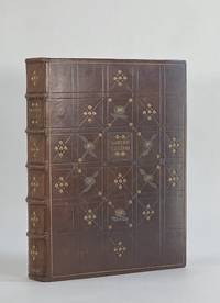
19058124London: J. M. Dent & Co 1905. Full Leather. Very Good binding. Quarto. xvi 196 pp. frontis plates. First edition. In later antiqued calf decorated in an Arts and Crafts style the cover divided into compartments with stylized gilt leaves alternating with onlay and gilt chrysanthemums. A restrained but quite lovely design signed at the top turn-in of the front cover "BENELINOR / 1935" and again on the bottom of the rear turn-in "E. K. B." Turn-ins decorated with a single fillet and corner embellishment. Top edge is rough gilt. 50 watercolor sketches all present as called for. Binding is lightly rubbed but quite solid; front cover gilt is somewhat dulled in comparison to the spine and rear cover. Thread of the top headband is worn with the core exposed. Foxing to the leaves facing the verso of each plate. Previous owner debossed stamp on the first blank. A very attractive binding on a lovely book. J. M. Dent & Co unknown
19489757Paris: Chez Georges Visat 1948. Full Leather. Near Fine binding. Octavo. 52 6 pp. frontis illus. Limited edition number 195 of 225 copies. This copy bound by Monique Lallier in full calf with extensive leather onlay shapes referencing the style of Alanore's illustrations. Textblock is sewn on meeting guards with the original wrappers incorporated in the binding. Silk embroidered endbands and leather doublures and flyleaves. Stamp-signed and dated 2014 by Lallier in gold on the rear pastedown. Light offsetting from the etchings and occasional light foxing but generally an internally clean copy nearly fine in a fine binding housed in clamshell that is slightly bumped at the extremities. <br /> <br /> An engaging and quirky narrative text in French wonderfully illustrated with 20 drypoint etchings by Alanore some full page but most incorporated around the printing. This binding from Lallier's personal collection is featured in her 2018 retrospective exhibition put on by Guildford College with catalogue published by Oak Knoll Press. In it she remarks how Alanore's etchings all have prominent lips which informed her design of the cover in a leather that looks like horse p. 100. A striking book inside and out bound by one of the most important design binders of the last 50 years. Chez Georges Visat unknown
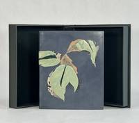
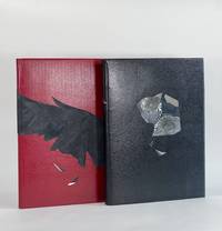
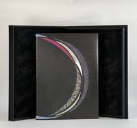
9284San Francisco: Arion Press 2022. Full Leather. Fine binding. Large quartos. 171 1; 27 pp. illus. Limited edition number 52 of 250 "Fine Press" copies 50 Deluxe copies were also issued. Both volumes finely bound by American design binder Robin Brandes. Phantasia in black straight-grained goatskin with crimson doublures and gray suede flyleaves; onlays of distressed mirror mylar composed with image transfers and exotic leathers. The Raven is inversely bound in crimson straight-grained goatskin with black doublures and gray suede flyleaves. Striking raven wing spans from fore-edge of the front board around the spine to midway on the rear board—"feathers" composed of textured fabric with a suede finish and distressed mirror mylar. Fine copies each in crimson cloth clamshell. Prospectus laid in. <br /> <br /> A remarkable production from the Arion Press presenting some of Poe's most recognizable tales and poems here illustrated by American artist Natalie Frank—color as well as black and white; both full page and in-text illustrations printed in offset lithography and overprinted by letterpress. Brandes's restrained bindings are perfectly suited to these books rendering visually the same experience one feels when reading Poe and navigating the uncertain terrain he creates—clear enough that one recognizes the landscape but subtly disquieting. The binder writes in her artist's statement: "In his short lifetime Edgar Allan Poe became the pre-eminent chronicler of the unquiet mind. A mixture of unusual materials and striking color palette were used to emanate an enigmatic yet dramatic presentation. The haunting cover portrait I created for Poe's Phantasia is a mosaic suggesting shapes of 2 ravens. Image transfers of Poe's eyes on distressed mirror mylar and onlays of exotic leathers evoke Poe's unquiet disturbed mind filled with illusions and wishing for the return of lost love. For the covers of The Raven I designed the raven wing feathers to be a bold presentation for one of the most translated poems in history." <br /> <br /> Brandes has been binding for nearly a decade and already has a notable resume having been exhibited at Arion Press The American Bookbinders Museum The Book Club of California Guild of Book Workers San Francisco Center for the Book and more. Brandes's binding of 2020 Vision was the First Place Winner of the Rocky Mountain Guild of Book Workers 2023 Traveling Exhibition. Arion Press unknown
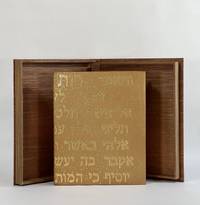
10426Provo UT: Tryst Press 2011. Full Leather. Fine binding. Quarto. 32 pp. illus. Limited edition one of 160 copies this copy out of series. Bound by Katy Starr-Baum in tan goatskin; textblock is sewn on meeting guards with hand-embroidered silk endbands; binding with Hebrew lettering made up of hand-tooled gold dots which extend to the top edges of boards and headcaps; edge-to-edge hand-painted doublures and free endpapers. Housed in clamshell box. A fine copy. <br /> <br /> A lovely book by Robert Buchert at his Tryst Press printed on purpose-made paper by the printer with a barley ear watermark and in Buchert's Psalter type. The colophon reports that this is the first book employing Buchert's typeface. Many in-text woodcuts some full page embellish the book. Here beautifully bound in a meaningful way by Starr-Baum who having over the course of a few years learned of her Jewish roots and converted to Judaism like Ruth that first convert before her. The Hebrew rendered in gold on the binding reads in the King James version: "And Ruth said Intreat me not to leave thee or to return from following after thee; for whither thou goest I will go; and where thou lodgest I will lodge: they people shall be my people and they God my God; Where thou diest will I die and there will I be buried; the Lord do so to me and more also if ought be death part thee and me." Starr-Baum has been binding books for more than 20 years and is among the most recent recipients of the Fine Binding Diploma of the elite American Academy of Bookbinding. Tryst Press unknown
9573Monterey KY: Larkspur Press 2006. Full Leather. Fine binding. Octavo. 4 36 4 pp. Limited edition number 9 of 75 copies on Somerset Book paper there was also an edition of 500 regular copies. Signed by Wendell Berry at the colophon; additionally noted by Fox the year it was bound. In full goatskin binding with a series of leather onlays tooled in gold and blind all creating a fantastic pictorial binding. Accompanying the binding is a fine paper portfolio with publisher's prospectuses samples and associated material; additionally some templates related to Fox's binding. All housed a custom clamshell by Fox. <br /> <br /> The text offers a lens into the 19th century view of how a native of region assesses the value of the natural wonders. Berry's commentary at the end of Allen's text brings the troubling viewpoint into a modern context: "The chapter is built upon a division of mind which in our time has become terrifying but which Allen believed to be no more than a simple equation. On the one hand in a sentimentally romantic fashion he was sensitive to the natural life of the area which was then still intact. And on the other hand he seems eager for the destruction of this virgin bounty that so inspired him. I say 'the destruction' and not 'the use' for his language is patently that of an exploiter intent upon 'conquering' nature." A sobering volume that will most surely always remain relevant. Larkspur Press unknown
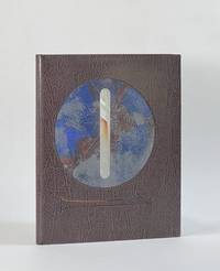
196110424San Francisco: Grabhorn Press 1961. Folio. 4 46 2 blank pp. illus. Limited edition one of 180 copies. This copy bound by Katy Starr-Baum in full black calf with inlays of sanded aluminum and pained paper as well as onlays of buffalo watersnake and stone veneer all arranged in a coronal design from front board to rear; graphite top edge with sprinkled palladium; handsewn silk endbands; hand-painted endpapers echo the cover design. Housed in clamshell box. <br /> <br /> A beautiful and fitting binding on one of the Grabhorn Shakespeare series with colored woodblock illustrations by Mary Grabhorn. A bold design using material that speaks to the time—stone and metal. The hand-painted endpapers evoke the night sky and have an iridescence that is dynamic when one opens the cover the light catching the paint shifts as the board moves. While boldly monochromatic what color there is in the binding the leather onlays and the painted paper picks up the pastels of Grabhorn's illustrations. The coronal design speaks to the backdrop of this play Henry IV holding onto power amidst treachery and Prince Hal's coming into the crown. But as Starr-Baum notes the design has a more potent deeper meaning: "the circular shape … represents familial cycles: the traits and behaviors that are passed down from one generation to the next and the transformation of Prince Hal into King Henry." A powerful binding by one of the most recent recipients of the Fine Binding Diploma of the elite American Academy of Bookbinding. Grabhorn Press unknown
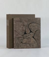
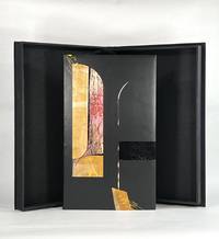
10427Berkeley CA: Editions Koch 2003. Full Leather. Fine binding. Folio. 44 pp. frontis plates. Limited edition one of 120 copies this copy out of series; there are also 26 lettered deluxe copies with a suite of 10 engravings. All are signed by Bringhurst Wagener and Peter Koch at the colophon. Bound by Camille Botelho in black box calf with inlays and onlays of dyed calf vinyl snakeskin painted paper mylar laminates and a porcupine quill; hand embroidered endbands; vinyl snakeskin doublures. A fine copy in clamshell box. <br /> <br /> True to form Peter Koch has produced a marvelous edition of what remains of Parmenides's poem "On Nature." The fragments of the poem are rendered in this opposite page bilingual edition with the Greek on the left and Bringhurst's English translation on the right. The poetry is brilliantly accompanied by Wagner's striking engravings a frontispiece and 4 additional wood engravings in red and orange. <br /> <br /> Given it survives only in fragments there is some debate as to the "meaning" of the symbolism of Parmenides's poem making it a work ripe for interpretation. But at base his view of reality is one of stasis unchangeable. And while that enduring Greek logic marks the work Wagener introduces remarkably abstract and kinetic illustrations printed in an urgent deep red and orange—projecting anything but stasis. It is the discord between the logical understanding or reality and the emotional understanding of it that spoke to Botelho and informed her design of this incredible binding. She writes: "In the design I thought of Parmenides looking out past shadowy arches from within a dark room to find total chaos beyond. The curve of the Mylar inlay and the curve of the porcupine quill mimic a column marking a threshold beyond which is uncontrolled noise and movement and mess. I wanted the disparity between the smoothness of the box calf and the chaos of the inlays and yellow foiling to be a comment on how frightening examining one's reality can be." Magnificently achieved Botelho has created an exceptional binding that bridges Parmenides and Wagener giving voice to the paradox she sees in this metaphysical conversation on the nature of reality. Editions Koch unknown
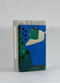
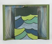
9379Old Stile Press 2009. Full Leather. Near Fine binding. Folio. 56 pp. illus. Limited edition number 193 of 195 copies signed by Onken at the colophon. A skilled and imaginative design binder and a graduate of the American Academy of Bookbinding fine binding program Brenda Gallagher has engaged with this modern telling of a story that comes from a long tradition of Celtic and Norse selkie stories. Full bound in green goat with onlays in fish leather that capture the movement of the waves in green blue and gray. Gallagher's binding wonderfully complements the tale both thematically and artistically as her bold stylized cover shares a harmony with Onken's woodcuts. But even subtler details bring this text and binding together like her skillfully woven silk endbands and the painted top-edge a lovely sea-green with the suggestion of vegetation as though looking down on the top-edge of the book is to look down into the sea. Housed in clamshell box. <br /> <br /> A finely printed and illustrated selkie story written by Brown in 1984 and first published here by the Old Stile Press. The cuts by Onken are beautifully done and are indispensable in conveying this story of a selkie who has been separated from her seal skin by a fisherman trapping her in her human form. Perhaps the most striking of Onken's cuts is only found on the publisher-issued binding as a pictorial pastedown on the front board. Gallagher whose engagement with this text is not limited to the binding relays the tale of disappointment when purchasing this book unbound and necessarily without this woodcut—perhaps the woodcut that resonated with her the most. Since the printer had no extra copies of the illustration Gallagher was driven to locate and contact Onken who had neither print nor the block from which the illustration was printed. Instead he offered to lend her a good drawing of the image. From this image Gallagher cut her own linoleum block and printed the illustration remarkably true to the original. That print serves as the front fly leaf in her binding—a one of one lino print. An exceptional designed binding by an American binder coming into her own. Old Stile Press unknown
1901840301901. DESIGN BOOK Kamisaka SEKKA Yoshitaka. SHIKISHI. Kyoto: Tanaka jihei Meiji 34 1901. 2 folios each 31.2 x 21.5 cm. Volume one has 2 color prints and 30 bw sumi prints volume two has 30 bw sumi prints. An interesting design book of subtlety. The covers are quite worn and stained and there is some internal wear and spotting as well. But overall a good early printing. Cord-bound fukuro-toji Japanese style with the title printed on the covers. Complete. unknown
1934891821934. DESIGN BOOK Yoshida Gyokujo compiler. TANSAI GAFU. Kyoto Happpodo Showa 9 1934. 2 vols. complete. Tall folios 36.7 x 25.4 cm orihon folded album in woodcut printed paper over board covers with printed paper title labels. There are 25 total full page color woodblock prints. Interesting style mixing flat solid colors with small naturalistic elements in a single print. Good impressions and colors. Complete in clasped chitsu case with printed silk label. Case is worn books about good. The set eventually ran to 4 volumes these are the first two produced. unknown
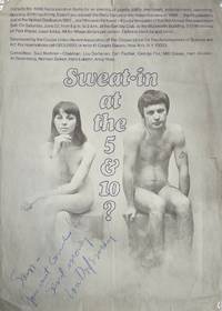
1968List2843New York City 1968. 20 x 28 inches. Folded with some tears at folds slightly wrinkled; inscribed “Sam – / You must come! / Send money / Lou Dorfsmanâ€. Very good plus. An invitation to the “Recooperation Baths†which seems to be an annual get-together for Cooper Union alumni. Cooper Union was founded in 1859 by business magnate Peter Cooper to offer a tuition-free education in practical areas such as architectural drawing shorthand and the like. No longer free Cooper Union now consists of three schools: art architecture and engineering. Graphic designer Lou Dorfsman 1918–2008 who inscribed this poster with a message for “Sam†graduated from Cooper Union in 1939. He would serve on its board of directors and as this poster states on its Alumni Committee. More famously Dorfsman was the art director and later creative director at CBS where he designed not just programming advertisements but also sets and the CBS headquarters’ interior. The poster promises alumni “an evening of gayety jollity merriment entertainment swimming dancing drinking dining†at the Woolworth Building in Tribeca – probably at its private basement swimming pool. unknown