[COLLECTIF]. MEIER-GRAEFE, Julius (dir.).Livre Rare Book
6 392 résultats
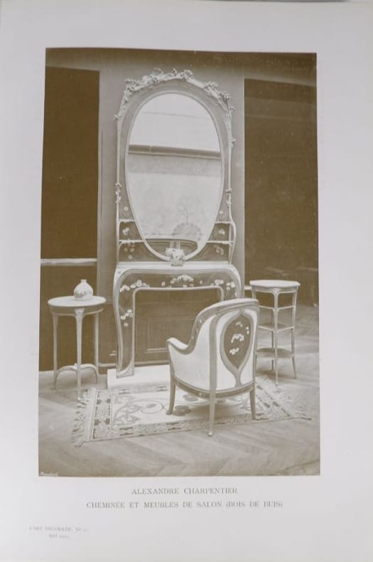
2404Paris, s.n., octobre 1900- mars 1902. 3 volumes consécutifs (n°25 à 42). In-4° - 20 x 29 cm. Cartonnages de l’éditeur à la Bradel en pleine percaline bleu-gris imprimés et illustrés sur le dos et le premier plat d’un décor bleu nuit de style Art Nouveau (filets et volutes), avec le même décor, mais à froid, sur les seconds plats. 2 ff. (table des matières, hors-texte en couleurs, illustrations), 268 pp. ; 266 pp., 2 ff.(tables) ; 260 pp., 2 ff. (tables). Fort belle série de 18 numéros reliés en 3 volumes consécutifs (n°25-30, 3e année-1e semestre, octobre 1900-mars 1901 ; n°31-36, 3e année-2e semestre, avril-septembre 1901 ; n°37-42, 4e année-1er semestre, octobre 1901-mars 1902) de cette prestigieuse revue fondée en 1898 par Julius Meier-Graefe, historien d’art, critique et galeriste allemand. Abondamment illustrées dans le texte (parfois à pleine page), et bien complètes de respectivement 12, 16 et 14 hors-texte en couleurs, soit 42 planches h.t. au total, les livraisons témoignent de la diversité des sujets abordés, ne laissant dans l’ombre aucun domaine des arts décoratifs : architecture, décoration intérieure, bijouterie, art textile, céramique, mobilier, reliure, typographie, sculpture, arts graphiques, orfèvrerie, etc. Plusieurs articles sont consacrés à l’Exposition Universelle de Paris 1900, et de nombreuses monographies évoquent les oeuvres des plus grands artistes européens du temps (T.-A. Steinlen, J. Chéret, H. Vever, G. d’Espagnat, A. Besnard, R. Lalique, G. de Feure, L. Métivet, Ch. Plumet, G. Auriol, T. Selmersheim, E. Gallé, L. Majorelle, V. Horta, A. de la Gandara, K. Moser, H. de Waroquier, E. Grasset, G. Canape, H. Guimard, F. Jourdain, A. Mucha, H. Sauvage, Tiffany, M. Michel, H. Rivière, A.Renoir, …). Rédigée avec le concours d’écrivains, critiques et intellectuels d’avant-garde, la revue contribua activement à la diffusion des principes de l’Art Nouveau triomphant. Chers clients Abebooks, le poids et le volume important de cet ouvrage entraîneront des frais postaux additionnels, merci de le prendre en considération avant votre achat. Dear Abebooks customers, the weight and volume of this book will entail additionnal shipping fees, thank you for taking it into consideration before ordering.
2 vol. in-4, pp.XXX, 218, 258, con 8 tavole fuori testo riproducenti le incisoni di Grimod de la Reyniere. Elegante copertina editoriale in cartoncino crème, sovracoperta in pelle con titolo in oro al dorso, astuccio in pelle. Magnifica edizione di 1000 esemplari ''sur vélin blanc pur chiffon fabriqué et filigrané au nom de Brillat-Savarin'' delle cartiere Ventura di Cernobbio. Il presente è il n.623, perfettamente conservato. L'edizione originale di questo notissimo classico della gastronomia era apparsa a Parigi nel 1826. La presente edizione adotta il testo di quella di Tessier del 1834. Esemplare freschissimo, un capolavoro della tipografia di Alberto Tallone uscito dai torchio di Alpignano. . .
1997010721Paris Le Cercle d'or 1997 In-4 carré En feuilles, couverture illustrée, emboitage éditeur
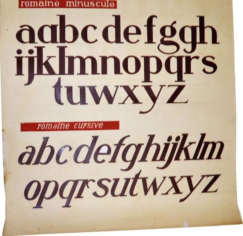
2244Sans lieu, sans éditeur, pièce unique, sans date (circa 1950-1960). Très grand format : 100 x 150 cm. Affiche originale, réalisée manuellement, au crayon et à la gouache (couleurs brun et rouge), sur papier.Il s'agit de l’œuvre d'un peintre en lettres pour servir de "catalogue" à ses clients. L'affiche comporte d'ailleurs 2 œillets afin de la suspendre plus facilement. L'artiste est très probablement Jacques Daugert ayant exercé cette profession en région parisienne dans les années 1950-1960.Nous disposons d'autres affiches de la même provenance, n'hésitez pas à les consulter. Pour des raisons de sécurité, l'affiche sera expédiée enroulée (en tube).
<p>22 cm, bella rilegatura coeva in piena pelle con titolo e fregi impressi in oro al dorso diviso da 5 nervi, filetti decorati impressi in oro ai piatti, risguardie ricoperte con carta marmorizzata, p. LXXXXVI, 427. Leggero alone al margine inferiore delle prime carte, poi ottimo. In barbe.</p>
105318Affiche originale de l'exposition Musée Stedelijk, Amsterdam 1977, impression offset noir et blanc sur papier translucide, 980x690mm. Papier jauni et traces de pliage avec un petit manque. M. Nannucci, ED/MN 1967/2016, Éditions Viaindustraie, Foligno, 2016, p. 42. (105318)
in-8, pp. (6), 434, bella legatura coeva in pelle, cornice floreale ai piatti, raffinati motivi geometrici e floreali al dorso, il tutto impresso in oro. Completo del ritratto in antiporta di S. Nersete. Il testo comprende 24 preghiere al santo stampate in 24 lingue diverse, fra cui l'etiopico, l'armeno, l'ebraico, il gaelico, il russo, il cinese, lo svedese, il turco, il siriaco, con l'uso dei propri caratteri tipografici. Il monastero armeno fu votato a San Lazzaro nel 1717 da una congregazione di monaci seguaci di Mechitar. Bell' esemplare di questo graziosissimo saggio tipografico stampato nel monastero armeno sull'isola di san Lazzaro nella laguna di Venezia.. .
1912115901912 Paris, Gravure et Fonderie G. Peignot et fils, sans date ( c. 1912); plaquette in-4 oblong broché de 24 pages non chiffrées illustrées et imprimées en noir , jaune orange, ocre et 4 feuillets sur papier fin gris illustrés et imprimés en noir pour : "Les vignettes" et "Les Galvanos". Couverture beige illustrée et imprimée en noir, jaune et ocre, dos muet qui porte en titre "Le Bellery-Desfontaines et ses Ornements". Très bel ouvrage qui renferme l'alphabet et les vignettes commandées par Peignot à Henry Bellery -Desfontaines.
<p>33 cm, rilegatura in mezza pergamena, titolo in oro al dorso, solido cofanetto originale, telato ; p. LXXXVII, 251, (8). In barbe, segnalibro. Edizione di 470 esemplari numerati in numeri arabi, il nostro n. 93 su carta Ventura di Cernobbio.</p>
1889054047Stuttgart, Julius Hoffmann, 1889. gr 4°, Halblwd. d. Zeit, 3 Bl., 121 TafelS. - Kanten etwas berieben, sonst gutes Exemplar
in-4, pp. 64, con un opuscolo e numerose incisioni n.t. e f.t., leg. in cart. edit (difetti al dorso). Splendida monografia sull'arte tipografica in Italia, la cui serie completa comprende: Fascicolo I, Francia e Belgio. Fascicolo II, Italia. Fascicolo III, Inghilterra, Stati Uniti d'America e Giappone.. .
1998240186Emmerthal, Edition Einstein 1998. 16 unpag. S. Durchgehend von Hans Witte typographisch illustriert. Quer-2°, 25 x 33,5 cm, ill. OPp.
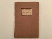
19379872AB1937. Portfolio with 6 prints by The Typophiles. New York 1937. 23 : 155 cm. With 6 booklets. Original cardboard portfolio. Portfolio of the Typophiles for the dinner party given for the british book-designer and author Beatrice Ward how wrote under the pseudonym of Paul Beaujon. There were published only very few portfolios of this type of this then young society of book-designers authors and book-lovers under the leadership of Pau. A. Bennett. They were all designed and produced by and for the members of the club. Contains: Paul A. Bennett Greetings - Paul Beujon Betrice Warde - The battle of the Century Beaujon verses Typophiles - Beatrice L. Warde Printing should be invisible - Stags and a few Dears A Souvenir - Alicis Paul Beaujon A portriat of him. - Very rare. unknown
19379872ABNew York, 1937. 23 : 15,5 cm. With 6 booklets. Original cardboard portfolio. Portfolio with 6 prints by The Typophiles.
19488956Aurora, Hammerpresse, 1948. V, 171 S. Gr.-8°. OLwd. (leicht berieben).
COMPLETE THREE VOLUME SET. RARE second edition of 'Voigt and Günther's Orbis pictus' - the classic illustrated textbook for children in the tradition of Comenius' 'Orbis Pictus'. Contains 90 full-page colored plates. [ALL VOLUMES]: 260x195mm. [148] + [138] + [VI+204] pages & 90 plates. Hardcover rebound with original boards (without the original spine). Gilt volume numbers on spine. Original boards and spine worn and stained. Cover corners and edges, and spine edges bumped and peeling. Few pages/plates slightly dirty. Some pages/plates age-stained. Few pages somewhat worn at corners and/or edges - no damage to text or plates. Pages yellowing and rough-cut. [VOL.I]: Ink inscription on front inner cover. Text page 45/46 edges worn, upper edge taped - NO damage to text. Plates XIII and XVIII mispaginated as nos.VI and VII. [VOL.3]: Puncture-marks on rear cover (not penetrating into inner cover). [SUMMARY]: This extremely rare and beautifully illustrated three volume classic children's textbook is otherwise in good condition. PLEASE NOTE: This item is overweight. We may ask for extra shipping costs.
Folio, [x],111,[3]pp., printed in Linotype Estienne with Civilite headings, Cockerell marbled paper boards, title label to spine, uncut. "This [library] was designed to be a guide and inspiration to a working printer and to illustrate the history of printing and all its adjuncts: types, pages, margins, woodcut and other decoration. The great names of Gutenberg, Fust and Schoeffer, Zel, Sweynheym and Pannartz, Wendolin of Speier, Jenson, Crantz, Gering and Friburger, and Caxton appear, and there are a number of examples of the fine borders and initials produced by the Zainers at Augsburg and Ulm and by Ratdolt at Venice."?Preface. Rogerson, 26.
Third Edition, corrected, xix,117,[3]pp., 2 fold-out lithographed plates, the first containing twelve figures of tools and implements, the second nine figures of printing presses and parts, both plates are lightly water-marked affecting the image, & with 1" marginal tear to vertical fold of each, final leaf includes publisher's advertisements for two additional titles by Hullmandel; front & back endpapers soiled, with early owner's signature (L. Stilson) & date on front pastedown, final two blank leaves bit stained, half calf with early marbled paper over boards, red leather label (3x2") with gilt border & title, "A Manual of Lithography", & the name "L. Stilson" added to front board; spine worn & rubbed with 1-1/4" piece missing at head & small label with black "C" at foot; 3" split in front joint; corners, edges & joints worn, paper boards chipped, edges of cover label chipped. Hullmandel's best know work and most influential publication is his book 'The art of drawing on stone' which was first published in 1824. But in terms of establishing lithography in Britain, his translation from the French of this treatise by Raucourt de Charleville was probably just as important. This third and final edition contains some important new additions. Colonel Antoine Raucourt was chief engineer at the Ecole des Ponts et Chauss?es in Paris and ran its in-plant lithographic press. His book was originally published in Toulon in 1819. Hullmandel thought highly of Raucourt's treatise and wrote in the preface: "The books which have hitherto been published on lithography are very imperfect, and are much more adapted to persons who already understand the art than those who wish to learn it... I have repeatedly wished for a guide to explain the new accidents which occur every instant, and which... appear each time so new and intricate, that the beginner is consequently tempted to give up all hopes of ever succeeding. I am consequently better enabled to appreciate the value of this excellent treatise on lithography, and hesitate not an instant to pronounce it the best work which has ever been published on the art." Bigmore & Wyman II, p.240; Twyman, pp.110-14.
Second edition, revised, 12mo, xxxvi,176pp., 12 illustrs., (6 of which are on 2 folding leaves), the folding leaves creased and waterstained, some light spotting and staining, bookplate of Jacob L. Chernofsky, new marbled endpapers, recent full calf. The second revised edition which was published in the same year as the first. It provides a good overall account of the art of lithography up this date and illustrates the apparatus involved along with examples of techniques. Michael Twyman, Lithography 1800-1850, p. 264.
2 Vols., 4to (280 x 215 mm), 141, [3]pp., number 17 of 50 de luxe copies signed by the author, Vivian Ridler and John Simmons, numerous plates and specimens tipped-in, quarter-bound red morocco, marbled paper boards, together with a portfolio of 12 additional specimen sheets, the whole presented in a slip-case, fine copy. Tells the story of the writing and printing of what was perhaps the masterpiece of printing in the 'Fell types' in the twentieth century: Stanley Morison's John Fell, the University Press and the 'Fell' types published by Oxford University Press in 1967. Prospectus inserted.
8vo (230 x 145 mm), title printed within a ornamental border, followed by [32] leaves of types specimens printed on rectos only, two minor worm pinholes, orig. cloth-backed blue card covers, worn, loss to front and rear cover covers. An apparently unrecorded specimen book from this firm of commercial printers. The firm traded from 14 College Hill, Cannon Street, London from c. 1895 to c. 1909, and were formerly connected with the house of Edward Saunders & Son. They specialised in supply banks and commercial houses with all manner of suitable stationery and account-books, all produced by the best and most artistic kind of lithographic and letterpress printing. No other copy located.
1911bf2329Imprimerie des cours professionnels Relié 1911 In-folio, relié, demi chagrin bordeaux à coins, dos à quatre nerfs, caissons ornés de figures géométriques dorées et de maroquin vert mosaïqué, tête dorée, les deux plats de la couverture sont conservés, 480 pp., manuel de composition typographique, très nombreux exemples in et hors-texte, parfois en deux tons, voire plus, envoi de Victor Breton ; quelques petits frottements à la reliure, par ailleurs reliure en bel état et intérieur en très bel état. Livraison a domicile (La Poste) ou en Mondial Relay sur simple demande.
1999J053(Hamburg), Raamin-Presse, 1999. (Neue Reihe der Raamin-Presse, Hamburg, 1. Druck) - Nummer 7 von 250 Exemplaren, im Druckvermerk von Hans Magnus Enzensberger und Roswitha Quadflieg signiert. Erste Ausgabe. Buchkunstobjekt aus der heersten zeitgenössischen Presse, eine typographisches Kostbarkeit ersten Ranges: "Handsatz aus der Grotesque bold extendet und Druck des Textes Offizin Haag-Drugulin, Leipzig. Die beiden, sich von der ersten bis zur letzten Seite wiederholenden Textausschnitte in der Vendôme halbfett". Der eigentliche Text des Dramas ist auf Transparentpapier in serifenlosen Typen mit Schwarzer Farbe gedruckt, im Hintergrund erscheint in weißer Farbe ein versetzter Text in einer Serifentype, der in den senffarbenen Vorsatzpapieren weitergeführt wird, nun in schwarzen Lettern. Die Bilder der Roswitha Quadflieg wurden von den Originalplatten von Till Verclas auf chinesisches Chang Chuen Cotton Papier gedruckt, die geschmackvoll aufeinander abgestimmten cremefarbigen gelben und tiefschwarzen Zwischenpapiere sind Bugra Bütten, die auch für den Einband benutzt wurden, geliefert durch Japico Feinpapiere, Dietzenbach. - Der Einband wurde mit Antiqua-Lettern im Siebdruckverfahren von Ute Behling bedruckt und in der Buchbinderei Christian Zwang, Hamburg, gebunden. Sauberes und wohlerhaltenes, nahezu tadelloses Exemplar.
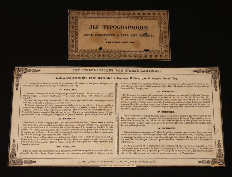
kk3003A Paris, chez Jules Renouard, libraire, rue de Tournon, n°6 Sélection Abraxas-libris Etiquette "RARE.Très intéressant et très curieux jeu typographique pour apprendre à lire aux enfans. Jules Renouard, sans date [la première édition du Jeu Typographique date de 1814]. Nous proposons ici deux étiquettes imprimées dans un encadrement orné : étiquette de titre et étiquette d' ""Instruction nécessaire pour apprendre à lire aux Enfans, par le moyen de ce Jeu"" qui devaient être apposées sur la boîte renfermant les lettres découpées de la méthode du prêtre et pédagogue Louis Gaultier. Seul enseignant du lycée qu'il ouvrit pour les enfants de familles immigrées lors de son exil en Angleterre pendant la Révolution, l'Abbé Gaultier fut le précurseur de l'enseignement mutuel en faisant des élèves les plus habiles des professeurs pouvant instruire le niveau inférieur ; petits trous dans l'étiquette de titre, par ailleurs bel état. Livraison a domicile (La Poste) ou en Mondial Relay sur simple demande."
1802105430BBParis, Pierre Didot l'ainé, 1802. 8°. XII, 412 S.; [2] Bl., 390 S., [1] Bl.; [2] Bl., 390 S.; [2] Bl., 387, (1) S. Dunkelgrüne Hldr. d. Zt. mit jeweils 2 goldgepr. Rückensch. u. dekorativer Rückenvergoldung. 4 Bände. [8 Warenabbildungen] Edition stereotype, d'après le procédé de Firmin D