Baumeister, WilliAntiquariat.de

6 389 résultats
192765577ABStadt Stuttgart., 1927. 15,0 x 10,5 cm. 1 Blatt. OKarton-Karte., 65577AB Sehr gutes, frisches Exemplar.
23200Paris, Edouard Cornély & Cie, éditeurs, 1907. With portrait-frontispiece and 11 plates, 1 facsimile and 2 maps. xl, (2), 688 pp. 8vo. Contemporary half vellum, marbled boards, original covers preserved. Stammhammer, Bibliographie des Sozialismus, iii, p. 272. Original edition. Indispensible source for the study of the Icarian movement. The author made use of the archives of Beluze, today dispersed and even partly lost. The bibliography is the best known and most elaborate. - Wonderful copy: with a handwritten and signed dedication by Prudhommeaux on the half-title and with a coloured portrait of Cabet painted on the spine.
889898Vodaine Basse-Yutz 1963 In-8 carré ( 270 X 215 mm ) de 23 pages, en feuilles sous couverture imprimée rempliée. 5 gravures originales de Jean VODAINE hors-texte. EDITION ORIGINALE, 1 des 100 exemplaires sur Balkis de Lana justifiés et signés par Jean VODAINE au colophon. Couverture tachée, bel état intérieur.
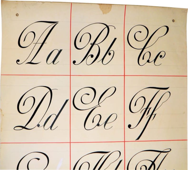
19602241Sans lieu, sans éditeur, pièce unique, sans date (circa 1950-1960). Très grand format : 100 x 150 cm. Affiche originale, réalisée manuellement, au crayon et à la gouache (couleurs chocolat et menthe), sur papier.Il s'agit de l’œuvre d'un peintre en lettres pour servir de "catalogue" à ses clients. L'affiche comporte d'ailleurs 2 œillets afin de la suspendre plus facilement. L'artiste est très probablement Jacques Daugert ayant exercé cette profession en région parisienne dans les années 1950-1960.Nous disposons d'autres affiches de la même provenance, n'hésitez pas à les consulter. Pour des raisons de sécurité, l'affiche sera expédiée enroulée (en tube).
19602248Sans lieu, sans éditeur, pièce unique, sans date (circa 1950-1960). Très grand format : 100 x 150 cm. Affiche originale, réalisée manuellement, au crayon et à la gouache (couleurs noir, vert et rouge), sur papier.Il s'agit de l’œuvre d'un peintre en lettres pour servir de "catalogue" à ses clients. L'affiche comporte d'ailleurs 2 œillets afin de la suspendre plus facilement. L'artiste est très probablement Jacques Daugert ayant exercé cette profession en région parisienne dans les années 1950-1960.Nous disposons d'autres affiches de la même provenance, n'hésitez pas à les consulter. Pour des raisons de sécurité, l'affiche sera expédiée enroulée (en tube).
17606364Alphabets Anciens et Modernes. 25 gest. Tafeln von Niodot u. a. nach Goussier u. des Hautesrayes. [Paris ca. 1760]. Folio (ca. 45 x 30 cm). Lose nicht gefaltete u. beschnittene Bogen.
1908V102974Haarlem, Erven F. Bohn 1908 XXXIV + [2] + 404pp., with ca. 520 illustrations of type specimens etc. (many of them are full-page) + 4 colour ills. (mounted on 1 plate), text in French, original publishers's hardcover in gilt tooled cloth, folio (38x30cm.), printed on handmade paper, very good condition, [Original edition of a richly illustrated and learned history of printing-types and vignettes used in the Netherlands from the 15th till 19th cy.], weight: 3,7kg., V102974
XXXIV + [2] + 404pp., with ca. 520 illustrations of type specimens etc. (many of them are full-page) + 4 colour ills. (mounted on 1 plate), text in French, original publishers's hardcover in gilt tooled cloth, folio (38x30cm.), printed on handmade paper, very good condition, [Original edition of a richly illustrated and learned history of printing-types and vignettes used in the Netherlands from the 15th till 19th cy.], weight: 3,7kg., V102974
1936107262BBLondon, Shenval Press, 1936-1938. 4°. Mit zahlr. teils mont. und farb. Abb. und Beilagen. OKart. mit Kunststoff-Ringheftung. 7 Bände. [16 Warenabbildungen]
46400177, Parisiis A.A. Renouard, typis P. Didot natu Majoris, 1795; in-folio, demi-veau vert, dos lisse avec ornements dor. et à froid, tr. marbr. (Reliure romantique) Chef-d'œuvre typographique dû à Pierre Didot l'aîné, cette grande édition de la Pharsale n'a été tirés qu'à 212 exemplaires. Pierre Didot avait déjà donné en 1791, dans le même format un Virgile auquel Renouard fait allusion dans sa préface «splendido editio!» Ces grandes éditions de classiques latins, tirées à petit nombre, sont en quelque sorte les premiers essais pour les luxueuses publications illustrées par les artistes néo-classiques, connues sous le nom """" d'éditions du Louvre"""" que P. Didot donnera à partir de 1798. Le verso du dernier feuillet porte la JUSTIFICATION AUTOGRAPHE de l'éditeur Renouard """"Cent soixante treizième, sur deux cent douze"""". Bel exemplaire provenant de la bibliothèque du Vicomte d'Aboville ( ex-libris.)
176512133Den Haag, Paris und London, N. van Daalen, de Bure und Wilcox, 1765. 2 Tle. in 1 Band. 2 gest. Porträts, 1 gef. Tabelle, 10 ( davon 2 gefaltet, bzw doppelblattgroß) Kupfertafeln, 1 Textkupfer. XI, 260, VIII, 312 S. 4°, Pappe der Zeit mit goldgepr. Rückenschildchen. Berieben, bestoßen, am oberen Kapital schadhaft.
2003bf5171Robert et Lydie Dutrou, éditeurs Feuilles sous chemise et emboitage 2003 "NUMÉROTÉ ET SIGNÉ--PARFAIT ETAT. Paris, Robert et Lydie Dutrou, 2003. In-4 (22 x 31 cm), exemplaires en feuilles sous chemise et coffret entoilé, texte inédit de Raymond Queneau accompagné de gravures de Jean Cortot, exemplaire n°4/60, signé par l'auteur et tiré sur vélin de Rives. Ouvrage édité à l'occasion du centenaire de la naissance de Raymond Queneau. Envoi de l'auteur et invitation à la présentation de l""ouvrage ; parfait état. Livraison a domicile (La Poste) ou en Mondial Relay sur simple demande."
196713168BBBasel, Hamburg, Wien, Basilius Presse, 1967. 33,5x29,5 cm. 4 Bl., 22 Tafeln mit mont. farb. Abb. Lose in OBr.- und OKt.-Decke mit Schutzumschlag.
1932ARTE2345Praha, Petr 1932. 208 S., überw. Illustration(en), zahlr. graph. Darst., einige Seiten mehrfarbig gedruckt, OHLn. mit rot geprägtem Rücken- u. Deckeltitel, Typografie und Layout von Karel Teige. Sehr gut erhalten und im Originalzustand, ohne Schutzumschlag. Erste Ausgabe. Bolliger VI,696. - Erste Werkmonographie des Architekten Jaromír Krejcar (1895-1950), Hauptvertreter des tschechischen Funktionalismus. Krejcar war ein enger Freund von Teige, mit dem er sich schon früh in der Dev?tsil-Bewegung engagierte. Das Buch ist zum Teil eine umfassende Darstellung seiner realisierten Bauten, enthält aber auch nicht realisierte Projekte sowie Arbeiten zu Stadtplanung, Innenarchitektur, Graphik und Design. Eine der wichtigsten Architekturpublikationen der tschechischen Architektur jener Zeit. Text in tschechischer Sprache, mit Bildlegenden und Zusammenfassungen auf Russisch und Deutsch.
1957EDZZ1989Teufen, Niggli 1957. gr.-8°. 213 Seiten, OLn. mit schwarz geprägtem Rückentitel, Orig.-Umschlag, dieser leicht gebräunt, sonst sehr gutes Exemplar. Typographisch die erste bedeutende Äußerung der schweizer Typographie nach Tschichold. Umschlag und Typographie von Karl Gerstner, wie Kutter einer der drei Mitbegründer der seinerzeit bedeutenden Werbeagentur GGK.
199578263Ffm., Basel, Göttingen: Stroemfeld u. Wallstein 1995-2020. Zus. 3.590 Ss., 24 Bll. Gr.8° (Hefte 1-6) u. 4° (Heft 7 ff.). Kt.
8vo., First Edition, with portrait frontispiece and plates; handsomely bound in dark red full crushed morocco, sides with gilt frame border, back with raised bands, second and fourth compartments lettered and ruled in gilt, all other compartments tooled in gilt, gilt top, hand-made endpapers, a most attractive copy ideal as a gift or for presentation.
1918ABE-1693603570673Dill & Collins 1918 Original pictorial paper boards newly rebacked with matching paper. Illustrations throughout featuring the work of 30 graphic designers ranging from decorative initials and ornaments to reproductions of posters and magazine covers many of them full-page one double-page mostly in color. Printed on specimens of 30 different types of paper made by Dill & Collins seven of the leaves with multiple paper. Owner's signature of Jeanette E. Samuelson of the N.Y Herald Tribune dated 1933 on front fly leaf with her gift inscription. Rear paste-down with the bookplate/shelf label of Will Ransom. Corners and portions of edges of the paper boards somewhat worn two-inch tape repair to rear in one leaf crossing a very small portion of a border without loss first few leaves a bit spotted around margins many leaves slightly darkened a few additional trivial spots otherwise an excellent copy generally quite clean. Rare. 1st Edition. Hardcover. Very Good. Dill & Collins hardcover
19317431Praha: Druzstevnà práce Orbis 1931. Octavo 19 x 14 cm. 355 4 pages. Stated fourth printing "Ctvrté vydánÃ" one of five hundred copies printed. The colophon states there were cloth and leather binding issues but does not state the number of each. Originally published in 1919 Sup was one of the first works and I believe the first novel of Emil Vachek journalist playwright and novelist and inventor of the Czech detective story. This later edition was issue in the prestigious and design-wise ground breaking Druzstevnà práce by Orbis. The series was overseen by the great Ladislav Sutnar who also contributed the typographical design for each volume. Fine in full cream-colored calf with gilt decorative design by Josef Kaplicky Czech sculptor generally in a social realist style and father of the significant architect Jan Kaplicky. Signed on a preliminary leaf by the author. OCLC locates only one copy of this issue National Library the Czech Republic and five copies with similar pagination but carrying the Sfinx imprint none of either imprint in the U.S. Druzstevnà práce [Orbis] hardcover books
1822BB1085London: Published By R. Ackermann At The Repository Of Arts 101 Strand London; And To Be Had Of All The Booksellers In The United Kingdom 1822. Full Leather. Very Good . First Edition of the "last of the genuine or 'authorized' Syntax books" Abbey first issued in eight monthly parts. Royal 8vo 236 x 1452mm: iv267pagination irregular but text complete1pp with 24 hand-colored aquatints by Thomas Rowlandson. Contemporary straight-grain morocco gilt boards framed in gilt and in blind with leaf-and-flower rolls rebacked with part of original spine and red morocco lettering piece laid down marbled end papers. A Very Good or better copy generally clean and bright with first and final leaves including title page foxed usual offsetting from plates very occasional finger-soiling. Abbey Life 268. Tooley 413. Grolier Rowlandson 48. Martin Hardie 174-75. As early as 1809 the publisher Ackermann had hired Combe to write the letterpress to accompany many of Rowlandson's most successful illustrations including those for the final volume of the "Microcosm of London" and perhaps especially for the illustrations that resulted in the series of comic poetry for which Combe is still most famous and which earned him his nickname Doctor Syntax: The Tour of Doctor Syntax in Search of the Picturesque and its two sequels 1812 1820 1821 The English Dance of Death 1815 1816 The Dance of Life 1817 and finally The History of Johnny Quae Genus the Little Foundling of the Late Doctor Syntax 1822. "Combining light-hearted satire of William Gilpin's theory of the picturesque in art with a central character modelled on Cervantes' Don Quixote and Henry Fielding's Parson Adams Combe created a lovable eccentric whose misadventures on the road structure the Tour. For over a century the many editions and numerous imitations of the Tour attested to the popularity of Combe's humorous hero." ODNB N. B. With few exceptions always identified we only stock books in exceptional condition. All orders are packaged with care and posted promptly. Satisfaction guaranteed. Fine Editions Ltd is a member of the Independent Online Booksellers Association and we subscribe to its codes of ethics. Published By R. Ackermann, At The Repository Of Arts, 101, Strand, London; And To Be Had Of All The Booksellers In The United Ki unknown
Thick 8vo, 24pp., followed by [212] leaves (mostly printed on one side only), a couple of samples excised from to leaves, orig. decorated cloth, gilt, a very good copy. This specimen book presents a fine and extensive example of the period. Provenance: From the library of Ruari McLean with his signature to front-endpaper.
6811imprimerie spécialisée dans les menus,6 rue Servan,Paris, sans date,vers 1920.Très bel album pour représentant de commerce.Format grand in 4,11 feuillets de bristol, feuillets intercalaires de papier cristal légendés. Cartonnage d’éditeur,demi-toile verte,titre doré sur le premier plat.L’Album contient un étonnant ensemble de 100 modèles de superbes menusgaufrés, imprimés,en or,en argent ou en couleurs, avec une typographie et des ornements très typique des années 20,ainsi que des cartes de table et de visite.Le tout,classé par série et mode d’impression,est contrecollé et en parfait état de conservation.On joint 3 albums,in 8 étroit broché, Novembre 1931 mai 1932(tarif) janvier 1939 tarif producteur en suspension de taxe. Peu courant
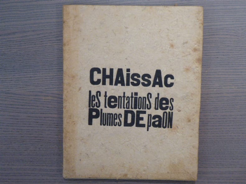
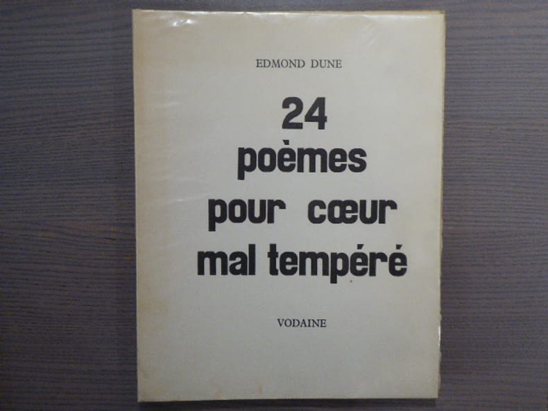
216999Vodaine Basse-Yutz 1967 In-4 ( 330 X 260 mm ) de 80 pages, en feuilles sous couverture imprimée rempliée. 6 gravures hors-texte de Jean VODAINE. EDITION ORIGINALE, Tirage à 150 exemplaires celui-ci 1 des 20 d'auteur H. C. sur Lana signé par Edmond DUNE et Jean VODAINE au colophon. Bel exemplaire.
19282348Bruxelles, Plantin, sans date (circa 1928). Grand in-8 - 20 x 27,5 cm. Reliure à la Bradel de l’éditeur, en pleine toile noire, dos lisse et premier plat titrés à l’or, filet à froid en encadrement des plats, tranches aubergines. XII, (1 f.), 106 pp., (I f.), 107-159 pp. (I f.), 160- 200 pp. (pagination continue), 3 pp. (supplément). Ouvrage multilingue : principalement en français, flamand et néerlandais mais aussi en anglais, allemand, espagnol et latin. Exemplaire enrichi d'une lettre commerciale tapuscrite (2 feuillets), signée du directeur C. Vreeling, datée du 1er mars 1932, à destination de l'Imprimerie Bastiaire à Chamalières (63). Fondés en 1911, les établissements Plantin avaient pour but la fabrication et le commerce de tous articles employés dans l’industrie de l’imprimerie, notamment typographique et lithographique. A partir de 1920, ils édifièrent un important complexe industriel, fleuron de la société, rue de la Braie à Bruxelles, pour la fonte de caractères typographiques. Cette fabrique porta le nom de Plantin aux quatre coins du monde.
19122172Paris, G. Peignot & Fils, sans date (circa 1912). Format oblong, 28,5 x 23 cm. Broché, premier plat titré. 36 pages. Grâce à la qualité graphique de ses lettres, Bellery-Desfontaines se fit remarquer par le fondeur Georges Peignot, qui lui commanda un véritable alphabet. Ce caractère, qui porte le nom de son créateur, fut disponible à partir de 1911, après avoir été présenté au Salon des Artistes Décorateurs de 1910, lors de l’exposition rétrospective des oeuvres de l’artiste. Exemplaire complet des 6 feuillets en papier gris (3 en début et 3 en fin d’ouvrage) présentant les ornements : vignettes et galvanos.