KHAÏR-EDDINE (Mohammed)Livre Rare Book
Pharsalia
214Parisiis : apud Lefèvre, 1822. ÉDITION IMPRIMÉE SUR GRAND RAISIN VÉLIN SATINÉ DANS UNE FINE RELIURE SIGNÉE HERING & MULLER

Librairie-Galerie Emmanuel Fradois · Paris, France300,00 €
6 392 résultats
5327Jean-Paul Michel éditeur, Brive, 1966. Imprimé à la main en Plantin corps 24 ; 170 ex. sur papier paille numérotés 1 à 170, 100 ex. sur kraft 90 g, numérotés 171 à 270 ; en feuilles sous jaquette kraft. 24p., 30,5 x 43 cm.
214Parisiis : apud Lefèvre, 1822. ÉDITION IMPRIMÉE SUR GRAND RAISIN VÉLIN SATINÉ DANS UNE FINE RELIURE SIGNÉE HERING & MULLER
1818PHO-2123Paris, [Imprimerie de Molé] pour J. Eberhardt, 1818-1819. In-4 (26,8 × 21,2 cm), 24 pages non chiffrées, texte en arabe, encadrements et séparations ornementales, non coupé tel que paru.
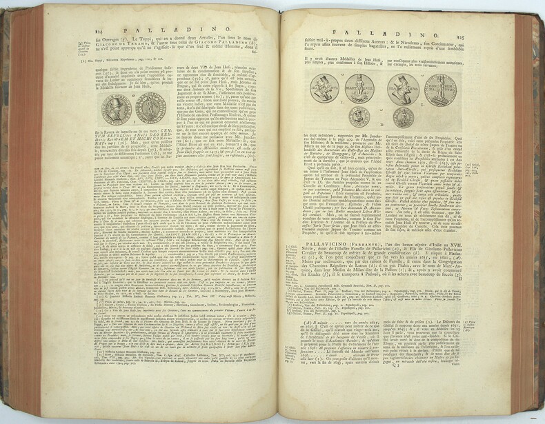
1758PHO-2105La Haye, Pierre de Hondt, 1758-1759. 2 tomes en 1 vol. in-folio (41 × 26 cm). 4ff.-330pp.-3ff., 2ff.-328pp.-14ff. Reliure de l’époque en veau brun, dos à nerfs orné, pièce de titre rouge, tranches rouges, coins émoussés, coiffes absentes, dos manquant, frottements, épidermures, premier plat fragile, mouillure angulaire, quelques brunissures.
In-8° (253x160mm), pp. (8), 177, legatura del tempo p. percallina nera con titolo in oro al dorso. Sguardie pavonate. Annotazioni alle pp. 161 e sgg. Ottimo stato. Prima e unica edizione, rara. Il Marocco fu collegiale onorario del santuario di Oropa, dottore in teologia, membro corrispondente di numerose società accademiche. Gli si debbono numerose opere di storia locale piemontese. Italiano
1724o.J. 4° (31 x 23 cm). 30 n.n. Blatt mit 144 montierten fotografischen Bildern und 4 hinreißenden, rot-schwarzen Original-Farblithographien im Art Deco-Stil auf den Vorsätzen. Vollständig. Seltenes Sammelalbum mit leichten Alterungsspuren. Einband an den Kapitalen leicht bestoßen, innen und außen teilweise etwas stockfleckig, sonst gut erhalten.
588356At The Sign Of The Pegasus Paris 1927 In-12 carré ( 190 X 130 mm ), demi vélin ivoire, plats de cartonnage vert. Edition en fac-similé par Albert FRISCH, du seul exemplaire connu du premier traité sur la construction des lettres majuscules romaines, Parme vers 1480, avec une introduction de Stanley Morison et la traduction du texte original en anglais. Police et corps en italique Blado 13 et 10. Tirage limité à 350 exemplaires sur papier d'Arches. Très bel exemplaire.
28176Paris, Editions de France, " Joyaux de la typographie ", 1960. Grand in-4, en feuilles, couverture illustrée et rempliée, chemise et étui éditeur, (ex-libris).
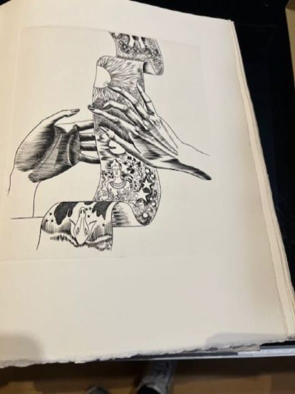
Paris, Editions de France, " Joyaux de la typographie ", 1960. Grand in-4, en feuilles, couverture illustrée et rempliée, chemise et étui éditeur, (ex-libris). Tirage limité à 490 exemplaires. Un des 425 ex n° sur vélin d'Arches. 25 burins originaux de Michel Jamar, dont un sur la couverture, un frontispice et 23 hors-texte. Bel exemplaire. Artiste de talent, le graveur lorrain Michel Jamar (1911-1997) est l’auteur de nombreuses illustrations, gravures, peintures et ex-libris. Formé à L’Ecole des Beaux-Arts de Nancy où il est l’élève de Victor Prouvé, il allie les talents du peintre, du sculpteur, du céramiste, du décorateur, du buriniste mais c’est surtout comme graveur sur bois qu’il donne naissance à des œuvres des plus originales. Récompensé en 1981 par le grand prix de la gravure sur bois de l’Académie des beaux arts de France, son travail s’inscrit parmi l’œuvre des grands graveurs lorrains.
195211245Lyon, Audin, le 31 décembre 1952 ; in-24, broché ; (48) pp. non chiffrées, couverture crème décorée, ouvrage imprimé en noir et rouge sur un vergé écru pur chiffon fait main ; le premier et le dernier feuillets sont blancs.
in-4, pp.187, con 48 tavole fuori testo di campionari di caratteri tipografici. Copertina editoriale in cartoncino muto. Importante monografia sui caratteri mobili della tipografia settecentesca, profondo studio bibliografico e tipografico. Edizione di 2000 esemplari non venali (numero 1103), accuratamente impressi su carta a mano. Il presente a pieni margini, perfetto.. .
First edition, large 8vo, xii, 168pp., one of 300 copies, coloured frontis., 18 plates and inserts (collotype, photogravure and line: one coloured), some folding and others of 4 & 8pp., orig. buckram, spine gilt with red leather label, uncut. This important critical biography of the founder and part proprietor of the Morning Post, The World, The Oracle or Bell's New World, Bell's Weekly Messenger, La Belle Assemblee, original proprietor of the The British Library, Bell's British Theatre, Bell's Poets of Great Britain and Bell's Edition of Shakespeare is an elegant production. There are appendixes on Bell's book and newspaper typography, the story of his types in the United States, and his type specimens. Appleton 94.
19594604New York / Basel SW: Hastings House / Teufen Ar. A. Niggli 1959 . First edition. Hardcover. Very Good/issued without. Square octavo 248 pages clothbacked boards rear joint repaired in publisher's worn slipcase. Scarce. <br/><br/>"This international pictorial survey takes modern graphic art from its origins through the present-day achievements and concludes with a look into the future. Although 'graphic art' is limited here to art in the service of advertising there is no limit to the artistic value of the means employed - this is a selection of the best work in the field past and present. Contemporary graphic art - work done since the end of the World War II - is presented in the second and more comprehensive part of the book. It includes a wide range of media and techniques among which are: Newspaper advertisements leaflets catalogues posters displays lettering packages business stationery trade markes and devices." Trilingual text in Englilsh German and French. 432 illustrations of which 12 are in full colour. Printed in Switzerland. "Gerstner is one of the most important innovators in typography commercial art and corporate design - Swiss National Library." Includes treatments of trade marks book jackets posters magazines etc. Hastings House / Teufen, Ar., A. Niggli hardcover
19780007014Boston & Lexington KY: D. R. Godine 1978. First Limited edition. Hardcover. Fine/issued without. Quartos 57 213 pages quarter brown morocco brown cloth covered boards in matching cloth slipcase. <br/><br/>These are copies XXXII of 50 deluxe copies of printings of 500 and 550 copies. The second title carries the imprint of The Anvil Press 1981. Both volumes were designed by Martino Mardersteig and printed at his Stamperia Valdonega Verona Italy. These two companion volumes were later joined by VICTOR HAMMER: AN ARTIST'S TESTAMENT. Sir John Rothenstein was the Director of London's Tate Gallery. His volume includes 19 color plates. Hammer''s volume includes bibliographies of Victor Hammer and his four presses. D. R. Godine hardcover
192855499München: Albert Langen 1928. First edition. Softcover. Good- to good condition. Quarto. 251pp. Original tan wraps with brown lettering on cover and spine. Dedicated to E. H. F. Porsche. Cover by E. A. Enders. Font and typography similar to the Bauhaus book-series.<br /> <br /> 'Style seen strictly aesthetically demands foremost a consistent uniform character of an object or matter. We know that because we easily detect violations against this rule finding the objects violating it tasteless in bad style;' this is how Kollmann opens his introduction. Therefore Kollmann concludes: "Style is a basic aesthetic demand that is to say that of unity not to be confused with the delight humans take in the decorative. <br /> <br /> An extensive treatise of industrial architecture and design including factories bridges cranes masts ships airplanes and Zeppelins cars trains machines and their pats. The book is profusely illustrated with 151 b/w reproductions of photographs and some technical drawings. Contains notes on text and pictures and bibliography at rear. Text in German. Light wear along edges of covers. Minor foxing of endpapers and foredge of block. Previous owner's stamp on half-title. Albert Langen unknown
1822BB0354London: Printed for Samuel Richards and Co. 3 Grocers'-Hall Court Poultry; and T. Mason & Sons 2 Great Russel Street Bloomsbury 1822. Paper-Covered Boards. Very Good . The "best scandalous chronicle of the day" complete in three volumes. Tooley 12mo: viii319; 321; 326pp with 12 hand-colored plates engraved by Maddocks E. F. Burney and W. Read. Uniformly rebound to style by Fitterer with period marbled paper-covered boards and modern paper labels top edges gilt end papers renewed with laid paper. Bindings pristine; some gatherings foxed in volume I otherwise a very good or better set with only sporadic foxing and offsetting from the plates which are generally fresh and bright. Tooley 283 for 1821 octavo edition. Originally published pseudonymously in 1760 in two volumes. This Johnston's chief work spelled variously Johnston Johnson and Johnstone "appeared in four volumes between 1760 and 1765. The first and second volumes were written during a visit to the earl of Mount-Edgcumbe in Devon and had already gone through three editions before Johnstone was prevailed on to write the concluding two and the whole work was frequently reprinted during the eighteenth century and translated into French. An excoriating satire that won Johnstone respect as a wit but few friends the novel is set roughly during the period of the Seven Years' War 1757–63 and pretends to reveal political secrets and to expose the private profligacy of many of the well-known—and highly colourful—public characters of the time." ODNB N. B. With few exceptions always identified we only stock books in exceptional condition. All orders are packaged with care and posted promptly. Satisfaction guaranteed. Fine Editions Ltd is a member of the Independent Online Booksellers Association and we subscribe to its codes of ethics. Printed for Samuel Richards and Co. 3, Grocers'-Hall Court, Poultry; and T. Mason & Sons, 2, Great Russel Street, Bloomsbury unknown
1962qam1fentduEigenverlag / DuMont, 1962. Jubiläumsgabe der Drucker des DuMont-Verlages zum 10jährigen Dienstjubiläum von Alfred Neven DuMont, 1962. Eine Zeitreise durch die Geschichte des Verlages von 1952 bis 1962 mit besonderer Berücksichtung der durch Neven DuMont eingebrachten Änderungen und Neuerungen im Verlagswesen: Demoskopische Analysen durch Marktforschungsinstitute. Verbesserung und Erweiterung des redaktionellen Teils. Bunte Blätter. Die Fernsehseite. Änderung des Zeitungskopfes. Wachsende redaktionelle Leistung. Weltblick geplatzt. Kölner Stadtanzünder. Neuorganisation der Anzeigen-Abteilung. Trennung der Agenturen in Anzeigen und Vertrieb. Akquisiteure, Vertreter, Werber. Umbau der Geschäftsstellen und Agenturen. Entwicklung der technik. Papierverbrauch. Preisentwicklung. Auglagenentwicklung. Fluktuation. Zahlr der Anzeigen in den Hauptausgaben. Werbung. Umsatz, Anzeigen und Vertrieb. Sehr aufwändig und phantasievoll, teils mehrfarbig illustriert: 130 Aufnahmen, davon 128 einzeln solarisierte Diapositive, davon 28 tongetrennte, teilweise 4 fach solarisierte Negative, 76 Vergrößerungen 18 x 24, 12 Vergrößerungen 18 x 48, davon 9 Vergrößerungen mit Montage und Mehrfachbelichtungen bis zu 18 mal. Fotografiert, solarisiert, geklebt, gezeichnet, gebastelt und fotomontiert von Claus Schmid und Hans Günther Schmitz. Numerierte Auflage, Nr. 29. Einband, Rücken, Seiten leicht angebräunt, gering lichtrandig, sauber. 4° Querformat [4 Warenabbildungen] Original-Leinen
In-4° pp. 312 con 15 tav. a col. n.t. Bross. edit. con sovracopreta in velina trasparente più cartella protettiva ed in custodia. Ottima la conservazione, tiratura di 640 copie numerate 374.
192081486(Berlin, 1920). 5 nn., XVI, 2 Bll. Zierhandschrift in schwarzer Tusche auf dünnem Papier. Mit 1 mont. Abb. nach einer Tuschzeichnung von Liang Kai. 4to. 29,5 cm. Schlichtes Ln.
In folio (49,2×34,5 cm); (66) pp. Brossura editoriale con tavola incisa da Armando Baldinelli al piatto anteriore entro cornice azzurra e la xilografia "Foot-Ball" di Ugo Lucerni al piatto posteriore. Leggere tracce di polvere ai piatti e una macchiolina di acqua al margine alto del piatto anteriore. All'interno in buone condizioni di conservazione. Rarissima opera, due soli esemplari censiti in ICCU, in tiratura di soli 60 esemplari numerati, questa è la copia numero 8, di questa importante opera xilografica. Dedica autografa del celebre artista e studioso dell'arte grafica, fra gli innovatori dell'arte grafica italiana della prima metà del XX° secolo, Cesare Ratta al grande caricaturista Umberto Tirelli. L'opera venne curata dallo stesso Ratta che formava, nella città natale di Bologna, nuove generazioni di incisori. Ratta fu il fondatore della prima cooperativa di muta assistenza dei tipografi ed una delle personalità di punta del movimento tipografico ed incisorio italiano della sua epoca. Personaggio dalle spiccate doti diplomatico fu in contatto con tutti i più grandi artisti della stampa italiana dei suoi tempi che contribuirono a più riprese ad illustrare le sue pubblicazioni. La sezione bolognese della Federazione italiana dei lavoratori del libro lo designa a presiedere la commissione che sta progettando di realizzare una scuola professionale per la città, come già hanno fatto Milano e Torino. È l'inizio di un'avventura difficile ma appassionante, che coinvolge il comune, alcuni industriali del settore e persino un bibliotecario esperto come Albano Sorbelli. Ratta si dà da fare come non mai per reperire fondi e convincere gli scettici, fino a che, dopo cinque anni, nel 1913, la Scuola finalmente apre.Gli insegnanti non hanno titoli accademici, sono semplicemente operai esperti del lavoro, che mettono a disposizione le conoscenze pratiche acquisite negli anni. Ben presto, oltre ai giovani da avviare alla professione, la scuola accoglie, di sera, gli adulti che già lavorano, perché, come scrive Ratta, occorre "integrare e perfezionare l'ordinaria istruzione pratica che l'operaio riceve in officina, insegnandogli quei processi razionali, quelle formule, quelle finezze di lavoro, che nell'affrettata produzione industriale egli non ha agio di imparare" (da Re-R). Nella sua scuola si formarono numerosi artisti. Il raro volume qui presentato si avvale delle incisioni di alcuni dei maestri dell'arte incisoria italiana come Cisari, Bayeli, Remo Branca, Cervellati, Aroldi, Baldinelli, Servolini ed altri. Il volume si avvale di due interessanti scritti dedicati all'arte tipografica ed ai tipografi, scritti da Sam Benelli "Il Canto dei Tipografi" e da Rapisardi "La Stampa". Opera assai rara ed fra le più rare fra gli albi editi da Ratta. Rif. Bibl.: IT\ICCU\UBO\1616059.
19218035EB[Berlin-]Charlottenburg, Verlag Das Plakat, [1921.]. 4°. 28,5 x 22,5 cm. XII, Seiten 319-374. Original-Klammerbroschur. [5 Warenabbildungen]
193224849Paris CLAUDE JACOUB ET CIE 1932 1 Affiche originale, en couleurs, Paris, Claude Jacoub et Cie, 1932, 54 x 40 cm.
In 8, leg. in tela, titolo al dorso, fregio impresso al piatto ant., pp. 780 + CCCXXXII, numerose ill., esempi di carta applicati.Piatti un po' lenti e con abrasioni, fior., strappo ad una tav. Discrete condizioni.ATTENTION.If the book is older than 50 years Please contact us BEFORE to order it.In this caseits not immediately available to export and we will send you more information about cost and timing.Luogo di pubblicazione TorinoEditore Edizione unica fatta ad opera e a spese dell'AutoreAnno pubblicazione 1926Materia/Argomento Tipografia, Stampa
19078Leipzig, B.G. Teubner 1840, 292x225mm, 15 ff 406Seiten, Halbperkalin. Etiquette de titre manuscrite au dos, un coin du plat supérieur plié.
183056945BBParma, Co'Tipi Bodoniani. 1830. 4°. 8 n.n. S., 40 S. Interimspappband der Zeit.