Fabric DesignBiblio.com
29 262 résultats
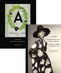
PJH32371Scheidegger & Spiess 2010. Mint set in publishers boards in plain slipcase still shrink wrapped. Textiles are one of Switzerland's oldest industries. Cotton and silk has been spun and woven in homework in the rural parts of the country for decades before the textile sector was one of the first to become quickly and fully industrialised. One of the major players in Switzerland's silk trade has been Abraham AG Abraham Ltd. The company's history dates back to 1878 when Jakob Abraham became a partner in a Zurich-based business. Under the direction of Gustav Zumsteg who had joined as a partner in 1943 the business became a firm part of post-war Paris Haute Couture as supplier of silk fabrics to the leading fashion houses. The 1960s-80s were the heyday of Abraham AG with the close and personal collaboration between Zumsteg and Yves Saint Laurent from 1961 onwards. This equally successful and glamorous period was followed by a slow but steady decline eventually leading to the company's bankruptcy and liquidation in 2002. 'Soie Pirate: The History and Fabric Designs of Abraham Ltd.'. is a comprehensive history of this fascinating enterprise. Volume one tells the company's story and investigates its importance in the international business of high fashion and in the context of time. Volume two presents a wealth of designs patterns and samples of the beautiful fabrics designed by Abraham AG but also of the elegant dresses and spectacular gowns the great couturiers like Cristobal Balenciaga Coco Chanel Christian Dior Hubert de Givenchy Yves Saint Laurent or Emanuel Ungaro have created using Abraham's products. Together both volumes bring to life a chapter in the history of high fashion worldwide. ISBN 9783858817259 Scheidegger & Spiess 2010 hardcover
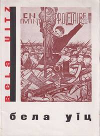
54109Kharkiv: Mystetstvo 1933. Large octavo 25.7 × 18.8 cm. Original pictorial wrappers by Vasily Sedliar decorative dust jacket; 20 1 pp. of text 41 leaves of plates to rectos 2 pp. of text including list of reproductions. Small loss to corner of first leaf; pre-war stamps to title verso and p. 21 of the Ukrainian Public Library without inventory numbers marking the book part of the later dispersed duplicate exchange fund. Else about very good. A striking important Ukrainian avant-garde book designed by Vasily Sedliar 1899-1937 a leading Ukrainian painter illustrator and art pedagogue of the interwar period who was killed during the Stalin Terror of 1937. The book is likely the first monograph on Béla Uitz 1887-1972 a Hungarian-Soviet avant-garde artist who later turned to monumental painting creating large-scale murals for the Kharkiv Krasnovodsk Theatre a project he worked on with Sedliar. Uitz was initially influenced by Cubism Expressionism and later Constructivism with the 42 reproductions of his work in this volume tracing his artistic trajectory. Active in Comintern in Hungary France Austria and Germany in 1926 Uitz moved to the Soviet Union joining the October group and teaching at VKhUTEMAS in 1927-1930. In 1931 Uitz was elected secretary of the International Union of Revolutionary Artists at a conference held in Kharkiv and commissioned to decorate the Kharkiv theatre with this volume likely published for the occasion.<br /> <br /> The Ukrainian art critic and monumental painter Ievhen Kholostenko 1904-1945 wrote the introductory text to the volume. Both Sedliar and Kholostenko were students of Mykhailo Boichuk 1882-1937 at the Kyiv Academy of Art. A celebrated modernist painter Boichuk came into disfavor in the 1930s. His arrest and execution he was accused of being "an agent of the Vatican" affected an entire generation of students known as the "Boichukists" who practiced the innovative kind of monumental painting Boichuk taught. One of the closest associates of Boichuk Sedliar was part of the so-called "executed renaissance" rozstriliane vidrodzhennia a generation of innovative artists and writers who perished during the Great Purge. Any printed matter bearing their names was systematically removed from libraries and bookstores in the late 1930s.<br /> <br /> As of June 2024 KVK OCLC show a sole copy worldwide at Staats- & Universitätsbibliothek Hamburg. unknown
19722091202133212420Not Available 1972. Soft Cover. Fine. Volume: 1 Not Available paperback
195896590Olten, Otto Walter, 1958-1965. 18 Hefte (in 17), mit zahlreichen teils farbigen Abbildungen. Or.kt., 4°. Vollständige Reihe der von Richard P. Lohse, Joseph Müller-Brockmann, Hans Neuburg und Carlo L. Vivarelli herausgegebenen Zeitschrift. Sie war in den späten 1950er und den 1960er Jahren massgeblich für die Entwicklung der neuen Schweiz Grafik und prägte deren Ästhetik lange Zeit darüber hinaus. Zu den Mitarbeitern gehörten auch Max Bill, Nelly Rudin, Eugen Gomringer, Emil Ruder. Ernst Scheidegger, Bruno Kammerer, Gerrit T. Rietveld und Margrit Staber. Das Heft 18 mit dem vierfach gefalteten detaillierten Inhaltsverzeichnis für die Nummern 13 bis 18 und einem dreisprachigen (deutsch, englisch, französisch) Wort an die Leser, in dem die Herausgeber die Einstellung der Zeitschrift ankündigen und begründen und gleichzeitig erklären, in absehbarer Zeit solle die Publikation "mit konsequenter und straffer gewähltem Inhalt" wieder aufgenommen werden. Softcover Umschlage etwas berieben und im Schnitt angestaubt. Neue Grafik
190018325Wien, Gerlach & Schenk, o. J. (1899 oder 1900). XII, 78 S. mit zahlr. teils farb. Abb. 8 farb. Tafeln. Gr.-8°. Lose in OKart.-Flügelmappe (Rücken fachmännisch erneuert, hinterlegte Einrisse, hs. Name und Reste einen Buchhandelsschildchens am Vorderdeckel). [3 Warenabbildungen]
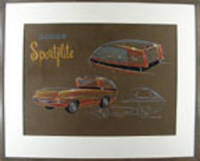
187861970. Watercolor and pastel on illustration board. Signed "William A. Moore" Intriguing concpetual drawing for an unusual pickup truck<br/> <br/> Three views of a rather dazzling vision of a pickup truck and though the "Dodge Sportflite" was never produced the idea of making more luxurious and innovative pickup trucks has definitely caught fire since the time of this handsome drawing. This design brings the driver over the engine as in many heavier trucks giving the driver greater command of the road especially for town and city driving. The styling of the cab and cargo bed is anything but mundane with lines vents a black ribbon around the cab and two large additional brake lights that add a notes of elegance and creativity to the overall effect. "In 1956 William Moore won the General Motors Fisher Body Craftsmen' Guild National Exhibition for his car design. In 1968 he accepted a position as Head of Design for Lear in Reno Nevada. William Moore's art has been placed in.the Smithsonian and the Favell Museum of Art and Artifacts." The Museum of Automotive Art and Design website.<br/> <br/> The Museum of Automotive Art and Design website artist biographies # 129. unknown
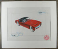
195318800Boston 1953. Tempera on paper. Initialled "R.S.W." Mounted circular label lower right. Handsome 1950s sports car design.<br/> <br/> All of our present information about this drawing comes from a label on the back of the piece which indicates that it comes from the archives of the A.J. White Motor Vehicle Research Company - designers of exotic cars in the Boston MA area. We have not discovered any further information about the A. J. White Research Company thus far nor about the artist R.S.W. of this particular drawing. There does not appear to be any connection to the great White truck manufacturer. The drawing itself is especially nice its cool red sportscar positioned diagonally between two details in blue in a way that makes it appear anxious to move. unknown
197119762New York: New York Committee To Free Angela Davis / Afro-Arts Inc 1971. Original poster lithographed in three colors on white stock measuring 58.5cm x 76cm 23" x 30". A Fine copy / A. An original poster designed and produced by Richard McCrary for the NY Committee to Free Angela Davis. The poster prominently features an image of Davis with her fist clenched and a poem by McCrary printed at upper left corner: "Angela yes you are a black woman - and I want it to be known; The only thing you're guilty of is being a black woman to the bone / For such beauty to be held captive is really no mystery; It is because you are a black woman truly black enough for me." We note a single example at auction Swann 2014 - $7500 with the only other example known to us held in the Rossman Family Collection at the Oakland Museum of California. Not located in OCLC. A1. New York Committee To Free Angela Davis / Afro-Arts Inc unknown books
1931KC16123Moscow; Leningrad 1931. Paperback. Fair. Rare periodical with photomontage cover design by El Lissitzky. pp. 32. Some loss to top edge; rear lower corner loss at the back resulting in some missing text. Edgeworn and creased. Not a pretty copy but very few of this issue have survived. <br/><br/> paperback books
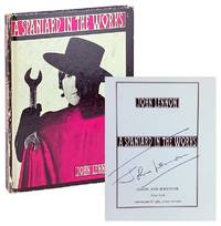
196545569New York: Simon and Schuster 1965. Very Good-. New York: Simon and Schuster 1965. Second Printing. Small octavo; publisher's photo-illustrated paper covered boards; 90pp.; illus. throughout by Lennon. Boards quite rubbed front hinge starting to crack; overall a Good to Very Good only example of this fragile work. Signed by Lennon on title page with Certificate of Authenticity laid in. Simon and Schuster unknown
19001653431900. KIMONO DESIGN. Album of 15 elaborate silk kimono designs. Folio. 335 x 260 mm bound in contemporary silk over boards. NP. ND. A stunning and most unusual production which consists of 15 designs for kimonos printed using woodblocks on textile and each mounted within a different elaborate hand-painted border. In addition elaborate designs have been sown onto the printed outlines. Altogether a unique and impressive piece of book-making. hardcover books
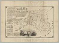
7643Boston: J. H. Bufford’s Lith. ca. 1870. Lithograph 20.25†x 30.25†plus margins. CONDITION: Very good old folds and a .5†chip to upper-right edge recently backed with Japanese tissue. <p>A scarce and elaborate plat map for a seaside resort development at Pigeon Cove in Rockport Mass.</p> <p>Located on the eastern extremity of Cape Ann Pigeon Cove began attracting vacationers from the Boston area during the 1840s. Once the train reached the area in 1862 summer boarding homes soon gave way to seasonal hotels. Spearheading the development of Ocean View were the two men listed at the center-left of this map—George Babson of Pigeon Cove 1835–1895 and Eben Phillips of Boston 1808–1875 the latter owning much property there.</p> <p>The map shows the various subdivisions of Ocean View including occupied lots and those set aside for various purposes as well as numbered lots for sale. Among the lots occupied or in use are those of Pigeon Cove House Mrs. M. D. Babson Summer Boarding House Rev. E. H. Chapin of New York two observatories and the town school. Also identified on the plan are commercial entities surrounding Pigeon Cove Harbor such as E. Eames & Co. and Marchent & Co. A vignette entitled “View from Phillips Avenue near Dick’s Dream†shows a couple riding horseback against a sunset backdrop of vessels plying the waters.</p> <p>Text in the upper-left corner extolls Ocean View’s various beauties its mineral springs—“differing entirely from others and pronounced by leading physicians to contain great medicinal propertiesâ€â€”and the “laying out of the lots which are very large†and “beautifully shaded with a native growth of Walnut Oak and Pine trees…†In the lower-left corner are fifteen glowing testimonials from summer residents visitors from Boston and New York the editor of the New Orleans Picayune and publications such as Springfield Republican Boston Transcript etc. Commended here are Ocean View’s “wild and romantic†scenery; the “grateful odor of the forest mingled with the briny exhalations from the oceanâ€; “rocks in magnific multitudes†and so on. Poet William Cullen Bryant observes: “Full of pleasant paths running in every direction the woods here look like a beautiful rural temple.†One rapturous visitor cites a few lines of poetry: “Blended there / In wild reality when life is old / And many a scene forgot the heart will hold / Its memory of this.â€</p> <p>Ocean View is here advertised as accessible from Boston by little over an hour’s rail ride via the Eastern Railroad; at the time of this map’s production four trains traveled from Boston to Ocean View each way daily.</p> <p> OCLC records just two holdings of what appears to be the same edition of this map at the Peabody Essex Museum and the Leventhal Center at the Boston Public Library. We locate a third example held by the town of Rockport. Another edition with tinting and more vignettes was published as well.</p> <p>A rare and quite handsome promotional map for this North Shore resort development. </p> <p>REFERENCES: Ray Martin. “Ocean View†at Notes from Halibut Point online; pictured at Digital Commonwealth Massachusetts of Rockport Town Hall.</p> Boston: J. H. Bufford’s Lith., [ca. 1870] unknown
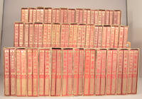
1927910941927. ONCHI Koushirou æ©åœ°å四郎 binding design. NIHON JIDOU BUNKO 日本å…童文庫 JAPANESE CHILDREN'S LIBRARY 76 volumes complete. <br /> Searching for a concise introduction to this set I found a wonderful little essay written by the owner of the UMINEKO book shop in Japan. He was remarking on the exhibition of art bindings that he had seen at an exhibition of art bindings from the 20s and 30s that was held at the Old Book Center æ±äº¬å¤æ›¸ä¼šé¤¨ã€€in Tokyo a few years ago.<br /> <br /> This is a rather poor translation more a paraphrase really from his original Japanese. Just a nice introduction to the set and the era.<br /> <br /> â€When I went to the recent exhibition I was quite taken with a variety of book named "Yenbon" It is a general term for the collection of literary works published by many publishers in the late 1920s early Showa era. They were called 'yen book' at that time because they were priced cheaply at 1 yen per volume.<br /> <br /> So-called "Yen books" for children representatives of which are this "Nihon Jidobunko"Children's Library and "Shougakusei Zenshuu" Elementary School Children's Complete Works Published by Kobunsha Bungeishunjusha.<br /> <br /> ARS and Koubunsha are known for their fierce competition in advertising and sales in that era.<br /> <br /> "Nihon Jidoubunko" was a collection of 76 volumes published by ARS from 1927 Showa 2 to 1930 Showa 5.<br /> Ars Publishing is a publishing company founded by the famous poet Kitahara Hyakushu's younger brother Tetsuo. They published wonderful works on art theory photographic manuals dictionaries of science. many designed by Onchi.<br /> <br /> The sales policy of this "Japan Children's Library" was "Distributed only to reserved members not sold individually. Separate volume 'Self-Study Dictionary' will be given free of charge." In other words quite like the animal encyclopedia my parents bought me monthly at the supermarket back in the early 60s.<br /> <br /> Illustrated by Takeo Takei Yumeji Takehisa Hatsuyamaji Kiichi Okamoto and many other of the finest children's illustrators of the time.<br /> The authors and editors included Mimei Ogawa Hakushu Kitahara Shoyo Tsubouchi Miekichi Suzuki and Toson Shimazaki.<br /> <br /> Onchi himself worked on the cover art and binding of all volumes and the cover art is different for each volume. All are very beautiful.<br /> Onchi worked on everything from the layout of the illustrations to the creation of the block copy and the creation of the advertising pamphlet for the entire volume.<br /> <br /> A revised edition was released after the war in 1953 Showa 28. Onchi was in charge of the binding for the revised version but the design and binding are the same for all volumes. Not varied for each volume as here.<br /> <br /> Thus a remarkable set virtually impossible to find complete of a collection of contemporary children's stories by famous Japanese authors housed in a beautiful binding and book design. brother Tetsuo. They published wonderful works on art theory photographic manuals dictionaries of science. many designed by Onchi. The sales policy of this "Japan Children's Library" was "Distributed only to reserved members not sold individually. Separate volume 'Self-Study Dictionary' will be given free of charge." In other words quite like the animal encyclopedia my parents bought me monthly at the supermarket back in the early 60s. Illustrated by Takeo Takei Yumeji Takehisa Hatsuyamaji Kiichi Okamoto and many other of the finest children's illustrators of the time. The authors and editors included Mimei Ogawa Hakushu Kitahara Shoyo Tsubouchi Miekichi Suzuki and Toson Shimazaki. Onchi himself worked on the cover art and binding of all volumes and the cover art is different for each of the 76. All are very beautiful. He also did the layout of the illustrations created the block copy and the advertising pamphlet for the entire volume. A revised edition was released after the war in 1953 Showa 28. Onchi was in c. unknown
1920013746London: Macmillan 1920. 1st Edition. Hardcover. Very Good/Good . First edition in first issue dustjacket which is soiled with a spine that is browned and missing about half inch at each end. Covers designed by Moore are quite nice. Moderate wear to cloth at spine ends. Some offsetting to ffe and fly with an ownership name that looks like Leslie Hogarth dated 1919 upper right corner of half title. Macmillan hardcover
199174861Screen Gems 1991-01-01. Paperback. Acceptable. Fair; Lower corners are bumped; general wear and soiling to covers; stain to foredge; Soft Cover; Screen Gems-EMI Music; 1991; 0 Screen Gems paperback
2016115377Avedition GmbhCsi. New. 2016. Paperback. 3899862341 . FREE UPGRADE to Courier/Priority Shipping Upon Request - IN STOCK AND IMMEDIATELY AVAILABLE FOR SHIPMENT - IN STOCK AND IMMEDIATELY AVAILABLE FOR SHIPMENT - Flawless copy brand new pristine never opened - Text in English and German. -- with a bonus offer-- . Avedition Gmbh,Csi paperback
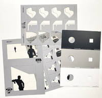
1464<p>Colordinamo 1975 1976 1977. Here all three installments of this rare publication. some parts missing in the 1975 issue but rare in any form or shape.</p><p><br /><strong>Colordinamo 1975.</strong> Manuale per uso professionale.</p><p>Il Colore dell'energia 40 nuovi colori per la progettazione dell'ambiente</p><p>Colordinamo 1975: The Color of energy forty new colours for environmental design</p><p>Milano: Montefibre S.p.A. 1975.</p><p>Grey colored blind stamped and printed portfolio 305 x 221 cm containing two pouches:</p><p>one pouch containing:</p><p>a manual for users missing</p><p>A parallel edition of the Colordinamo devoted to users is published and distributed by ACNA S.p.A. This contains the colour samples and the recipes for their reproduction onto certain types of support.</p><p>a colour isolator - being a sheet printed in white grey and black with 3 round and three square die-cut holes.</p><p>For a correct vision of the colour it is advisable to utilize the isolator comprised of two detachable sections: the first with a round punched hole is suitable for the comparison of one or more colours; the second with a square punched hole is suitable for isolating the sample on the colour chart. The black zone is to be used for the dark colours the grey zone for the middle colours and the white zone for the light colours.</p><p>a 6-page color illustrated foldout colour chart</p><p>The Colour Chart is the basic reference document of the handbook which must also be used for reading the dominant themes on the Composition Handbook. The sample colourants of the Colour Charts are the same as those of the Colour Cards; the guarantee and the precautions to be adopted are thus identical.</p><p>a composition handbook - nine foldout plates one complete plate missing 4 of which the 'environmental diagram is missing</p><p>The introductory part of the Composition Handbook is followed by the section dealing with the dominating themes. At the side of each iconographic subject there is an environmental diagram with the colours corresponding to the dominant theme visible through a window cut into the sheet after insertion of the Colour Chart</p><p>the second pouch containing: 40 color cards each measuring 296 x 105 cm</p><p>The reflectance spectra values R% and the tristimulus coordinates X Z Y given on the back of the Colour Cards can be utilized by Colorimetric centres for the instrumental matching of the colour onto any support fabrics of various types plastics natural materials etc. The values provided refer to the basic colour; the Colour Cards produced are guaranteed equal to the sample within /- 2 N.B.S. points. In order to prevent colour alterations of the Colour Cards it is recommended not to leave it exposed for a long time to direct light.</p><p><strong>Colordinamo 1976</strong>: Manuale per uso professionale.</p><p>The first reconstruction of the chromatic universe prior to the introduction of syntetic dyes. From original recipes the colors used by european dyers from XIV to XVI century.</p><p>Ricostruito per la prima volta l'universo cromatico precedente all'introduzione dei coloranti sintetici. Dalle ricette originali i colori usati nella tintoria europea<br />dal XIV al XVI secolo.</p><p>Milano: Montefibre S.p.A. 1976.</p><p>Grey colored blind stamped and printed portfolio 305 x 221 cm containing two pouches:</p><p>one pouch containing:</p><p>a monograph - 24 pages illustrated throughout in color printed stiff wrappers</p><p>This section contains a brief historical study of ancient dyeing up until the discovery of synthetic colouring materials complete with descriptive passages of the natural pigments most commonly used.</p><p>a colour isolator - being a sheet printed in white grey and black with 3 round and three square die-cut holes</p><p>a simulator – 3 silk-screened acetate sheets one sheet printed in white grey and black with 3 round and three square die-cut holes</p><p>Transparent sheets A and B are designed to permit the simulation of a chromatic family on a series of different types of objects outlined on A and B as they are superimposed on the Colour Cards. Sheet C similarly allows for the visualisation of colours distributed over vaster surfaces which simulate living areas.</p><p>a 6-page color illustrated foldout colour chart.</p><p>the second pouch with 40 color cards each measuring 296 x 105 cm</p><p>- First edition. This the personal numbered no. 720 copy addressed to the architect Giovanni Michellucchi.</p><p><strong>Colordinamo 1977</strong>: Manuale per uso professionale.</p><p>Colordinamo 1977: the environmental colour of the 70's for a new chromatic quality<br />of the environment.</p><p>Colordinamo 1977: il colore ambientale degli anni '70 per una nuova qualità cromatica dell'ambiente.</p><p>Milano: Montefibre S.p.A. 1977.</p><p>Grey colored blind stamped and printed portfolio 305 x 221 cm containing two pouches</p><p>one pouch containing:</p><p>40 color cards each measuring 296 x 105 cm</p><p>the second pouch:</p><p>a colour chart</p><p>the portfolio contains furthermore a 12-page one loose page color illustrated monograph with two texts entitled: 'the international culture of colour' and 'new environmental qualities' texts illustrated with examples of paintings by Frank Stella Adami and Ellsworth Kelly the architecture of Constantino Corsini and Girogio Wiskemann and the Trigondorf village by Justus Dahinden Zurich. in the monograph section furthermore 6 die-cut sheets 'Chromatic selection': vast horizontal surfaces vast vertical surfaces making new signpost colors cold colors hot colors; one page with 'munsell' codes referring to all the color codes as published in Colordinamo 1975 1976 and 1977 the colour isolater: being one sheet printed in white grey and black with 3 round and three square die-cut holes.<br />Attached on a yellow cord a folded bookmark with names of the 14 Italian businesses that helped realize this issue of Colordinamo</p><p>- All three first – unsalable - editions.</p> Montefibre S.p.A. hardcover
1967008323New York: Holt Rinehart and Winston 1967. Book. Near Fine. Cloth. First Edition. Tall 4to - over 9¾" - 12" Tall. RARE Review Copy of this groundbreaking behind-the-scenes look into the New York art scene of the 1960s. With four 8" x 10" B&W glossy photos from the book laid in; George Segal's "Couple at the Stairs"; Andy Warhol in his studio; Marcel Duchamp in his Manhattan apartment; and Lee Bontecon relaxing in her studio first 3 photos Fine last photo small faint spot bottom margin and faint bottom corner crease. The book is Near Fine small prior owner name 2nd front end page slight bowing to boards. In a Very Good dust jacket 1/4" chip across head and 1 1/2" chip base of spine narrow chip at top edge front flap fold several small closed edge tears. Original photographs from this New York collection are uncommon at auction.RBH. While these four are not originals they would be striking framed as a set. Holt, Rinehart and Winston Hardcover
71495Kyoto Keika Hasegawa 1905. In three volumes. Large 8vo size 24.1 x 16.4 cm. 60 20; 20; 20 folded leaves each with two recto verso or more hand-coloured illustrations several heightened with silver. Original near uniform hand-coloured pictorial soft covers. = A breathtakingly beautiful inspiring collection of hand-coloured wood engravings by the Japanese artist Keika Hasegawa active in the late 19th and early 20th century. The very colourful designs are in various styles: some are pictorial e.g. a harbour scene; a boat race in "drone"-view while others show flowers leaves feathers and animals in various degrees of abstraction often using bold and unexpected but well-balanced colours. The bookblocks and covers are original. A very good set. paperback
198138205-A-66547Delft / Rotterdam: Delftsch Bouwkundig Studie Genootschap Stylos publ. / NAI Nederlands Architectuurinstituut 1981-2009. In total 71 of 73 issues of OASE formerly known as 'O' the famous Dutch / English architectural journal. Incl. 2 loose OASE-cahiers belonging to no. 7 and 12. All volumes in very good condition. Some very light traces of use. The first 10 issues of OASE were called 'O' referring to Ontwerp Onderzoek Onderwijs Design Research Education. Includes 12 duplicates of respectively no 1 2 3 4 5 6 12 13 15 18 19 and 22. Delftsch Bouwkundig Studie Genootschap Stylos (publ. ) / NAI Nederlands Architectuurinstituut unknown
In -folio; pp. (12), 13 cc. con riproduzioni a tutta pagina di altrettanti disegni a inchiostro, (2). Cartonato con sovraccoperta. L’introduzione di Lebel presenta il testo a fronte in italiano e francese. Disegno a china a piena pagina con dedica autografa. Original full page india ink drawing with dedication of Parmeggiani.
First and only edition of the best monograph on Soler i Rovirosa (1836-1900), the great Catalan set designer of the late 19th century. Profusely illustrated throughout. 43 beautifully produced full-page plates of set designs, several printed in color. FROM A TOTAL EDITION OF ONLY 310 COPIES, this is ONE OF ONLY THREE (3) ON JAPAN PAPER WITH AN ORIGINAL SIGNED WATERCOLOR BY SOLER I ROVIROSA. The highly-finished watercolor measures 12 x 23 cm and depicts a set design (perhaps for "Miss Robinson"). It is signed by Soler i Rovirosa with his monogram, and is annotated Barna (i.e., Barcelona), 17 Junio 1894. It is on fine wove paper, mounted on a blank sheet of Japan paper. There are additional sketches and annotations on the back. Original watercolors by Soler i Rovirosa are very rare, especially signed. Folio, loose as issued in original wraps. Fine and bright, with no defects. An outstanding item.
197755311ABBern, Haupt., 1977. 4°. Jeder Band 104 S. Mit vielen teils farbigen Abbildungen. Originalbroschuren in Schuber. 4 Bände.
197755311AB4 Bände. Bern, Haupt. 1977. 4°. Jeder Band 104 S. Mit vielen teils farbigen Abbildungen. Originalbroschuren in Schuber.