29 262 résultats
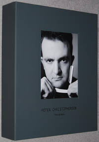
016890<p>Special 60th Anniversary Edition. Handmade Box Set published in a limited roman-numbered hand signed edition of 60 copies in 2015 to mark Peter Christopherson's 60th birthday. This copy II/LX and is signed by Thighpaulsandra. 'The Set comprises one of 60 copies set aside from the original first special edition of both books and 6 individually numbered and stamped fine art photographic silverprints on 300gr Hahnemuhle paper Ilford MG Art presented in a folder.' - colophon. This box also includes the 'Bonus Item' booklet. The main book published in 2014 compiled by Xavier Laradji Claus Laufenburg and Thighpaulsandra. Layout and design by Valnoir with the editors. Fine copy apart from small scratch to front cover of main book special edition book still sealed. More photographs available on request. All books dispatched same or next working day in robust packaging. Heavy item will require extra postage for overseas purchase.</p> Timeless hardcover
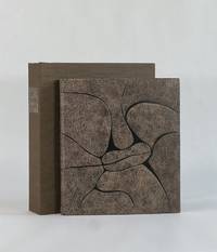
19489757Paris: Chez Georges Visat 1948. Full Leather. Near Fine binding. Octavo. 52 6 pp. frontis illus. Limited edition number 195 of 225 copies. This copy bound by Monique Lallier in full calf with extensive leather onlay shapes referencing the style of Alanore's illustrations. Textblock is sewn on meeting guards with the original wrappers incorporated in the binding. Silk embroidered endbands and leather doublures and flyleaves. Stamp-signed and dated 2014 by Lallier in gold on the rear pastedown. Light offsetting from the etchings and occasional light foxing but generally an internally clean copy nearly fine in a fine binding housed in clamshell that is slightly bumped at the extremities. <br /> <br /> An engaging and quirky narrative text in French wonderfully illustrated with 20 drypoint etchings by Alanore some full page but most incorporated around the printing. This binding from Lallier's personal collection is featured in her 2018 retrospective exhibition put on by Guildford College with catalogue published by Oak Knoll Press. In it she remarks how Alanore's etchings all have prominent lips which informed her design of the cover in a leather that looks like horse p. 100. A striking book inside and out bound by one of the most important design binders of the last 50 years. Chez Georges Visat unknown
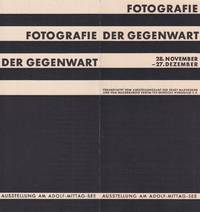
55284Magdeburg: Verein für deutsche Werkkunst printed by W. Pfannkuch & Co. 1929. Octavo unfolded: 20.9 × 29.8 cm. Tri-fold prospectus lithographed to recto and verso. Very good; in protective mylar. Original promotional leaflet for the Magdeburg stop of the international exhibition "Fotografie der Gegenwart" Contemporary Photography organized by the Folkwang Museum Essen in conjunction with the Magdeburg exhibition office and curated by Kurt Wilhelm-Kästner. Playing a key role in cementing photography's role within modern art and visual culture the exhibition was originally shown at the Museum Folkwang in Essen and later in Hannover Berlin Dresden Magdeburg and London among other locations. In particular it highlighted the achievements of Neue Sachlichkeit and "Neues Sehen" with its connections to the Bauhaus. Among the contributors were major figures such as Herbert Bayer Karl Blossfeldt Hans Finsler John Heartfield Germaine Krull Man Ray Moholy-Nagy and Lucia Moholy Albert Renger-Patzsch August Sander as well as schools and organizations such as the Voks Soviet-Film-Photo agency among many others. The importance of the Magdeburg location as a regional center for avant-garde design architecture and photography is underscored by the fact that Moholy-Nagy himself opened the Magdeburg leg of the exposition with a lecture cf: Landeshauptstadt Magdeburg Magdeburg: die Stadt des neuen Bauwillens p. 42.<br /> <br /> Like the poster for the exhibition which was created using linocut the brochure was designed by Walter Dexel "Entwurf Dr. Dexel". A German painter graphic designer and art historian Dexel 1890-1973 .<br /> <br /> As of January 2026 KVK OCLC trace two copies one in Spain and one in Switzerland with none recorded in North American libraries although MoMA does appear to own a copy as part of the Tschichold Collection. unknown
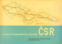
54527Brno: self-published 1935. Oblong quarto 21.5 × 30 cm. Original pictorial wrappers; 100 1 pp. With fifty illustrations mostly maps printed in blue black and red a few reproductions from photographs. Additional graphs and charts throughout. Signed and inscribed by the author to Adolf BenÅ¡. Very good. A striking work of infrastructure cartography and visual communication by architect and urban planner Bohuslav Fuchs 1895-1972 with ZdenÄ›k Rossmann's design throughout in red and black and the maps and plans printed mostly in blue and red. With Fuchs's dedicatory inscription to the functionalist architect Adolf BenÅ¡ dated 1951. This study by Fuchs and the architect JindÅ™ich KompoÅ¡t was a response to the call to lift the country out of the 1930s economic crisis through a progressive system of transportation infrastructure. By the late 1920s a modern internal transportation infrastructure for Czechoslovakia was being considered with the aimr of increasing the role of automobile transportation which the existing network of roads no longer accommodated. The need for new long-distance roads and a new form of road was further compounded by the absence of roads connecting lands that had not been strongly historically linked: the very lands that made up the new country in 1918. Yet this grandiose project did not acquire its specific contours until 1935 when the first studies were drawn up by two independent teams of planners. The study of the first group led by engineer Stanislav BechynÄ› designed the Plzeň - KoÅ¡ice national road to take the shortest route meaning through the middle of the country. The authors of the second plan Brno architects Fuchs and KumpoÅ¡t designed the trunk road from Cheb via KoÅ¡ice all the way to Chust in Carpathian Ruthenia. This would consist of two roads a "northern" and "southern" route. The northern route was to provide a transportation route for key centers of heavy industry and would lead to KoÅ¡ice via Hradec Králové ZlÃn and LevoÄa. The southern route was intended to help bring economic prosperity to regions with an inadequate network of roads and led around Plzeň through TÅ™ebÃÄ HodonÃn Banská Bystrica and Rožňava. "Both plans were enthusiastically received by the Czechoslovak public but state officials rejected them claiming that it would mean the use of an extremely high amount of public funds for something that was not all that urgent" Bartlová Building a State: The Representation of Czechoslovakia in Art Architecture and Design 2016.<br /> <br /> One of 600 copies.<br /> <br /> Rare; as of August 2024 KVK OCLC show two copies outside the Czech Republic one in the UK and one in North America. unknown
192420052Wien, Würthle, 1924. 80 S., 16 nn. Bll. (Anzeigen) mit zahlr. Textabb. 8°. OKart. (kl. Restaurierungen, etw. gebräunt und bestoßen). [6 Warenabbildungen]
19234485EBPlauen i.V., Christian Stoll, 1923. Groß-2°. 45,5 cm. Titelblatt, 20 lose Blatt. Original-Halbleinenmappe mit Titelschildchen und Schließbändern. [6 Warenabbildungen] Emile Alain Seguy, 1877-1951, war ein bedeutender französischer Künstler des Art Deco.
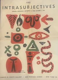
19493479New York 1949. First edition. Folding prospectus forming a large poster when unfolded central folds. Very good condition. First edition. Folding prospectus forming a large poster when unfolded central folds. <p><br /> Scarce poster-prospectus for the 1949 Kootz Gallery exhibition of the "Intrasubjectives" marking an early formation of Abstract Expressionism.<br /> <p><p><br /> Exhibition prospectus for the Kootz Gallery presentation of the "Intrasubjectives" documenting an early moment in the emergence of what would later be termed Abstract Expressionism. The publication announces and frames the work of artists including Willem de Kooning Arshile Gorky Robert Motherwell Jackson Pollock Ad Reinhardt and Mark Rothko at a stage before the movement had acquired its later critical designation.<br /> <p><p><br /> Texts by Harold Rosenberg accompany the presentation situating the group within a developing discourse of postwar abstraction. The design-by William Baziotes Hans Hofmann and Adolph Gottlieb-reflects the close alignment between artistic production and exhibition graphics characteristic of the New York avant-garde of the late 1940s.<br /> <p>. unknown
1933900971933. DESIGN FUJII Tatsukichi 藤井é”å‰ designer. SÔSAKU SENSHOKU ZUANSHÛ 創作染色図案集. A Collection of Designs for Dyework Tokyo & Osaka: Bungado Showa 8 1933. Large portfolio 41 x 31 cm. decorative cloth covered clasped chitsu case with a printed decorative label all enclosed in the publisher's folding cardboard outer box. A 4 page fascicle of preliminaries and a table of contents. With the chitsu design the cover design 3 preliminary page designs and 61 designs on the 50 content fascicles. The designs are primarily in color woodcut printed on both paper and occasionally cloth. A beautiful production here in almost perfect condition. Fujii Tatsukichi 1881-1964 was one of the most important reformers of the traditional arts in Japan. His creativity touched nearly every area: lacquer pottery papermaking dyeing - his influence was enormous. This scarce and lovely portfolio of his original designs helps to illustrate why he was so important. This deluxe production cost 25 yen in 1933 - a princely sum during the depths of the Depression in Japan. Complete. unknown
1815832561815. DESIGN Matsuoka Tokikata; Honma Hyakuri. SHOKUMON ZUE. 7 vols. privately published by Hyakuri apparently from 1815-25 as a completion of work begun by Tokikata in the late 18th very early 19th century. 19.3 x 26.9 cm string-bound Japanese-style fukuro toji with printed paper title labels - all bindings match. Hundreds of beautiful color textile designs reproduced in color woodcut. Nobleman Ladies Ceremonial dress Brocades Imperial costumes all are covered. Important and quite scarce as few sets were produced. Some worming otherwise the overall condition is very good. unknown
1933900971933. DESIGN FUJII Tatsukichi designer. SÔSAKU SENSHOKU ZUANSHÛ. A Collection of Designs for Dyework Tokyo & Osaka: Bungado Showa 8 1933. Large portfolio 41 x 31 cm. decorative cloth covered clasped chitsu case with a printed decorative label all enclosed in the publisher's folding cardboard outer box. A 4 page fascicle of preliminaries and a table of contents. With the chitsu design the cover design 3 preliminary page designs and 61 designs on the 50 content fascicles. The designs are primarily in color woodcut printed on both paper and occasionally cloth. A beautiful production here in almost perfect condition. Fujii Tatsukichi 1881-1964 was one of the most important reformers of the traditional arts in Japan. His creativity touched nearly every area: lacquer pottery papermaking dyeing - his influence was enormous. This scarce and lovely portfolio of his original designs helps to illustrate why he was so important. This deluxe production cost 25 yen in 1933 - a princely sum during the depths of the Depression in Japan. Complete. $4500.00. unknown books
1815832561815. DESIGN Matsuoka Tokikata; Honma Hyakuri. SHOKUMON ZUE. 7 vols. privately published by Hyakuri apparently from 1815-25 as a completion of work begun by Tokikata in the late 18th very early 19th century. 19.3 x 26.9 cm string-bound Japanese-style fukuro toji with printed paper title labels - all bindings match. Hundreds of beautiful color textile designs reproduced in color woodcut. Nobleman Ladies Ceremonial dress Brocades Imperial costumes all are covered. Important and quite scarce as few sets were produced. Some worming otherwise the overall condition is very good. unknown books
52019Bonlanden/ near Stuttgart: Edition Domberger 1973. First edition. Paperback. Very good- to fine condition. Folio 1971 17 x 11 3/4". 1 12/14pp.; Elephant Folio 1972 1972 19 1/4 x 16 1/2". 1 12/12pp. each. Spiral-bound calendars with original screen prints and black lettering on covers with additional screen printed mylar overlays. All calendars designed by Luitpold Domberger and printed at the Domberger KG Bonlanden Germany. All calendars are limited editions and hand-numbered on title page. The screen-printed mylar overlays create an op-art effect. The 1971 contains prints by Max Bill Herbert Bayer and Robert Indiana.<br /> <br /> 1971 558/2500: Cover and overlays with screen prints by Herbert W. Kapitzki; January: Max Bill; February: George Van der Sluis; March: Herbert Bayer; April: Robert Indiana; May: Müller-Brittnau; June: Allan d'Arcangelo; July: Horst Scheffler; August: Peter Stroud; September: Josef Levi; October: Sanford Wurmfeld; November: Erich Lethgau; December: Larry Zox.<br /> <br /> 1972 1754/3000: Cover and overlay with screen prints of Herbert W. Kapitzki; January: Stephen Edlich; February: Robert Indiana; March: Frank Werner; April: Josef Levi; May: Richard Anuszkiewicz; June: Luitpold Domberger; July: Nicholas Krushenick; August: Horst Scheffer; September: Hugo Dietz; October: Edna Andrade; November: Peter Stroud; December: Raimund Gierke.<br /> <br /> 1973 2107/2500: Cover and overlay with screen prints by Herbert W. Kapitzki; January: Walter Allner; February: Werner Berges; March: Allan d'Arcangelo; April: Julian Stanczak; May: Larry Stark; June: Ingrid Pohl; July: Rinaldo Paluzzi; August: Timo Kw. Heimann; September :Karel Novosad; October: Fritz Ruoff; November: Gerd Winner; December: John Willenbecher. <br /> <br /> Text in German. Printed overlay of the 1971 calendar partially separated from spiral. 1971 bound with two duplicate pages of calendar January and October without graphic. Front cover of 1972 with three inch crease at bottom right of front cover not affecting screen print. Generally some minor wear. Screen prints in fine condition. Calendars all protected in modern mylar. Luitpold Poldi Domberger was a pioneer of screen-printing in Germany. He established his first printing studio in 1949 in Stuttgart. His neighbor at the time was Willi Baumeister. His son Michael Domberger joined him developed and continued his legacy to the present day. Edition Domberger is at the forefront of screen-printing and continues to develop and promote the medium. Amongst the artists collaborating with Edition Domberger are Josef Albers Josef Beuys Keith Haring Claes Oldenburg Robert Indiana Antoni Tapies Cy Twombly among many others.<br /> <br /> "For decades the Domberger brand has been synonymous with excellence in screen printing. The print workshop is open to artists and publishers providing a wide range of technical possibilities alongside seasoned expertise. It offers the highest level of craftsmanship in both digital- and screen-printing. The exceptional quality of the prints produced by Domberger have made it one of the leading print workshops in the world" Edition Domberger. Edition Domberger paperback
19341653411934. JAPANESE DESIGN. Juraku Cho. 3 volumes illustrated with a total of 90 colour and monochrome woodblock plates. Oblong folio 270 x 390 mm. bound in publisher's silk over boards in a new chitsu case. Kyoto: Unsodo 1934. A spectacular series of designs with superb colour woodblock plates with each volume devoted to a different motif. Volume 1 is Ryu no maki the dragon. Volume 2 is Hoo no maki the phoenix and Volume 3 is Shishi no maki the lion. Both the full colour plates and the monochrome plates facing them are masterpieces of the woodblock maker's art. Unsodo is the name of a large Japanese publishing company with branches in both Tokyo and Kyoto. Founded in 1891 this company is still in existence today. From the 1890s through the 1930s the Unsodo publishing house was involved in printing high quality pattern books for various crafts including textiles and lacquer.Some wear to the boards but otherwise a fine set. Rare with no listing on OCLC. hardcover
009472Teramachi Nijo Kyoto Japan: Yamada Unsodo Book. Very Good. Pictorial Paper Covered Boards. First Edition. Folio - over 12" - 15" tall. 37 pages held together with 2 brads top end. 35 pages with tissue guards over multiple lovely woodblock prints either 96 or 102 depending on how one repeated image is counted. With an additional full page black and silver woodblock print on rice paper 9" x 12 1/2" laid in. No date in English circa 1902-1905. Laid into original folio black paper covered boards printed in silver Art Deco design with title artist and publisher printed in English front and back. Front and back pages printed in Japanese. Very Good cloth at spine torn at top and bottom edges rubbing to boards at edges. Some tissue guards creased or torn the woodblock prints are all bright and Fine. Kamisaka Sekka 1866-1942 was aan important early 20th c. Japanese artist known as the father of modern Japanese design and the last great master of the Rinpa traditional school of art. RARE one copy found in current commerce lacking the additional woodblock print and 8 copies found at WorldCat. Yamada Unsodo Hardcover
1519FURNITUR011798Eget F�rlag G�teborg. 1915-1916. First edition. Small quarto. Four volumes: 196 23 adverts; 198 23 adverts; 192 27 adverts; 192 31 adverts. Almost all the pages are devoted to photographs of the hugely prolific Otto Schultz's distinctive furniture designs which seem to take elements from the Arts and Crafts movement and blend them with the latest Art Deco ideas. Each volume has a short introduction by Schultz. Text in Swedish. Original hessian bindings stamped with titles in art deco type. Laid into the third and fourth volumes are eight-page pamphlets giving the dimensions of the various items. Otto Schultz went on to found the Boet interior design store in Gothenburg and ran the influential magazine of the same name.Ownership signatures on front endpapers of first volume. Titles on covers slightly flaking. A very good set indeed. Very scarce. Eget F�rlag, G�teborg. unknown
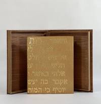
10426Provo UT: Tryst Press 2011. Full Leather. Fine binding. Quarto. 32 pp. illus. Limited edition one of 160 copies this copy out of series. Bound by Katy Starr-Baum in tan goatskin; textblock is sewn on meeting guards with hand-embroidered silk endbands; binding with Hebrew lettering made up of hand-tooled gold dots which extend to the top edges of boards and headcaps; edge-to-edge hand-painted doublures and free endpapers. Housed in clamshell box. A fine copy. <br /> <br /> A lovely book by Robert Buchert at his Tryst Press printed on purpose-made paper by the printer with a barley ear watermark and in Buchert's Psalter type. The colophon reports that this is the first book employing Buchert's typeface. Many in-text woodcuts some full page embellish the book. Here beautifully bound in a meaningful way by Starr-Baum who having over the course of a few years learned of her Jewish roots and converted to Judaism like Ruth that first convert before her. The Hebrew rendered in gold on the binding reads in the King James version: "And Ruth said Intreat me not to leave thee or to return from following after thee; for whither thou goest I will go; and where thou lodgest I will lodge: they people shall be my people and they God my God; Where thou diest will I die and there will I be buried; the Lord do so to me and more also if ought be death part thee and me." Starr-Baum has been binding books for more than 20 years and is among the most recent recipients of the Fine Binding Diploma of the elite American Academy of Bookbinding. Tryst Press unknown
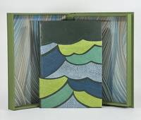
9379Old Stile Press 2009. Full Leather. Near Fine binding. Folio. 56 pp. illus. Limited edition number 193 of 195 copies signed by Onken at the colophon. A skilled and imaginative design binder and a graduate of the American Academy of Bookbinding fine binding program Brenda Gallagher has engaged with this modern telling of a story that comes from a long tradition of Celtic and Norse selkie stories. Full bound in green goat with onlays in fish leather that capture the movement of the waves in green blue and gray. Gallagher's binding wonderfully complements the tale both thematically and artistically as her bold stylized cover shares a harmony with Onken's woodcuts. But even subtler details bring this text and binding together like her skillfully woven silk endbands and the painted top-edge a lovely sea-green with the suggestion of vegetation as though looking down on the top-edge of the book is to look down into the sea. Housed in clamshell box. <br /> <br /> A finely printed and illustrated selkie story written by Brown in 1984 and first published here by the Old Stile Press. The cuts by Onken are beautifully done and are indispensable in conveying this story of a selkie who has been separated from her seal skin by a fisherman trapping her in her human form. Perhaps the most striking of Onken's cuts is only found on the publisher-issued binding as a pictorial pastedown on the front board. Gallagher whose engagement with this text is not limited to the binding relays the tale of disappointment when purchasing this book unbound and necessarily without this woodcut—perhaps the woodcut that resonated with her the most. Since the printer had no extra copies of the illustration Gallagher was driven to locate and contact Onken who had neither print nor the block from which the illustration was printed. Instead he offered to lend her a good drawing of the image. From this image Gallagher cut her own linoleum block and printed the illustration remarkably true to the original. That print serves as the front fly leaf in her binding—a one of one lino print. An exceptional designed binding by an American binder coming into her own. Old Stile Press unknown
000700<p><b>For consideration: These wall coverings could be framed for display.</b></p><p>Newark DE/ Scottsdale AZ: Schumacher Co./ Frank Lloyd Wright Foundation. Frank Lloyd Wright: Wallcoverings title from cover Wright. Trade catalogue.- Newark DE/ Scottsdale AZ. Schumacher Co./ Frank Lloyd Wright Foundation. There are seventy pages that are numbered corresponding to listed samples. There are 17 unpaged samples which are borders that go along with the wallpaper samples. Then there are six interior scenes showing of the wallpaper and other Wright inspired designs. Then there are another eleven pages of textile designs for sheers panels prints wovens and rugs. Extremely rare to find a wright Catalog with actual samples. We did not find a date but it appears based on research that this is from the 1980's. Wright catalogs are EXTREMELY RARE. Condition:The book is in Very Good condition. It measures 9 inches by 12 inches. The covers have minor edge wear. The contents are tightly bound and secured with two metal bolts as issued. The contents are almost Like New. There is a very strong paint and wallpaper odor associated with this book when it is opened. There is no mold. The buyer would do well to let the book sit open. Please write with questions. First Edition. Hard Cover. Near Fine. Folio - over 12" - 15" tall.</p> Schumacher Co./ Frank Lloyd Wright Foundation. hardcover
Album in 4, cm 39,5 x 31, 14 pagine di fotomontaggi su 7 fogli in cartone con bordatura metallica. Pieno marocchino con aquila fascista in pressofusione in alluminio e N (per Nebiolo) alla base applicata al piatto anteriore. Rarissimo album celebrativo della piu' importante fabbrica italiana di macchine e caratteri tipografici in occasione della fondazione dell'impero fascista, caratterizzato da una costruzione inedita per questo tipo di manufatti prodotti nell'ambito della tipografia industriale e di propaganda. Il testo, che percorre le quattordici facciate come un sottopancia cinematografico, e' coerente alla stessa continuita' dei fotomontaggi che travalicano il senso delle "due pagine in una" per costituire un continuum per tutto il corso dell'intero volume nel quale il susseguirsi delle pagine rilegge in qualche modo la sequenza dei fotogrammi della pellicola. In questo senso, l'anonimo impaginatore di questo esempio pressoche' unico di tipografia modernista porta alle estreme conseguenze gli insegnamenti che, a partire dagli anni 1932-33, andavano propagandosi in Italia, grazie al lavoro del gruppo di Campo Grafico, di pubblicitari quali i collaboratori dello Studio Boggeri o altri progettisti grafici come Pagano o Edoardo Persico. Anche la mancanza del margine bianco, sostituita dalla bordatura in metallo (elemento avulso dal contesto del libro ma in sintonia con alcune sperimentazioni futuriste quali i litolatta o il bullonato deperiano) punta a stravolgere canoni che, pur resistenti, iniziavano a mostrare la loro non assoluta centralita'. Esemplificativa realizzazione dello Studio Artistico Nebiolo, diretto dal 1933 da Giulio Da Milano, sostituito a partire dal 1936 da Alessandro Butti (che volle con se il giovanissimo Aldo Novarese), presenta una prima pagina che vede una fusione di immagini che sovrappone una bandiera sabauda, il profilo in bianco della parte sommitale di un fascio littorio sulla base costituita da una cartina della Somalia. Segue l'impattante immagine, che occupa le pp. 2 e 3, di una colonna militare coloniale in marcia, fusa con una visione parziale dall'alto di una moltitudine tratta da una manifestazione fascista e il testo che occupa la parte estrema destra, composta sull'ingrandimento del particolare fotografico del terriccio. La 4o e 5o pagina accolgono una immagine unica dei due stabilimenti Nebiolo a volo d'uccello, con sullo sfondo una visione dall'alto di Torino, sovrastata dalla visione delle Alpi e il testo che corre sullo sfondo del cielo. Seguono in 6o e 7o pagina la fotografia di 6 diverse macchine da tipografia con come decorazione posteriore, la stilizzazione del fascio littorio e il testo su sfondo bianco alla parte destra. Le pagine 8 e 9 presentano la fusione di immagini di officine come la coppia successiva fonde un blocco di caratteri tipografici, 2 tondi con i particolari delle mani dei compositori e quella di altre fasi di questa specifica lavorazione. La pagina finale e' costituita da uno sfondo composto da una varieta' di libri e giornali con in sovrastampa tre bambini somali intenti a leggere. Il testo, che rispetta la scansione delle immagini senza al contempo scadere nella didascalia ma, anzi, seguendo ritmicamente la successione fotografica, recita: "Per celebrare la fondazione dell'Impero/che volere del capo, eroismo delle legioni, disciplina del popolo hanno riconquistato all'Italia... /La societa' Nebiolo di Torino, che diffonde i suoi prodotti in tutto il mondo/L'impianto completo di una tipografia cosi' composta: platina ideale N, perforatrice a pedale Hystrix, tagliacarta ty. cucitrice z, bancone multiplex, serie di caratteri, accessori diversi, le macchine...i cui getti vengono fusi nello stabilimento fonderia di ghisa... studiate e... costruite nelle moderne officine della sezione fabbrica macchine ed i caratteri disegnati, incisi e fusi nella fonderia caratteri, saranno... mezzi fra i piu' potenti per diffondere la cultura e la civilta' romana fra le giovani generazioni del risorto impero italiano".
Bellezza E Identità-L'europa E Le Sue Cattedrali-Fmr-2006 Franco Maria Ricci BELLEZZA E IDENTITA'L'EUROPA E LE SUE CATTEDRALI. A CURA DI TIMOTHY VERDON CON UN TESTO DEL CARDINAL JOSEPH RATZINGER ORA SUA SANTITA' BENEDETTO XVI. ESEMPLARE 981 DI MILLE. CARATTERI USATI SONO BODONIANI TONDI E CORSIVI LA CARTA IN PURO COTONE IMPREZIOSITA DALLA FILIGRANA FMR APPOSITAMENTE REALIZZATA PER QUESTA TIRATURA E' STATA FABBRICATA ALLA FORMA TONDA NELLE CARTIERE D'ARCHES IN FRANCIA. LA LEGATURA IN PELLE TINTA ALLA BOTTE CON IMPRESSIONI IN ORO BIANCO, E' STATA REALIZZATA MANUALMENTE PRESSO LA LEGATORIA L'ARTE DEL LIBRO DI TODI. PP. 414 PIÙ INDICE. CM. 46 X 35.
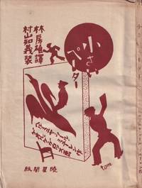
55248Tokyo: Gyoseikaku 1927. Small octavo 16.5 × 12.5 cm. Original pictorial wrappers illustrated by Tomoyoshi Murayama; 4; 89 5 pp. with 6 plates of illustrations by George Grosz. An uncut copy with wide margins; wrappers and margins somewhat dust-stained and toned; good or better. Rare first Japanese edition of the children's book with illustrations by George Grosz and cover design by Mavo founder Tomoyoshi Murayama. It was first published in 1921 under the title "Was Peterchens Freunde erzählen" What Little Peter's Friends Talk About in 1921 as the first volume in the book series "Märchen der Armen" Fairy Tales of the Poor published by Malik-Verlag which had been founded by John Heartfield and Wieland Herzfelde for the Berlin Dada movement. The little volume was to become one of the most successful proletarian children's books worldwide. In it the "Red Countess" as the communist noblewoman was also known describes how the objects in Peter's room begin to speak while he lies sick and bored in bed. The coals in the stove tell of the miners' hard work the water bottle of the glassblowers and the matchbox of the trees and forest workers.<br /> <br /> The Japanese translation by Hayashi Fusao featuring illustrations by Grosz played a key role in making Grosz known in China. Surprisingly it was the Japanese edition published between the two wars with Japan and approximately two years after the suspension of the Chinese Civil War between Nationalists and Communists in favor of a united front against Japan that served as the basis for Lu Xun's first Chinese translation in 1929 titled "Xiao Bide." Remarkably Grosz had been known in the Japanese Empire for many years before his illustrations in this book also gained circulation in China which unlike Japan had extensive Communist Party structures. Cf. Paul Bevan. A Modern Miscellany: Shanghai Cartoon Artists Shao Xunmei's Circle and the Travels of Jack Chen 1926-1938 Berlin 2018 pp. 135ff.<br /> <br /> It was mainly thanks to Tomoyoshi Murayama that the Berlin Dadaist Grosz became known in Japan; Murayama studied in Berlin from 1921 to 1923 and joined the circle associated with the "Der Sturm" gallery run by the communist Herwarth Walden. There he met among others Grosz and Schwitters. He also took part in the Düsseldorf Congress of "Progressive Artists" where Dadaists and Constructivists joined forces. Upon returning to Tokyo he founded "Mavo" as so to speak the Japanese branch of Dada. Like the Berlin group "Mavo's" art actions were not least political protests directed against the military government in Tokyo. Cf. Hanne Bergius Das Lachen Dadas: Die Berliner Dadaisten und ihre Aktionen Berlin 1989 p. 300. It was also Murayama who introduced Mavo member Yanase Masamu to the work of Grosz. The illustrator and cartoonist was also a member of the "Japanese Proletarian Artists' Association" for which he designed several journals posters and books. Furthermore he had been employed as a cartoonist and comic artist at the daily newspaper "Yomiuri Shimbun" since 1920. In 1929 Yanase published a comprehensive monograph on Grosz's work titled "Musan kaikyu no gaka Georuge Gurossu" George Grosz: Painter of the Proletariat. See Bevan ibid.<br /> <br /> As of March 2026 KVK OCLC lists no copy worldwide. unknown
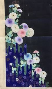
181956897Kyoto Japan: Marubeni Shoten Design Dept. Keimeikai Textile & Dyeing Studio Tanioka Shoten Design Dept. ca. 1918-1945. Folio. 61 original hand-painted inked and pencil designs with a few on a lightly toned but quality semi-translucent paper the majority on thick paper stock and still others with two pieces carefully pasted together with contiguous designs sized from 9 x 15 in. up to 19.25 x 38.5 in. with 13 of the pieces larger the larger size a number of them sized 18 x 32 in. and many in the 14.25 x 15.5 in. size colour painted; the majority feature the design studio chop or crest at lower corners throughout many w/ annotations in margins several w/ change orders neatly annotated or even the title of the design and still many others w/ Roman numeric inventory codes in margins as well two still retaining original small silk samples many with creasing or minor tears & edgewear or creasing to fore-edges a few w/ small & large closed tears while others show some creasing and thumbing from continued use still an exceptional group of manuscripts. This superb archive of 61 original hand-painted kimono designs furnishes an exceptional visual array of Taisho- and early Showa-era Japanese motifs and styles. A number of the designs evoke traditional Japanese Ukiyo-e woodblock prints with deep vivid colours and well rendered illustrations. Many of these designs incorporate floral patterns including Kiku Chrysanthemum Botan Mon Peony Pattern Manju Kiku Marigolds Japanese Irises Morning Glory Cockscomb Ivy Dahlias and many other botanical motifs. In addition there are many illustrating ornately embroidered designs austere bamboo mushrooms and intriguing landscapes some with a small portion fully painted in with brilliant colouring while the outline of the kimono fills out the drawing. Two of the designs still features their original small attached silk kimono sample more reminiscent of Western Design houses which often attached their chosen fabric samples to their clothing designs. A few of the designs are executed on translucent thin paper for the kimono draper to transfer the design to white silk or other fabrics via some type of carbon paper process. Another of the designs has been executed on a stunning silver metallic paper with palm or bamboo leaf fronds executed in vivid blues & browns. Some feature a nearly surrealist quality while several others include illustrations of doves or chickens. Two of the designs incorporate Art Deco representations of Chinese Junks and Japanese sailing vessels typical of the 1930’s prior to World War II. In the Taisho Era a new era opened for textile designers working with Kyoto drapers and department stores with many having trained at new art colleges and then working in the design studios of Marubeni Keimeikai Textile & Dyeing Studio and others. The Tachiki Artist design studio designs on thin translucent paper include one with designer stamp of character embedded within a skull. Some appear to have two different date stamps for the Marubeni Shoten Design and some are unsigned or stamped. The Taisho- and Showa-era kimonos featured brighter colours more groundbreaking designs as Japan’s designers embraced traditional dress and transformed it into a new garment equally appealing to the “Moga†or brazen “Modern Girl.†The designer notes include instructions to “leave a little more space between the fans;†“Drop the little fan crest;†“too much white bush clover†on the pine cones and even that Matsuo Taishichi had ordered a design for “clothes for paying a visit for a young person.†The Marubeni Shoten originated with Chubei Itho who began in 1858 as a salesman for linen cloth and by 1872 had opened his drapery store Benchu in Senba Osaka. By 1918 Chubei Itoh had expanded the business into Osaka and deciced to merge with Itochu Shoten Ltd. becoming Marubeni Shoten with their own drapers shops and many contracts with department stores. Later by the mid-1950s Marubeni merged with the company that operated the Takashimaya Dept. Store Chain all the while preserving their design studio and artists. See: Yuko Fukatsu-Fukuoka The Evolution of Yuzen-dyeing Techniques and Designs After the Meiji Restoration 2004; Arisa Shinko Tomikawa Hand Painted Kyo Yuzen Atelier “Arisa†A Brief Introduction 2020; Annie Van Asche Japanese Kimono Fashion of the Early Twentieth Century Textile Society of America Symposium Proceedings 2000; Our History Our Roots Marubeni Corporation 2020. Marubeni Shoten Design Dept., Keimeikai Textile & Dyeing Studio, Tanioka Shoten Design Dept., hardcover
197154569Tokyo: Shueisha 集英社 1971. New edition. Hardcover. vg to near fine. Large oblong folio. 15x21". Unpaginated. All content housed inside the publisher's original cardboard shipping box with printed label pasted on the front. Binding protected in original a white cloth portfolio with red lettering on the front cover and lavishly decorated interior flaps. Black suede-covered boards with mutli-colored illustration mounted on the front cover. Decorative endpapers. Engraved stainless-steel plate showing Mishima's face mounted on black paper preceding the title page.<br /> <br /> The deluxe and lavishly printed new bilingual edition of the acclaimed and eroticly-charged work also know as "Killed by Roses" by Japanese photographer Eikoh Hosoe b.1933. It gained notoriety and elicited controversy when it was originally released in 1963 and won the Japan Photo Critics Association's writer award. The main photographic subject of the book the acclaimed and controversial writer Yukio Mishima 1925-1970 wrote the preface to the original edition and also writes the preface for this new edition both are included here. Mishima's acclaimed works include the famous and controversial novels "Confessions of a Mask" 1949 and "The Temple of the Golden Pavilion" 1956. Hosoe's striking high-contrast b/w photographs are all printed in high-quality photogravure retaining all the power and atmosphere of his original images. In comparison with the first version of the work this edition features the content having been noticeably re-edited with one image added a few others removed. The images have been thematically re-organized into five new chapters with the names "Sea & Eyes" "Eyes & Sins" "Sins & Dreams" "Dreams & Death" and "Death" respectively. Influential artist and graphic designer Tadanori Yokoo b. 1936 oversaw all of the design and layout aspects of the book and also created its additional illustrated elements most of which comprise the first chapter of this new edition.<br /> <br /> While Hosoe was still completing work to prepare this new edition of "Ordeal by Roses" the notorious "Mishima Incident" occurred November 25th 1970 which culminated in the ritual suicide of Yukio Mishima by seppuku. The incident shocked the nation and in its wake the photographer was quite unsure of how to proceed regarding the publication of the book. Not wanting to seem like an opportunist taking advantage of the controversy and the publicity surround Mishima's death he contemplated shelving the project but was later persuaded by Mishima's widow Yoko who said that her husband would have wanted it to be released. It was finally release only a few months later on January 30th 1971.<br /> <br /> Text in Japanese and English throughout.<br /> <br /> Portfolio with light foxing and sunning to the white cloth of the front cover very minor foxing and smudges to the flaps. Interior of portfolio with minor smudging to the cloth joints but the illustrations on the flaps are still clean. Suede binding clean. Minor foxing to the verso of the front endpaper. Interior with all pages and images clean and vibrant save for a few sporadic instances of the most minor stains or smudges on the blank versos a few pages. Portfolio in very good binding and interior in very good to near fine condition overall. Alternate title: 細江英公写真作å“. Shueisha (集英社) hardcover
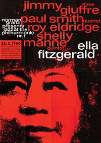
196073749Hamburg: 1960. Superb large-scale poster for the JATP tour of Germany in 1960 featuring Ella Fitzgerald the Jimmy Giuffre Three Paul Smith Quartet Roy Eldridge and the Shelly Manne Quintet. An example of the work of Kieser's early collaborative atelier with typographer Hans Michel 1952-62 which produced some truly remarkable work graphically highly original and imbued with a great sensitivity to the aesthetic of the artists being promoted. Here red black and white typography in lower case sans serif is overlaid on a portrait of Ella in black on red to stunning effect. Produced solely for the German tour this is an uncommon poster particularly so in the A0 format in such sharp condition. Offset lithographic on paper. Vintage outsize A0 format sheet size: 112 x 82.6 cm. Light creases from old folds some very slight cracking of the colour surface and one or two mild scuff minute closed tear to the right-hand edge but overall very good. Presented float mounted in a black museum box-style frame. unknown