29 262 résultats
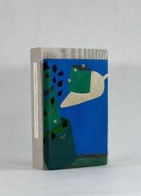
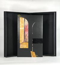
10427Berkeley CA: Editions Koch 2003. Full Leather. Fine binding. Folio. 44 pp. frontis plates. Limited edition one of 120 copies this copy out of series; there are also 26 lettered deluxe copies with a suite of 10 engravings. All are signed by Bringhurst Wagener and Peter Koch at the colophon. Bound by Camille Botelho in black box calf with inlays and onlays of dyed calf vinyl snakeskin painted paper mylar laminates and a porcupine quill; hand embroidered endbands; vinyl snakeskin doublures. A fine copy in clamshell box. <br /> <br /> True to form Peter Koch has produced a marvelous edition of what remains of Parmenides's poem "On Nature." The fragments of the poem are rendered in this opposite page bilingual edition with the Greek on the left and Bringhurst's English translation on the right. The poetry is brilliantly accompanied by Wagner's striking engravings a frontispiece and 4 additional wood engravings in red and orange. <br /> <br /> Given it survives only in fragments there is some debate as to the "meaning" of the symbolism of Parmenides's poem making it a work ripe for interpretation. But at base his view of reality is one of stasis unchangeable. And while that enduring Greek logic marks the work Wagener introduces remarkably abstract and kinetic illustrations printed in an urgent deep red and orange—projecting anything but stasis. It is the discord between the logical understanding or reality and the emotional understanding of it that spoke to Botelho and informed her design of this incredible binding. She writes: "In the design I thought of Parmenides looking out past shadowy arches from within a dark room to find total chaos beyond. The curve of the Mylar inlay and the curve of the porcupine quill mimic a column marking a threshold beyond which is uncontrolled noise and movement and mess. I wanted the disparity between the smoothness of the box calf and the chaos of the inlays and yellow foiling to be a comment on how frightening examining one's reality can be." Magnificently achieved Botelho has created an exceptional binding that bridges Parmenides and Wagener giving voice to the paradox she sees in this metaphysical conversation on the nature of reality. Editions Koch unknown
51000Letterpress poster 38" x 25" designed by Duchamp printed in black and orange on white ground acting as both notice for and as a catalogue of works shown at the landmark DADA exhibition at the Sidney Janis Gallery in New York April 15 to May 9 1953 with the texts and list of exhibited works creating a complex typographically radical and beautifully informative tableau. New York Sidney Janis Gallery 1953. The international group exhibition was assembled catalogued and installed by Duchamp and included some 212 works by both Duchamp and a roster of artists associated with the DADA movement working both individually and collaboratively. According to Arturo Schwarz in the Duchamp catalogue raisonne "The catalog was distributed at the exhibition as a ball of crushed tissue paper 'a Dada gesture to cancel the 'seriousness' of exhibition catalogs'. Sidney Janis in answer to a request for further information wrote 'The Dada poster by Marcel Duchamp for our DADA show of 1953 was very carefully planned over a period of weeks and when it was finally accepted as perfect then Duchamp crushed one into a wastepaper ball to be discarded into the wastepaper basket. 'This is the way you should mail them' and we did just that. We also had these 'wads of wastepaper' on exhibit in a wastepaper basket and when the visitors arrived they rescued these from the basket opened them and flattened them as best they could and read the catalog notations. Many clients complained that they did not receive the DADA catalog and when we checked we discovered that the various maids and butlers receiving these 'wads of paper' threw them away without noticing them to be a catalog.'" Arturo Schwarz "The Complete Works of Marcel Duchamp; Third revised and expanded edition; New York Delano Greenidge 1997; entry #543 page 801. Because so many of the posters were crushed and discarded only a small number of uncrushed examples have survived thus making the present object quite rare.<br/><br/>Our copy is one of an unknown but presumably very small number of uncrushed examples though it was folded at one point. There is some fading to the orange ink to various degrees and some very minor soiling along a couple of folds otherwise a very good copy of a rare and important work documenting an influential exhibition both Johns and Rauschenberg were reportedly big fans of the show that has only gained importance over the ensuing years. unknown books
1920186580Tokyo: Rinshikin Shukai 1920-34. The birth of the matchbox-collecting movement A vibrant collection containing pre-war matchbox labels produced by the Rinshikin Shukai Japan's first society for matchbox collectors. The boldly coloured designs show kabuki actors geisha Buddhist deities baseball players famous ukiyo-e prints vistas of capital cities and even wartime propaganda. Matchbox labels became popular in the late-19th and early-20th centuries in Japan as an opportunity for striking and individualistic graphic design. This album opens with 100 labels on untrimmed sheets each one submitted by an individual member of the Rinshikin Shukai. The labels are then divided into sets usually of 12 as per traditional Japanese artistic conventions. Many are after famous prints by the likes of Kitagawa Utamaro and Sharaku but the majority are fresh designs. One charming set is titled "Sports in the Afterlife" showing silver skeletons playing a variety of sports. The wartime labels are particularly striking showing cartoon soldiers firing missiles piloting aircraft and wading through rivers. One set commemorates the "Three Brave Bombers" a group of soldiers who were lionized for breaking through the Chinese lines during the Shanghai Incident and setting off suicide bombs to allow the Japanese army to advance. The Rinshin Shukai was formed in 1903 by Fukuyama Hekisui 1876-1934 as a society for those interested in collecting designing and distributing matchbox labels. It quickly grew in popularity as branches were established all over Japan and in 1907 it held a sponsored display at the Tokyo Industrial Exhibition where thousands of labels designed by Hekisui were given out. Over the following 30 years Hekisui's personal collection grew to exceed 200000 examples designed by prominent members such as Furuya Rankei Hasegawa Giichiro Ogawa Saku and Oda Shuichi. Upon his death in 1934 the society produced a commemorative label which is pasted at the front of this album. Quarto concertina-style. With 1323 colour woodblock matchbox labels 60 x 42 mm to 117 x 78 mm 100 on tipped-in and untrimmed sheets 2 loosely inserted 10 letterpress labels mounted on recto and verso of 26 leaves 2 sides blank; many printed on mica-speckled paper text in Japanese. Original brown thick card boards original manuscript paper label on front board. Labels bright a couple with loss a few seemingly missing boards rubbed 2 joints repaired with Japanese tissue: a well-preserved collection. hardcover
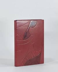
19279186New York: Printed by William Edwin Rudge for the Grolier Club 1927. Full Leather. Very Good binding. Quarto. 6 xxiii 1 208 2 pp. illus. Limited edition one of 390 copies. This copy bound by Don Glaister in full crimson goatskin with typographic design referencing Rogers's type design throughout the volume—a stylized A on the front cover and Z on the rear tooled in blind and gold transitioning to painted lines. Glaister employs slightly raised and recessed areas beneath the leather with occasional light sanding all to offer subtle dimensionality a suggestive nod to the raise aspects of type. Crimson cork endpapers gold and crimson silk headbands accent the original gold top-edge. Signed in blind on the rear pastedown with date and gold dot "Donald Glaister 2025." Fine in clamshell.<br /> <br /> This edition designed by Bruce Rogers is the first English translation of Tory's landmark work begun in 1523 and published 1529. Tory's influence on 16th century typography was immeasurable—moving French printing away from gothic types towards the roman faces a movement that would define modern typography. D. B. Updike calls Tory's Champ Fleury "one of the important books in the history of letter design" I p. 188. A beautiful edition that took decades for Rogers to bring from a proposal to the Grolier Club to a printed edition. And of all he designed it was among Rogers's favorite #24 in BR Thirty. Tory's groundbreaking and forward-looking work had long been a classic text by the time Rogers designed this edition 400 years later. Now 100 years further on Glaister adds his voice to this typographic tradition and in his distinct style takes these now-classic letterforms and nudges them into modernity. Haas 413. Grolier 361. Updike Daniel Berkeley. Printing Types. 3rd ed. 1966. Printed by William Edwin Rudge for the Grolier Club unknown
9402New York: Caliban Press 2020. Full Leather. Fine binding. Tall octavo. 3 blanks 44 2 prospectus 3 blanks ll. Limited edition number 5 of 100 copies signed by McMurray. Originally issued by McMurray in a spiral binding with heavy printed wrappers; the printer notes that this was "printed on various scrap papers found at Caliban Press over time. Canada China England France Germany India Japan Mexico Nepal and Spain are all represented—including Papeterie St-Armand." It includes fold-outs a volvelle and slide-outs. This copy is finely bound by Donald Glaister in full goat skin with onlays of laminated mylar and sanded and painted aluminum on the front and back boards. There are also recessed areas on both boards with acrylic painted lines at some perimeter edges. Polished top-edge with silk endbands; painted cork endpapers. The leaves original covers and prospectus have been mounted on guards with a portion of the perforations from the spiral binding still visible with intention a way in which Glaister is engaging with McMurray's style and playfulness that present throughout this specimen book. Even the clamshell box holding the book has a compartment containing the original red spiral a toy begging to be played with. <br /> <br /> McMurray describes this type specimen of numerals as a way to document a collection of more than 4 dozen cases and around 75 fonts. It became evident that a complete catalogue was far too expansive for a single volume so this the first volume was just numerals. Far from a straightforward specimen book McMurray's playfulness and humor engage the viewer throughout. And engaged Glaister in his design. He writes in his artist’s statement: "Mark McMurray has compiled a wonderfully designed collection of families of numbers from his collection. The is almost without words only numbers . . . The design for the binding is as simple and as complicated as the binary system. A '1' and a '0' on each cover is all there is. However these numbers are presented differently subtly richly and with great care as to their design and positions. These forms and qualities are a mirror of the text within." A wonderful book beautifully bound by one of the premier designer bookbinders in the country. Caliban Press unknown
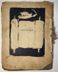
19271751Paris: I. Grodzensky 1927. First edition. Text in French and Yiddish. In publisher’s wrappers bound by string. Cover design by Marc Chagall. Cover and plates are worn at extremities. Cover and some plates damaged at corners and at the string. Two photographic reproductions are loose. Overall in good condition. First edition. Text in French and Yiddish. In publisher’s wrappers bound by string. Cover design by Marc Chagall. 4 text plates and 19 album card plates with mounted photographic reproductions. <p><br /> Scarce book with Chagall’s cover design.<br /> <p><p><br /> With Marc Chagall’s image on the front cover. Before a black background the image features an opened Torah scroll with the inscription of Schwartzbard's name in Hebrew letters an angel with sword flies over the Torah an allusion to Michael the Archangel the advocate of the Jews.<br /> <p><p><br /> A scarce album with pictures of places and portraits of people connected with the Schwartzbard-trial together with short expressions of opinion from prominent intellects as well as brief biographical notes on Schwartzbard and Petliura.<br /> <p><p><br /> Sholom Schwartzbard 1886–1938 was a Russian-born French Yiddish poet and anarchist the assassin of Symon Petliura 1879–1926 head of the Ukrainian government-in-exile in Paris in 1926. Schwartzbard held Petliura responsible for the death of fifteen of his relatives murdered in pogroms during Petliura rule of the Ukrainian National Republic. The number of Jews murdered during the massive 1918–1921 pogroms in Ukraine is estimated to be between 35000 and 50000 and a large percent of the violent attacks were carried out by soldiers under Petliura’s command. The Schwartzbard trial began in mid-October 1927 lasted for eight days in the end it turned on accusations of Petliura's responsibility for the pogroms and eventually Schwarztbard was acquitted. <br /> <p><p><br /> Scarce we could trace only 3 copies in institutional holdings Harvard University Widener Library Cambridge MA USA; NLI Jerusalem; Musée d’art et d’histoire du Judaïsme Paris.<br /> <p>. [I. Grodzensky] unknown
36848Easthampton MA: Cheloniidae Press 1990. Hardcover. Fine. Hardcover. Number 21 of 100 xxi/c copies in the deluxe edition signed and numbered by illustrator and book designer Alan James Robinson. There were also 26 copies bound in quarter leather. This magnificent book was undertaken by the press as a celebration of its tenth anniversary. It is one of the great achievements of Robinson's Cheloniidae Press one of the most respected American private presses. Founded in 1979 the press went through several incarnations during its existence. The constant throughout was the artistry of Alan James Robinson who became famed for his superlative wood engravings and etchings of animals birds the sea and more. The original text for this edition was written by Arthur F. Kinney who was then the Thomas W. Copland Professor of Literary History at the University of Massachusetts and an extensive publisher and lecturer on Shakespeare. <br /> <br /> From the prospectus: this book "focuses on popular bird and animal lore and the way Shakespeare turns it into lines of haunting and indelible beauty by describing the familiar and unfamiliar ideas about many creatures and by showing how Shakespeare used these ideas to shape character and plot in his plays.Shakespeare's imaginative use of observed detail and magical fantasies is matched by the intricate and mysterious wood engravings of Robinson."<br /> <br /> Beautifully bound by noted binders Claudia Cohen and Sarah Creighton in full rust morocco with the title stamped in gilt on the front panel within a blind rule at the outer edge of the covers raised bands and leather hinges. Illustrated with 54 wood engravings depicting the birds and beasts found in Shakespeare's plays and poems plus two portraits of the Bard: one etching and one wood engraving. The book is accompanied by an additional suite of 56 signed and numbered prints from the illustrations. There is also an original watercolor of a Barnacle goose that is not known or called for in the prospectus. They are housed in a linen covered portfolio. The prospectus is also included. There are beautiful hand marbled endpapers by Faith Robinson. The book was printed on special Cheloniidae Rag paper carrying the press watermark that is the exact size of the First Folio of 1623. The type is Centaur and Arrighi set by M&H Type in San Francisco with additional hand composition by Arthur Larson. The book was letter press printed by master printer Harold Patrick McGrath. Housed in a custom clamshell box in near fine condition covered with beige linen with a brown leather spine label. The book is In fine condition. Book is 10.5 x 16 inches. Box is 11 x 17 inches. iv 87 single fold pages. PRI/102423. Cheloniidae Press hardcover
1965122002N.p.: N.p. 1965. A dazzling collection of ten original pressbooks designed by Saul Bass documenting the majority of the famed title and ad designer's work with director Otto Preminger in the 1950s 60s and 70s. <br /> <br /> Several of the pressbooks defy the conventions of pressbook design with custom shapes to represent items in keeping with the films for which they were made: "Advise and Consent" resembles a briefcase "In Harm's Way" is designed as a dossier with a string tie "The Cardinal" as a parcel and "Bunny Lake is Missing" as a newspaper. Other key titles in the collection include "Anatomy of a Murder" "Bonjour Tristesse" "Exodus" and "The Man with the Golden Arm."<br /> <br /> For most of the pressbooks in this collection we have never seen another example. A fascinating example of the advertising work done by the premiere title and ad designer of the twentieth century. <br /> <br /> Various sizes ranging from Very Good to Near Fine condition. <br /> <br /> Complete details available on request. N.p. unknown
1916143509N.p.: N.p. 1916. Vintage Swiss one sheet lithograph poster made to promote the 1916 opening of Speck's Orient-Cinema in Zurich during the heart of the silent film era. Designed and illustrated by costume and commercial designer Ernst Deutsch-Dryden. <br /> <br /> The poster's illustration portrays well-dressed clientele watching a Western movie likely meant to represent a US import. During this period there was a push in Zurich as in all large European and American cities to build lavish new cinemas to accommodate the constantly growing public demand for films and elegant movie houses in which to view them. <br /> <br /> 27 x 39 inches. Linen backed with no extra linen borders with slight restoration at the folds and edges. Archivally framed with UV plexi. N.p. unknown
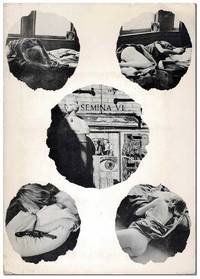
19607086Larkspur CA: Wallace Berman 1960. First Edition. Complete copy of the sixth issue of Berman's iconic assemblage zine dedicated entirely to David Meltzer's 13-part poem "The Clown." Berman illustrated the title leaf and designed the photographic collage on the cover of the portfolio featuring four images of his Larkspur landlady and Sausalito gallery owner Phyllis surrounding an image of the Semina Gallery. Semina Culture p.62. One of 335 copies. Slim octavo 21cm; photo-illustrated card portfolio with 14 handpress-printed loose sheets held in a pocket mounted to inner cover. Subtle toning to the edges of the 14 inserts else Near Fine. Portfolio is lightly edgeworn and dust-soiled with some faint scattered foxing and a few tiny tears; Very Good. Housed in a custom half-morocco clamshell case. Wallace Berman unknown
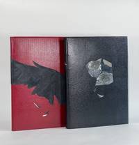
9284San Francisco: Arion Press 2022. Full Leather. Fine binding. Large quartos. 171 1; 27 pp. illus. Limited edition number 52 of 250 "Fine Press" copies 50 Deluxe copies were also issued. Both volumes finely bound by American design binder Robin Brandes. Phantasia in black straight-grained goatskin with crimson doublures and gray suede flyleaves; onlays of distressed mirror mylar composed with image transfers and exotic leathers. The Raven is inversely bound in crimson straight-grained goatskin with black doublures and gray suede flyleaves. Striking raven wing spans from fore-edge of the front board around the spine to midway on the rear board—"feathers" composed of textured fabric with a suede finish and distressed mirror mylar. Fine copies each in crimson cloth clamshell. Prospectus laid in. <br /> <br /> A remarkable production from the Arion Press presenting some of Poe's most recognizable tales and poems here illustrated by American artist Natalie Frank—color as well as black and white; both full page and in-text illustrations printed in offset lithography and overprinted by letterpress. Brandes's restrained bindings are perfectly suited to these books rendering visually the same experience one feels when reading Poe and navigating the uncertain terrain he creates—clear enough that one recognizes the landscape but subtly disquieting. The binder writes in her artist's statement: "In his short lifetime Edgar Allan Poe became the pre-eminent chronicler of the unquiet mind. A mixture of unusual materials and striking color palette were used to emanate an enigmatic yet dramatic presentation. The haunting cover portrait I created for Poe's Phantasia is a mosaic suggesting shapes of 2 ravens. Image transfers of Poe's eyes on distressed mirror mylar and onlays of exotic leathers evoke Poe's unquiet disturbed mind filled with illusions and wishing for the return of lost love. For the covers of The Raven I designed the raven wing feathers to be a bold presentation for one of the most translated poems in history." <br /> <br /> Brandes has been binding for nearly a decade and already has a notable resume having been exhibited at Arion Press The American Bookbinders Museum The Book Club of California Guild of Book Workers San Francisco Center for the Book and more. Brandes's binding of 2020 Vision was the First Place Winner of the Rocky Mountain Guild of Book Workers 2023 Traveling Exhibition. Arion Press unknown
196721850New York and East Greenville PA ca. 1967. Very good . Production archive for a 1967 article on the Knoll company by Olga Gueft. Collection includes 65 original photographs of the Knoll workshop and designs with contact prints dated 7/66 and negatives; several production sheets with layout and markup; notes and ephemera; a 1966 Knoll catalog with color and black-and-white photography and price list; and one complete 17-page typescript article draft by Olga Gueft dated 3/27/67. About a quarter of the photographs have numbers or notes on the back identifying the subject or photographer either Gueft herself or as "Not Gueft Photo." Most are approx. 10'' by 7'' with a few others in smaller sizes. A few photographs thumbed at corners; otherwise very good or better. All housed in large archival box. <br/><br/>Production archive of contact prints original photographs page mock-ups ephemera typescript and other primary materials from INTERIORS MAGAZINE editor Olga Gueft 1915-2015. Gueft a highly influential figure in the history of 20th century design joined INTERIORS as managing editor in 1945 and ascended to editor in 1953 remaining in that position through 1974. Her eye for promising designers led her to commission early cover artwork from Andy Warhol and under her guidance the magazine showcased the work of Florence Knoll Vladimir Kagan and Edward Wormley among many others. Tucked inside a 1966 Knoll Leisure Collection catalog is a 17-page typescript article on the history and contemporary design direction of the Knoll company titled NEW HANDS FOR THE TORCH and most likely intended for publication i INTERIORS. Gueft always an editor with strong opinions begins by reviewing the unspeakable ugliness of the early 1940s — "Most disgusting of all were the chairs" — as a reminder to the reader of what horrors preceded the midcentury modern aesthetic and what a great and gracious service Hans and Florence Knoll did for America and for the world. The article then details the several periods of Knoll through Hans's death and Florence Knoll's departure in 1965 concluding with an overview of the then-current design and development team. The remainder of the archive consists of 65 photographs with contact sheets negatives and other notes and ephemera all associated with Knoll. A memo from Gueft to "Christine" specifies that none of her photos may be used without credit or without payment outside of "a Knoll or Knoll International in-company house organ or newsletter." A few of the photographs thus have "Not Gueft Photo / Can Be Used" scrawled on the back. The East Greenville Pennsylvania workshop described in the article is the setting and subject of the majority of the photographs many of which include identified or identifiable designers and other figures at Knoll — Warren Platner Don Albinson Richard Schultz Don Pettitt William Stephens — and their work both in progress and in finished form. The remarkable series of photographs shows Knoll workers assembling furniture some in extreme close-up or documenting technical details. Another group focuses specifically on the Platner chair both in the process of assembly and finished. Gueft cites Platner's wire furniture Richard Schultz's "elegant aluminum frames" Albinson's "remarkably strong remarkably elegant" stacking chair all pictured in photographs as exemplars of "the continuity of the Knoll ideal . maintained without a break." A detailed portrait of midcentury design from the height of perhaps its greatest practitioner: Knoll. unknown books
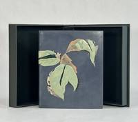
9594New Haven: Editions Wequetequock Cove 2006. Full Leather. Fine binding. Small folio 8.5" x 7". 32 pp. illus. Limited edition number 23 of 50 copies. Signed by Baltazar and Watsky. This copy sewn on meeting guards with silk endbands. Bound in dyed calf and finished with recessed stone veneer over sheep skiver dyed calf inlays and onlays as well as onlays in lizard. Subtly titled in blind across one of the onlays at the spine. Paper doublures with dyed calf hinges. <br /> <br /> Botehlo writes of this book being "filled with etchings of heavy lined and voluptuous shapes with textures and shade all done in black. The poetry evoked for me the verdancy of rogue plants that spring up between the cracks of concrete. It spoke of the appeal of being a snake allusions to original sin. I wanted the green onlays that have been dyed and embossed to be pillowed the stone inviting touch. I intended to create something that invites a sensory exploration." And here she has succeeded with astonishing grace creating a design that draws and keeps the attention. Wonderfully conceived and executed with exceptional skill. Botelho is among a select group of extraordinary design binders who are graduates from the American Academy of Bookbinding Fine Binding program. Editions Wequetequock Cove unknown
9573Monterey KY: Larkspur Press 2006. Full Leather. Fine binding. Octavo. 4 36 4 pp. Limited edition number 9 of 75 copies on Somerset Book paper there was also an edition of 500 regular copies. Signed by Wendell Berry at the colophon; additionally noted by Fox the year it was bound. In full goatskin binding with a series of leather onlays tooled in gold and blind all creating a fantastic pictorial binding. Accompanying the binding is a fine paper portfolio with publisher's prospectuses samples and associated material; additionally some templates related to Fox's binding. All housed a custom clamshell by Fox. <br /> <br /> The text offers a lens into the 19th century view of how a native of region assesses the value of the natural wonders. Berry's commentary at the end of Allen's text brings the troubling viewpoint into a modern context: "The chapter is built upon a division of mind which in our time has become terrifying but which Allen believed to be no more than a simple equation. On the one hand in a sentimentally romantic fashion he was sensitive to the natural life of the area which was then still intact. And on the other hand he seems eager for the destruction of this virgin bounty that so inspired him. I say 'the destruction' and not 'the use' for his language is patently that of an exploiter intent upon 'conquering' nature." A sobering volume that will most surely always remain relevant. Larkspur Press unknown
19341653411934. JAPANESE DESIGN. Juraku Cho. 3 Volumes. Illustrated with a total of 90 colour and monochrome woodblock plates. Oblong folio 390 x 270 mm bound in publisher's silk over boards in a new chitsu case. Kyoto: Unsodo 1934. A spectacular series of designs with the superb colour woodblock plates with each volume devoted to a different motif. Volume 1 is Ryu no maki the dragon. Volume 2 is Hoo no maki the phoenix and Volume 3 is Shishi no maki the lion. Both the full colour plates and the monochrome plates facing them are masterpieces of the woodblock maker's art. Unsodo is the name of a large Japanese publishing company with branches in both Tokyo and Kyoto. Founded in 1891 this company is still in existence today. From the 1890s through the 1930s the Unsodo publishing house was involved in printing high quality pattern books for various crafts including textiles and lacquer. Some wear to the boards but otherwise a fine set. Rare. hardcover books
19011717801901. NAKAMURA Gyokushu. Miyama no shiori. 2 volumes. 250 x 160 mm. Kyoto: Honda Unkido 1901. An exquisite collection of designs probably created as patterns for kimonos. In fine condition and extremely rare. Some of the plates have a distinctly modernist feel. There is some soiling but the stunning plates are immaculate. OCLC lists The National Diet Library and the Wolfsonian. unknown
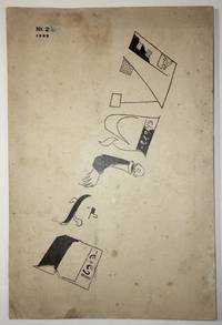
19221736Moscow: Der Shtrom The Moscow School for Yiddish Printers 1922. First edition. In publisher’s illustrated wrappers. Paper yellowed due to aging. Tiny inkblots on cover. Note in pencil on title page. Numeric notes between pp. 9–25. Three pinholes throughout at the gutter. Cover artistically restored. Overall in very good condition. Cover design by Marc Chagall. Cover design by Marc Chagall. First edition. In publisher’s illustrated wrappers. 80 p. <p><br /> The second number of the first Soviet Yiddish literary-cultural periodical featuring a cover designed by Marc Chagall.<br /> <p><p><br /> Shtorm was founded and edited by a literary and artistic group formed in Kiev of Yekhezkl Dobrushin Nokhem Oyslender and Arn Kushnirov and Dovid Hofshteyn. Six numbers were published in five issues between 1922 and 1924. <br /> <p><p><br /> Each cover featured the same illustration on the front by Marc Chagall. “Chagall used only the letters in the word Shtrom as illustrations which included a disembodied person on the »R« and a factory with a worker entering the building as part of the »Sh«†Shneer pp. 145–6.<br /> <p><p><br /> Bibl.: Shneer D.: Yiddish and the Creation of Soviet Jewish Culture: 1918–1930. Cambridge University Press 2004.<br /> <p>. Der Shtrom, The Moscow School for Yiddish Printers unknown
192988435New York: Harper & Brothers Publishers 1929. First Edition. First Printing. Octavo 19.5cm; navy blue and red paper-covered boards and black cloth backstrip with titles stamped in gilt on spine; decorative endpapers; orange topstain; dustjacket; viii23-3262pp. Spine ends gently nudged topstain slightly dulled else a fresh very Near Fine copy. In the original dustjacket designed by Aaron Douglas; unclipped priced $2.50 gently spine-sunned and lightly edgeworn with a few tiny tears a tiny split at rear flap fold and some mild dust-soil; still a bright Near Fine copy. <br /> <br /> McKay's second novel an accurate social perspective of Black life in southern France drawn directly from McKay's experience living in Marseilles. "Lincoln Agrippa known to his drifter cohorts on the 1920s Marseilles waterfront as "Banjo" passes his days panhandeling and dreaming of starting his own little band. At night Banjo Malty Ginger Dengel Bugsy Taloufa Goosey and even Jake of Home to Harlem prowl the rough waterfront bistros drinking looking for women playing music fighting loving and talking - about their homes in Senegal the West Indies or the American South; about Garvey's Back-to-Africa Movement; about being Black. When Ray a writer joins the group it triggers his rediscovery of his African roots and his feeling that at last he belongs to a race "weighted tested and poised in the universal scheme" from the HarperCollins reissue. PERRY 377; GLOSTER p.165-166. 88435. Harper & Brothers Publishers unknown
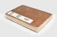
1908884571908. DESIGN Sugiura HISUI designer. MITSUKOSHI; MITSUKOSHI TIMES; OSAKA MITSUKOSHI Tokyo & Osaka 1908-1923. Western-style magazines 24.9 x 18.4 cm decorated wrappers. Lovely covers most by Sugiura Hisui 1876-1965 or designed under his supervision. Hisui is the most important figure in the development of Japanese commercial art in the 20th century the progenitor of "Taisho Chic" and a force to be reckoned with as a practical designer at Mitsukoshi and an educator at the Japan School of Art the Imperial School of Fine Art and the Tama Imperial School of Art which he co-founded. He even spent two years in Europe in the early 20s researching design. He created many portfolios of design examples for professionals wrote treatises on the principles of design and was a tireless creator of posters and magazine covers. He began work at Mitsukoshi in 1908 as a design consultant in charge of cover art for the house organ MITSUKOSHI TIMES. When MITSUKOSHI magazine began in 1912 he had already been promoted to head of design for the company a year earlier and stayed in that position for decades. His artwork graced the covers of many magazines over the years but it was his work for MITSUKOSHI and MITSUKOSHI TIMES and OSAKA MITSUKOSHI that began his design career. We are offering here a group of issues of those magazines most with his brilliant cover art. The magazines as a form of trade catalog and guide to fashion for the well-heeled clientele of Mitsukoshi department store were intrinsically ephemeral. They are hefty magazines a vade mecum for the bon ton with pictures of summer frocks kimono fabrics morning coats shoes - with instructions on how they should be cleaned stored worn. With pictures and prices and order sheets. Useful and used then thrown away they are seldom found today. A gathering of this size is quite unusual especially as it begins with issues of MITSUKOSHI TIMES from 1908 - the year that Hisui took over design reponsibilities for the house organ. The issues: MITSUKOSHI TIMES 11 issues from 1908-13 Oct & Nov Meiji 41 1908; V.8 #s 4 & 6; V.10 #s 9 & 11; V.11 #s 4 7 11 & 14 V.12 #3. MITSUKOSHI 31 issues from 1912-1923 V.2 #4; V.4 #s 5 6 7 & 8; V.5 #s 4 5 7 & 8; V.6 #s 2 & 11; V.7 #s 6 7 & 8; V.8 #s 2 3 4 5 & 7; V.9 #s 4 5 6 7 9 & 12; V.10 #s 4 6 & 12; V.11 #11`; V.12 #3; V.13 #6. OSAKA MITSUKOSHI 2 issues V.4 #8 1915 a. unknown
1913D7495Paris 1913-1918. Hardcover. Very Good. Morocco backed original cloth; oblong 380 x 305 mm; contains over 100 drawings of dresses hats jackets and more done primarily in pen and ink and colored in pencil or gouache; and highlighted by 5 mounted photographs of a woman modeling different gowns. From the Parisian fashion house Detrois et Cie. Women's garments shown from the front and back and professionally presented -- drawings are polished and nicely detailed and colored. Scuffing along spine and edges of boards; binding a bit shaken. <br/><br/> hardcover
1908884571908. DESIGN Sugiura HISUI designer. MITSUKOSHI; MITSUKOSHI TIMES; ÔSAKA MITSUKOSHI Tôkyô & Ôsaka 1908-1923. Western-style magazines 24.9 x 18.4 cm decorated wrappers. Lovely covers most by Sugiura Hisui 1876-1965 or designed under his supervision. Hisui is the most important figure in the development of Japanese commercial art in the 20th century the progenitor of "Taishô Chic" and a force to be reckoned with as a practical designer at Mitsukoshi and an educator at the Japan School of Art the Imperial School of Fine Art and the Tama Imperial School of Art which he co-founded. He even spent two years in Europe in the early 20s researching design. He created many portfolios of design examples for professionals wrote treatises on the principles of design and was a tireless creator of posters and magazine covers. He began work at Mitsukoshi in 1908 as a design consultant in charge of cover art for the house organ MITSUKOSHI TIMES. When MITSUKOSHI magazine began in 1912 he had already been promoted to head of design for the company a year earlier and stayed in that position for decades. His artwork graced the covers of many magazines over the years but it was his work for MITSUKOSHI and MITSUKOSHI TIMES and ÔSAKA MITSUKOSHI that began his design career. We are offering here a group of issues of those magazines most with his brilliant cover art. The magazines as a form of trade catalog and guide to fashion for the well-heeled clientele of Mitsukoshi department store were intrinsically ephemeral. They are hefty magazines a vade mecum for the bon ton with pictures of summer frocks kimono fabrics morning coats shoes - with instructions on how they should be cleaned stored worn. With pictures and prices and order sheets. Useful and used then thrown away they are seldom found today. A gathering of this size is quite unusual especially as it begins with issues of MITSUKOSHI TIMES from 1908 - the year that Hisui took over design reponsibilities for the house organ. The issues: MITSUKOSHI TIMES 11 issues from 1908-13 Oct & Nov Meiji 41 1908; V.8 #s 4 & 6; V.10 #s 9 & 11; V.11 #s 4 7 11 & 14 V.12 #3. MITSUKOSHI 31 issues from 1912-1923 V.2 #4; V.4 #s 5 6 7 & 8; V.5 #s 4 5 7 & 8; V.6 #s 2 & 11; V.7 #s 6 7 & 8; V.8 #s 2 3 4 5 & 7; V.9 #s 4 5 6 7 9 & 12; V.10 #s 4 6 & 12; V.11 #11`; V.12 #3; V.13 #6. OSAKA MITSUKOSHI 2 issues V.4 #8 1915 a. unknown books
1913D7495Paris 1913-1918. Hardcover. Very Good. Morocco backed original cloth; oblong 380 x 305 mm; contains over 100 drawings of dresses hats jackets and more done primarily in pen and ink and colored in pencil or gouache; and highlighted by 5 mounted photographs of a woman modeling different gowns. From the Parisian fashion house Detrois et Cie. Women's garments shown from the front and back and professionally presented -- drawings are polished and nicely detailed and colored. Scuffing along spine and edges of boards; binding a bit shaken. <br/><br/> hardcover books
1933274DB(Wien, 1933-1938). 8°. (32) Seiten ohne Umschlag., 1
9380New York: Crown Publishers 1976. Full Leather. Fine binding. Octavo. 160 pp. illus. First edition first printing thus. Full bound in burgundy morocco with blind-tooling sanding and dyed and acrylic-toned goat onlays. Top edge gilt with sgraffito designed. Hand-woven silk endbands. Housed in clamshell box. <br /> <br /> In this binding Brenda Gallagher has drawn from Boyce's erotic illustrations to render a beautifully blind-tooled drawing spanning both covers. Stamped onlays and sanded details bring the binding into perfect union with the text. Gallagher has subtly titled the cover by embedding both the author's name and title within the blind tooling. A remarkably designed and excellently executed binding capturing the spirit of Nin's prose and quite directly the character of Boyce's drawings. Gallagher is a design bookbinder and a graduate of the American Academy of Bookbinding. Crown Publishers unknown
196110424San Francisco: Grabhorn Press 1961. Folio. 4 46 2 blank pp. illus. Limited edition one of 180 copies. This copy bound by Katy Starr-Baum in full black calf with inlays of sanded aluminum and pained paper as well as onlays of buffalo watersnake and stone veneer all arranged in a coronal design from front board to rear; graphite top edge with sprinkled palladium; handsewn silk endbands; hand-painted endpapers echo the cover design. Housed in clamshell box. <br /> <br /> A beautiful and fitting binding on one of the Grabhorn Shakespeare series with colored woodblock illustrations by Mary Grabhorn. A bold design using material that speaks to the time—stone and metal. The hand-painted endpapers evoke the night sky and have an iridescence that is dynamic when one opens the cover the light catching the paint shifts as the board moves. While boldly monochromatic what color there is in the binding the leather onlays and the painted paper picks up the pastels of Grabhorn's illustrations. The coronal design speaks to the backdrop of this play Henry IV holding onto power amidst treachery and Prince Hal's coming into the crown. But as Starr-Baum notes the design has a more potent deeper meaning: "the circular shape … represents familial cycles: the traits and behaviors that are passed down from one generation to the next and the transformation of Prince Hal into King Henry." A powerful binding by one of the most recent recipients of the Fine Binding Diploma of the elite American Academy of Bookbinding. Grabhorn Press unknown