10 865 résultats
17307560BB4 Bde. Amsterdam, Wetstein & Smith, 1730. 8°. Titel in Rot und Schwarz. (1) Bl., XXXVIII, 484 S.; (3) Bl., 495 S.; (3) Bl., 426 S.; (3) Bl., 507 S.Mit gest. gef. Frontispiz von J. Folkema nach B. Picart, gest. Titelvignette, gest. Kopfstück von G. F. Debrie, 10 gef. Karten, 68 Kupfertafeln (davon 51 gef.) nach Merian, Scheuchzer u. a. Kalblederbände der Zeit mit reicher Rückenvergoldung, zwei Rückenschildchen und Stehkantenverg.
17406488CBZürich, Heidegger und Compagn., 1740. 4°. Titel, 15) Bl., 467 S., (8) Bl. Register. Späterer marmor. Pappbd. mit hs. Rückenschild.
1768774ABBasel, (Nicolaus Köllner), 1768. 4°. (16) 504 S. Mit 1 gest. Frontispiz , 1 gest. Vignette u. 3 (dv. 1 gef.) Tafeln von Johann Rudolph Holzhalb u. von Johann Balthasar Bullinger nach Johann Rudolph Holzhalb. Pappband mit Rückenbeschriftung.
54442 gravures galantes rehaussées, dans leurs cadres en bois doré anciens. 500 x 400 XIXè siècle
Kolorierte Lithographie auf Papier. 605 x 800 mm. Sehr seltene Monumentallithographie von Joseph Lanzedelli dem Jüngeren nach einem Entwurf von Adam Brenner, gedruckt bei B. Greiffenstein für J. Sedlaczek in Wien. Das Plakat zeigt eine Anbetung Jesu Christi als Himmelskönig auf textlicher Basis des "Te Deum Laudamus". Die irdische Sphäre ist zentral durch den schreibenden Heiligen Ambrosius von Mailand repräsentiert, dem der berühmte Hymnus zugeschrieben wird. Mehrere Textzitate mit Strophenangabe der deutschen Nachdichtung des Te Deums von Ignaz Franz sind illustriert, darunter die Anbetung der Cherubim. Erst durch die Bildunterschrift wird der Zusammenhang mit der Hochzeit des Kaiserpaares hergestellt: "Zur Erinnerung an die Oesterreichs Völker beglückende Vermählung und glorreiche Regierung Sr. kais. königl. Apostolischen Majestät unsers allgeliebten und allergnädigsten Kaisers Franz Joseph I., mit Ihrer königl. Hoheit der durchlauchtigsten Prinzessin Elisabeth Amalie Eugenie, Herzogin in Bayern". Die Betonung des Heiligen Ambrosius von Mailand als Schutzpatron des österreichischen Kaisertums hatte in der angespannten Lage vor dem zweiten italienischen Unabhängigkeitskrieg (1859) auch eine politische Dimension. - Der Wiener Kaufmannssohn Adam Brenner (1800-91) studierte unter Leopold Kupelwieser und Ferdinand Georg Waldmüller an der Akademie der bildenden Künste. Er trat sowohl in der Historienmalerei als auch in den niedrigeren Gattungen als begabter akademischer Maler hervor. - Mehrere geklebte Einrisse sowie fachgerechte Ergänzungen im Randbereich. Leicht fleckig und gebräunt.
Ensemble de deux volumes de format in 4° de 8 ff.; une eau-forte originale numérotée; 141 planches reproduites en phototypie avec serpentes protectrices explicatives; 4 ff. pour le tome 1. Pour le tome II: 4 ff.; planches 142 à 271 reproduites en photypie; 4ff.. Reliure de l'éditeur en demi maroquin noir à longs grains; dos à quatre nerfs, caissons richement ornés et dorés, titres dorés, dates en pied; décor de filets dorés sur les coins; têtes dorées; non rogné. Couvertures entièrement conservées. Tirage total à 1030 exemplaires; celui-ci N°132 sur vélin, second papier. Rousseurs en marge de la gravure originale sans atteinte à l'oeuvre sinon exemplaire frais en état quasi neuf. Joint une photographie de l'artiste.
1781704313Göttingen, Victorinus Bossiegel, 1781. Kl.-8°. Gestoch. Frontispitz, gest. Titelvign., 7(2 gef.) Kupfertaf., 9 Bl., 136 Seiten. Schlichter Pappband der Zeit mit kleinem Rückenschild.
HD-161o.J. Lithographie, auf chamoisfarbenem Velin, mit den Adressen: Au bureau ,chez Aubert, pass. Véro-Dodat., sowie: Lith. Delaunois. Darstellungsgröße 21,7:27,8 cm, Blattgröße 25,5:29 cm. Literatur: Daumier-Register 108 I, (von III); Delteil 108 I (von III); Blatt 463, erschienen am 05.02.1835 in ?LA CARICATURE?, Nr. 222. ? Sur blanc.
Kolor. Titelblatt und 31 kolor. lithogr. Tafeln. Lose in Originalmappe mit montiertem, wdh. Titelblatt. Reste von Bindebändern. Folio (262:338 mm). Mappenwerk des belgischen Zeichners und Karikaturisten Draner (Anagramm für Renard; 1833-1926), der ab 1861 in Paris lebte und neben seiner Arbeit für diverse Zeitschriften auch Theater- und Opernkostüme entwarf und mehrere Alben mit Bildern zum Militärleben veröffentlichte. "Draner interessiert sich stofflich vor allem für das Militär" (Thieme/B.). Die Tafeln zeigen die verschiedenen Soldaten der französischen Armee um 1870 ("Officier de Turcos", "Dragons", "Artillerie", "Chasseur d'Afrique" etc.). - Die Mappe leicht bestoßen; Titel und Ränder gering gebräunt bzw. vereinzelt unbedeutend fleckig. Vgl. Thieme/Becker IX, 540.
17828255Manière noire. Le Blanc 99; Très belle épreuve du 2è état sur 3, avant la lettre. Cadre moderne. Cadre moderne Très bon Londres John Boydell 1782 55 x 73 cm avec le cadre.
1713627877Tübingen, Cotta, 1713-15. 4to. 8 Bl., 1436 S.; 6 Bl., 1340 S.; 3 Bl., 1398 S., 167 Bl. Pergament d. Zeit mit schwarzgeprägtem Rückentitel (fleckig, Innengelenke teils mit Wurmspuren). [2 Warenabbildungen]
15085617Très rare estampe, une des plus belles de l’œuvre. Également une des premières. D’après Mantegna (?) 2è état (Bartsch 345) avec le flambeau et le carquois ajoutés. Petites marges, belle impression. En feuille Très bon 1508 31 x 21,9 cm
18976128Belle épreuve parue dans le numéro 3 (juillet 1897) de l’Estampe Moderne. Notre épreuve porte le timbre sec de l’Estampe Moderne en bas à droite. L’Estampe Moderne a paru de mai 1897 à avril 1899. Cadre et passe-partout Très bon Paris L’Estampe Moderne. 1897 34 x 22 cm.
1840725DGPayerne., Lith. de J.J. Schwab., ca. 1840. Altkolorierte Lithographie auf zwei Pavatexblatten aufgezogen. Bildformat: 22 x 273 cm. Blattformat: 30 x 290 cm. + Wichtig: Für unsere Kunden in der EU erfolgt der Versand alle 14 Tage verzollt ab Deutschland / Postbank-Konto in Deutschland vorhanden +, A
1734117910Frankfurt, Fleischer, 1734-42. Mit 5 doppelblattgroßen Titelblättern u. 8 gefalteten Tabellen. Pergament d. Zeit (verstaubt). [2 Warenabbildungen]
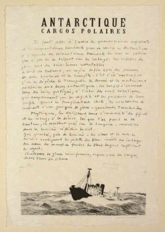
20070042502007 Aux Pujols, Philippe Parage «l'Atelier de la Guinguette », 2007. Huit planches in-folio (475 X 330 mm) et un lavis original (485 X 335) sur BFK de Rives sous boite écrin de toile grise anthracite à l'intérieur de laquelle est contrecollé le feuillet de justification du tirage. Petites rousseurs en marge de certaines planches.
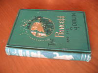
1872025507Philadelphia: J B Lippincott & Co 1871 1872. 2nd Edition 1st Printing. Green Cloth Gilt. Very Good . 6 7/8' Tall. 203 Pp. Green Cloth Gilt And Black Lettering And Design Two Blank Front Free Endpapers Two Blank Rear Free Endpapers The Elaborate Green Cloth Binding Being Very Similar To Strahan's 1871 London First Edition And The 1871 Routledge New York Printing But With No Publisher's Name At Base Of Spine And Lippincott Name And 1872 Date On Title Page The Actual Publication Date Of This Lippincott Edition Is Cited As December 1871 And As Lippincott Was Strahan's American Publisher At This Time It Seems Likely That This Edition Is The First Authorized American Edition. The Strahan Edition Has "Goblin" On Spine And Cover In Black But In The Routledge And This Lippincott Edition That Word On The Spine Is In Gilt. 30 B/W Illustrations In The Text Half-Page At Center Of Pages Signed With The Dalziels' Name In Plural And Hughes' Initials. Very Well Preserved Covers Clean All Gilt And Black Complete And Strong All Gilt Still Brilliant Rubbing And Wear To Cloth At Top And Bottom Of Spine And At Tips A Few Frays At Top And Bottom Of Spine And Pinpoint Frays At Three Of The Tips; Hinges Tight Original Off White Coated Endpapers No Cracking To Hinges No Names Or Marks No Repairs Slight Spine Lean. Display Quality. <br/> <br/> J B Lippincott & Co [1871] hardcover
184488648London England: Virtue and Co. City Road and Ivy Lane 1844. Hardcover. Very Good Plus. W. H. Bartlett. TWO VOLUMES IN A SINGLE BINDING<br /> Quarto. Forest green half-morocco corners and spineruled in gilt. Full-page Frontis Map by W. Hughes & Aldine Chambers. Aquamarine/White diagonally-striped silver-veined marbled endpapers. 120 magnificent tissue-guarded full-page engravings with Historical and Descriptive Text by J. Stirling Coyne N.P. Willis and others. EXCEPTIONALLY clean and Bright after 180 years. Each volume separately paginated with its own title page. Beautiful book. Virtue and Co., City Road and Ivy Lane hardcover
- Lucien Vogel éditeur, Paris 1920-1922, 18x24cm, relié. - [FASHION] POIRET Paul & WORTH Charles Frederick & BEER & DOEUILLET Georges & LANVIN Jeanne & SIMON Mario & WOODRUFF André-Edouard. Croquis de mode Lucien Vogel éditeur, Paris 1920-1922, 18 x 24 cm, bound Set of 24 original lithographs in color, on vergé paper: - Croquis de mode d'été par Mario Simon ("Croquis", La Gazette du Bon ton, 1920 n° 3). - Les modes en l'an de grâce Mil neuf cent vingt un ("Croquis", La Gazette du Bon ton, 1921 n° 3) - Pour la Riviera. Robes garnies de fleurs naturelles, dans la mesure où l'on en a et où l'on ne préfère pas d'employer, moins coûteuses, les fleurs artificielles ("Croquis", La Gazette du Bon ton, 1921 n° 10). - Costumes tailleur de fantaisie ornés de colifichets ("Croquis", La Gazette du Bon ton, 1922 n° 4). Original prints used to illustrate the Gazette du Bon ton, one of the most attractive and influential 20th century fashion magazines, featuring the talents of French artists and other contributors from the burgeoning Art Deco movement. A celebrated fashion magazine established in 1912 by Lucien Vogel, la Gazette du Bon ton appeared until 1925, with a hiatus from 1915 to 1920 due to the war (the editor-in-chief having been called up for service). It consisted of 69 issues printed in only 2,000 copies each and notably illustrated with 573 color plates and 148 sketches of the models of the great designers. Right from the start, this sumptuous publication "was aimed at bibliophiles and fashionable society," (Françoise Tétart-Vittu, "La Gazette du Bon ton", in Dictionnaire de la mode, 2016) and was printed on fine vergé paper using a type cut specially for the magazine by Georges Peignot, known as Cochin, later used (in 1946) by Christian Dior. The prints were made using stencils, heightened in colors, some highlightened in gold or palladium. The story began in 1912, when Lucien Vogel, a man of the world involved in fashion (he had already been part of the fashion magazine Femina) decided, with his wife Cosette de Brunhoff - the sister of Jean, creator of Babar - to set up the Gazette du Bon ton, subtitled at the time: "Art, fashion, frivolities." Georges Charensol noted the reasoning of the editor-in-chief: "'In 1910,' he observed, 'there was no really artistic fashion magazine, nothing representative of the spirit of the time. My dream was therefore to make a luxury magazine with truly modern artists...I was assured of success, because when it comes to fashion, no country on earth can compete with France." ("Un grand éditeur d'art. Lucien Vogel" in Les Nouvelles littéraires, n° 133, May 1925). The magazine was immediately successful, not only in France but also in the United States and Latin America. At first, Vogel put together a team of seven artists: André-Édouard Marty and Pierre Brissaud, followed by Georges Lepape and Dammicourt, as well as eventually his friends from school and the School of Fine Arts, like George Barbier, Bernard Boutet de Monvel and Charles Martin. Other talented people soon came flocking to join the team: Guy Arnoux, Léon Bakst, Benito, Boutet de Monvel, Umberto Brunelleschi, Chas Laborde, Jean-Gabriel Domergue, Raoul Dufy, Édouard Halouze, Alexandre Iacovleff, Jean Émile Laboureur, Charles Loupot, Chalres Martin, Maggie Salcedo. These artist, mostly unknown when Lucien Vogel sought them out, later became emblematic and sought-after artistic figures. It was also they who worked on the advertising drawings for the Gazette. The plates put the spotlight on, and celebrate, dresses by seven designers of the age: Lanvin, Doeuillet, Paquin, Poiret, Worth, Vionnet and Doucet. The designers provided exclusive models for each issue. Nonetheless, some of the illustrations are not based on real models, but simply on the illustrator's conception of the fashion of the day. The Gazette du Bon ton was an important step in the history of fashion. Combining aesthetic demands with the physical whole, it brought tog
- Louis Broder, Paris 1960, 20x24,1cm, une feuille. - Pointe sèche originale de Valentine imprimée sur japon et réalisée pour l'ouvrage Feuilles éparses en hommage à René Crevel. Envoi autographe signé de l'artiste en marge basse de la planche : "pour Louis Broder - Son amie Valentine Hugo" Très bel exemplaire. [ENGLISH DESCRIPTION ON DEMAND]
1826ABE-90785021091826 Faust was Goethe's most celebrated creation with international editions in his lifetime and subsequently in films and books across the world with translations in most languages. This is a complete set of the 26 engravings Moritz Retzsh produced as an illustration of Goethe's text; the book has no words in it not even a publisher or date. What it does have is a fabulous set of the original plate pulls complete with plate marks. Friedrich August Moritz Retzsch was a German painter draughtsman and etcher; much celebrated in his day. This is in a way a fine example of what would now called a graphic novel. The 26 etched pictures tell the story and words are not needed. In Germany there were many such books without words and this one in particular influenced the English Pre Raphaelites. This volume is in its original binding with a very fragile leather spine which turns around to the original marbled cover boards which are also in a fragile state. There is no title page or date and no publishing house is mentioned. The corners are leather also and the spine has five subtly raised bands and no title. A much poorer copy of this was featured in the exhibition of Pre Raphaelites at Tate Britain. My copy is considerably better but it is by no means a fine one. It has been used and looked at probably a great deal over the last 200 years or so. The leather is very worn the marbled cover boards are patinated and there is a mixture of hand written names and an inscription on the front end paper. It is very rare in any state at all because it was easily broken up so the plates could be framed. This is I must stress a complete bound full set and as such it is very rare indeed. The earlier of the two dated inscriptions states 1826; but it cannot be viewed as an accurate issue date. An edition exists which has a German title page and text but this is not one of those. It's a bit of a mystery. The exhibited copy in the Tate exhibition was inspected by me I knew one of the curators and it was also without any text. International Edition. Hardcover. Very Good. hardcover
1406Siena : Matteo Florimi, 1607. QUELQUE 240 PROTRAITS GRAVÉS
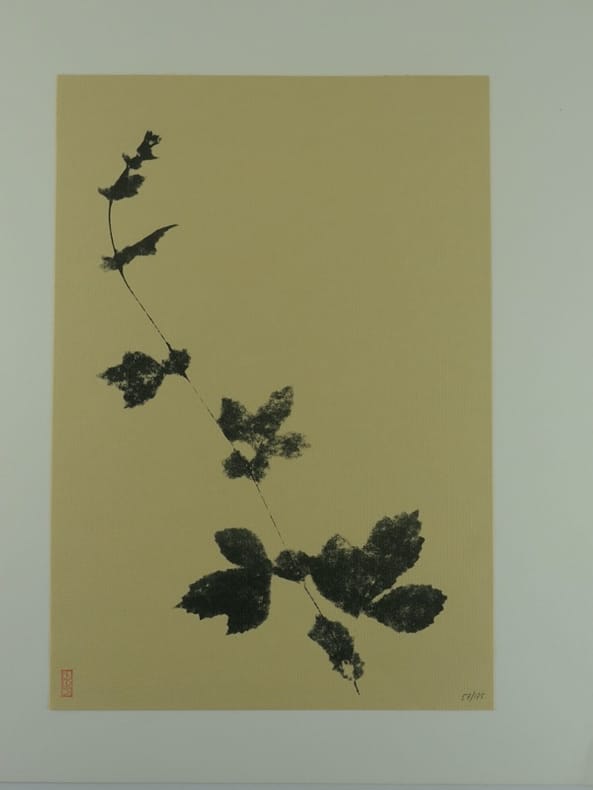
197082669Rhode-St-Genese, Ed. Albert de Visscher, 1970, 32x40cm, en feuilles sous emboîtage, non paginé. Exemplaire complet des 56 NATUROGRAPHIES tirées sur papier vergé de différentes couleurs et contrecollées sur papier fort.Emboîtage légèrement défraîchi. Planches de toutes fraîcheurs. Avant-propos de l'auteur :"Il fut une époque où en toutes choses, on distinguait le fond et la forme. Cette notion simple et pourtant plus subtile qu'il n'y paraît, fut éliminée, à tort ou à raison, par la philosophie contemporaine et par une vision plus globale des objets où l'apport de la couleur « totale » noya rapidement certaines beautés simples. Faisant abstraction des mille charmes de la couleur et contemplant le dessin de chaque fleur, de chaque graminée ou de chaque plante, je me suis penché sur le problème de rendre tout en finesse l'exquise délicatesse de chacune de ces merveilles. Il me fallait découvrir les possibilités infinies des demi-tons et des grisailles pour que chaque objet dépasse sa réalité ou la sublime. Une patiente recherche m'a appris à voir avec une nouvelle ferveur chaque détail d'une corolle, d'un pistil, d'une tige ou d'une radicelle. Encore fallait-il communiquer cette vision au moyen d'une technique nouvelle. Des mois d'étude et d'expériences passionnantes m'ont permis de proposer ici ce mode d'expression inédit, fruit d'une habilité manuelle et de l'apport des techniques modernes. Pourquoi, me direz-vous, NATUGRAPHIES ? Tout simplement pour prouver, s'il le fallait encore, qu'instinctivement notre plume, notre crayon, notre pinceau font référence à ces discrètes beautés. J'ai marché de surprise en surprise, je l'admets, mais ma recherche ne s'en est pas moins poursuivie par une approche plus consciente pour faire saisir ces graphies. Et si certains de ces beaux documents faisaient mieux voir ou même percevoir, je serais payé de toutes mes peines. Les estampes japonaises - depuis les modestes cahiers d'écriture jusqu'aux oeuvres les plus raffinées d'Outamaro, Hiroshige et Hokusai -continuent à nous enseigner cette optique des choses en la découpant en mille facettes et en nous attachant à ce noir dans ses multiples splendeurs. Chaque peuple, chaque civilisation, au moment où les hommes se croyaient comblés, a cru utile d'opérer ces retours à des valeurs élémentaires sinon fondamentales. Les écologistes du XXème siècle ne me démentiront pas."Il a été tiré du présent ouvrage cinq exemplaires sur papier Japon Impérial, numérotés de I à V réservés aux collaborateurs, vingt-cinq exemplaires sur papier Japon pur fil, numérotés de A à Y, et cent soixante-quinze exemplaires sur papiers Fabriano, Médieva crème, Ingres Arches blanc et chamois, Médieva teinte saumon, numérotés de 1 à 175. L'ouvrage comporte 56 Natugraphies toutes numérotées et signées. La gravure a été assurée par Pierre de Wespin, l'impression par les frères Naumann de l'imprimerie Dereume et l'exécution du boîtier par Adrien Austraet, relieur. Après achèvement du tirage, les originaux ont été détruits. Exemplaire N° 57/175
1980010059Paris Michèle Broutta 1980 In-4 carré En feuilles, sous emboitage toilé de l'éditeur
1346Paris : Boivin, Leclerc et. al., s. d. (vers 1750). 21 RARES LIVRETS DE MUSIQUE GRAVÉE