34 831 résultats
Opera tratta dai "Los Caprichos", per la prima volta pubblicati nel 1799. Prova della quarta edizione di dodici, stampata dalla calcografia di Madrid, circa 1870. Aquaforte, acquatinta brunita e puntasecca, in perfetto stato di conservazione. La serie chiamata Los Caprichos, è composta da ottanta incisioni, la cui prima edizione [l’unica a non essere pubblicata postuma] venne alla luce ne 1799. Curata in fase d’edizione dallo stesso artista, la serie fu commercializzata e dopo poco tempo ritirata dal mercato. Infatti, a causa dei numerosi soggetti che ironizzavano sulla società spagnola di fine secolo, il Goya subì una censura. L’interpretazione dei soggetti rappresentati su queste lastre, sempre enigmatiche, è spesso controversa Etching with burnished aquatint and engraving, 1799. From the fourth edition of twelve of the so-called "Los Caprichos" series, edited by the Madrid Calcografia [circa 1870].A very good impression, with good contrast, printed on contemporary paper, customary margins, in very good conditions. The series called Los Caprichos, consists of eighty etchings. This first edition of 1799, the only one not to be published posthumously, is imprinted on soft laid pape. Cured in phase edition by the same artist, the series was marketed and before long withdrawn from the market. In fact, because of the many subjects that mocked the Spanish society of the century, Goya suffered censorship. The interpretation of the subjects represented on these plates, always enigmatic, is often controversial. Harris 63, Delteil 65.
Opera tratta dai "Los Caprichos", per la prima volta pubblicati nel 1799. Prova della quarta edizione di dodici, stampata dalla calcografia di Madrid, circa 1870. Aquaforte, acquatinta brunita e puntasecca, in perfetto stato di conservazione. La serie chiamata Los Caprichos, è composta da ottanta incisioni, la cui prima edizione [l’unica a non essere pubblicata postuma] venne alla luce ne 1799. Curata in fase d’edizione dallo stesso artista, la serie fu commercializzata e dopo poco tempo ritirata dal mercato. Infatti, a causa dei numerosi soggetti che ironizzavano sulla società spagnola di fine secolo, il Goya subì una censura. L’interpretazione dei soggetti rappresentati su queste lastre, sempre enigmatiche, è spesso controversa. Etching with burnished aquatint and engraving, 1799. From the fourth edition of twelve of the so-called "Los Caprichos" series, edited by the Madrid Calcografia [circa 1870].A very good impression, with good contrast, printed on contemporary paper, customary margins, in very good conditions. The series called Los Caprichos, consists of eighty etchings. This first edition of 1799, the only one not to be published posthumously, is imprinted on soft laid pape. Cured in phase edition by the same artist, the series was marketed and before long withdrawn from the market. In fact, because of the many subjects that mocked the Spanish society of the century, Goya suffered censorship. The interpretation of the subjects represented on these plates, always enigmatic, is often controversial. Harris 113, Delteil 115.
Opera tratta dai Los Caprichos, per la prima volta pubblicati nel 1799.Prova della quarta edizione di dodici, stampata dalla calcografia di Madrid, circa 1870.Acquaforte, acquatinta brunita e puntasecca, in perfetto stato di conservazione.La serie chiamata Los Caprichos, è composta da ottanta incisioni, la cui prima edizione [l’unica a non essere pubblicata postuma] venne alla luce ne 1799. Curata in fase d’edizione dallo stesso artista, la serie fu commercializzata e dopo poco tempo ritirata dal mercato.Infatti, a causa dei numerosi soggetti che ironizzavano sulla società spagnola di fine secolo, il Goya subì una censura. L’interpretazione dei soggetti rappresentati su queste lastre, sempre enigmatiche, è spesso controversa. In questo soggetto Goya affronta il tema del mondo alla rovescia. Nella scena ci sono tre personaggi, il centro dell'attenzione è l'uomo che sta mangiando, e che cerca di evitare tutti gli sguardi, vergognandosi dei tratti osceni del suo viso. L'artista ha chiaramente indicato il suo pensiero disegnando la cintura di un paio di pantaloni sopra la testa del personaggio. I nasi assumono una presenza notevole sul viso, e nel linguaggio popolare "nasi" è un chiaro eufemismo sessuale. Il modo in cui il viso è costruito, in modo che sopracciglia, occhi e naso evochino l'apparato genitale maschile, rafforzerebbe lo stesso senso. Altri commenti insinuano che la figura, nel piano superiore, con i suoi grandi pugni serrati, stia commettendo sodomia con la figura che tiene il vaso da cui mangia l'uomo vergognoso. L'anno 1799 è uno dei momenti chiave nella vita e nel lavoro di Francisco de Goya. Oltre ad essere nominato primo pittore da camera di Goya, a godere di un crescente prestigio come ritrattista e ad inaugurare la cappella di San Antonio de la Florida, che aveva decorato, il 6 febbraio il Diario de Madrid pubblicò un annuncio in cui venivano messe in vendita le ottanta stampe che compongono la serie dei Caprichos. Etching with burnished aquatint and engraving, 1799.From the fourth edition of twelve of the so-called Los Caprichos series, edited by the Madrid Calcografia [circa 1870].A very good impression, with good contrast, printed on contemporary paper, usual wide margins, in very good conditions.The series called Los Caprichos, consists of eighty etchings. This first edition of 1799, the only one not to be published posthumously, is imprinted on soft laid pape.Cured in phase edition by the same artist, the series was marketed and before long withdrawn from the market. In fact, because of the many subjects that mocked the Spanish society of the century, Goya suffered censorship.The interpretation of the subjects represented on these plates, always enigmatic, is often controversial. In this print Goya approaches the theme of the world upside down. In the scene there are three characters, being the focus of attention the man who is eating, and tries to avoid all eyes, ashamed of the obscene features of his face. The artist has clearly indicated his thinking by drawing above the character's head the waistband of a pair of pants. The noses take on a notable presence on the face, and in popular language "noses" is a clear sexual euphemism. The way the face is constructed, so that eyebrows, eyes and nose evoke the male genital apparatus, would reinforce the same sense. Other comments insinuate that the figure, in the upper plane, with his large clenched fists, is committing sodomy with the figure holding the vessel from which the shameful man eats. The year 1799 is one of the key moments in the life and work of Francisco de Goya. In addition to being named first chamber painter, enjoying a growing prestige as a portrait painter and the inauguration of the chapel of San Antonio de la Florida, which he had decorated, on February 6 the announcement of the sale of the eighty prints that form the series of the Caprichos was published in the Diario de Madrid. Here, Goya focuses his social criticism on the bestiality of a deformed man whose head emerges from his breeches. Among the slight variations between the print and the preparatory drawing, the most striking is that, in the former, he wears his trousers, but in the latter, he does not. As a result, the latter came to be known as The satire of man’s lechery. Moreover, this is the only drawing in the series to mix red-ink wash with pen. Valentín Carderera’s handwritten commentaries on the Caprichos, which are in both the Biblioteca Nacional and the Museo del Prado, further clarify this subject. The first reads: Men with large noses also tend to have large arrows [here, “arrow” is a euphemism for penis] and fat gandumbas [testicles]. As they are often sodomites, this one is depicted with his breeches on his head, with his pudenda hanging out as he lies on top of a poor devil and pulls up his skirts. The second commentary completes the information: There are men whose face is the most indecent part of their body, and it would be good if those whose face is that disgraceful and ridiculous would stick it in their breeches. Example fomr the HENRI MARIE PETIET (Saint-Prix, Seine-et-Oise, 1894-1980) collection (Lugt 5031). Harris 89; Delteil 91.
Opera tratta dai "Los Caprichos", per la prima volta pubblicati nel 1799. Prova della quarta edizione di dodici, stampata dalla calcografia di Madrid, circa 1870. Aquaforte, acquatinta brunita e puntasecca, in perfetto stato di conservazione. La serie chiamata Los Caprichos, è composta da ottanta incisioni, la cui prima edizione [l’unica a non essere pubblicata postuma] venne alla luce ne 1799. Curata in fase d’edizione dallo stesso artista, la serie fu commercializzata e dopo poco tempo ritirata dal mercato. Infatti, a causa dei numerosi soggetti che ironizzavano sulla società spagnola di fine secolo, il Goya subì una censura. L’interpretazione dei soggetti rappresentati su queste lastre, sempre enigmatiche, è spesso controversa. Etching with burnished aquatint and engraving, 1799. From the fourth edition of twelve of the so-called "Los Caprichos" series, edited by the Madrid Calcografia [circa 1870].A very good impression, with good contrast, printed on contemporary paper, customary margins, in very good conditions. The series called Los Caprichos, consists of eighty etchings. This first edition of 1799, the only one not to be published posthumously, is imprinted on soft laid pape. Cured in phase edition by the same artist, the series was marketed and before long withdrawn from the market. In fact, because of the many subjects that mocked the Spanish society of the century, Goya suffered censorship. The interpretation of the subjects represented on these plates, always enigmatic, is often controversial. Harris 82, Delteil 84.
Opera tratta dai "Los Caprichos", per la prima volta pubblicati nel 1799. Prova della quarta edizione di dodici, stampata dalla calcografia di Madrid, circa 1870. Aquaforte, acquatinta brunita e puntasecca, in perfetto stato di conservazione. La serie chiamata Los Caprichos, è composta da ottanta incisioni, la cui prima edizione [l’unica a non essere pubblicata postuma] venne alla luce ne 1799. Curata in fase d’edizione dallo stesso artista, la serie fu commercializzata e dopo poco tempo ritirata dal mercato. Infatti, a causa dei numerosi soggetti che ironizzavano sulla società spagnola di fine secolo, il Goya subì una censura. L’interpretazione dei soggetti rappresentati su queste lastre, sempre enigmatiche, è spesso controversa. Etching with burnished aquatint and engraving, 1799. From the fourth edition of twelve of the so-called "Los Caprichos" series, edited by the Madrid Calcografia [circa 1870].A very good impression, with good contrast, printed on contemporary paper, customary margins, in very good conditions. The series called Los Caprichos, consists of eighty etchings. This first edition of 1799, the only one not to be published posthumously, is imprinted on soft laid pape. Cured in phase edition by the same artist, the series was marketed and before long withdrawn from the market. In fact, because of the many subjects that mocked the Spanish society of the century, Goya suffered censorship. The interpretation of the subjects represented on these plates, always enigmatic, is often controversial. Harris 56, Delteil 78.
Opera tratta dai "Los Caprichos", per la prima volta pubblicati nel 1799. Prova della quarta edizione di dodici, stampata dalla calcografia di Madrid, circa 1870. Aquaforte, acquatinta brunita e puntasecca, in perfetto stato di conservazione. La serie chiamata Los Caprichos, è composta da ottanta incisioni, la cui prima edizione [l’unica a non essere pubblicata postuma] venne alla luce ne 1799. Curata in fase d’edizione dallo stesso artista, la serie fu commercializzata e dopo poco tempo ritirata dal mercato. Infatti, a causa dei numerosi soggetti che ironizzavano sulla società spagnola di fine secolo, il Goya subì una censura. L’interpretazione dei soggetti rappresentati su queste lastre, sempre enigmatiche, è spesso controversa. Etching with burnished aquatint and engraving, 1799. From the fourth edition of twelve of the so-called "Los Caprichos" series, edited by the Madrid Calcografia [circa 1870].A very good impression, with good contrast, printed on contemporary paper, customary margins, in very good conditions. The series called Los Caprichos, consists of eighty etchings. This first edition of 1799, the only one not to be published posthumously, is imprinted on soft laid pape. Cured in phase edition by the same artist, the series was marketed and before long withdrawn from the market. In fact, because of the many subjects that mocked the Spanish society of the century, Goya suffered censorship. The interpretation of the subjects represented on these plates, always enigmatic, is often controversial. Harris 94, Delteil 96.
Monotipo o herkomergravure, 1891, firmato e datato sulla lastra in alto a destra Hubert Herkomer '91. Una bella impressione, stampata su carta contemporanea, con margini, condizioni perfette. “Il monotipo è il mezzo di stampa più diretto. L'artista dipinge su una superficie liscia e impermeabile, mette un pezzo di carta bianca sopra il dipinto e applica una pressione in modo che l'immagine dipinta venga trasferita sulla carta. […] Durante il diciannovesimo secolo ci fu molto ingegno nel trovare un modo per gli stampatori di creare edizioni che fossero pittoriche come il monotipo. Generalmente, gli inventori sperimentavano un composto speciale che poteva essere applicato al dipinto dell'artista ancora umido, non appena eseguito su una lastra di rame. Quando la lastra veniva asciugata e galvanizzata, poteva essere inchiostrata come una lastra incisa e stampata più e più volte, fornendo la spontaneità del monotipo, ma con la ripetibilità di altri mezzi di stampa. Vari inventori inventarono processi simili, e alla fine del 1800 erano disponibili tre processi per coloro che desideravano fare una stampa che avesse alcune delle qualità visive di un monotipo, ma che potesse anche essere prodotta in un'edizione di stampe identiche: il galvanografo, l'elettrotinta e l'herkomergravure, dal nome del suo inventore, Hubert Herkomer (1849-1914). William Merritt Chase (americano, 1849-1916) introdusse Herkomer al processo del monotipo nel 1885. Herkomer sviluppò il suo processo nel 1897, ma ne scrisse per la prima volta nel 1892. Potrebbe essere stato nel 1902 che Herkomer ricambiò il favore di Chase introducendolo all'herkomergravure, quando Chase tornò in Inghilterra. Il processo implicava la spalmatura di inchiostro su una lastra di rame e la creazione dell'immagine con le dita e/o i pennelli, come nel processo del monotipo. Poi la lastra veniva spolverata con una combinazione di polveri speciali, asciugata e placcata. L'immagine risultante era un quasi monotipo" (cfr. Andrew Stevens, American Monotypes from the Baker/Pisano Collection, pp. 3-6). Sir Hubert von Herkomer era un artista britannico di origine tedesca, e anche un regista e compositore pioniere del cinema. Sebbene fosse un ritrattista di grande successo, soprattutto di uomini, è ricordato soprattutto per le sue prime opere che avevano un approccio realistico alle condizioni di vita dei poveri Bibliografia Herkomer, Hubert. Etching and Mezzotint Engraving: Lectures Delivered at Oxford. New York: Macmillan, 1892; Andrew Stevens, American Monotypes from the Baker/Pisano Collection, Exh. Cat., by Russell Panczenko, Andrew Stevens, and D. Frederick Baker, pp. 3-6. Monotype or herkomergravure, 1891, signed and dated on plate at the upper right Hubert Herkomer ’91. A fine impression, printed on contemporary wove paper, with margins, perfect condition. “Monotype is the most direct print medium. The artist paints on a smooth, impermeable surface, places a blank piece of paper on top of the painting, and applies pressure so that the painted image is transferred onto the paper. […] Through the nineteenth century there was much ingenuity expended on finding a way for printmakers to create editions that were as painterly as monotype. Generally, inventors came up with a special compound that could be applied to the still-wet artist’s painting executed on a copper plate. When the plate was dried and electroplated, it could then be inked like an etched or engraved plate and printed again and again, providing the spontaneity of the monotype, but with the repeatability of other print media. Various inventors came up with similar processes, and by the end of the 1800s three processes were available for those wishing to make a print that had some of the visual qualities of a monotype, but could also be produced in an edition of identical prints: the galvanograph, the electrotint, and the herkomergravure, named after its inventor, Hubert Herkomer (English, 1849–1914). Herkomer was a popular painter of portraits and social genre scenes, and an inveterate experimenter in the arts. William Merritt Chase (American, 1849–1916) introduced Herkomer to the monotype process in 1885. Herkomer developed his process by 1897, but first wrote about it in 1892. It may have been in 1902 that Herkomer returned Chase’s favor by introducing him to the herkomergravure, when Chase next returned to England. The process involved smearing ink onto a copper plate and creating the image with fingers and/or brushes, as with the monotype process. Then the plate was dusted with a combination of special powders, dried, and electroplated. The resulting image was a quasi-monotype” (cfr. Andrew Stevens, American Monotypes from the Baker/Pisano Collection, pp. 3-6). Sir Hubert von Herkomer was a German-born British artist, and also a pioneering film-director and composer. Though a very successful portraitist, especially of men, he is mainly remembered for his earlier works that took a realistic approach to the conditions of life of the poor. Bibliografia Herkomer, Hubert. Etching and Mezzotint Engraving: Lectures Delivered at Oxford. New York: Macmillan, 1892; Andrew Stevens, American Monotypes from the Baker/Pisano Collection, Exh. Cat., by Russell Panczenko, Andrew Stevens, and D. Frederick Baker, pp. 3-6.
Acquaforte, fine del XVIII secolo, nel margine inferiore, un’iscrizione su due righe, non chiaramente leggibile: “Joanni Baptistae Locatelli sculpori Egreggio Quas es Augustino Caraccia .... Primitias suas Verae Amicitiae in ...gum D D Lomazzi ?” Bell’esemplare, impresso su carta azzurra, rifilato alla linea marginale, in ottimo stato di conservazione. Copia, in controparte, di un’incisione di Agostino Carracci (1598) a sua volta basata sull'acquaforte di Annibale Carracci del 1597. Sconosciuta a De Grazia, non abbiamo trovato alcun riscontro bibliografico. Etching, 1790’ circa, in lower margin an inscription on two lines, not clearly readable: “Joanni Baptistae Locatelli sculpori Egreggio Quas es Augustino Caraccia .... Primitias suas Verae Amicitiae in ...gum D D Lomazzi ???” Beautiful example, printed on blue paper, trimmed at the marginal line, in excellent condition. Copy, in reverse, of an Agostino Carracci’ engraving (1598) based on the original etching by Annibale Carracci.. Unknown to De Grazia, we have not found any bibliographical reference. Non descritta.
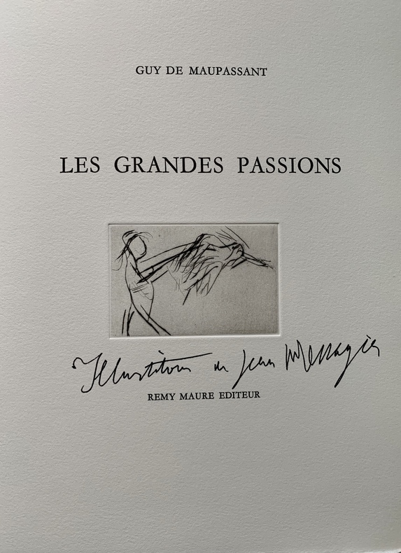
awd-107S. l., s. d., Rémy Maure éditeur. In-4 en feuilles, couverture rose à rabats, emboîtage toilé jaune et moutarde de l’éditeur (40 pp.). Tirage non spécifié. 12 pointes sèches signées de l’artiste. Bon état.
1853149161853 Un volume, reliure d'époque demi-maroquin rouge in-quarto (binding half morocco in-quarto, dos à nerfs (spine with raised bands) décoration or (gilt decoration) et à froid (blind-stamping decoration) - entre-nerfs à caissons à froid, - titre frappé or (gilt title) - chiffre surmonté d'une couronne Baronnale or en pied, plats décorés d'un encadrement de filets à froid + le chiffre du baron de Poléon surmonté de la couronne Baronnale à froid (cover blind-stamping), plats légèrement tachés (traces d'humidité), papier gaufré aux plats de la même couleur que le dos (cover with embosed paper of the same color as spine), toutes tranches lisses (all smooth edges), cahier manuscrit à l'encre brune, avec des encadrements et calligraphies manuscrites à l'encre brune + des cartes de géographies manuscrites in et hors-texte dont 2 dépliantes (dont une colorée) , sans pagination (224 pages), fait au chateau de poléon entre 1851 et 1853, corrections en bleu et notes par leur professeur C. Camadet,
Acquaforte e bulino, 1747, stampata da H. Woodfall per John e Paul Knapton a Londra, nel 1749. Ottima impressione su carta vergata coeva, con margini, perfette condizioni. Questo raro lavoro fa parte dello splendido atlante anatomico del XVIII secolo, il The Tables of the Skeleton and Muscles of the Human Body di Albino. Venne pubblicato da John e Paul Knapton, a Londra, senza il permesso dell'autore solo due anni dopo la prima edizione del 1747, a Leida. Questa seconda edizione è stampata nello stesso enorme formato della prima edizione, con le illustrazioni derivanti dalle celebri tavole di Jan Wandelaar, curate qui da Charles Grignion, Jean-Baptiste Scotin, Ludovico Antonio-Ravenet e Louis-Pierre Boitard. Wandelaar posò scheletri e figure muscolose contro lussureggianti sfondi ornamentali per dare loro l'illusione di vitalità, arricchiti con contrasti di massa e luce per produrre un effetto tridimensionale. Etching with engraving, 1747. Printed by H. Woodfall for John and Paul Knapton, London, 1749. A very good impression on contemporary laid paper, with margins, perfect condition. This rare work is part of the most splendid anatomical atlas of 18th century, The Tables of the Skeleton and Muscles of the Human Body, published by John and Paul Knapton in London without author's permission (later that year they issued an English translation of the work), only two years after the 1st edition was published in 1747 in Leiden (largely at Albinus' own expense). This second edition is printed in the same enormous format as the first of 1747, with the celebrated Jan Wandelaar's plates re-engraved for this edition by Charles Grignion, Jean-Baptiste Scotin, Ludovico-Antonio Ravenet and Louis-Pierre Boitard. Wandelaar placed his skeletons and musclemen against lush ornamental backgrounds to give them the illusion of vitality, using contrasts of mass and light to produce a three-dimensional effect. ESTC (RLIN) N49651 Garrison-Morton (5th ed.), no. 399 Russell, K.F. British anatomy (2nd ed.), no. 5 Wellcome cat. of printed books, vol. II, p. 26.
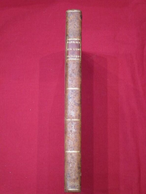
1791117402Imprimerie Nationale 1791 1 A Paris, De l'Imprimerie Nationale, 1791, 1 volume in-quarto de 195x250 mm environ, page de titre, 216 pages, complet des 9 planches dépliantes. Demi-reliure, dos long portant titres dorés sur pièce de cuir rouge, tranches jaspées. Coiffe de tête et coins arasés, des frottements sur les plats et les coupes, tampons et ex libris, annotations marginales au crayon de papier, rares rousseurs sinon intérieur propre, état général correct.
146523Paris, Société de Propagation des Livres d'Art, 1914-1915 fort gr. in-4, 838 pp., 107 reproductions en couleurs, 264 gravures en noir et 26 plans, broché.
Acquaforte e incisione, 1645, numerata "14" in basso a destra. Dalla serie: Amoenissimae aliquot Regiunculae, et antiquorum momentorum ruinae: a Ioanne Veldio Iuniore delineatae, et per chalcographiam in luck aeditae a Nicolao Ioannis Vischerio anaglijptario. Anno. MDCXV. AMSTELODAMI, composta da diciotto paesaggi con rovine, pubblicato da Claes Jansz. Visscher (II) nel 1615. Sebbene priva di titolo e genericamente descritta dalle bibliografie, la veduta raffigura il Tevere e ponte Sisto a Roma. Si tratta di uno dei numerosi paesaggio con rovine romane che Van de Velde ritrasse durante il suo periodo italiano. Magnifica prova, stampata su carta vergata contemporanea, rifilata vicino alla marca da lettera, in ottime condizioni. Jan van de Velde II proveniva da una famiglia di artisti. Suo padre era un celebre calligrafo e insegnante ed era il nipote di Esaias van de Velde, un importante pittore di paesaggi. Anche Jan si specializzò in paesaggi, ma si fece notare come incisore e disegnatore. I suoi paesaggi incisi erano spesso basati su disegni dalla natura e la sua enfasi sui dettagli naturalistici e sulla composizione semplice influenzò altri artisti tra cui Rembrandt Harmensz. van Rijn. Cresciuto a Rotterdam, Van de Velde si formò come incisore con l'artista Jacob Matham a Haarlem. Nel 1614, si unì alla Gilda di San Luca di Haarlem e iniziò a produrre stampe in serie. In questa fase iniziale della sua carriera, Van de Velde era tra gli artisti più prolifici di Haarlem e aveva prodotto più di cento incisioni di paesaggi entro il 1617 (all'età di ventiquattro anni). Oltre ai paesaggi, Van de Velde creò più di cinquanta ritratti, così come scene di genere, illustrazioni di libri e dipinti. Con il progredire della sua carriera, cominciò a basare la sua produzione incisa sul lavoro di altri artisti, compreso quello di suo cugino Esaias. Lavorò anche come insegnante e suo figlio, Jan Van de Velde III, fu un pittore di nature morte. Etching and engraving, 1645, numbered “14” at bottom right. From the series: Amoenissimae aliquot Regiunculae, et antiquorum momentorum ruinae: a Ioanne Veldio Iuniore delineatae, et per chalcographiam in luck aeditae a Nicolao Ioannis Vischerio anaglijptario. Anno. MDCXV. AMSTELODAMI." consisting of of eighteen landscapes with ruins, published by Claes Jansz. Visscher (II) in 1615. Magnificent proof, printed on contemporary laid paper, trimmed close to platemark, in very good condition. Jan van de Velde II came from an artistic family. His father was a celebrated calligrapher and teacher and he was the nephew of Esaias van de Velde, an important landscape painter. Jan also specialized in landscapes but made his mark as a printmaker and draftsman. His engraved landscapes were often based on drawings from nature and his emphasis on naturalistic detail and simple composition influenced other artists including Rembrandt Harmensz. van Rijn.Raised in Rotterdam, Van de Velde trained as an engraver with the artist Jacob Matham in Haarlem. In 1614, he joined Haarlem's Guild of St. Luke, and began producing prints in series. At this early stage in his career, Van de Velde was among Haarlem's most prolific artists and had produced more than a hundred landscape etchings by 1617 (at the age of twenty-four).In addition to landscapes, Van de Velde created more than fifty portrait prints as well as genre scenes, book illustrations, and paintings. As his career progressed, he began to base his engraved output on the work of other artists including that of his cousin Esaias. He also worked as a teacher and his own son, Jan Van de Velde III, was a still-life painter. Hollstein 194; Franken & van der Kellen (1883), n. 233 p. 104.
80 pages. Undated. Circa early 1900s? Colour illustration upon front board shows two young girls and a boy making daisy chains. Colour plate frontis (by D.C.S.?) shows girl on park bench reading to three youngsters and a dog seated around her, with the caption "There sits fair-haired Effie." Stories include: Playing Horses; The Concert at the Zoo; The Holiday Coach; The Bravest Deed; Going to See the Queen; A Visit to the Country; Elsie's Team; Eric's Holiday; Mrs. Lion's Infant School; A visit to the West Indies; Five Peas in a Pod; Proud Mr. Drake; The Whistling Pig; The Stray Lamb; The Boy and the Monkey; A Merry Game; How do you Do?; Mrs. Otter and Her Young Ones; Morning Song; The Wonderful Doll's House; Tired of Waiting; Poor Mrs. Duck!; The Grand Duchess; The Clever Cat; Eddy's Accident; My Portrait; Father's Birthday Present; Will's Wondrous Story; Katie's Present; and Topsy and the Gypsies. Contemporary pencil gift greetings atop front free endpaper. Erased pencil writing inside front board nearly invisible. Hinges intact. Binding sound. Original maroon cloth backstrip intact. Average wear and soiling to boards. Moderate yellowing to contents. A sound copy of this charming work. Book
Half-leather binding. Telephone Talk was the glossy bimonthly publication of the British Columbia Telephone Company. It was written by employees for employees to present information of interest to those engaged in the plant, traffic, commercial, operating, accounting and other departments of the service. Each issue is replete with black and white photos and information on topics such as: company, industry and technological news, traffic levels, expansion plans, personnel announcements, publicity and social events, deaths, weddings, lists of exchanges, and more. As such, these issues serve as a vital preserve of rare and fascinating British Columbia history. This volume covers topics including: Photos of operators at work in Haney, Nanaimo and Port Moody; $35 million improvement and expansion programme; Rotation billing will be inaugurated in March; Ed Tomer terminates 44-year career; Victoria says good-bye to George Gaetz; Daniel G. Houston - he installed phones in the horse-and-wagon days; Retirement of Thomas (Tom) Smith; photos of W.J. Jefree's clothing store and W.J. Pendray soap works, both in Victoria - the first commercial firms in British Columbia to be linked by a telephone line, in 1880; Photo of Nanaimo's first telephone office in 1887 at the fruit store of Mr. and Mrs. E.G. Cavalsky; Photo of splicer's school; Annual report reveals record demand for service as result of great growth of province; World telephone network is operating again; A farewell to Dave Falconer; The telephone situation as we see it today; Hammond-Haney toll charges eliminated; From Office Boy to District Plant Chief - Lindsay Morrison; High school visitors to the Hasting's operator area; New Building Commemorates Name of First Company President, William Farrell - article with photos; A Report on the telephone situation in B.C.; Thirty-Four Years of Phone Service at Parksville; First commercial VHF circuits now in service here; Toll Chief Operator weds Chief Engineer - A.H. Lemmon and Lila Boden; advertising slogans; Wirephoto service comes to Vancouver; Telephony made great Strides during Labelle Career - Eugene P. LaBelle retires after 44 years in telephony *THIS APPEARS TO BE THE PERSONAL COPY OF MR. LABELLE AS HIS NAME IS STAMPED ON TOP EDGE OF TEXT*; A.C. Bull Elected Federation President; Photo of lovely twin sister operators in Vancouver; Photos behind the scenes at the Victoria Plant Building; New Dial Offic, 'Cedar', Now in Service; 800,000 phone calls per day in Vancouver; Wage increases for 1,000 plant employees; Meet the Executive Assistant's Department - many photos; Nearly 3,800 Bayview phones 'cut' to Cedar; Revenue accounting girls adopt three orphans; replica's of 3 recent billboards, 2 of which include suggestions for party line use; misc. photos of Fraser Valley operators; 1947 was record year despite shortages; *Car phone* service now available - with photo; Leo Griggs, Nanaimo Plant Head, retires; Fifteen years ago; Three blind mice in South America - Kathleen Stephen and Catherine Wilson recall their trip; Ads advise fewer calls, shorter calls - with 2 ads; "Newton" joins our telephone family - story and photos; 1947 progress was offset by record demand annual report points out; 37 years of ups and downs - Percy Turley, cable-splicing foreman; Miss Gertrude Greaves honoured; Photos of Seymour (Vancouver) operators; photo of radiotelephone transmitting station at Lulu Island; various photos inside Kamloops office with staff; article on John (Jack) C. Hemer; Operators learn Human Nature's Queer Quirks; Newspaper columnist visits new William Farrell Building; Trans-Canada phone system construction job resumed - text and photos; photos of staff and facilities at Princeton; Spirit of service triumphs over flood - photos of washed out Mission bridge and more, plus article; PNE float photos; Introducing the company's new business library; New submarine cable links Vancouver and North Shore - photos and text; T. Percy Waters Book
1911R260186978AUGUSTE VINCENT. 1911. In-12. En feuillets. Bon état, Couv. convenable, Dos satisfaisant, Intérieur frais. PLANCHES 1 A 254 en noir et blanc dans et hors texte. DE LA SERIE 1 A LA SERIE N° 6 - 4 PHOTOS DISPONIBLES -. . . . Classification Dewey : 720-Architecture
1935R260187006ECOLE NATIONALE SUPERIEURE DES BEAUX ARTS -. 1935. In-4. En feuillets. Bon état, Couv. convenable, Dos satisfaisant, Intérieur frais. PLANCHES DE 1 A 147 en noir et blanc hors texte ( certaines sont sur 2 pages). MANQUE LES PLANCHES N° : 16 - 28 - 34 - 55 - 59 - 70 - 89 - 126 - 127 - 128 // 3 PHOTOS DISPONIBLES -. . . . Classification Dewey : 720-Architecture
Appears to be a 1970s or 1980s replica of the pre-WWII original. Features sexy young beauty holding parasol in canoe. She is wearing only short shorts and a skimpy red top which is pulled down to reveal her right breast. Periphery features illustrations of the many products offered by the Great Eastern Dispensary Ltd. Approximately 30" x 20". Crimped metal strips protect top and bottom edges. Clean and unmarked with light wear. A charming memento of 1930s Shanghai and a classy addition to the wall of any Asian man cave. Will be shipped in a sturdy mailing tube. Poster
Wonderful vintage photo montage of the British Columbia Normal (Teacher Training) School class of 1911-12 in Vancouver, British Columbia. Photos taken by Walter H. Calder. Montage, which measures 15.75" x 9.6", is mounted on a contemporary matte backing which measures 17" x 14". Moderate wear. Pencilled name on reverse, otherwise clean and unmarked. A wonderful piece of Vancouver and British Columbia history. Book
Pages 337-374 plus xvi pages of great vintage ads. Many great black and white photos. Features: The House of A.C. Bartlett, Esq., Lake Geneva, Wisconsin; Raffia in the Normal School; The Endicott Garden at Danvers, MA; A French Rhea (a South American bird related to the emu and ostrich) and Cassowary Farm; A Flock of Highland Sheep Homeward Bound - wonderful two-page photo of a large flock being driven down a road by two farmers; A Residential Park near Philadelphia - "Stoke Pogis," at Villanova, PA; The Bark Cabin - durable, attractive and inexpensive summer homes; "The Terraces" - the Summer Residence of Edward Vassallo Hartford, at Deal, NJ; One-page ad for Chickering Pianos; Sensational back cover color ad for the 1909 line of Pierce Arrow cars features wealthy couple in car with butler, tennis jock and young couple standing beside car; and more. Printed on glossy stock. Complete and unmarked with average wear. Some pages loose but all present. A quality copy of this great vintage issue. Magazine
95 pages. Author's signature upon title page. "Money, and in modern times credit, in all their forms and instruments, are the lifeblood of society and the nation. For generations, practically all modern industrialized nations have experienced periods of boom times and inflation, followed by depression, hard times and a shortage of 'money'... and in recent decades, every country seems plagued with an escalating mountain of debt - and taxation to pay the interest on the mounting debt." - dust jacket. Author has been an inexhaustable and prominent proponent of freedom for Canadians for many decades. Unread. Gift quality. Book
98 unnumbered pages. 11.3" x 8.3". A comprehensive and well presented history of this large WWII training centre for Air Bombers and Navigators. At its peak, No. 7 consisted of some 2,000 people. The informative text is generously illustrated with dozens of black and white photos featuring hundreds of students, graduates, administrators, and all manner of support staff, many of whom are named. Printed upon glossy stock. Undated but appears to be circa 1945. Blue card covers attractively decorated in black and gilt. Openings at each end of backstrip otherwise unmarked with average wear. Binding intact. A quality copy of this important history. Peel [3] 6778. Book
210 pages. "This little book is offered to the reader in the hope that it will help him/her to liberate the beautiful self which is him/herself; and also to see that everyone has a beautiful self waiting to be let out." Early printing of this classic home schooling work. Prior owner's name atop front endpaper else unmarked. Binding intact. Moderate wear to blue boards. Yellowing to endpapers. Nice copy. Book
252 pages including index. "The point of view taken in this volume is, that all beautiful and noble possibilities are present in everyone; but that each person is subject to assault and hindrance in various ways of which he should be aware in order that he may watch and pray." - from preface. Prior owner's name atop front endpaper else unmarked. Binding intact. Minor warp to blue boards. Moderate to average wear. Nice early copy of this classic home-learning work. Book