GAUGUIN Paul & MONFREID George-Daniel deMareMagnum

10 681 résultats
- s.d. (1924), 93x78mm, autre. - Diane et Actéon aux Marquises. Noa Noa. Unique proof of the woodcut drawn and engraved after Paul Gauguin by George-Daniel de Monfreid [between 1904 & 1924] | 9,3 x 7,8 mm | one sheet Original proof, likely unique, of this intermediate state of a woodcut drawn and engraved by George-Daniel de Monfreid after two works by Paul Gauguin. Print on Japan silk, annotation by the artist in the left-hand margin. Woodcut drawn and engraved after two works, the man holding a branch being a reproduction of a watercolor on page 37 of the Noa Noa manuscript, while the full-length woman originally observed by this browser, is presented here in bust with her hand to her face, model reproduced on a woodcut engraved by Gauguin on page 4 of the manuscript (and his original sketch pasted on page 51), evoking a similar scene. The final woodcut will serve as the head of chapter IV of the first true illustrated edition of Noa Noa, published by Crès in 1924, the first illustrated work after Paul Gauguin and a majestic tribute to one of the precursors of modern art. Superb engraving synthesizing a watercolor from the original Noa Noa manuscript, inspired by the myth of Diana and Actaeon, engraved by Gauguin's closest friend and executor, the artist George-Daniel de Monfreid, heir to the album he would offer to the French State in 1927. A likely unique proof, part of 17 known test woodcuts from the early project to publish Noa Noa, all made on various fine papers and annotated by the artist. Woodcut engraved after a watercolor reinterpreting the myth of Diana, surprised in the bath by Actaeon. In the engraving, Monfreid took care to preserve the typical of deer antler shape of the branch seized by the indiscreet, which evokes its metamorphosis by the goddess. A very rare work by Gauguin mixing ancient mythology and island exoticism, whose subversive power seems entirely carried by the vahine Diana's expression of feint surprise. It is from the original illustrated manuscript of Noa Noa, brought back from Tahiti by Segalen on the artist's death in 1903, that Monfreid began producing this fundamental work from as early as 1904. This is the second version of this "to read and look at" notebook. The first manuscript, written on the return of his first voyage and entrusted by Gauguin to Charles Morice in 1893, responded to a different project. Gauguin had composed only the text, interspersed with blank pages for Morice's poems. But after several years without news, Morice preferred to publish a version entirely rewritten by himself in 1901. Gauguin, therefore, copied his manuscript and illustrated it during his second stay in Polynesia, with sketches, watercolors and collages. This album, that the artist enriched and safely preserved until his death, is preserved today at the Musée d'Orsay. It is, therefore, from this manuscript, the only one illustrated, that Monfreid composed the edition of Gauguin's Noa Noa. However, although Monfreid's publication was forward, it took more than twenty years to complete, in part due to a copyright dispute with Charles Morice who wanted to be co-author of the forthcoming edition and whose poems would eventually be preserved. The result of several years of reflection and work, the 1924 edition is both faithful to the watercolors and woodcut engravings illustrating the precious manuscript, and to the whole of Gauguin's Tahitian work, who died in indifference. Monfreid thus engraves several drawings from the original notebook and enriches it with woodcuts made from other works of which he is the custodian. Some of these compositions combine several paintings, while scrupulously respecting the artist's line, transforming the work into a true journey through the painter's works. The very choice of using wood engraving is a tribute to this technique prized by Gauguin, who, in Pont-Aven, produced 10 woodcuts to illustrate his manuscript between his two Polynesian stays. The interm
- s.d. (1924), 93x78mm, autre. - La Mémoire et l'Imagination. Noa Noa. Unique proof of the woodcut drawn and engraved after Paul Gauguin by George-Daniel de Monfreid [between 1904 & 1924] | 9,3 x 7,8 cm | one sheet Original proof, likely unique, of this intermediate state of a woodcut drawn and engraved by George-Daniel de Monfreid after a watercolor by Paul Gauguin. Print on fine cream laid paper, annotation by the artist in the left-hand margin. Woodcut drawn and engraved after a watercolor from the Noa Noa manuscript, pasted on a page of text of the famous album. The final woodcut will serve as the head of the first illustrated edition of Noa Noa, published by Crès in 1924, the first illustrated work after Paul Gauguin and a majestic tribute to one of the precursors of modern art. Superb and significant engraving after a very specific watercolor from Paul Gauguin's manuscript, a real breakthrough in text, engraved by his closest friend and executor, the artist George-Daniel de Monfreid, heir to the album he would offer to the French State in 1927. The initial watercolor was cut out in waves around the female figure and pasted on the last chapter to prevent it from being read and thus get the story back on track. Gauguin had also added winding lines starting from the watercolor on the text page, thus giving the impression of a cave breaking through the page, by the psychic power of the sitting woman whose head diffuses the undulating rays. Monfreid decided to place it at the head of the work accompanied by two birds taken from other works, to illustrate the power of the artist and his imagination. A likely unique proof, part of 17 known test woodcuts from the early project to publish Noa Noa, all made on various fine papers and annotated by the artist. Unique proof of a woodcut engraved after the mystical watercolor erasing the first ending of the story to allow the reader to graphically enter the painted album, repeated in the printed version as the initiatory opening of the engraved story. It is from the original illustrated manuscript of Noa Noa, brought back from Tahiti by Segalen on the artist's death in 1903, that Monfreid began producing this fundamental work from as early as 1904. This is the second version of this "to read and look at" notebook. The first manuscript, written on the return of his first voyage and entrusted by Gauguin to Charles Morice in 1893, responded to a different project. Gauguin had composed only the text, interspersed with blank pages for Morice's poems. But after several years without news, Morice preferred to publish a version entirely rewritten by himself in 1901. Gauguin, therefore, copied his manuscript and illustrated it during his second stay in Polynesia, with sketches, watercolors and collages. This album, that the artist enriched and safely preserved until his death, is preserved today at the Musée d'Orsay. It is, therefore, from this manuscript, the only one illustrated, that Monfreid composed the edition of Gauguin's Noa Noa. However, although Monfreid's publication was forward, it took more than twenty years to complete, in part due to a copyright dispute with Charles Morice who wanted to be co-author of the forthcoming edition and whose poems would eventually be preserved. The result of several years of reflection and work, the 1924 edition is both faithful to the watercolors and woodcut engravings illustrating the precious manuscript, and to the whole of Gauguin's Tahitian work, who died in indifference. Monfreid thus engraves several drawings from the original notebook and enriches it with woodcuts made from other works of which he is the custodian. Some of these compositions combine several paintings, while scrupulously respecting the artist's line, transforming the work into a true journey through the painter's works. The very choice of using wood engraving is a tribute to this technique prized by Gauguin, who, in Pont-Aven, produced 10 woodcuts to illu
- s.d. (1924), 93x78mm, autre. - Les Odalisques aux mangues. Noa Noa. Unique proof of the woodcut drawn and engraved after Paul Gauguin by George-Daniel de Monfreid [between 1904 & 1924] | 9,3 x 7,8 cm | one sheet Original proof, likely unique, of this intermediate state of a woodcut drawn and engraved by George-Daniel de Monfreid after Paul Gauguin. Print on fine cream laid paper, annotation by the artist in the left-hand margin. Woodcut drawn and engraved after two different works. The back of the woman is an exact reproduction of an ink from page 92 of the Noa Noa manuscript, while the woman lying down takes up the well-known theme of the woman with mangos, Te Arii Vahine-Opoi, that Gauguin represented in paint as well as with an engraving in 1898. The final woodcut will serve as the head of chapter V of the first true illustrated edition of Noa Noa, published by Crès in 1924, the first illustrated work from Paul Gauguin and a majestic tribute to one of the precursors of modern art. Superb and significant engraving uniting two major themes of the Tahitian work, including the central drawing of the Noa Noa manuscript, faithfully engraved by Gauguin's closest friend and executor, the artist George-Daniel de Monfreid. A likely unique proof, part of 17 known test woodcuts from the project to prematurely publish Noa Noa, all made on various fine papers and annotated by the artist. Woodcut engraved from two major original works. By uniting these two vahines with sensual postures, Monfreid brings about a true synthesis of Gauguin's work, all while using the traditional double figure of the artist's paintings. It is from the original illustrated manuscript of Noa Noa, brought back from Tahiti by Segalen on the artist's death in 1903, that Monfreid began producing this fundamental work from as early as 1904. This is the second version of this "to read and look at" notebook. The first manuscript, written on the return of his first voyage and entrusted by Gauguin to Charles Morice in 1893, responded to a different project. Gauguin had composed only the text, interspersed with blank pages for Morice's poems. But after several years without news, Morice preferred to publish a version entirely rewritten by himself in 1901. Gauguin, therefore, copied his manuscript and illustrated it during his second stay in Polynesia, with sketches, watercolors and collages. This album, that the artist enriched and safely preserved until his death, is preserved today at the Musée d'Orsay. It is, therefore, from this manuscript, the only one illustrated, that Monfreid composed the edition of Gauguin's Noa Noa. However, although Monfreid's publication was forward, it took more than twenty years to complete, in part due to a copyright dispute with Charles Morice who wanted to be co-author of the forthcoming edition and whose poems would eventually be preserved. The result of several years of reflection and work, the 1924 edition is both faithful to the watercolors and woodcut engravings illustrating the precious manuscript, and to the whole of Gauguin's Tahitian work, who died in indifference. Monfreid thus engraves several drawings from the original notebook and enriches it with woodcuts made from other works of which he is the custodian. Some of these compositions combine several paintings, while scrupulously respecting the artist's line, transforming the work into a true journey through the painter's works. The very choice of using wood engraving is a tribute to this technique prized by Gauguin, who, in Pont-Aven, produced 10 woodcuts to illustrate his manuscript between his two Polynesian stays. The intermediate woodcuts, until then unknown, testify to the slow work of composition to restore the artistic richness of Gauguin's work by his most faithful artistic companion and first champion: "When I saw Gauguin for the first time, I was greatly disconcerted by the details of art that radiated from his works as well as from the conversations
- s.d. (1924), 93x78mm, autre. - Retour de pêche aux thons et bonites. Noa Noa. Unique proof of the woodcut drawn and engraved after Paul Gauguin by George-Daniel de Monfreid [between 1904 & 1924] | 9,3 x 7,8 cm | one sheet Original proof, likely unique, of this intermediate state of a woodcut drawn and engraved by George-Daniel de Monfreid after a watercolor by Paul Gauguin. Print on fine cream laid paper, annotation by the artist in the left-hand margin. Woodcut drawn and engraved from the first watercolor of the Noa Noa manuscript, pasted on a page of text of the famous album. The final woodcut will serve as the head of chapter X of the first true illustrated edition of Noa Noa, published by Crès in 1924, the first illustrated work from Paul Gauguin and a majestic tribute to this precursor of modern art. Superb and significant engraving of the work opening Paul Gauguin's manuscript, engraved by his closest friend and executor, the artist George-Daniel de Monfreid, heir to the album he would offer to the French State in 1927. This likely unique proof, part of 17 known test woodcuts from the project to prematurely publish Noa Noa, all made on various fine papers and annotated by the artist. Woodcut engraved from the watercolor inaugurating one of the painter's most beautiful albums, symbolizing the Tahitian art of living, between the nourishing sea and earthly pleasures. It is from the original illustrated manuscript of Noa Noa, brought back from Tahiti by Segalen on the artist's death in 1903, that Monfreid began producing this fundamental work from as early as 1904. This is the second version of this "to read and look at" notebook. The first manuscript, written on the return of his first voyage and entrusted by Gauguin to Charles Morice in 1893, responded to a different project. Gauguin had composed only the text, interspersed with blank pages for Morice's poems. But after several years without news, Morice preferred to publish a version entirely rewritten by himself in 1901. Gauguin, therefore, copied his manuscript and illustrated it during his second stay in Polynesia, with sketches, watercolors and collages. This album, that the artist enriched and safely preserved until his death, is preserved today at the Musée d'Orsay. It is, therefore, from this manuscript, the only one illustrated, that Monfreid composed the edition of Gauguin's Noa Noa. However, although Monfreid's publication was forward, it took more than twenty years to complete, in part due to a copyright dispute with Charles Morice who wanted to be co-author of the forthcoming edition and whose poems would eventually be preserved. The result of several years of reflection and work, the 1924 edition is both faithful to the watercolors and woodcut engravings illustrating the precious manuscript, and to the whole of Gauguin's Tahitian work, who died in indifference. Monfreid thus engraves several drawings from the original notebook and enriches it with woodcuts made from other works of which he is the custodian. Some of these compositions combine several paintings, while scrupulously respecting the artist's line, transforming the work into a true journey through the painter's works. The very choice of using wood engraving is a tribute to this technique prized by Gauguin, who, in Pont-Aven, produced 10 woodcuts to illustrate his manuscript between his two Polynesian stays. The intermediate woodcuts, until then unknown, testify to the slow work of composition to restore the artistic richness of Gauguin's work by his most faithful artistic companion and first champion: "When I saw Gauguin for the first time, I was greatly disconcerted by the details of art that radiated from his works as well as from the conversations of this extraordinary man... You immediately felt that he was the Master" (in L'Hermitage, 1903). [FRENCH VERSION FOLLOWS] Epreuve originale probablement unique de cet état intermédiaire d'un bois dessiné et gravé d'après une aquarel
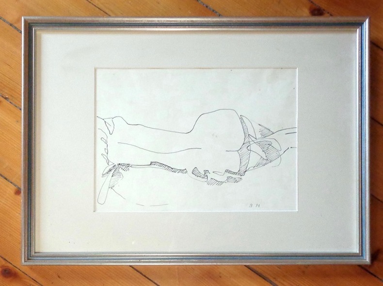
6791Splendide dessin original à l'encre noire 17 x 31 (motif), signé de son initiale, daté de [19]33, sous cadre à baguette argentée 38 x 53. Quelques toutes petites rousseurs.
List2882Pittsburgh Pennsylvania 1989. 22 x 28 inch poster on heavy cardstock. Staining some marginal folding overall very good to excellent. Poster for the Pittsburgh date of LL Cool J’s Nitro World Tour with Big Daddy Kane Slick Rick and De La Soul who had just released the hugely influential 3 Feet High and Rising. Handwriting on the poster—also seen on other examples—corrects the time to 7:30 PM and the ticket price to $17.75. LL Cool J was touring on Walking with a Panther his third studio album. unknown
1897662801897 Paris, Librairie Nilsson / Per Lamm successeur , sd , Petit in-quarto ,40 pp, +63 planches, reliure d'éditeur ,cartonnage illustré sur les plats,bon état,
19681029281968 affiche Sans lieu ni date, sans nom d’éditeur (Tokyo, 1968-1969, Mangashugi henshû iinkai), une lithographique originale en couleurs, 530x395mm.Affiche promotionnelle pour la revue « Mangashugi » une variante de la couverture du no.6.Tirage limité à 100 exemplaires. (102928)
195965531Wien, Druck: Urania V. U., 1959. Aus zwei Teilen zusammengesetzte illustr. Gründungsschrift (einseitiger illustr. Offsetdruck in Schwarz/Weiß mit einem aquarellierten grünen Farbstrich; ca. 42 x 118 cm).
1898287Invitations - Billets de fairepart - Cartes d'adresse -Petites estampes du XVII ième siècle jusqu'à nos jours ouvrage orné de 460 reproductions d'après les documents originaux des meilleurs artistes à Paris - Librairie artistique G. Boudet éditeur - vente exclusive : Librairie Charles Tallandier 1898 grand format : 23.5 32 cm, 404 pages, reliure demi-maroquin à coins d'époque, dos lisse, date en queue, tête dorée, couverture et dos conservés, tirage limité à 1050 exemplaires, un des 1000 sur papier vélin. Couverture illustrée par Alphonse MUCHA. traces d'usure sur les mors et sur les angles de la reliure (voir photo), une restauration ancienne sur le second plat (invisible) photos supplémentaires sur demande pour cet ouvrage devenu fort rare
1897GF358081897 Paris - G. Boudet - C. Tallandier - 1897 - Reliure demi chagrin rouge - dos plat orné de style art nouveau -
192265921München, Druckerei und Verlagsanstalt ?Deutsche Alpenzeitung? G.m.b.H., o. J. (um 1922). Farb. lithogr. Plakat (89,5 x 121,5 cm).
1988249251988 Affiche. Affiche lithographiée, L'affiche Européenne en France, 1988, 102 x 70 cm. (format à vue), 109 x 78 cm. (format entoilé), signée en bas à droite dans la planche.
1930510931930 Paris, Eugène Rey, 1930, grand in 4° broché ; couverture rempliée imprimée (queue du dos légèrement frottée).
- L'Estampe Moderne, Imprimerie Champenois pour CH. Masson & H. Piazza, Paris (Mai 1898), sujet : 34,5x24,5cm, planche : 55x40,8cm, une feuille et une serpente. - Rare lithographie originale en couleurs, exécutée par Etienne Dinet pour L'Estampe Moderne, série numéro 13 publiée en mai 1898. Une des 50 épreuves de grand luxe tirées sur Japon à grandes marges, signature de l'artiste dans la planche, timbre à sec de l'éditeur représentant un profil d'enfant en marge inférieure, tampon numéroté du tirage de luxe au dos, légère trace du tampon de la gravure précédente au recto ; gravure précédée d'une serpente légendée du nom de l'artiste, du titre, et d'un texte. Lithographie inspirée d'un extrait d'Eugène Fromentin, reproduit sur la serpente de l'estampe. Magnifique publication mensuelle française éditée entre mai 1897 et avril 1899, L'Estampe moderne se constitue de chromolithographies inédites qui, contrairement à d'autres revues comme Les Maîtres de l'Affiche et tel qu'il est stipulé sur les serpentes, ont été réalisées spécialement par chaque artiste pour la revue. Ce sont ainsi 100 estampes qui paraissent au total, couvrant les courants artistiques majeurs de la fin du XIXème siècle : Symbolisme, Art Nouveau, Préraphaélites, Orientalistes et Belle Epoque. Chaque livraison de quatre estampes est tirée à 2000 exemplaires vendus 3,50F et 100 sur papier Japon proposés à 10F. Henri Piazza prévoit également un tirage confidentiel de très grand luxe : 50 exemplaires sur Japon à grandes marges et 50 en noir sur Chine au prix considérable de 30F. Cette estampe d'un beau format est superbement imprimée sur le plus prestigieux des papiers : le Japon. Epais, soyeux, satiné et nacré, il contribue à faire de chaque page une uvre à part entière. Sa qualité d'absorption de l'encre et son affinité avec les couleurs en font également le support idéal de ces très belles lithographies. L'intérêt des collectionneurs français pour les affiches artistiques s'amplifie au début des années 1890. Octave Uzanne, pour qualifier cette fièvre invente le terme d'« affichomanie ». L'affiche, à l'origine populaire et placardée dans les rues de la capitale, devient alors objet d'art et son support éphémère se fait précieux et voué à la conservation. Piazza décide de soustraire l'affiche à sa vocation publicitaire et de l'élever au rang d'uvre d'art à part entière au même titre que le livre illustré de luxe. Il compose ainsi une collection prestigieuse d'uvres entièrement originales, par les artistes européens les plus en vue du moment : Georges de Feure, Eugène Grasset, Henri Detouche, Emile Berchmans, Louis Rhead, Gaston de Latenay, Lucien Lévy-Dhurmer, Gustave-Max Stevens, Charles Doudelet, Hans Christiansen, Henri Fantin-Latour, Steinlen, Ibels, Engels, Willette, Henri Meunier, Evenepoël, Bellery-Desfontaines, Charles Léandre, etc. Bel exemplaire dans le style orientaliste. [ENGLISH DESCRIPTION ON DEMAND]
- L'Estampe Moderne, Imprimerie Champenois pour CH. Masson & H. Piazza, Paris (Octobre) 1897, sujet : 35x26cm, planche : 55x40,8cm, une feuille et une serpente. - Rare lithographie originale, exécutée par Paul Jouve pour L'Estampe Moderne, série numéro 6 publiée en octobre 1897. Une des 50 épreuves de grand luxe tirées sur Japon à grandes marges, signature de l'artiste dans la planche, timbre à sec de l'éditeur représentant un profil d'enfant en marge inférieure, tampon numéroté du tirage de luxe au dos ; gravure précédée d'une serpente légendée du nom de l'artiste, du titre, d'une extrait d'oeuvre de A. Malfilatre et d'un texte de présentation ; serpente vierge. "C'est avec un crayon déjà sûr de lui-même, une fermeté très puissante de dessin et aussi une connaissance fort approndie que Jouve, le dessinateur animalier, a rendu pour nous cette page imaginairement pittoresque de la vie des singes". Magnifique publication mensuelle française éditée entre mai 1897 et avril 1899, L'Estampe moderne se constitue de chromolithographies inédites qui, contrairement à d'autres revues comme Les Maîtres de l'Affiche et tel qu'il est stipulé sur les serpentes, ont été réalisées spécialement par chaque artiste pour la revue. Ce sont ainsi 100 estampes qui paraissent au total, couvrant les courants artistiques majeurs de la fin du XIXème siècle : Symbolisme, Art Nouveau, Préraphaélites, Orientalistes et Belle Epoque. Chaque livraison de quatre estampes est tirée à 2000 exemplaires vendus 3,50F et 100 sur papier Japon proposés à 10F. Henri Piazza prévoit également un tirage confidentiel de très grand luxe : 50 exemplaires sur Japon à grandes marges et 50 en noir sur Chine au prix considérable de 30F. Cette estampe d'un beau format est superbement imprimée sur le plus prestigieux des papiers : le Japon. Epais, soyeux, satiné et nacré, il contribue à faire de chaque page une uvre à part entière. Sa qualité d'absorption de l'encre et son affinité avec les couleurs en font également le support idéal de ces très belles lithographies. L'intérêt des collectionneurs français pour les affiches artistiques s'amplifie au début des années 1890. Octave Uzanne, pour qualifier cette fièvre invente le terme d'« affichomanie ». L'affiche, à l'origine populaire et placardée dans les rues de la capitale, devient alors objet d'art et son support éphémère se fait précieux et voué à la conservation. Piazza décide de soustraire l'affiche à sa vocation publicitaire et de l'élever au rang d'uvre d'art à part entière au même titre que le livre illustré de luxe. Il compose ainsi une collection prestigieuse d'uvres entièrement originales, par les artistes européens les plus en vue du moment : Georges de Feure, Eugène Grasset, Henri Detouche, Emile Berchmans, Louis Rhead, Gaston de Latenay, Lucien Lévy-Dhurmer, Gustave-Max Stevens, Charles Doudelet, Hans Christiansen, Henri Fantin-Latour, Steinlen, Ibels, Engels, Willette, Henri Meunier, Evenepoël, Bellery-Desfontaines, Charles Léandre, etc. Bel exemplaire d'une oeuvre d'une spirituelle drôlerie de ce célèbre peintre animalier. [ENGLISH DESCRIPTION ON DEMAND]
- L'Estampe Moderne, Imprimerie Champenois pour CH. Masson & H. Piazza, Paris (Février 1899), sujet : 19,4x33,4cm, planche : 40,8x55cm, une feuille. - "Beauty" - Original lithograph on Japan paper - L'Estampe Moderne L'Estampe Moderne | Imprimerie Champenois pour C.H. Masson & H. Piazza | Paris [February 1899] | subject: 19.4 x 33.4 cm | plate: 40.8 x 55 cm | one leaf and one guard Rare original color lithograph by Edward Burne-Jones for L'Estampe Moderne, series no. 3, published in July 1897. One of 50 grand luxe proofs printed on Japan paper with wide margins, signed by the artist in the plate, publisher's embossed stamp showing a child in profile to lower margin, numbered stamp of the de luxe printing to verso, upper margin of proof slightly sunned; the print itself preceded by a silk paper guard with the name of the artist, the title of the work and an introduction to the artist as well as a blank guard leaf. A magnificent monthly French publication that appeared between May 1897 and April 1899, L'Estampe moderne comprised unpublished chromolithographs that, unlike those in other magazines like Les Maîtres de l'Affiche and as is stipulated on the guard sheets, were specially made by each artist for the magazine. There are thus 100 prints that appeared in total, covering the major artistic currents of the late 19th Century: Symbolism, Art Nouveau, the Pre-Raphaelites, Orientalists and the Belle époque. Each fascicule of four prints was printed in 2,000 copies and sold for 3.50F, with 100 on Japan paper sold at 10F. Henri Piazza also planned a very luxurious secret printing of 50 copies on Japan paper with wide margins and 50 in black and white on China paper at the considerable price of 30F. This well-sized print is superbly printed in colors on the most prestigious of papers: Japan. Thick, creamy, satin and with a nice sheen, it contributes to making each page a work of art in itself. Its absorptive qualities for ink and its affinity for colors make it the ideal support for these lovely lithographs. The interest of French collectors for artistic posters grew from the beginning of the 1890s. Octave Uzanne invented a term for this growing interest: affichomanie, or poster mania. The poster, originally not rare and posted up in the streets of the capital, thus became a work of art and its ephemeral background became precious and essential for conservation. Piazza decided to extract the poster from its advertising role and to elevate it to a form of art, similarly to luxury illustrated artists' books. He thus put together a prestigious collection of entirely original works by the most fashionable European artists of the age: Georges de Feure, Eugène Grasset, Henri Detouche, Emile Berchmans, Louis Rhead, Gaston de Latenay, Lucien Lévy-Dhurmer, Gustave-Max Stevens, Charles Doudelet, Hans Christiansen, Henri Fantin-Latour, Steinlen, Ibels, Engels, Willette, Henri Meunier, Evenepoël, Bellery-Desfontaines, Charles Léandre, etc. A fine copy of this Art Nouveau style poster. [FRENCH VERSION FOLLOWS] Rare lithographie originale, exécutée par Edward Burne-Jones pour L'Estampe Moderne, série numéro 2 publiée en février 1899. Une des 50 épreuves de grand luxe tirées sur Japon à grandes marges, papier velin contrecollé sur Japon, signature de l'artiste dans la planche, timbre à sec de l'éditeur représentant un profil d'enfant en marge inférieure, tampon numéroté du tirage de luxe au dos ; gravure précédée d'une serpente légendée du nom de l'artiste, du titre et d'un extrait d'oeuvre ; serpente présentant un texte sur les femmes dans l'oeuvre de Burne-Jones par Gabriel Mourey. Magnifique publication mensuelle française éditée entre mai 1897 et avril 1899, L'Estampe moderne se constitue de chromolithographies inédites qui, contrairement à d'autres revues comme Les Maîtres de l'Affiche et tel qu'il est stipulé sur les serpentes, ont été réalisées spécialement par chaque artiste pour la revue. Ce sont ainsi 100 estampes qui paraiss
- Millikin & Lawley, London 1880 (S.d), 9x14,5cm, autre. - Magic Lantern Red Riding Hood - 12 Lantern slides Millikin & Lawley | London [ca 1885] | 9 x 14.5 cm | 12 plates in publisher's box Complete series of illustrations the tale of Red Riding Hood hand-painted on 12 glass plates intended for a magic lantern, the ancestor of the projector and the cinema. Publisher's cardboard box, with the titles on the top board: "12 Superior English Made lantern slides". Handwritten: "Red Riding Hood". Signs of rubbing on the box. A stop in the split lid at 2cm. On plate 9, paper is missing which circles the plate in a border. On plate 12, the black part has a small scratch, this part encircling the medallion which is projected by the lantern. Otherwise collection in excellent condition. Millikin & Lawley carried out their trade in magic lanterns and plates between 1860 and 1900. [FRENCH VERSION FOLLOWS] Série complète du conte du petit chaperon rouge sur 12 plaques de verre peintes à la main et destinées à une lanterne magique, l'ancêtre du projecteur et du cinéma. Boite en carton agrafé de l'éditeur, avec sur le plat supérieur les titres suivants : 12 superior english made lantern slides. Manuscrit : Red riding hood. Traces de frottement sur la boîte. Une arrête du couvercle fendue sur 2cm. Sur la plaque 9, manque du papier qui cercle la plaque sur une bordure. Sur la plaque 12, la partie noire est grattée sur 1cm, cette partie ceinturant le médaillon qui est projetée par la lanterne. Ensemble en excellent état. Millikin & Lawley exercèrent leur commerce de lanternes magiques et de plaques entre 1860 et 1900. La date donnée à cette série du petit chaperon rouge est indicative.
- L'Estampe Moderne, Imprimerie Champenois pour CH. Masson & H. Piazza, Paris (Janvier 1898), sujet : 27x35cm, planche : 40,8x55cm, une feuille et une serpente. - Rare lithographie originale en couleurs, exécutée par Edmond Aman-Jean pour L'Estampe Moderne, série numéro 9 publiée en janvier 1898. Une des 50 épreuves de grand luxe tirées sur Japon à grandes marges, signature de l'artiste dans la planche, timbre à sec de l'éditeur représentant un profil d'enfant en marge inférieure, tampon numéroté du tirage de luxe au dos ; gravure précédée d'une serpente légendée du nom de l'artiste, du titre et d'une présentation de l'artiste ; serpente vierge. Magnifique publication mensuelle française éditée entre mai 1897 et avril 1899, L'Estampe moderne se constitue de chromolithographies inédites qui, contrairement à d'autres revues comme Les Maîtres de l'Affiche et tel qu'il est stipulé sur les serpentes, ont été réalisées spécialement par chaque artiste pour la revue. Ce sont ainsi 100 estampes qui paraissent au total, couvrant les courants artistiques majeurs de la fin du XIXème siècle : Symbolisme, Art Nouveau, Préraphaélites, Orientalistes et Belle Epoque. Chaque livraison de quatre estampes est tirée à 2000 exemplaires vendus 3,50F et 100 sur papier Japon proposés à 10F. Henri Piazza prévoit également un tirage confidentiel de très grand luxe : 50 exemplaires sur Japon à grandes marges et 50 en noir sur Chine au prix considérable de 30F. Cette estampe d'un beau format est superbement imprimée sur le plus prestigieux des papiers : le Japon. Epais, soyeux, satiné et nacré, il contribue à faire de chaque page une uvre à part entière. Sa qualité d'absorption de l'encre et son affinité avec les couleurs en font également le support idéal de ces très belles lithographies. L'intérêt des collectionneurs français pour les affiches artistiques s'amplifie au début des années 1890. Octave Uzanne, pour qualifier cette fièvre invente le terme d'« affichomanie ». L'affiche, à l'origine populaire et placardée dans les rues de la capitale, devient alors objet d'art et son support éphémère se fait précieux et voué à la conservation. Piazza décide de soustraire l'affiche à sa vocation publicitaire et de l'élever au rang d'uvre d'art à part entière au même titre que le livre illustré de luxe. Il compose ainsi une collection prestigieuse d'uvres entièrement originales, par les artistes européens les plus en vue du moment : Georges de Feure, Eugène Grasset, Henri Detouche, Emile Berchmans, Louis Rhead, Gaston de Latenay, Lucien Lévy-Dhurmer, Gustave-Max Stevens, Charles Doudelet, Hans Christiansen, Henri Fantin-Latour, Steinlen, Ibels, Engels, Willette, Henri Meunier, Evenepoël, Bellery-Desfontaines, Charles Léandre, etc. Bel exemplaire dans le style symboliste. [ENGLISH DESCRIPTION ON DEMAND]
- Crayon sur papier Fin XIXème - Début XXème, 22 x 15,5 cm. - ANQUETIN Louis Fête villageoise - étude pour le bal champêtre Pencil on paper, Late 19th - Early 20th century, 22 x 15.5 cm. Original pencil drawing, presented under a two-colour marie-louise frame. Signed with the artist's signature stamp in the lower right corner of the work, and signed with the workshop's stamp on the back. A minor tear in the left margin. Very good condition. Provenance: artist's workshop, referenced in the Atelier Louis Anquetin catalogue (Thierry de Maigret, 28/11/08). Louis Anquetin, born in Étrépagny in 1861 and died in Paris in 1932, is an important French painter. He began his career alongside avant-garde painters such as Vincent Van Gogh and Henri de Toulouse-Lautrec. He is the inventor, with Émile Bernard, of Cloisonnism. From 1884 to 1893, Louis Anquetin never stopped exploring the new possibilities that the freedom of Impressionism brought to French painting. From 1893, following a long confrontation with the "maîtres d'autrefois" "masters of the past," he adopted a pictorial bias which would put him on the fringes of the general art movement and distance him from his friends. Dazzled by Baroque art and its creative vigour, he then thought that his childhood friends were taking a path that would lead to the death of painting. He believes in a "peinture parfaite" "perfect painting," which is embodied in the re-remembering of Michelangelo and Rubens' lessons in particular. His work, therefore, becomes more classic; he advocates the return to the profession, by proposing to reflect on the a priori conditions of any possible form of art in accordance with the rules of perspective and anatomy, as practised by the masters of the 16th and 17th century. Leaving only a few works that can be described as monumental, Anquetin proves to be prolific as a result of his many studies and sketches; he who considered that drawing was "un moyen d'expression tout puissant" "an all powerful means of expression," the obligatory foundation of all fine art. By working voluntarily in reverse of his time, Louis Anquetin made the existance of an original modern portrayal possible. Through his persistance and his passion for painting, he indeed prevented the path of the great western tradition from being completely sealed. His works can be admired in many prestigious museums, such as the Musée d'Orsay or the Louvre in Paris, in San Francisco or in Detroit, in the State Hermitage Museum in St Petersburg, in the National Gallery and the Tate in London, etc. [FRENCH VERSION FOLLOWS] Dessin original au crayon, présenté sous marie-louise bicolore. Signature du cachet de la signature de l'artiste dans l'angle inférieur droit de l'uvre, et signature du cachet de l'atelier au verso. Une déchirure sans manque en marge gauche. Très bel état de conservation.Provenance : atelier de l'artiste, référencée au catalogue Atelier Louis Anquetin (Thierry de Maigret, 28/11/08). Louis Anquetin, né à Étrépagny en 1861 et mort à Paris en 1932, est un important peintre français. Il commence sa carrière aux côtés de peintres d'avant-garde tels que Vincent Van Gogh ou Henri de Toulouse-Lautrec. Avec Émile Bernard, il est l'inventeur du Cloisonnisme. De 1884 à 1893, Louis Anquetin ne cesse d'explorer les possibilités nouvelles offertes par la libération introduite par l'Impressionnisme dans la peinture française. A partir de 1893, à la suite d'une longue confrontation avec les « maîtres d'autrefois », il adopte un parti-pris pictural qui le mettra en marge du mouvement général de l'art, et l'éloignera de ses amis. Ébloui par l'art baroque et sa vigueur créatrice, il pense alors que ses amis de jeunesse se sont engagées dans une voie qui mènera à la mort de la peinture. Il croit en une « peinture parfaite » qui s'incarne dans le re-souvenir des leçons de Michel-Ange et de Rubens notamment. Son travail devient donc plus classique, il prône le retour au métier, en proposant de réfléchir sur
- s.d. (ca 1910), 50x17,8cm, une feuille. - Dessin original à l'encre rehaussé au crayon bleu, signé "G.B." et intitulé "Rallye-Paper". Une légère ombre autour du sujet, vestige d'un encadrement ainsi que quelques traces de pliures. Tampon chiffré au dos ainsi qu'une indication manuscrite en vue de l'impression probablement dans un journal: "à la largeur de la page". [ENGLISH DESCRIPTION ON DEMAND]
- Sorlier , Paris 1961, 56x76cm, une feuille. - Lithographie originale intitulée "Le Christ : Ayez Pitié", épreuve d'artiste justifiée en bas à gauche "E.A.", signature de Bernard Buffet également au crayon en bas à droite. Très bel exemplaire. [ENGLISH DESCRIPTION ON DEMAND]
- Louis Broder, Paris s.d. (1965), 20x24,1cm, une feuille. - Eau-forte originale de Giacometti imprimée sur japon et réalisée pour l'ouvrage Feuilles éparses en hommage à René Crevel. Très bel exemplaire. [ENGLISH DESCRIPTION ON DEMAND]
- 1831, 18,6x15,4cm et 19,5x29,5cm, dessin au lavis et lithographie. - Dessin original au lavis d'Alfred Johannot, étude intitulée La Confession pour une lithographie publiée dans le tome 2 de L'Artiste (22e livraison). Jointe : une épreuve lithographiée du dessin (un peu piquée) réalisée par J. Lion et Bichebois l'aîné, signée Alfred Johannot pinx. dans l'angle inférieur gauche, et J. Lion lith. dans l'angle inférieur droit. Alfred Johannot travaille avec ses frères Tony et Charles en tant qu'illustrateur, graveur et vignettiste. Les frères Johannot occupent une grande place dans l'histoire du livre illustré romantique pour leur travail sur des oeuvres célèbres de Walter Scott, Beaumarchais, Bernardin de Saint-Pierre ou encore Goethe, mais aussi pour de nombreux livrets d'opéra comique et de vaudeville. Ils contribuent par ailleurs largement à l'illustration des nouvelles parues dans l'hebdomadaire L'Artiste, créé en 1831. Cette revue de beaux-arts et de littérature est un incontournable de la littérature romantique et un rendez-vous d'artistes, de critiques et de gens de lettres. Elle publie le Colonel Chabert de Balzac, des articles de Chateaubriand ou encore George Sand, et reçoit la participation de Delacroix entre autres. Parue sous la forme d'un cahier d'une quinzaine de pages, son frontispice est signé Tony Johannot et de jeunes artistes comme Decamps ou Raffet y collaborent et lui donnent une teinte très romantique. Ce dessin provient de la collection d'Aristide Marie (1862-1938), essayiste, spécialiste de Gérard de Nerval, et grand collectionneur des uvres d'Alfred et Tony Johannot, à qui il consacra un ouvrage (Alfred et Tony Johannot, Paris, H. Floury, 1925, 124 p.). Il réalise par ailleurs des essais sur d'autres peintres et lithographes romantiques, dont Célestin Nanteuil et Henry Monnier. La majorité des uvres Johannot de ce fonds est désormais entreposée au Musée de la vie romantique à Paris. [ENGLISH DESCRIPTION ON DEMAND]
- s.d. (circa 1950), Collage : 15x22,5cm / Cadre : 27,7x34,7cm, un collage encadré. - Original collage t[ca 1950] | Collage: 15 x 22.5 cm / Frame: 27.7 x 34.7 cm Original collage by Claude Tarnaud, enhanced with white painting and monogrammed in ink on the bottom right. «With Yves Bonnefoy and Jaroslav Serpan, Claude Tarnaud founded the magazine, La Révolution la nuit. Contacted by André Breton, he then joined the surrealist group and participated actively in the 1947 International Exhibition of Surrealism, and the magazine, Néon, (5 issues from January 1948 to April 1949). In November 1948, after disagreeing with the exclusion of painter Roberto Matta, he broke with the surrealist group, like his friends Victor Brauner, Stanislas Rodanski and others. Next, he was associated with François Di Dio and the management of the magazine, Positions, published by Le Soleil noir, a publishing house to which he gave three books. From 1953 to 1966, he participated in the activities of the Phases movement and collaborated with the magazine of the same name. In 1966, he met Pénélope and Franklin Rosemont who founded the first surrealist group of the United States of America in Chicago.» (Bibliothèque Kandinsky) [FRENCH VERSION FOLLOWS] Collage original de Claude Tarnaud, rehaussé à la peinture blanche et monogrammé à l'encre en bas à droite. "Claude Tarnaud fonde avec Yves Bonnefoy et Jaroslav Serpan la revue La Révolution la nuit. Contacté par André Breton, il rejoint alors le groupe surréaliste et participe activement à l'Exposition internationale du surréalisme de 1947, et à la revue Néon (5 numéros de janvier 1948 à avril 1949). En novembre 1948, en désaccord avec l'exclusion du peintre Roberto Matta, il rompt avec le groupe surréaliste, à l'instar de ses amis Victor Brauner, Stanislas Rodanski et d'autres. Il est ensuite associé avec François Di Dio à la direction de la revue Positions publiée aux éditions Le Soleil noir, maison à laquelle il donnera trois ouvrages. De 1953 à 1966, il participe aux activités du mouvement Phases et collabore à la revue du même nom. En 1966, il rencontre Pénélope et Franklin Rosemont qui fondent à Chicago, grâce à lui, le premier groupe surréaliste des États-Unis d'Amérique." (Bibliothèque Kandinsky)