48 775 résultats
1690BB005<p>A remarkable collection of 62 engraved copperplates representing the earliest impressions of fantastic figures composed of the tools or attributes of their trades created and produced about 1690 onwards thru 1694 enhanced at the time with brilliant hand-coloring silver and gold paint. These prints are a marvel of inventiveness showing the inspiration and influence of the 16th century painter Giuseppe Arcimboldo 1527-1593 who chiefly imagined only heads now extended and re-invented for the Court of Louis XIV. </p><p>Amongst the most famous prints of the late 17th century their printing history is rather complicated. Nicolas I de Larmessin or L'Armessin 1632-1694 designed engraved and published approximately 62 plates in his lifetime. His widow Marie Bertrand added 14 plates from his unfinished designs and his younger brother Nicolas II c.1645-1725 engraved a further 21 plates from 1695 to 1720s. All of the prints were individually published with re-engravings in reverse by the younger brother which often simplified these earlier designs by omitting background details. Altogether it has been suggested that a total of 97 images were eventually issued. </p><p>From the Beauvillain library ex-libris by Jouas. Colas 1779 Lipperheide 1971.</p> chez N. de L'Armessin [or for 7 sheets] ou chez la Veuve de N. de l'Armessin, rue St Jacques, Ã la Pomme d'Or, circa circa hardcover books
1690BB005<p><b>L'ARMESSIN II</b> Nicolas de 1632–1694</p><p><b><i>Habits des Metiers et Professions</i></b>. </p><p>Paris: chez N. de L'Armessin ou chez la Veuve de N. de l'Armessin Rue St. Jacques à la Pomme d'Or N.d. <i>circa</i> 1690–1695.</p><p>4to. 62 ff. last two plates with restoration; bound in green morocco gilt second-half of the 19th century signed Chambolle-Duru.</p><p>A remarkable collection of 62 engraved copperplates representing the earliest impressions of fantastic figures composed of the tools or attributes of their trades created and produced about 1690 onwards thru 1694 enhanced at the time with brilliant hand-coloring silver and gold paint. These prints are a marvel of inventiveness showing the inspiration and influence of the 16th century painter Giuseppe Arcimboldo 1527-1593 who chiefly imagined only heads now extended and re-invented for the Court of Louis XIV. </p><p>Amongst the most famous prints of the late 17th century their printing history is rather complicated. Nicolas I de Larmessin or L'Armessin 1632-1694 designed engraved and published approximately 62 plates in his lifetime. His widow Marie Bertrand added 14 plates from his unfinished designs and his younger brother Nicolas II c.1645-1725 engraved a further 21 plates from 1695 to 1720s. All of the prints were individually published with re-engravings in reverse by the younger brother which often simplified these earlier designs by omitting background details. Altogether it has been suggested that a total of 97 images were eventually issued. </p><p>From the Beauvillain library ex-libris by Jouas. Colas 1779 Lipperheide 1971.</p> chez N. de L'Armessin [or for 7 sheets] ou chez la Veuve de N. de l'Armessin, rue St Jacques, à la Pomme d'Or, circa circa hardcover
20786Pen and grey and brown ink grey wash on laid paper on an archival mount. Fine condition. Sheet size: 18 x 23 7/8 inches. Provenance: Dr. C.A. Pompe; G. Meijer; L. Houthakker with his collector's mark at lower right corner not in Lugt. A beautiful and very rare drawing of one of the most beautiful "Wunderkammern" of the day which later became the property of the Empress of Russia.<br/> <br/> This drawing shows the interior of the cabinet of curiosities of Catharina van Grovestins-von Schutz in the family house in The Hague. There is another earlier drawing of the same cabinet by the artist Daniel Marot the Younger 1695-1769 dated 1756 and currently in the collection of the Gemeentearchief in The Hague. This earlier drawing shows the interior just after it was completed but before the expanding collection necessitated certain improvements that are shown in the present drawing: additions include a shaped central cabinet bearing what may be a portrait bust of Catharina van Grovestins-von Schutz. Other improvements include the display shelves for taxidermy specimens that have been added between the built-in display cases and the architrave above; and the central bracketed display of coral and shells that was added above the fireplace. Catharina lady-in-waiting to Princess Anna of Orange employed the talents of the well-known naturalist and collector Arnout Vosmaer to help assemble the Cabinet. Vosmaer later commented in his memoirs that the cabinet was 'one of the most beautiful collections . covering every domain of nature" and noted that it was eventually sold to the Empress of Russia. The present drawing may perhaps have been intended as part of the successful attempt to sell the collection to the Empress The earliest cabinets were gathered together in the 16th century. They initially represented a genuine attempt to begin to understand the natural world but also came to be seen as an expression of the power and influence of the owner: the larger the 'wunderkammer' the more important the owner. They were the precursor to today's museums the most famous in England being the collection of Elias Ashmole 1617-1692. His private collection founded by the naturalist John Tradescant circa 1570-1638 was presented to Oxford University and opened to the public on 24 May 1683 as the Ashmolean Museum. One of the best known American examples was the Peale Museum founded in Philadelphia in 1784 for Charles Wilson Peale a painter and a scientist. His son Rembrandt Peale more famous today as a portrait painter subsequently established a 'branch' of the Peale Museum in Baltimore Maryland and this is now the oldest museum building in the Western hemisphere. The museum differed from the earlier more private collections in that it was always the Peales' intention to open the museum to the public. In its heyday the show included 90 specimens of mammals more than 700 bird specimens mounted in 'naturalistic' mini-dioramas a whole room of marine specimens about 4000 insects numerous minerals as well as their famous mammoth skeleton the first such display as well as scores of Peale's portraits.<br/> <br/> Cf. H. Engel Alphabetical list of Dutch Zoological Cabinets and Menageries Amsterdam: 1986; P. Fuhring Design into Art: drawings for architecture and ornament the Lodewijk Houthakker Collection London 1989 vol. II p. 761 #1102. unknown
EN-154o.J. Lithographie, 1912, auf Bütten mit Wasserzeichen: SLG, mit Bleistift signiert ?E L Kirchner?. Darstellungsgröße 26,7:21,5, Blattgröße 53:39 cm. Verso mit dem Basler Nachlass-Stempel, Lugt 1570b und der handschriftlichen Registriernummer ?L 175 I D?. - Provenienz: Frankfurter Kunstkabinett Hanna Becker vom Rath; Privatsammlung, Oberursel. - Literatur: Dube L. 214; Schiefler L. 175; Gercken 559 I (von II) (das im Werkverzeichnis von Gercken aufgeführte Exemplar). [2 Warenabbildungen]
EN-172o.J. Aquarell, um 1930, über leichter Bleistiftskizze, auf genarbtem Velin, mit Bleistift signiert ?R. Schlichter?. Blattgröße 56:40,2 cm. - Provenienz: Rheinische Privatsammlung. - Bei der Dargestellten ?Speedy? handelt es sich um Schlichters Ehefrau Elfriede Elisabeth Köhler (1902-1975), die er 1929 heiratete.
EN-075o.J. Radierung, 1921, auf Kupferdruckpapier, mit Bleistift signiert. 15,1:19,4 cm. Provenienz: undeutlicher Sammlerstempel verso. Literatur: Georg Scholz, Das druckgraphische Werk. Karlsruhe, Künstlerhaus Galerie, 1982, Nr. 50, S. 47. Entstanden nach dem Aquarell "Hakenkreuzritter" von 1921, doch ohne das Hakenkreuz am Revers der Hauptperson. Im Werkverzeichnis werden lediglich 15 Exemplare erwähnt. - Sehr selten!
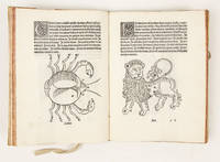
14823785Venice:: Erhard Ratdolt 14 October 1482. FIRST ILLUSTRATED EDITION of Hyginus' "Poeticon Astronomicon". Quarto:. 19 x 14 cm. Collation: a-f8 g10 a1 blank a2r dedication to M. Fabius Quintilianus a3r text g9r commendatory poem by Jacobus Sentinus g10r poem and verse colophon by Johannes Santritter g10v blank. 58 leaves. 31 lines. Types 3:91G text 7:92G heading on a2r 91 Gk a few words. Title on a2r printed in red 11- 7- 5- and 3-line white-on-black woodcut initials. 47 half-page woodcuts probably designed by Johannes Santritter of the constellation and planet figures. Illustrated with 47 half-page woodcuts of the constellations and the planets personified. The text of Hyginus was first published in an unillustrated edition in Ferrara in 1475. A very good copy in 18th c. stiff vellum. The initial blank is soiled and stained. Light stains to top of second leaf and leaves d1-2. Soiling to f1 and blank verso of final leaf with faded inscription. The "Poeticon Astronomicon" more correctly the "Astronomica" is an ancient Roman work on the constellations chiefly based on the work of the Greek scientist Eratosthenes 3rd c. B.C. The work was traditionally attributed to the first century writer C. Julius Hyginus the Director of the Palatine Library under the Emperor Augustus but the extant text is now believed based on stylistic analysis to be an abridgement of Hyginus' work made in the late second century. The fact that the order of the constellations in the poem follows precisely that of Ptolemy's "Almagest" further strengthens the case for a second century date. A remarkable aspect of Hyginus' text is his insistence on the use of astronomical models in particular a celestial globe as an aid to teaching or explaining astronomical principles and phenomena particularly for "discussions on the inter-relationships between the constellations and especially between the constellations and the celestial circles."Lippincott p.4Like Manilius' "Astronomicon" and Proclus' "Sphaera" a text that Hyginus sought to improve upon the "Poeticon Astronomicon" was of special interest to Renaissance astronomers who desired accurate editions of ancient texts from which they might derive a clear understanding of the astronomical knowledge of the Romans and Greeks thereby establishing a firm foundation upon which to undertake astronomy's "renewal".Hyginus' text which gives detailed accounts of the myths associated with each of the constellations served as source material for artists in the Middle Ages and Renaissance one of the most famous examples of the text's influence being the splendid ceiling painted around 1511 by Peruzzi for Agostino Chigi in the Sala di Galatea of the Villa Farnesina See Förster Farnesina-Studien 1880 p. 40.One of the chief interests in Ratdolt's editions of Hyginus 1482 and 1485 lies in the illustrations of the constellations the first such illustrations to appear in a printed book. These images derive from medieval manuscript and other artistic sources –though a specific source has not been identified. The figures appear in medieval European costume and in the words of Redgrave "There is a vigour and quaintness about these woodcuts which merit recognition." These images proved enormously influential serving as models for the representation of the constellations in stellar atlases and celestial maps for centuries to come."In many instances these medieval European often mythological constellation figures differed notably from those used by Ptolemy and his Islamic successors . Several stylistic conventions first published in Ratdolt's woodcuts endured for several centuries both in the numerous editions of Hyginus and in the various maps derived therefrom . Ratdolt's figures led directly to those of Jacob de Gheyn 1600 and through him to those of Johannes Bayer 1603." Warner The Sky ExploredThe Contents of Hyginus' "Poeticon Astronomicon"Hyginus tells us that he intends to give a better description of the celestial sphere than Aratus had done in his "De Sphaera". Book I gives a brief overview of the cosmography of the universe the celestial sphere the Earth and its zones and the Zodiac. Book II is a compendium of myths related to the constellations the five planets Mercury Venus Mars Saturn and Jupiter as well as the Sun Moon and Milky Way.Book III is Hyginus' star catalogue. It is in this book that Ratdolt's woodcuts appear. "Each constellation is described in the same order as in Book II in terms of its location relative to the surrounding constellations and the celestial circles with some indications being given as to the overall shape and disposition of the figure. In addition Hyginus provides a list of the positions of the stars relative to the figure itself describing the placements in terms of 'left' and 'right' and 'above' and 'below' in line with the tradition of descriptive star catalogues. Moreover he tends to list the stars from the top of a figure downwards or from the head to the feet regardless of the orientation of the figure within the sky. This is very different from the way the more mathematically-oriented astronomers such as Hipparchus or Ptolemy describe the constellations."Book IV returns to the subject of cosmology and to astronomical topics such as the position of the constellations on each celestial circle the unequal division of the night and day and the risings and settings of the constellations relative to the signs of the zodiac. He discusses the movements of the Sun and the Moon and the five planets and touches upon Pythagorian notions of the harmony of the spheres." Lippincott Kristen "The textual tradition of the De Astronomia of Hyginus" pp. 10-11 BMC V 286; BSB-Ink H-459; CIBN H-334; Essling 285; Goff H-560; HC 9062; Hind II p. 462; IGI 4959; Klebs 527.2; Pollard/Perrins 31; Redgrave 30; Sander 3472 Erhard Ratdolt, 14 October, books
EN-076o.J. Lithographie, 1922, auf chamoisfarbenem festem Papier, mit Bleistift betitelt, nummeriert, signiert und datiert. Darstellungsgröße 29,6:39,9 cm, Blattgröße 40:59,8 cm. - Mit leichtem Lichtrand rundum. Provenienz: Sammlung MO oder OM, nicht bei Lugt. Literatur: Georg Scholz, Das druckgraphische Werk. Karlsruhe, Künstlerhaus Galerie, 1982, Nr. 56, S. 47; Ausst. Katalog: Glanz und Elend in der Weimarer Republik. Hrsg. von Ingrid Pfeiffer. Frankfurt, Schirn Kunsthalle, 2017, Abb. S. 42. - Nr. 69 von 100 Exx.
EN-060o.J. Lithographie, 1920, auf chamoisfarbenem Kupferdruckkarton, mit Bleistift signiert und datiert und als ?Probedruck? bezeichnet. Darstellungsgröße 35,8:26,6 cm, Blattgröße 42:50 cm. - Die linken Ecken leicht knitterspurig, der untere Rand mit einem Fleck.- Literatur: Ausst. Katalog: Realistische Kunst der 20er Jahre in Karlsruhe. Karlsruhe, Künstlerhaus Galerie, 1982, Nr. 143, Abb. 30; Ausst. Katalog: Georg Scholz. Das druckgraphische Werk. Karlsruhe, Künstlerhaus Galerie, 1982, Nr. 46, Abb. 44. Zur vorliegenden Lithographie heißt es hier: ?Der schwarzweißen und der aquarellierten Fassung dieser Lithographie ging ein Ölgemälde voraus, das den Titel ?Industriebauern? trägt (heute: Von der Heydt-Museum, Wuppertal). Das Ölbild mit Collagen, auf Holz, wurde erstmals auf der ?Erste Internationale Dada-Messe? in Berlin 1920 gezeigt. Zum Kopf des Bauern existiert eine Vorstudie, 1919 datiert. Zum Titelt: Bisher wurde die Lithographie in Anlehnung an den Titelt des Ölbildes immer ?Industriebauern? genannt. Auf keinem der uns bekannten Exemplare findet sich jedoch dieser Titel. In der Lithographie entfallen auch alle Elemente des Ölbildes, die die Verbindung von Landwirtschaft und Industrie anzeigen, z. B. der Mähdrescher im Fensterausblick. Es finden sich dagegen Exemplare die rückseitig von fremder Hand ?Wucher-Bauernfamilie?, ?Bauernfamilie? oder ?Durlacher Schwarzbuckelfamilie? beschriftet sind.?
EN-162o.J. Holzschnitt, 1911/1912, auf feinem Japan, mit Bleistift bezeichnet ?No. 1?, verso von Maria Marc mit Bleistift bezeichnet ?Nachlass Franz Marc bestätigt Maria Marc?, Darstellungsgröße 16,9 x 23 cm, Blattgröße 20,5: 28,5 cm. - Von allergrößter Seltenheit! - Provenienz: Maria Marc, Gattin des Künstlers; Privatsammlung; Lempertz, Köln, Auktion 1212, Lot 149; Rheinische Privatsammlung. - Literatur: Hoberg/Jansen Bd. III, Nr. 23 (im Werkverzeichnis aufgeführtes Exemplar); nicht bei Schardt; nicht bei Lankheit (in seinen handschriftlichen Notizen aufgeführt als nur 3 Abzüge vom schwarzen Holzstock).
EN-169o.J. Radierung mit heller Tonätzung, 1907, auf chamoisfarbenem Velin, mit Bleistift signiert ?Emil Nolde.?. Darstellungsgröße 30:22,1 cm, Blattgröße 43,5:31,7 cm. Gedruckt von Otto Felsing, Berlin. - Eines von 37 Exemplaren dieses Zustandes und von vorzüglicher Erhaltung! - Provenienz: Galerie Nierendorf, Berlin; Privatsammlung, Hessen. - Literatur: Schiefler/Mosel/Urban R 76 V (von V). [2 Warenabbildungen]
EN-061o.J. Lithographie, 1921/22, auf chamoisfarben Karton, mit Bleistift signiert und datiert ?21?. Darstellungsgröße 40,1:29,9 cm, Blattgröße 55,6:39,1 cm. - Verso unkenntlicher Sammlerstempel und Annotation mit blauem Kugelschreiber.- Literatur: Ausst. Katalog: Georg Scholz. Ein Beitrag zur Diskussion realistischer Kunst. Karlsruhe, Badischer Kunstverein, 1975, Nr. 46 mit Abb.; Ausst. Katalog: Georg Scholz. Das druckgraphische Werk. Karlsruhe, Künstlerhaus Galerie, 1982, Nr. 55, Abb. 52.- Die Reproduktion der Lithographie diente als Titelbild des 1. Heftes des 3. Jahrgangs (März 1922) der Zeitschrift ?Der Gegner?. Im Künstlernachlass in Waldkirch hat sich eine kleine Bleistiftzeichnung des Kopfes des Standartenhalters links im Vordergrund der Lithographie erhalten.
EN-059o.J. Farbholzschnitt in Azurblau und Schwarz, 1917, auf elfenbeinfarbenem Bütten mit Wasserzeichen: Perfecta, mit weichem Bleistift signiert, mit Druckersignatur von Fritz Voigts und mit Blindstempel des Euphorion Verlages, Berlin. Darstellungsgröße ca. 29:34 cm, Blattgröße 46:58,5 cm. Provenienz: Sammlung Ernst Rathenau (1898-1986); Kunstantiquariat C.G. Boerner, Düsseldorf, Lagerliste 89, 1988, Nr. 25 (mit farbiger Abbildung des Holzschnitts auf dem Umschlag). Literatur: Schapire 195. Ganz vorzüglicher, unberührt frischer Handdruck!- ?Die bei Fritz Voigt in Berlin mit der Handpresse gedruckte Auflage von einhundert Exemplaren für den Hyperion Verlag in München ging 1922 in den Besitz des Euphorion Verlages in Berlin über (Schapire, S. 10), dessen Blindstempel unten links sichtbar ist. Der Stock ist nicht, wie bei Schapire (1924) angegeben, zerstört, sondern kam mit den anderen erhaltenen Stöcken als Schenkung Schmidt-Rottluffs 1975 in den Besitz des Brücke-Museums, Berlin?? (Boerner 25).- ?Schmidt-Rottluff hat (sich)? eigentlich nur elf Jahre, von 1909 bis 1919, ganz intensiv dem Holzschnitt gewidmet, eine kurze Zeitspanne im Vergleich zu der beherrschenden Rolle, die in unserer Vorstellung mit Recht der Holzschnitt in der Kunst Schmidt-Rottluffs spielt. Es ist die Kraft der Ausstrahlung, die diese ihm ureigenste Kunstform über die Zeit hinaus bewirkt hat.? (L. Reidemeister, Der Holzstock als Kunstwerk. 1983).- Der Verleger Ernst Rathenau, Sohn des Architekten Georg Albert Rathenau und Neffe 2. Grades von Walther Rathenau, lieferte bedeutende Beiträge zur modernen Buchkunst und Kunstliteratur. Seit 1918 publizierte er gemeinsam mit Paul Westheim und Gustav Kiepenheuer die Zeitschrift "Die Schaffenden" und schuf damit ein umfassendes Panorama zeitgenössischer Druckgraphik.1920 trat er in den Euphorion Verlag ein, den er 1923 übernahm. Hier veröffentlichte er neben bibliophilen Drucken bis heutige gültige Werkverzeichnisse, etwa von Karl Schmidt-Rottluff und Oskar Kokoschka. 1938 emigrierte er nach New York und kehrte 1950 nach Europa zurück, um seine verlegerische und editorische Tätigkeit fortzusetzen.
EN-155o.J. Farblithographie, zwei Farbsteine, einer in Gelb, einer in Violett, 1921, auf festem, cremefarbenem Velin, mit Bleistift signiert, datiert und mit der Werknummer bezeichnet ?Klee 1921/123?. Darstellungsgröße 31,6:23 cm, Blattgröße 35,3:26,4 cm. - Provenienz: Kunsthandel Dr. Ewald Rathke, Frankfurt am Main; Privatsammlung, Hessen. - Literatur: Kornfeld 82 II B b; eines von 100 Exemplaren, erschienen in: Bauhaus-Drucke. Neue europäische Graphik. Erste Mappe. Meister des Staatlichen Bauhauses in Weimar. Weimar 1921. Die Mappe enthält 14 Graphikblätter; Söhn HDO 101-6.
EN-028o.J. Kaltnadelradierung, wohl 1922, auf chamoisfarbenem Kupferdruckpapier, mit Bleistift signiert und datiert ?22? sowie betitelt ?Der Dollar?. Darstellungsgröße 22,4:19,8 cm, Blattgröße 35,7:28,5 cm. Ganz vorzüglicher Abdruck, äußerst selten! Literatur: Riester 84, hier ?1924? datiert; Ausst. Katalog: Karl Hubbuch 1891-1979. Karlsruhe /Berlin/Hamburg, 1981/82, Nr. 96, hier ?um 1923? datiert, Abb. S. 151; Ausst. Katalog: Realismus und Neue Sachlichkeit, Malerei 1920-1935. München, Galerie Gunzenhauser, 1973, Nr. 49: Ausst. Katalog: Der frühe Hubbuch 1911-1925. Bremen/Berlin/ München, 1973, Nr. 94.
EN-027o.J. Kaltnadelradierung, wohl 1922, auf cremefarbenem Papier mit angeschnittenem Wasserzeichen: JW Zanders, mit Bleistift signiert und datiert ?22?, von anderer Hand betitelt ?Die Mörderzentrale?. Darstellungsgröße 18,7:21,2 cm, Blattgröße 29,2:33,8 cm. - Papier leicht gebräunt. Ganz vorzüglicher Abdruck und äußerst selten! Literatur: Riester 83, hier ?1924? datiert; Ausst. Katalog: Karl Hubbuch 1891-1979. Karlsruhe/Berlin/Hamburg, 1981/82, Nr. 97, hier ?um 1923? datiert, Abb. S. 150.
EN-026o.J. Radierung, 1922, auf cremefarbenem Velin, mit Bleistift signiert, datiert und betitelt. Darstellungsgröße 20,8:25,6 cm, Blattgröße 26,4:32,8 cm. Im linken Unterrand schwach lesbar bezeichnet ?Probezustand7Vorzugsdruck Nr. 1.?. Probedruck vor der späteren Auflage von 1967 in 100 Exemplaren. Äußerst selten! Literatur: Riester 56; Ausst. Katalog: Karl Hubbuch. Retrospektive. Karlsruhe, Städt. Galerie im Prinz-Max-Palais, 1993, Nr. 70; Katalog: Karl Hubbuch. Druckgraphik. München, Michael Hasenclever, 1983, Nr. 75 b.
EN-160o.J. Lithographie, teils aquarelliert, um 1930, auf festem, chamoisfarbenem Velin, mit Bleistift nummeriert ?1/6? und signiert ?JMammen?. Darstellungsgröße 44,5:34 cm, Blattgröße 70:50,3 cm. - Eines von nur zwei handkolorierten Exemplaren der Lithographie und somit von allergrößter Seltenheit! - Provenienz: Atelier der Künstlerin; Sammlung Prof. Dr. Stanislaw Karol Kubicki, Berlin (1926-2019). Karol Kubicki war lange Jahre Präsident der Jeanne-Mammen-Gesellschaft in Berlin. - Literatur: Döpping/Klünner D 14. [2 Warenabbildungen]
763-Eo.J. Aquarell über leichter Bleistiftskizze, mit Gummi arabicum besonders im Vordergrund über-gangen, auf festem chamoisfarbenem Zeichenkarton, rechts unten signiert ?F. Horner?. 41:55,8 cm. Literatur: Johannes Fichter, Weisslingen/Schweiz, hat das Aquarell unter Nr. 149 in das in Vorbereitung befindliche Werkverzeichnis aufgenommen (Brief vom 10.05.2006). Im Kupferstichkabinett des Kunstmuseums Basel befinden sich 80 Blätter von Horner mit orientalischen Motiven (Balkan, Griechenland und Türkei), zu denen eine Legende des Künst-lers existiert. Blatt 34 zeigt die gleiche Ansicht wie das oben beschriebene, wenn auch zahlrei-che Details ? besonders im Vordergrund ? verändert sind. Zu diesem Blatt gibt es in Basel auch zwei Vorzeichnungen. Wahrscheinlich hat Horner für beide Aquarelle dieselbe Vor-zeichnung benutzt. ?Die 80 Blätter in Basel sind alle mit viel grün bzw. einheitlichen Farbtö-nen aus einem Guß gemalt. Es kann sehr gut sein, dass Ihr Blatt zu den an die Großfürstin verkauften Blättern gehörte. Ihr Blatt ist etwas größer und m.E. lebendiger und schöner. Bis-her ist mir nur eine Ansicht des Hippodroms bekannt, die auch mit der gleichen Farbgebung wie Ihr Blatt gemalt wurde und von der auch ein entsprechendes Blatt in der Basel Serie vor-handen ist.? (zit. aus dem o.g. Brief von J. Fichter).
EN-089o.J. Lithographie (Asphaltdruck), um 1930, auf chamoisfarbenem Bütten, mit Bleistift nummeriert und signiert. Darstellungsgröße 46,5:35 cm, Blattgröße 62:49,9 cm. Provenienz: Atelier der Künstlerin; Sammlung Stanislaw Karol Kubicki. Literatur: Döpping/Klünner D 15, Nr. 4 von 20 Exx. Diese Lithographie zählt zu den Höhepunkten im graphischen Werk von Jeanne Mammen und liegt hier in einem prachtvollen, klaren Abdruck mit sehr breitem Rand vor. ?Jedes der Mammen-Girls (?) scheint in seiner Isolierung wie unter einem unsichtbaren Glassturz konserviert, der es von den anderen trennt. Ihre zu Schlitzen zusammengezogenen, ins Leere blickenden, durch Hutkrempen verdeckten und durch Schleier vergitterten Augen verbergen erfolgreich alles, was eventuell als ?Seelenkäse? enttarnt werden könnte.? (Zit. aus: Eva Züchner, Langweilige Puppen, in Döpping/Klünner, S. 55).
EN-090o.J. Radierung, 1922, auf Kupferdruckpapier, mit Bleistift nummeriert, bezeichnet, betitelt, signiert und datiert. Darstellungsgröße 34,7:28 cm, Blattgröße 49,7:43,5 cm. ? Gering fleckig und fingerspurig, kleine Knickfalte in der äußeren linken Ecke, zwei kleine bis winzige Abrisse am Oberrand. Provenienz: Galerie Nierendorf, Berlin; Privatsammlung, Schweiz, von diesem in den 1960er Jahren bei vorigem erworben; Sotheby?s, London, 9.-19.03.2021, Los 14. Literatur: Karsch 22/II, Abb. S. 45. Nr. 22 von 50 Exx. aus: Radierwerk III (Karsch 17-22), 6 Radierungen, im Februar 1922 im Dresdner Verlag Heinar Schilling als 11. Mappe der ?Graphischen Reihe? in 50 Exemplaren erschienen. - Vorzüglicher, vollrandiger Abdruck! - Otto Dix wird mit der Technik der Kaltnadelradierung populär, als er beginnt, den späten Expressionismus ? ein experimentelles Zwischenspiel ? aufzugeben und sich einem grotesk-realistischen Stil zuzuwenden. Die Radierung ?Vohse? entsteht 1922, zwei Jahre nachdem er die Technik der Kaltnadelradierung für sich entdeckt hat. Mit einer flinken Linie und einem ironischen Blick skizziert Dix die alternde Schönheit und liefert den Beweis für sein feines Auge für ?echte? Menschen. (Freya Mühlhaupt, Otto Dix. Das graphische Werk. Berlin 2001, S. 17).
EN-062o.J. Lithographie, 1921/22, auf chamoisfarbenem Papier, mit Bleistift signiert und datiert. Darstellungsgröße 20 × 22 cm, Blattgröße 40,3:54,8 cm.- Verso unkenntlicher Sammlerstempel und Annotationen in Bleistift und Kugelschreiber.- Literatur: Ausst. Katalog: Georg Scholz. Ein Beitrag zur Diskussion realistischer Kunst. Karlsruhe, Badischer Kunstverein, 1975, Nr. 42 o. Abb.; Ausst. Katalog: Georg Scholz. Das druckgraphische Werk. Karlsruhe, Künstlerhaus Galerie, 1982, Nr. 52, Abb. 49. Zur vorliegenden Lithographie heißt es hier: ?Es existieren zwei Aquarelle, datiert 1921, mit dem Titel ?Arbeit schändet?, denen die Lithographie seitenverkehrt folgt. Zur Datierung und zur Auflage: Ein Exemplar (Ausst. Katalog: Realismus der Zwanziger Jahre. München, Galerie M. Hasenclever, Nr. 103 m. Abb.) ist 1921 datiert; 1922 erschien in der 4. Mappe des 4. Jahrgangs der von Paul Westheim herausgegebenen Graphik-Zeitschrift ?Die Schaffenden?, die den Titel ?Neue Veristen und Konstruktivisten? trug, eine Auflage in Höhe von 125 Blatt. Es wurden also einige Exemplare 1921 gedruckt, denen 1922 die Auflage durch Westheim folgte. Die Lithographie wurde in der von W. Herzfelde herausgegebenen Zeitschrift ?Der Gegner? reproduziert unter der Überschrift: ?Verkehrte Welt? und mit der Unterschrift: ?Der Dicke: lebt von der Arbeit der Dünnen. Die Dünnen: verbreiten die Weisheit des Dicken.?
147-Io.J. Feder in Braun, braun laviert, über Stift, auf Velin, innerhalb der Darstellung auf der Brunnenmauer unten Mitte bezeichnet, datiert und signiert ?a Torre francolise 1792 Filippo Hackert. F.?. 68,2:47,5 cm.- Mit sorgfältigen Restaurierungen entlang der Ränder. [2 Warenabbildungen]
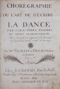
170940499Paris 1709. FEUILLET and DEZAIS<br /> Chorégraphie ou l'art de décrire la dance par caractères figures et signes démonstrifs avec lesquels on apprend facilement de soy-même toutes sortes de dances. ouvrage très utile aux maîtres à dancer et à toutes les personnes qui s'appliquent à la dance. Par Mrs. Feuillet et Dezais Maîtres de Dances. Prix: . <br /> <br /> Paris: Chez le Sr. Dezais Ruë de Bussi Faubourg St. Germain à la Cour Impériale . Avec Privilége du Roy 1713.<br /> <br /> 1f. recto title verso blank i dedication "A Monsieur Pécour Pensionnaire des Menus Plaisirs du Roy et Compositeur des Balets de l'Académie Royale de Musique de Paris" ii Préface i "Extrait du Privilege du Roi" 95 i blank pp. Engraved throughout. <br /> <br /> The revised fourth edition of this seminal work first published in 1700. RISM Écrits Imprimés p. 314 2 copies only of all editions in the U.S.: one of the first 1700 edition at the NYPL and one of the present edition at the Library of Congress. Beaumont p. 72. De Moroda 938. Schwartz and Schlundt 21. This edition not in Cortot Hirsch or Malkin.<br /> <br /> "A rather less known choreographer is Jacques Dezais. He lived in the first half of 18th century and regarded himself as a follower of R. A. Feuillet. In 1726 he published a collection of dances named Premier Livre de Contre-Dances à Quatre à six & à Huit. Unfortunately the publication was lost when the famous Anna-Amalie Library in Weimar burned in 2004." earlydance/news/8138-les-cotillons-de-jacques-dezais<br /> <br /> Bound with:<br /> FEUILLET<br /> Recueil de Dances Composées par Mr. Feuillet Maître de Dance. <br /> <br /> Paris: Chez l'Auteur rue de Bussi Faubourg St. Germain à la Cour Imperiale Avec Privilége du Roy 1709. <br /> <br /> 1f. recto title verso blank 84 pp. Engraved throughout.<br /> <br /> Contains 18 dances in Feuillet notation with melody for each at head as follows:<br /> <br /> - Le Rigaudon de la Paix pp. 1-2<br /> - 2e Rigaudons pp. 3-7<br /> - Gigue à deux Gigue de Roland pp. 8-11<br /> - Entrée a deux Rigaudon pp. 12-16<br /> - Autre Entrée a deux Rigaudon pp. 17-20<br /> - Sarabande pour femme Sarabande pp. 21-24<br /> - Sarabande pour homme Sarabande pp. 25-28<br /> - Sarabande Espagnole pour homme Sarabande Espagnole pp. 29-32<br /> - Folie d'Espagne pour femme Folie d'espagne pp. 33-38<br /> - Canary à deux Canary pp. 39-40<br /> - Gigue pour homme Gigue pp. 41-44<br /> - Entrée pour homme pp. 45-48<br /> - Autre entrée pour homme entree pp. 49-52<br /> - Entrée grave pour homme pp. 53-59<br /> - Entrée d'Apolon Entrée Apolon pp. 60-66<br /> - Balet de neuf Danseurs entre graue pp. 67-72<br /> - Canary pp. 73-74<br /> - second canary p. 75-84 with pp. 77-84 folding<br /> <br /> First published in 1700. Little and Marsh 1709-Feu p. 103 for a list of editions and issues see 1700-Feu. De Moroda 938. This edition not in Malkin Niles & Leslie Schwartz & Schlundt or RISM<br /> <br /> "All but one of the dances in Feuillet's collection are solos or duets ranging from easy to difficult; the single exception is a piece for eight dancers and a soloist - the only known example in Feuillet notation of a French ballet entry for more than two persons." Little and Marsh p. 91.<br /> <br /> Bound with: <br /> FEUILLET<br /> Recueil de Dances Composées par M. Pecour Pensionnaire des menus Plaisirs du Roy et Compositeur des Balets de l'Academie Royale de Musique de Paris et mise sur le Papier par M. Feuillet. Maître de Dance. <br /> <br /> Paris: Chez l'Auteur rue de Bussi Faubourg St. Germain à la Cour Impériale Avec Privilege du Roy 1709. 1f. recto title verso blank 72 pp. Engraved throughout.<br /> <br /> Contains 15 dances in Feuillet notation with melody for each at head as follows:<br /> <br /> - la Bourée d'Achille Bourée pp. 1-3<br /> - menuet pp. 4-11<br /> - La Mariée la Mariée pp. 12-21<br /> - le Passepied passepied pp. 22-23<br /> - 2e. Passepied pp. 24-31<br /> - la Contredance Gigue pp. 32-36<br /> - le Rigaudon des Vaisseaux Rigaudon pp. 37-39<br /> - 2e. Rigaudon pp. 40-42<br /> - la Bourgogne Courant pp. 43-44<br /> - Bourée pp. 45-46<br /> - Sarabande pp. 47-48<br /> - PassePied pp. 49-53<br /> - la Savoye Bourée pp. 54-61<br /> - la Forlana la Forlana pp. 62-67<br /> - la Conty Venitienne pp. 68-72 <br /> <br /> First published in 1700. Little and Marsh 1700-Péc p. 93. De Moroda 1341. This edition not in Malkin Niles & Leslie Schwartz & Schlundt or RISM.<br /> <br /> "Pecour's Recueil was bound and sold with Feuillet's Chorégraphie and Feuillet's Recueil . for a survey of editions and issues see comments under 1700-Feu. This collection contains a variety of pieces for ball dancing in vogue in 1700; many of them are quite difficult. According to the preface to Feuillet's Chorégraphie Pécour himself went over the proofs to eliminate errors in notation." Little and Marsh p. 93.<br /> <br /> Louis Guillaume Pécour 1651-1729 was an important French dancing-master and choreographer. He worked closely with celebrated royal choreographer Pierre Beauchamp 1631-1705 Louis XIV's personal dancing master.<br /> <br /> Octavo. Full dark brown mottled calf with raised bands on spine in decorative compartments gilt dark brown title label gilt. <br /> <br /> Binding worn rubbed and bumped with some abrasions; head of spine joints and edges chipped with minor loss; endpapers slightly worn soiled and foxed. Occasional minor signs of wear soiling and foxing; several titles very slightly cropped. <br /> <br /> Very good copies overall of all three works. Feuillet was a highly important French choreographer dancing-master and author. "He worked at the court of Louis XIV. His fame rests on his Chorégraphie a book describing a system of dance notation that was used in Europe throughout the 18th century. He probably did not invent the system himself although he said he had but derived it from the original work of Pierre Beauchamps Louis XIV's personal dancing-master. Unlike previous methods which describe movement verbally and use letters to refer to the sequence of steps Feuillet's system is a track notation. It represents symbolically not only the steps of the dancer with his turns leaps and slides but also the floor pattern in which he is to travel. The dance music is printed at the top of the page and the steps are marked off in a manner corresponding to the structure of the music. .<br /> <br /> The publication of the Beauchamp-Feuillet notation meant that specific dances could easily be distributed throughout Europe. It also added to France's pre-eminence in the world of dance. Today the system makes it possible for scholars to study some of the dances in use in the late 17th and early 18th centuries an important period for the development of the classical French ballet style and technique." Meredith Ellis Little in Grove Music Online<br /> <br /> "With the invention of his dance notation system in the eighteenth century Raoul-Auger Feuillet revolutionized the dance world. Published in 1700 his Chorégraphie . was conceived as a self-teaching device not a way of preserving dance. Yet owing to its immense popularity throughout Europe even today a large body of theatrical and ballroom dances from that period in both printed and manuscript forms can still be found in most archives. . Chorégraphie was reprinted three times in thirteen years translated into English by John Weaver in 1706 and appeared in various "improved" versions in France Germany Spain and Portugal. Voltaire 1751 ranked the invention among the "achievements of his day" and Denis Diderot 1763 devoted ten pages to the subject in his Encyclopédie." International Encyclopedia of Dance Vol. 2 p. 588.<br /> <br /> An extraordinary presentation of three of the most important early choreographic works all major factors in confirming France's preeminence in the world of 18th century ballet. unknown
EN-153o.J. Öl auf Karton, auf Blendrahmen aufgezogen, links unten monogrammiert und datiert ?E·D·K 13·?. 48,5:58,5 cm. - Provenienz: Aus dem künstlerischen Nachlass. - Seltenes Frühwerk Kinzingers, das in der Zeit entstand, als er Meisterschüler von Adolf Hölzel war.