Hubbuch, Karl - 1891 - Karlsruhe - 1979Antiquariat.de

48 778 résultats
EN-151o.J. Lithographie, um 1923, auf Kupferdruckpapier, mit Bleistift nummeriert und signiert ?Hubbuch?, verso betitelt. Darstellungsgröße 25:35,5 cm, Blattgröße 48:37,5 cm. Mit wenigen Fleckchen. - Nr. 7 von 10 Exx., sehr schöner Druck. - Literatur: nicht bei Riester; Ausstellungskatalog: Karl Hubbuch Druckgraphik, Galerie Michael Hasenclever, München, Okt./Nov. 1983, Nr. 131 mit Abb.; Ausstellungskatalog: Karl Hubbuch. Retrospektive. Karlsruhe, Städtische Galerie im Prinz-Max-Palais, 1993/94, Kat.-Nr. 149, o. Abb. - Karl Hubbuch porträtiert hier die politische Realität zur Zeit der frühen Weimarer Republik und entlarvt die Übereinkunft zwischen reichem, traditionell gesinntem Bürgertum bzw. Adel und dem republikfeindlichen, vom Ausgang des 1. Weltkriegs enttäuschten Militär. [2 Warenabbildungen]
003-Io.J. Bleistift, in lichten Farben aquarelliert (grau, gelb und wenig rosa), mit Deckweißhöhungen, auf festem Zeichenpapier. 22:29,8 cm. Mit leichtem Lichtrand rundum, sonst tadellos. Vorzeichnung zur Lithographie (mit Tonplatte) von 1851 aus der Folge ?Skizzen und Bilder aus Rom und der Umgegend.? Literatur: P.K.W. Freude: Karl Lindemann-Frommel. Ein Malerleben in Rom. Murnau 1997, D/XXI/5, Abb. 68.
0904-Co.J. Farbradierung, Roulette und Aquatinta, 1901, auf cremefarbenem Japan, mit Bleistift signiert. 19,5:13,3 cm. ? Mit ca. 1,5/2 cm breitem Rand um die Plattenkante, dieser etwas unregelmäßig geschnitten. Literatur: Kat. Galerie Glöckner. Köln 2007/2008, Nr. 82.- Vorzüglicher Abdruck, mit leichtem Wischton! ? Die in mehreren Farben gedruckten Exemplare dieser Radierung sind selten!
FH-318o.J. Farbholzschnitt, 1909, auf dichtem Japan-Bütten, am linken Rand mit Bleistift signiert, bezeichnet und datiert ?C. A. Reichel. Salzburg. 1909.? Darstellungsgröße 37,4:27 cm, Blattgröße 39,5:29,2 cm. ? Mit ungleichmäßig breiten Rändern, drei Ecken mit Knickspuren, rechte obere Ecke fehlt teils, insgesamt leicht stockfleckig. Literatur: Dickinger 1985, WVZ Nr. 19; Ausst. Katalog: Art for All. Der Farbholzschnitt in Wien um 1900. Schirn Kunsthalle Frankfurt/Albertina Wien, 2016/2017, Farbabb. S. 209, Werkliste S. 390. ? Außer diesem hier beschriebenen Exemplar, sind zwei weitere in der Sammlung der Albertina Wien nachweisbar (DG1910/364 und DG 1941/54). Ersteres wurde in der genannten Ausstellung gezeigt. Den drei Farbholzschnitten ist gemeinsam, dass sich jeder in kleinen Details von den zwei anderen unterscheidet. Die Unterschiede kommen dadurch zustande, dass der Künstler die einzelnen Farbholzschnitte nach dem Druck mit Farbe im Bereich des roten Fußbodens mit Farbe übergangen hat und die schwarzen Linien teils mit schwarzer Tusche individuell gezogen hat. Damit sind im Grunde Abdrucke mit unikatartigem Charakter entstanden. Farbholzschnitte des eigenwilligen Künstlers Carl Anton Reichel sind selten im Handel anzutreffen!
614-Eo.J. Feder in Braun, grau und braun laviert, auf Bütten mit undeutlichem Wasserzeichen, verso mit brauner Feder nummeriert ?5.? sowie Bleistiftskizzen. 25,7:32,8 cm. - Im oberen Bereich leichte Quetschfalte sowie im oberen Rand sorgfältig restauriertes Löchlein. Vergleichsliteratur: Ausst. Katalog: Johann Christian Reinhart. Ein deutscher Landschaftsmaler in Rom. Hamburg/München 2012/2013, Kat.-Nr. 15, Abb. S. 120 (die hier genannte Zeichnung ist in der Größe: 25,1:32,2 cm, mit unserer nahezu identisch). Die Authentizität der Zeichnung wurde mündlich bestätigt von Dr. Carlo Schmid, Düsseldorf (Feb. 2017), dem wir für die freundliche Unterstützung danken.
679-Eo.J. Pinsel in Grau und Deckweiß, über Bleistift, 1783/85, mit schwarzer Tuschlinie umrandet, auf blauem Bütten. 28,2:20,4 cm. ? Kleiner Abriss an der linken oberen Ecke ist sorgfältig ergänzt, Papierfehler in Form eines länglichen Löchleins im oberen Drittel der Darstellung kaum sichtbar. Literatur: Manfred Pix, Johann Christian Reinhart (1761-1847). Eine Dokumentation in Bild und Wort. Bd. I, 2018, W 218, Abb. S. 268. Pix verweist unter den Nummern B 99 und B 100 auf die Ähnlichkeit der Wahl der Landschaftsmotive bei Adrian Zingg (1734-1816), der wie Reinhart in Zeichnungen, die wenige Tage nach der Begegnung mit Reinhart und Conrad Gessner, am 13. Oktober 1785 entstanden, nämlich Wasserfälle darstellt.
303-Wo.J. Rote Kreide, auf cremefarbenem Velin, links unten signiert ?I. Teichmann?. 38:52,5 cm.- Winziges Löchlein im Papier rechts oben, verso umlaufend an den Rändern Reste alter Montage. Deutlich wird hier Teichmanns Nähe zur Mitte des 19. Jahrhunderts einsetzenden Lebensreform-Bewegung und der in diesem Zusammenhang propagierten Freikörperkultur.
WALTER-FILM000325No binding. Very Good. Fine Art Print Vintage original 41 x 27 103 x 68 cm. one sheet poster USA. Gene Tierney Clifton Webb Dana Andrews Judith Anderson Vincent Price dir: Otto Preminger; Twentieth Century Fox. One of the rarest and most desirable of all posters for this classic film noir one of the finest and best remembered of the genre. Perhaps the most romantic and one of the most haunting of all noir posters. Story of a beautiful girl in a painting who is believed to have been murdered the police investigator who falls in love with her image and her jealous Svengali. Lovely portrait of the iconic Tierney. On linen there has been touch-up to the fold lines and touch-up to one tiny tear near the right edge middle fold near Vincent Price shoulder. Immaculate colors a really clean copy ABOUT FINE. unknown books
1810WRCLIT67042Japan 1810. Folio 33 x 27.5 cm. Late 19th or early 20th century marbled calf raised bands spine gilt extra gilt label a.e.g. with watercolor river scenes on paper onlaid as doublures. Binding extremities rubbed images offset a bit to interleaves occasional patches of darkening to backgrounds of a few images one corner of an interleaf creased and a bit torn but otherwise very good to near fine. A lovely collection of watercolor images on silk of birds moths and butterflies the artist unknown but the paintings executed with great skill. The twenty-two individual panels vary somewhat in size but approximate 24 x 20 cm to 20 x 16cm and each includes several specimens: in the case of the birds 2-4 in the case of the Lepidoptera 5-10. The individual panels are mounted to heavy stock via blue silk bordering. The birds are identified via manuscript captions next to each bird; the Lepidoptera are not captioned. A pencil note on the free endsheet in an early hand dates the paintings somewhat earlier 1700-1750 Shijo School than do those later in its most recent provenance: tipped in unidentified mid-20th century auction description dating the paintings to early 19th century - private collection. hardcover books
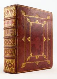
1710ST19567-052Cantabrigiae Cambridge: Cornelius Crownfield 1710. THE DEDICATION COPY ONE OF 150 ON LARGE PAPER per Mackenzie. 248 x 192 mm. 9 3/4 x 7 1/2". 4 p.l. xxiv 532 2 318 283-304 pp. 84 leaves.Edited by Rev. Joseph Wasse. <br/> FINE CONTEMPORARY RED MOROCCO GILT covers panelled with gilt fillets accented with fleuron acorn and scallop tools raised bands spine compartments densely gilt with similar tools red morocco label marbled endpapers all edges gilt probably with some very facile repairs to top and bottom of joints and spine. Front pastedown with the armorial bookplate of the dedicatee Henry Grey Duke of Kent dated 1713 and with the armorial ex-libris of Robert Offley Ashburton Crewe-Milnes Marquess of Crewe; front free endpaper with engraved armorial bookplate of Thomas Philip Earl de Grey see below for all. Dibdin II 385; Mackenzie "The Cambridge University Press 1696-1712" I 273-76. ◆Front joint with thin crack at head and tail covers with darkish splotches obvious but somehow not overly offending with antique morocco like this other very minor signs of use but the binding still extremely pleasing as a grand specimen for an important dedicatee. A MOST ATTRACTIVE COPY INTERNALLY especially clean and fresh with only negligible imperfections.<br/> <br/> This is the stately dedication copy of Wasse's monumental edition of Sallust in its original handsome unrestored binding. Described by Dibdin as "an excellent edition . . . the merits of which have long been acknowledged by the literary world" our version was prepared by Wasse after consulting nearly 80 manuscripts including "some very ancient editions." A huge undertaking it spent five years in the press. Oxford Antiquary Thomas Hearne mentioned it in his "Remarks" amazed that "Mr. Wasse . . . has so swell'd his Salust sic . . . with Notes" that "his Index will be upwards of 20 sheets"; in fact the Index consumes 84 leaves 21 quires. The text of the present volume contains the only two extant historical works of Sallust 86-34 B.C. which are his history of the conspiracy of Catiline against the senate in the year Cicero was consul and his history of the Roman war against the Numidian Algerian chieftain Jugurtha brought to its conclusion by the great soldier and populist politician Marius. As a stylist Sallust has enjoyed great fame for his artistic and epigrammatic speeches with their vividly delineated characters. A fellow of Queen's College Cambridge Joseph Wasse 1672-1738 served as chaplain to the Marquess later Duke of Kent Henry Grey 1671-1740 to whom he dedicated this work. The handsome binding is of very high quality and is decorated in the Cambridge style by an unknown binder of that city. Grey was a courtier who held a number of prominent positions: under Queen Anne he served as Lord Chamberlain of the Household and Knight of the Garter and as one of the Lords Justices Regents of the Realm upon her death; under George I he was Lord of the Bedchamber Lord Steward of the Household and Lord Keeper of the Privy Seal. Our volume was passed down in his family through the line of his granddaughter Jemima Campbell Marchioness Grey to Thomas Philip de Grey 2nd Earl de Grey 1781-1859 an amateur architect who rebuilt the family seat Wrest Park in Bedfordshire. He became the first president of the Royal Institute of British Architects. It was later in the 24000-volume library of the politician Robert Crewe-Milnes 1858-1945 Marquess of Crewe. Cornelius Crownfield unknown
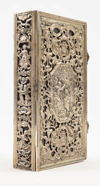
1885ST20549cOxford: Printed at the University Press for Peacock Mansfield and Britton London ca. 1885. 146 x 80 mm. 5 3/4 x 3 1/8". 536 pp. <br/> IN A LOVELY 18TH CENTURY SILVER BINDING over contemporary brown morocco DONE IN THE FRENCH RÉGENCE STYLE combining piercing with repoussé ornamentation the covers with central cartouche depicting a scene from the life of Christ in repoussé that on the front cover showing the Baptism of Christ with two hallmarks at the upper left an "A" and a rooster that on the lower cover showing the Ascension this surrounded by a pierced frame of rocaille drawer handles vases of flowers swans a leafy fronds spine pierced with rocaille and flowers separating three allegorical putti ornaments representing Faith Hope and Charity two openwork rocaille clasps. Endpapers rather worn at fore edge isolated very faint foxing otherwise A FINE COPY the text clean and fresh and THE SILVER BINDING SPARKLING AND UNMARRED.<br/> <br/> This glittering binding is a lovely example of 18th century silverwork in nearly flawless condition. While we have been unable to identify the maker the binding is probably French. A silver binding on a 1686 copy of a Rotterdam "Speculum Poenitentiae" catalogued by Antiquariat Roo is identical to ours in size and design except for the content in the large central frames and is identified by them as French. They find a master's mark of "T. G" beneath the front scene not present on our binding. In any case the delicate symmetrical ornamentation featured on our binding is typical of French Régence decorative arts with scrolls studded with naturalistic embellishments that reward close inspection. Many charming details are hidden within the sea of volutes such as the swans stealing treats from overflowing baskets of fruit. The central scenes from the life of Christ come to life through meticulous execution as our silversmith has taken great care with the details: water trickles from John the Baptist's outstretched arm and voluminous curls of cloud frame Christ's Ascension. The later Book of Common Prayer the binding now contains is a testament to the binding's enduring appeal as a precious devotional object. Printed at the University Press for Peacock, Mansfield, and Britton, London unknown
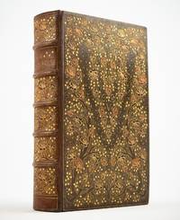
1885ST20626-1London: Printed at the Chiswick Press for Elliot Stock 1885. FIRST EDITION. 181 x 111 mm. 7 1/8 x 4 3/8". xxvi ii 274 i.e. 276 including text leaf marked as pp. 223-224 2 pp. <br/> ANIMATED CONTEMPORARY OLIVE BROWN MOROCCO ELABORATELY GILT AND INLAID covers with two climbing roses with 70 gilt and inlaid blossoms of wine red or salmon pink morocco and dozens of tiny heart-shaped leaves rising from the lower corners and winding up the sides before curving toward the center of the board in a heart shape the branches on a pointillé ground accented with tiny droplets upper cover with monogram of Eleanor Vere Boyle raised bands spine panels with rose branch featuring three inlaid blooms on a pointillé ground gilt lettering wide turn-ins with gilt rose sprays at corners yellow watered silk endleaves top edge gilt. With original front wrapper bound in at rear. Front joint replaced with great skill. With floral vignettes on title and half title decorative headpieces and initials and 11 full-page wood engravings by Boyle EXTRA-ILLUSTRATED with 28 engravings by Eisen Mariller Gravelot and many others. Spine lightly sunned to a hazel brown some extra-illustrations a little foxed occasional light to moderate offsetting from plates but the contents in excellent condition clean and bright throughout and the binding with only the most negligible signs of wear.<br/> <br/> The subject here is roses--on the extremely charming and exuberant binding in the text and in the illustrations. They were the favorite flower of author and illustrator Eleanor Vere Boyle 1825-1916 who planted them on a large scale in her garden at Huntercombe Manor. The popular illustrator of 14 children's books Boyle used most of her income to support charitable works in the parish where her husband was vicar. In her 50s she turned from illustrating to writing focusing primarily on nature and gardens as her subjects. Here she has collected English poems as well as translations in English of excerpts from poems in Greek Latin Persian Italian and French all of them celebrating the rose. Her illustrations show either close-ups of a flower or an adorable cupid accompanied by the flower of Venus. The press work in the present volume is first rate as one expects from the Chiswick Press and the binding is a riot of floral glimmering. Although the binding is unsigned the animated unconventional design is reminiscent of the work of the Guild of Women Binders while the execution is of exceptional quality equal to the productions by leading London workshops like Riviere and Zaehnsdorf. [Printed at the Chiswick Press for] Elliot Stock unknown
EN-071o.J. Radierung, 1916, auf cremefarbenem, mit Bleistift betitelt, datiert und signiert. 12,5:17,3 cm.- Blatt 9 aus der Mappe ?Gesichter?. München, Verlag der Marées Gesellschaft R. Piper, 1919.- Vorzüglicher Abdruck mit vollem Rand und dem Blindstempel der Marées Gesellschaft. Eins von 40 Exx. auf Japan, vor Verstählung der Platte. Literatur: Hofmaier 89 B a; Beckmann Liste 85; Glaser 83; Gallwitz 66.
EN-141o.J. Feder in Schwarz und Aquarell in Rot, auf chamoisfarbenem Velin, monogrammiert, bezeichnet und datiert ?peag / Berlin (19)30?, auf Karton montiert, dort betitelt, bezeichnet und datiert ?Café Lunte? / Orig. Zchg. / Berlin 1930? sowie signiert ?Peter-Anton Gekle.? - Dargestellt ist der Blick in das legendäre Café Lunte, dem Treffpunkt der Berliner Bohème der 1920er bis 1930er Jahre in der Eislebener Straße 11, an der Wand der dadaistische Spruch ?Anti chianti Chianti-Christ!?. - Die Eislebener Straße in Charlottenburg wurde ab 1893 angelegt und nach der Stadt Eisleben benannt, dem Geburts- und Sterbeort Martin Luthers. Sie ist nur 270 Meter lang und stellt eine der Verbindungsstraßen zwischen der Rankestraße und der Nürnberger Straße dar. Schon Anfang des 20. Jahrhunderts war die ?Eislebener? eine gutbürgerliche Adresse. Wie viele andere der umliegenden Straßen war auch die Eislebener Straße in den 1920er und frühen 1930er Jahren geprägt von der künstlerischen Bohème. In einem ehemaligen Zigarrenladen in der Eislebener Straße 11 residierte das kleine Café ?Die Lunte?. Man nannte sie ?wohl die verruchteste, billigste der Künstlerkneipen?, der renommierte Fotograf Umbo (d.i. Otto Umbehr, 1902-1980) fotografierte hier.
EN-022o.J. Holzschnitt, 1915, auf Büttenkarton, mit Bleistift signiert, datiert und bezeichnet ?Ostende?. Darstellungsgröße 37:27 cm, Blattgröße 44,9:32 cm. - Die rechte obere Ecke leicht knitterig, im Rand mit vereinzelten Braunflecken. Literatur: Dube H 287, I (von III).
67457ABo.J. 67457AB Die gesamte Sammlung befindet sich in einem nahezu makellos frischen Zustand.
125-Io.J. Aquarell, über Bleistift, auf cremefarbenem Velin, links unten datiert und signiert ?Juli (1824) Meyer?. 23,1:31 cm. ? Verso am Oberrand leichter Papierabrieb durch alte Montierung. Die Ponte della Paglia ist eine Brücke in Venedig im Sestiere San Marco. Sie überspannt den Rio de Palazzo o de la Canonica und verbindet den Molo San Marco mit der Riva degli Schiavoni. Ihren Namen verdankt sie den mit Stroh beladenen Booten, die hier festmachten und von deren Existenz man aus verschiedenen Gesetzen und Erlässen der Republik weiß. Beispiele von Zeichnungen, die am Beginn des Italienaufenthaltes entstanden, der von Juli 1824 bis Anfang 1849 dauerte, kommen im Handel äußerst selten vor.
Acquaforte e bulino, 1635, firmata e datata in lastra in alto, a puntasecca: Rembrandt ft 1635; sotto l’ovale l’iscrizione Quem pia miarari plebes, quem castra solebant, / damnare et mores aula coacta suos. Jactatus multum, nec tantum fructus ab anni / WTENBOGARDUS sic tuus, Haga redit. HGrotius. (La corte secolare fu costretta a condannare sia l’uomo tanto ammirato, sia le sue convinzioni. L’Aja, il tuo Uytenbogaert ritorna a te dopo lungo errare, provato solo dagli anni. Ugo Grozio). Esemplare nel V stato di VI, con i margini della lastra ripuliti. Magnifica prova, impressa su carta vergata coeva priva di filigrana, rifilata al rame, leggere ossidazioni in basso, per il resto in ottimo stato di conservazione. Il ritratto raffigurato è quello del predicatore Johannes Uytenbogaert (1577-1644), all’età di settantotto anni. Personaggio illustre ed assai influente del tempo, divenne il leader della Rimostranza, una corrente liberale della chiesa calvinista che formalizzava la dottrina di Arminio. Al Concilio di Dort (1618- 1619) la Rimostranza fu condannata e i seguaci perseguitati: Uytenbogaert fu costretto all’esilio, per porter far ritorno all’Aja solo nel 1629. La didascalia di Grozio - a sua volta appartenente alla fazione dei rimostranti e esiliato nel 1635 – non si limita a rievocare questi eventi, ma intende sottolineare il ritorno di Uytenbogaert a L'Aja. È probabile che il ritratto sia ordinato per diffonderne le stampe fra gli amici e gli estimatori dell'anziano pastore. Potrebbe essere lo stesso Uy- tenbogaert a commissionarlo, ma non è detto. Due anni prima Rembrandt lo ritrae in un dipinto, su richiesta di Abraham Antonisz. Recht, un mercante favorevole ai rimostranti. In quella occasione Uytenbogaert posa per Rembrandt, mentre per l'acquaforte non è sicuro che ciò sia avvenuto: infatti, nelle due opere il viso dell'uomo è rappresentato in modo quasi identico, perfino nelle ciocche di capelli che sfuggono dallo zucchetto. Per la testa, Rembrandt deve essere partito da un disegno oggi perduto. Esemplare in cornice dorata settecentesca. Bibliografia Hind 128; Bartsch 279; White & Boon 279, V/VI; E. Hinterding, Rembrandt, Dipinti, incisioni e riflessi sul ‘600 e ‘700 italiano, p.120, 26. Etching and engraving, 1635, signed and dated at upper edge Rembrandt ft 1635. Inscribed in Latin beneath the image: Quem pia miarari plebes, quem castra solebant, / damnare et mores aula coacta suos. Jactatus multum, nec tantum fructus ab anni / WTENBOGARDUS sic tuus, Haga redit. HGrotius. Example of the fifth state of six. Magnificent work, printed on contemporary laid paper without watermark, closely trimmed to the platemark, light oxidations at lower part, otherwise in good condition. Johannes Uytenbogaert (1557-1644), an important political and theological figure of the period , was a leader of the Dutch Remonstrants and a former chaplain to Maurice, Prince of Orange. Following the views of Jacobus Arminius, the Remonstrants presented to the States-General in 1610 a 'Remonstrance', setting forth their points of divergence from stricter Calvinism. Attacked on all sides, they were expelled from the Netherlands by the Protestant Synod of Dort (1618-19), which declared Remonstrant theology contrary to Scripture. Allowed back in the Netherlands by 1630, they were officially recognised in 1798. The inscription, in Latin, is far more extensive than in Rembrandt's other prints, and was composed by the leading Remonstrant Hugo de Groot - a Remonstrant still in exile in 1635. It alludes to Wtenbogaert's piety and court service, as well as his 'comeback' to the Hague in 1629. Rembrandt had previously depicted Uytenbogaert in a painting of 1633, in which the minister stands before a table and a large opened book (the portrait survives in the Rijksmuseum). Bibliografia Hind 128; Bartsch 279; White & Boon 279, V/VI; E. Hinterding, Rembrandt, Dipinti, incisioni e riflessi sul ‘600 e ‘700 italiano, p.120, 26.
19801014FBRoma., Galleria Pieroni., 1980. 23,6 x 17,1 cm. 12 unpaginierte S. OKarton, der vordere Deckel mit grauem Lack handgesprüht., 1014F Einband verso etwas stockig, sonst sehr gutes Exemplar.
EN-103o.J. Aquatinta und Radierung, 1921, gedruckt in Rotbraun, auf cremefarbenem Kupferdruckkarton, mit Bleistift nummeriert, signiert und datiert ?Felixmüller 21? sowie betitelt ?Stillende Mutter?. Darstellungsgröße 27,8:17,4 cm, Blattgröße 49,4:34,7 cm. ? Mit vereinzelten Stockflecken. Literatur: Söhn 251b (von b). ? Nr. 2 von 10 Exx. ? Vorzüglicher Abdruck mit viel Grat! [3 Warenabbildungen]
1744D4448France 1744. Hardcover. Very Good. Manuscript book on paper in French. c.1744. 8vo 166 x 106mm. 8 355pp. written in brown ink in a clear humanist script with some calligraphic aspects between framed pages in a single column of approximately 28 lines headings in Roman majuscules. With 89 full-page diagrams and technical illustrations of sundial construction and usage and other supporting images three are on plates and two of which are folding at rear. Contemporary mottled calf spine gilt in compartments labeled Gnomonique on gilt red morocco lettering piece marbled endpapers & edges; edges uniformly toned occasional stains; expertly rebacked preserving the original spine somewhat worn. Full contents listed on first 6 pages for this expertly executed and comprehensive compendium on the sundial. The objective of this manual is to enable the 18th century audience to understand the operating principle of sundials by describing the construction and manipulation of different forms of sundials including the planet-sundial moon-clock celestial houses-clock polar-clock ancient Babylonian and Jewish clocks as well as the construction of quadrants and astronomical tables. The suns position in the sky has always been an obvious means to keep track of time. The use of shadows of sticks cast by the sun were a natural means of indicating the time of day by the direction of the shadow and the time of year by its length. Although town squares began constructing clocks beginning somewhere in the 14th century sundials remained in the picture well into the 18th century. Mechanical clocks were expensive and could be found only in the most noble of homes. They were also more of a curiosity at first; most people still used their sundials or just estimated the time of day by the height of the sun in the sky. In 1777 when the French General Lafayette wanted to express his admiration for his ally and friend General George Washington during the American Revolution he chose a silver Explorer sundial as his gift. But by the close of the 18th century clocks and watches began to supersede sundials. They had one huge advantage- they worked all day long and were not dependent on weather. However they were also notoriously unreliable- telling time only approximately within an hour and needing to be reset frequently of course with the help of a sundial. Although the work of this study is anonymous an ownership entry at the foot of the title helps to date the work: Hic est Thorridon Rectoris Laurentii Moussault 1744. This wide-ranging study of the sundial appears at a time when the mechanical clock was on its way into popular fashion. A unique scholarly work that may well be one of the last close studies of such an ancient and important time-telling tool. <br/><br/> hardcover
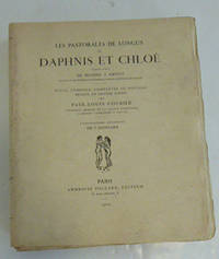
51-6792Paris: Ambroise Vollard 31 octobre 1902. 4to. 24.5 x 30cm. 10. 294 4pp.Original wraps in a contemporary half calf chemise with marbled boards in a matching slipcase repaired. One of 250 numbered copies.Francis Bouvet The Complete Graphic Work no. 75; Luc Monod Manuel. no. 7262; François Chapon Le Peintre et le livre pp. 67-68 -- The Artist & the Book 28 -- Rauch 22; OCLC Number / Unique Identifier:54167315.One of the most famous modern illustrated books – copy on hollande paper. Seduced by his first collaboration with Pierre Bonnard on Parallel by Verlaine 1900 Ambroise Vollard commissioned a second one from him these Pastorales. Where Parallel with its daring layout and the choice of printing the lithographs in pink had been disconcerting the layout of this second book is more classical the illustration being clearly separated from the text. However at the time of its publication it remained "shunned by bibliophiles who for a long time refused to see it as an appropriate illustration technique for luxury books because it was considered too commercial even vulgar" Limited edition. Vollard Petiet et l'estampe de maîtres pp. 44-45. .This judgment has largely been revised by their successors and the work is today considered one of the greatest successes of the illustrated book. Carteret Illustrés IV p. 242: a beautiful work highly sought after and highly rated. One of the greatest stars of modern books. ; « Like Bonnard’s earlier lithographs for Parallèlement and Manet’s for Le Corbeau these subtle plates had little appeal in 1902 for a public that preferred the sharply defined realism of the professional engraver.The book is today considered one of the finest of its periodâ€. The Artist and the Book n°28 ; Mahé II col. 695 ; Mornand Vingt-deux artistes du livre pp. 45-46 “Daphnis et Chloé fut pour Bonnard l’occasion de montrer toute la souplesse de son talent non seulement par la pureté du style bien antique des personnages mais par le caractère des paysages essentiellement grecsâ€. Paris: Ambroise Vollard, 31 octobre 1902. paperback
05-06351968. Gouache painting on board. 1.5 x 17 inches. BellevueAnnotated titled and dated on the mount by the artist in pencil. Literature: Millard Sheets. One-Man Renaissance by Janice Lovoos and Edmund Penney p. 148. Authenticated by the artist's son Tony Sheets on the verso. "Hilton’s Rainbow Murals Perhaps second only to Diamond Head as a Waikiki landmark the rainbow murals adorning the mauka mountain and makai ocean ends of the Village’s Rainbow Tower are the world’s tallest ceramic murals. Designed by renowned artist Millard Sheets the colorful ceramic tiles climb the entire height of the 31-story tower. By design the murals welcome all visitors to Oahu regardless of their hotel choice; the focal point for the murals is 2.5 miles away which on the ocean side coincides with the air corridor in and out of Honolulu International Airport. An inscription in Hawaiian on the mural reads: “Ho’ola’a ia I na kanaka me o ka uhane o Hawaii†“dedicated to the people and spirit of Hawaiiâ€. During 2004 the murals will receive a facelift of sorts – more than 100 tiles that have cracked broken or become badly weathered by the elements over the past 35 years will be replaced with exact recreations that will be impossible to discern from Sheets’ original masterpieces." 1968. unknown
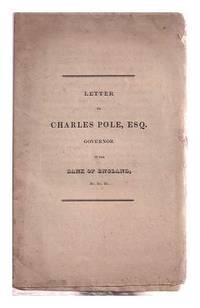
1820342776Publisher; Unknown 1820. First edition. Softcover. Specimen color/red plates 1 5 & 10 pound notes printed on single and double sides loosely inserted. Good copy; edges slightly nicked and dust-dulled as with age. An unread example with unopened pages. Remains particularly well-preserved overall; bright and clean. Additional scans and bibliographic detail on request. Date of publication is suggested. Physical description; 14 pp. Dis-bound as issued. Subjects; Bank of England.1800-1850. Bank notes - original currency samples -Great Britain. Banks and banking Central Great Britain. Currency - counterfeit and fraudulent - currency - forgery - nineteenth century. Currency printing - authentic registers. Pole served as Bank governor from 1820-1822 only. Publisher; Unknown paperback
In-folio; ff. (392), in caratteri romani; il titolo, tranne le prime due righe, è in caratteri gotici; pelle marrone ottocentesca firmata Bedford, con decorazione dorata ai piatti entro doppia cornice, titolo in oro al dorso, fregi, nervature, tagli dorati. Ex libris John Fairfax Crowder. Al frontespizio sotto al titolo una xilografia raffigura "Petrus Delphinus Generalis" inginocchiato di fronte a A. Romualdo; la pagina è inquadrata in una cornice a grottesche su legno che reca il monogramma "I C", che era stata impiegata nel 1521 per Sallustio, e poi per l'edizione delle Vite de SS. Padri del 1532. Raro epistolario del generale dei camaldolesi, fonte ricchissima per la vita storica e artistica fiorentina del XV secolo. PIETRO DELFIN, (Venezia 1444-1525), venne eletto generale dei camaldolesi nel 1480, e coltivò costantemente le lettere e la teologia, tenendosi in relazione con gli uomini più illustri del suo tempo, soprattutto con gli umanisti. Irriducibile avversario del Savonarola, nel suo Dialogus in Ieronymum Ferrariensem arrivò a chiedere la condanna al rogo del frate. Prima edizione del suo epistolario, una ricchissima fonte per la dottrina teologica ma anche per i dettagli storici di cui le sue lettere sono corredate. L'argomento principale che è al centro degli scritti di Delfin è certamente la disputa teologica o comunque religiosa, oggetto di fitti scambi epistolari con i rappresentanti del clero e gli umanisti di tutta Italia; tra gli altri argomenti vi rientra anche una disquisizione piuttosto lunga (l. II ep.LXXVII) circa l'azione corruttrice delle rappresentazioni teatrali, in particolare delle commedie, con un richiamo ai ludi scaenici degli antichi romani. Ma dati i rapporti con gli umanisti del tempo, la raccolta contiene anche scambi epistolari con questi ultimi: Ugolino Verino, Ermolao Barbaro, Francesco Guicciardini ecc. Ad esempio proprio in una di queste missive si esprime l'augurio che si ponga mano ad una edizione completa delle opere di Leon Battista Alberti. In folio; ff. (392), in Roman characters; the title, except for the first two lines, is in gothic characters; 19th century brown calf binding signed Bedford, with gilt decoration on the plates within a double frame, gilt title on the spine, friezes, bands, gilt edges. Ex libris John Fairfax Crowder. On the title page, under the title, a wood plate depicts "Petrus Delphinus Generalis" kneeling in front of A. Romualdo; the page is framed in a grotesque frame on wood bearing the monogram "I C", which had been used in 1521 for Sallustio, and then for the edition of the Vite dei SS. Padri 1532. Rare epistolary of the general of the Camaldolese order, a very rich source for the historical and artistic life of Florence in the 15th century. PIETRO DELFIN, (Venice 1444-1525), was elected general of the Camaldolese order in 1480, and constantly cultivated literature and theology, keeping in touch with the most illustrious men of his time, above all with the humanists. Irreducible opponent of Savonarola, in his Dialogus in Ieronymum Ferrariensem he came to ask for the friar to be condemned to the stake. First edition of his epistolary, a very rich source for theological doctrine but also for the historical details with which his letters are accompanied. The main topic that is at the center of Delfin's writings is certainly the theological or religious dispute, the subject of dense exchanges of letters with representatives of the clergy and humanists from all over Italy; among the other topics there is also a rather long disquisition (l. II ep.LXXVII) about the corrupting action of theatrical representations, in particular of comedies, with a reference to the ludi scaenici of the ancient Romans. Given the relationships with the humanists of the time, the collection also contains correspondence with the latter: Ugolino Verino, Ermolao Barbaro, Francesco Guicciardini etc. For example, precisely in one of these letters the wish is expressed that a complete edition of the works of Leon Battista Alberti be put to work.