Frey, Johann Jacob - 1813 Basel - Frascati 1865Antiquariat.de

48 790 résultats
016-Io.J. Aquarell, auf cremefarbenem Velin, rechts unten signiert und datiert ?J.J. Frey Rom 1838.?, auf beigefügtem altem Untersatz vermutl. vom Künstler selbst numeriert und bezeichnet ?N 1 Castel Gandolfo bei Albano, See... Albano in der Ferne das Meer gegen Ardea zu.? . 31:45 cm.
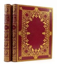
1780ST17950Caprées i.e. Nancy: Chez Sabellus 1780 1784. FIRST EDITIONS FIRST PRINTINGS 11 lines on title page and long "s" in text with these Illustrations. 256 x 190 mm. 10 x 7 1/2". Two volumes. <br/> BEAUTIFUL 19TH CENTURY RED MOROCCO GILT IN THE ROCOCO STYLE BY CUZIN stamp-signed in gilt on front turn-ins covers with a gilt-ruled border featuring rocaille motifs at the sides and a floral spray at each corner elaborate inner frame of strapwork interwoven with scrolling acanthus drawer-handle tools flower garlands and several special tools including satyrs mountain goats insects and large vases of flowers raised bands compartments with gilt lettering or a central floral sprig surrounded by a frame of leaves and flowers turn-ins with intricate gilt lace roll-tooling all edges gilt. WITH A TOTAL OF 102 EROTIC PLATES by Denon each volume with a frontispiece and 50 plates plus an engraved title in volume II. Front pastedowns with ex-libris of Léon Gambetta. Cohen-de Ricci 474-75. ◆Light offsetting from illustrations paper in both volumes perhaps lightly pressed but not washed FIRST VOLUME with the faint stain from a ribbon marker now gone one plate slightly toned and with two very small repairs to margin otherwise IN FINE CONDITION; paper in volume II slightly toned and with occasional small spots and light stains but still excellent. None of this significant because THE GLORIOUS BINDINGS LUSTROUS AND UNWORN.<br/> <br/> Despite their scholarly titles which promise scenes from the private lives of the 12 Caesars and secrets from an ancient Roman cult these are among the most famous erotic books of the 18th century. In the first volume the 12 Roman emperors from Julius Caesar to Domitian are depicted engaged in a panoply of intimate acts beginning with Julius Caesar's liaison with King Nicomedes IV of Bithynia which led his enemies to dub him "Queen of Bithynia." We see what Caesar's heir Augustus was willing to do in order to succeed his great-uncle and his later sexual excesses as emperor including incest. Antony and Cleopatra are relatively demure compared to the orgies of Caligula Nero and Claudius' wife Messalina. The "Secret Cult of Roman Women" examined in the companion work is devoted to the fertility god Priapus and his phallic symbols with guest appearances by assorted satyrs nymphs and Bacchantes. The images are white-on-black to resemble sculptured wall medallions and claim to be based on ancient carvings; however Cohen-de Ricci informs us that while the text is evidence of d'Hancarville's erudition the illustrations are entirely the result of his libertine imagination. Art historian Pierre-François Hugues Baron d'Hancarville 1719-1805 established himself in the world of antiquarians when he helped William Hamilton acquire the impressive Porcinari collection of Etruscan Greek and Roman antiquities that would subsequently be purchased by the British Museum. He then supervised the production of four sumptuous volumes of engravings documenting the collection. He seems to have undertaken the present work for his own amusement. A later issue of the second title facetiously attributed publication to the Imprimerie de Vatican the Church had of course put it on the Index of Prohibited Books. According to Cohen-de Ricci this is the first and most desirable printing identifiable by 11 rather than 10 lines of text on the title page of the first work and by the use of the f-like "long s" in both volumes. The especially splendid bindings by Francisque Cuzin 1836-90 nod to the Rococo bindings of the 18th century and to the risqué subject matter with satyrs cavorting about the elegant frame. Cuzin opened his Paris workshop in 1855 and soon made his name among bibliophiles of that city with his exquisite bindings establishing what was called the "Cuzin style." Devauchelle says that this style was copied by Cuzin's colleagues but was never equalled. Cuzin was not a gilder but employed some of the best in the trade to execute his graceful designs among them Marius Michel père Wampflug Maillard and Cuzin's eventual successor Émile Mercier. Our copy was once in the library of the distinguished French statesman Léon Gambetta 1838-82 one of the founders of the Third Republic who served as president of the Chamber of Deputies. Chez Sabellus unknown
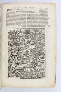
1529ST20181Lugduni Lyon: Jean Crespin 1529. 326 x 215 mm. 13 x 8 1/2". 6 leaves 12-268 pp.; 1-95 1 pp.; 1-600 pp. 8 leaves. Three sections in one. Edited by Josse Badius Ascensius. <br/> Restrained 17th century mottled calf covers triple ruled in blind with oblique gilt fleurons in each corner raised bands neatly rebacked and recornered with modern deep brown morocco marbled endpapers edges sprinkled. WITH 203 TOTAL ILLUSTRATIONS comprised of 190 different woodcuts 11 of which repeat once and one repeating twice. The first title printed in black and red with an elaborate woodcut border; the second title with a fleur-de-lys device. With criblé initials throughout in three sizes many historiated. Handwritten book label of Tobias Gutberleth on title see below title additionally with ink ownership inscription of G. van Olden Junior dated 1860. Front flyleaf with pasted-in manuscript inscriptions of "Francis" and "R. E. Hattiule". Line numbers in ink in a contemporary hand through much of the volume. Mortimer 538; Renouard "Badius Ascensius" III 377; Adams V 474; Brunet V 1282; Graesse VI 336. Binding yawning a bit edges somewhat rubbed but a solidly restored and perfectly acceptable binding. Light smudges of no consequence here and there other trivial defects but internally very clean fresh and bright.<br/> <br/> This is a well-preserved copy of a 16th century printing of Virgil's "Opera" profusely illustrated with wonderfully detailed woodcuts replete with charm and drama. Initially produced in Strassburg for Johann Grüninger’s 1502 Vergil our striking set of illustrations was reused in the 1515 German translation of the Aeneid and then in Sacon’s 1517 Lyon printing which bears many similarities to the present edition. While the plates do show some of the wear expected with this level of reuse—Mortimer notes that several had split by the time of the 1517 printing—the impressions here are nevertheless quite good and the illustrations are no less compelling than befoe. The anonymous artist whom Mortimer describes as having "a skilled hand and lively imagination" has provided animated scenes that perfectly match the content of the text. They range from the charming pastoral images that accompany the Eclogues and Georgics full of cheerful farmers and leaping stags to the dramatic battle scenes of the Aeneid with their fierce heroes in full 15th century armor grotesque monsters and elaborately rendered cities engulfed by leaping flames all overlooked by the pantheon of unconcerned gods. The text here is framed by the commentary of French scholar and printer Josse Badius Ascensius as well as by the commentaries of Filippo Beroaldo Giovanni Pierio Valeriano Bolzani and others. The present copy was owned early in its history by Tobias Guberleth 1609-62 poet and head of the Leeuwarden Latin school. Jean Crespin unknown
FH-340o.J. Folge von 24 Blatt Farbholzschnitten, auf Japan, sämtlich mit Bleistift signiert und bezeichnet, Darstellungsgrößen von 9,3:9,2 cm bis 14,5:15,5 cm. Werknummern.: 67, 210, 211, 212, 216, 217, 218, 219, 220, 221, 222, 225, 226, 228, 229, 230, 231, 234, 235, 236, 246, 247, 248 und 249. Literatur: Ausst. Katalog: Fürstenfeldbruck, 1999.
EN-140o.J. Stahlstich, 1921, auf Velin, mit Bleistift nummeriert und bezeichnet ?6/8 Stahlstich, Probedruck / vor der Auflage, / ohne Correcturen, Signum etc?, signiert, datiert und betitelt ?Felixmüller / 1921. / Kohlenbergarbeiter?. Darstellungsgröße 21,5:14,9 cm, Blattgröße 27,7:23,4 cm. Prachtvoller, sehr ausgewogener Druck mit tiefen Schwärzen, deutlichem Grat, wunderbar glänzendem Plattenton und breitem Rand. Der seltene Probeabzug noch ohne das Monogramm und den zusätzlichen Schraffuren an der Gebäudewand hinter dem Arbeiter, der linken Fensterfront, sowie dem rauchenden hinteren Gebäudeteil. - Provenienz: Privatsammlung, USA. - Literatur: Söhn 257 a (von b). ? Söhn nennt ca. 10 Handabzüge auf unterschiedlichen Papieren neben der Auflage von 100 Exemplaren auf Kupferdruckpapier, gedruckt bei Walter Künzel, Dresden, als Beitrag zum ?Jahrbuch der Jungen Kunst?, 2. Jahrgang, 1921, Klinkhardt & Biermann Verlag. Abweichend zu diesen Angaben nummeriert Felixmüller unser Exemplar mit einer Auflage von 8 Probedrucken.
EN-144o.J. Kohle, auf Bütten mit Wasserzeichen: MICHALLET FRANCE, mit Bleistift signiert und datiert ?George Grosz / 1937?. Blattgröße 63,2:48,1 cm. Zu den Rändern hin leicht fleckig. - Provenienz: Villa Grisebach, Berlin, A 254, Lot 1197, November 2015; Privatsammlung, Hessen.
EN-166o.J. Kaltnadelradierung, um 1922, auf Bütten mit Fragment des Wasserzeichens: JWZander, nummeriert und bezeichnet ?18/25 Selbstdr(uck).?, sowie signiert ?Nesch?. Darstellungsgröße 24,6:17,5 cm, Blattgröße 38,7:29,2 cm. - Provenienz: Altenburg, Staatl. Lindenmuseum, ausgesch. 76/13922 (Stempel verso). - Literatur: Ausstellungskatalog: The Graphic Art of Rolf Nesch. Detroit, The Detroit Inst. of Arts, 1969, Kat. Nr. 2.; Helliesen/Sorensen 173. - Rolf Nesch zählt neben Edvard Munch (1863-1944) zu den bedeutendsten Künstlern der Klassischen Moderne in Skandinavien. Der gebürtige Deutsche mit norwegischer Staatsbürgerschaft ist einer der Ausnahmekünstler im Bereich der Druckgraphik. [2 Warenabbildungen]
EN-148o.J. Lithokreide, farbige Kreide, auf chamoisfarbenem Velin, mit Wasserzeichen: Importe d. A. Jonson, mit Bleistift signiert ?Hubbuch?. 41,2:48,5 cm. - Literatur: Ausstellungskatalog: Karl Hubbuch 1891-1979. Karlsruhe, Badischer Kunstverein 1981, Nr. 168 mit ganzs. Abb. S. 189 (dort fälschlich mit Titel einer anderen Zeichnung); Ausstellungskatalog Karl Hubbuch. Retrospektive. Städtische Galerie im Prinz-Max-Palais, Karlsruhe, 1993/94, Kat.-Nr. 41 mit ganzs. Abb. S. 294. - Karl Hubbuchs erste Begegnung mit Frankreich findet als Soldat während des 1. Weltkrieges statt, bleibt jedoch künstlerisch ohne Folgen. Der nächste Aufenthalt im Jahr 1926 ist der Beginn einer lebenslangen, intensiven Auseinandersetzung mit dem Land und seinen Menschen. Im Gegensatz zu vielen anderen Künstlern seiner Zeit will er sich nicht an der so häufig postulierten, vermeintlichen Überlegenheit der französischen Kunst bilden, sondern ist von der Atmosphäre der Städte und Landschaften angezogen. Dieser Aufenthalt, bei dem er Paris und Nordfrankreich bereist, zeigen u. a. auch Zeichnungen und Studien mit Ansichten der Küstenstädte Trouville, Fécamp oder Deauville; die Darstellung von Menschen, wie in den späteren Jahren, findet noch keinen Eingang in sein Werk.
EN-158o.J. Aquarell und Deckweiß, über Bleistift, auf cremefarbenem Velin, mit Bleistift signiert und datiert ?Franz Lenk / 1920?. Blattgröße 30,5:29,3 cm. Das Blatt stammt aus einem Zeichenblock, der Oberrand ist perforiert. - Lenk zeigt sich hier als ein vorzüglicher Porträtist, der die Züge der jungen Frau mit großer Sensibilität und beeindruckendem zeichnerischen Können formuliert.
762-Eo.J. Feder und Pinsel in Braun, mit reicher Deckweißhöhung, über Bleistift, auf bräunlichem Velin, rechts unten signiert ?C. M. Metz Roma 1813?, verso mit brauner Feder nummeriert ?No 3? zweite Nummerierung durchgestrichen. 41,3:54,2 cm. Mit leichtem Lichtrand rundum, einige winzige Läsuren sorgfältig restauriert, Knickfalte in der linken unteren Ecke geglättet und recto nahezu unsichtbar. Provenienz: Lucien Goldschmidt, New York. Hylas ist eine Figur der griechischen Mythologie Er war der jugendliche und sehr schöne Freund des Herakles, den er beständig begleitete. Hylas blieb als Waffenträger bei Herakles, als dieser sich den Argonauten anschloss. Gemeinsam suchten sie nach dem Goldenen Vlies.
EN-171o.J. Kaltnadelradierung mit Riffelfeile und Pinselätzung, 1920, auf festem Japan, mit Bleistift signiert ?HMPechstein?. Darstellungsgröße 26,5:20,7 cm, Blattgröße 36,6:30,9 cm. - Eines von 25 Exemplaren der Vorzugsausgabe auf Japanpapier. - Provenienz: Privatsammlung Berlin. - Literatur: Krüger R 118; Söhn HDO 72709-8. Erschienen in: ?Die Schaffenden?, 3. Jahrgang, 1. Mappe. Hrsg. von Paul Westheim, Berlin, Euphorion-Verlag, 1921. [2 Warenabbildungen]
EN-104o.J. Farblithographie, 1909, auf cremefarbenem Japan, mit Bleistift signiert. Darstellungsgröße 34,7:28,2 cm, Blattgröße 47:38,5 cm. ? In den breiten Rändern etwas stockfleckig, verso an den Rändern Reste einer alten Montierung. Provenienz: Verso unbekannter Sammlerstempel. Literatur: Georg Scholz, Das druckgraphische Werk. Karlsruhe, Künstlerhaus Galerie, 1982, Nr. 11, Abb. S. 57; Hans-Dieter Mück (Hrsg.), Georg Scholz. Stuttgart, 1991, S. 20 f.
EN-012o.J. Radierung, 1924, auf Velin mit Wasserzeichen: BSB, mit Bleistift signiert und nummeriert. Darstellungsgröße 19,3:13,8 cm, Blattgröße 48:35,7 cm. Nr. 51 von 70 Exemplaren. Vorzüglicher, vollrandiger Abdruck! Literatur: Karsch 120.
EN-118o.J. Radierung in Braundruck, 1910, auf festem, chamoisfarbenem Japan, mit Bleistift signiert ?W. Lehmbruck?, sowie eigenhändig betitelt ?Verzweifelnde Mutter? und als ?1. Zustand? bezeichnet. Darstellungsgröße 11,8:15,9 cm, Blattgröße 25,8:32,6 cm. Verso mit der Cassirer-Verzeichnis Nummer ?25? und am Oberrand vom Ablösen einer alten Montierung entstandene dünne Stelle im Papier. - Ganz ausgezeichneter, mit reichem Ton effektvoll gesteigerter Druck mit breitem Rand. - Als signierter Frühdruck von allergrößter Seltenheit! - Literatur: Wilhelm Lehmbruck?s Graphisches Werk, Paul Cassirer Verlag, Berlin 1913 (57 Nrn.), Nr. 25; Wilhelm Lehmbruck. Paul Cassirer Verlag, Berlin 1920 (Radierungen 138 Nrn., Lithographien 16 Nrn.), Nr. 25; Petermann 5 I (von III).
EN-163o.J. Holzschnitt, 1912, auf feinem Japan. Darstellungsgröße 19,8 x 24 cm, Blattgröße 25: 36,7 cm. Verso mit Bleistift bezeichnet ?Handdruck vom Originalholzstock bestätigt Maria Marc?. Der Holzschnitt von Franz Marc wurde für die Nrn. 1-25 der Vorzugsausgabe durch Heinrich Campendonk mit der Hand vom Originalholzstock auf Japanpapier abgezogen. - Provenienz: Lempertz, Köln, Auktion 1234, Lot 129; Hessische Privatsammlung. - Literatur: Hoberg/Jansen Bd. III, Nr. 27, vgl. 3. Auflage; Söhn HDO 507-1; nicht bei Schardt; nicht bei Lankheit. Erschienen in: Buch Der Toten. Hrsg. Wolf Pryzgode. Erster Sonderdruck der Dichtung, München, Roland-Verlag, 1919. [2 Warenabbildungen]
EN-164o.J. Kaltnadelradierung, 1913, auf Van Gelder Zonen Bütten, unsigniert. Darstellungsgröße 16,7:12 cm, Blattgröße 32,5:26 cm. - Von größter Seltenheit! - Provenienz: Hessische Privatsammlung. - Literatur: Ausstellungskatalog: W. Flammann, Ludwig Meidner, Das druckgraphische Werk / Ein Überblick, Stadt Hofheim/Taunus, 1991, Kat. Nr. 3 mit Abb. S 24. [2 Warenabbildungen]
EN-175o.J. Holzschnitt, 1919, auf chamoisfarbenem Japan-Bütten, mit Bleistift signiert ?Scholz?. Darstellungsgröße 15,6:25 cm, Blattgröße 30,6:46 cm. - Tiefschwarzer, sehr breitrandiger Druck und von vorzüglicher Erhaltung. - Äußerst selten! - Provenienz: Privatsammlung, Karlsruhe; Privatsammlung, Hessen. - Literatur: Georg Scholz. Das druckgraphische Werk. Karlsruhe, Künstlerhaus Galerie, 1982, Nr. 40, Abb. S. 85; nicht im Katalog 1975. [2 Warenabbildungen]
EN-174o.J. Lithographie, 1916, auf chamoisfarbenem Papier, im Stein monogrammiert und datiert ?Sch. 16?, mit Bleistift signiert ?Scholz?. Darstellungsgröße 18:13,3 cm, Blattgröße 32,5:25 cm. Fleckig. - Äußerst selten! - Provenienz: Blauer Stempel einer unbekannten Sammlung verso; Privatsammlung, Karlsruhe. - Literatur: Ausstellungskatalog: Ein Beitrag zur Diskussion realistischer Kunst. Karlsruhe, Badischer Kunstverein e. V., 1975, Nr. 21, Abb. S. 41; Georg Scholz. Das druckgraphische Werk. Karlsruhe, Künstlerhaus Galerie, 1982, Nr. 31, Abb. S. 77; H.-D. Mück, Georg Scholz. Malerei Zeichnung Druckgraphik. Stuttgart, 1991, Abb. S. 32. ?Zu diesem Thema existiert im Nachlaß eine bereits 1914 entstandene (datierte) Federzeichnung, auf der der Titel ?Mann ohne Kopf? eingetragen ist.? [2 Warenabbildungen]
EN-176o.J. Holzschnitt, 1919, auf chamoisfarbenem Bütten, mit Bleistift signiert ?Scholz?. Darstellungsgröße 25,3:15,8 cm, Blattgröße 42,4:25,3 cm. - Tiefschwarzer, sehr breitrandiger Druck und von vorzüglicher Erhaltung. - Äußerst selten! - Provenienz: Privatsammlung, Karlsruhe; Privatsammlung, Hessen. - Literatur: Georg Scholz. Das druckgraphische Werk. Karlsruhe, Künstlerhaus Galerie, 1982, Nr. 41, Abb. S. 86; nicht im Katalog 1975. [2 Warenabbildungen]
36596Birmingham England late 18th century. Oblong quarto. 7 1/2 x 11 inches. 113 engraved plates on laid paper priced throughout in manuscript. Later calf backed marbled paper covered boards flat spine ruled and lettered in gilt.<br/> <br/>A rarely encountered pattern book or trade catalogue of 18th century English furniture hardware including drawer pulls keyholes hinges locks castors bolts and more.<br/> <br/>By 1770 over thirty different brass foundries operated in Birmingham England making it the epicenter of furniture hardware design in the last quarter of the 18th century. At roughly the same period trade catalogues like the present began to be issued by both furniture and hardware makers alike. In all over 500 designs are shown on the 113 consecutively numbered plates from rather simple hinges to incredibly ornate pulls. Although no engravers' names are identified it has been suggested that the foundries themselves produced such plates utilizing the talents of their own craftsmen who by their very occupation would have been highly skilled at etching on metal. Such pattern books "illustrate the beginning of what was then a new movement in the conditions of the crafts namely the growth of the organised factory as a means of production and distribution as compared with the earlier limitation of these functions to the efforts of individuals" Young.<br/> <br/>Cf. Hummel Charles F. "Samuel Rowland Fishers Catalogue of English Hardware." Winterthur Portfolio Vol 1 1964: 188-197; cf. Symonds R. W. "An Eighteenth-Century English Brassfounders Catalogue." Magazine Antiques Feb. 1931: 102-105; Young W. A. comp. Old English pattern books of the metal trades: a descriptive catalogue of the collection in the V&A Museum. London: HMSO 1913. unknown books
15465968Venice: Cornelio Adelkind for Daniel Bomberg 1546. First edition. Very Good. Folio 32 cm; 93 leaves. Text in Hebrew. Title within architectural border reproduced in Amram "Makers of Hebrew Books in Italy" p. 215 also in the Jewish Museum's 1989 exhibition catalogue "Gardens and Ghettos: the Art of Jewish Life in Italy" page 50. Some section headings within ornamental borders. Bound in c19 or c20 dark red crushed morocco ruled in gilt and decorated with arabesques on both boards; spine with raised bands and compartments tooled and titled in gilt; green polished leather doublures with red crushed morocco dentelles bordered in pointillé accented with arabesques; green moiré free endleaves. Edges gilt. Binding not signed. Joints and crown adroitly reinforced with Japanese paper; corners somewhat worn down. Occasional contemporary notes in manuscript in text; brief stain on leaf mem-tet and lightly along the bottom edge of leaves nun-bet and nun-gimmel. Text otherwise pristine. Title page light possibly washed. Old library ink stamps from an institution in Warsaw on title page. Red morocco ex-libris of mining magnate and philanthropist Adolph Lewisohn 1849-1938. References: Adams T-766; BM Italian 674; Steinschneider 7304 #1; Amram 215 illustration and 222. <br /><br />First printed edition editio princeps of the 11th century commentary on portions of the pentateuch by the Bulgarian poet and Talmudist Tobiah ben Eliezer. Published by the house of the seminal printer of Hebrew books Daniel Bomberg under the supervision of his scholar-in-residence extraordinaire Cornelio Adelkind. Venetian law at this time limited Hebrew publishing to Gentile printers. Bomberg a protestant from Antwerp entered this lucrative market and with Adelkind's help became its prime exponent until his death in 1549. Cornelio Adelkind for Daniel Bomberg hardcover
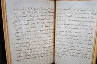
1441Italy 17th Century. <p>127 x 98 mm. 5 x 3 ¾ inches.  16 p. including final blank. Italy 17th century.                                      <br /> A handwritten guide to the drawing of the human head the most important element of any figure drawing and frequently the starting point for early modern drawing manuals. The manuscript appears to be unpublished and we have been unable to trace the text anywhere in the vast digitized corpus.</p> <br /> <p>The content is divided into five brief sections the first explaining how to draw a head in profile. Our scribe focuses on the triangle method in which the profile is anchored by three primary points: the top of the forehead cima della fronte beneath the nostrils sotto le narici and the well of the chin and the beard pozzetta del mento ò barbuccio. The author then explains how to connect these points how to form the nose place the mouth and lips draw the eye etc. Our scribe closes this section with the kind of aspirational promise endemic to manuals of this time namely that if you simple follow my instructions you’ll be able to do this easily. “without much confusion and effort†senza tante confusion et fatiche.</p> <br /> <p>The second section explains how to draw the head “in majesty†Della testa in scurcio by which the author appears to mean ‘head-on’ in such a way to convey power and authority he elsewhere refer to this position as prospetto e.g. on p. 9. Here the author likewise focuses on a simple method of drawing lines between different features of the face. The third section covers drawing the head in shadow Della testa in scurcio which the author admits is alquanto più difficle than the first two exercise and so he won’t be sticking to such geometrical rules. But then he goes on to provide a single very simple rule una regola facile assai namely to start with drawing rounded oval l’ovato cirolare and continues with guidelines that sound awfully geometric to us. The fourth section is on drawing a child’s head in profile la testa del fanciullo in profilo where he again starts with the triangle method adding other geometric principles and referencing the point of a compass. The fifth and final section is on drawing a child’s head in maestà wherein the author cites earlier discussion and further expounds on geometric advice. The author then closes with a general comment on the excellence and nobility of the art of drawing.</p> <br /> <p>The focus throughout is on lines and contours and proportions always guided by geometric rules for producing an accurate but relatively basic sketch. There is only brief passing reference to elements like “hair or other ornament according to the need and what is most pleasing†pelli or altro ornamento secondo che porfarà il bisogno e che più in piacerà . Despite the brief section on drawing the head in shadow there is nothing on rendering value or otherwise on capturing the subtleties that give a drawing depth and feeling.</p> <br /> <p>Like its spine title the Fairfax Murry catalogue calls this 17th-century and we tend to agree based on the script. While we haven’t traced our particular “bird†watermark Heathwood records a few similar marks used in the 17th century and Briquet finds many in the 16th especially in Italy.</p> <br /> <p>No less absorbing than the manuscript is a pair of 16th century Italian binding covers here preserved as doublures both heavily decorate in blind. The front doublure carries an arabesque motif and center Alexander the Great in profile. The rear appears to have been impressed with a single panel stamp also arabesque both doublures betraying the Islamic influence that characterized many Italian bindings of the period. </p> <br /> <p>Provenance: Lot 237 in the second Fairfax Murray sale his label on the inside rear board and perhaps then to Robert Tunstill his bookplate on the front fly-leaf. To us from a fellow ABAA bookseller who purchased it from a UK dealer in the 1990’s.</p> <br /> <p>Condition: Written in a cursive hand in dark brown ink on laid paper watermarked with a bird within a circle. Rebound in the late 19th century or early 20th century in cream pigskin tooled in black preserving as doublures the decorated covers of a 16h-century Italian binding described above title in gilt on spine Del disegno. Ms. Saec XVII. Following the manuscript are four additional blank leaves saved for scanning old pen trials early but the paper is different than the manuscript proper. Additionally six more modern fly leaves have been added at both front and back presumably at the time of rebind. A little loss since filled to the upper outer corner of the manuscript leaves and the four earlier blank leaves affecting just a word or two on each page; a few old pen trials over the text though it remains legible. Binding extremities lightly worn.</p> <br /> References: Catalogue of the Second Portion of the Library of C. Fairfax Murray 1918 p. 42 no. 237 “Manuscript on paper Italian hand 16 pp. repaired white morocco extra the cover of an old stamped vellum binding used as a double. 12mo. Saec. xviiâ€. Alexandra Arvilla Greist Learning to Draw Drawing to Learn: Theory and Practice in Italian Printed Drawing Books 1600-1700 PhD Dissertation UPenn 2011 p. vii “Italian printed drawing books libri da disegnare comprise an important body of evidence for our knowledge of artistic training in Italy during the early modern period. . . Intended for both professional and amateur audiences these printed sources were soon copied throughout Europe where they influenced drawing education for the next 400 yearsâ€. C. M. Briquet. Les Filigranes v. 3 # 12202- 12232 similar watermarks mostly 16th century. Edward Heawood Watermarks Mainly of the 17th and 18th Centuries 1950 # 179 183 similar watermarks 17th century. Anthony Hobson Humanists and Bookbinders 1989 p. 220-21 recording a few 16th century Italian bindings with Alexander the Great plaquettes. Thanks to Patrick Olson for help with this description. unknown
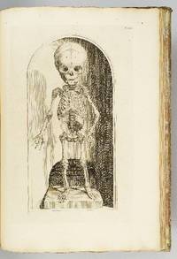
1739ST12883Leyden: Johann Arnold Langerak 1739. First Edition in Latin. 540 x 380 mm. 21 1/4 x 15". 70 leaves of text.Translated by William Dundass. <br/> Original red quarter vellum over marbled boards raised bands UNTRIMMED EDGES. Engraved printer's device on title large decorative initials and tailpieces EXTRA ENGRAVED TITLE AND 114 STRIKING PLATES OF ANATOMICAL FIGURES three folding. Wellcome II 401; Heirs of Hippocrates 468; Choulant-Frank pp. 252-3; Russell 213. ◆Vellum on spine rather worn with three one-and-one-half-inch pieces broken away revealing structure underneath paper boards quite chafed other minor problems externally but an entirely solid unrestored binding. A couple of plates with short closed marginal tears one folding plate with one-inch closed tear into image no loss untrimmed edges a little browned and brittle with isolated small chips occasional minor foxing or insignificant stains three plates lightly browned but still AN UNUSUALLY ATTRACTIVE COPY INTERNALLY with the broadest of margins with especially clean and fresh leaves and with rich impressions of the plates.<br/> <br/> With plates of notable visual impressiveness this was the finest anatomy book in England during the first half of the 18th century; it also was largely a plagiarism borrowing most of its engraved content from a work by the Dutch physician Govert Bidloo published in 1685. Bidloo's work was the first large-scale anatomical atlas to appear after Vesalius' epoch-making "De Humani Corporis Fabrica" and the plates which are highly praised by Norman and Garrison-Morton are characterized by startlingly detailed life-size depictions of the human body both adult and infant with figures flayed to reveal muscles opened to show organs and unfleshed to exhibit bones. According to Choulant-Frank Bidloo's publishers sold 300 impressions of these plates to Cowper probably to recoup some of their money after disappointing sales. Cowper took Bidloo's original 105 plates added nine of his own and produced an English translation of the original Latin text to accompany them. Discussing the original plates produced by Gerard de Lairesse 1641-1711 Norman says that the figures are displayed "in an emotional almost tender manner contrasting the raw dissected parts with the full soft surfaces of uncut flesh placing flayed bound figures in ordinary nightclothes or bedding setting ordinary household objects such as books jars or cabinets in the same scene as cut-up torsos or limbs. His illustrations brought the qualities of Dutch still-life painting into anatomical illustration and gave a new darker spiritual expression to the significance of the act of dissection." When Cowper's version of the atlas first appeared as "The Anatomy of Humane Bodies" in London in 1698 there was also a 1737 Leyden printing in English before our more scholarly Latin edition Bidloo complained to the Royal Society and accused Cowper of plagiarism and fraud resulting in much acrimony and heated pamphleteering between the two physicians. Notwithstanding this scandal Cowper's achievements and discoveries--including the pair of glands that bear his name--were considerable and his text improved significantly upon the original work. Unfortunately as the DNB notes "the notoriety of this case has served to obscure a true appreciation of Cowper and of his many original contributions to anatomical illustration." The atlases of Bidloo and Cowper appear on the market regularly but at 540 x 380 mm. the present copy is distinguished by its size which is significantly larger than what is typically seen with this edition--we have not been able to trace a copy larger than ours from marketplace or institutional records. Johann Arnold Langerak unknown
1593ST15853London: Deputies of Christopher Barker 1593. FIRST EDITION. 185 x 140 mm. 7 1/4 x 5 1/2". 12 p.l. 328 327-342 pp. <br/> Contemporary limp vellum yapp edges flat spine with later red morocco label. Inside front cover with ink owner's inscription of George Wilson dated November 1 1854; front flyleaf with engraved armorial bookplate of Thomas Francis Fremantle; early pen trials to title page old mathematical calculations on rear endpaper. Cockle 57; STC 23468; ESTC S117986; Heuser Beatrice "Strategy Before Clausewitz: Linking Warfare and Statecraft 1400-1830" 2017 chapter 5: "A National Security Strategy for England: Matthew Sutcliffe the Earl of Essex and the Cadiz Expedition of 1596." ◆Vellum a bit soiled half-inch chip to head of spine two-inch crack to fore edge of front cover title page with small ink stain and light soiling other trivial imperfections in the text but still an excellent copy clean and fresh internally and in a sound binding.<br/> <br/> This rare treatise addressing all aspects of war has been cited by military historian Beatrice Heuser as perhaps a unique example of a case "in which a civilian an 'armchair strategist' published a book containing a comprehensive concept for how to conduct a war with a specific enemy that was applied in practice." According to Heuser Sutcliffe penned "a national security strategy for England" and one that Robert Devereux Earl of Essex to whom the work is dedicated put into practice in the country's ongoing conflicts with Spain leading to the operation that resulted in the successful capture of Cadiz in 1596. Sutcliffe had met Essex at Trinity College Cambridge where he had likely served as one of the young earl's tutors. DNB observes that Sutcliffe who studied law before becoming a doctor of divinity applied his legal training to this work in which he examines not only fortifications aggressive and defensive tactics and the practical considerations of recruiting paying feeding and housing armed forces but also discusses laws and regulations governing the military. Cockle notes that the work "was well known both at home and abroad" and that it "urged the importance of military studies." Following this consequential work Sutcliffe restricted his writings to theological subjects and enjoyed a 40-year career as dean of Exeter Cathedral. This work is rare in the marketplace: ABPC and RBH find just three other copies at auction in the past 40 years. Deputies of Christopher Barker unknown
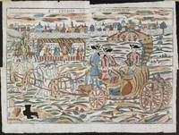
178009496Orléans: P.-F. Perdoux 1780. Beneath the title band lies the walled city of Soissons fronted by a broad field. In the center left shoemakers and cobblers serve customers and make and repair shoes in the shelter of a temporary stall. An elaborate outsized carriage dominates the scene. On the left an angel leads the team of six white horses toward the town gate. In the carriage a well dressed coachmen drives the beasts which are caparisoned with the tools of the shoemaker's and cobbler's trades. With a Cross of the Holy Spirit pinned to each of their chests Saints Crispin and Crispinian richly garbed sit behind unruffled in their journey. The carriage door is emblazoned with shoemakers' and cobblers' tools. In the lower left of the scene more tools overflow a wooden box and just to the right a pair of high boots and a half-dozen lasts lie scattered on the ground. Famous throughout northern Europe in the Middle Ages Crispin and Crispinian are known today from the king's great speech before the Battle of Agincourt in Shakespeare's Henry the Fifth act IV scene 3. Probably produced for their feast day - 25 October - to be hung in merchants' stalls and shops and fixed to tavern walls this wonderfully exuberant monumental print celebrates THE PATRON SAINTS OF SHOEMAKERS AND COBBLERS and of Soissons where they made shoes at night having preached all day. These sheets were sold to the tradesmen across France who were protected by the saints and broadly to the inhabitants of Soissons. Orléans was the most important center for the production and distribution of popular imagery in 18th-century France and Perdoux a dominant force not only in cheap prints but in decorated papers many used for book wrappers. It is unlikely that another example of this four-sheet print survives and certainly not in such superb condition four neat blank marginal repairs on the verso one just into the image. [P.-F.] Perdoux unknown