Felixmüller, Conrad - 1897 Dresden - Berlin 1977Antiquariat.de

48 779 résultats
EN-120o.J. Kaltnadelradierung, 1918, auf Bütten, mit Bleistift bezeichnet, betitelt, signiert und datiert ?Kaltnadel ? Essendes Ehepaar ? Felixmüller 18.?. 25,7:17,7 cm. Literatur: Söhn HDO 154. Ganz vorzüglicher, breitrandiger Abdruck.
0825-Co.J. Folge von 10 Linolschnitten und Titelblatt, um 1920, auf dünnem Japan-Bütten, sämtlich signiert und als ?Original Handdruck? (außer Titelblatt) bezeichnet. Ca. 20:23 cm. In Original-Passepartouts. ? Teils etwas braunfleckig. Nr. 2 von 10 Exx. Sehr selten! [5 Warenabbildungen]
EN-041o.J. Kaltnadelradierung und Pinselätzung, 1920, auf festem Bütten, mit Bleistift signiert und datiert. Darstellungsgröße 26,1:30,2 cm, Blattgröße 45,2:52 cm. - Papier leicht vergilbt und mit einigen Stockflecken. Literatur: Nicht bei Schmidt/Werner, vgl. jedoch stilistisch und motivisch: Schmidt/Werner 46.
149-Wo.J. Öl, auf Papier, links unten ritzsigniert ?Ernestine von Lipowsky, geborene von Eder?, rechts unten bezeichnet ?Untersberg?. 13,7:19,6 cm. Nagellöchlein in den unteren Ecken. Minimaler Einriß links unten. Frische und dynamische, sicher vor Ort entstandene Landschaftsstudie, die eine intensive Beschäftigung mit der Münchner Freilichtmalerei erkennen läßt.
0872-Co.J. Kaltnadelradierung, 1919, auf festem Velin, signiert und nummeriert. 17,4:15,6 cm. Literatur: Stix/Osborn 42; Pabst R 45. Nr. 25 von 100 Exx. ? Sehr guter, vollrandiger Abdruck, mit kleinem Einriß im linken Seitenrand. - Das Porträt des bekannten Geigers entstand im Zusammenhang mit dem gleichnamigen Ölgemälde, das Max Oppenheimer über mehrere Wochen und Sitzungen verteilt von Szigeti anfertigte. Wie Oppenheimer in ?Menschen finden ihre Maler? beschreibt, war Szigeti so sehr beschäftigt, dass er für einige Sitzungen Schüler mit seiner venezianischen Violine ins Atelier schickte, damit diese an seiner statt Porträt saßen.
130-Wo.J. Gouache, auf schwarz grundiertem chamoisfarbenem Bütten, verso monogrammiert ?M R? sowie signiert ?Reinheimer? und Paraphe. 29,9:22,4 cm.
FH-445o.J. Farbholzschnitt 1925, auf cremefarbenem Japan, mit Bleistift signiert, bezeichnet und betitelt ?Original-Farbenholzschnitt, Handdruck / ?Vor dem Gewitter? Carl Thiemann?. Darstellungsgröße 25,6:41,5 cm, Blattgröße 29,7:46,7 cm. Literatur: Thiemann-Stoedtner FH 85; Merx 350 F. Abgebildet in Klaus Merx, Carl Thiemann, Meister des Farbholzschnitts. Darmstadt, Ed. Roether, 1976, Farbabb. S. 108. Prachtvoller Abdruck in satten Farben und in tadelloser Erhaltung!
210-Do.J. Rote Kreide, mit Kreidelinie umrandet, auf Bütten mit Wz: MGTLS FIN 1742, rechts oben sign. ?Wille?. 21,1:29 cm. Zeichenstil und das datierte Wasserzeichen siedeln die Entstehungszeit dieser Zeichnung einer ländlichen Idylle in die frühen Jahre des Pariser Aufenthalts von Wille.
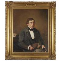
1876690691876. 39-1/2" x 31-1/4. 39-1/2" x 31-1/4" A Notable Nineteenth-Century Philadelphia Lawyer and Democratic Politician American School 19th Century. Hirst William L. 1804-1876. Portrait of William L. Hirst. 31-1/4" x 39-1/2" image size. Oil on canvas in ornate nineteenth-century gilded wood frame. Some minor nicks and chips to frame gilding slightly dulled otherwise fine. $3750. Hirst had a thriving private law practice and was active in Democratic politics. In 1853 Hirst was elected President of the Democratic State Convention. He was an early proponent of the City of Philadelphia consolidation. This portrait belonged to the Philadelphia Bar Association. Founded in 1802 it is the oldest association of lawyers in the United States. Its library where this portrait was last displayed was renamed the Theodore F. Jenkins Memorial Law Library in 1967. unknown books
59115Photograph albums. Oblong folio. 2 volumes: 401 mounted photographs 4 3/8 x 2 to 3 1/2 x 5 3/4 inches; 102 mounted photographs 2 3/4 x 1 7/8 to 3 1/2 x 5 3/4 inches predominantly of the larger size in both volumes and with nearly all of the images captioned in white. Included are sections dedicated to Pinehurst North Carolina 75 images Lake Placid New York 37 Detroit Michigan 68 and several other eastern United States locales where Bigelow and his family lived and vacationed and depictions of the Sound Beach Golf Club of Old Greenwich Connecticut in its inaugural year of 1905 6 the Detroit Country Club in 1905 4 the Pinehurst Golf Club in 1905 16 identifying golfers George Low Sr. Alex Findlay Andrew Kirkaldy Alan Lard and Donald and Alec Ross photo-essays on the 1906 and 1910 Vanderbilt Cup Automobile Races at Westbury Long Island 13 Dyker Meadow Golf Club in 1907 Brooklyn New York 6 the White Mountain Express train wreck of 1908 4 Salisbury Golf Links & Club in 1911 Garden City New York 6 a 1911 Lake Placid fire department drill 7 and the Ann Arbor and Detroit Golf Clubs in 1915 and 1925 8. Scattered through the text are images of other golf courses and country club buildings a baseball game and cricket match horseback riding and other outdoor sporting activities making a total of about 130 in the album 25 per cent of the total. Covers very worn but images for the most part are bright and sharp. Original gilt-stamped suede rear cover detached spine eroded yapped edges chipped and gilt-stamped brown fabrikoid tied original ties replaced. #6114. Of particular interest is the 75-image section documenting the early days of the Pinehurst development a photo-essay examining the relatively new golf resort which had opened its first course in 1899 and saw Donald Ross appointed golf pro there in 1900 a position he would hold until his death in 1948 productive decades that would find him designing over 400 courses in the United States; this section of the first album includes in addition to the 16 images of the golf course and golfers photographs of the train depot a "Negro cabin" 'possum hunting elaborate cottages the town hall an African-American with his wagon pulled by the "oldest mule in the state" sand hills pine stands and other scenery quail hunting the deer park owl cage and hennery the golf club house and an old turpentine mill. Other sections of the albums picture Bigelow and his family living vacationing and participating in various outdoor activities as they moved from Brooklyn to Greenwich and Farmington Connecticut Long Island Grosse Point Michigan and Philadelphia and visited a wide range of cities and outdoor destinations in the south middle Atlantic and upper midwest states. The Vanderbilt cup race was the first major trophy in American auto racing; the inaugural race in 1904 and the next two were held on winding dirt roads in Nassau County Long Island suspended for a year and then held 1908-1910 on the Long Island Motor Parkway the first specially built racetrack in America. We have not found much information on Bigelow; apparently he studied at Cornell in the 1880s playing on the baseball team competed in tennis and golf tournaments around New York in the 1890s and 1900s and was a member of the Brooklyn Boat Club in the 1910s. Nevertheless his photograph albums offered here provide an expansive look at the leisure activities of the well-to-do in the early decades of the 20th century especially revealing for the views of American golf courses clubs and play just at the time when the wave of professionals from Scotland began to make their presence felt with improved course design and instruction. <br/><br/> unknown books
a796334to. 54 leaves cloth cover fully decorated with metallic thread in ornate embossed decoration with sequins sewn in and much fancy knotting of gold and silver threads on what appears to be silk cloth. Book is entirely hand written and hand illustrated with full page watercolor frontis of Chalice; title page "In Depositione SS. Sacramenti" no place no date given. 54 leaves of handprinted text in black and red a few internal pages are blank with grey line border on every page. Contents are hymns and prayers: Hymnus Pangelingua Oratio de Sacramento Preces post Psal. Miserere Oratio pro Imperatore Oratio pro infirmo Oratio pro Serenitate et de S. Vitale Preces in Gratiarum Actionibus In Solemnitate SS Reliquianum and so on. One color illustration in text one page written on different paper and tipped in. Internally VG neat and clean; cover is faded and somewhat worn cloth but not book itself is split at hinge. Cover is Fair intact. Nice example of relatively rare mid-17th century book binding. . hardcover
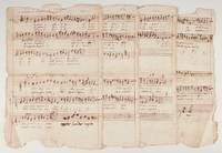
39441Folio ca. 335 x 235 mm. 8 pp. in total with each of the four parts notated in ink on both sides of a single leaf. Text in Latin.<br /> <br /> Includes settings of "In lumen tu splendor" "Ibant Maji quam indesant" "Hic nempe mundi gaudia" and "Qui pius puidens." <br /> <br /> With several corrections; a short passage added to the end of the first page of the Canto part in another hand.<br /> <br /> Somewhat worn; slightly browned; creased at central folds with several small holes; frayed at edges with small chips; some show-through; portions of both upper and lower blank margins lacking affecting titling but not notation. We have not located any other sources of the present works either manuscript or printed. unknown
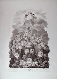
180740691Firenze: La Societa Rainaldi 1807. Each print features small circular engraved portraits and includes mythological elements at the upper portion amongst clouds and rays of sunlight with a background of a rocky outcrop including elements including vegetation and a running stream. The scenes evoke the celestial qualities of music and a reverence for the musicians depicted. <br /> <br /> On good quality laid paper sheet size 695 x 505 mm; plate impression 650 x 365 mm.<br /> <br /> Plate 1<br /> With printed dedication "Al Nobil uomo il Sig: March: Cav: Gius: Antonio Corsi Comandante del R. Corpo dei Cacciatori di Firenze e Gentlehome di Camera di S. M. il Re d'Etruria." <br /> <br /> Subjects include:<br /> Abel d'Arezzo Bach Bertoni Caffaro Campioni Cimarosa Clari Corelli Durante Fux Galilei Galuppi Gluck Handel Jomelli Ligneville Manna Leo Marcello Martini Miers Morales Palestrina Pena Perez Pergolesi Piccinni Poli Porpora Rameau Redi Rousseau Sacchini Sala San Martino Scarlatti Schuster Stefani Traetta Valotti and Zarlino.<br /> <br /> Plate 2<br /> With printed dedication "Al Nobil Uomo il Sig: Giovanni di Poggio Baldovinetti Patrizo Fiorentino. La Societa Rainaldi D.D.D." <br /> <br /> Subjects include:<br /> Albinoni Anfossi Arrighi Asoli Basili Bianchi Borghi Bornei Brunetti Buonvicini Caruso Cherubini Cicchi Colla ERgizio Domenico Gizzi Gazzaniga Gretry Guglielmi Hasse Haydn Lully Manfredini Mariani Mayer Méhul Mozart Paër Paisiello Paolucci Pleyel Porta Prati Puccini Righini Sabbatini Salieri Saratelli Sarti Schüster Tarchi Tozzi Trillo Vinci and Zingarelli.<br /> <br /> Plate 3<br /> With printed dedication "Al nobil uomo il sig: Conte Priore Ant: Colombani Verzeri Amatore delle Belle Arti e Professore dilettante della Musica."<br /> <br /> Subjects include:<br /> Capuzzi Cervetto Chabrand Clememnti Cramer Sr. Cramer Jr. Creuzer Kreutzer Dragonetti Dussek Ferrari Galeotti Geminiani Giardini Janevitz Janovich Krunpholtz Krumpholtz Mad. Krumpholtz La Motte Locatelli Lully Manfredi Mastrino Nardini Piantanida Pugnani Rodhe Roda Rolla Salomon Somis Steibelt Tartini Veracini and Viotti <br /> <br /> Several small marginal tears professionally repaired. Light horizontal crease to each plate hardly visible. <br /> <br /> A highly attractive set of important figures in the musical pantheon. Arrigoni & Bertarelli 2053 2097 and 3264. Rare. La Societa Rainaldi unknown
1683ST20461-2Paris: Pierre le Petit 1683. 203 x 127 mm. 8 x 5". 4 p.l. first blank xxxii 629 3 pp. <br/> REGAL CONTEMPORARY RED MOROCCO GILT covers with French fillet border central field semé with alternating fleur-de-lys and Louis XIV's stylized "L" topped with a crown raised bands spine compartments with crowned "L" at center oblique fleur-de-lys at corners marbled endpapers olive green morocco label all edges gilt. Printer's device on title page and four engraved plates depicting the Entry into Jerusalem the Crucifixion the Descent into Hell and the Resurrection. Front pastedown with morocco bookplate of Hans Fürstenberg; verso of front free endpaper with book label of the Fondation Fürstenberg. USTC 6098649. For the binding: Olivier Pl. 2493 Fer no. 8. Top inner corner of covers a shade darker but apparently not from moisture boards tending to splay slightly corners a bit bumped endpapers with offsetting from binder's glue but the binding lustrous with very little wear to the joints and generally pleasing. About a quarter of the leaves with small faint dampstain at upper gutter intermittent minor browning and foxing more pronounced on a couple of quires other unserious signs of devout use but the text with nothing approaching a fatal defect.<br/> <br/> Bound for a distinguished library--and perhaps for a member of the French royal household--and with an illustrious modern provenance this is a pleasing copy of a 17th century Parisian edition of the Office of Holy Week. The attractive engravings that accompany these paschal hours demonstrate the lush graceful style that distinguished the fine late baroque printmakers. The scenes of the Crucifixion and Resurrection were engraved by Jean Morin ca. 1605-50 whose innovation of combining engraving and etching on the same plate ushered in a new popular style of printmaking and the depiction of the Entry into Jerusalem by Flemish artist Peter Paul Bouche fl. ca. 1685-1702 is especially pleasing. But the story of this volume is its period binding. The owner who commissioned the binding may well have been a member of the noted Lamoignon family whose celebrated library was built over several generations but particularly by Chrétien-François de Lamoignon I 1644-1709 a cultivated man of letters and friend to writers such as Boileau and Racine. The "L" surmounted by a crown appears typically on the family bindings though normally accompanied by the same cypher stamped in the margin of the third leaf of text a stamp that is not present here. The impressive library was sold to bookseller Thomas Payne and auctioned off in 1791-92. Equally or really unequally the repeating motif of Louis XIV's crowned "L" monogram could well indicate that this was the property of royalty. We have not been able to identify its specific owner but this style of semis was not uncommon for royal bindings; the Russian National Library has two late 17th century examples with Louis XIV's own arms over an identical ground. According to Olivier the semis repetition alternating the monarch's initial with a fleur-de-lys or with a specific royal's cipher became popular during the reign of Louis XIII and continued under his successors; "the result for royal bindings is a sort of uniformity in the ornamentation which seems to reflect in the field of art the unification and centralization of France." Our binding's crisp precise tooling has survived beautifully despite apparent dedicated devotional use by its early owner. Our copy is further distinguished by coming from the collection of Hans or Jean Fürstenberg 1890-1982 a bibliophile of refined discrimination who assembled one of the great collections of the 20th century and whose books were noted for their outstanding condition. He put together one of the finest collections of 18th century French books ever assembled and his library contained a discriminating selection of bindings from other periods such as the present example. Pierre le Petit unknown
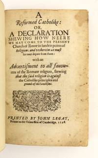
1598ST16441Cambridge: John Legat 1598. Second Printing. 153 x 98 mm. 6 x 3 7/8". 4 p.l. 375 1 pp. <br/> Modern sprinkled calf blind-ruled covers raised bands flanked by double gilt rules brown morocco label remnants of paper library shelf label at tail of spine. Printer's device on title page. Front pastedown with bookplate of the Fox Pointe Collection; rear pastedown with deaccession stamp of Bradford City Libraries. STC 19736; ESTC 19736. ◆Spine just faintly sunned leaves lightly browned due to paper quality and trimmed a bit close at head grazing headline on a couple of leaves isolated marginal stains or tiny rust spots but an excellent copy fresh and clean in a sympathetic binding with few signs of wear.<br/> <br/> This was an important work in establishing distinctions in liturgy and doctrine between the Catholic Church and the Church of England written by a moderate puritan whom DNB considers "perhaps the most significant English theologian of his age." Perkins 1558-1602 was one of the most popular voices of his time speaking from a Calvinist puritan point of view; while he could be virulently anti-Catholic he did not believe in repudiating the English church only in reforming it. According to DNB "The genius of Perkins's work did not lie in its originality—his theology represents a conventional recital of Calvinist scholasticism in virtually every respect. His gift lay rather in bringing to a broad audience a variety of theological and moral issues popularizing essentially technical discussions and therefore as Fuller observed humbling 'the towering speculations of philosophers into practice and morality.'" The present work spread his polemical influence beyond England to the Continent; even the Catholic bishop William Bishop admitted he had "not seene any book of like quality published by a Protestant to contain either more matter or delivered in better method." Both the 1597 first edition and our 1598 second printing are rare: no other copies of either edition are recorded at auction by RBH or ABPC in the past 50 years. John Legat unknown
1800409761800. Depicting couples from various regions with accoutrements as named in each lower margin unsigned. Image size: 10 1/2 x 8 3/4 inches. Sheet size: 13 3/8 x 10 3/8 inches The group consists: 1. Di Pesco Costanza Contado di Molise 2. Paese di Sessano Provincia Contado di Molise 3. Massagronica Provincia si Chiete Abruzzo Citra 4. Passe di Monte Aldiero Provincia d'Aquila. This group of watercolours showcases couples from various mountainous villages in the Abruzzo and Molise regions of Italy. Dressed in traditional garb each couple's attire highlights the distinct differences in the dress across this region to the east of Rome as well and the delicately ornate clothing of the time complete with bright colours intricate patterns and fascinating accessories. Each couple is beautifully captured in gauche executed with delicate brushwork and vivid colours that bring the characters to life capturing the essence of each couple's culture and lifestyle. The drawings offer a glimpse into Italy's rich and diverse heritage presenting a window into the customs and traditions of its people through their traditional clothing and accessories. unknown
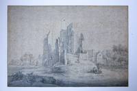
65233View on the ruins of the ""Huis ter Kleef"" a castle near Haarlem.Shepherds with dogs in front of the ruins. Birds flying in the sky above the ruins. Dated and signed below 1649 Maas or Maes. The date seems original but the signature doesn't. In a sale catalog from 2010 lot. 587 it is considered as a drawing by a young Nicholaes Maes 1634-1693 who in 1650s was beginning with his apprenticeship at Rembrandt's.On the bottom right corner are traces of what seems to be a collector's mark stamped in black ink fashioned as a ramping animal a lion in profile turned towards the left. not in Lugt.See R. van 't Zelfde 'Josua Breckerveld 1644-1700' Delineavit et Sculpsit 23 juli 2001 p. 11-17 illustrated. Drawing on paper in pen with brown ink washed in grey with some highlights in white. Total: 270 x 404 mm. Pasted down on cardboard an operation that is contributing to the spreading of foxing especially on the top region. The drawing was probably divided into two pieces from a notebook and recomposed by pasting it down on a wide cardboard. On the back another date was added in pen and brown ink ""1885."" and might refer to the pasting down the kind of cardboard would be consistent with that period. Other more recent numbers on the backing in pencil. Possibly the drawing was pasted down due to a minor defect of the paper located on the shirt of the sitting shepherd. The hole has been repaired from the backing and the lacuna was filled in with pencil. This area extends for less than 5 mm. unknown
198660747ABZürich., Parkett Verlag., 1986 - 2014. 25 x 21 cm. Ca. 23000 S. OKarton / OKarton mit OKlappenumschlag., 60747AB 95 in 92 Bänden. 1. Auflage. Sehr gutes Exemplar.
Bulino, 1610/20 circa, in basso al centro l'excudit di Claes Janz. Visscher (CJV intrecciate). Sotto l'immagine una spiegazione in francese e in olandese e un riferimento al testo biblico di Matteo (15:14). Numerato 3, in basso a destra. Da un soggetto di Pieter Brueghel il Vecchio. L'opera traduce in immagini la parabola evangelica del cieco che guida un altro cieco, riportata da Matteo 15:14, in cui Cristo si rivolge ai Farisei: «Sono ciechi e guide di ciechi. E quando un cieco guida un altro cieco, tutti e due cadranno in un fosso!». Il cui significato è: quando l'incompetente consiglia altri incompetenti, le cose vanno male. L'acquaforte pubblicata da Claes Jansz. II Visscher è apparentemente ispirata a De parabel der blinden [La parabola del cieco], dipinta da Pieter Bruegel il Vecchio nel 1568. Questa ipotesi è stata avanzata dal Rijksmuseum, che conserva due impressioni di questa incisione. È incisa al contrario rispetto al quadro, e utilizza la stessa composizione: uomini ciechi, vestiti come vagabondi, seguono una linea diagonale attraverso il quadro, che porta a un fiume in cui cadranno presto; hanno mancato per poco un piccolo ponte di assi a monte, vicino a un albero. Come nel quadro, c'è un villaggio sullo sfondo. Tuttavia, ci sono solo tre ciechi invece dei sei del quadro di Bruegel, e quello di fronte, con la stessa ghironda del quadro sulla spalla, non è ancora caduto in acqua. Non descritto da Leeber, Bastealer e Hollstein. Il Rijksmuseum, che suggerisce una data del 1643 nella descrizione di una delle loro due impressioni, certifica che quest'opera è inserira dalla serie Theatrum Biblicum Hoc Est Historiae Sacrae Veteris et Novi Testamenti Tabulis Aeneis Expressae. Crediamo che una datazione più pertinente per l'opera sia tra il 1610 e il 1620 e che solo successivamente venga a far parte della Bibbia pubblicata da Claesz J. Visscher. L'incisore rimane anonimo, ma è possibile che si tratti dello stesso autore. Figlio di Jan Claesz Visscher, un incisore e editore di Amsterdam, padre di Nicolaes e nonno di Nicolaes II, fu attivo nella sua città natale dal 1601 fino al 1652. Nel 1605 lavorò come incisore per l'editore di Amsterdam Willem Jansz. Blaeu, realizzando tra l'altro alcune vedute dei più importanti monumenti di Amsterdam, e per Theodoor Galle. Molto presto però, Visscher iniziò a pubblicare stampe di propria fattura, caratterizzate dal logo del “pescatore”, riferimento al suo nome latino di Piscator. Immagazzinò, inoltre, stampe, acquisendo su larga scala lastre di rame da altri editori e stampatori, non solo prodotte da artisti viventi, ma anche vecchie tavole da Maarten van Heemskerck e altri noti pittori, prodotte da Hieronymus Cock e dai suoi successori. Contribuì, in questo modo, a costituire una delle più importanti case editrici dell'epoca. Rappresentò soggetti religiosi, paesaggi, in particolare invernali, e architetture, e realizzò stampe di devozione. Nonostante la più importante pubblicazione dell'epoca, la “Bibbia”, nella versione autorizzata nei Paesi Bassi, fosse senza illustrazioni, Visscher, come pure altri editori dell'epoca, realizzarono stampe, che, inizialmente separate dal testo religioso, vi furono in seguito incorporate. Bellissima impressione, su carta vergata coeva, con ampi margini, in perfetto stato di conservazione. Engraving, signed at the lower center with the excudit of Claes Janz. Visscher (CJV entwined). Beneath the image an explanation in French and in Dutch and a reference to the Bible text in Matthew 15:14. Numbered 3. After Pieter Brueghel the Elder. The blind leader is about to step into a ditch, taking his equally blind followers with him. The guide has a hurdy-gurdy under his cloak. A village can be seen in the background. The scene is a depiction of the proverb and parable: “if the blind lead the blind, both shall fall into a ditch”. The meaning of which is: when the incompetent advises other incompetents, things go wrong. The etching published by Claes Jansz. II Visscher is seemingly inspired by De parabel der blinden [The parable of the blind], painted by Pieter Bruegel the Elder in 1568. This hypothesis has been put forward by the Rijksmuseum, which keeps two impressions of this etching. It is etched in reverse compared to the painting, and uses the same composition: blind men, dressed like vagrants, follow a diagonal line across the picture, leading to a river in which they will soon fall; they narrowly missed a small plank bridge upstream, next to a tree. As in the painting, there is a village in the background. However, there are only three blind men instead of six in Bruegel's picture, and the one at the front, wearing the same hurdy gurdy as in the painting over his shoulder, hasn't fallen into the water yet. Not described by Leeber, Bastealer and Hollstein. The Rijksmuseum suggests a date of 1643 in the notice to one of their two impressions, this work is taken from the series Theatrum Biblicum Hoc Est Historiae Sacrae Veteris et Novi Testamenti Tabulis Aeneis Expressae. We believe that a more pertinent date for the work is between 1610 and 1620 and that it only later became part of the Bible published by Claes Jansz. Visscher. The engraver remains anonymous, but it is possible that it is the same author. Visscher, who was born and died in Amsterdam, was also known as Nicolas Joannes Piscator or Nicolas Joannis Visscher II, after his father who lived ca. 1550–1612. He learned the art of etching and printing from his father, and helped grow the family printing and mapmaking business to one of the largest in his time. It was a family business; his son Nicolaes Visscher I (1618–1679), and his grandson Nicolaes Visscher II (1649–1702) were also mapmakers in Amsterdam on the Kalverstraat. The times were with the Visschers for other reasons; due to the Protestant reformation, the older Bibles with their "Roman Catholic" illustrations were seen as outdated and apocryphal, but to liven up the new Protestant Bibles for the less well-read clergy, the Visschers produced illustrated maps and even landscapes of the places in the Bible. This became a very successful family business, with collaboration with many respected draughtsmen of the day. A new translation of the Bible was underway in the Netherlands, and until then, the new German translation done by Johannes Piscator, published in 1602–1604, was translated into Dutch. Though probably not a relative, his Bible translation was accepted by the Dutch Staten-General in 1602, which only lent more publicity and authenticity to the "Fisher" name. The trademark of the Visschers was a “fisherman”, after their name (thus the Latin nickname Piscator). A small fisherman would be strategically placed somewhere near water. If the subject was a landscape without a stream or pond, then often a figure walking with a fishing rod can be seen. Their map plates were reused for a century by other printers who unknowingly copied the entire plates, including the tell-tale fishermen. Observant scholars are thus able to trace the provenance of Bibles, maps, and landscapes from these signs. A fine impression, printed on contemporary laid paper, with margins, perfect condition.
Xilografia, 1505 circa, monogrammata nella tavoletta in basso a destra. Stato unico, nella terza variante, di cinque, descritte da Meder (n. 233 c/e) Magnifica prova, nitida e ben contrastata, nella terza variante descritta da Meder, caratterizzata da una piccola rottura del legno che comporta una mancanza di circa 5 mm nella parte superiore della linea d’inquadramento. In ottimo stato di conservazione. San Nicola, a sinistra, è identificato dal pane che tiene in mano, che gli fu portato durante una carestia sull'isola dove viveva, dalla barca sullo sfondo. Sant'Erasmo, a destra, sta portando le sue viscere, avvolte intorno a un rocchetto, e inoltre, è identificato dalla ruota con una candela accesa. Al centro c'è Sant'Ulrico, il patrono di Augusta, con in mano il suo simbolo, un pesce. Poiché è al posto d'onore, è stato ipotizzato che questo foglio sia stato commissionato o inteso per essere venduto ad Augusta. Il nome Ulrich non era comune a Norimberga. Questa stampa è spesso considerata come la controparte di un’altra xilografia, raffiguranti i SS. Lorenzo, Sisto e Stefano, sebbene le figure siano più allungate. Alcuni critici hanno anche riconosciuto un concetto spaziale che sembra corrispondere ad alcuni fogli de La Piccola Passione. Di conseguenza, datano questo foglio dopo il ritorno di Dürer dal suo secondo viaggio in Italia, cioè verso il 1508. Ma – osserva Strauss - questa xilografia corrisponde in troppi dettagli ad altre due: il soggetto, lo sfondo, gli uccelli, e inoltre il tipo di carta su cui è stampata, che non la distingue affatto dalle altre cosiddette "modest woodcuts", tutte riferibili agli anni 1503-1505. La forma della tavoletta che porta il monogramma è unica, ma rudimentale. Queste differenze possono essere più propriamente attribuite alla presenza di un'altra mano nella bottega di Dürer che ha modificato il disegno di Dürer in fase di intaglio. Bibliografia Bartsch, 118; Meder, 233 (c/e); Tietze, 398; Panofsky 338; Strauss n. 88. Woodcut, 1505 circa, signed with monogram on tablet lower right. Only state. Impression of Meder variant c/e, with a 5 mm gap in the upper border. Good impression, black, full-bordered, with a 5mm gap in the upper border according the variant c/e described by Meder. Very good condition “St. Nicholaus, on the left, is identified by the bread he is holding, which was brought to him during a famine on the island where he lived by the boat in the background. St. Erasmus, on the right, is carrying his entrails, wound around a reel, and in addition, is identified by the wheel with a burning candle. In the center is St. Ulrich, the patron saint of Augsburg, holding his symbol, a fish. Because he is in the place of honor, it has been surmised that this sheet was commissioned or intended to be sold in Augsburg. The name Ulrich was not common in Nuremberg. This print is often regarded as the counterpart to the preceding one (no. 87), although the figures are longer elongated. Some commentators have also detected a spatial concept that seemingly corresponds to some of the sheets of "The Small Passion' (nos. 106-142). Accordingly, they date this sheet after Dürer's return from his second Italian journey, i.e. c.1508.2 We find that assumption highly speculative. This woodcut corresponds in too many details with at least the two preceding ones: the subject, the background, the birds, and moreover the type of paper that it is printed on, which in no way sets it apart from the other "modest" woodcuts. The shape of the tablet bearing the monogram is unique, yet primitive. These differences can more properly be ascribed to the presence of another hand in Dürer's workshop who modified Dürer's design in preparation for the cutter.” (cf. Strauss, n. 88, p. 296). Literature Bartsch, 118; Meder, 233 (c/e); Tietze, 398; Panofsky 338; Strauss n. 88.
197166348ABStuttgart. Köln. London. Reykjavik., Seimannsverlag - Vormals Edition Hansjörg Mayer., 1971. 23 x 17 cm. 2 Blatt, 114 Karton-Tafeln, 2 Blatt. OKarton in leinenbespanntem, lackierten Papp-Umschlag mit montierten, eingefärbtem Gebäck., 66348AB Auflage 1000 Exemplare. Einband am Rücken etwas gebräunt und gering fleckig, leicht angestaubt. Beide Hörnchen mit reichlich Wurmgängen, ein Hörnchen mit etwas Substanzverlust in der linken Hälfte, teils etwas bröselig aber insgesamt noch gut erhalten. Gesammelte Werke Band 6.
66823ABo.J. 66823A
197166618ABDüsseldorf., Hartmut Kaminski., 1971. 66618AB Gutes bis sehr gutes Exemplar.
302-Eo.J. Aquarell über Bleistift, auf cremefarbenem festem Velin, rechts unten signiert und datiert ?P.F. Peters 1852.?. 13,2:19,4 cm.
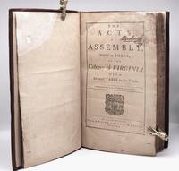
1769W2619Williamsburg Virginia: Printed by W. Rind A. Purdie and J. Dixon 1769. 4 577 1 pages. First and only printing of this important colonial Williamsburg imprint. Late in 1767 the General Assembly authorized a third "revisal" of Virginia laws which meant a compilation of all acts passed since the 1752 "revisal" together with all laws passed prior to 1752 that were still in effect. Ordinarily the contract for printing the book would have been awarded to the official public printer William Rind but Rind's financial straits caused the General Assembly to award the contract to Rind's financially stable competitors the Williamsburg printing company of Alexander Purdie and John Dixon . Perhaps to spare Rind public embarrassment it was decided to advertise the project as a joint venture; thus the names of Rind Purdie and Dixon are listed as printers on the title page. ASSOCIATION COPY: On the title page is the 1784 signature of Alexander Breckinridge 1752-1801 a Virginia surveyor veteran of the Revolution and participant of the 1787 convention on Kentucky statehood. On a blank page in the rear of the book is a form for a legal deed that is written in Breckinridge's hand. In the twentieth century book was sympathetically rebound in full leather with remnants of original leather and original leather title patch laid down. Professional rice paper repairs to margins of many pages; the repairs affect very little text. First Edition Thus. Hardcover. Very Good-. Folio - over 12" - 15" tall. Book. Printed by W. Rind, A. Purdie, and J. Dixon Hardcover